


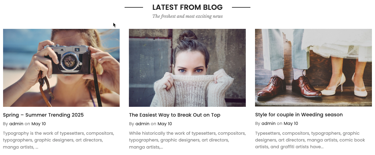
The Blog Posts section is designed to showcase the latest articles from your store’s blog in a visually appealing layout.
1. How to access the Blog post section?
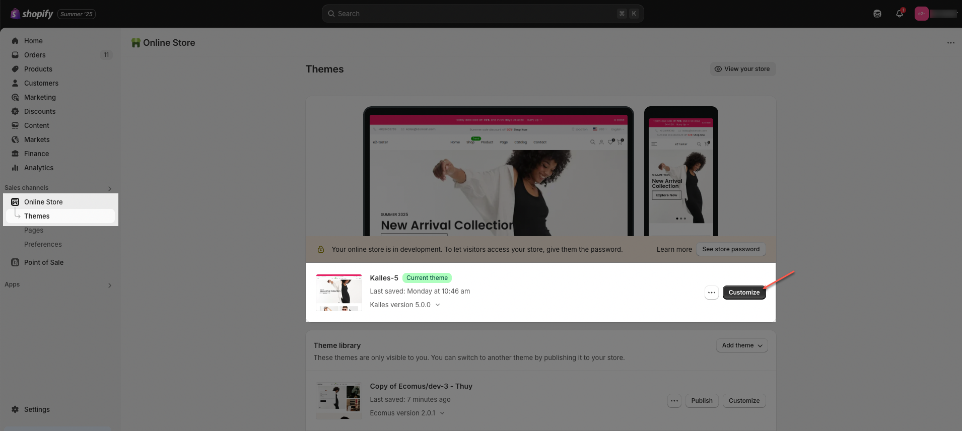
Step 01: From Shopify Admin, click on Online Store > Select Themes > In the Current theme section, click the Customize button.
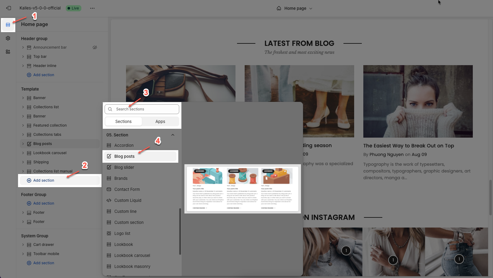
Step 02: In the theme editor (Customize), click the Sections button > Click the Add section button > In the Sections tab, scroll through the list or use the search bar to find and select Blog post.
2. How to customize the Blog post section?
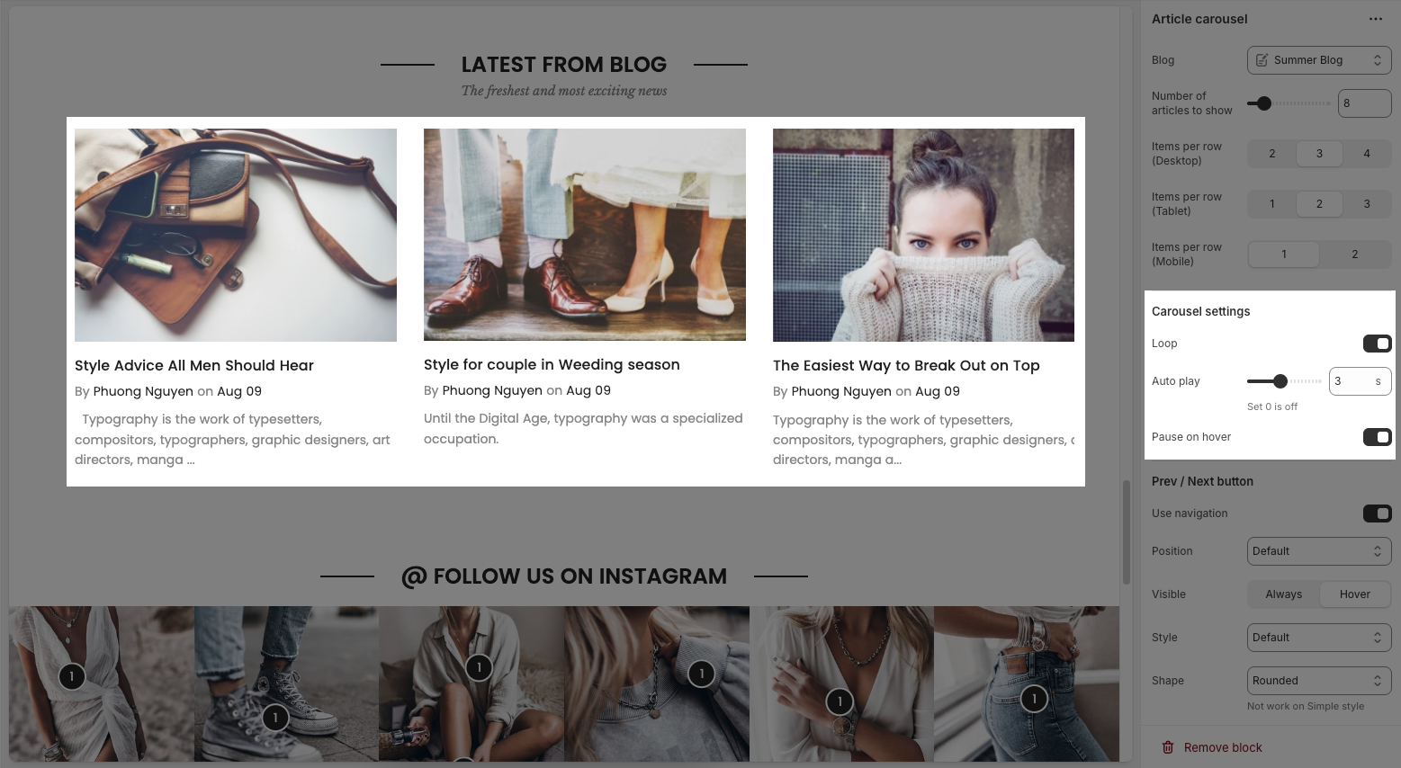
2.1. Article carousel
You can configure some general options for the Article carousel below:
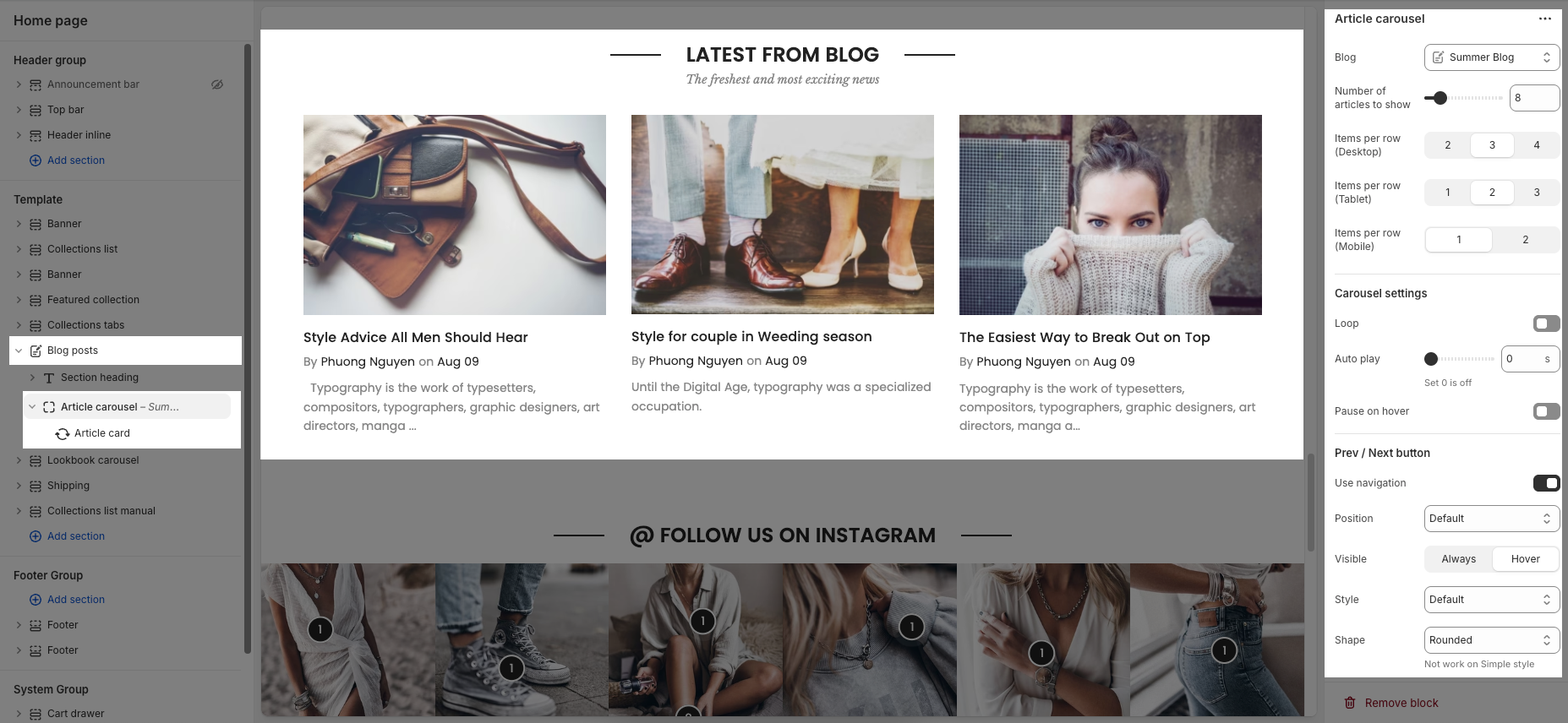
Blog: Select the blog source from which the articles will be pulled.
Number of articles to show: Choose how many articles to display in the carousel.
Items per row (Desktop / Tablet / Mobile): Define how many articles are shown side-by-side on different screen sizes.
2.1.1. Carousel settings
Loop: Enables continuous looping of the carousel; after the last slide, it returns to the first automatically.
Auto play: Sets the time (in seconds) for automatic slide switching. Setting to 0 disables autoplay.
Pause on hover: When enabled, the autoplay pauses while the user hovers over the carousel.
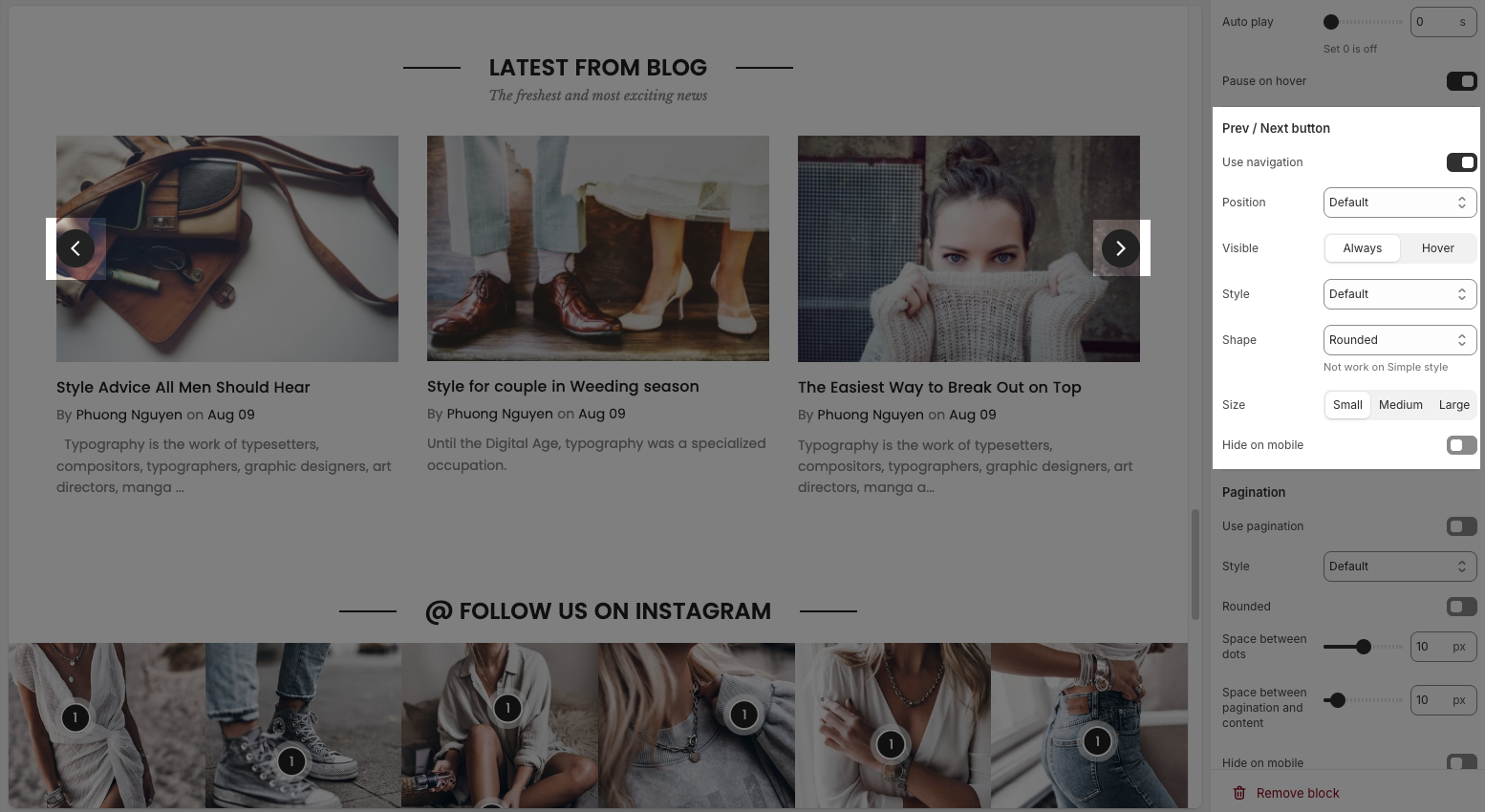
2.1.2. Prev / Next button
Use navigation: Enables the left/right navigation arrows for manual slide control.
Position: Sets the placement of the navigation buttons (e.g., Default, On border, Outside, etc.).
Visible: Choose whether the navigation buttons are always visible or only appear on hover.
Style: Select the design style of the navigation buttons (e.g., Default, Outline, Simple.).
Shape: Defines the button shape (e.g., Rounded, Rotate); note: doesn't apply to the “Simple” style.
Size: Sets the size of the navigation buttons (Small, Medium, or Large).
Hide on mobile: Hides navigation buttons on mobile devices when enabled.
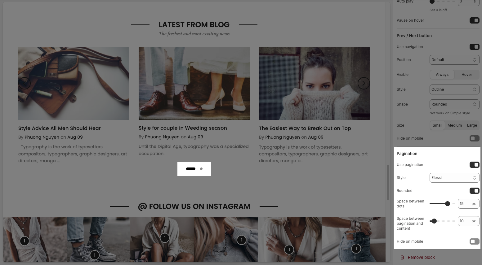
2.1.3. Pagination
Use pagination: Turns on pagination (usually dots below the carousel to indicate slide position).
Style: Sets the appearance of the dots (e.g., Default, Outline, Elessi, Full width).
Rounded: Makes the pagination dots circular when enabled.
Space between dots: Adjusts the distance (in px) between pagination dots.
Space between pagination and content: Controls the vertical gap (in px) between pagination and the content above.
Hide on mobile: Hides the pagination dots on mobile devices when enabled.
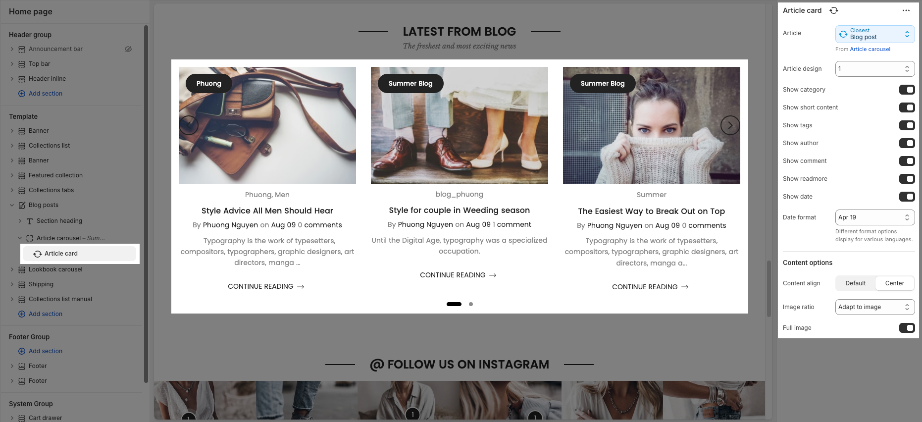
2.2. Article card
Click on Article carousel block > Add block (plus icon ➕) > Article card block
In the Article card block, you can configure:
Article: Select the article to display in the card (e.g., the closest blog post from the article carousel).
Cannot customize these options because a blog post has already been selected in the "Article carousel" section.
Article design: Choose the layout style for the article card.
Show category: Toggle to show/hide the article category.
Show short content: Toggle to show/hide the article summary or excerpt.
Show tags: Toggle to show/hide tags associated with the article.
Show author: Toggle to show/hide the article author name.
Show comment: Toggle to show/hide the number of comments.
Show readmore: Toggle to show/hide the “Continue Reading” button.
Show date: Toggle to show/hide the article publish date.
Date format: Choose the format in which the date will be displayed (e.g., Apr 19).
Content align: Set content alignment (Default or Center).
Image ratio: Select how the image should be displayed (e.g., Adapt to image).
Full image: Toggle to show the full image without cropping.
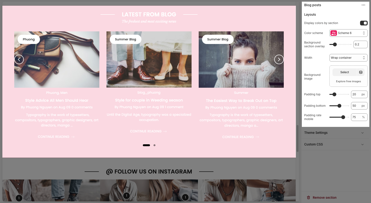
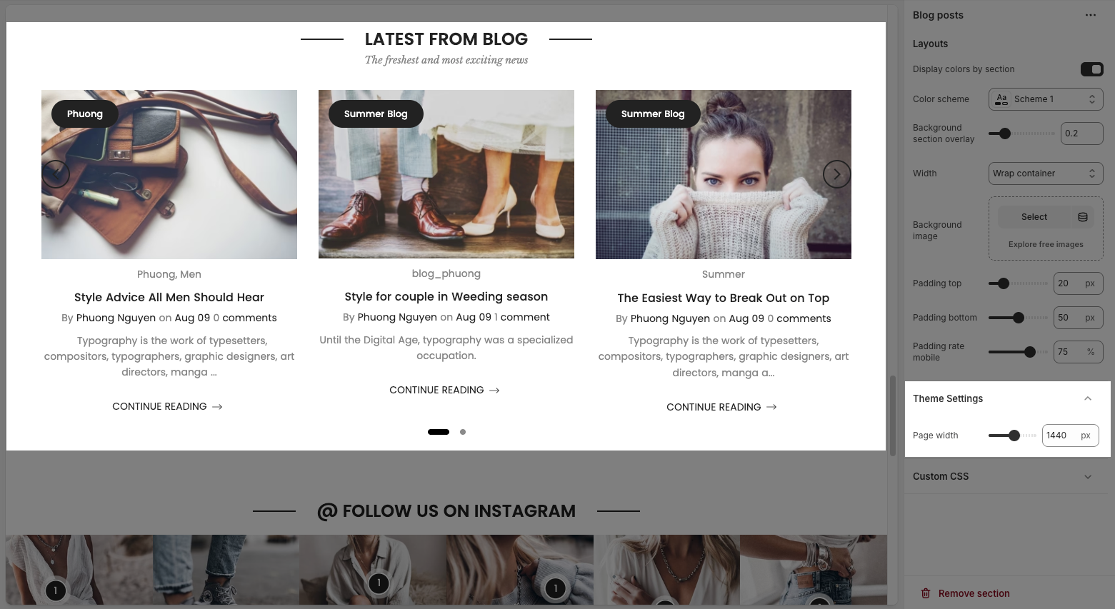
2.3. Blog post section
You can configure some general options for the section below:
2.3.1. Layouts
Display colors by section: Toggle to enable/disable color customization for this section.
Color scheme: Choose a predefined color scheme to apply styling to the section.
Background section overlay: Adjust the transparency of the background color overlay (0 = transparent, 1 = solid).
Width: Select how wide the section should be (e.g., Wrap container keeps content within a central layout).
Background image: Upload or select an image to use as the section background.
Padding top: Set the space (in pixels) above the section content.
Padding bottom: Set the space (in pixels) below the section content.
Padding rate mobile: Define the padding scaling percentage for mobile view compared to desktop.
2.3.2. Theme Settings
Page width: defines the maximum width of the main content area on the website.
2.3.3. Custom CSS
Allows users to customize by adding CSS rules, beyond the limitations of default settings. This allows for fine-tuning the design to every detail, to suit specific needs.
Add custom styles to this section only.
To add custom styles to your entire online store, go to theme settings for detailed instructions.


