


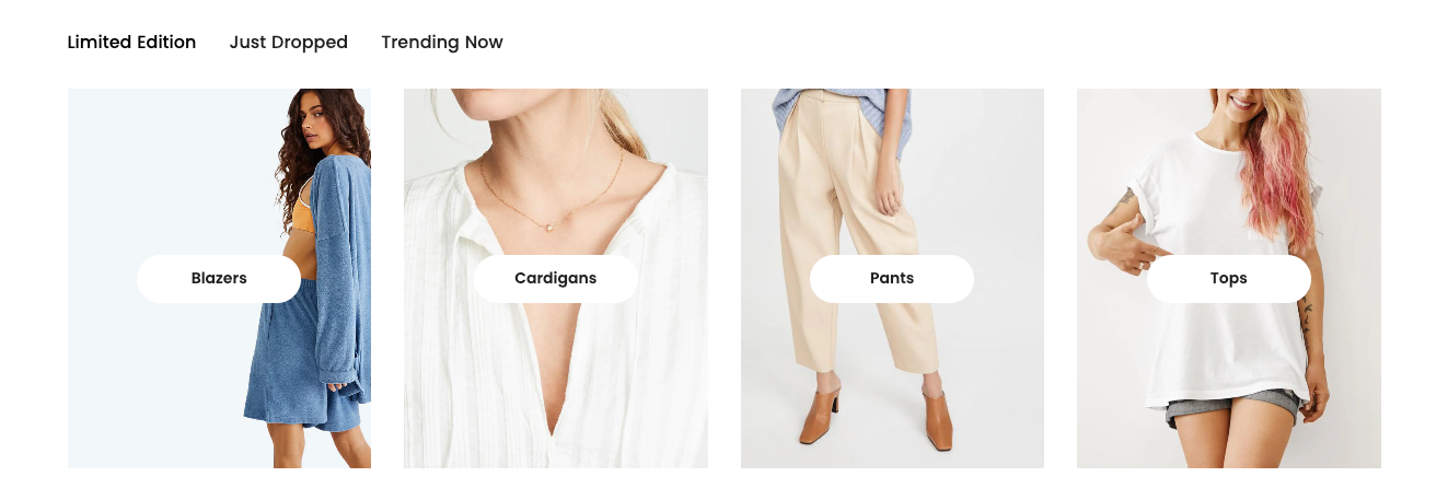
The "Collection list tabs" section provides an efficient mechanism for displaying multiple product collections as toggleable tabs. Each tab represents a separate collection, allowing users to easily browse through different product categories without reloading the page.
1. How to access the Collection list tabs section?
Step 01: From Shopify Admin, click on Online Store > Select Themes > In the Current theme section, click the Customize button.

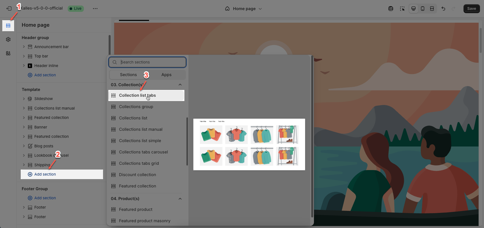
Step 02: In the theme editor (Customize), click the Sections button > Click the Add section button > In the Sections tab, scroll through the list or use the search bar to find and select the Collection list tabs section.
2. How to customize the Collection list tabs section?
2.1. Tabs item block
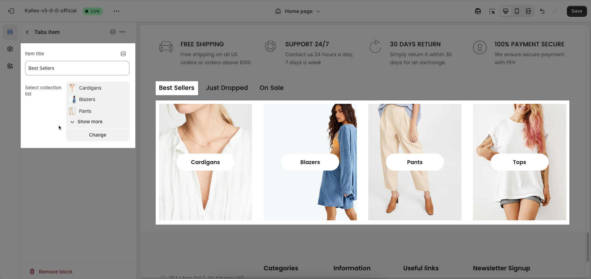
To add a Tabs item block to the Collection list tabs section, click the Add Tabs item button (plus icon ➕) under the Collection list tabs section.
After adding the Tabs item block, you can adjust its settings using the sidebar—located on the right or left side of your screen depending on your device
Item title: Enter the title for this item. This title will be displayed as a prominent heading or label for a group of collections.
Select collection list: Select the list of collections you wish to display. You can typically select multiple collections to create a list of collection links or images.
2.2. Collection list tabs section
After adding the Collection list tabs section, you can customize its settings in the left or right sidebar (depending on your screen size)
Heading options
Heading: Enter the heading text for the section. This will serve as the main focal point or a brief description of the section's content.
Heading tag: Select the semantic HTML tag for the heading. Choosing the correct tag (from
h1toh6) is crucial for document structure and SEOHeading size: Select the visual size of the heading
Distance between heading items: Enter the spacing (gap) between items within the heading area
Distance between heading and content: Enter the spacing (gap) between the entire heading area and the main content of that section
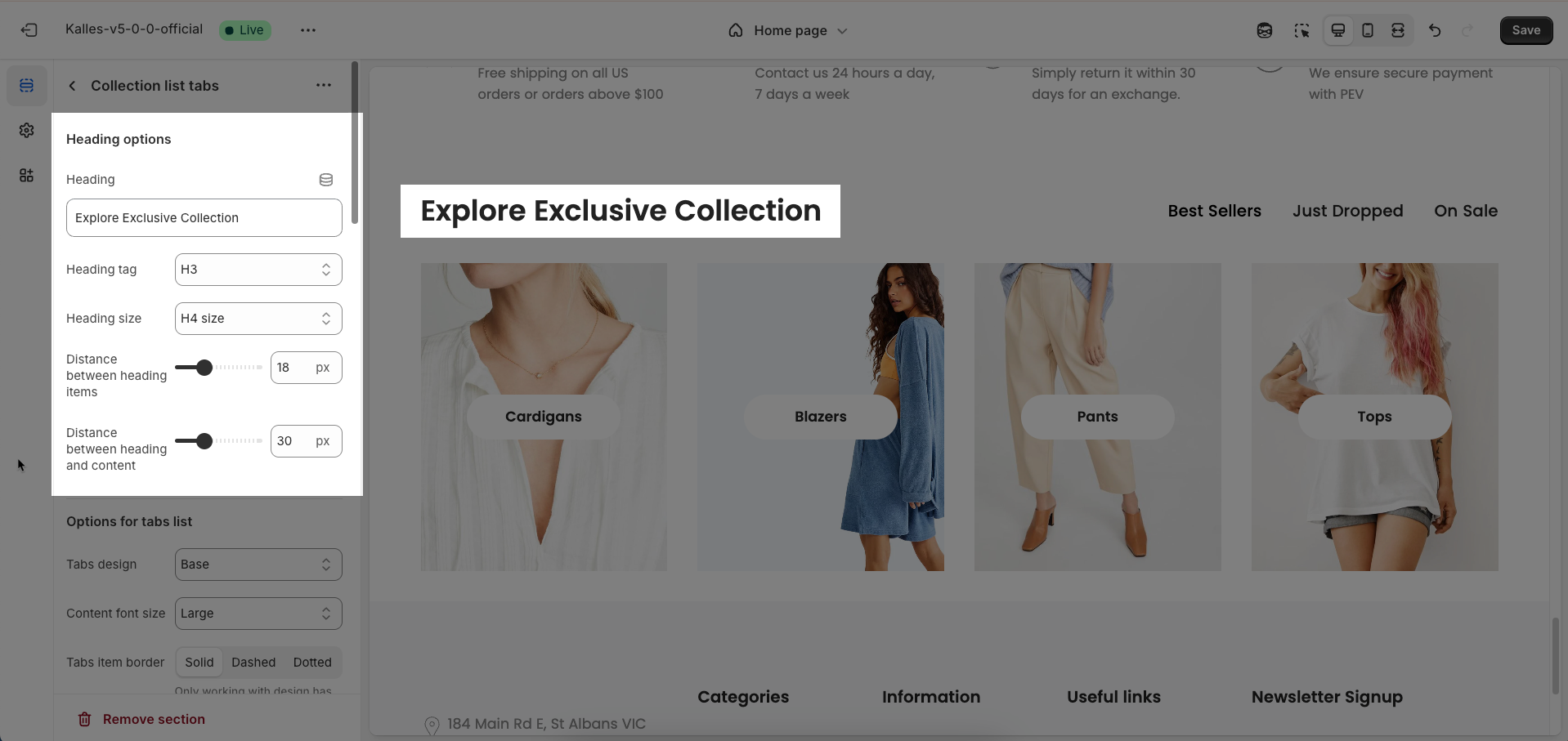
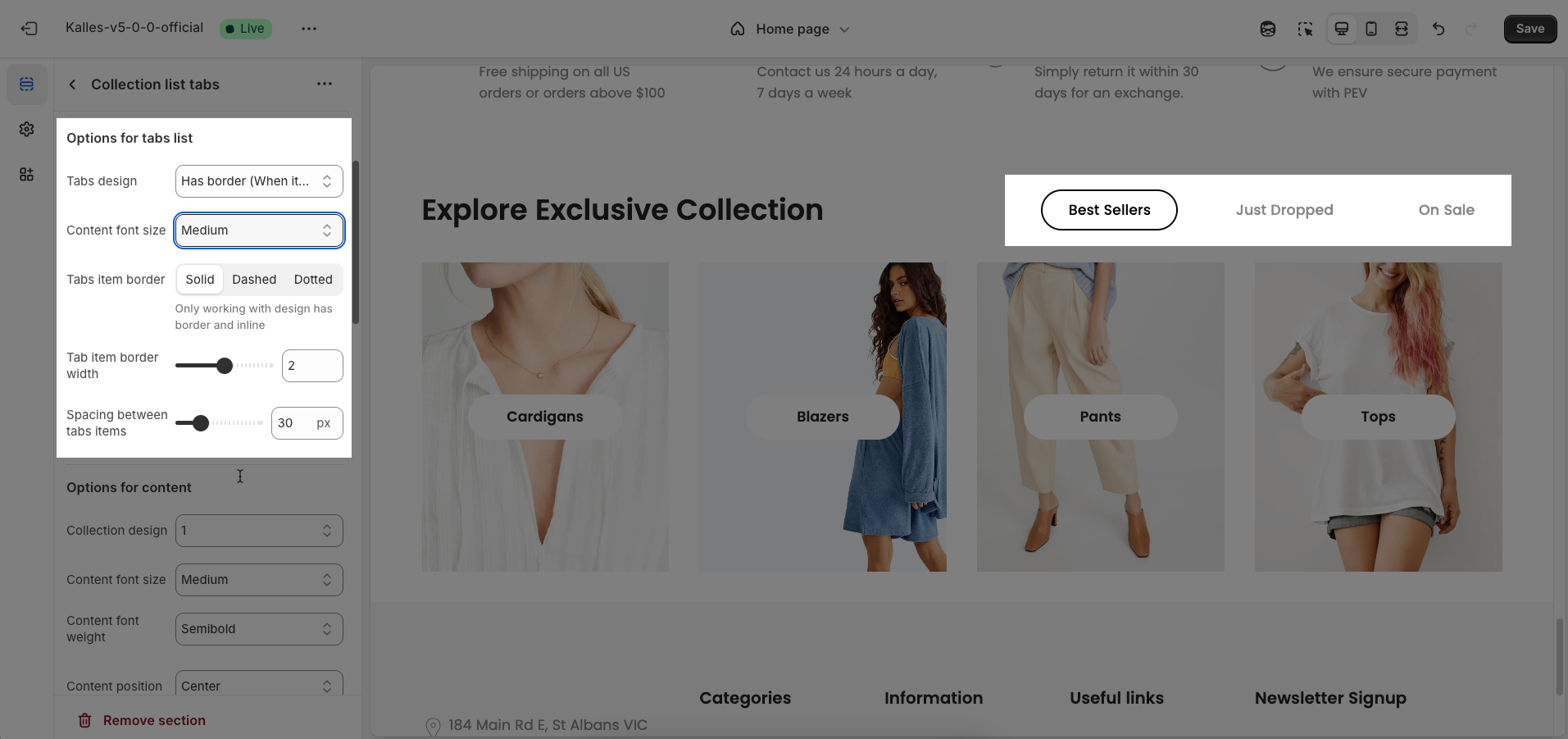
Options for tabs list
Tabs design: Select the overall design style for the tabs. This will shape the visual appearance of the entire tab component, including its shape, color, and basic interaction style.
Content font size: Select the font size for the content displayed within each tab pane. This controls the readability and information density of the content.
Tabs item border (Solid, Dashed, Dotted): Select the border style for each tab item. This style applies to the border around or beneath each tab, depending on the chosen
Tabs design.Solid: A continuous, unbroken border line.
Dashed: A border composed of a series of short lines.
Dotted: A border composed of a series of dots.
Only working with design has border and inline
Tab item border width: Enter the width of the tab item border (unit: pixels)
Spacing between tabs items: Enter the spacing (gap) between individual tab items (unit: pixels). This spacing improves readability and distinction between tabs.
Options for content
Collection design: Select the overall design style for each collection block. This shapes how the collection's image, title, and other information are arranged and presented.
Content font size: Select the font size for text elements within the collection content
Content font weight: Select the font weight for text elements within the collection content.
Content position: Select the position of the content block (title, description, item count) relative to the image or within a defined area.
Depending on the design to display the appropriate location
Content spacing: Enter the spacing (gap) between elements within the collection's content block
Depending on the 'content position'. Not work when 'content position' is center. Only work on desktop, on mobile it automatically adjusts to be responsive
Show count items: Enable this option to display the number of products within the collection.
Check here to show count item product in the collection
Count label: Enter the text to display before the product count. This helps provide context for the number.
Only work when enable 'Show count items'
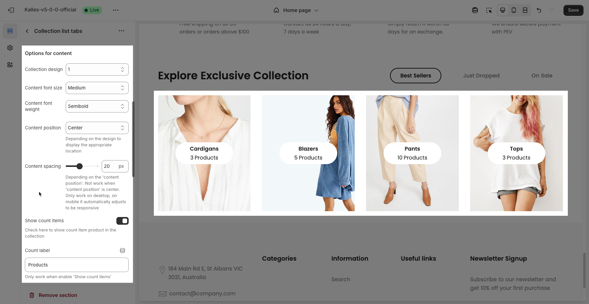
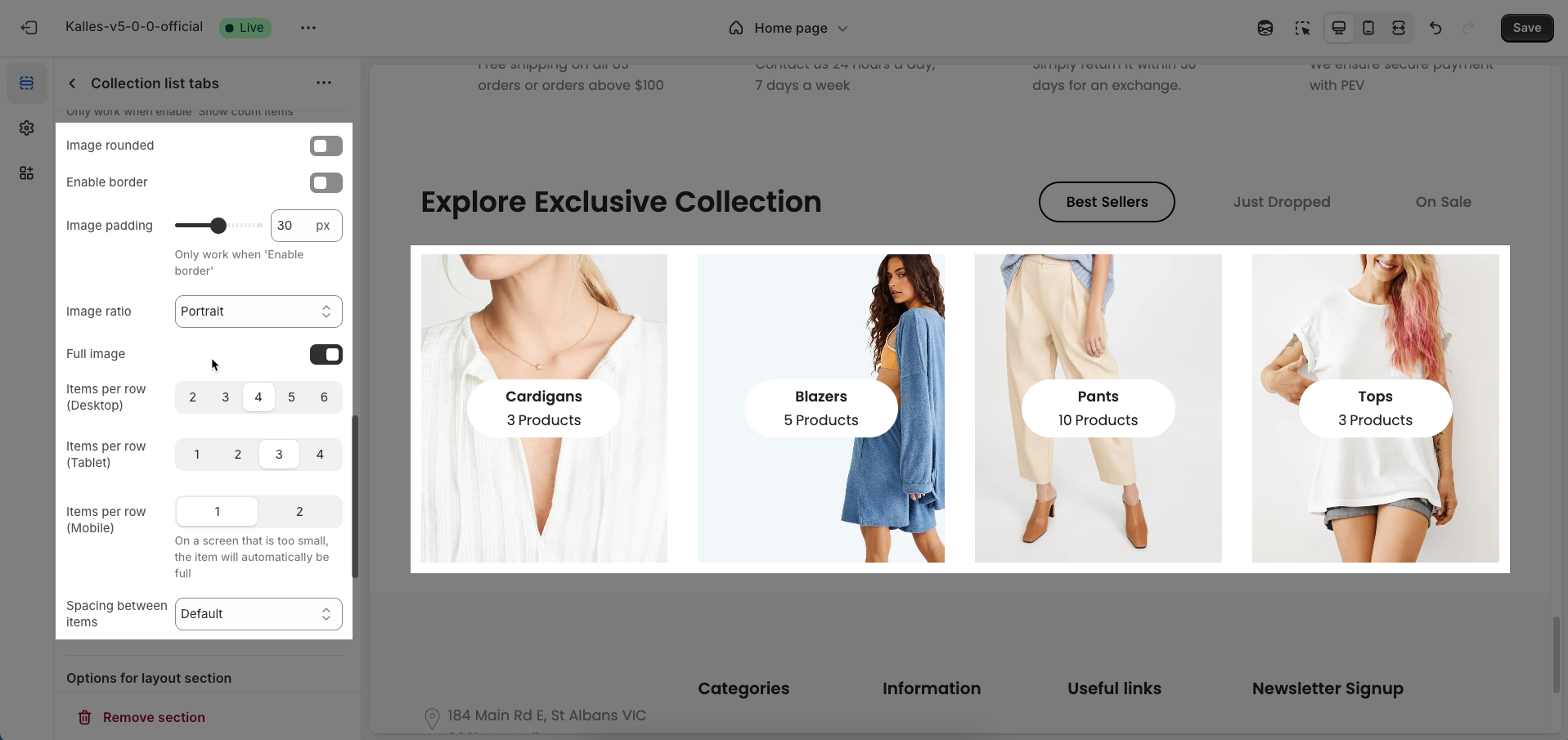
Image rounded: Enable this option to round the corners of the image. This creates a softer aesthetic effect, as opposed to sharp, square corners.
Enable border: Enable this option to add a border around the image. A border can help clearly delineate the image from the background or other elements.
Image padding: Enter the padding (in pixels) inside the image or between the image and its border.
Only work when 'Enable border'
Image ratio: Select the aspect ratio (Adapt to image, Square, Portrait, Landscape,...) for the image. Setting an aspect ratio helps ensure consistency in layout
Full image: Enable this option to make the image span the full available width of its containing element.
Items per row (Desktop): Enter the number of items to display per row on desktop screens (large screens). This shapes the column layout for desktop users.
Items per row (Tablet): Enter the number of items to display per row on tablet screens. This adjustment optimizes the display for intermediate devices, typically 2 or 3 columns.
Items per row (Mobile): Enter the number of items to display per row on mobile devices.
On a screen that is too small, the item will automatically be full
Spacing between items: Enter the spacing (gap) between individual items within the grid layout (unit: pixels).
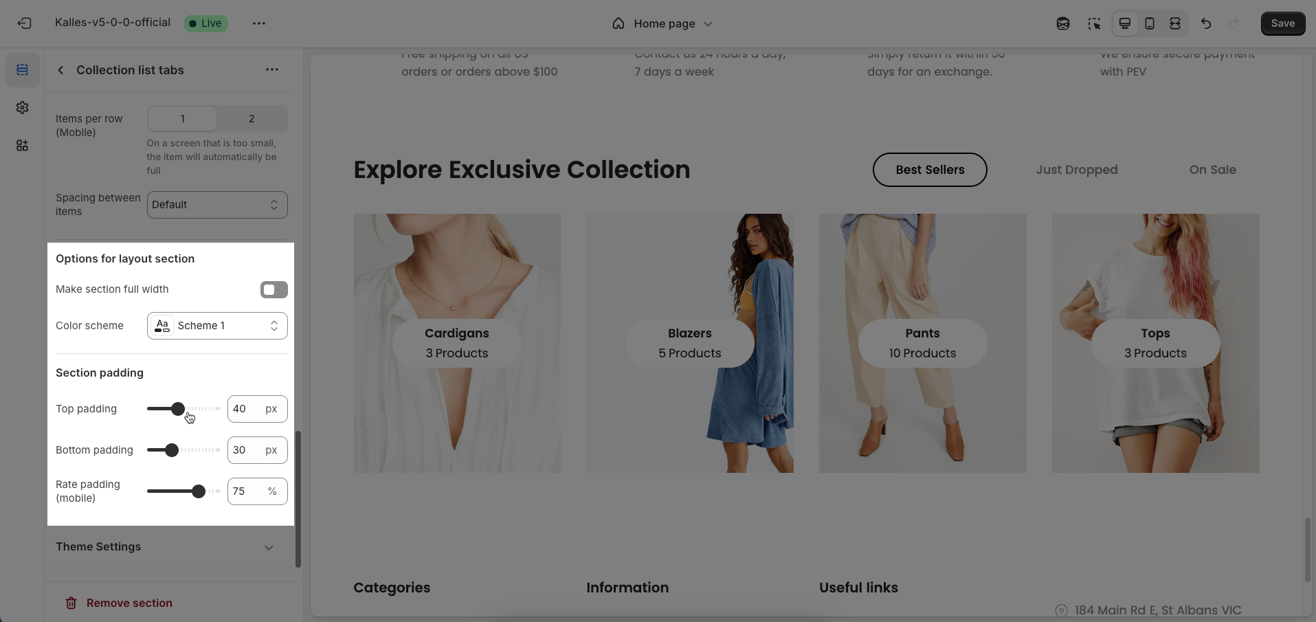
Options for layout section
Make section full width: Enable this option to make the section span the full width of the browser, ignoring the theme's usual content width constraints
Color scheme: Select the color scheme that will be applied to this section. A color scheme typically includes settings for background color, primary text color, secondary text color, and other accent colors, helping maintain design consistency and brand identity.
Section padding
Top padding: Enter the value for the top padding of the element (unit: pixels). This padding creates space between the top edge of the content and the top edge of the element.
Bottom padding: Enter the value for the bottom padding of the element (unit: pixels). This padding creates space between the bottom edge of the content and the bottom edge of the element.
Rate padding (mobile): Enter the padding rate value for the element on mobile devices
Theme Settings
Page width: Select or enter the maximum width for the main page content. This setting typically defines the width of the central container that holds all content elements, preventing them from stretching too far on wide screens, which improves readability and aesthetics.
Horizontal space: Enter the horizontal space (padding) inside the content-containing element, applied to both the left and right sides (unit: pixels). This spacing ensures that content does not butt up against the edges of the screen or container
Custom CSS
Allows users to customize by adding CSS rules, beyond the limitations of default settings. This allows for fine-tuning the design to every detail, to suit specific needs.
Add custom styles to this section only.
To add custom styles to your entire online store, go to theme settings for detailed instructions.


