


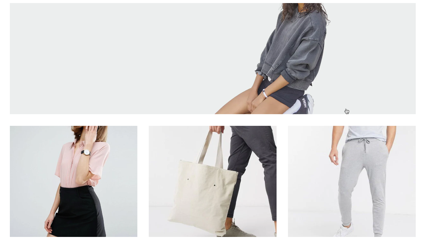
The "Image Gallery Packery" section delivers a dynamic and responsive image gallery that utilizes the Packery layout to efficiently arrange images of varying sizes, much like fitting bricks together. This layout optimizes space by filling vertical gaps, creating a visually unique and engaging interface.
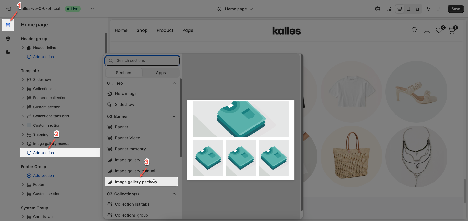
1. How to access the Image Gallery Packery section?
Step 01: From Shopify Admin, click on Online Store > Select Themes > In the Current theme section, click the Customize button.

Step 02: In the theme editor (Customize), click the Sections button > Click the Add section button > In the Sections tab, scroll through the list or use the search bar to find and select the Image Gallery Packery section.
2. How to customize the Image Gallery Packery section?
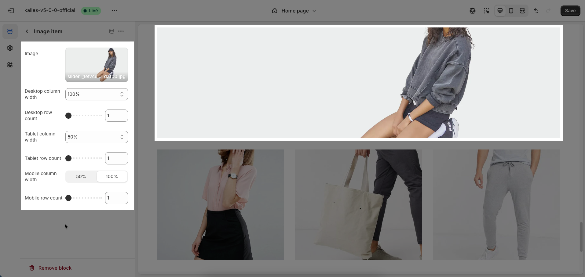
2.1. Image block
To add an Image block to the Image Gallery Packery section, click the Add block button (plus icon ➕) under the Image Gallery Packery section.
After adding the Image block, you can adjust its settings using the sidebar—located on the right or left side of your screen depending on your device
Image: Upload the image file to be displayed.
Desktop column width: Enter the relative column width that this image will occupy on desktop screens
Desktop row count: Enter the number of rows that this image will occupy on desktop screens. This allows the image to span multiple rows in a grid layout.
Tablet column width: Enter the relative column width that this image will occupy on tablet screens.
Tablet row count: Enter the number of rows that this image will occupy on tablet screens.
Mobile column width: Enter the relative column width that this image will occupy on mobile devices.
Mobile row count: Enter the number of rows that this image will occupy on mobile devices.
2.2. Image Gallery Packery section
After adding the Image Gallery packery section, you can customize its settings in the left or right sidebar (depending on your screen size)
Heading options
Design heading: Select the overall design style for the heading area. This can shape the layout and visual aesthetic of the main heading and subheading.
Heading align: Select the horizontal alignment for the main heading.
Heading tag: Select the semantic HTML tag for the main heading (e.g.,
H1,H2,H3). Using the correct heading tag is crucial for SEO and content structure.Heading size: Select the visual size for the main heading. This size will typically be defined in CSS, but this option allows users visual control.
Heading image: Upload an image to be displayed alongside the heading. This can be an icon, a small logo, or a decorative image to enhance visual emphasis.
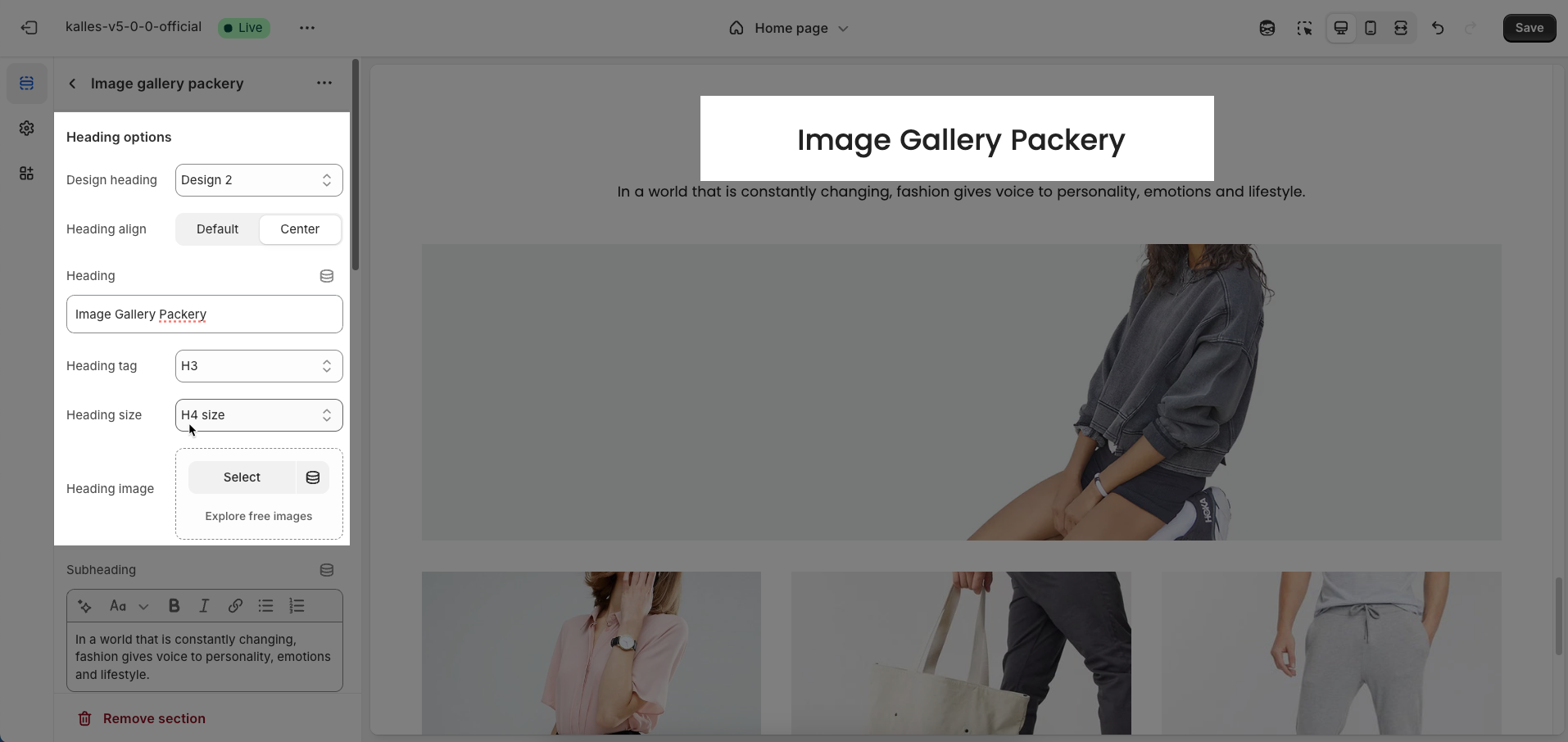
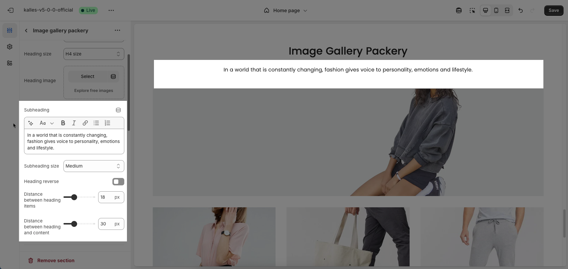
Subheading: Enter the content for the subheading. The subheading typically provides additional context or detail for the main heading.
Subheading size: Select the visual size for the subheading.
Heading reverse: Enable this option to reverse the display order of the main heading and subheading
Distance between heading items: Enter the spacing between the main heading, subheading, and heading image (unit: pixels). This spacing helps control visual balance and readability.
Distance between heading and content: Enter the spacing between the entire heading area (including main heading, subheading, and image) and the main content of the section (unit: pixels)
General options
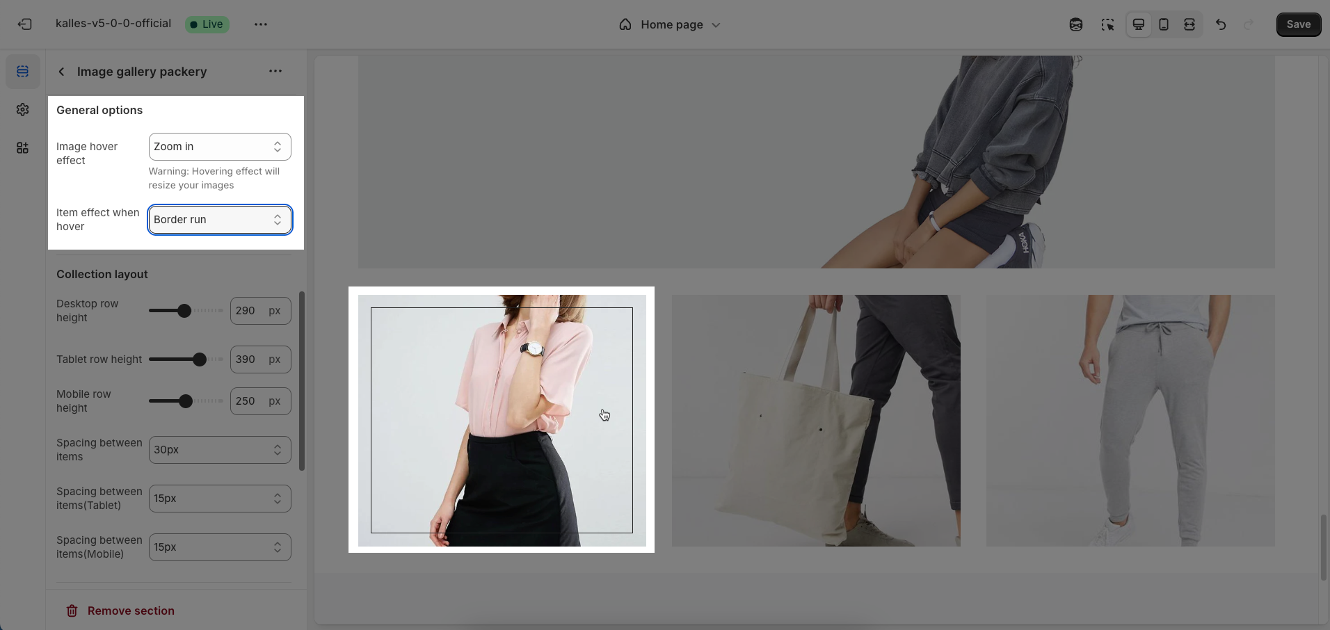
Image hover effect: Select the effect to apply to the image (Zoom image, Rotate, Filter,...) when the mouse cursor hovers over it. These effects focus on the image itself, creating a visual emphasis upon interaction.
Warning: Hovering effect will resize your images
Item effect when hover: Select the effect to apply to the entire item (Border run, Overlay,...) when the mouse cursor hovers over any part of it
Options for layout content
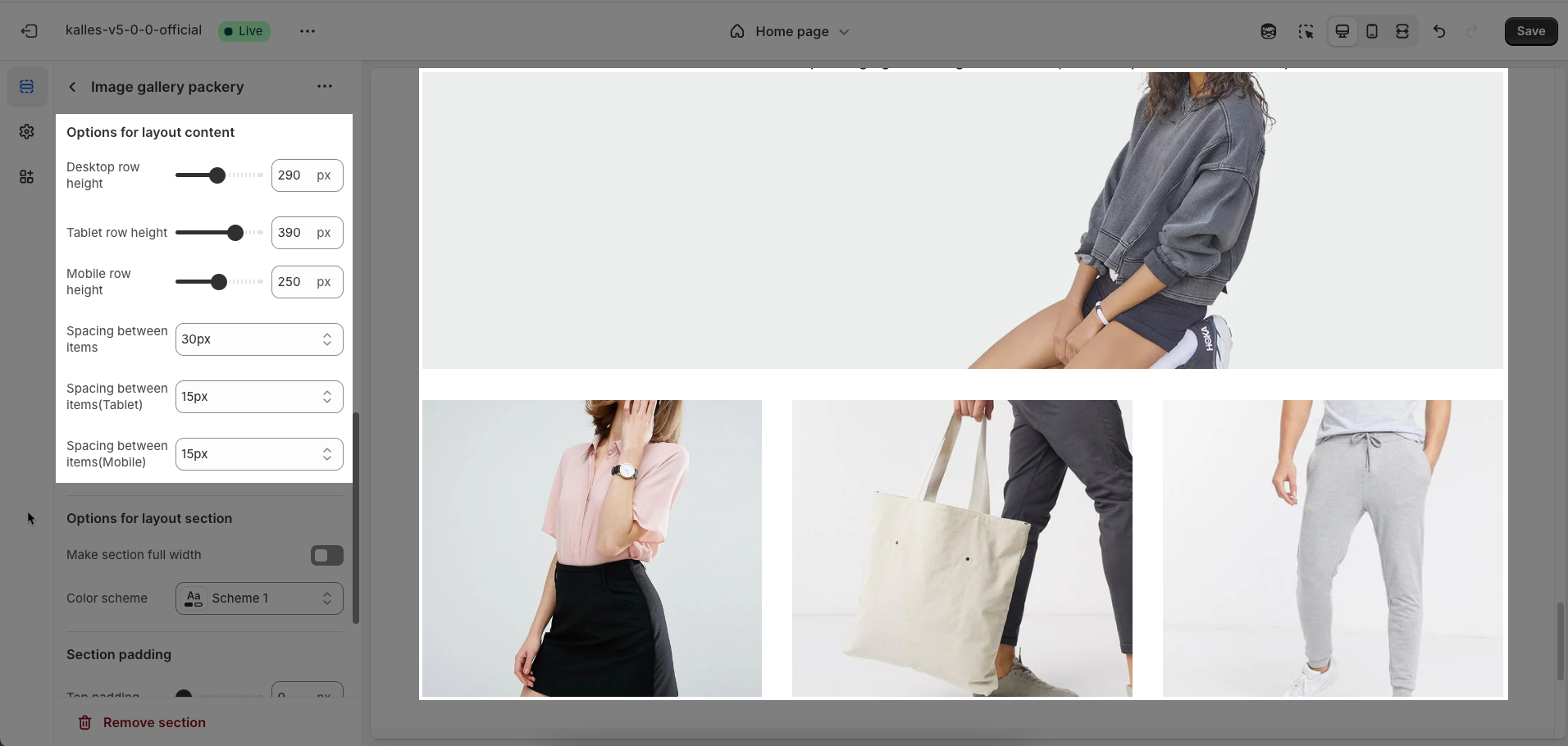
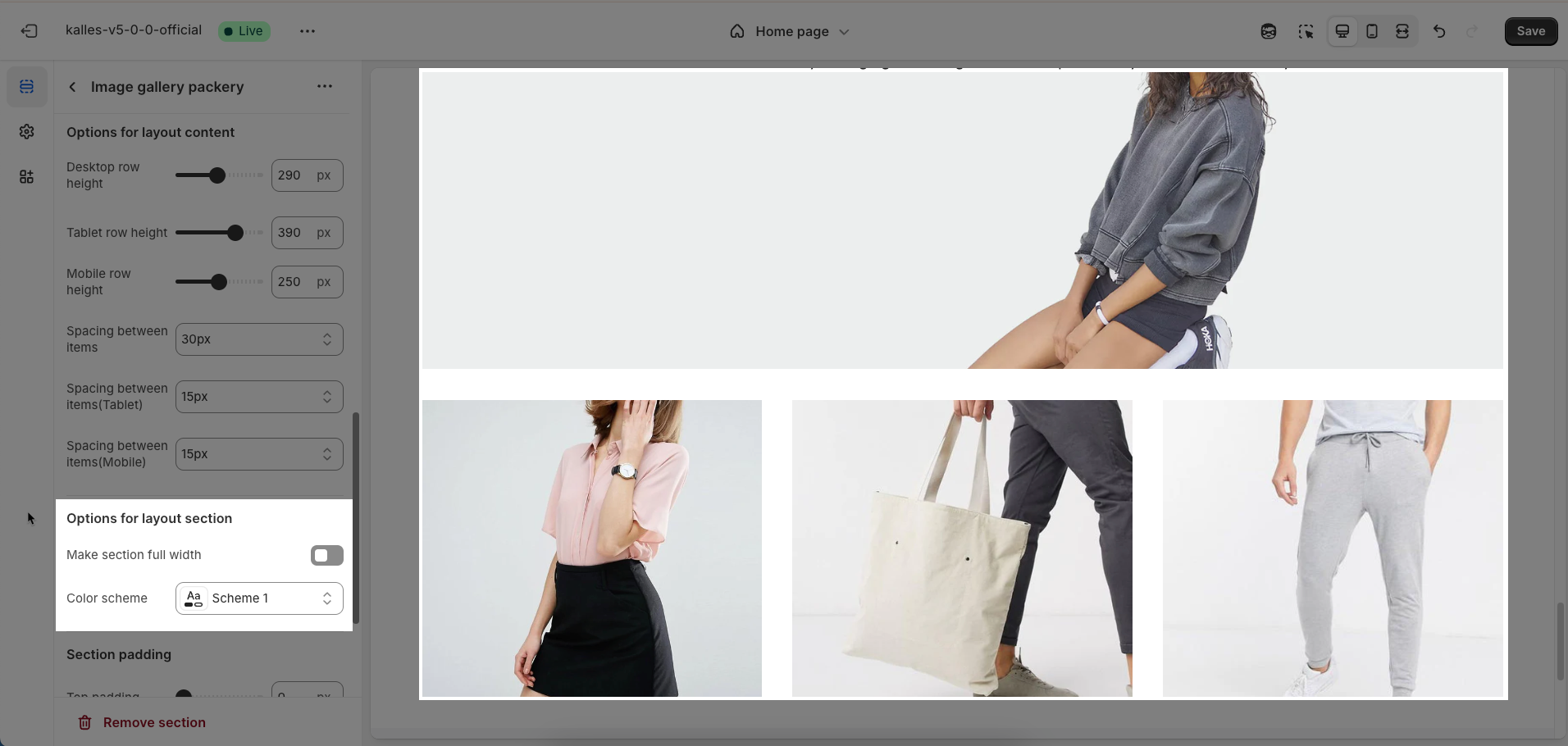
Desktop row height: Enter the height of each row on desktop screens
Tablet row height: Enter the height of each row on tablet screens. This customization helps optimize the layout for intermediate devices.
Mobile row height: Enter the height of each row on mobile devices. Optimizing for small screens is crucial for a good user experience.
Spacing between items: Enter the spacing (gap) between individual items within the layout.
Spacing between items(Tablet): Enter the spacing (gap) between individual items when displayed on tablet screens (unit: pixels)
Spacing between items(Mobile): Enter the spacing (gap) between individual items when displayed on mobile devices (unit: pixels)
Options for layout section
Make section full width: Enable this option to make the section span the full width of the browser, ignoring the theme's usual content width constraints
Color scheme: Select the color scheme that will be applied to this section. A color scheme typically includes settings for background color, primary text color, secondary text color, and other accent colors, helping maintain design consistency and brand identity.
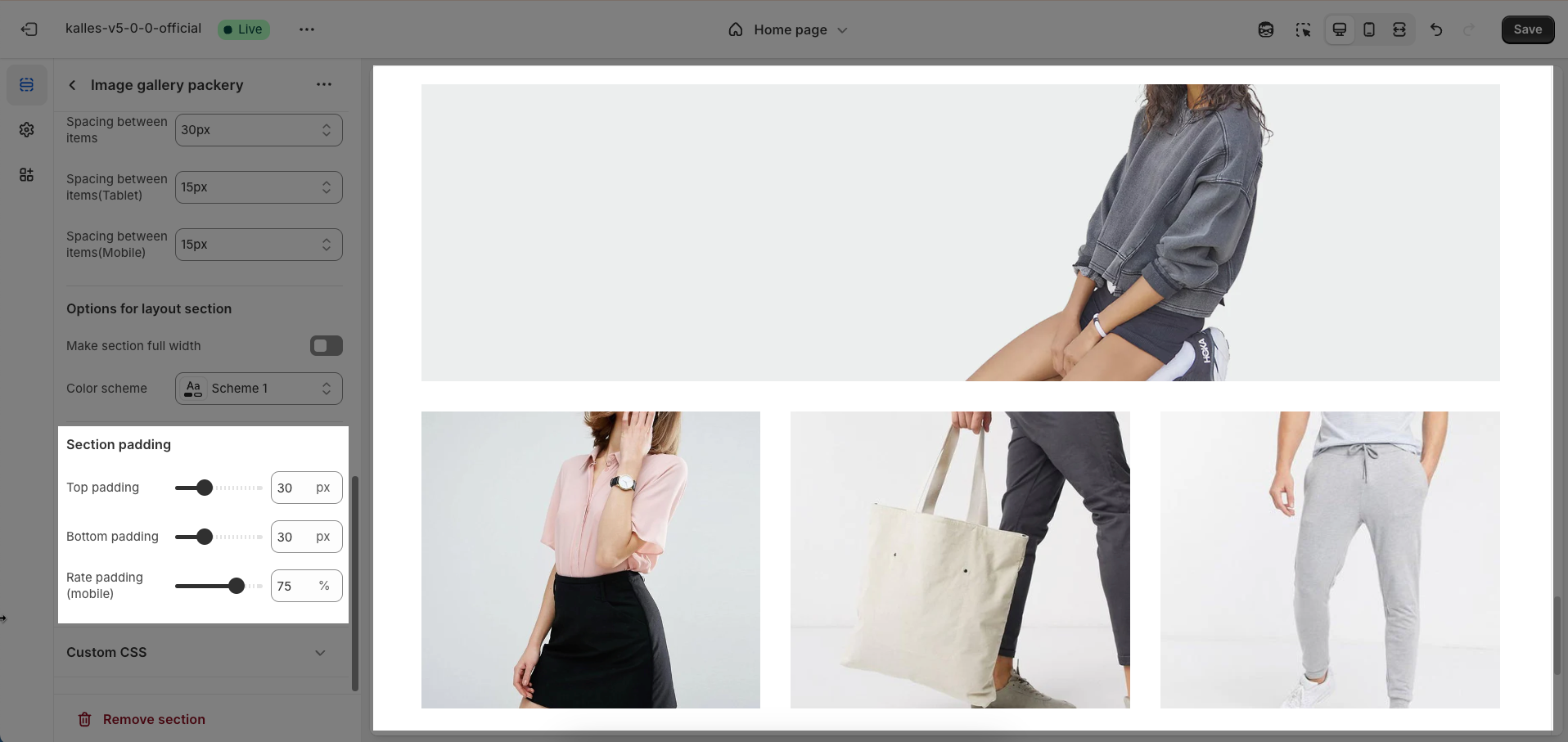
Section padding
Top padding: Enter the value for the top padding of the element (unit: pixels). This padding creates space between the top edge of the content and the top edge of the element.
Bottom padding: Enter the value for the bottom padding of the element (unit: pixels). This padding creates space between the bottom edge of the content and the bottom edge of the element.
Rate padding (mobile): Enter the padding rate value for the element on mobile devices
Custom CSS
Allows users to customize by adding CSS rules, beyond the limitations of default settings. This allows for fine-tuning the design to every detail, to suit specific needs.
Add custom styles to this section only.
To add custom styles to your entire online store, go to theme settings for detailed instructions.


