


The "Custom section" allows users to freely design and add unique content to their website, going beyond the limitations of pre-defined sections. With the "Custom section", you have full control over the design, ensuring that your website reflects your creative ideas and specific requirements.
1. How to access the Custom section?
Step 01: From Shopify Admin, click on Online Store > Select Themes > In the Current theme section, click the Customize button.

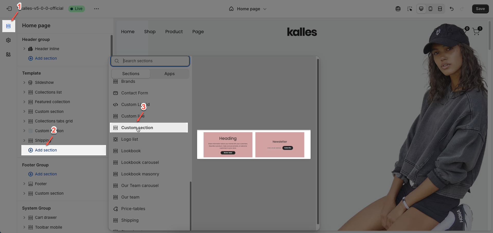
Step 02: In the theme editor (Customize), click the Sections button > Click the Add section button > In the Sections tab, scroll through the list or use the search bar to find and select the Custom section.
2. How to customize the Custom section?
2.1. Custom section
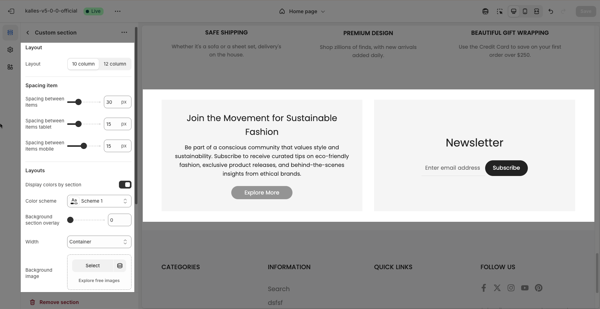
After adding the Custom section, you can customize its settings in the right sidebar.
Layout
Layout: Select the column grid system to be used for arranging content within the section.
10 column: Uses a 10-column grid system. This means the total available width of the section will be divided into 10 equal parts, allowing for lower-resolution content arrangement or asymmetric layouts.
12 column: Uses a 12-column grid system. This is the most common and flexible grid system, allowing content to be divided in various ways (e.g., 2, 3, 4, 6 equal columns) and creating more complex layouts.
Spacing item
Spacing between items: Adjusts the distance between elements in a list or grid on desktop screens, creating a clear and visually appealing layout.
Spacing between items tablet: Optimizes the spacing between elements on tablet screens, ensuring content is displayed balanced and easy to interact with.
Spacing between items mobile: Adjusts the spacing between elements on mobile phone screens, optimizing the user experience on small screens.
Layouts
Display colors by section: Enable this option to allow each section to manage its own color scheme independently
Color scheme: Select the color scheme that will be applied to this section. A color scheme typically includes settings for background color, primary text color, secondary text color, and other accent colors
Background section overlay: Select a color overlay that will be applied on top of the section's background
Width (Container, Wrap container, Full width): Select the width of the content within the section.
Container: The content will be confined within a fixed-width (or max-width) container defined by your global theme settings.
Wrap container: The content will be enclosed in a slightly wider container than the default, but still with limits.
Full width: The content will span the entire width of the browser viewport, ignoring any container constraints.
Background image: Upload an image to be used as the background for this entire section. This helps create a prominent and engaging visual element.
Top padding: Enter the value for the top padding of the element (unit: pixels). This padding creates space between the top edge of the content and the top edge of the element.
Bottom padding: Enter the value for the bottom padding of the element (unit: pixels). This padding creates space between the bottom edge of the content and the bottom edge of the element.
Rate padding (mobile): Enter the padding rate value for the element on mobile devices
Theme Settings
Page width: Enter the maximum width for the main content of your page (unit: pixels). The content will be centered and will not exceed this width, which helps improve readability and layout control.
Custom CSS
Allows users to customize by adding CSS rules, beyond the limitations of default settings. This allows for fine-tuning the design to every detail, to suit specific needs.
Add custom styles to this section only.
To add custom styles to your entire online store, go to theme settings for detailed instructions.

2.2. Column
To add Column block to the Custom section, click the Add block button (plus icon ➕) under the Multi Row block.
You can create a variable number of columns, depending on the desired layout
Once the Column is added, you can customize its settings in the right-hand sidebar:
Layout
We provide percentage options to customize columns for a professional layout design
Column desktop: Allows users to allocate percentage-based widths to individual columns on desktop screens, creating flexible and professional layouts.
Column tablet: Adjusts percentage-based widths for each column on tablet screens, ensuring balanced and readable content.
Column mobile: Optimizes percentage-based widths for each column on mobile phone screens, ensuring content is displayed neatly and interactively.
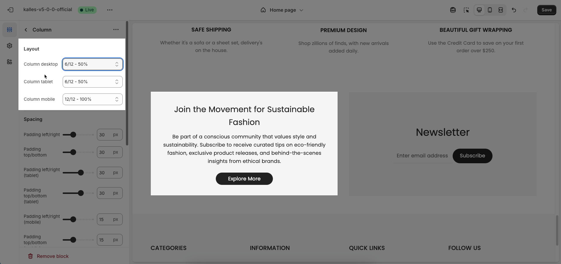
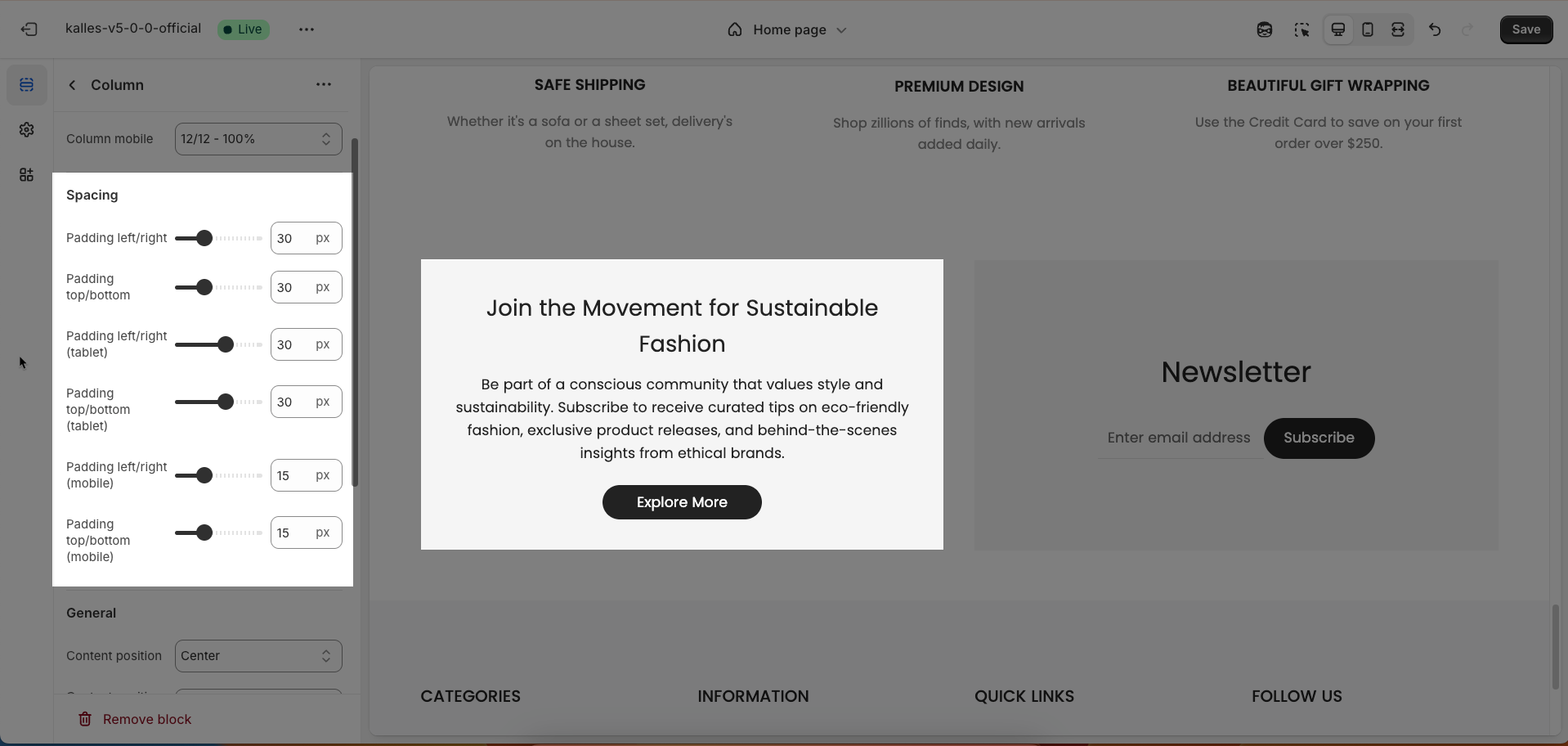
Spacing
Padding left/right: Adjusts the space to the left and right of the content within an element, creating padding and improving horizontal layout.
Padding top/bottom: Adjusts the space above and below the content within an element, creating padding and improving vertical layout.
Padding left/right (tablet): Optimizes the space to the left and right of the content on tablet screens, ensuring a balanced and readable layout.
Padding top/bottom (tablet): Optimizes the space above and below the content on tablet screens, ensuring a balanced and readable layout.
Padding left/right (mobile): Adjusts the space to the left and right of the content on mobile phone screens, optimizing the user experience on small screens.
Padding top/bottom (mobile): Adjusts the space above and below the content on mobile phone screens, optimizing the user experience on small screens
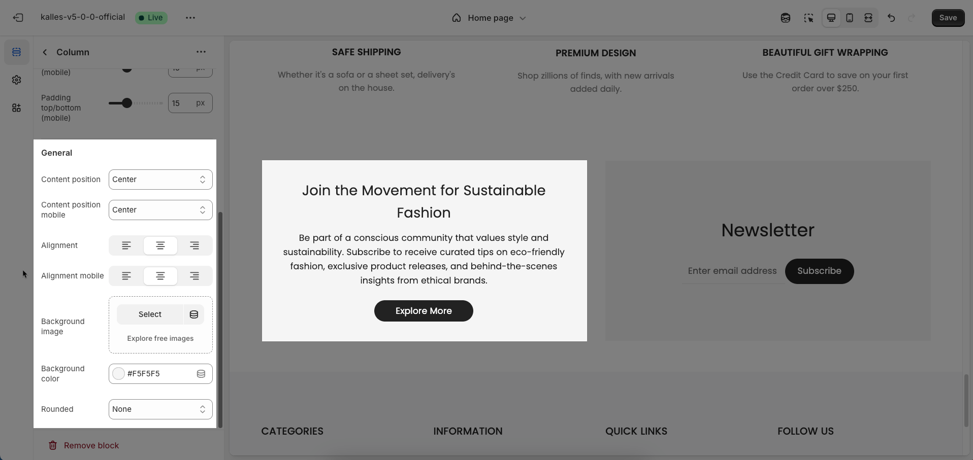
General
Content position: Selects the display position of content within an element, allowing for precise alignment in various directions, creating an intuitive and design-appropriate layout
Content position mobile: Optimizes the content display position for mobile screens, ensuring content is readable and interactive on small devices, maintaining a good user experience.
Allows users to define the display position of content within an element, ranging from top corners (top left, top right) to bottom corners (bottom left, bottom right), or centered both horizontally and vertically
Alignment: Adjusts the horizontal placement of text or elements, creating a visually organized and readable layout.
Alignment mobile: Optimizes text or element alignment for mobile screens, ensuring content is displayed neatly and interactively on small devices.
Background image: Adds a background image to an element, creating an appealing visual effect and enhancing the website's aesthetics.
Background color: Selects a background color for an element, creating contrast and highlighting content.
Rounded: Adjusts the curvature of element corners, creating a softer and more modern interface (Users can select from the following rounded corner options: none, extra small, small, medium, large, and full).
2.3. Other Blocks
Follow this guide


