This guide will help you customize shared blocks across different sections, such as Headings, Text, Spacer, Button,.... By following this tutorial, you'll learn how to adjust these blocks to fit your design needs, ensuring consistency and flexibility throughout your layout.
1. Heading block
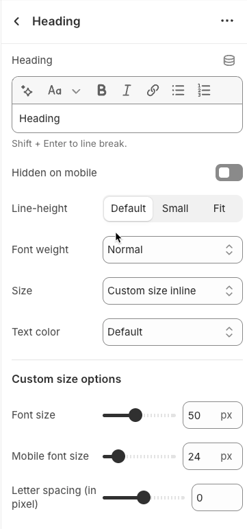
Customizing the Heading allows you to control its appearance across different devices, ensuring consistency and responsiveness. Below are the available options to fine-tune your heading styles.
Heading: Allows you to enter and format the text (bold, italic, underline, lists, links, etc.).
Shift + Enter to line break.
Hidden <br> on mobile: Disables line breaks on mobile devices.
Hidden on mobile: Hides the heading on mobile screens.
Size: Lets you select sizes for the heading.
Text color: Allows you to set the text color. Please follow this guideline to configure the Color.
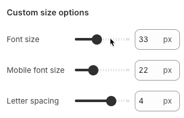
Custom Size Options:
Font size: Adjusts the heading size for desktop.
Tablet font size: Adjusts the heading size for table.
Mobile font size: Adjusts the heading size for mobile.
Font weight: Controls the thickness of the text (e.g., 600 is semi-bold).
Letter spacing: Adjusts the space between characters.
2. Text block
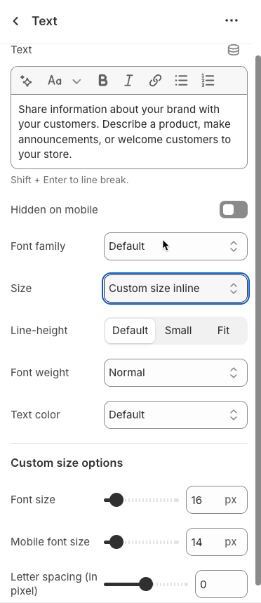
Text: Allows you to enter and format the text (bold, italic, underline, lists, links, etc.).
Shift + Enter to line break.
Hidden <br> on mobile: Disables line breaks on mobile devices.
Hidden on mobile: Hides the heading on mobile screens.
Size: Lets you select sizes for the heading.
Text color: Allows you to set the text color. Please follow this guideline to configure the Color.
Custom Size Options:
Font size: Adjusts the heading size for desktop.
Tablet font size: Adjusts the heading size for table.
Mobile font size: Adjusts the heading size for mobile.
Font weight: Controls the thickness of the text (e.g., 600 is semi-bold).
Letter spacing: Adjusts the space between characters.
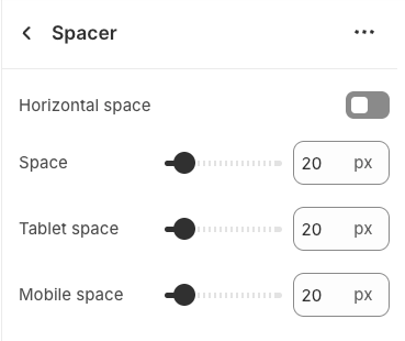
3. Spacer block
The Spacer block is used to add empty space between blocks. It helps improve the layout, create visual separation, and ensure a balanced design. This block is particularly useful for adjusting spacing in different screen sizes (desktop, tablet, and mobile) to enhance readability and aesthetics.
4. Button block
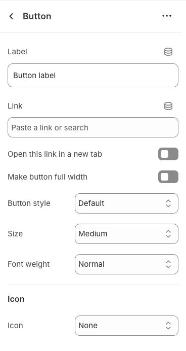
Once the Button block is added, you can customize its settings in the left or right-hand sidebar (depending on your screen size)
Label: Enter the text that will be displayed on the button. This is the main content users will read to understand the button's function
Link: Enter the URL that the button will link to when clicked. This can be an internal page within your store, a collection, a specific product, or an external link.
Open this link in a new tab: Enable this option to open the link in a new browser tab or window when the button is clicked.
Make button full width: Enable this option to make the button expand to the full available width of its containing element. This can make the button more prominent, especially on mobile devices.
Button style: Select the visual style of the button (Defaul, Outline, Link,...)
Size: Select the size of the button (e.g.,
Small,Medium,Large,...). This affects the button's height and internal padding.Font weight: Select the weight or boldness of the font on the button (e.g.,
Normal,Bold). This impacts the prominence of the button text.
Icon
Icon: An icon is a small graphic element used for illustration or emphasis.
Icon position: Select the position of the icon relative to the text or element it accompanies
Icon size: Select the size of the icon
Icon spacing: Enter the spacing between the icon and its adjacent text or element (unit: pixels).
5. Icon block
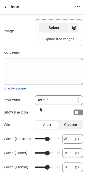
Once the Icon block is added, you can customize its settings in the left or right-hand sidebar (depending on your screen size)
Image: Upload an image file to display. This is ideal for logos, illustrations, or any other graphic you wish to use.
SVG code: Paste SVG (Scalable Vector Graphics) code directly into this field. SVG is an ideal vector graphic format for icons or simple graphics, scalable without loss of quality, and can be color-customized with CSS.
Icon color: Choose the color for the icon. This option applies to icons rendered from SVG code or those sourced from an icon library.
Show line icon: Enable this option to display a line icon (outline icon) instead of a filled icon, if your theme supports both styles.
Width: Select the width setting mode.
Auto: The width will automatically adjust based on the content and available space of its parent element. This is the default and often the most flexible setting.
Custom: Allows you to specify a custom width. When this option is selected, detailed width input fields for each device will appear.
Width (Desktop): (Only visible when
Widthis set toCustom) Enter the width of the element on desktop screensWidth (Tablet): Enter the width of the element on tablet screens
Width (Mobile): Enter the width of the element on mobile devices
Spacing
Top padding: Enter the value for the top padding of the element (unit: pixels). This padding creates space between the top edge of the content and the top edge of the element.
Bottom padding: Enter the value for the bottom padding of the element (unit: pixels). This padding creates space between the bottom edge of the content and the bottom edge of the element.
Rate padding (mobile): Enter the padding rate value for the element on mobile devices
6. Block Quote block
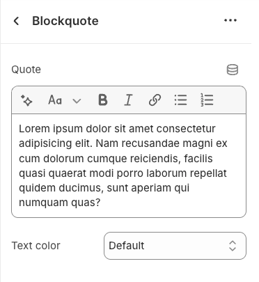
Quote: This is where you will input the text content of the quote you wish to display. This could be a testimonial, an inspirational saying, or any short, impactful piece of text.
Text color: Select the color for the quote text. This allows you to fully control the visual appearance of the quote, ensuring it has adequate contrast and blends well with the section's background.
7. Media block
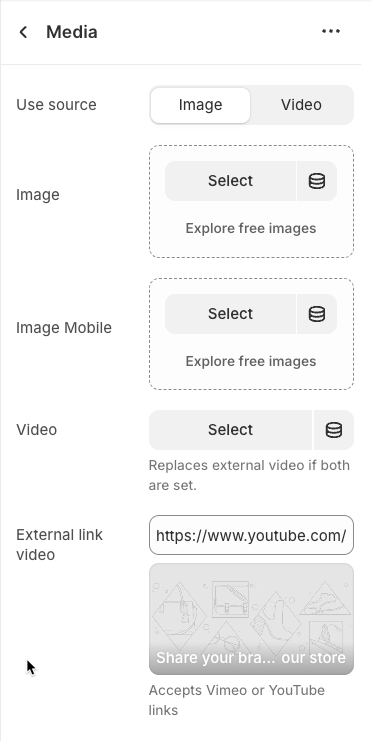
Use source: Select the type of media source you want to use.
Image: Display a static image.
Video: Display a video (either uploaded or from an external link).
Image: (Only applies when
Use sourceis Image) Upload or select the main image to be displayed on desktop and tablet devices.Image Mobile: Upload or select an alternative image optimized for mobile devices
Video: (Only applies when
Use sourceis Video) Upload or select an MP4 video file to be playedReplaces external video if both are set.
External link video: Enter the URL of the video from external platforms like YouTube or Vimeo. The video will be embedded and played from this source.
Accepts Vimeo or YouTube links
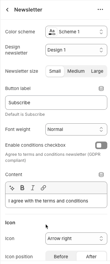
8. Newsletter block
Color scheme: Select the color scheme to be applied to this section. A color scheme typically defines primary background and text color pairs to ensure contrast and consistency with the overall theme.
Design newsletter: Select the design style for the newsletter signup block. This controls the visual appearance of the newsletter form.
Newsletter size: Select the overall size of the newsletter block. This impacts the padding, width (if constrained), and font-size of internal elements.
Button label: Enter the text that will be displayed on the submit button of the newsletter form.
Default is Subscribe
Font weight: Select the font weight for the text on the newsletter button.
Enable conditions checkbox: Enable this option to display a checkbox with a conditions text (e.g., "I agree to the terms and conditions"). This is often necessary for data privacy compliance (GDPR, CCPA).
Agree to terms and conditions newsletter (GDPR compliant)
Content: Enter additional text content to be displayed above or below the newsletter signup form
Icon
Icon: An icon is a small graphic element used for illustration or emphasis.
Icon position: Select the position of the icon relative to the text or element it accompanies
Icon size: Select the size of the icon
Icon spacing: Enter the spacing between the icon and its adjacent text or element (unit: pixels).
9. Liquid block
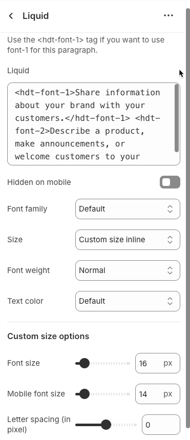
Use the <hdt-font-1> tag if you want to use font-1 for this paragraph.
Liquid: This is a special option that allows you to input custom Liquid code for dynamic content display.
Hidden on mobile: Enable this option to hide the element containing this text on mobile
Font family: Select the font family to be used for this text. This allows you to define the overall typographic style of the text
Size: Select the font size for the text. This controls the scale of the text and impacts readability.
Font weight: Select the font weight for the text. This helps control the visual emphasis of the text, either making it stand out or blend more subtly.
Text color: Select the color for the text. This allows you to fully control the visual appearance of the text
Custom size options
Font size: Select the font size for the text on desktop and tablet devices. This directly impacts the readability and visual prominence of the text.
Mobile font size: Select the specific font size for the text when displayed on mobile devices
Letter spacing (in pixel): Enter the spacing between characters (letters) in the text, measured in pixels
10. Counter block
A Block Counter is a dynamic user interface element designed to display important metrics or achievements as an animated counter that increments from 0 to a target value.
Counter always run if start number is less than end number
Counter always abs value
Start number: Set the starting number for the counter or numerical display. This is the initial value from which the number will visually progress.
End number: Enter the final number that the counter or numerical display will reach. This is the key metric you want to highlight.
Speed: Set the speed (duration) of the counter or other animation (in milliseconds). A smaller value will make the animation faster.
Unit: Enter the unit or symbol that will be displayed next to the number (e.g., "%", " USD", " products").
Font size: Set the font size for the number and its related text
Text color: Select the text color for the number, unit, and descriptive text.
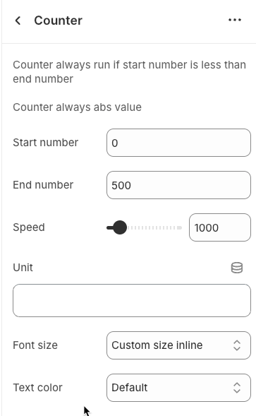
Custom size options
Font size: Set the font size for the text (in pixels). This value applies to desktop and tablet devices.
Mobile font size: Set the font size for the text on mobile devices (in pixels).
Letter spacing: Set the spacing between characters (letters) in the text (in pixels or
emunits). Positive values increase spacing, negative values decrease it.