


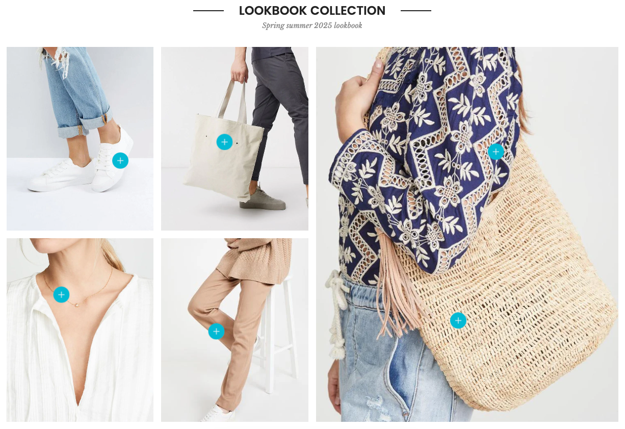
The Lookbook Masonry section is made up of multiple masonry items, each functioning as an individual image tile within the grid. Every masonry item can include a combination of blocks such as Media (image or video), Pin Product (clickable product tag), and Pin Text (custom text label). This structure allows for a flexible, shoppable visual experience that blends editorial styling with interactive elements.
1. How to access the Lookbook masonry section?
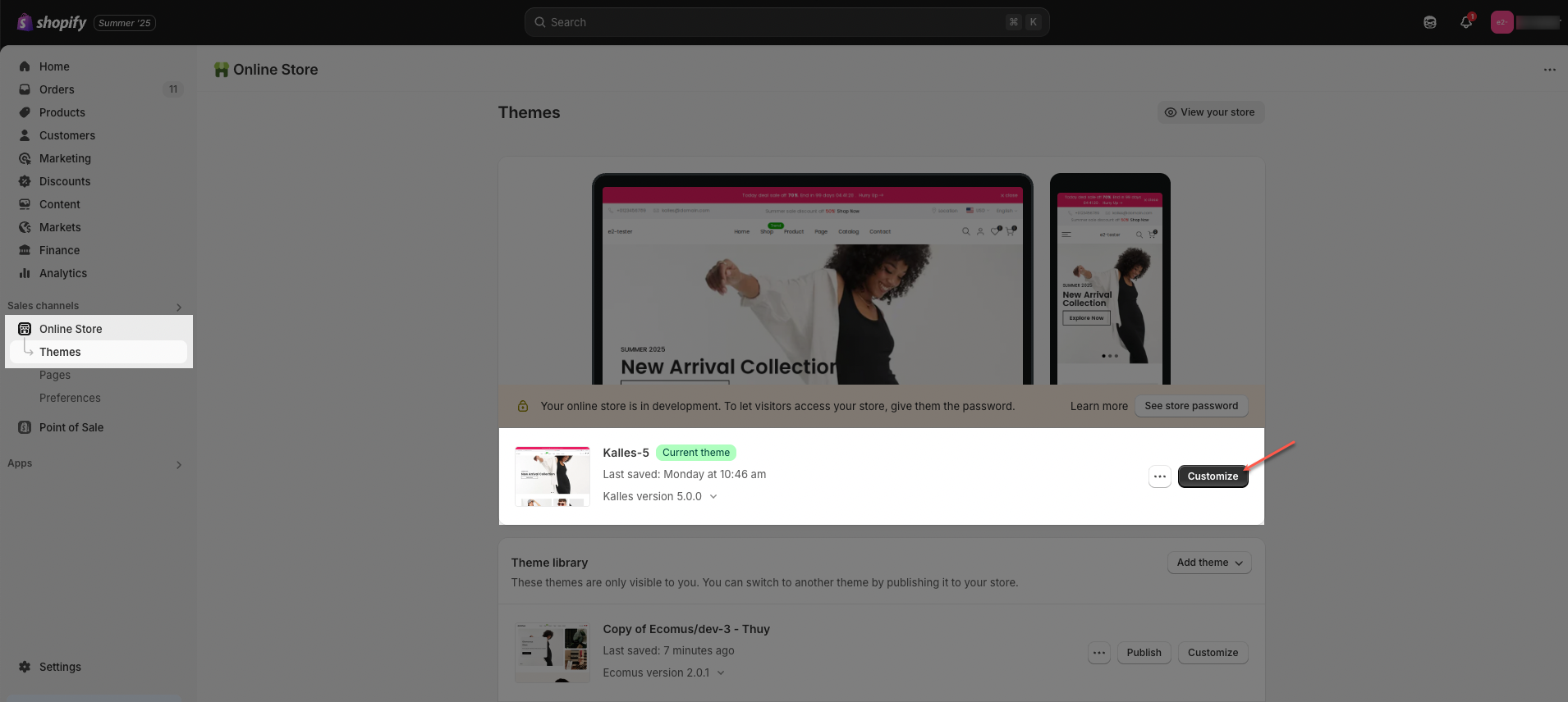
Step 01: From Shopify Admin, click on Online Store > Select Themes > In the Current theme section, click the Customize button.
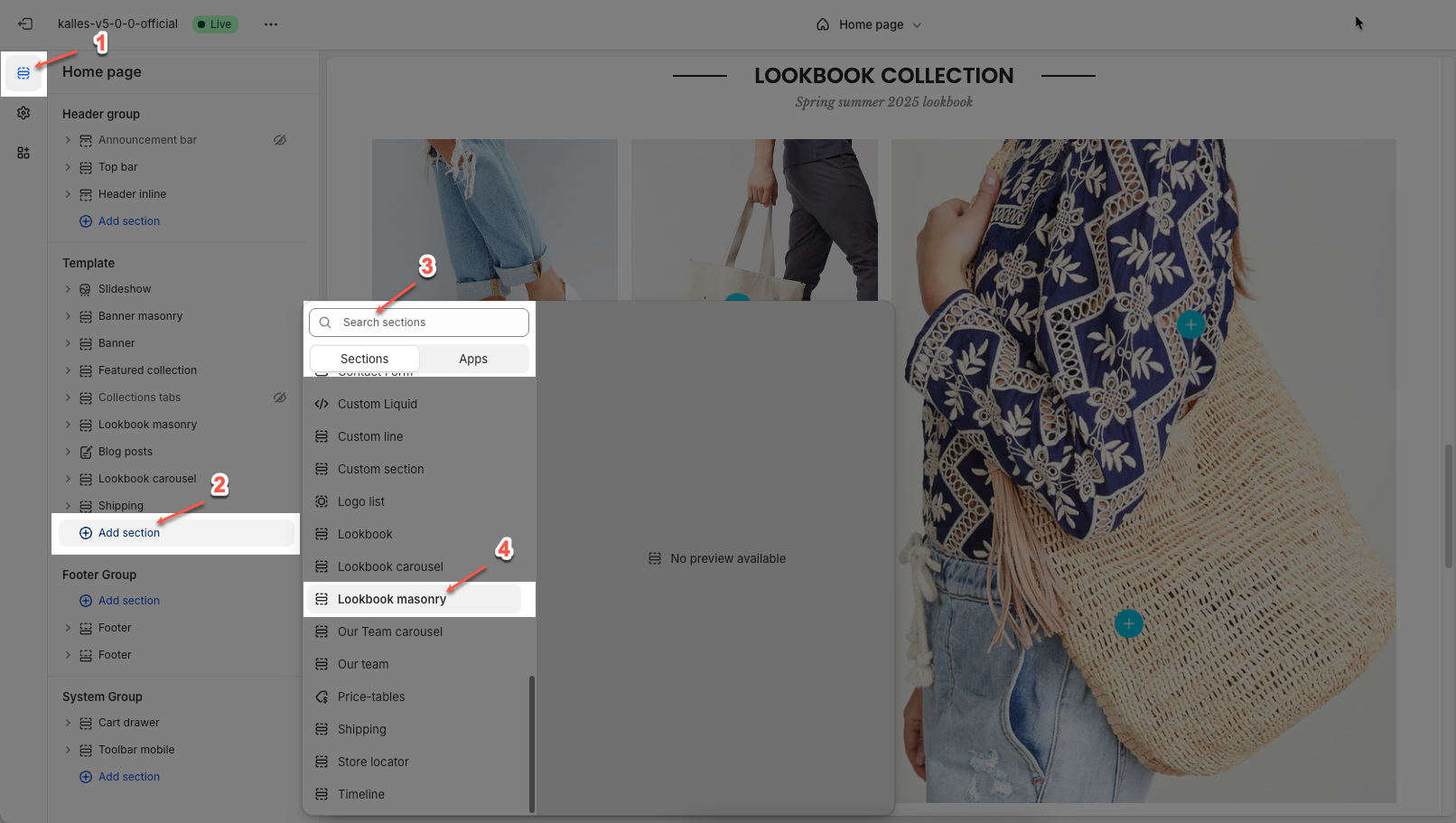
Step 02: In the theme editor (Customize), click the Sections button > Click the Add section button > In the Sections tab, scroll through the list or use the search bar to find and select Lookbook masonry.
2. How to customize access the Lookbook masonry section?
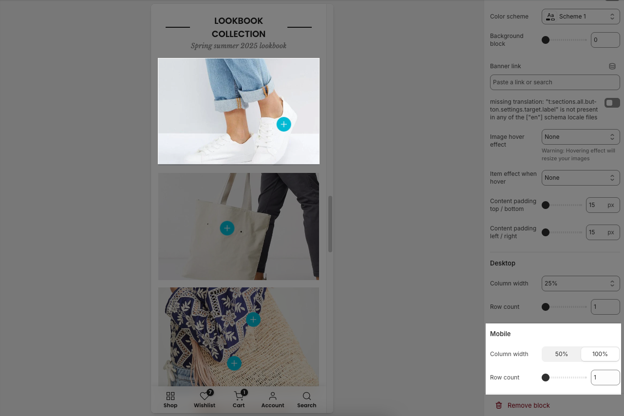
2.1. Item masonry
The Item masonry block represents a visual tile within the Lookbook Masonry section, allowing you to combine media, product pins, and text pins for a rich, interactive display.
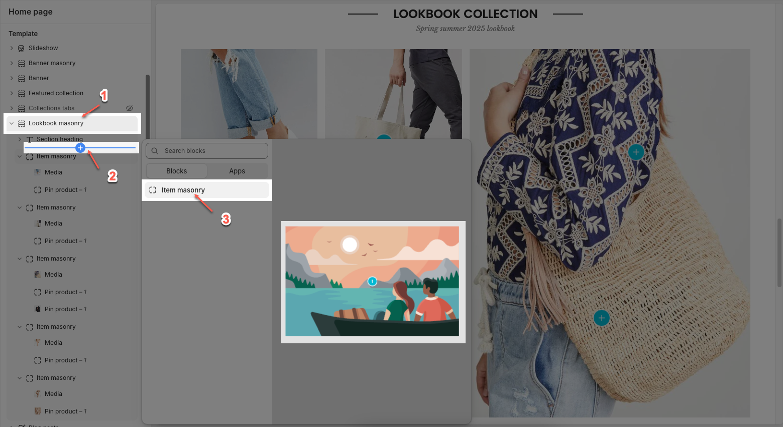
Click on Lookbook masonry section > Add block (plus icon ➕) > Item masonry block
You can customize a lookbook item with the options below:
Display colors by section: Toggle to apply the section's global color scheme to the block.
Color scheme: Select the color scheme for the lookbook.
Background block: Adjust the transparency or background overlay for the lookbook. Value ranges from 0 (fully transparent) to 100 (fully opaque).
Banner link: Enter the link for the banner when clicked.
Open this link in a new tab: Enable/disable opening the link in a new tab.
Image hover effect: Choose how the image behaves when hovered over.
Warning: Hovering effect will resize your images
Item effect when hover: Optional visual effects for the entire banner when hovered (e.g., border run, overlay,...).
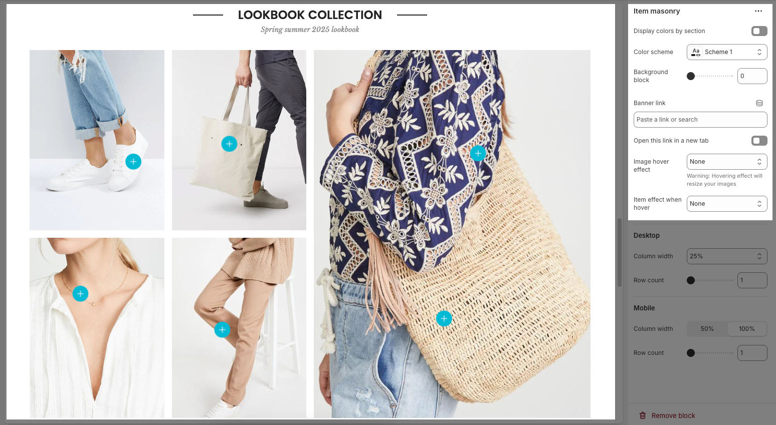
Desktop
Column width: Set the banner width as a percentage of the total width.
Row count: Define the number of banner rows in the Masonry layout.
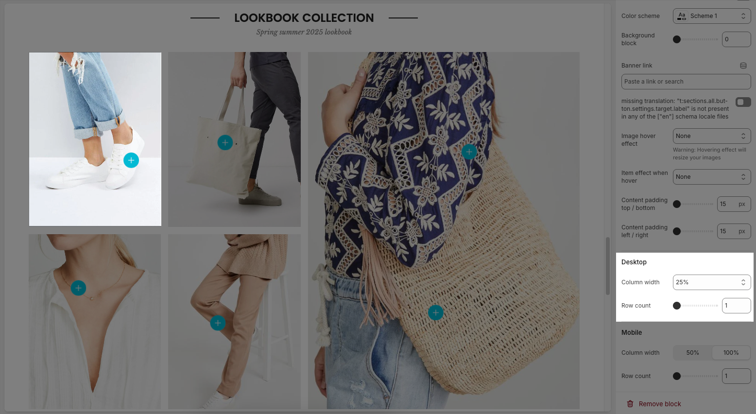
Mobile
Column width: Set the banner width on mobile (50% or 100%).
Row count: Define the number of banner rows displayed on mobile.
2.2. Other blocks
In the Item masonry, you can add various blocks such as Media, Pin product and Pin text to enhance the layout and design.
Click on Item masonry block > Add block (plus icon ➕) > Select the block you can add
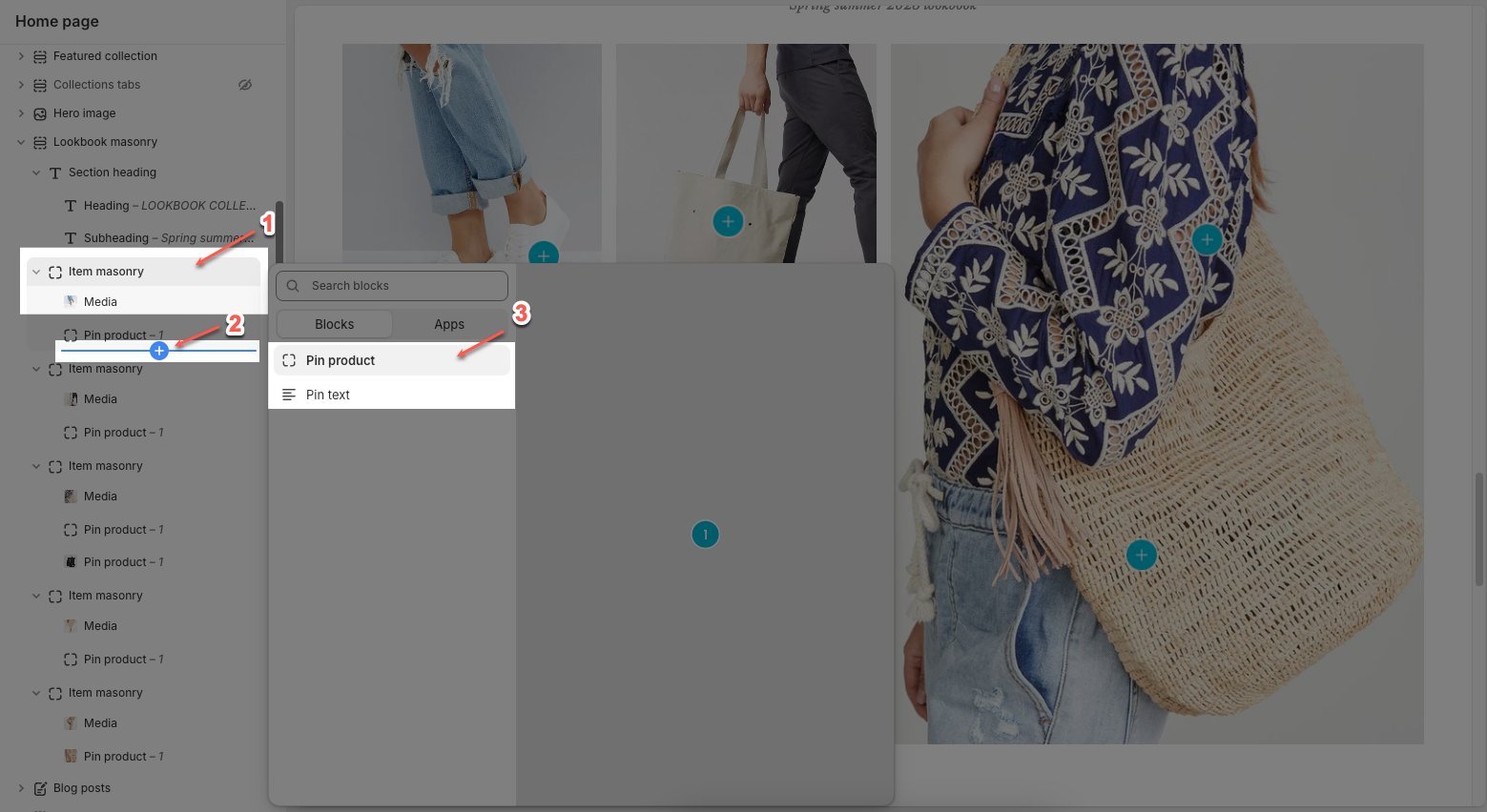
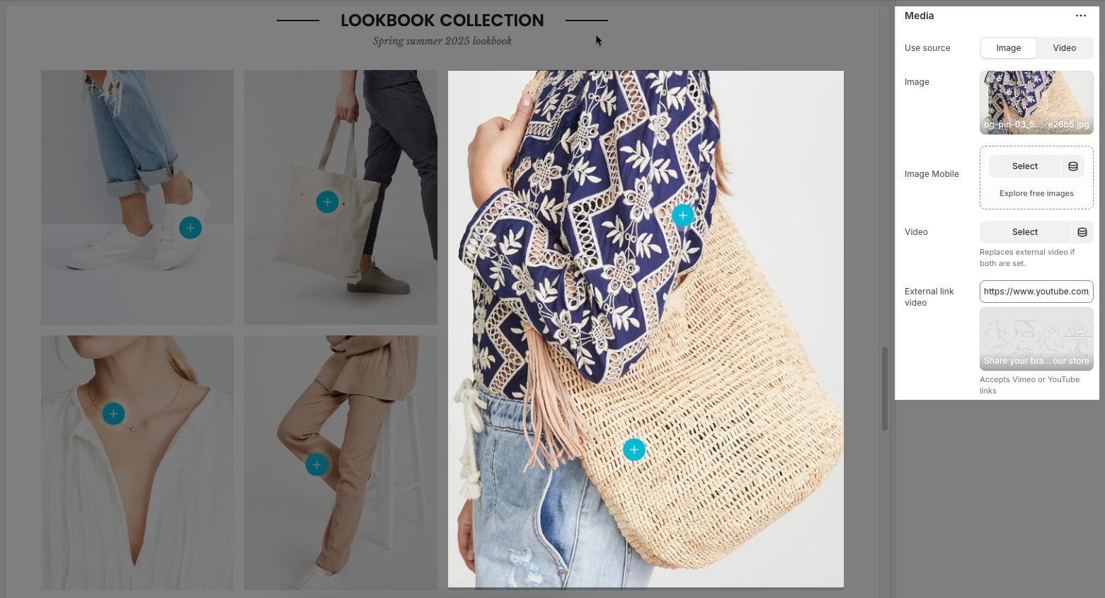
2.2.1. Media
Use source: Choose between using an image or a video as the media type for the banner.
Image: Upload or select an image to display on desktop.
Image Mobile: Upload or select a separate image specifically for mobile devices. Helps optimize layout for smaller screens.
Video: Upload or select a video file to display in place of an image. This overrides the external video link if both are set.
External link video: Add a video link from YouTube or Vimeo. Used only if no uploaded video is selected.
2.2.2. Pin product
The Pin Product feature allows you to add interactive hotspots to images, showcasing specific products with a pop-up display. Below are the customization options available for configuring a Pin product.
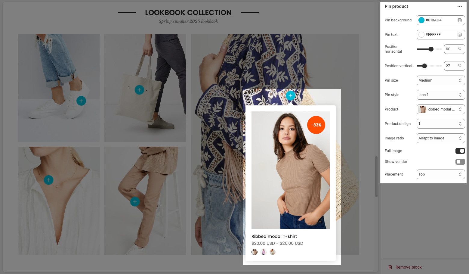
Pin background: Sets the background color of the pin
Pin text: Sets the color of the text on the pin
Position horizontal/vertical – Adjust the horizontal/vertical position of the pin on the image.
Pin size – Choose the size of the pin (small, medium, large).
Pin style – Select how the pin is displayed (icon only or with text).
Text – Enter the text displayed on the pin.
Product – Assign a product linked to the pin.
Product design – Choose how the product appears in the pop-up.
Image ratio – Select the image aspect ratio (square, landscape, portrait).
Full image – Enable/disable full product image display.
Show vendor – Enable/disable displaying the brand or vendor.
Placement – Choose where the pop-up appears (top, bottom, left, right of the pin).
2.2.3. Pin text
Below are the customization options available for configuring a Pin text:
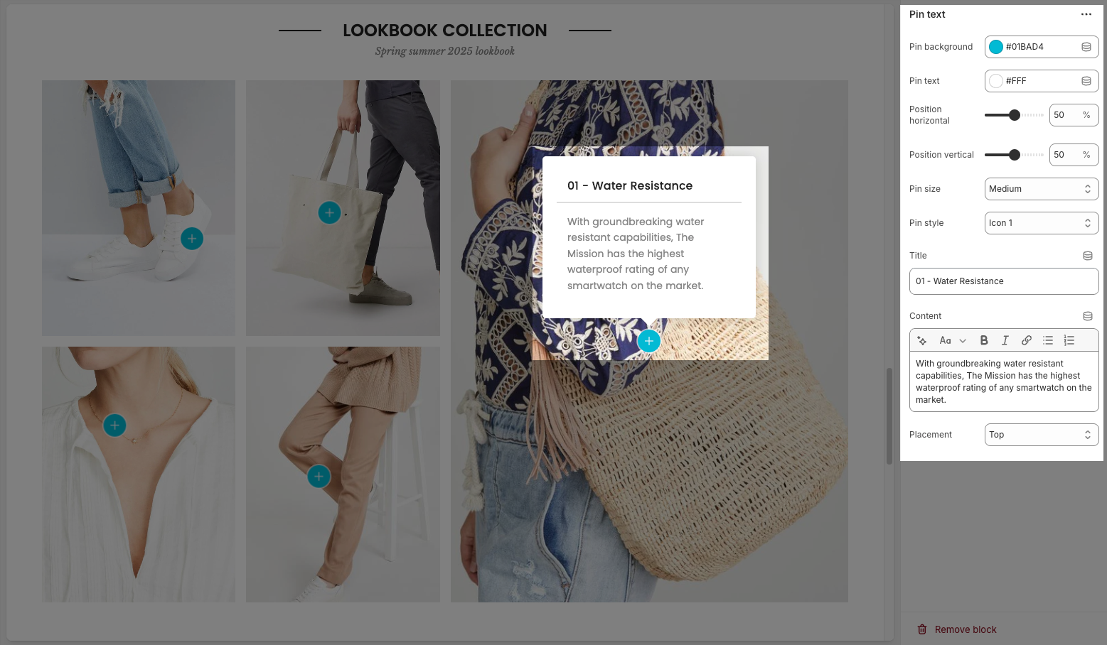
Pin background: Sets the background color of the pin
Pin text: Sets the color of the text on the pin
Position horizontal/vertical – Adjust the pin’s exact location on the image.
Pin size – Select the size of the pin (small, medium, large).
Pin style – Choose the icon style for the pin.
Title – Enter a heading for the text box.
Content – Provide a detailed description or information related to the pin.
Placement – Set the position of the text box relative to the pin (top, bottom, left, right).
2.3. Lookbook masonry
The Lookbook masonry allows you to showcase images in a stylish grid layout, perfect for highlighting collections, featured products, or lifestyle photography. Below are the customization options available:
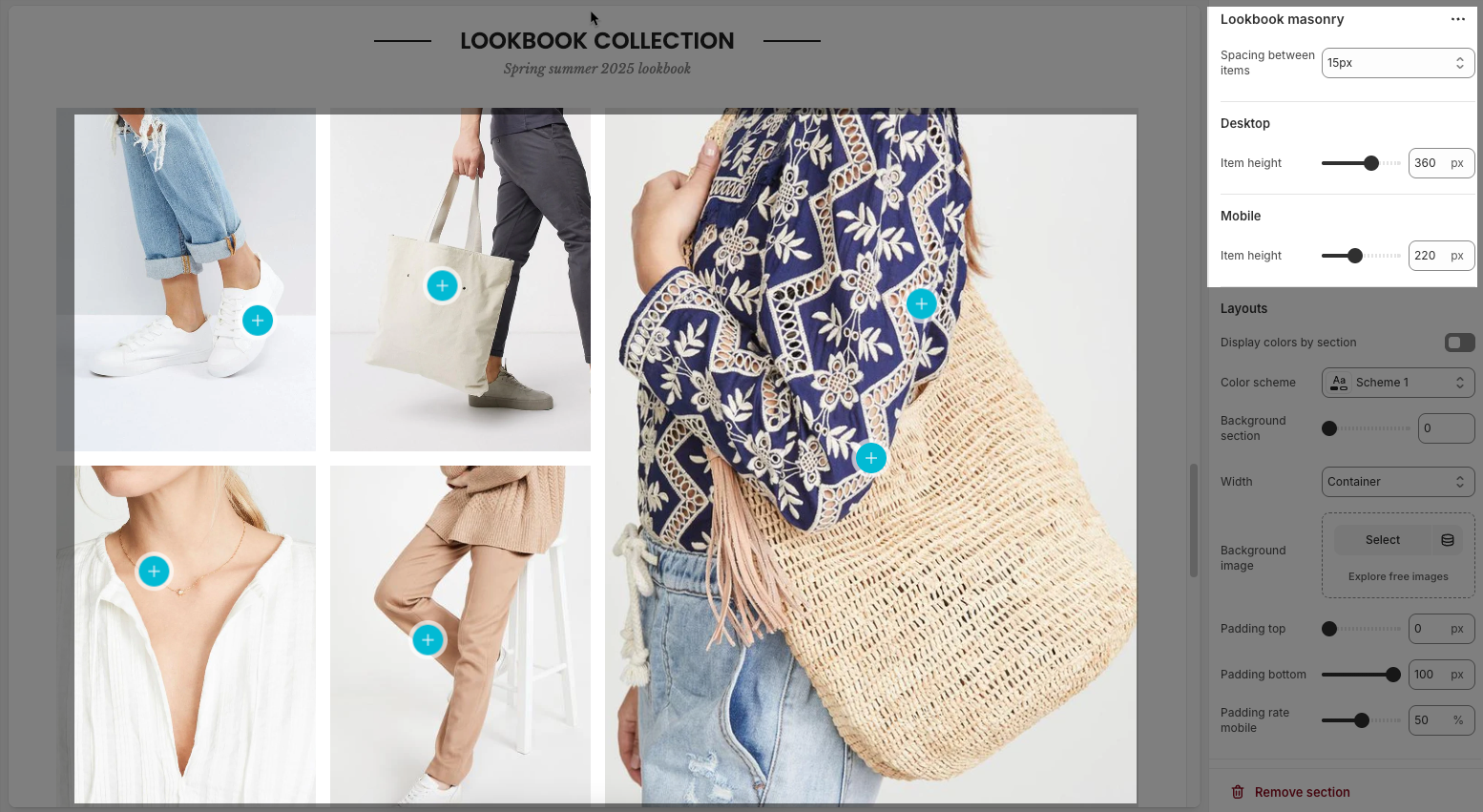
Spacing between items: Sets the gap between individual blocks in the masonry grid.
Desktop
Item height (Desktop): Controls the vertical height of each item when viewed on desktop.
Mobile
Item height (Mobile): Controls the vertical height of each item on mobile devices.
Layouts
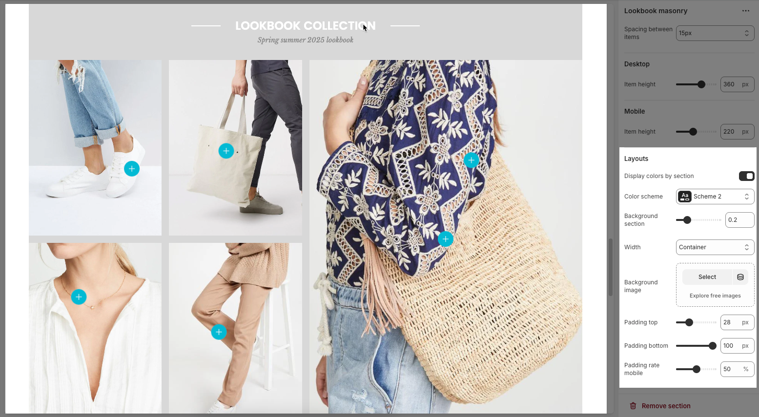
Display colors by section: Enables section-specific color styling based on the selected scheme.
Color scheme: Choose a predefined color palette for the section.
Background section overlay: Adjusts the transparency level (0–100%) of a dark or colored overlay above the background.
Width: Sets the section’s width (e.g., Container, Wrap container, Full width).
Background image: Allows you to select an image for the section background.
Padding top / bottom: Controls the vertical spacing (in px) above and below the content in the section.
Padding rate mobile: Sets the padding as a percentage for mobile layout to ensure responsiveness.


