


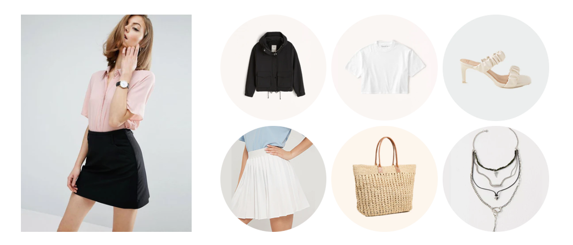
The "Image Gallery Manual" section is a powerful tool for you to flexibly and visually display images on your website. Instead of automatically displaying images from products or collections, this section allows you to manually select each image, add descriptive text and links, creating unique and attractive image stories.
1. How to access the Image Gallery manual section?
Step 01: From Shopify Admin, click on Online Store > Select Themes > In the Current theme section, click the Customize button.

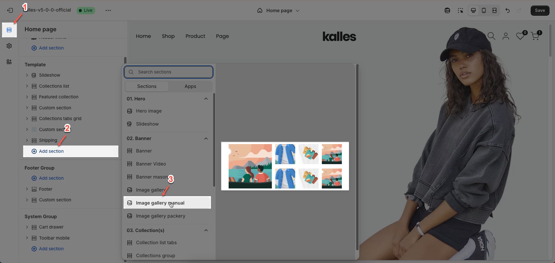
Step 02: In the theme editor (Customize), click the Sections button > Click the Add section button > In the Sections tab, scroll through the list or use the search bar to find and select the Image Gallery manual section.
2. How to customize the Image Gallery manual section?
2.1. Image item block
To add an Image item block to the Image Gallery section, click the Add block button (plus icon ➕) under the Image Gallery manual section.
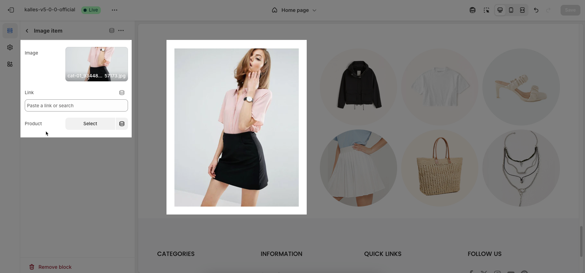
After adding the Image item block, you can adjust its settings using the sidebar—located on the right or left side of your screen depending on your device
Image: Upload the image file to be displayed.
Link: Enter a URL or select a page (e.g., a blog post, an About Us page), a collection, or a product that you want this image to link to
Product: Select a specific Shopify product to associate with this image. This is useful if you're using a lifestyle image but still want customers to easily access the related product page
2.2. Other block
2.2.1. Section heading block
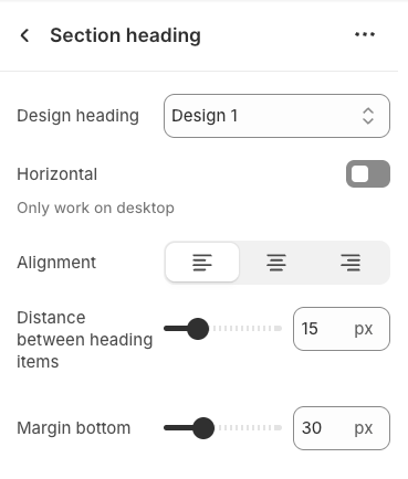
The Section Heading block allows you to add a title and description to different sections of your page, you can customize this block with options below:
Design heading: Choose a design for the header to ensure aesthetics
Horizontal: Select how horizontal lines will be displayed with the heading
Only work on desktop
Text Alignment: Align the Section heading block to the left, center, or right
Spacing between items: Adjust the space between the heading and the text (measured in pixels).
Margin bottom: Define the space between the Section Heading and the next section to maintain a balanced layout.
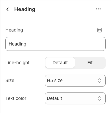
2.2.2. Heading block
To add a Heading block to the Section heading, click the Add block button (plus icon ➕) under the Section heading.
Once the Heading block is added, you can customize its settings in the left or right-hand sidebar (depending on your screen size)
Heading: Enter the heading text to display. This is the main content you want users to read.
Line-height: Select the line height for the heading.
Default: Uses the default line height of the font or theme.
Fit: Automatically adjusts the line height to optimally fit the font size and content, often resulting in tighter text.
Size: Select the font size for the heading. This directly impacts the prominence and readability of the heading.
Text color: Choose the color for the heading text. Ensure this color has good contrast with the background for readability.
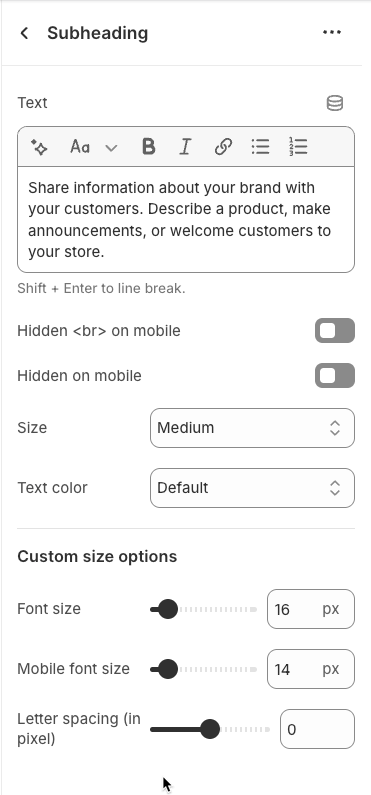
2.2.3. Sub heading block
To add Sub heading block to the Section heading, click the Add block button (plus icon ➕) under the Section heading.
Once the Sub heading block is added, you can customize its settings in the left or right-hand sidebar (depending on your screen size)
Text (Shift + Enter to line break): Allows users to add textual content, providing information, descriptions, or explanations.
Hidden <br> on mobile: Remove unnecessary line breaks on mobile devices
Hidden on mobile: Choose whether to hide the heading completely on mobile devices for a streamlined display.
Choose "Custom size inline" to freely adjust the size in the Custom Size Options section.
Custom size options
Font size (Desktop/Mobile): Set different font sizes for each device type to ensure a responsive and visually appealing layout.
Letter spacing (in pixel): Adjust the space between letters to enhance readability and design precision.
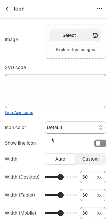
2.2.4. Icon block
To add Icon block to the Section heading, click the Add block button (plus icon ➕) under the Section heading.
Once the Icon block is added, you can customize its settings in the left or right-hand sidebar (depending on your screen size)
Image: Upload an image file to display. This is ideal for logos, illustrations, or any other graphic you wish to use.
SVG code: Paste SVG (Scalable Vector Graphics) code directly into this field. SVG is an ideal vector graphic format for icons or simple graphics, scalable without loss of quality, and can be color-customized with CSS.
Icon color: Choose the color for the icon. This option applies to icons rendered from SVG code or those sourced from an icon library.
Show line icon: Enable this option to display a line icon (outline icon) instead of a filled icon, if your theme supports both styles.
Width: Select the width setting mode.
Auto: The width will automatically adjust based on the content and available space of its parent element. This is the default and often the most flexible setting.
Custom: Allows you to specify a custom width. When this option is selected, detailed width input fields for each device will appear.
Width (Desktop): (Only visible when
Widthis set toCustom) Enter the width of the element on desktop screensWidth (Tablet): Enter the width of the element on tablet screens
Width (Mobile): Enter the width of the element on mobile devices
Spacing
Top padding: Enter the value for the top padding of the element (unit: pixels). This padding creates space between the top edge of the content and the top edge of the element.
Bottom padding: Enter the value for the bottom padding of the element (unit: pixels). This padding creates space between the bottom edge of the content and the bottom edge of the element.
Rate padding (mobile): Enter the padding rate value for the element on mobile devices
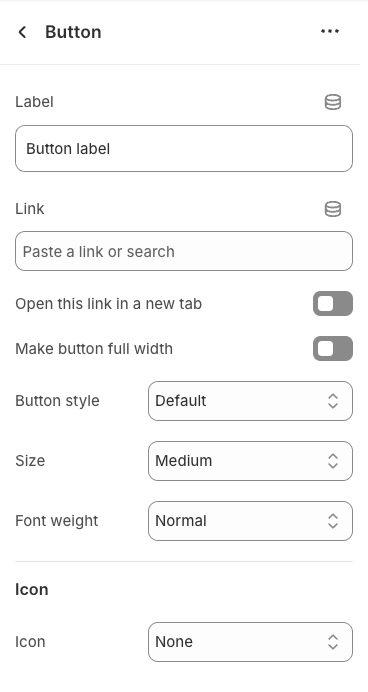
2.2.5. Button block
To add Button block to the Section heading, click the Add block button (plus icon ➕) under the Section heading.
Once the Button block is added, you can customize its settings in the left or right-hand sidebar (depending on your screen size)
Label: Enter the text that will be displayed on the button. This is the main content users will read to understand the button's function
Link: Enter the URL that the button will link to when clicked. This can be an internal page within your store, a collection, a specific product, or an external link.
Open this link in a new tab: Enable this option to open the link in a new browser tab or window when the button is clicked.
Make button full width: Enable this option to make the button expand to the full available width of its containing element. This can make the button more prominent, especially on mobile devices.
Button style: Select the visual style of the button (Defaul, Outline, Link,...)
Size: Select the size of the button (e.g.,
Small,Medium,Large,...). This affects the button's height and internal padding.Font weight: Select the weight or boldness of the font on the button (e.g.,
Normal,Bold). This impacts the prominence of the button text.
Icon
Icon: An icon is a small graphic element used for illustration or emphasis.
Icon position: Select the position of the icon relative to the text or element it accompanies
Icon size: Select the size of the icon
Icon spacing: Enter the spacing between the icon and its adjacent text or element (unit: pixels).
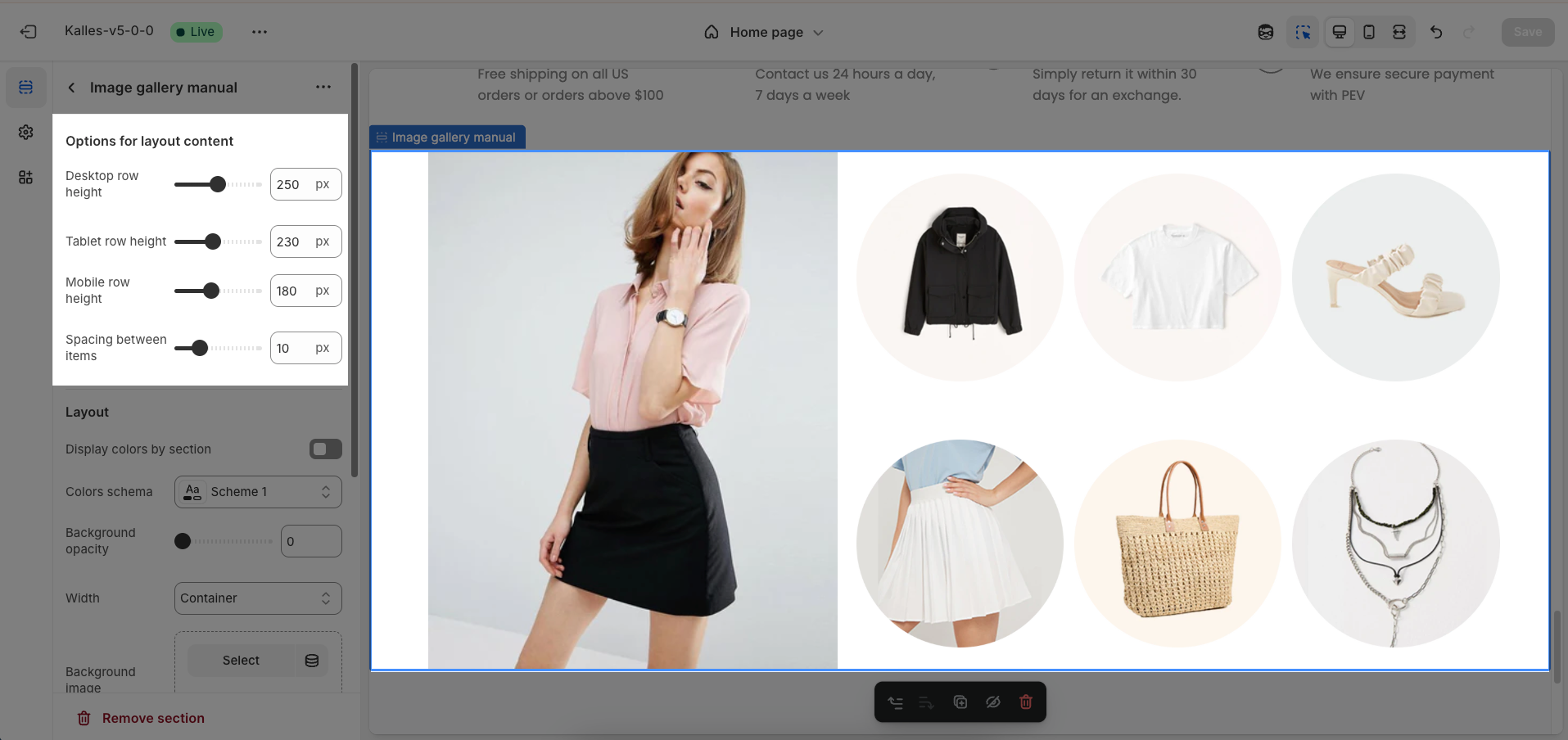
2.3. Image Gallery manual section
After adding the Image Gallery manual section, you can customize its settings in the left or right sidebar (depending on your screen size)
Options for layout content
Desktop row height: Set the height of each row when viewed on desktop devices
Tablet row height: Set the height of each row when viewed on tablet devices
Mobile row height: Set the height of each row when viewed on mobile devices
Spacing between items: Adjust the gap (also known as "gutter") between individual items (e.g., product cards, images) within the grid layout.
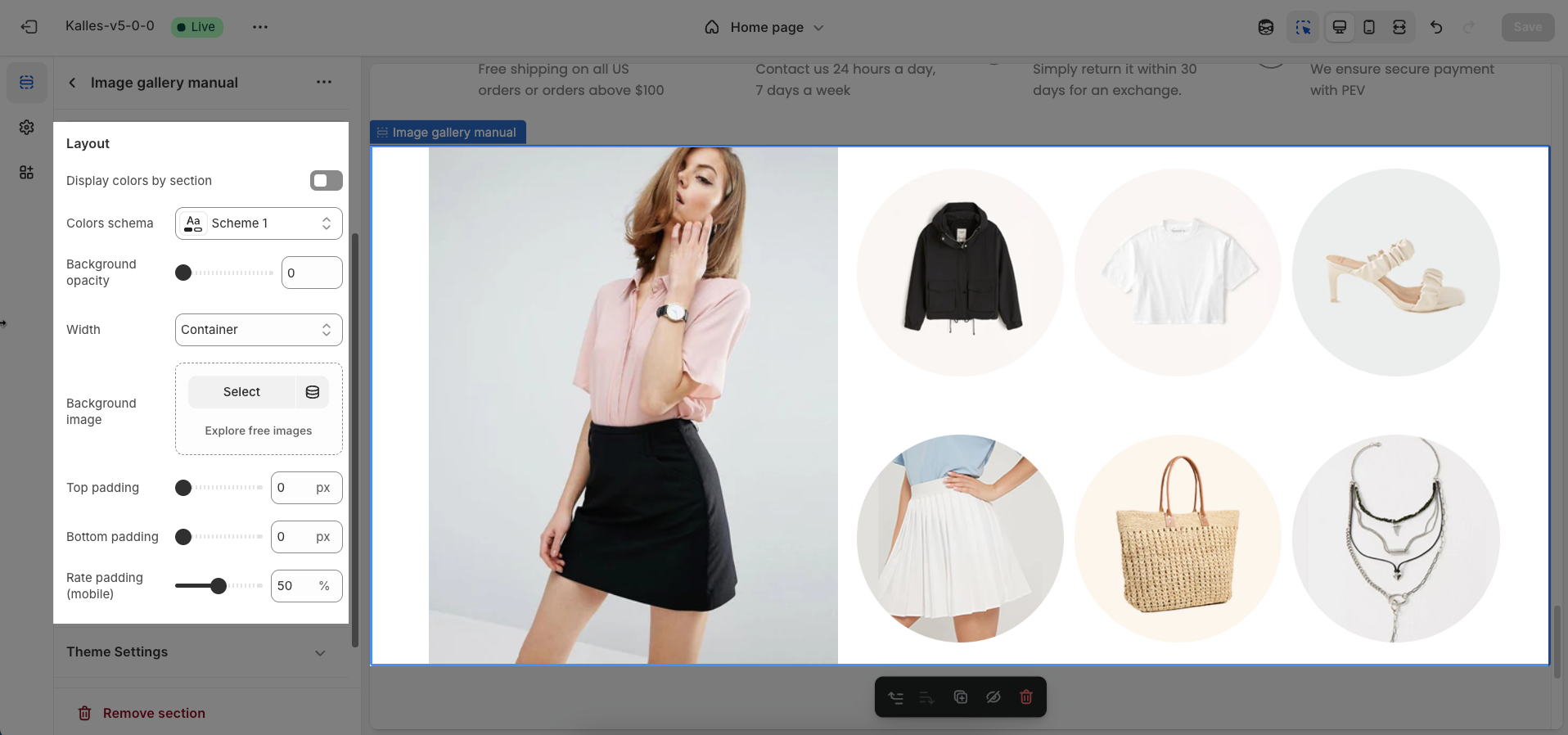
Layout
Display colors by section: Turn on this option to apply different color schemes to individual sections on your page.
Colors schema: Select the color scheme to be used for this specific section. These schemes are predefined in your theme
Background opacity: Set the opacity for the background color or color overlay on the section's background image. Values range from 0 (completely transparent) to 1 (fully opaque)
Width: Select the content width for this section.
Container: The content will be constrained within a fixed-width container, usually centered with a defined maximum width (e.g., 1200px), leaving space on the sides on larger screens.
Wrap container: The content will have a maximum width similar to "Container" but might have slightly less padding or more flexible wrapping.
Full width: The content will span the entire width of the browser window, with no horizontal padding at the edges.
Background image: Upload the image to be used as the background for this section.
Top padding: Enter the value for the top padding of the element (unit: pixels). This padding creates space between the top edge of the content and the top edge of the element.
Bottom padding: Enter the value for the bottom padding of the element (unit: pixels). This padding creates space between the bottom edge of the content and the bottom edge of the element.
Rate padding (mobile): Enter the padding rate value for the element on mobile devices
Theme Settings
Page width: Defines the maximum width of the page content, influencing layout and display on various devices.
Custom CSS
Allows users to customize by adding CSS rules beyond the limitations of default settings. This allows for fine-tuning the design to every detail, to suit specific needs.
Add custom styles to this section only.
To add custom styles to your entire online store, go to theme settings for detailed instructions.


