


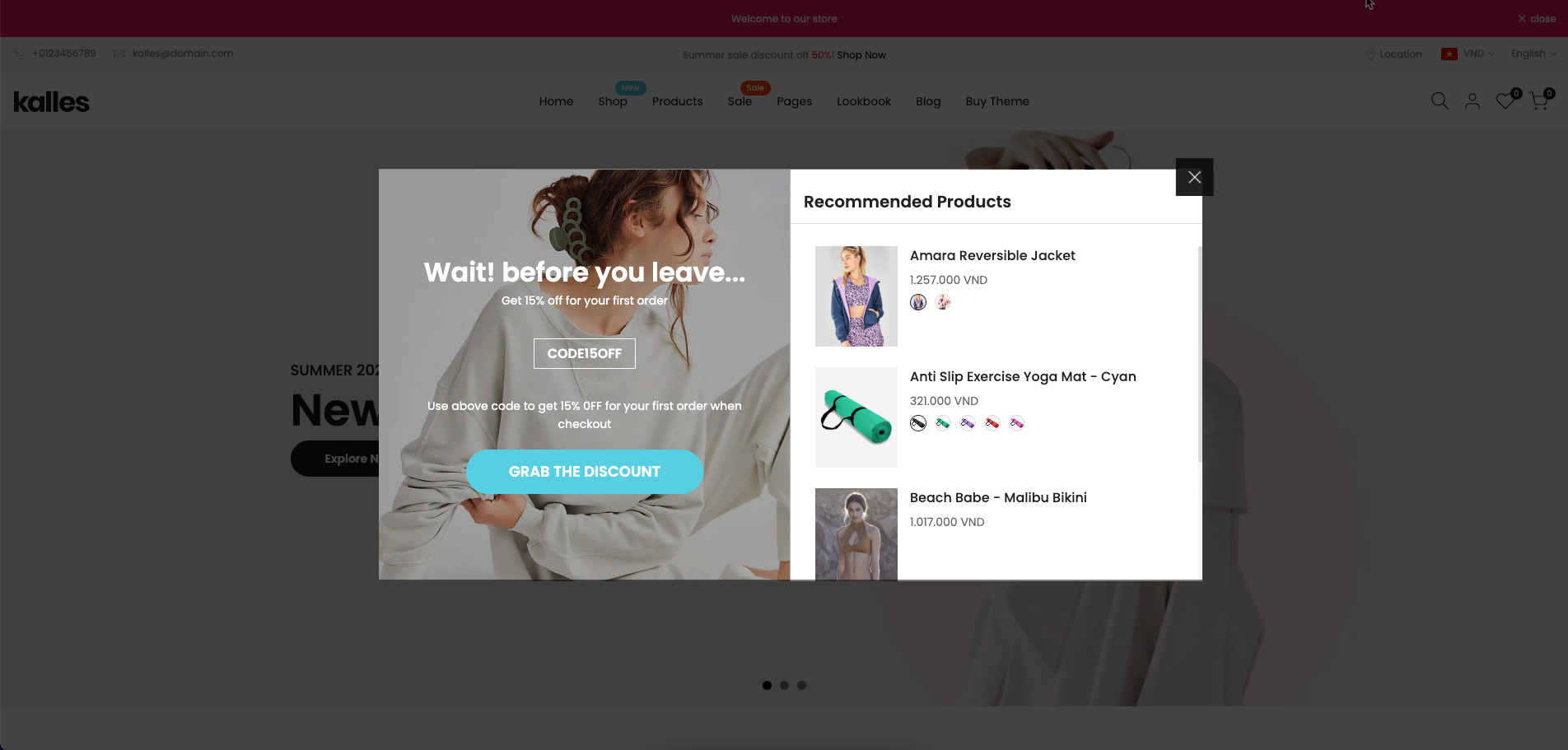
The Exit Popup is a powerful tool designed to retain potential customers who are about to leave your store. By displaying a last-minute offer, discount code, or product recommendations, it helps reduce bounce rates and boost conversions.
In this guide, we’ll walk you through how to configure and optimize the Exit Popup for maximum impact.
1. How to access the Exit popup section?
Step 01: From Shopify Admin, click on Online Store > Select Themes > In the Current theme section, click the Customize button.

Step 02: In the theme editor (Customize), click the Sections button > Click the Add section button > In the Sections tab, scroll through the list to System Group or use the search bar to find and select Exit popup.
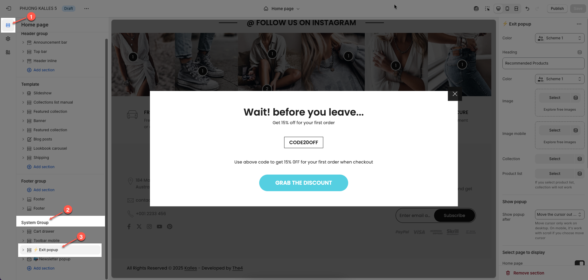
2. How to customize the Exit popup section?
2.1. Exit popup section
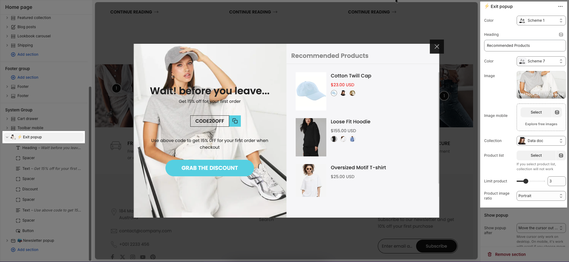
Color: Select the color scheme for the popup to match your store's theme.
Heading: Enter the title or message displayed at the top of the popup (e.g., “Recommended Products”).
Image: Upload or select an image that will appear on desktop view of the popup.
Image mobile: Upload or select a mobile-optimized image for better display on smaller screens.
Collection: Choose a product collection to automatically pull items for display in the popup.
Product list: Manually select specific products to show; overrides the collection if used.
Limit product: Set the maximum number of products displayed in the popup.
Product image ratio: Choose how product images should be displayed (e.g., adapt to image, square, etc.).
Show popup
Show popup after: option allows you to choose a specific action or a set amount of time for the popup to appear.
Move the cursor out of screen: The popup will appear when the user moves their mouse cursor outside the top boundary of the screen (usually indicating intent to leave). This option only works on desktop devices.
After amount time: The popup will be displayed after a specified number of seconds, regardless of user activity. This works on both desktop and mobile.
Scroll to end of page: The popup will appear when the user scrolls to the bottom of the page. This is commonly used on mobile, where cursor-based triggers don't apply.
Popup delay: This setting lets you define how many seconds to wait before showing the popup after the selected trigger condition is met.
Day next show (n): If the customer closes the popup, this setting controls how many days must pass before the popup is shown to them again.
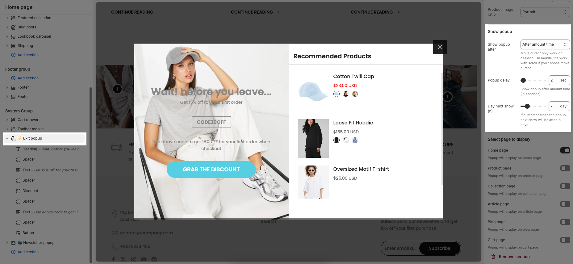
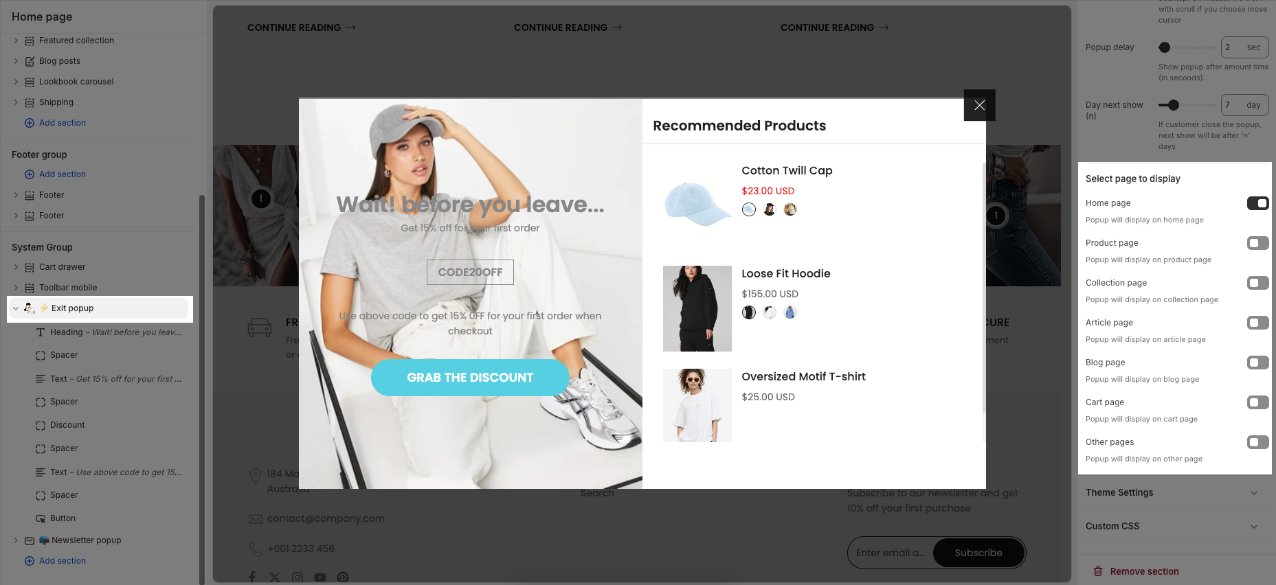
Select page to display
Home page: Popup will display on the website’s home page.
Product page: Popup will display on individual product pages.
Collection page: Popup will display on collection or category pages.
Article page: Popup will display on article or content pages.
Blog page: Popup will display on blog listing or main blog page.
Cart page: Popup will display on the shopping cart page.
Other pages: Popup will display on any other pages not listed above (e.g., About Us, Contact, etc.).
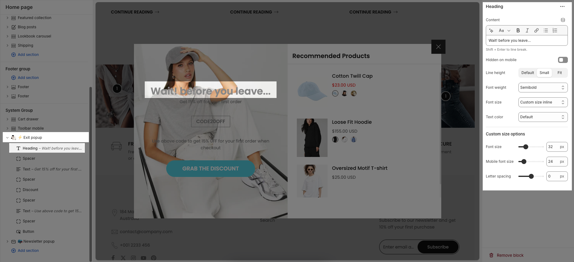
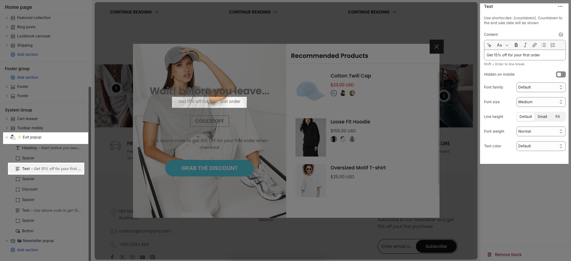
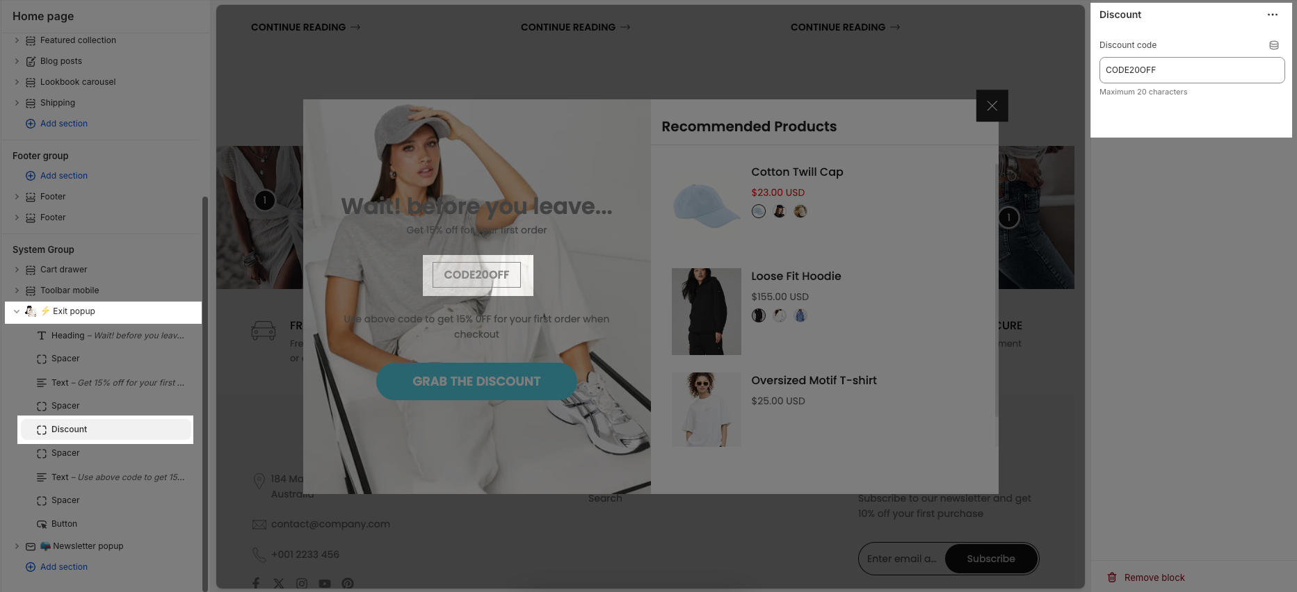
2.2. Exit popup blocks content
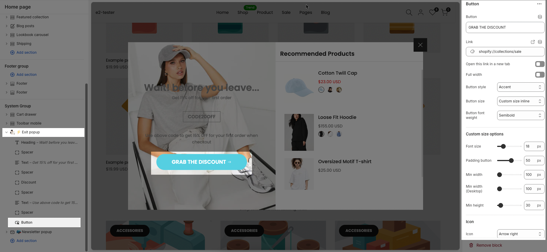
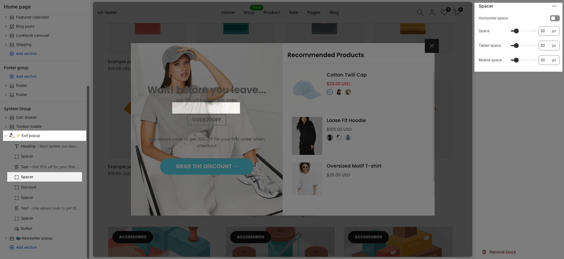
There are 5 blocks: Heading, Text, Discount, Spacer and Button.
Heading: This feature allows you enter the heading, change heading font and adjust size.
Text: This feature allows you enter the text, change text font and adjust size.
Discount: It allows you give the code and customers can copy cope and paste when checkout.
Button: You can add label, link, select open in the new tab, change font size, style, font-weight and button icon.
Spacer: It allows you to add and customize the spacing between blocks.
This guide will help you customize the detailed options of each content block in the exit popup.


