


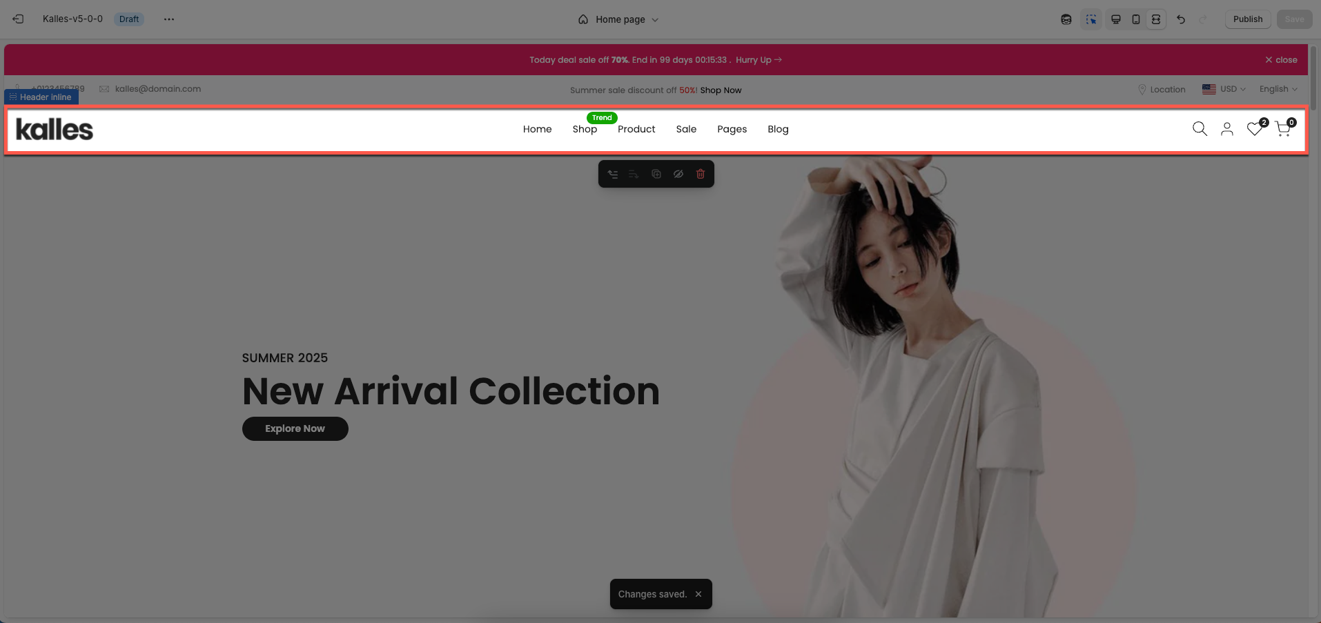
The Inline Header is a flexible element designed to display a title and optionally a short description inline with its own content, rather than as a separate, full-width section. This approach is particularly useful for content areas where you want to maintain layout continuity, while providing clear titles for each smaller block.
1. How to access the Header inline section?
Step 01: From Shopify Admin, click on Online Store > Select Themes > In the Current theme section, click the Customize button.

Step 02: In the theme editor (Customize), click the Sections button > In the Sections tab, scroll through the list or use the search bar to find and select the Header inline section.
2. How to customize the Header inline section?
Follow this guide to easily create and manage a menu.
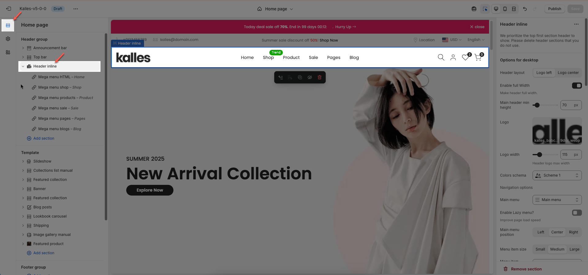
2.1. Config Header inline section
We prioritize the top first section header to show. Please delete header sections that you do not use.
2.1.1. Options for desktop
Header layout: Choose the layout for your header. Common options include a center-aligned logo with a centered menu, a left-aligned logo with a right-aligned menu, or a left-aligned logo with a center-aligned menu.
Enable full Width: Check to enable full width for the header. When enabled, the header will stretch across the entire browser viewport
Main header min height: Set the minimum height of the header on desktop. This affects the vertical space the header occupies on the page.
Logo: Upload your logo image file. This is the primary visual identifier for your brand, typically appearing at the top of the page.
Logo width: Set the width of the logo (in pixels) for desktop viewing. This width will automatically adjust for mobile devices to ensure optimal display.
Colors schema: Select the color schema for the header. This schema will determine the header's background color and text color, ensuring color consistency across your website.
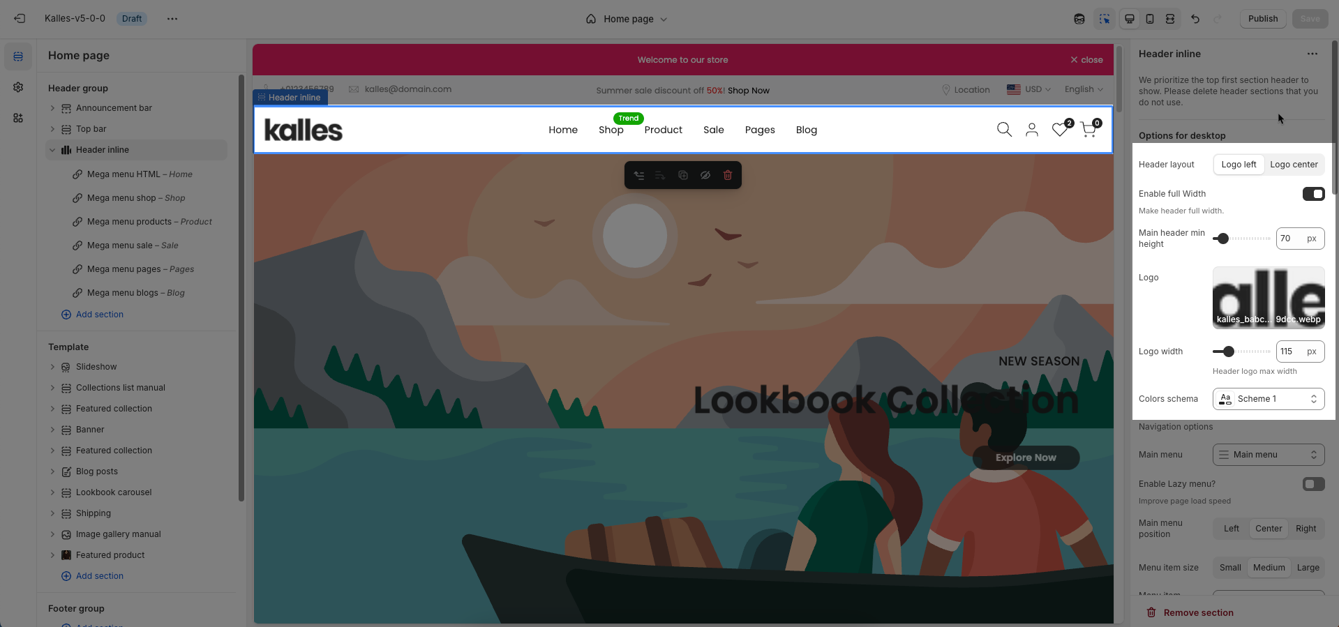
Navigation options
Main menu: Select the main navigation menu to be displayed on your website.
Enable Lazy menu?: Enable this option to lazy load the menu. This improves initial page load speed by only loading parts of the menu when they are needed
Improve page load speed
Main menu position: Select the position of the main menu within the header. Common options include center-aligned, left-aligned, or right-aligned.
Menu item size: Set the font size for the main menu items.
Menu item weight: Set the font weight for the main menu items.
Enable uppercase text: Enable this option to transform all menu item text to uppercase.
Show dropdown arrow: Display a dropdown arrow icon next to main menu items that have submenus. This arrow will always be shown on submenu items.
Item main menu has submenu will show dropdown arrow. Always show in submenu item
Open dropdown items on event: Select the event to open dropdown menu items (on hover or click).
Click mode is forced on touch devices.
Spacing menu items: Set the horizontal spacing between main menu items.
Spacing between menu items
Menu type: Select the type of menu to be used. Options include default menu (traditional dropdowns), sidebar menu (opens an off-canvas panel on click), or split menu (divides the menu into two sections).
Menu split only work with header layout 'logo center'
Color for submenu default: Select the default color for the background and text of submenus.
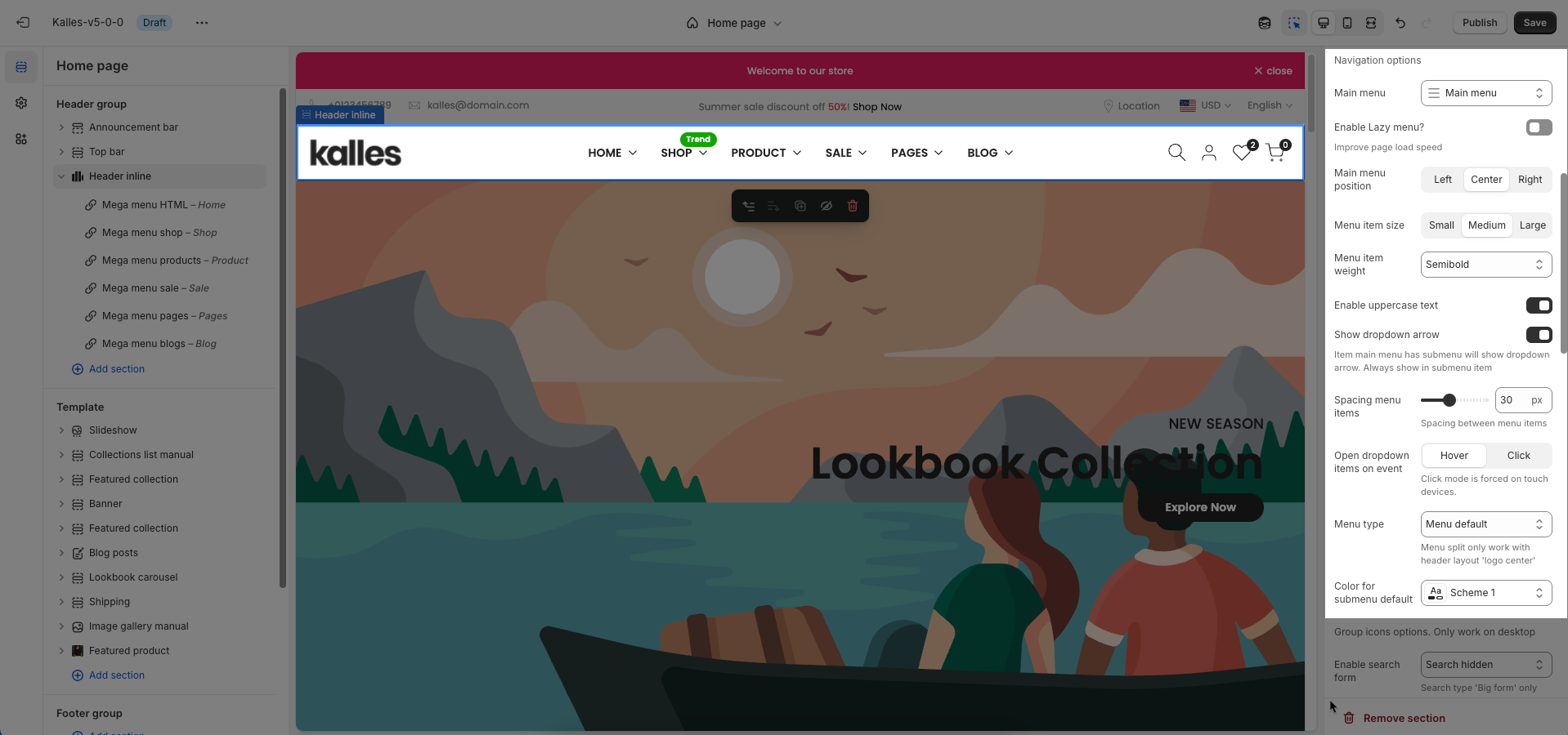
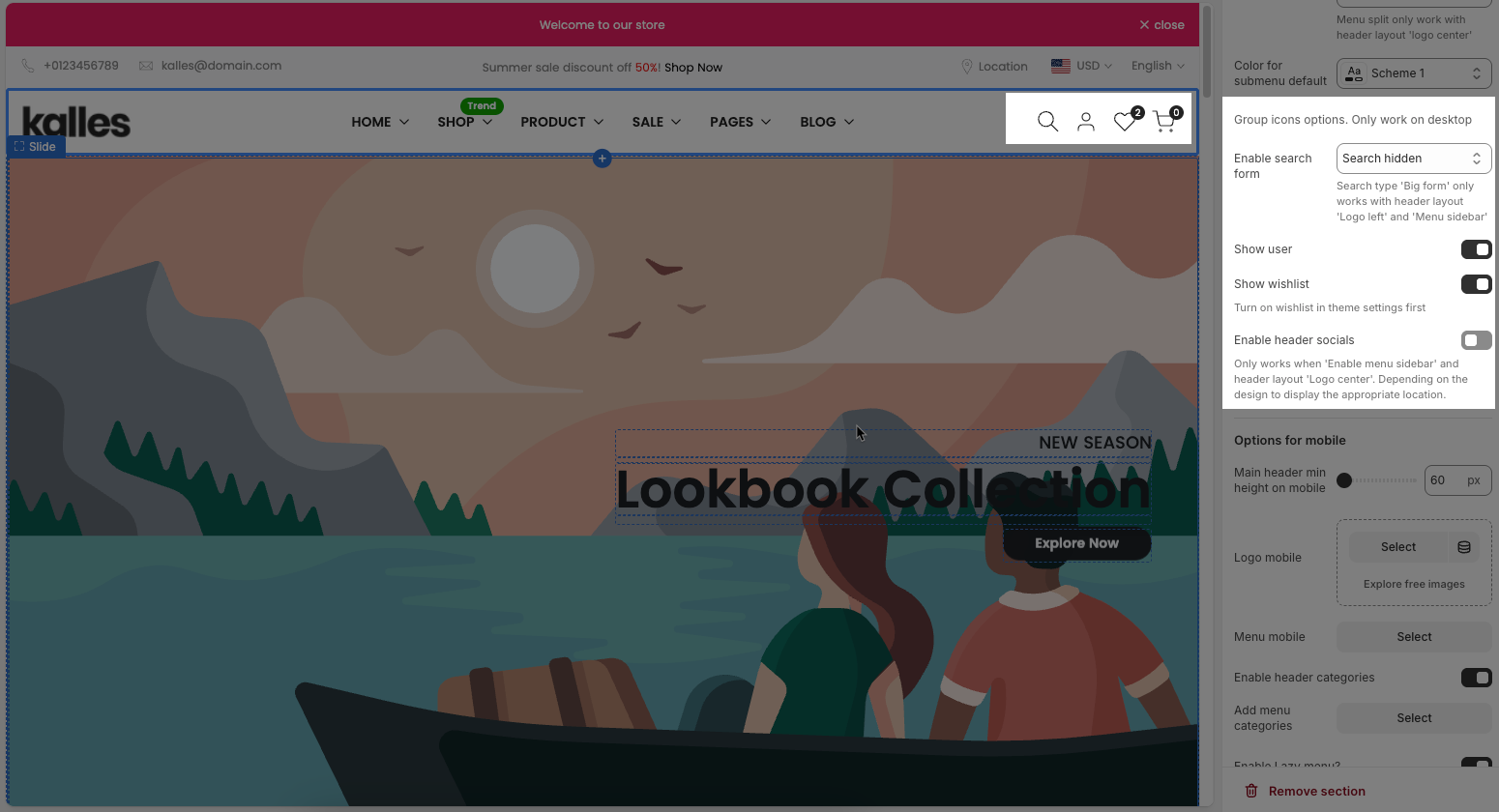
Group icons options. Only work on desktop
Enable search form: Choose the display style for the search form. Options include: Search hidden (icon only), short form (a compact input field), or big form (a prominent or full-screen search input).
Search type 'Big form' only works with header layout 'Logo left' and 'Menu sidebar'
Show user: Check to display the customer account icon or link in the header. This link will direct to the login page or the customer's account page if they are already logged in.
Show wishlist: Check to display the wishlist icon in the header. This feature allows customers to save products for later viewing or purchase.
Turn on wishlist in theme settings first
Enable header socials: Enable this option to display social media icons (e.g., Facebook, Instagram) in the website header.
Only works when 'Enable menu sidebar' and header layout 'Logo center'. Depending on the design to display the appropriate location.
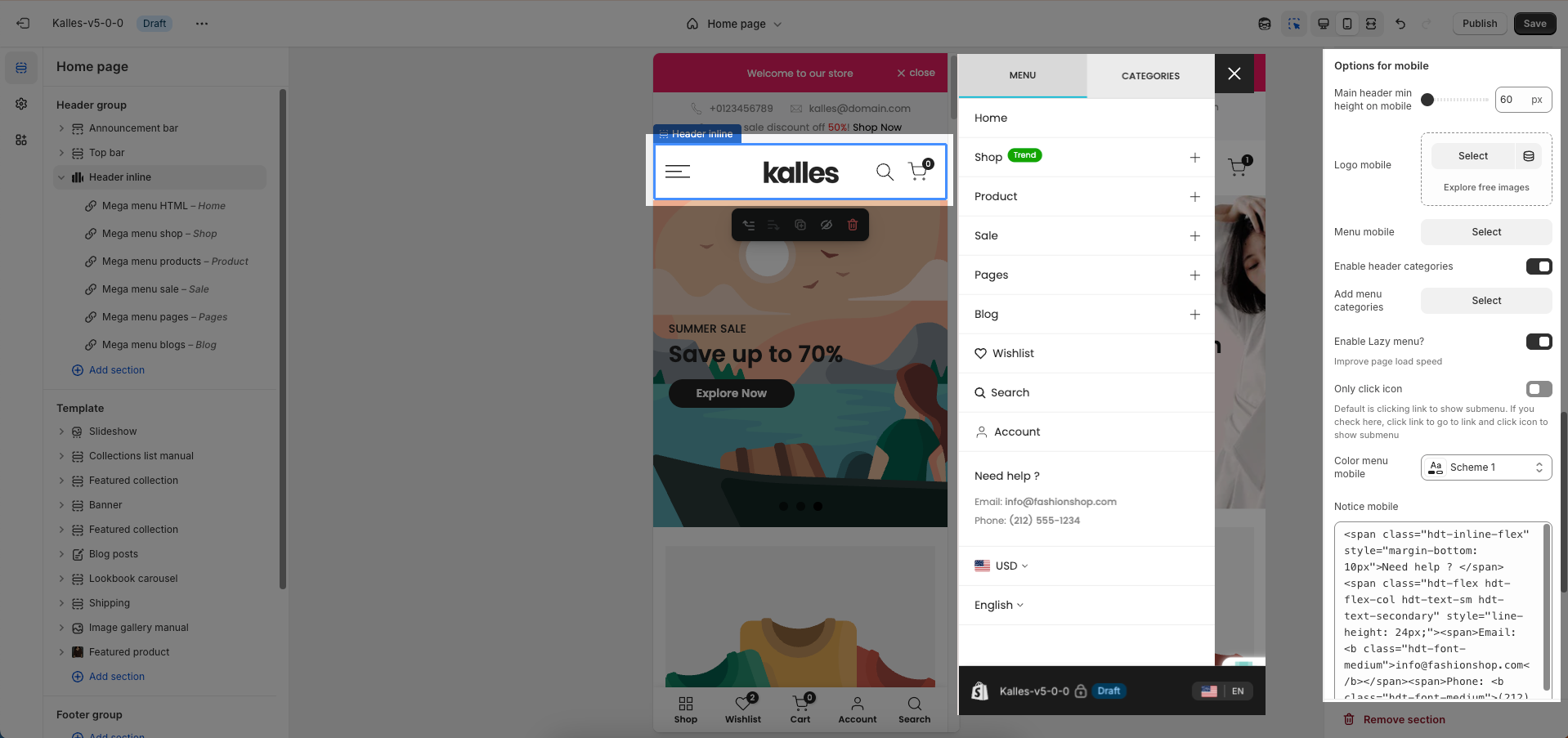
2.1.2. Options for mobile
Main header min height on mobile: Set the minimum height of the header on mobile devices. This ensures the header remains clearly visible and easy to interact with on smaller screens.
Logo mobile: Upload a separate logo image file specifically for mobile devices (optional). Use a logo optimized for smaller screens or a brand icon if desired.
Menu mobile: Select the navigation menu to be displayed when users access the website from a mobile device.
Enable header categories: Enable this option to display product categories directly in the header
Add menu categories: Select the list of collections or categories to be displayed when 'Enable header categories' is active.
Enable Lazy menu?: Enable this option to lazy load the menu on mobile devices. This improves initial page load speed by only loading parts of the menu when they are needed
Only click icon: When enabled, only clicking the arrow icon will expand a submenu; clicking the menu item text will navigate directly to the linked page.
Color menu mobile: Select the color schema for the mobile menu when it is open. This schema will determine its background color and text color, ensuring color consistency and readability.
Notice mobile: Enter a short notification text to be displayed at the top of the mobile menu
2.1.3. Transparent header
Enable header transparent: To show a transparent header, add a compatible section (such as slideshow, hero image, banner) as the first section.
Logo header transparent: Upload the logo image file that will display when the header is in transparent mode.
Colors schema: Select the color schema to be applied to this section. A color schema defines color variables such as background color, text color, button colors, and more,
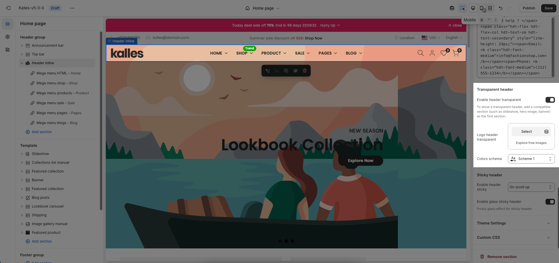
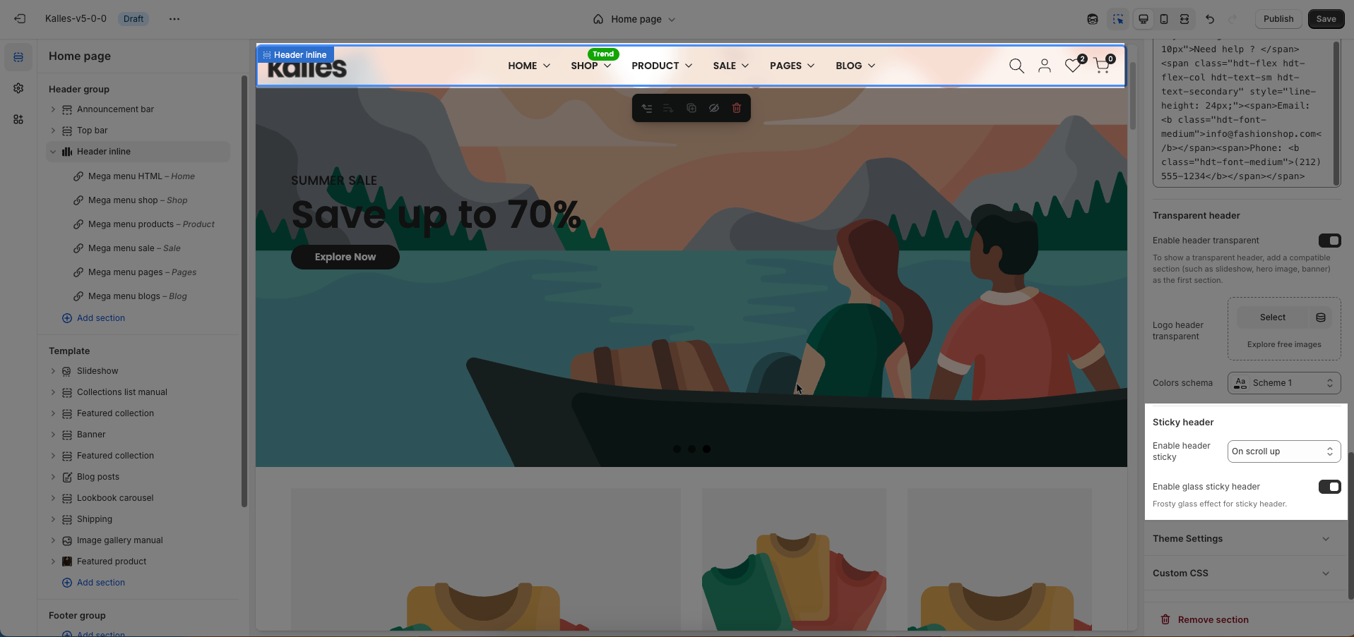
2.1.4. Sticky header
Enable header sticky: Select the behavior of the sticky header when scrolling.
On scroll up: The header reappears only when the user scrolls upwards.
Always: The header remains fixed at the top of the page after scrolling down a certain distance.
None: The header does not stick (it scrolls out of view).
Enable glass sticky header: Enable this option to apply a "glassmorphism" effect to your sticky header.
Frosty glass effect for sticky header.
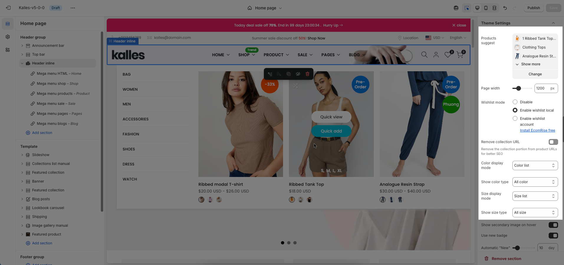
2.1.5. Theme Settings
Products suggest: Suggests products that are similar in category, style, features,
Page width: Defines the maximum width of the page content, influencing layout and display on various devices.
Wishlist mode: Enables or disables the wishlist feature, providing users with a function to save favorite products.
You can Disable, Enable wishlist local, Enable wishlist account Install EcomRise free, Enable Growave wishlist
Remove collection URL: Eliminates the collection URL from the product page path, optimizing SEO and creating shorter URLs.
Remove the collection portion from product URLs for better SEO
Color display mode: Selects the product color display method, such as color list or count
Show color type: Displays All colors or Only color available. This option allows customers to see the complete color range of a product or focus solely on colors currently in stock.
Size display mode: Choose how the product size options are displayed.
Show size type: Choose which product sizes to display (All sizes, Only available sizes).
Enable size limit: Enables or disables the limit on the number of product sizes displayed
Show secondary image on hover: Displays a secondary product image when hovering over it, giving customers a multi-dimensional view of the product.
Use new badge: Enables or disables the display of a "new" badge on new products, attracting customer attention.
Automatic "New" badge period: Enter the number of days a product will automatically display a "New" badge from its creation date. After this period, the badge will automatically disappear.
Use on sale badge: Enables or disables the display of an "on sale" badge on discounted products, stimulating purchases
Label on sale style (text, percentage):
Use pre-order badge: Enables or disables the display of a "pre-order" badge on upcoming products, informing customers of pre-order availability
Use sold out badge: Enables or disables the display of a "sold out" badge on out-of-stock products, notifying customers of product availability.
Compare mode: Enables or disables the product comparison mode, allowing customers to compare products side-by-side for informed purchasing decisions.
You can Disable, Enable compare local, Enable compare account
Max products compare: 6
Show quick view: Enables or disables the "quick view" button, allowing customers to view product details without leaving the current page.
Show ultra button: Enables or disables the "ultra" button (custom button), allowing the addition of special action buttons to products.
Ultra buttons: Quick add, Choose options, Add to cart, View product
Show quantity selector: Requires showed ultra button and only show with button add to cart. Quantity selector button shows with Product Design 1,3,5,6,7,9,10
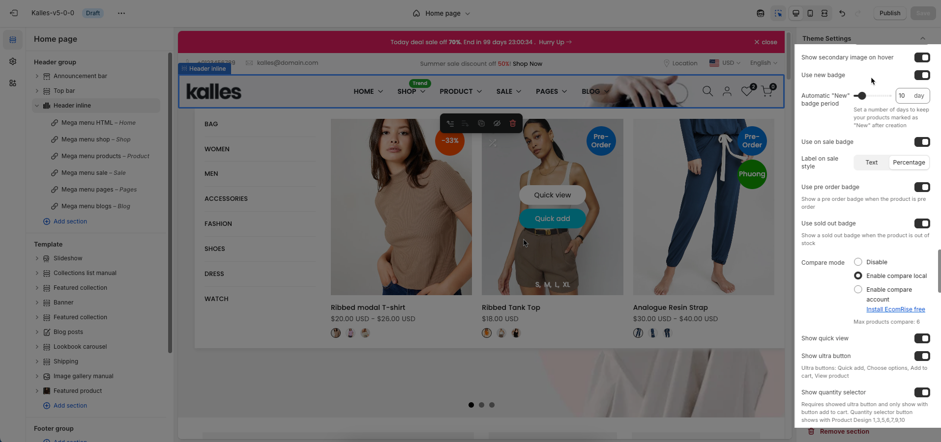
Show quick add: Requires showed ultra button
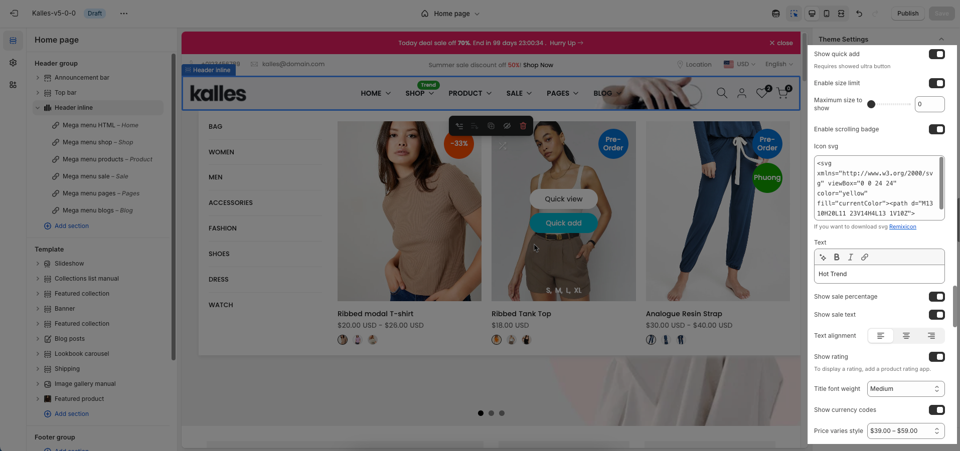
Enable size limit: Enables or disables the limit on the number of product sizes displayed
Maximum size to show: Limits the number of product sizes displayed, with "0" for responsive auto-adjustment based on screen resolution. (Requires size limit to be enabled.)
Enable scrolling badge: Follow this Guide
Icon SVG: Use Remixicon to make it more attractive and eye-catching
Text: Use text to promote a promotion or emphasize the benefits of your product.
You can also enable sales badges in Percentage or Text format.
Sale percentage will be given priority.
Text alignment: Adjusts the text alignment of products (left, right, center), customizing the display layout.
Show rating: Enables or disables the display of product ratings, providing customer feedback information.
To display a rating, add a product rating app.
Title font weight: Selects the font weight of the product title, creating emphasis and attracting attention.
Show currency codes: Enables or disables the display of currency codes next to product prices, providing clear currency information.
Price varies style: Choose a display style for variable product prices (e.g. "From [price]"), which helps customers understand the price range.
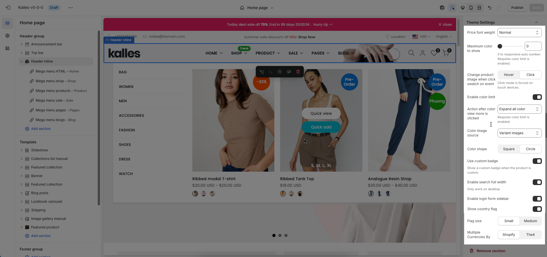
Price font weight: Select the font weight for the product price. This allows you to control the visual emphasis of pricing information, either making it stand out or blend more seamlessly with other text elements.
Maximum color to show: Limits the number of product colors displayed
0 to responsive auto number. Requires color limit is enabled.
Change product image when click swatch on event: Allows the product image to change when a user clicks on a color swatch, creating a more interactive and visual experience.
Click mode is forced on touch devices.
Enable color limit: Enables or disables the limit on the number of product colors displayed, allowing control over the color count shown on the product page.
Action after color view more is clicked: Select the action after clicking a color "View More" option. Common choices include redirecting to the product page or displaying all color options in a popup.
Requires color limit is enabled.
Color image source: Choose the image source for color variants (e.g., pulling from product variant images or uploading custom images).
Color shape: Selects the display shape for product colors (e.g., square, circle), customizing the color display interface.
Use custom badge: Show a custom badge when the product is custom
Enable search full width: Enable this option to display the search form full width. This creates a more prominent and immersive search experience
Only work on desktop
Enable login form sidebar: Enable this option to display the login form as a sidebar
Show country flag: Check to display the country flag next to the country name in the currency/region selector.
Flag size: Set the size of the country flag.
Multiple Currencies By: Select the multi-currency management tool being used.
Shopify: Utilizes Shopify Payments' built-in multi-currency feature.
The4: Uses The4's custom solution (likely an app or integrated theme feature).
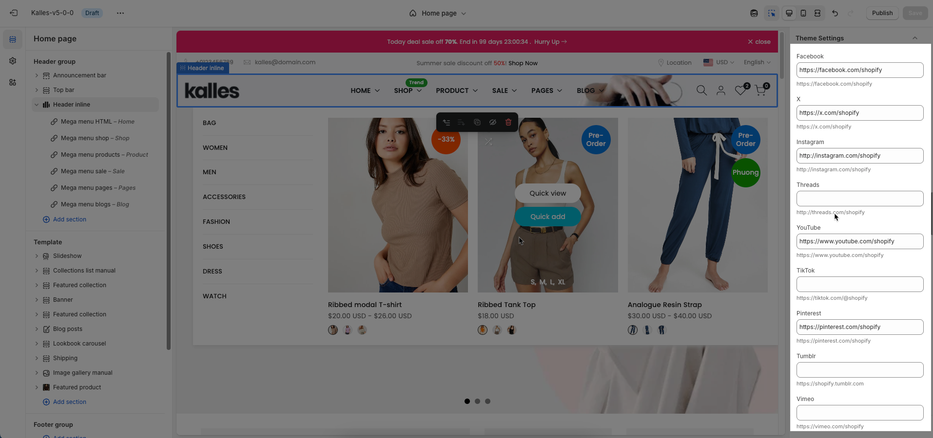
Social links: Enter the link to display the social you want
2.1.6. Custom CSS
Allows users to customize by adding CSS rules, beyond the limitations of default settings. This allows for fine-tuning the design to every detail, to suit specific needs.
Add custom styles to this section only.
To add custom styles to your entire online store, go to theme settings for detailed instructions.

2.2. Config Mega menu block
Please follow this Guide


