In Shopify, a product card is a visual snapshot of a product, displaying essential details like image, title, and price. It streamlines the shopping experience by providing key information without requiring users to visit a separate product page, enhancing the overall user interface design.
1. How to access the Product Card?
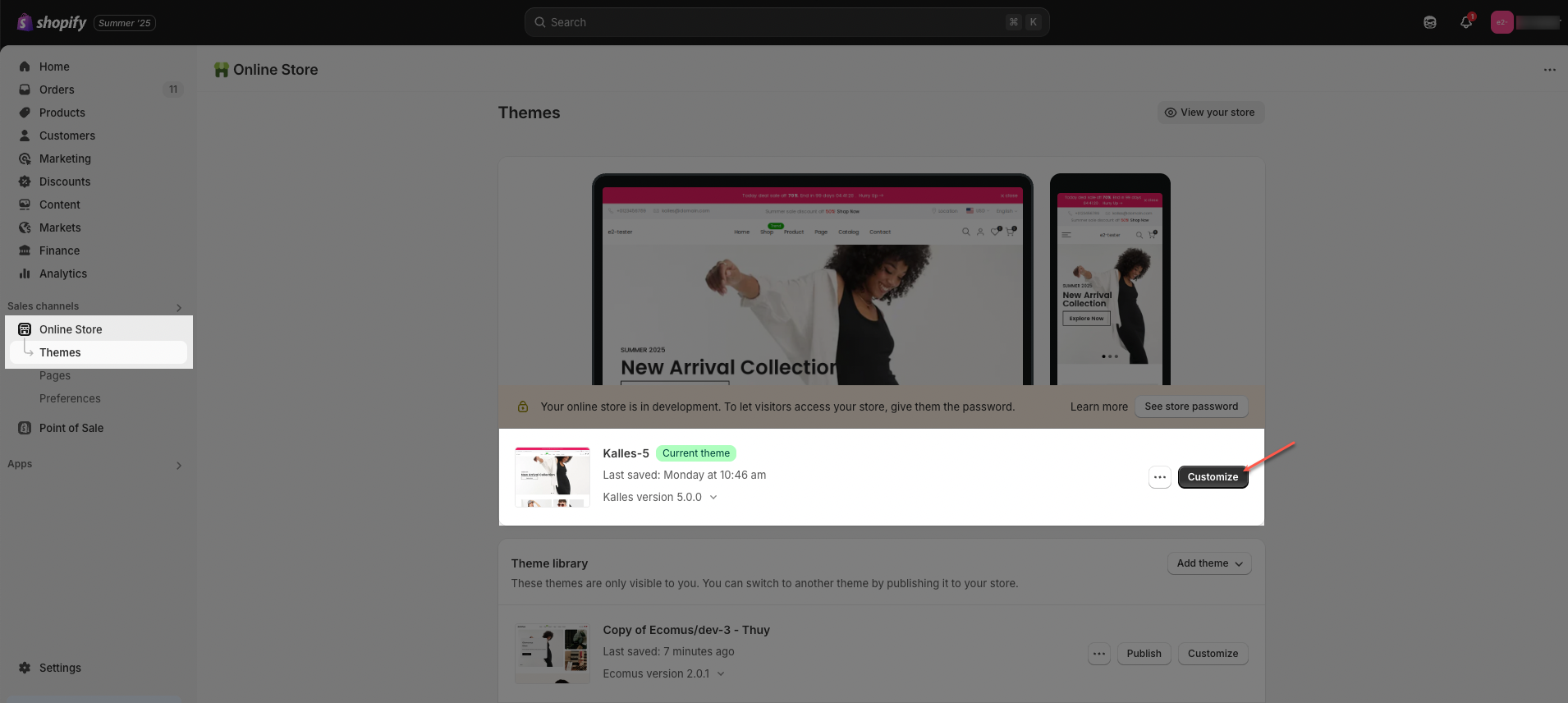
Step 01: From Shopify Admin, click on Online Store > Select Themes > In the Current theme section, click the Customize button.
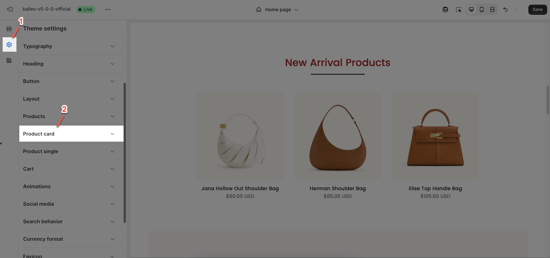
Step 02: In Theme settings (Customize) > scroll through the list to find and open the Product Card tab.
2. How to configure the Product Card?
2.1. Product image
Show secondary image on hover: Enable this option to activate the effect of displaying the product's secondary image when a user hovers over the primary image
Effect secondary image: Select the transition effect style when the secondary image appears (e.g.,
Fade,Slide,Zoom).Effect shows the secondary image on hover
Product image custom ratio: An image's aspect ratio is the ratio of its width to its height. You will change ratio in the section.
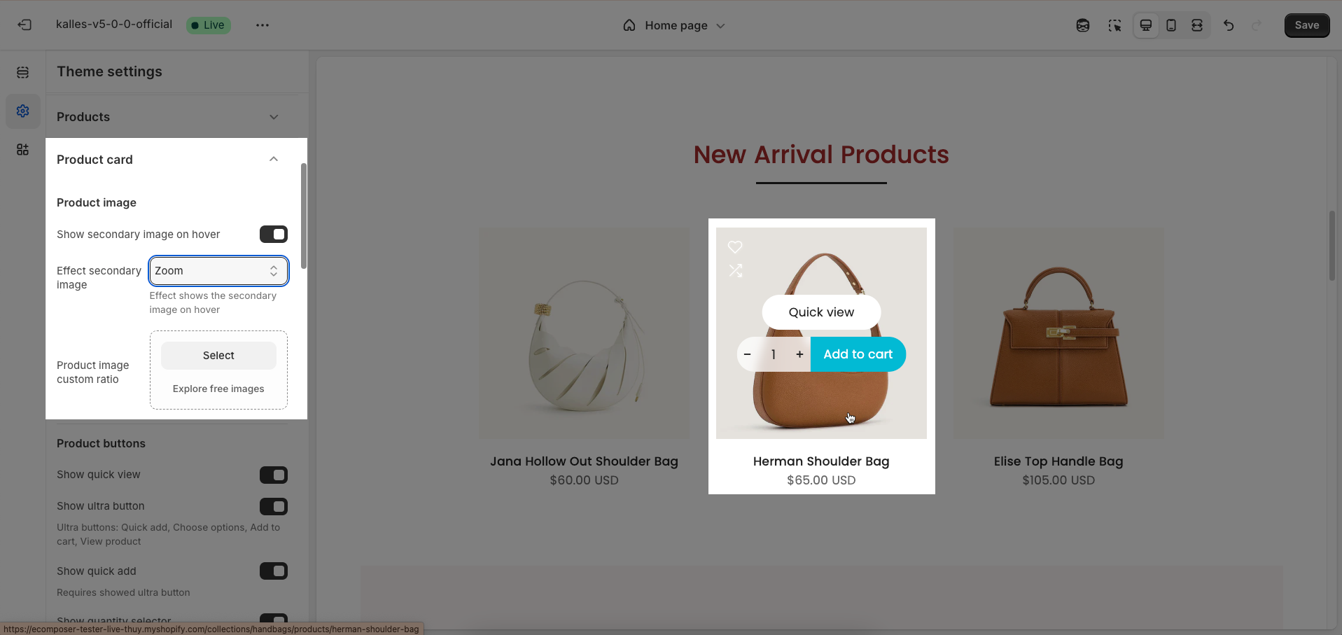
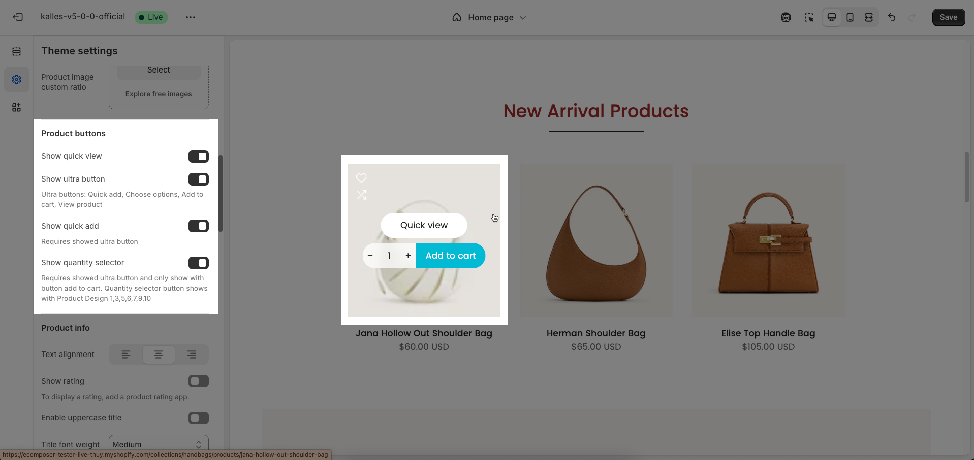
2.2. Product buttons
Show quick view: Enable this option to display the "Quick View" feature on products. When activated, customers can click an icon or link on a product to open a popup window or modal containing detailed product information
Show ultra button: Enable this option to display an "ultra button" (typically a prominent call-to-action button or a direct link to the product) on products within listings or grids
Ultra buttons: Quick add, Choose options, Add to cart, View product
Show quick add: Enable this option to display a "Quick Add" button on products. This button allows customers to directly add a product to their cart without visiting the product details page.
Requires showed ultra button
Show quantity selector: Enable this option to display a quantity selector right next to the "Add to Cart" or "Quick Add" button
Requires showed ultra button and only show with button add to cart. Quantity selector button shows with Product Design 1,3,5,6,7,9,10
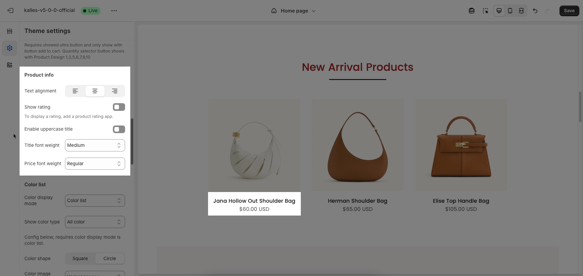
2.3. Product info
Text alignment: Select how text will be horizontally aligned within the element (e.g.,
Left,Center,Right). This applies to text blocks, headings, or other text-containing elements.Show rating: Enable this option to display star ratings for products or services
To display a rating, add a product rating app
Enable uppercase title: Enable this option to convert all letters in the title to uppercase. This can be used for emphasis or a consistent design style.
Title font weight: Select the weight or boldness of the font for the title (e.g.,
Normal,Bold,Light). This value impacts the prominence of the title.Price font weight: Select the weight or boldness of the font for the product price (e.g.,
Normal,Bold,Light). Adjusting the price font weight can help it stand out or blend with the overall design.
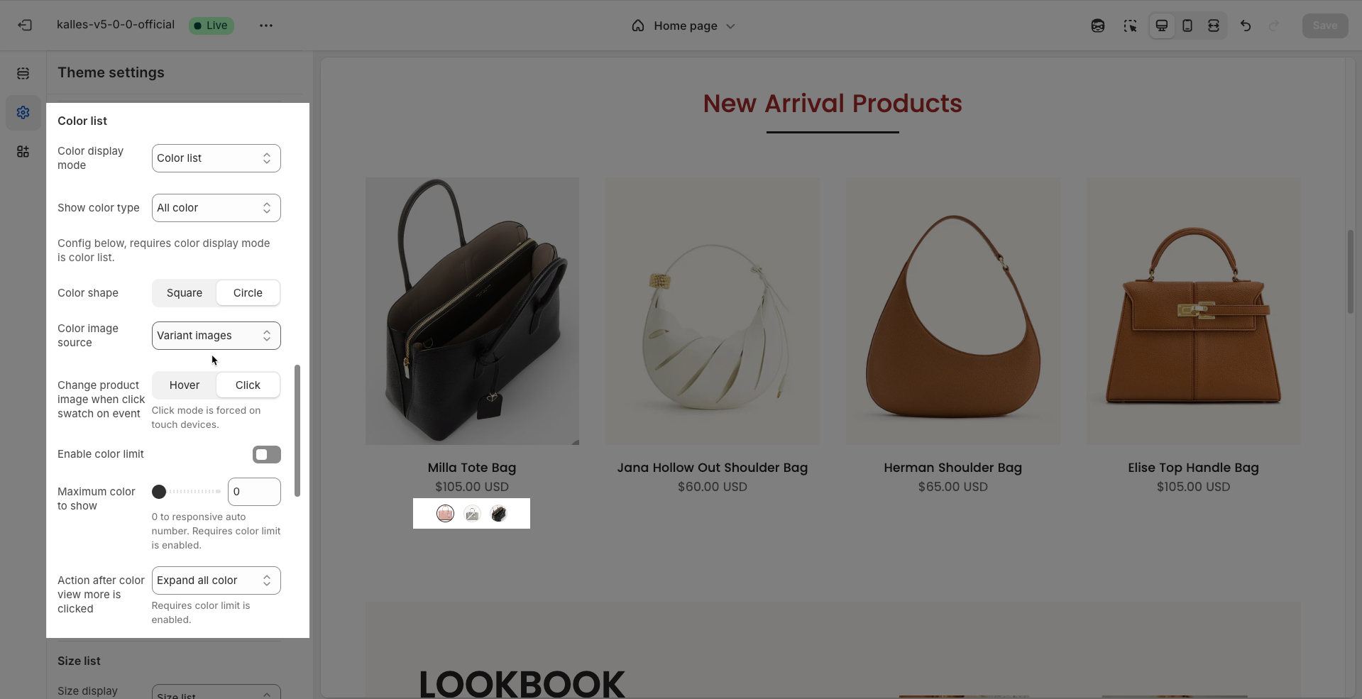
2.4. Color list
Color display mode: Select the display mode for product color variants (Hide, Count, Color list)
Show color type: Enable this option to display the color type (All color, Only color available)
Config below, requires color display mode is color list.
Color shape: Select the shape of the color swatches or image swatches
Color image source: Select the image source to be used for the color swatch display.
Change product image when click swatch on event: Enable this option to change the main product image (on the product page or within a product grid) when a customer clicks on a color swatch or variant image.
Click mode is forced on touch devices.
Enable color limit: Enable this option to limit the number of color swatches or images displayed initially.
Maximum color to show: Enter the maximum number of colors to display before offering a "view more" option.
0 to responsive auto number. Requires color limit is enabled.
Action after color view more is clicked: Select the action that will occur when a customer clicks the "view more" color option.
Show all colors: Displays all remaining colors in place.
Go to product page: Redirects the customer to the full product details page to view all variants.
Requires color limit is enabled.
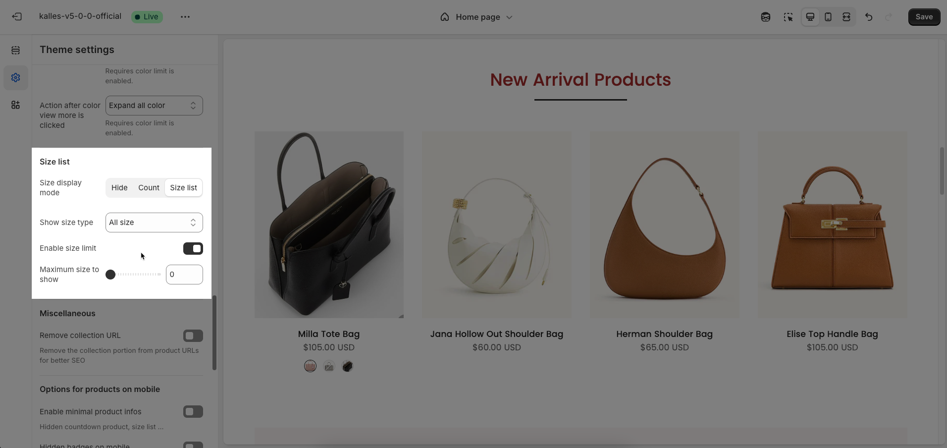
2.5. Size list
Size display mode: Select the display mode for product size variants
Show size type: Enable this option to display the size name alongside the text swatch.
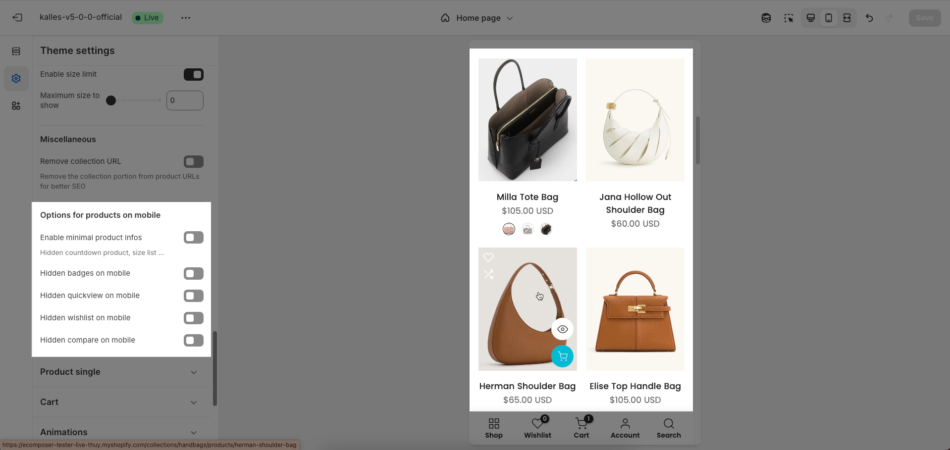
Enable size limit: Enable this option to limit the number of size swatches displayed initially. This is useful when there are many different sizes for a product.
Maximum size to show: Enter the maximum number of sizes to display before offering a "view more" option.
2.6. Miscellaneous
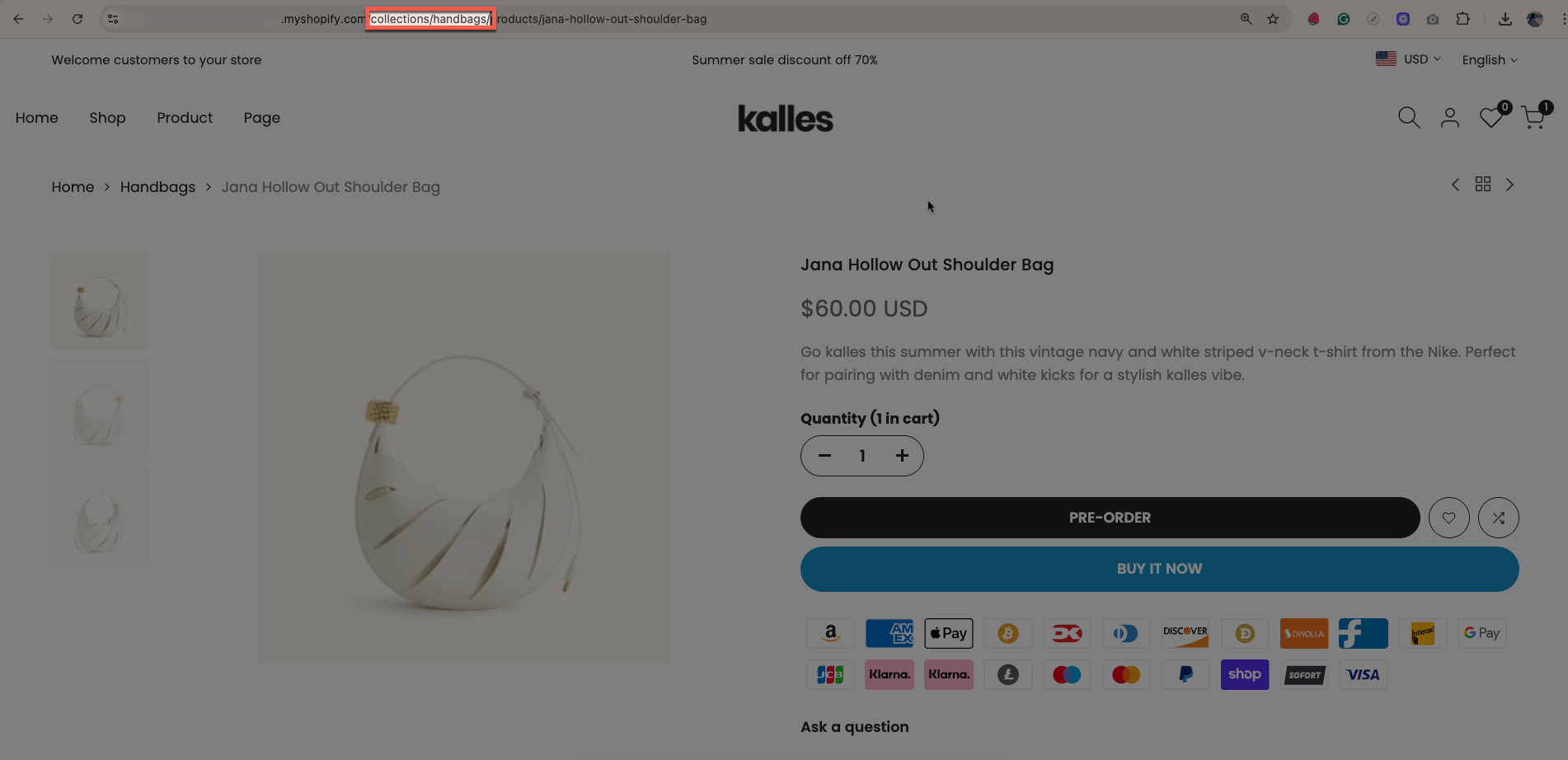
Remove collection URL: Remove the collection portion from product URLs for better SEO.
2.7. Options for products on mobile
Enable minimal product info: Enable this option to display minimal product information in product grids or listings.
Hidden countdown product, size list ...
Hidden badges on mobile: Enable this option to hide product badges (e.g., "Sale", "New", "Out of Stock") when displayed on mobile devices
Hidden quickview on mobile: Enable this option to hide the "Quick View" feature on products when displayed on mobile devices.
Hidden wishlist on mobile: Enable this option to hide the "Wishlist" button/icon on products when displayed on mobile devices.
Hidden compare on mobile: Enable this option to hide the "Compare Products" button/icon on products when displayed on mobile devices.