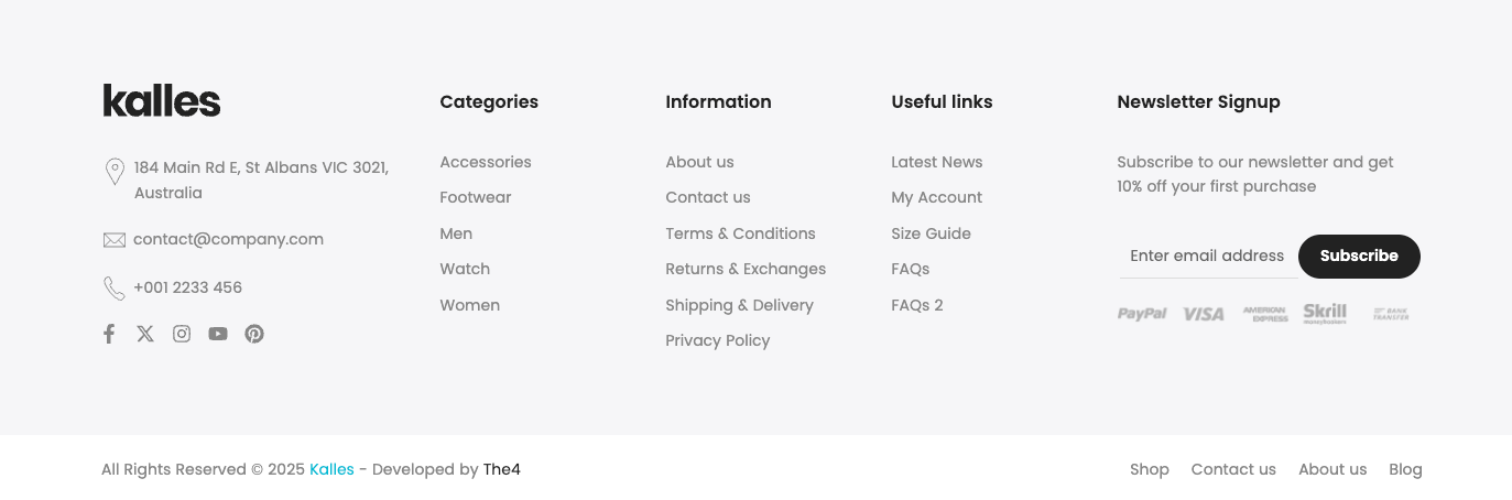
The Footer provides essential information and quick access to important resources. It typically includes useful links, contact details, terms of service, and social media channels.
This guide will walk you through the different blocks of the footer, explaining their purpose and how to use them effectively, so you can navigate the website with ease and make the most of the available features.
1. How to access the Footer section?
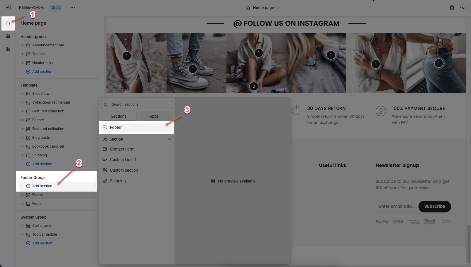
Step 01: From Shopify Admin, click on Online Store > Select Themes > In the Current theme section, click the Customize button.

Step 02: In the theme editor (Customize), click the Sections button > Click the Add section button > In the Sections tab, scroll through the list or use the search bar to find and select the Footer section.
2. How to customize the Footer section?
2.1. Config Footer section
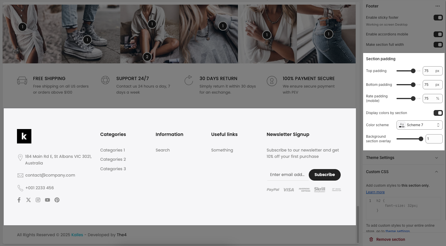
2.1.1. Footer
Enable sticky footer: Keeps the footer fixed at the bottom of the screen on desktop, even when scrolling. (Note: Only works on desktop screens.)
Enable accordions mobile: Enables collapsible (accordion) sections within the footer when viewed on mobile devices, helping to save vertical space.
Make section full width: Expands the footer section to span the full width of the browser window, regardless of site container width.
Background image: This option allows you to upload or select an image to be displayed as the background of the footer section.
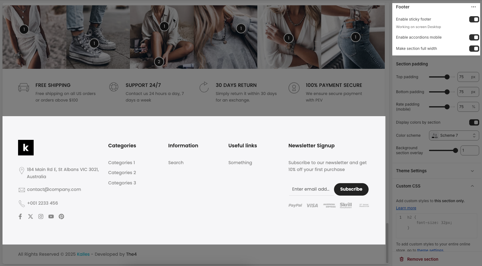
2.1.2. Section padding
Top padding: Adds vertical spacing (in pixels) at the top of the footer section.
Bottom padding: Adds vertical spacing (in pixels) at the bottom of the footer section.
Rate padding (mobile): Adjusts the top and bottom padding specifically for mobile devices, set as a percentage.
Display colors by section: When enabled, uses predefined color settings for this specific section instead of the global theme settings.
Color scheme: Lets you choose a predefined color scheme (e.g., “Scheme 7”) to style the footer section.
Background section overlay: Adjusts the transparency level of a color overlay applied on top of the footer background; range is usually from 0 (transparent) to 1 (opaque).
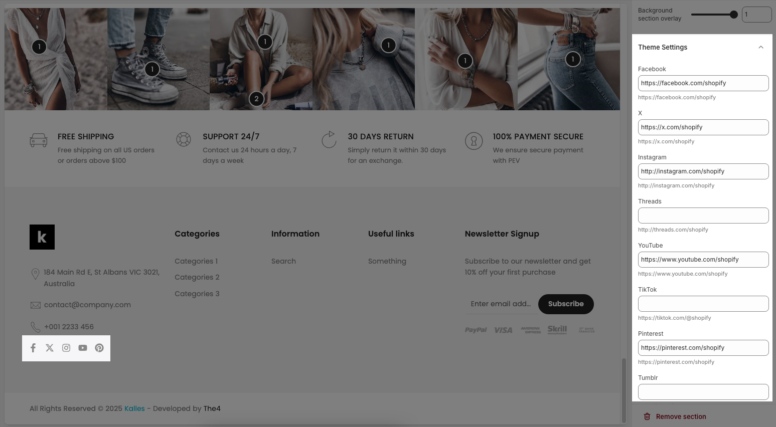
2.1.3. Theme settings
You will configure Social Media and add links for them here.
2.1.4. Custom CSS
Allows users to customize by adding CSS rules, beyond the limitations of default settings. This allows for fine-tuning the design to every detail, to suit specific needs.
Add custom styles to this section only.
To add custom styles to your entire online store, go to theme settings for detailed instructions.

2.2. Config Footer column block
The Footer section is structured using Footer column blocks, which help divide the footer into multiple content columns.
Below are the available options for customization:
Footer column
Text: This is the heading or label text for the column. In the example, it's “Get in touch.”
Hide on mobile: If enabled, this block will be hidden on mobile devices.
Accordion only on mobile: When enabled, content in this block will appear in accordion format only on mobile devices.
Font size: Sets the font size for the text inside this column (e.g., Small, Medium, Large).
Heading space: Controls the vertical spacing (in pixels) below the heading/title.
Display colors by block: When enabled, allows individual blocks to use their own color scheme settings.
Color scheme: Choose a predefined color palette for the section.
Background section overlay: Adjusts the transparency level (0–100%) of a dark or colored overlay above the background.
Size
Width: Sets the column width as a percentage of the total footer width on desktop.
Tablet width: Sets the column width for tablet screen sizes.
Mobile width: Sets the column width on mobile devices (usually 100% for full-width stacking).
Spacing top
Padding top: Adds space (in pixels) above the column to adjust vertical positioning.
Bottom padding: Adds space (in pixels) below the content.
Rate padding (mobile): Sets the relative padding (in percentage) for mobile devices.
Each Footer column can contain various inner blocks such as Button, Image, Heading, Text, Linklist, Newsletter, and more—allowing you to organize your footer content flexibly and effectively.
Follow the instructions below to configure them accordingly.
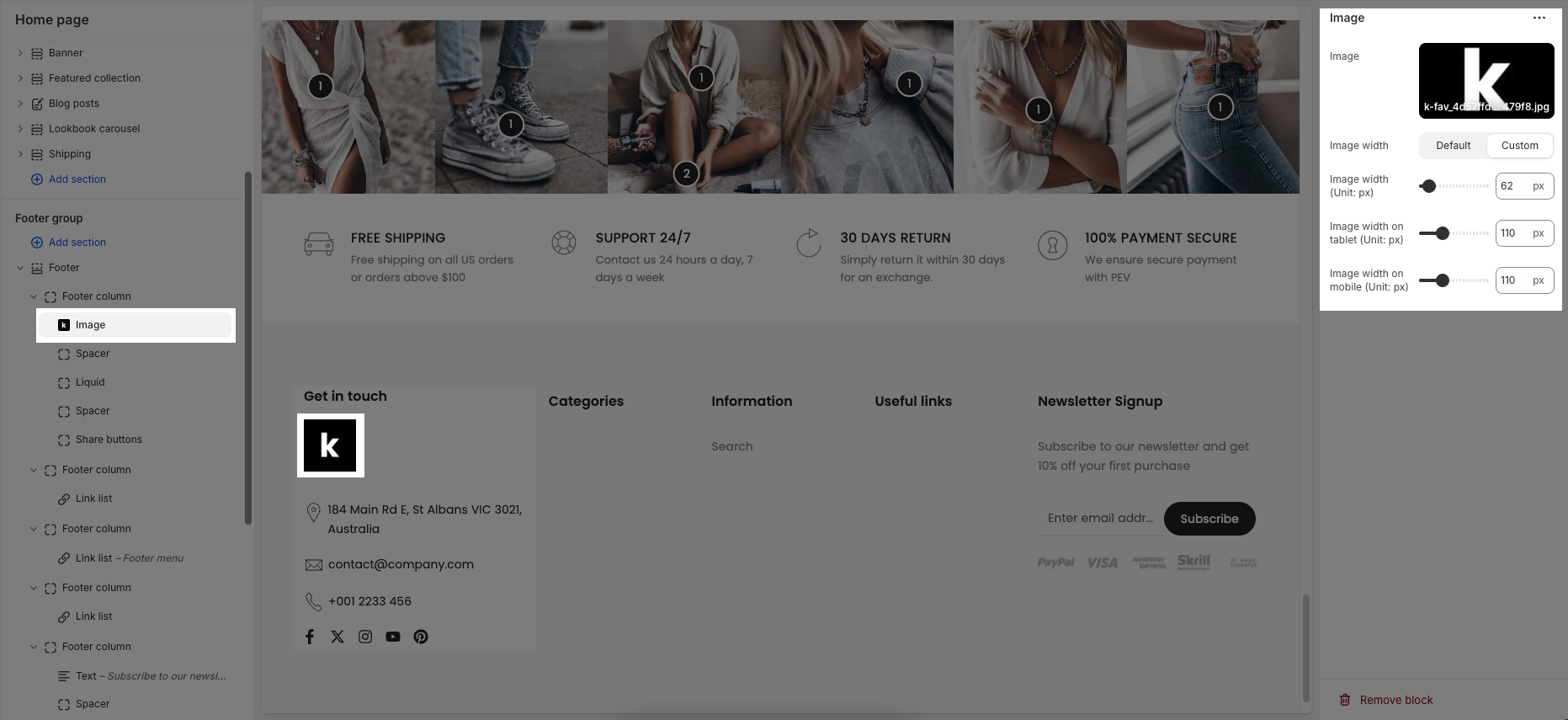
2.2.1. Image block
Image:
Select: Click to upload or choose an image from your library.
Explore free images: Browse and use free stock images provided by Shopify.
Image width: You can choose image width with Default or Custom option
Default uses the theme’s standard image sizing.
Custom allows you to define exact pixel widths.
Custom Width Options (when selected)
Image width (Unit: px): Sets the image width in pixels for desktop view.
Image width (Unit: px) (middle slider): Another field to define or fine-tune the image width (may act as a preview width).
Image width on mobile (Unit: px): Sets the image width in pixels specifically for mobile devices.
2.2.2. Liquid block
Custom liquid: This block allows you to insert custom code using Liquid, Shopify’s templating language.
Add app snippets or other Liquid code to create advanced customizations.
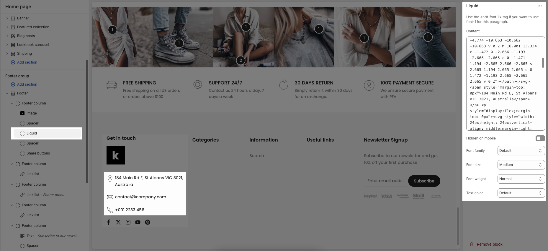
Hidden on mobile: When enabled, this content block will not appear on mobile devices.
Font family: Choose the typeface used for the text (e.g., Default, Body font, Heading font).
Font size: Select from predefined sizes or choose Custom size inline to manually define font size values.
Font weight: Adjusts the thickness of the text (e.g., Normal, Bold, Light).
Text color: Defines the color of the text. Uses default theme colors unless changed.
Custom Size Inline (Visible when selected)
Font size: Sets the custom font size (in pixels) for desktop devices.
Mobile font size: Sets a separate font size (in pixels) specifically for mobile devices.
Letter spacing: Controls the amount of space between characters, in pixels.
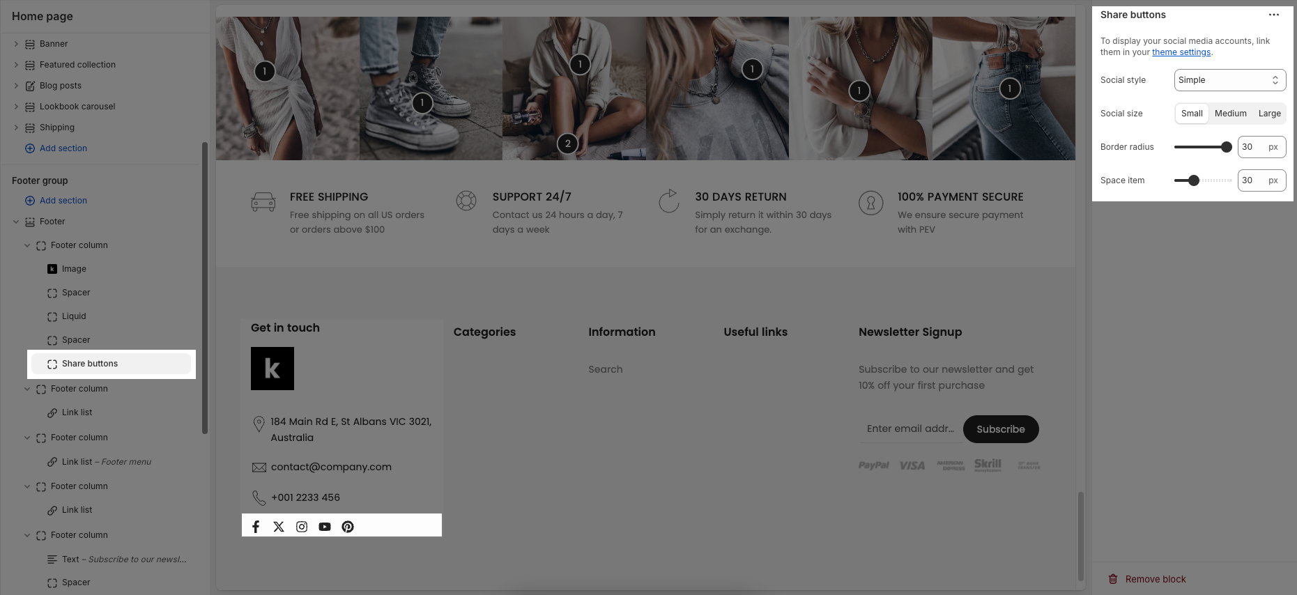
2.2.3. Share button block
To display your social media accounts, link them in your theme settings.
Social style: Choose the visual appearance of the social icons (e.g., Simple, Outline, Border & background,...)
Social size: Set the size of the icons (e.g., Small, Medium, Large)
Border radius: Controls how rounded the corners of each icon are. A higher value makes the icons more circular.
Space item: Adjusts the spacing (in pixels) between individual social media icons.
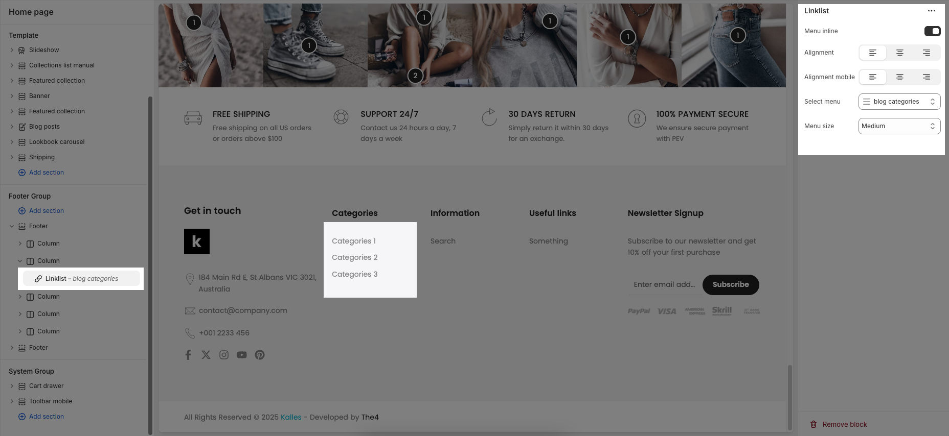
2.2.4. Linklist block
Menu inline: When enabled, displays menu items horizontally (inline). When disabled, items are stacked vertically.
Alignment: Controls the horizontal alignment of the menu on desktop
Alignment mobile: Sets how the menu is aligned on mobile devices
Select menu: Allows you to choose a menu from your navigation to display as a link list.
Menu size: Controls the font size or overall visual size of the menu text
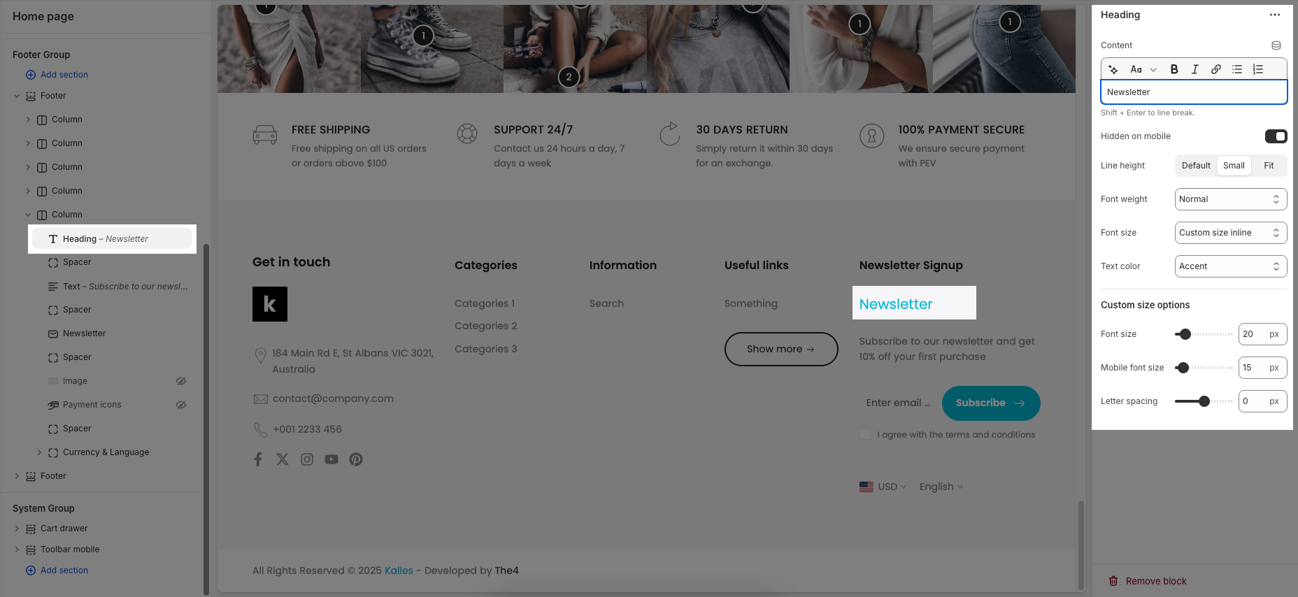
2.2.5. Heading block
Heading: Allows you to enter and format the text (bold, italic, underline, lists, links, etc.). Shift + Enter to line break.
Hidden <br> on mobile: Disables line breaks on mobile devices.
Line height: Adjusts the spacing between lines of text. Options include: "Default", "Small", "Fit".
Size: Lets you select sizes for the heading.
Text color: Allows you to set the text color.
Custom size options:
Font size: A slider and input field to set the font size (e.g., 50 px) for regular (desktop) viewing.
Mobile font size: A slider and input field to set the font size (e.g., 24 px) specifically for mobile devices.
Letter spacing (in pixel): A slider and input field to adjust the spacing between individual characters (e.g., 0 pixels).
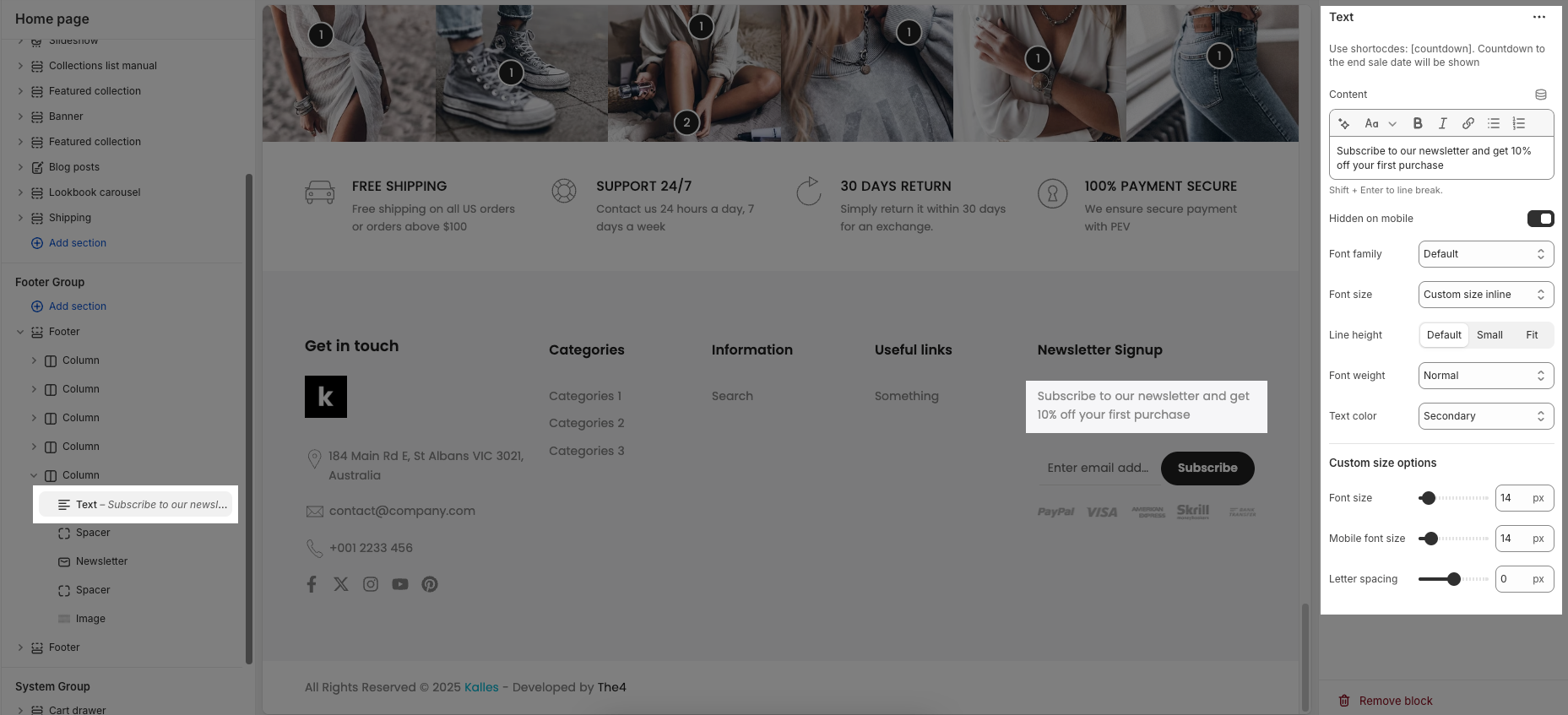
2.2.6. Text block
Text: This is where you input the main text content
Shift + Enter to line break.
Use shortocdes: [countdown]. Countdown to the end sale date will be shown
Hidden <br> on mobile: Disables line breaks on mobile devices.
Hidden on mobile: A toggle switch. If enabled, the text content will not be displayed on mobile devices.
Font family: A dropdown menu to select the typeface for the text. "Default" is currently selected.
Size: Controls font size, options include such as Small, Medium, Large, ... and "Custom size inline" for specific settings.
Line-height: Adjusts the vertical spacing between lines of text. Options include "Default", "Small", and "Fit".
Font weight: A dropdown menu to choose the thickness or boldness of the font.
Text color: A dropdown menu to set the color of the text. "Default" is currently selected.
Date countdown: An input field or date picker where you can set the exact date and time for the countdown to end (e.g., "2025-09-30 15:00:00").
Text day countdown: An input field where you define the text to display for the "days" unit of the countdown.
Effect slider: This likely refers to the transition effect for the content, with options like "Fade" or "Slider" currently selected.
Autoplay speed in seconds: A slider and input field to set the duration (in seconds) before the next slide or item in the "slider" effect appears.
Set is '0' to disable autoplay
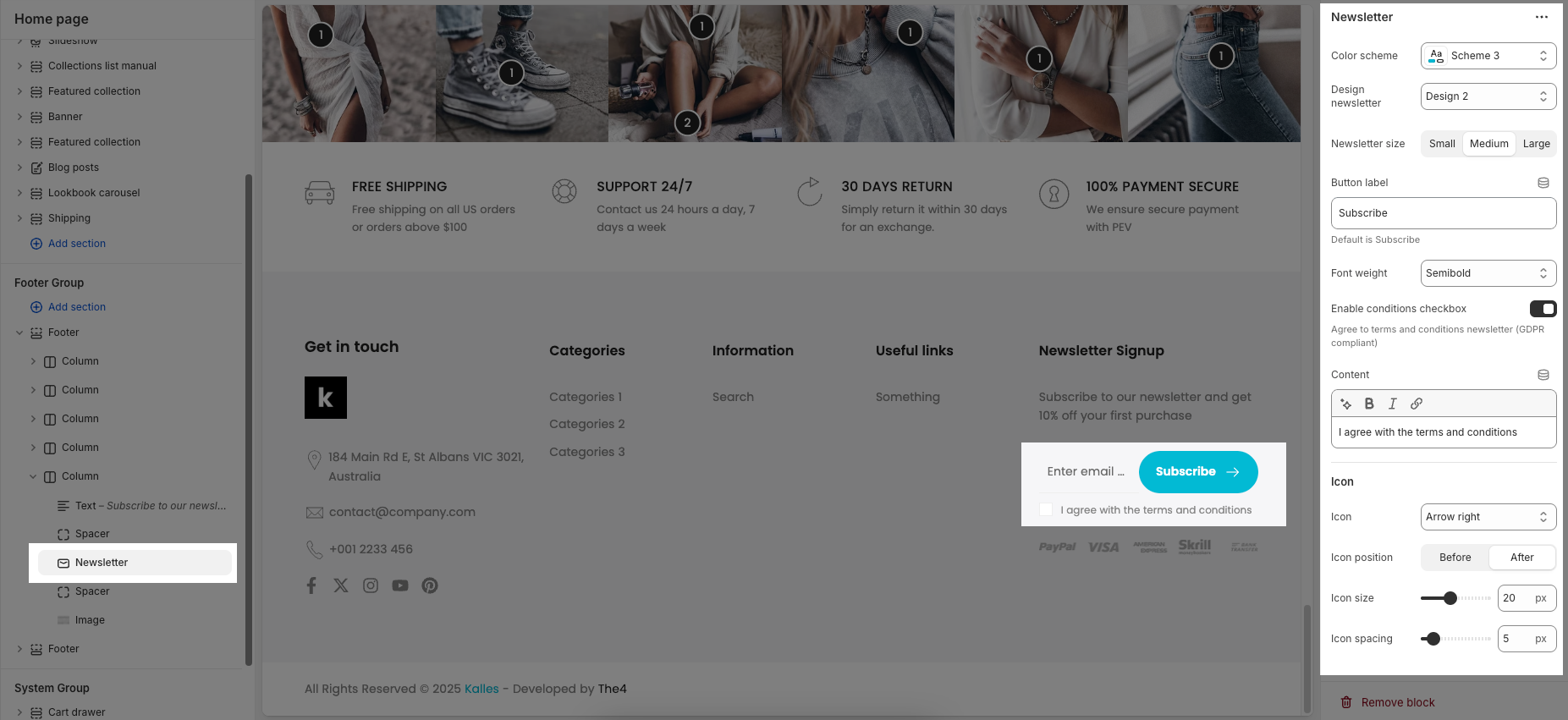
2.2.7. Newsletter block
Color scheme: Choose a predefined color style for the block.
Design newsletter: Select a layout style for the newsletter form.
Newsletter size: Set the size of input and button (Small, Medium, Large).
Button label: Customize the subscribe button text.
Font weight: Adjust the thickness of the text (e.g., Semibold).
Enable conditions checkbox: Show a checkbox to agree to terms (for GDPR).
Content: Enter and style the text next to the checkbox.
Icon: Choose an icon to display in the button.
Icon position: Set icon to appear before or after the button text.
Icon size: Adjust the icon’s size in pixels.
Icon spacing: Set space between icon and text.
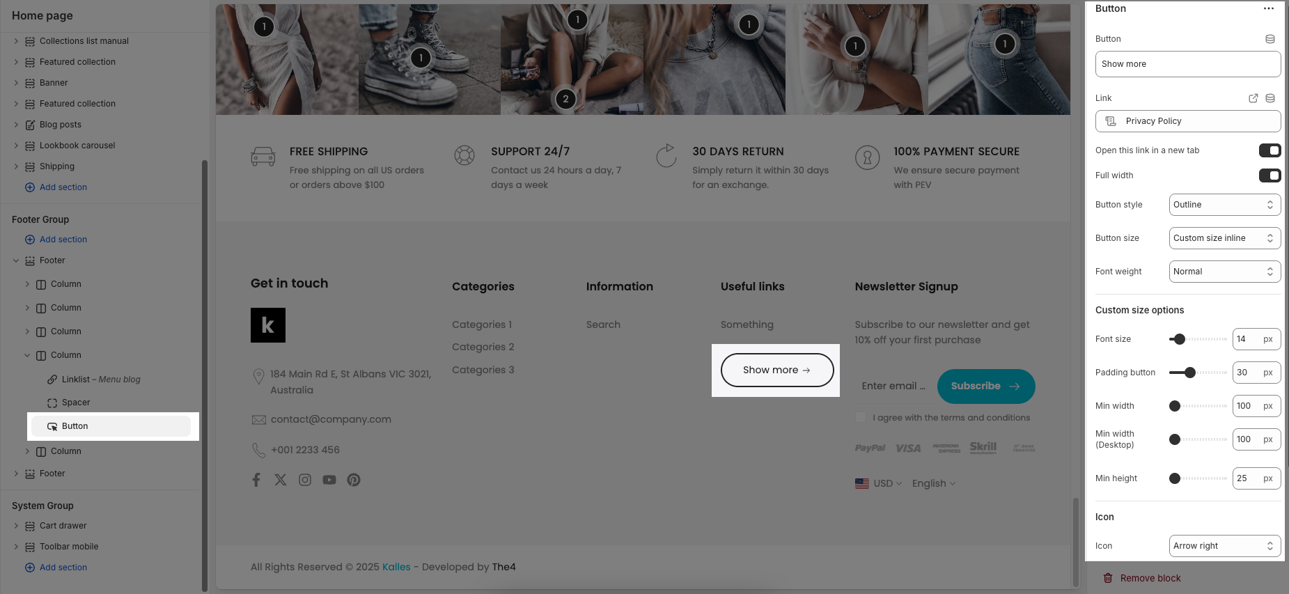
2.2.8. Button block
Label: Defines the text displayed on the button.
Link: Specifies the destination URL when the button is clicked.
Open this link in a new tab: Opens the link in a new browser tab when enabled.
Make button full width: Expands the button to take up the full width of its container.
Style: Choose between Solid, Outline, or Link styles for different visual effects.
Size: Adjusts the button size (e.g., Extra Large, Medium, etc.).
Font weight: Controls the thickness of the button text (e.g., Normal, Bold).
Custom Size Options:
Font size: Adjusts the heading size for desktop.
Tablet font size: Adjusts the heading size for table.
Mobile font size: Adjusts the heading size for mobile.
Font weight: Controls the thickness of the text (e.g., 600 is semi-bold).
Letter spacing: Adjusts the space between characters.
Icon:
Icon: Select the icon to display on the button (e.g., arrow, plus, etc.).
Icon position: Choose whether the icon appears Before or After the button text.
Icon size: Adjust the size of the icon in pixels.
Icon spacing: Set the spacing between the icon and the text to ensure proper alignment and readability.
2.2.9. Currency & Language block
In the Currency & Language block, you can add individual Currency and Language blocks to display in the footer.
The Spacing option allows you to adjust the space (in pixels) between these two blocks for better layout alignment.
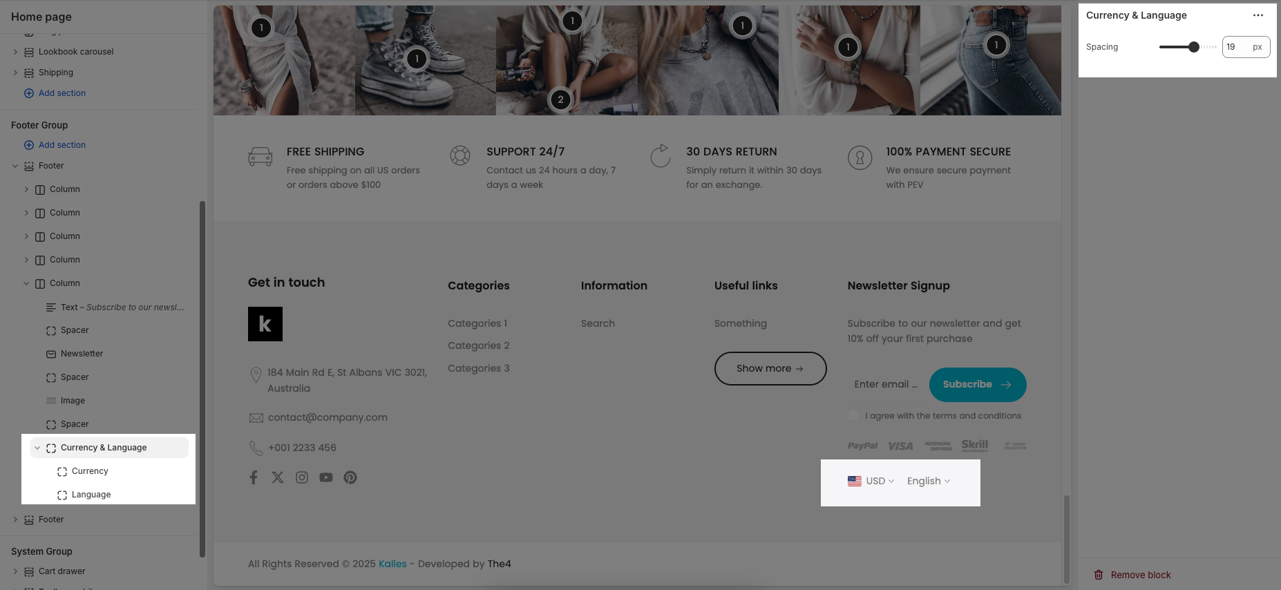
To learn how to add different currencies and languages, please refer to the next guide.
Country/region selector
To add a country/region, go to your Shopify admin -> Settings ->Markets to set up:
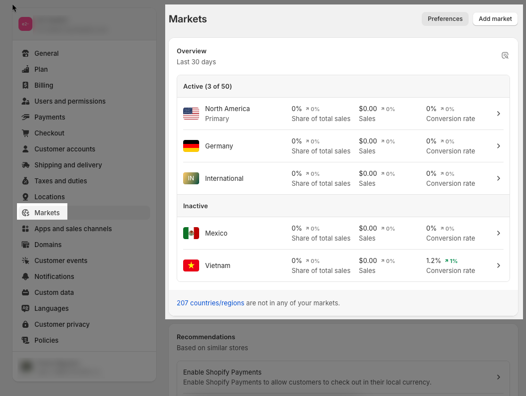
Please Enable country/region selector if you want to show it in the Footer
Languages selector
To add a language, go to your Shopify admin -> Settings -> Languages to set up:
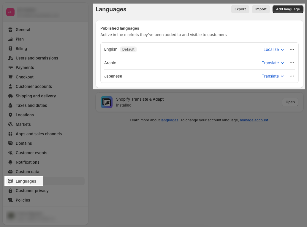
Enable the language selector if you want to show it in the Footer
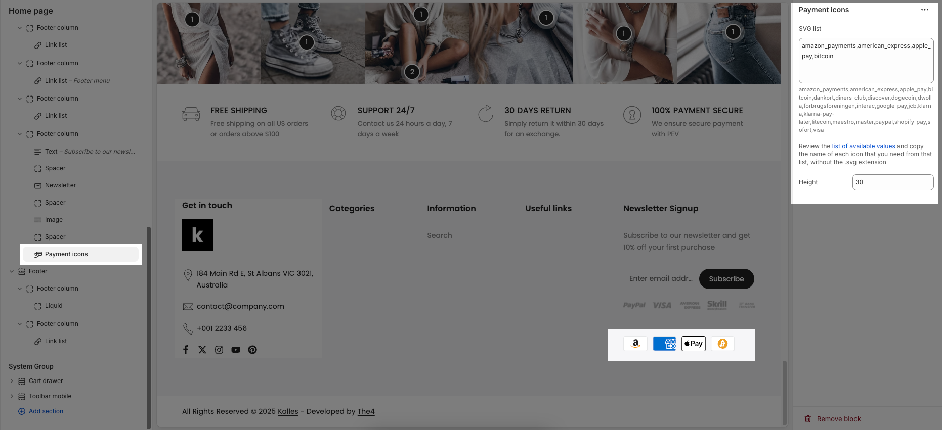
2.2.10. Payment icons block
SVG list: This is where you enter the names of the payment icons you want to display. Only icon names from the provided list of available values are accepted.
Height: Defines the height of each payment icon in pixels.
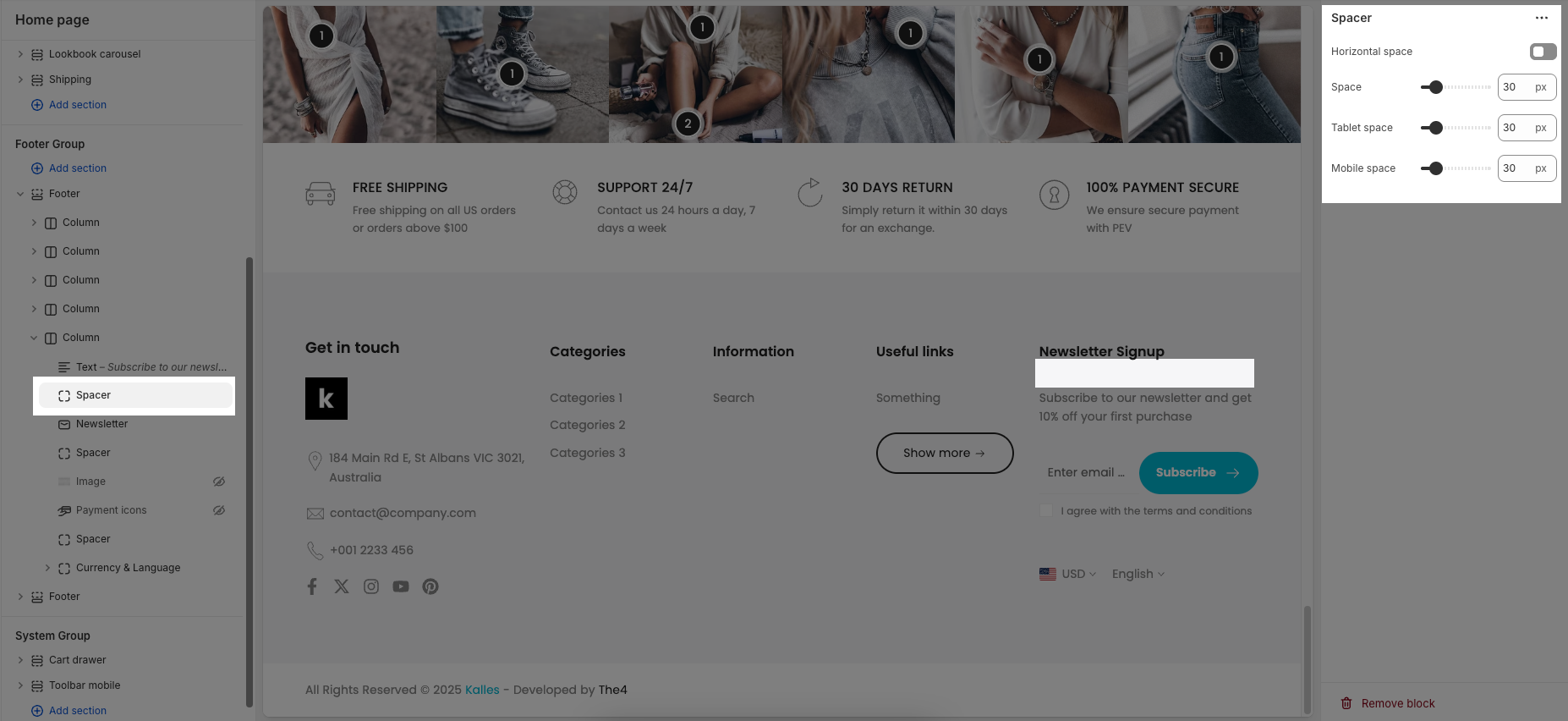
2.2.11. Spacer block
Horizontal space: If enabled, the spacer will also add horizontal spacing instead of only vertical spacing.
Space: Adjusts the amount of space (in pixels) on desktop screens.
Tablet space: Defines the amount of space for tablet devices, ensuring responsive spacing.
Mobile space: Sets the spacing specifically for mobile screens.