


The Mobile Toolbar provides a fixed navigation bar at the bottom of the screen for mobile users, giving quick access to key sections like Shop, Wishlist, Cart, Account, and Search. It enhances usability and ensures important features are always within reach.
1. How to access the Toolbar mobile section?
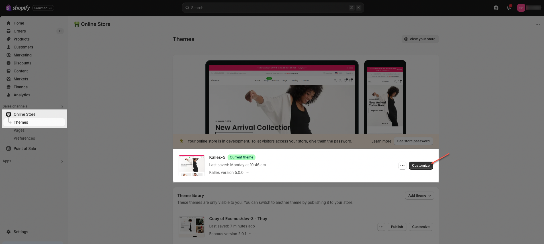
Step 01: From Shopify Admin, click on Online Store > Select Themes > In the Current theme section, click the Customize button.
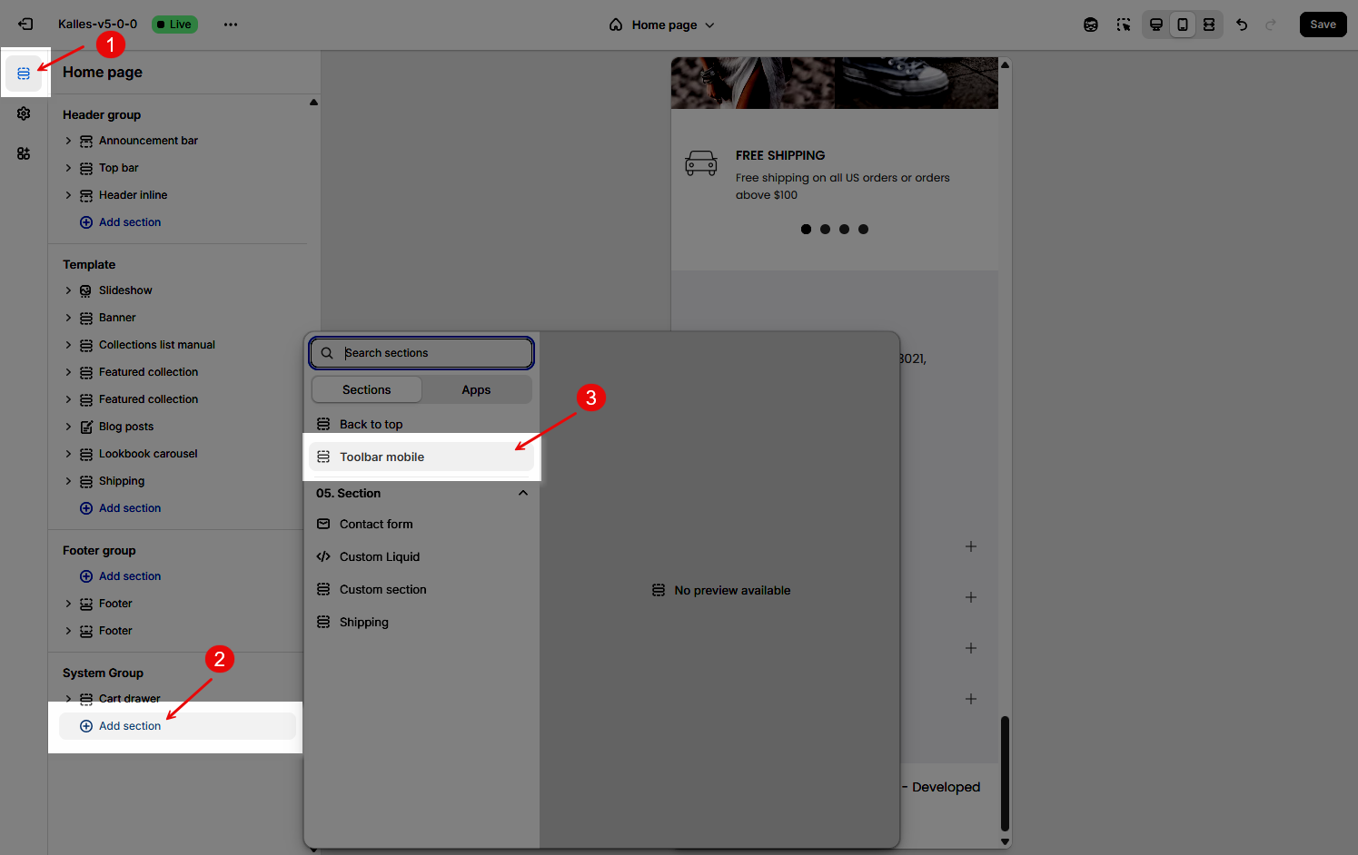
Step 02: In the theme editor (Customize), click the Sections button > In the Sections tab, scroll through the list to the System Group section, click the Add section button > Select the Toolbar mobile section.
2. How to customize the Toolbar mobile section?
2.1. Toolbar mobile
The Mobile Toolbar is a bottom navigation bar designed specifically for mobile devices, allowing users to access key store features quickly and conveniently while browsing on smaller screens.
Below are the available options for customization:
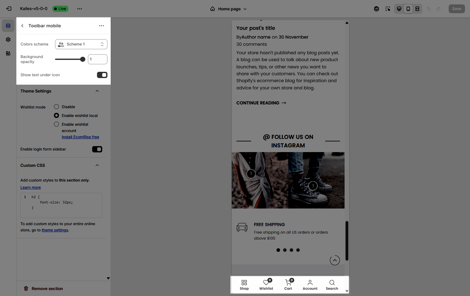
Colors schema: Choose a predefined color scheme (e.g., Scheme 1) to match your store’s branding.
Background opacity: Adjust the transparency of the toolbar background using the slider (value ranges from 0 to 1, with 1 being fully opaque).
Show text under icon: Toggle this option to display or hide the label text beneath each icon in the toolbar.
Theme Settings
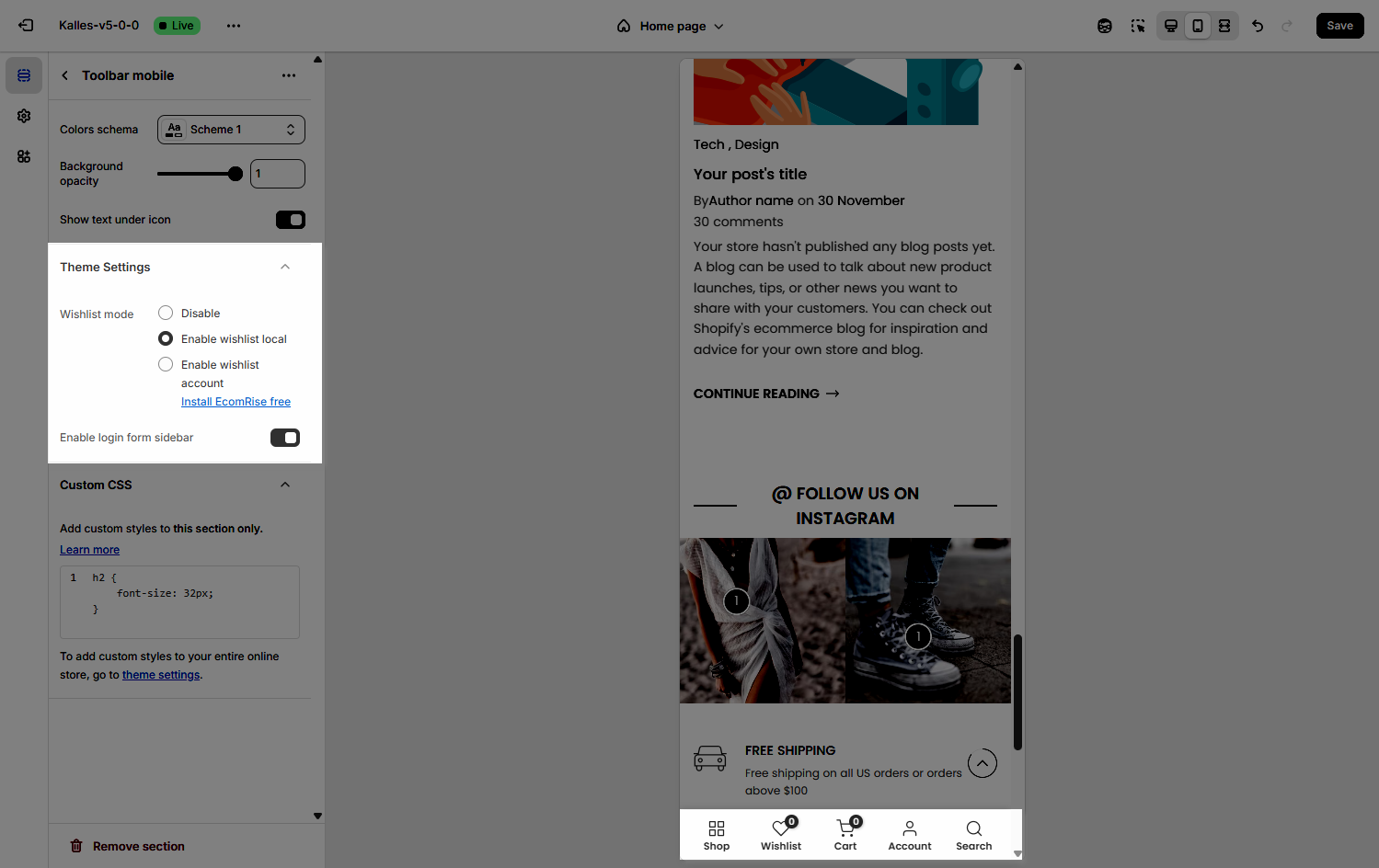
Wishlist mode: Enables or disables the wishlist feature, providing users with a function to save favorite products.
You can Disable, Enable wishlist local, Enable wishlist account Install EcomRise free, Enable Growave wishlist
Compare mode: Enables or disables the product comparison mode, allowing customers to compare products side-by-side for informed purchasing decisions.
You can Disable, Enable compare local, Enable compare account
Max products compare: 6
Enable login form sidebar
Toggle this option to show or hide a login form in a sidebar drawer when users access account icon from the mobile toolbar.
Custom CSS
Allows users to customize by adding CSS rules, beyond the limitations of default settings. This allows for fine-tuning the design to every detail, to suit specific needs.
Add custom styles to this section only.
To add custom styles to your entire online store, go to theme settings for detailed instructions.

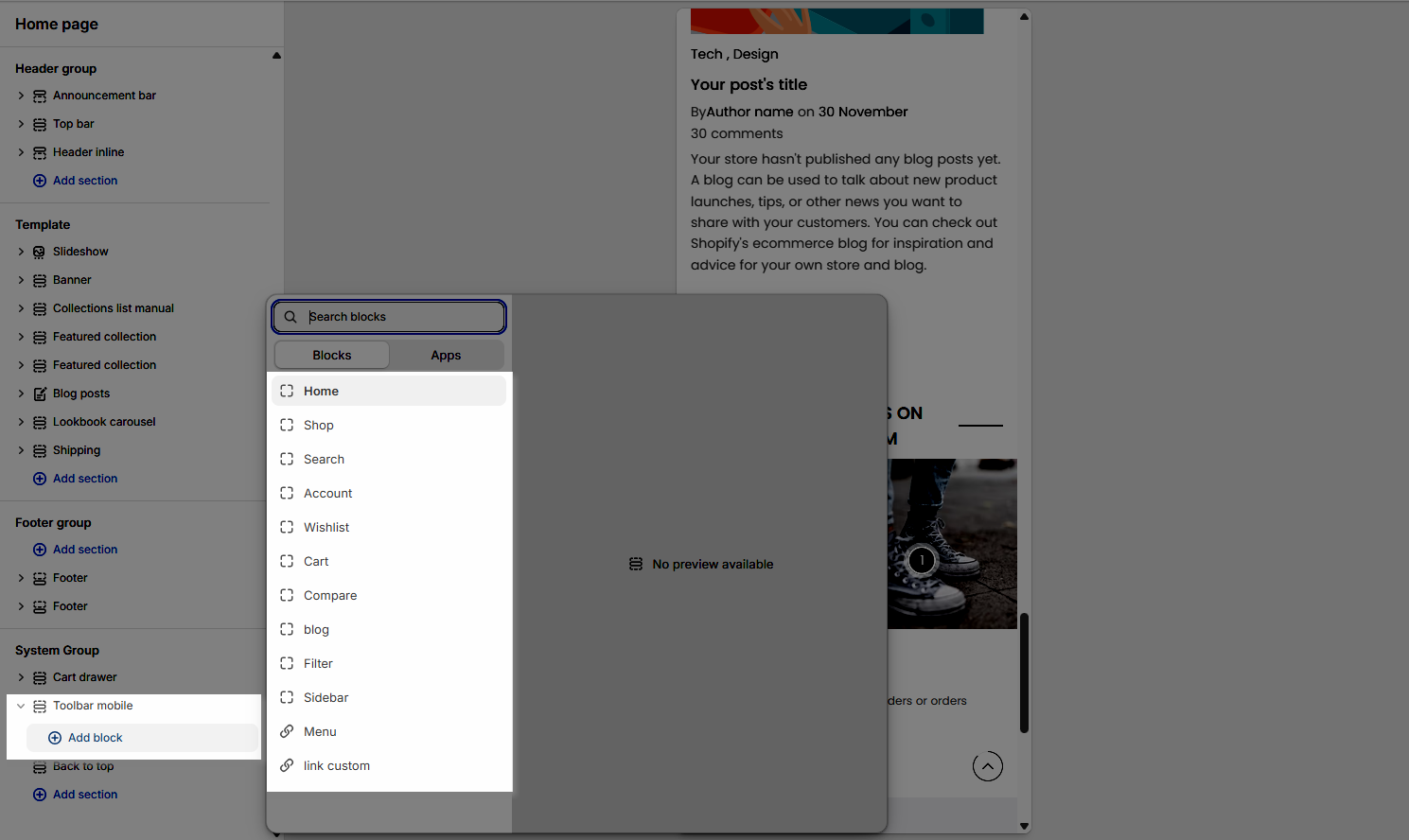
2.2. Blocks in the Toolbar mobile
In the Toolbar mobile section, you can add various blocks such as Shop, Wishlist, Cart, Account, Search, Home, Compare, Blog, Filter, Sidebar, Menu and Link custom to enhance the layout and design.
Click on Toolbar mobile section > Add block (plus icon ➕) > Select the block you can add.
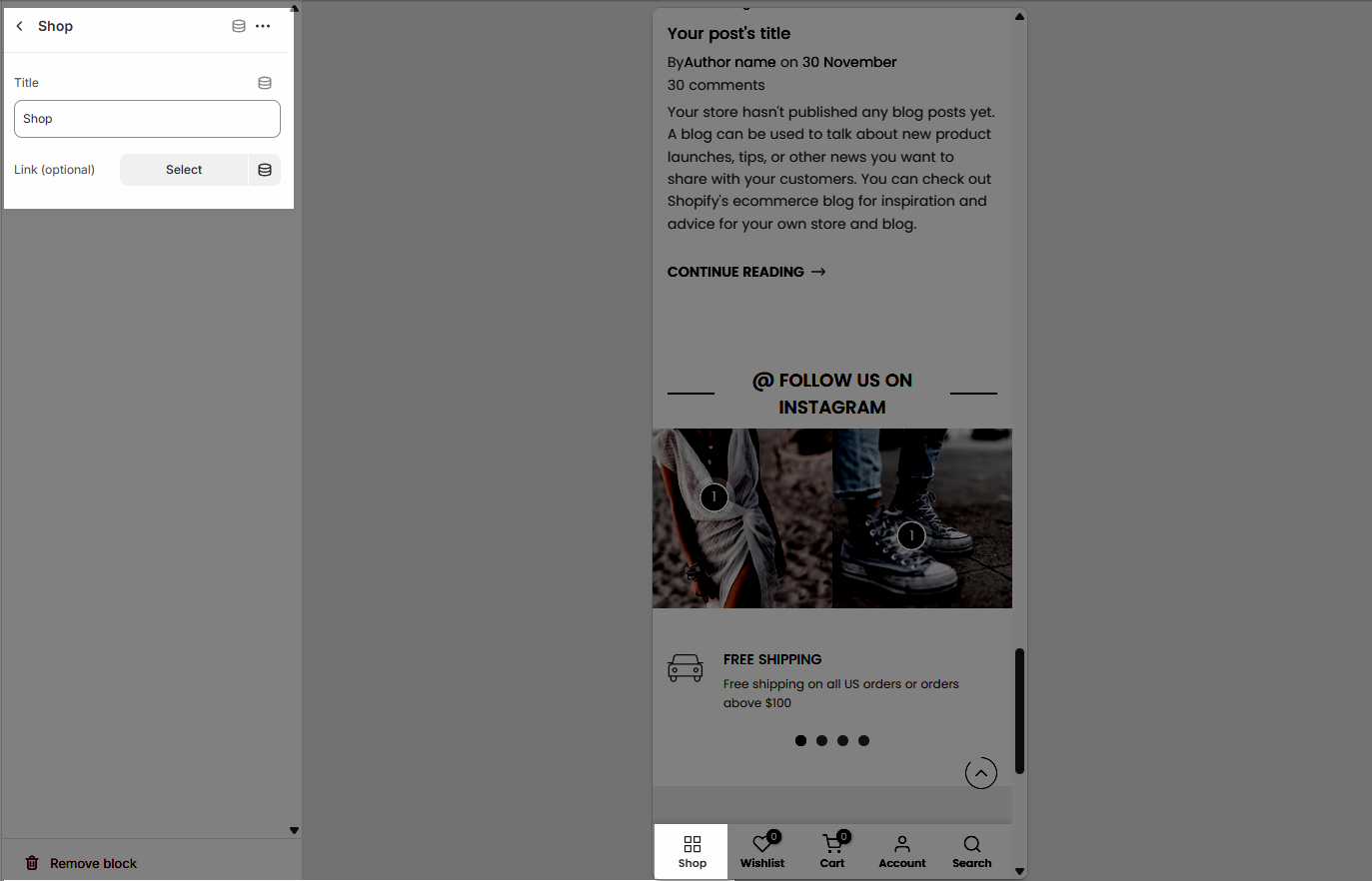
2.2.1. Shop
Title: The label that will appear under the Shop icon in the mobile toolbar. You can customize this text to fit your store's language or navigation style.
Link (optional): Allows you to set a destination URL for the Shop button. Click Select to choose a page, collection, or any link from your store. If left blank, the button will not redirect anywhere.
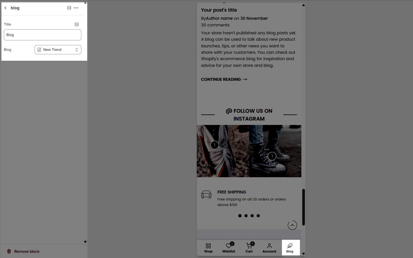
2.2.2. Blog
Title: This is the label shown under the blog icon in the mobile toolbar. You can customize the text to match your site’s language or branding.
Blog: This field allows you to select a specific blog from your store. When users tap the Blog icon in the toolbar, it will direct them to the selected blog page.
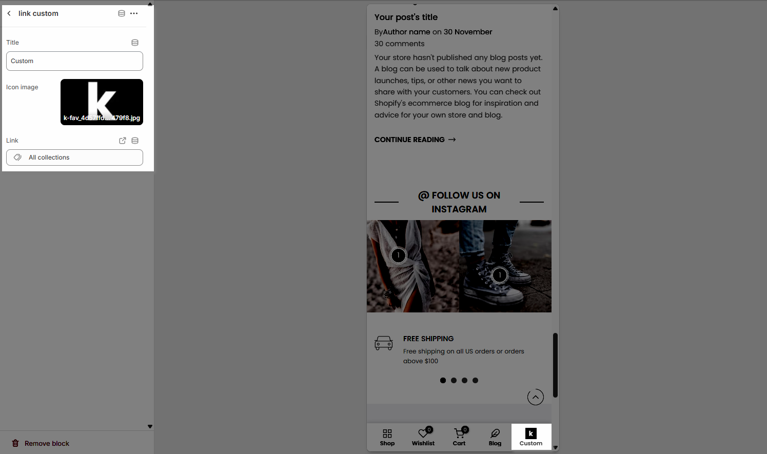
2.2.3. Link custom
Title: This is the label that appears below the Link custom icon in the mobile toolbar. You can enter any custom name to describe the link.
Icon image: Allows you to select a custom icon for the toolbar item. Click Select to choose from your store’s media library or Explore free images for available icon options.
Link: Paste a URL or search for a page, product, or collection from your store to set the destination for this custom toolbar item.
2.2.4. Other blocks
Title: This is the label that appears below the icon in the mobile toolbar. You can enter any custom name to describe the link.


