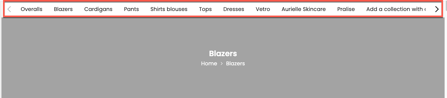
The Top List Collections section is a versatile and visually appealing component designed to showcase a curated list of your most important or popular product collections
1. How to access the Top list collections section?
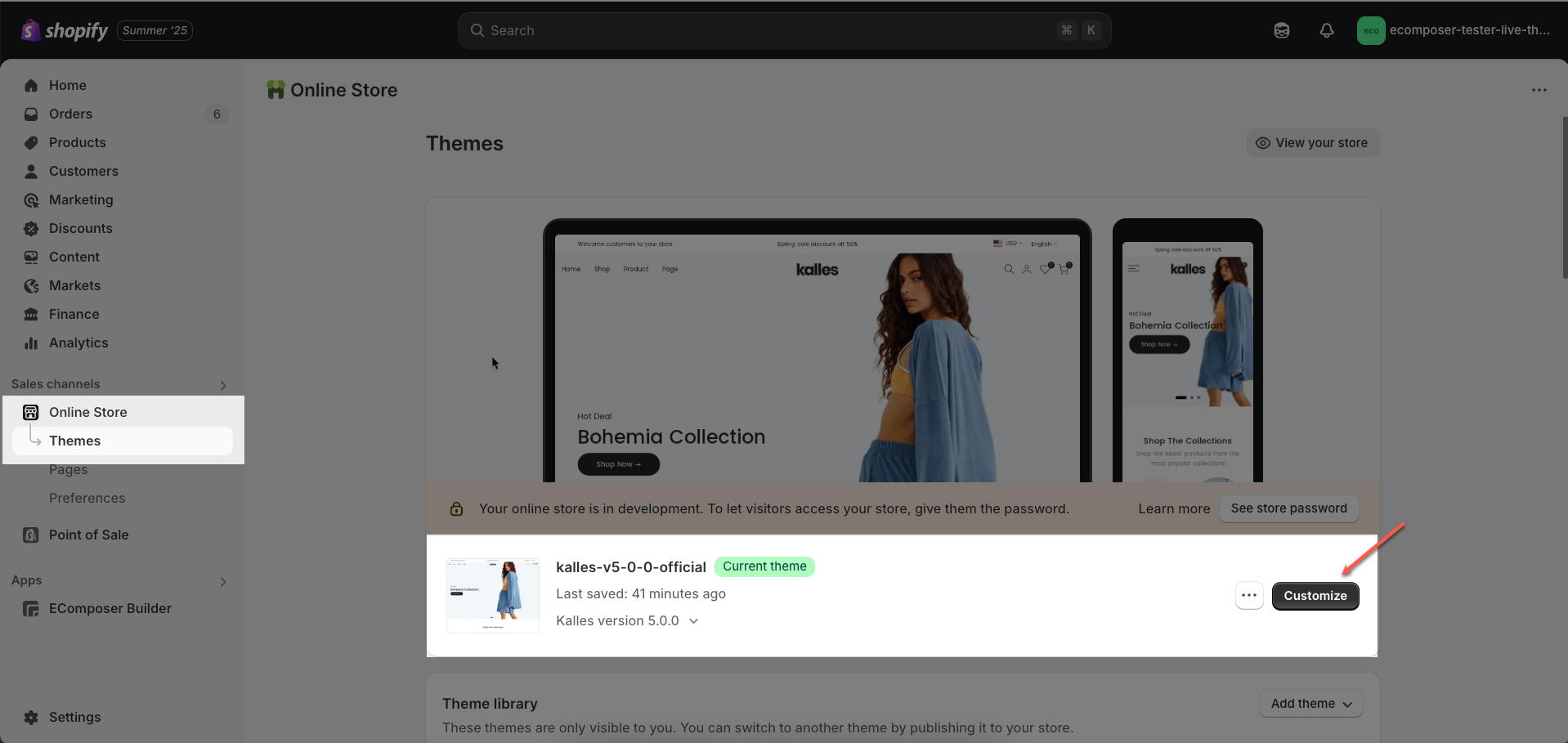
Step 01: From Shopify Admin, click on Online Store > Select Themes > In the Current theme section, click the Customize button.
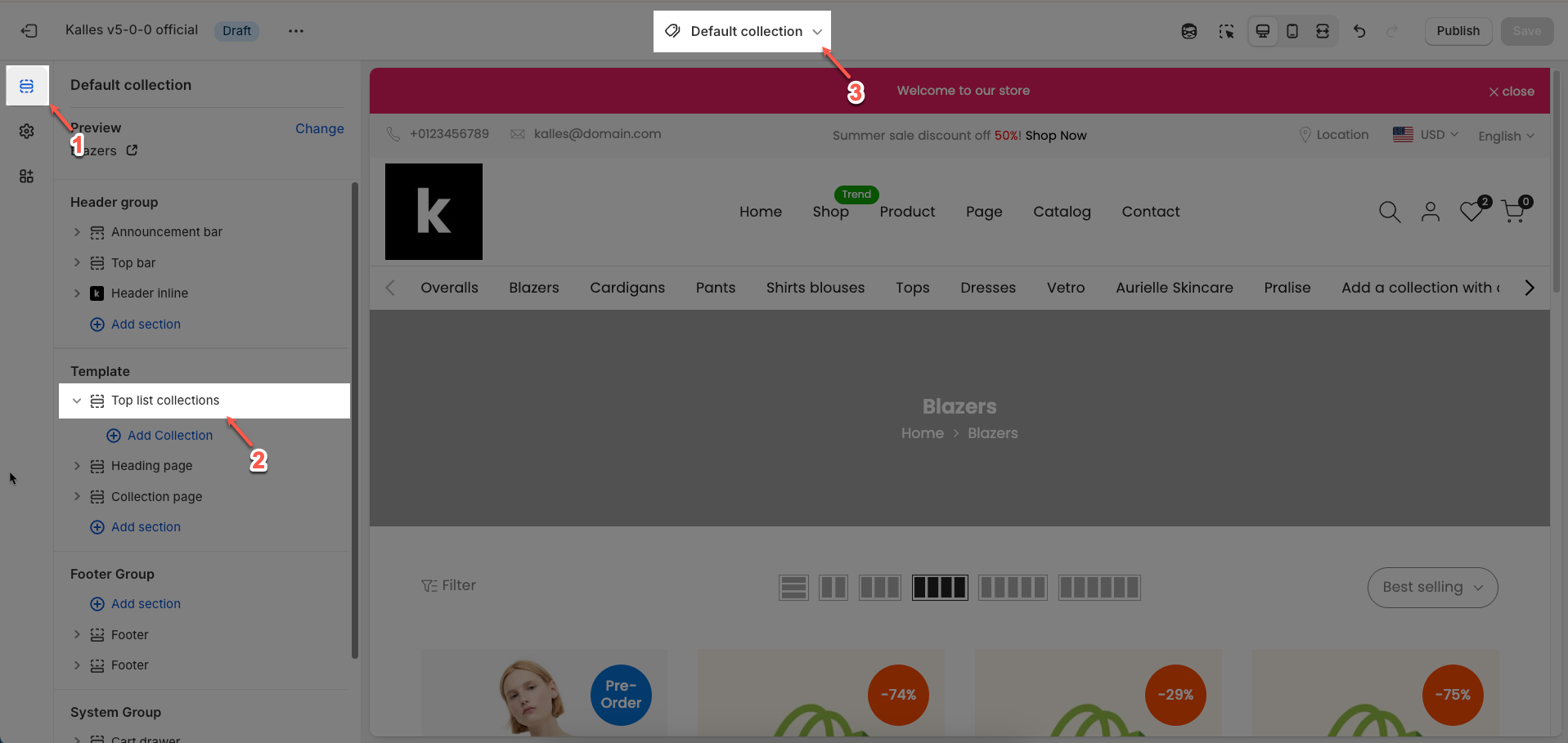
Step 02: In the theme editor (Customize), click to open dropdown pages in the topbar > select Collections > select Default collection > In the Sections tab, scroll and find Top list collections or add Top list collections section in Template
2. How to customize the Top list collections section?
2.1. Top list collections section
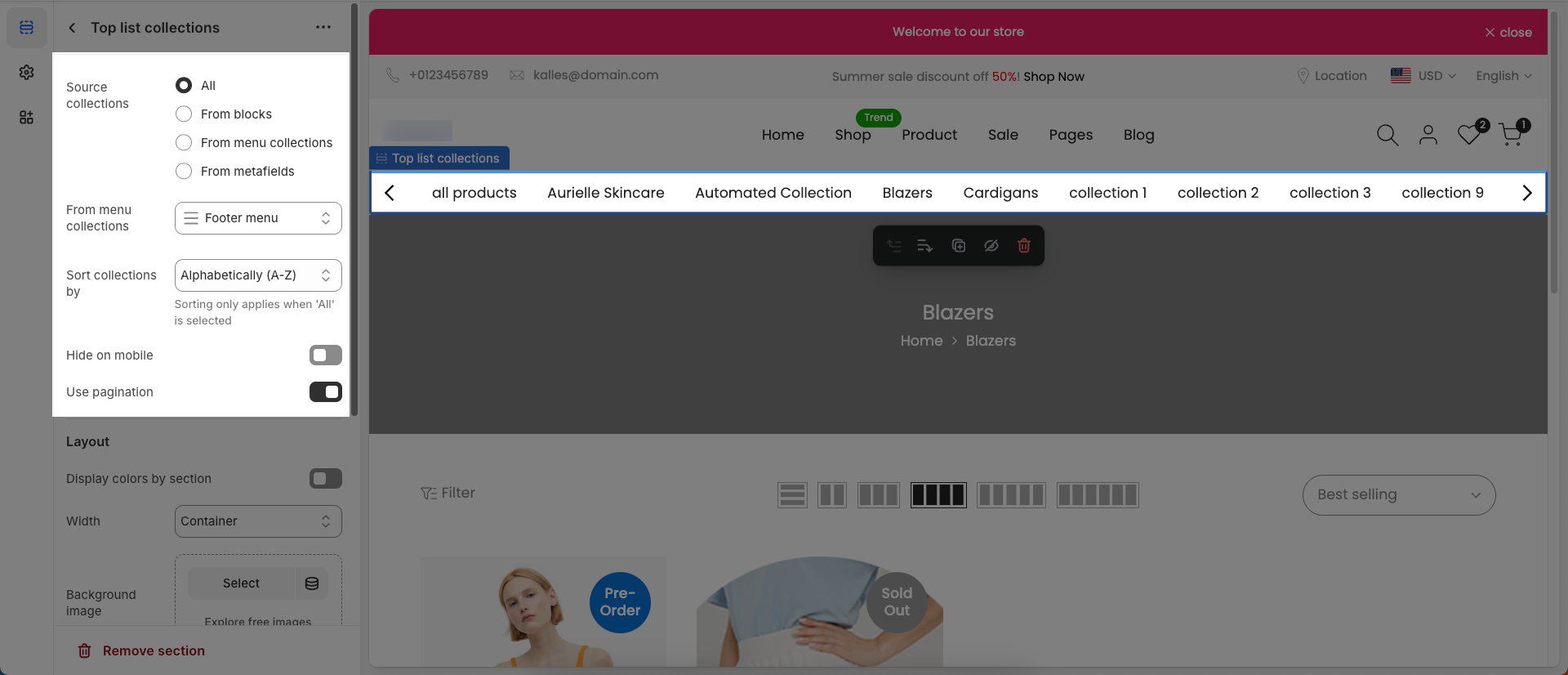
After adding the Top list collections section, you can customize its settings in the left or right sidebar (depending on your screen size)
Source collections: Select the method to determine which collections will be displayed in this section.
All: Displays all available collections in your store.
From blocks: Displays only the collections you have manually added via the section's blocks in the theme editor.
From menu collections: Displays collections linked to a specific menu item (e.g., a category dropdown menu).
From metafields: Displays collections defined through a dynamic metafield field. This is an advanced option for more complex use cases.
From menu collections: (Only applies when
Show typeis Menu collections) Select the navigation menu from which collections will be sourced for displaySort collections by: Select the sorting criteria for the displayed collections (High to low - Product count, Low to high - Product count, Alphabetically A-Z, Alphabetically Z-A, New to Old - Date, Old to New - Date)
Sorting only applies when 'All' is selected
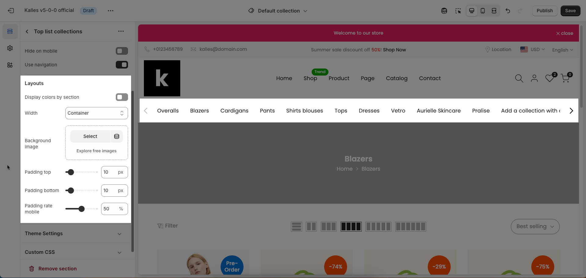
Hide on mobile: Enable this option to hide this entire section on mobile devices
Use navigation: Enable this option to display navigation controls for the section, such as arrows (next/prev)
Layouts
Display colors by section: Enable this option to allow each section to manage its own color scheme independently
Color scheme: Select the color scheme that will be applied to this section. A color scheme typically includes settings for background color, primary text color, secondary text color, and other accent colors
Background section overlay: Select a color overlay that will be applied on top of the section's background
Width (Container, Wrap container, Full width): Select the width of the content within the section.
Container: The content will be confined within a fixed-width (or max-width) container defined by your global theme settings.
Wrap container: The content will be enclosed in a slightly wider container than the default, but still with limits.
Full width: The content will span the entire width of the browser viewport, ignoring any container constraints.
Background image: Upload an image to be used as the background for this entire section. This helps create a prominent and engaging visual element.
Top padding: Enter the value for the top padding of the element (unit: pixels). This padding creates space between the top edge of the content and the top edge of the element.
Bottom padding: Enter the value for the bottom padding of the element (unit: pixels). This padding creates space between the bottom edge of the content and the bottom edge of the element.
Theme Settings
Page width: Defines the maximum width of the page content, influencing layout and display on various devices.
Custom CSS
Allows users to customize by adding CSS rules, beyond the limitations of default settings. This allows for fine-tuning the design to every detail, to suit specific needs.
Add custom styles to this section only.
To add custom styles to your entire online store, go to theme settings for detailed instructions.

2.2. Collection block
To add a Collection block to the Top list collections section, click the Add block button (plus icon ➕) under the Top list collections section.
After adding the Collection block, you can adjust its settings using the sidebar—located on the right or left side of your screen depending on your device
Only applies when
Show typeis Added Collections
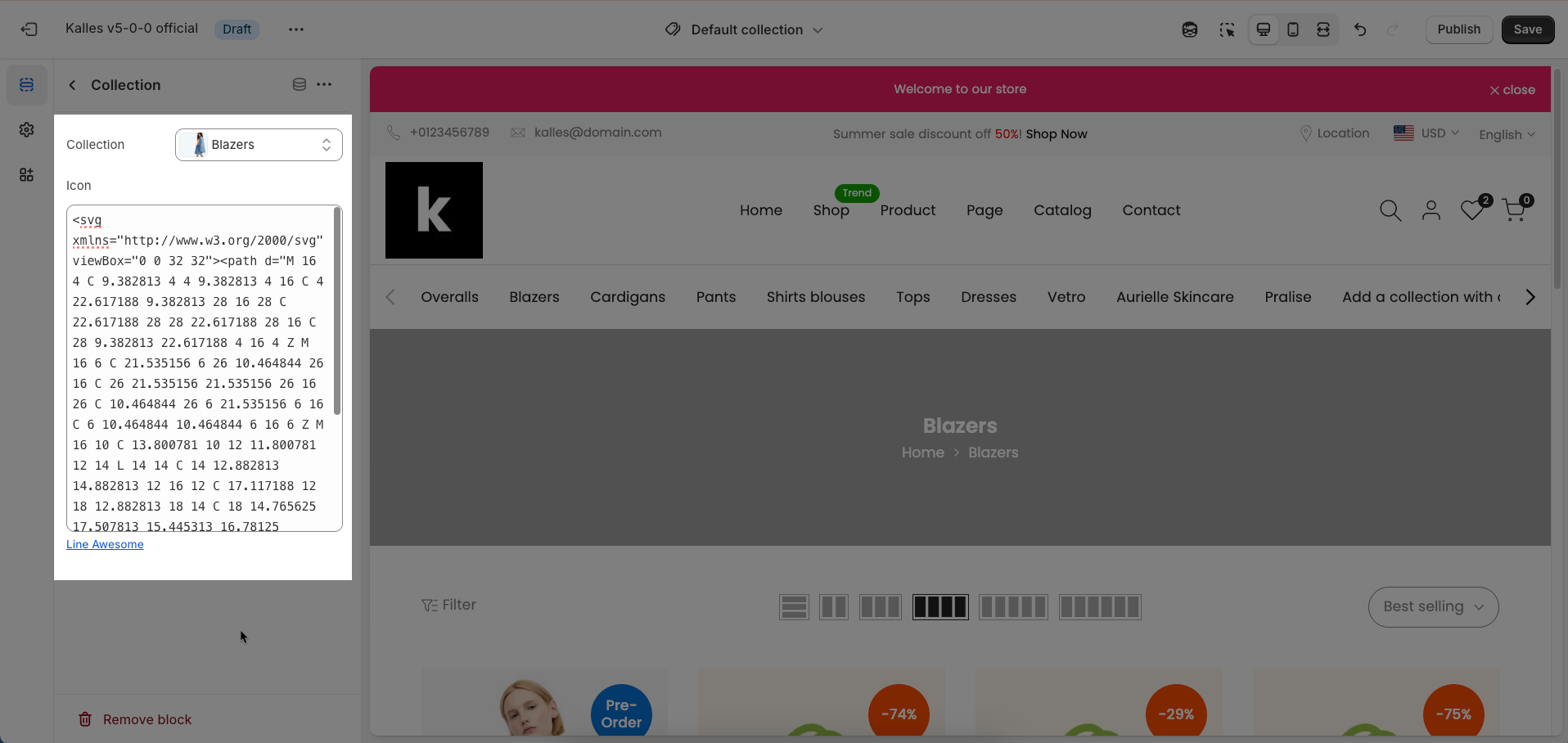
Collection: Select the product collection that you want to associate with this element
Icon: Select the icon to be displayed with or within this element. Icons help enhance visual appeal and user recognition