


The Hero Image section is designed to create a strong visual impact at the top of the homepage. It typically includes a large background image, headline text, supporting description, and a call-to-action button. This section is ideal for highlighting promotions, featured products, or key brand messaging. It helps grab the visitor’s attention immediately and directs them to explore your offerings further.

1. How to access the Hero image section?
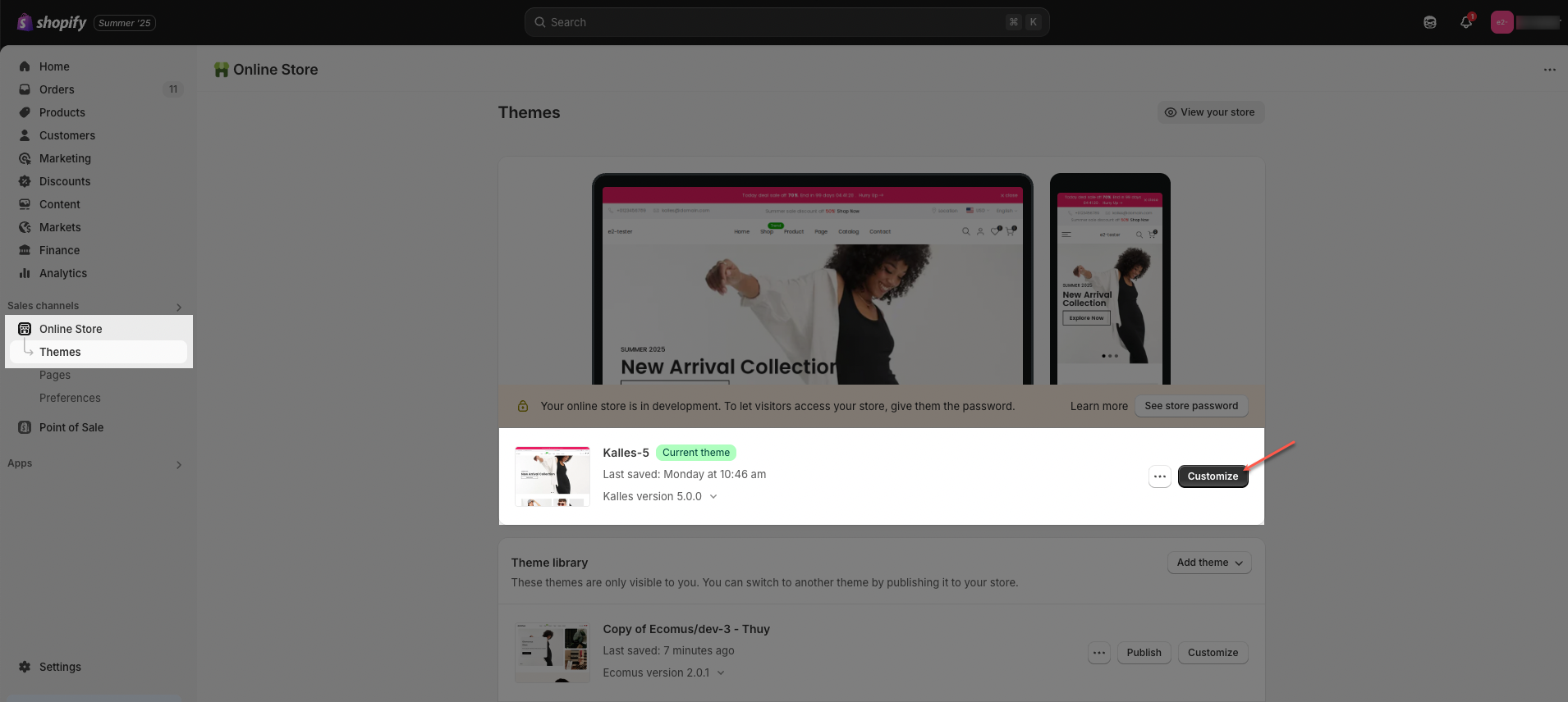
Step 01: From Shopify Admin, click on Online Store > Select Themes > In the Current theme section, click the Customize button.
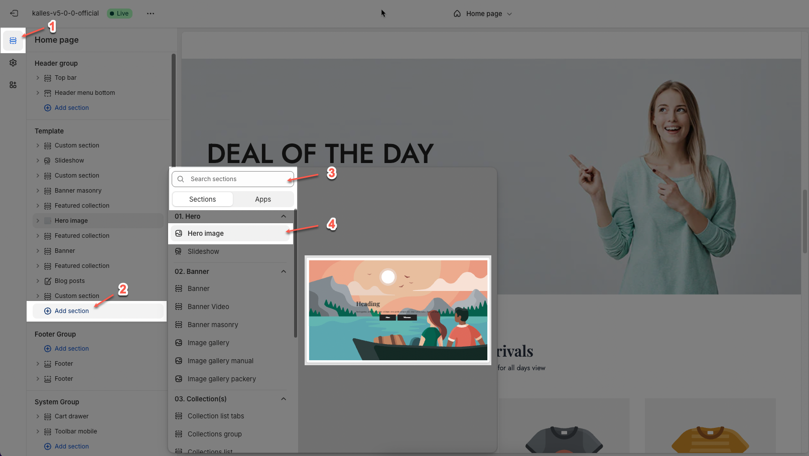
Step 02: In the theme editor (Customize), click the Sections button > Click the Add section button > In the Sections tab, scroll through the list or use the search bar to find and select Hero image.
2. How to customize the Hero image section?
2.1. Blocks in the Hero image
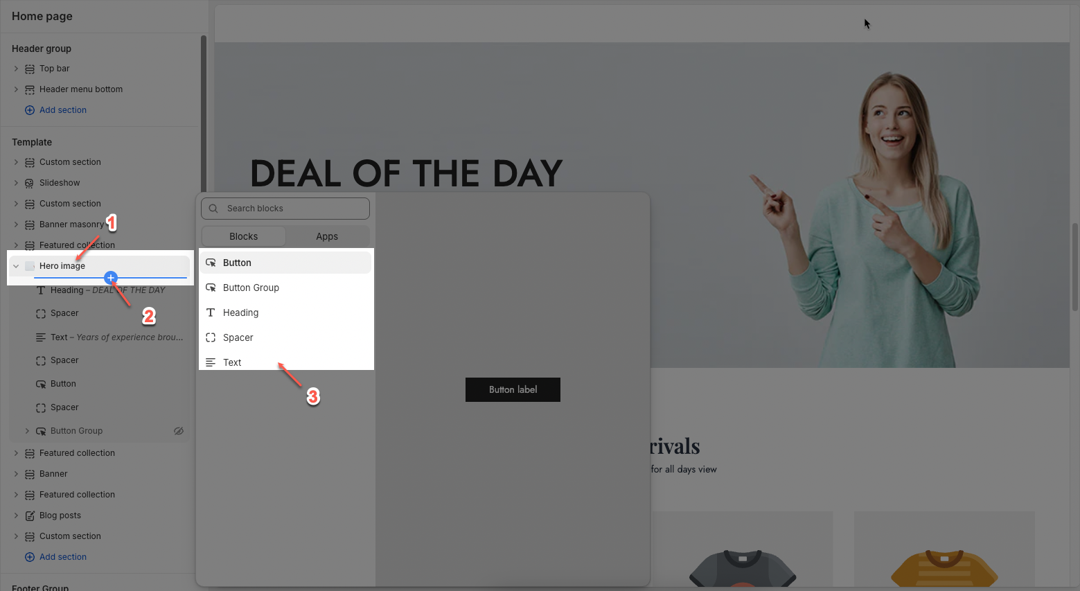
In the Hero image section, you can add various blocks such as Heading, Text, Button, Button Group and Spacer to enhance the layout and design.
Click on Hero image section > Add block (plus icon ➕) > Select the block you can add.
2.1.1. Heading
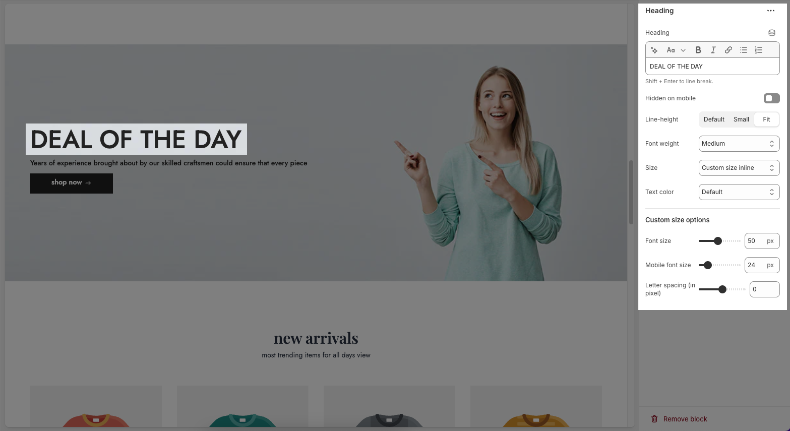
Heading: Allows you to enter and format the text (bold, italic, underline, lists, links, etc.). Shift + Enter to line break.
Hidden <br> on mobile: Disables line breaks on mobile devices.
Line height: Adjusts the spacing between lines of text. Options include: "Default", "Small", "Fit".
Size: Lets you select sizes for the heading.
Text color: Allows you to set the text color.
Custom size options:
Font size: A slider and input field to set the font size (e.g., 50 px) for regular (desktop) viewing.
Mobile font size: A slider and input field to set the font size (e.g., 24 px) specifically for mobile devices.
Letter spacing (in pixel): A slider and input field to adjust the spacing between individual characters (e.g., 0 pixels).
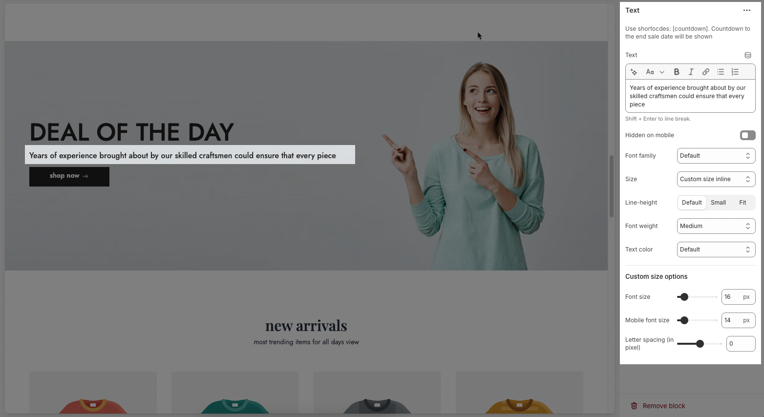
2.1.2. Text
Text: This is where you input the main text content
Shift + Enter to line break.
Use shortocdes: [countdown]. Countdown to the end sale date will be shown
Hidden <br> on mobile: Disables line breaks on mobile devices.
Hidden on mobile: A toggle switch. If enabled, the text content will not be displayed on mobile devices.
Font family: A dropdown menu to select the typeface for the text. "Default" is currently selected.
Size: Controls font size, options include such as Small, Medium, Large, ... and "Custom size inline" for specific settings.
Line-height: Adjusts the vertical spacing between lines of text. Options include "Default", "Small", and "Fit".
Font weight: A dropdown menu to choose the thickness or boldness of the font.
Text color: A dropdown menu to set the color of the text. "Default" is currently selected.
Date countdown: An input field or date picker where you can set the exact date and time for the countdown to end (e.g., "2025-09-30 15:00:00").
Text day countdown: An input field where you define the text to display for the "days" unit of the countdown.
Effect slider: This likely refers to the transition effect for the content, with options like "Fade" or "Slider" currently selected.
Autoplay speed in seconds: A slider and input field to set the duration (in seconds) before the next slide or item in the "slider" effect appears.
Set is '0' to disable autoplay
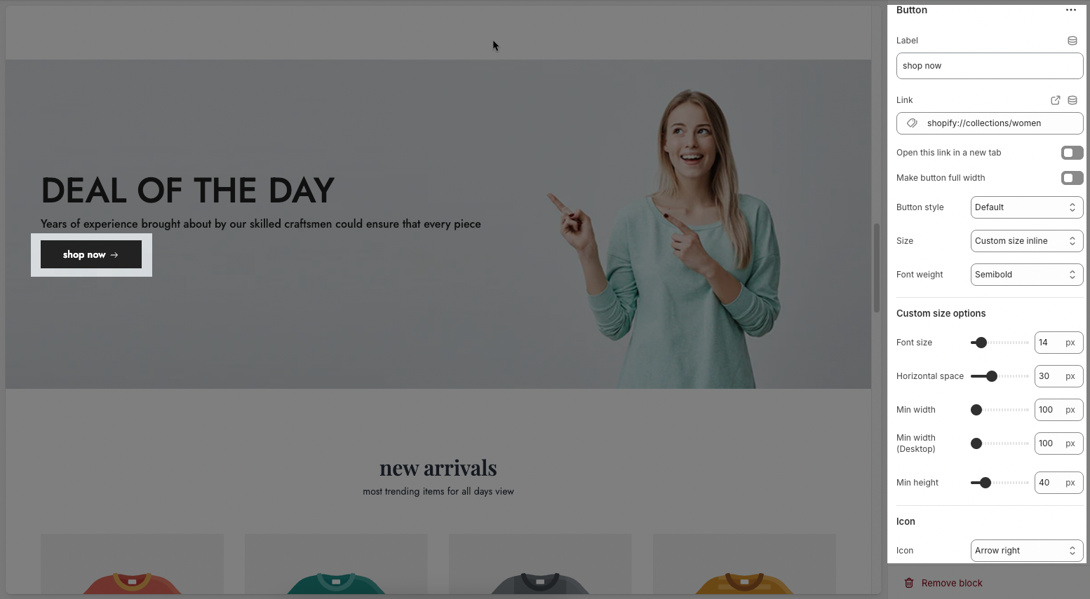
2.1.3. Button
Label: Defines the text displayed on the button.
Link: Specifies the destination URL when the button is clicked.
Open this link in a new tab: Opens the link in a new browser tab when enabled.
Make button full width: Expands the button to take up the full width of its container.
Style: Choose between Solid, Outline, or Link styles for different visual effects.
Size: Adjusts the button size (e.g., Extra Large, Medium, etc.).
Font weight: Controls the thickness of the button text (e.g., Normal, Bold).
Custom Size Options:
Font size: Adjusts the heading size for desktop.
Tablet font size: Adjusts the heading size for table.
Mobile font size: Adjusts the heading size for mobile.
Font weight: Controls the thickness of the text (e.g., 600 is semi-bold).
Letter spacing: Adjusts the space between characters.
Icon:
Icon: Select the icon to display on the button (e.g., arrow, plus, etc.).
Icon position: Choose whether the icon appears Before or After the button text.
Icon size: Adjust the size of the icon in pixels.
Icon spacing: Set the spacing between the icon and the text to ensure proper alignment and readability.
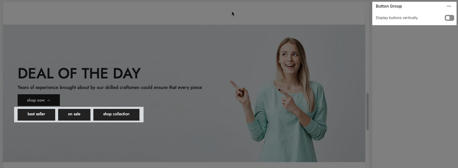
2.1.4. Group Button
The Button Group block allows you to display multiple call-to-action buttons together within a section. This feature helps guide users toward different actions, such as shopping collections or viewing offers.
Display buttons vertically: This toggle option controls the button layout. When enabled, buttons stack vertically (one on top of the other) instead of the default horizontal layout (side by side). It’s useful for mobile views or when you want a more compact, column-style arrangement.
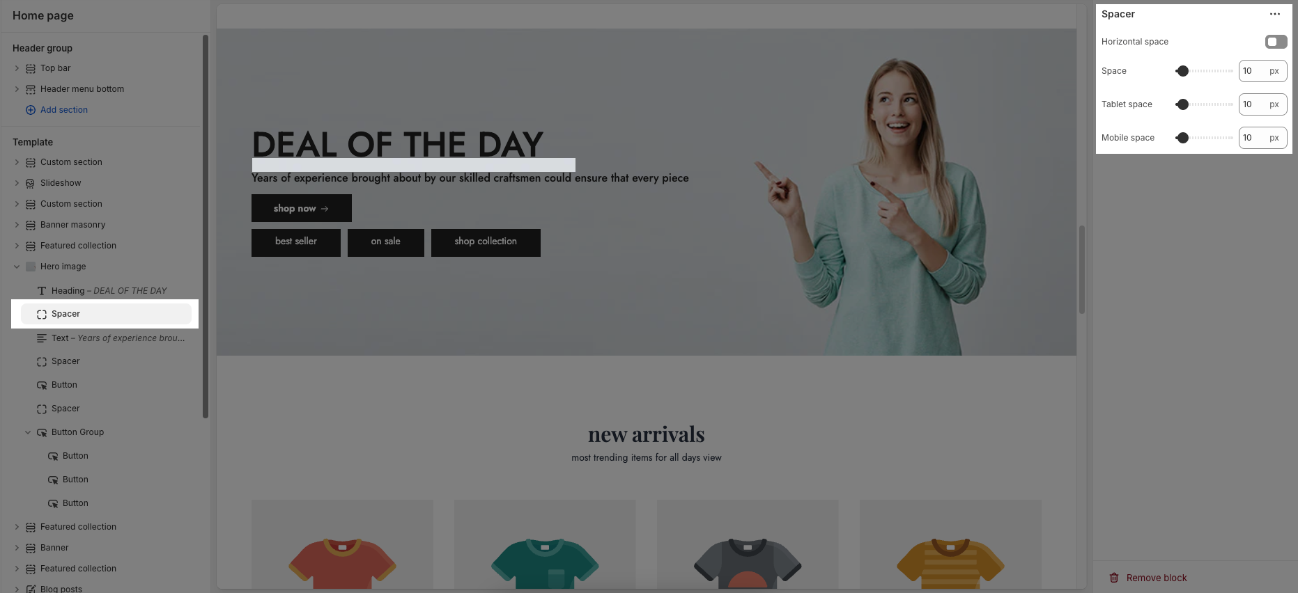
2.1.5. Spacer
Horizontal space: If enabled, the spacer will also add horizontal spacing instead of only vertical spacing.
Space: Adjusts the amount of space (in pixels) on desktop screens.
Tablet space: Defines the amount of space for tablet devices, ensuring responsive spacing.
Mobile space: Sets the spacing specifically for mobile screens.
2.2. Hero image section
2.2.1. Hero image
Here’s how you can customize the Hero image section to best fit your content and layout. Below are the available options for customization:
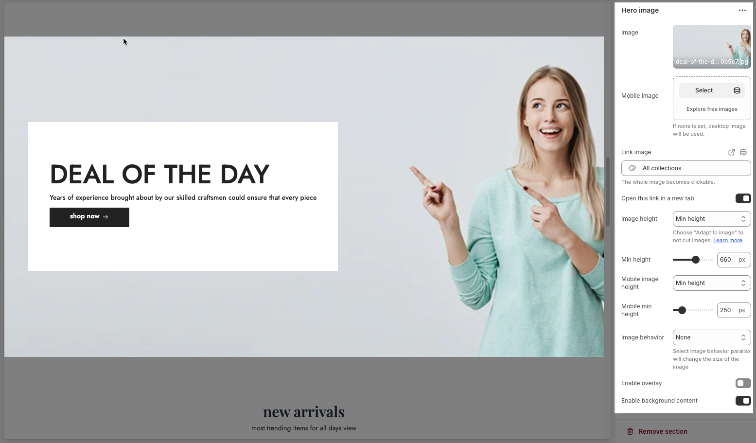
Image: This section allows you to select a desktop image.
Select: Click this button to choose an image from your files or a library.
Explore free images: This option suggests finding images that are available for free.
Mobile image: This section is for selecting an image specifically for mobile devices.
If you don't choose a separate mobile image, the desktop image will be displayed on mobile devices.
Link image: In this input field, you can paste a URL or type a search query to link the image to. And the whole image becomes clickable.
Open this link in a new tab: This is a toggle switch. When enabled (switch to the right), clicking the linked image will open the destination URL in a new browser tab or window. When disabled (switch to the left), the link will open in the current tab/window.
Image height: This controls how the image scales vertically. Options include: Adapt to image, Fill screen height, and Min height. You can choose "Adapt to image" to not cut images.
Min height: This sets the minimum height for the image.
Mobile image height: Similar to "Image height," this controls how the image scales vertically for mobile devices.
Mobile min height: This sets the minimum height for the image for mobile devices.
Image behavior: This defines how the image interacts with scrolling or other elements. Options include: None, Parallax, and Ambient movement. Select image behavior parallax will change the size of the image.
Enable overlay: This is a toggle switch. When enabled, it likely adds a semi-transparent layer on top of the image, which can be used for text, icons, or other visual effects.
Enable background content: This is a toggle switch. When enabled, background added behind the content.
2.2.2. Desktop
Content position: This dropdown menu allows you to control the vertical positioning of the content on desktop screens. Example:
Top: Align the content to the top of the slider area.
Center: Centers the content vertically within the slider area.
Bottom: Align the content to the bottom of the slider area.
Text alignment: This set of three buttons controls the horizontal alignment of the content on desktop screens.
Left align (first button): Aligns the content to the left side of the slide.
Center align (second button): Centers the content horizontally within the slide.
Right align (third button): Aligns the content to the right side of the slide.
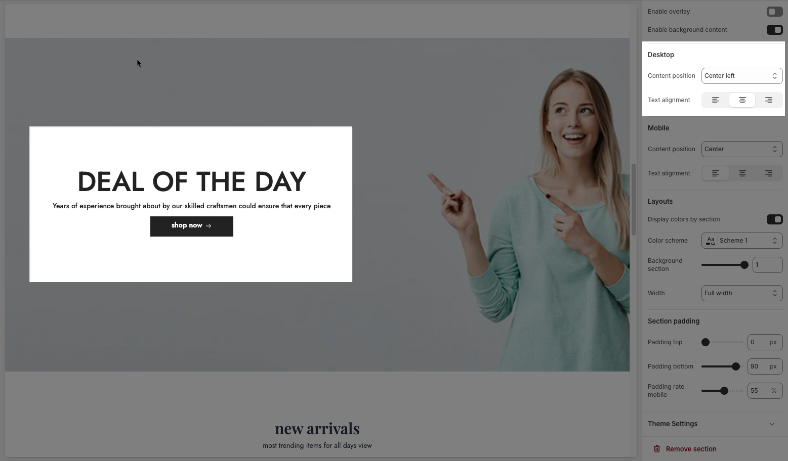
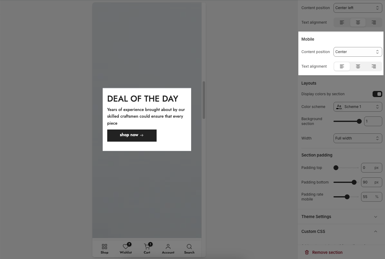
2.2.3. Mobile
Content position: This dropdown controls the vertical positioning of the content on mobile devices. This allows for different layouts on smaller screens.
Top: Aligns the content to the top on mobile.
Center: Centers the content vertically on mobile.
Bottom: Aligns the content to the bottom on mobile.
Text alignment: Similar to the desktop "Text alignment," these three buttons control the horizontal alignment of the content on mobile devices.
Left align (first button): Aligns the content to the left side on mobile.
Center align (second button): Centers the content horizontally on mobile.
Right align (third button): Aligns the content to the right side on mobile.
2.2.4. Layouts
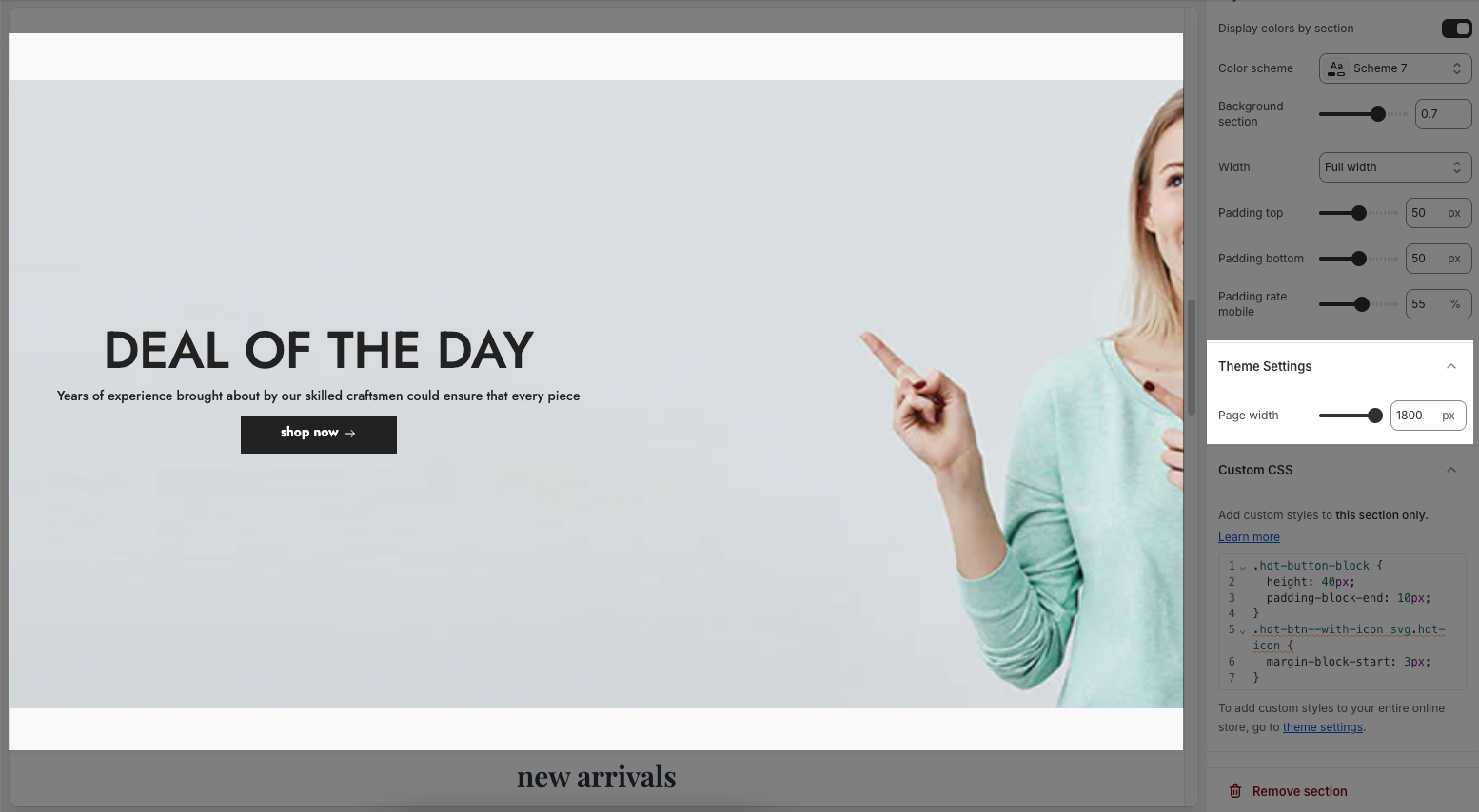
Display colors by section: Enables section-specific color styling based on the selected scheme.
Color scheme: Choose a predefined color palette for the section.
Background section overlay: Adjusts the transparency level (0–100%) of a dark or colored overlay above the background.
Width: Sets the section’s width (e.g., Container, Wrap container, Full width).
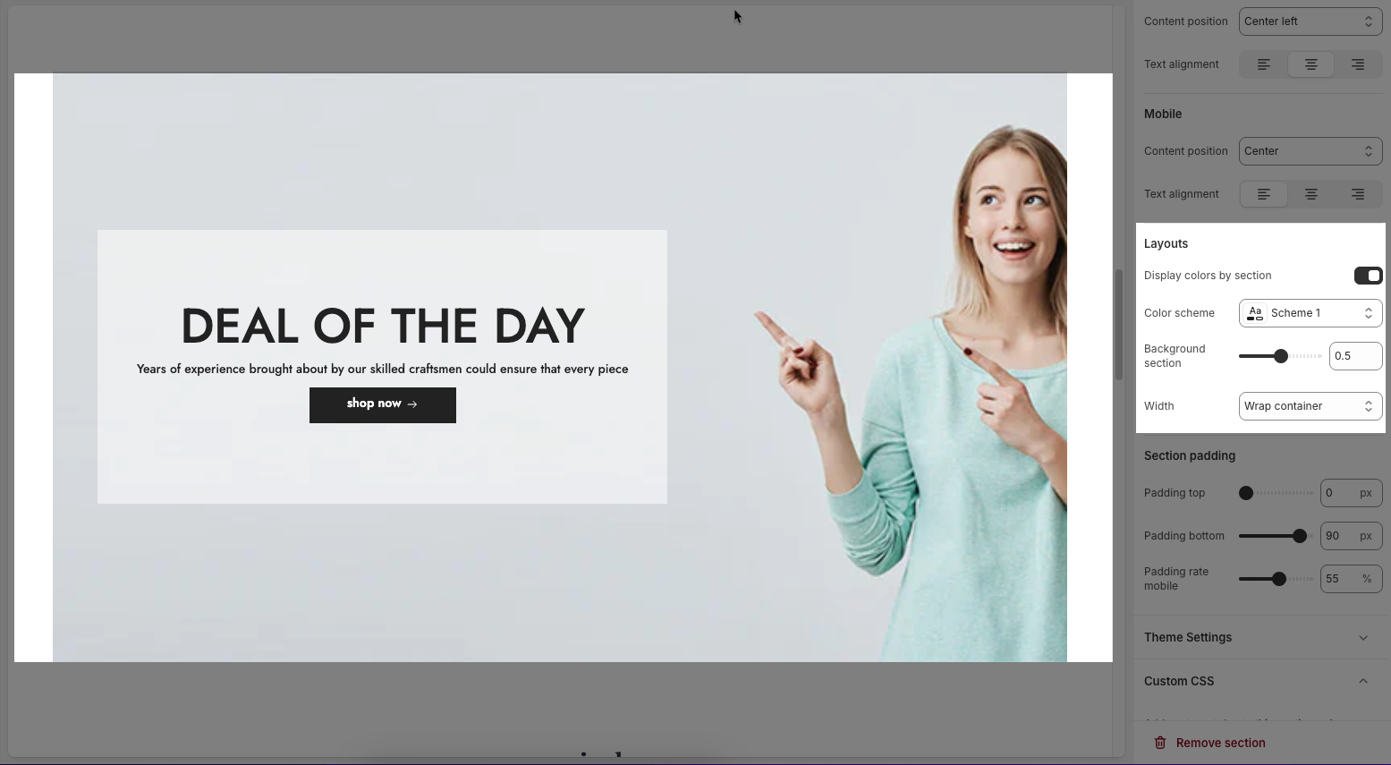
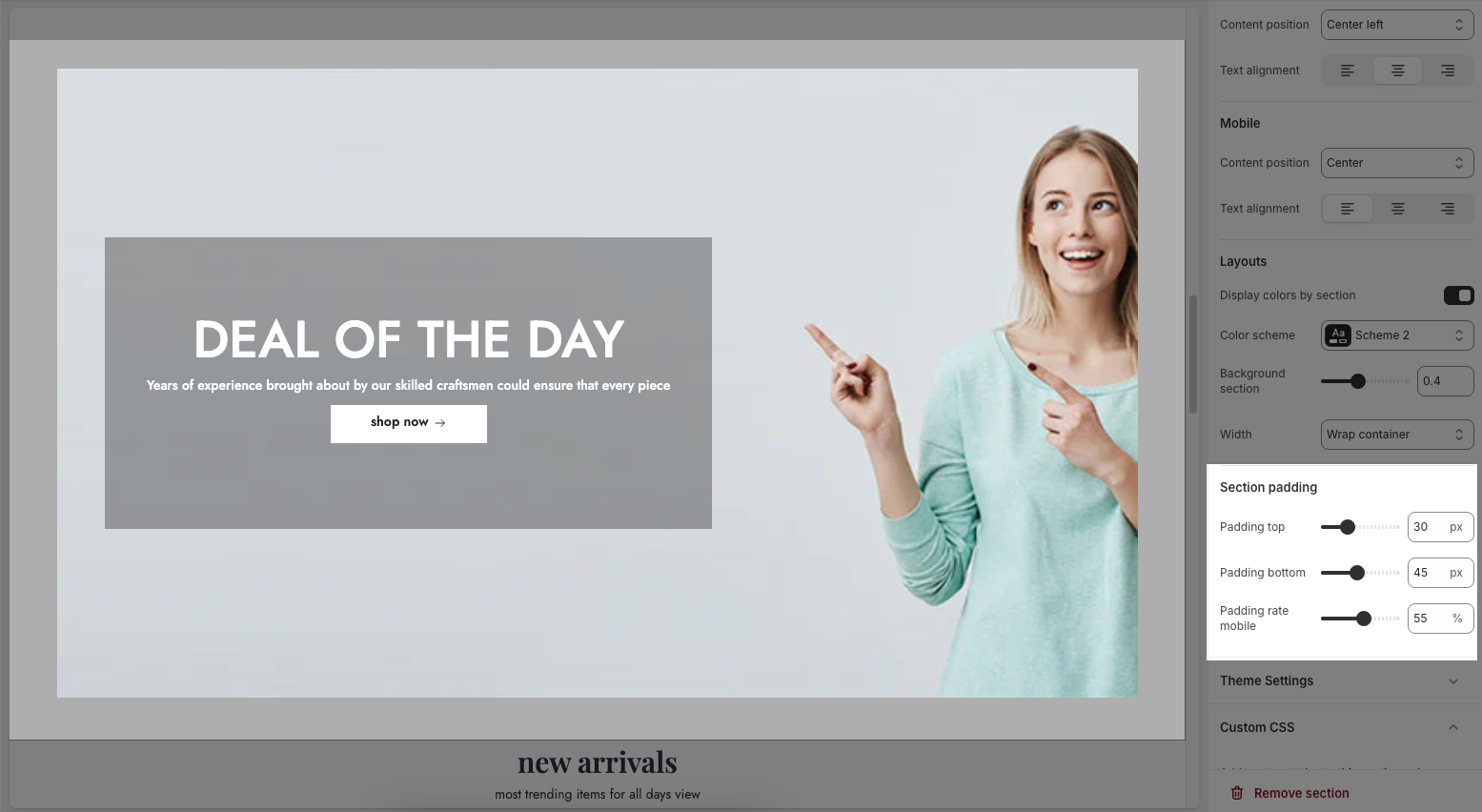
2.2.5. Section padding
Top padding: Sets the vertical spacing (in pixels) above the section.
Bottom padding: Sets the vertical spacing (in pixels) below the section.
Rate padding (mobile): Defines the vertical padding as a percentage for mobile devices, allowing responsive spacing.
2.2.6. Theme settings
Page width: defines the maximum width of the main content area on the website.
2.2.7. Custom CSS
Allows users to customize by adding CSS rules, beyond the limitations of default settings. This allows for fine-tuning the design to every detail, to suit specific needs.
Add custom styles to this section only.
To add custom styles to your entire online store, go to theme settings for detailed instructions.


