


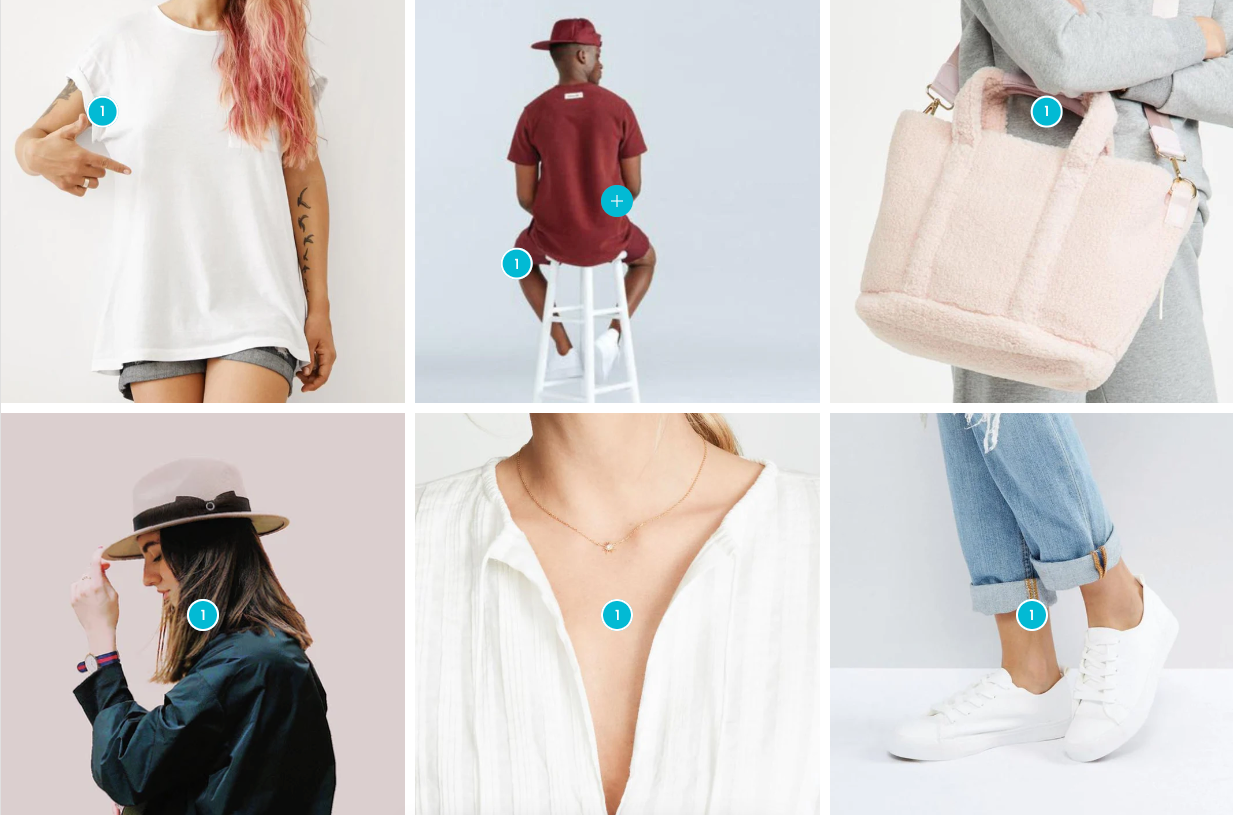
The Lookbook section is a visually engaging part of your homepage designed to showcase curated product collections or featured styles. It allows you to pair compelling images with product pins, helping customers explore and shop specific looks directly.
1. How to access the Lookbook section?
Step 01: From Shopify Admin, click on Online Store > Select Themes > In the Current theme section, click the Customize button.
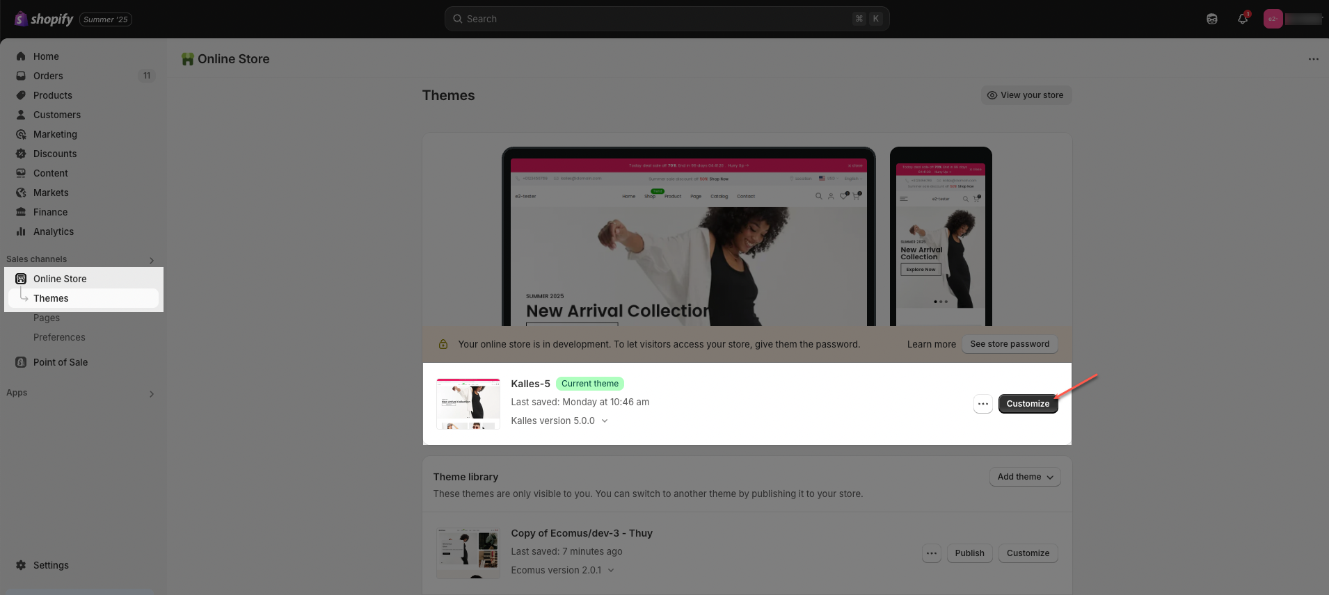
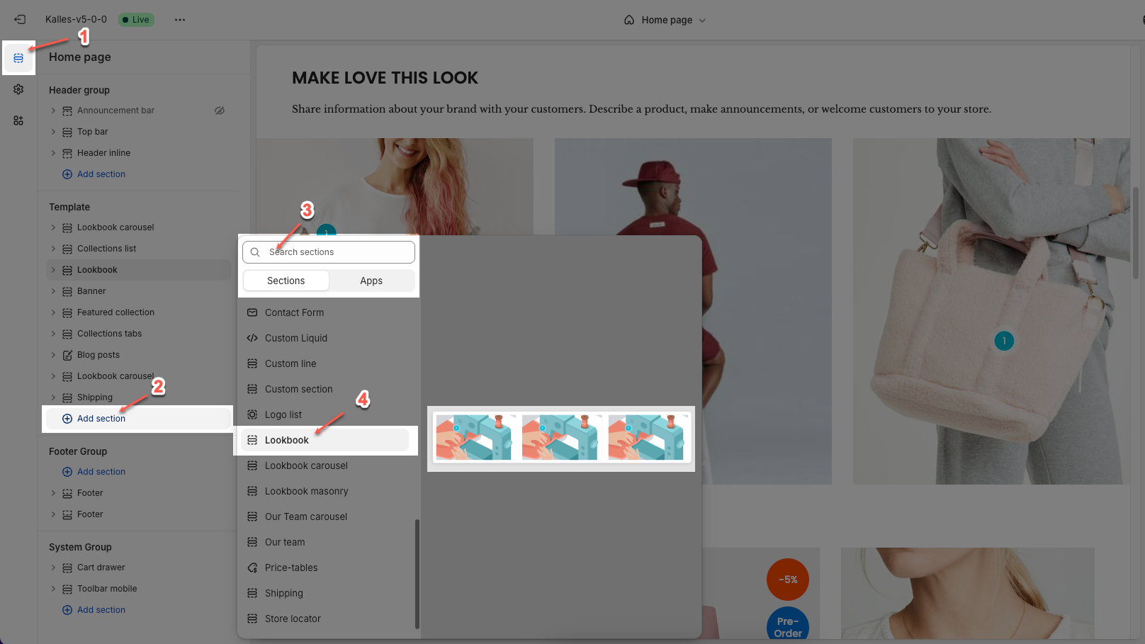
Step 02: In the theme editor (Customize), click the Sections button > Click the Add section button > In the Sections tab, scroll through the list or use the search bar to find and select Lookbook.
2. How to customize the Lookbook section?
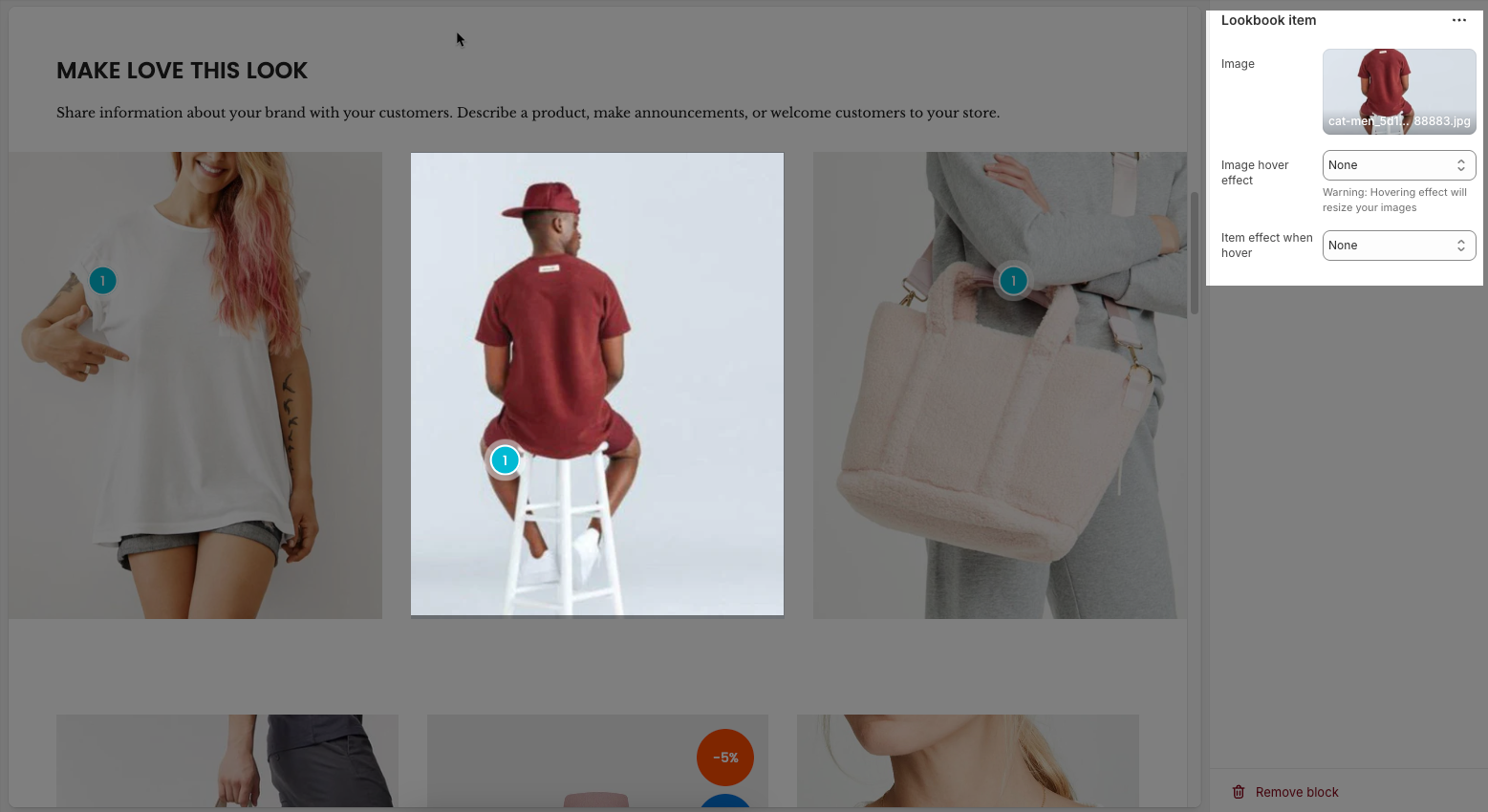
2.1. Lookbook item
A Lookbook Item is a component within the Lookbook that allows you to add hotspots on an image to display product details or direct users to a product page.
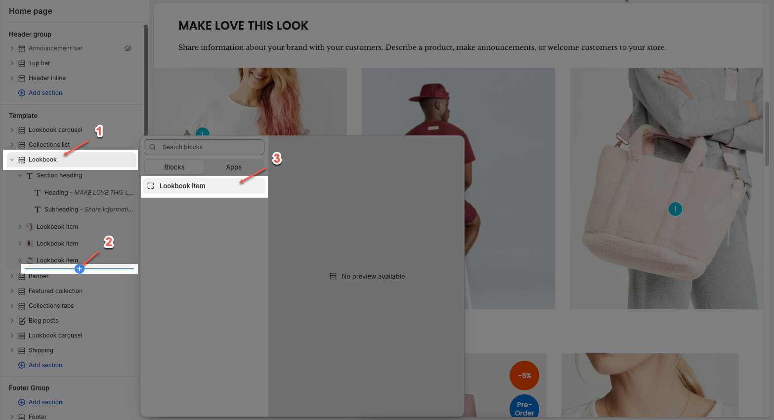
Click on Lookbook section > Add block (plus icon ➕) > Lookbook item block
You can customize a lookbook item with options bellow:
Image: Select the main image for the Lookbook Item.
Image Hover Effect: Allows you to apply effects when hovering over the image. Options may include zooming in, fading, or changing the image color.
Item Effect When Hover: Allows you to apply effects when hovering over the item, such as a running border effect or other visual effects.
There are 2 Pin blocks can add to the Lookbook item: Pin product and Pin text.
Click on Lookbook item block > Add block (plus icon ➕) > Pin product/ Pin text block
2.1.1. Pin product
The Pin Product feature allows you to add interactive hotspots to images, showcasing specific products with a pop-up display. Below are the customization options available for configuring a Pin product.
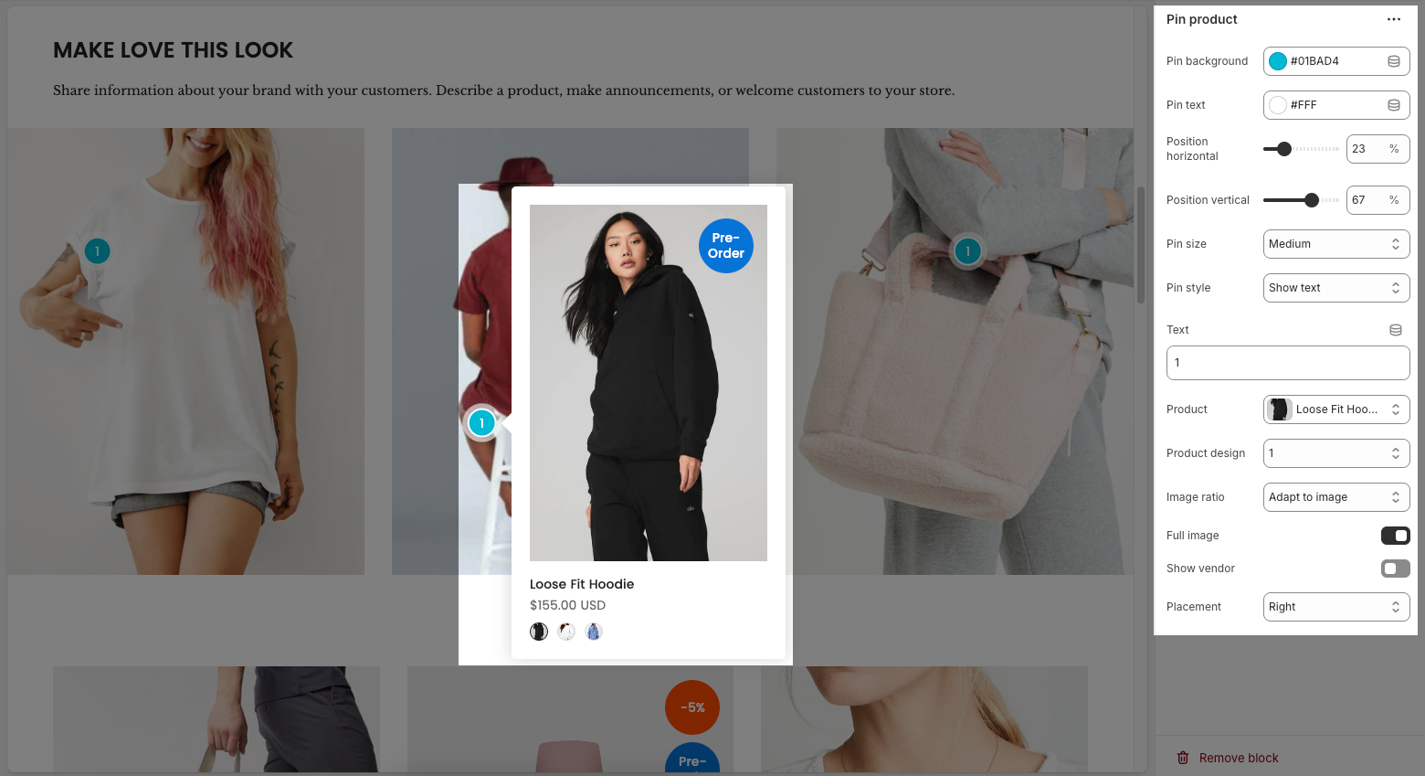
Pin background: Sets the background color of the pin
Pin text: Sets the color of the text on the pin
Position horizontal/vertical – Adjust the horizontal/vertical position of the pin on the image.
Pin size – Choose the size of the pin (small, medium, large).
Pin style – Select how the pin is displayed (icon only or with text).
Text – Enter the text displayed on the pin.
Product – Assign a product linked to the pin.
Product design – Choose how the product appears in the pop-up.
Image ratio – Select the image aspect ratio (square, landscape, portrait).
Full image – Enable/disable full product image display.
Show vendor – Enable/disable displaying the brand or vendor.
Placement – Choose where the pop-up appears (top, bottom, left, right of the pin).
2.1.2. Pin text
Below are the customization options available for configuring a Pin text:
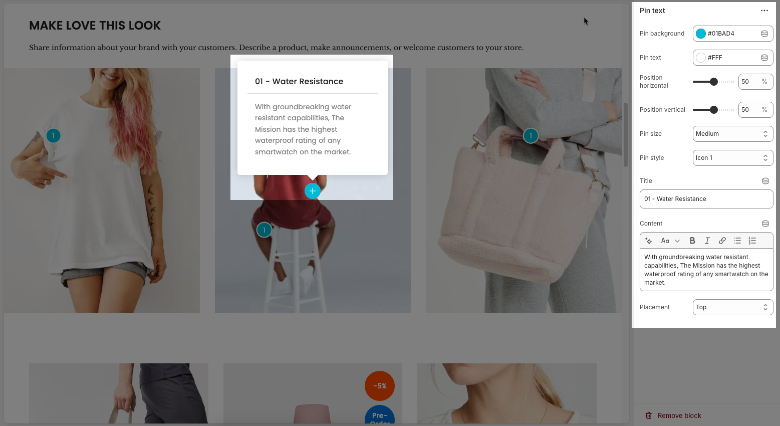
Pin background: Sets the background color of the pin
Pin text: Sets the color of the text on the pin
Position horizontal/vertical – Adjust the pin’s exact location on the image.
Pin size – Select the size of the pin (small, medium, large).
Pin style – Choose the icon style for the pin.
Title – Enter a heading for the text box.
Content – Provide a detailed description or information related to the pin.
Placement – Set the position of the text box relative to the pin (top, bottom, left, right).
2.2. Lookbook
The Lookbook allows you to visually present featured products or styles in an engaging and shoppable format, helping you tell a cohesive brand story while enhancing customer experience. Below are the customization options available:
2.2.1. Options layout
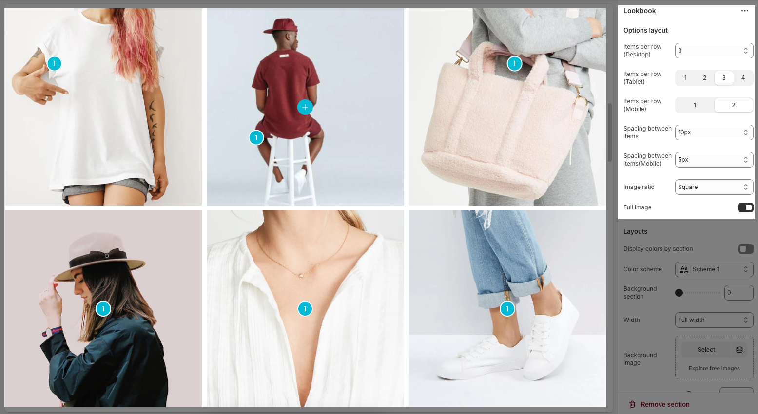
Items per row (Desktop): Sets how many items to show in one row on desktop view (e.g., 2 to 6 items).
Items per row (Tablet): Sets how many items to show in one row on tablet view (e.g., 1 to 4 items).
Items per row (Mobile): Sets how many items to show in one row on mobile view (e.g., 1 or 2).
Spacing between items: Controls the horizontal and vertical spacing between the collection items.
Spacing between items (Mobile): Controls the horizontal and vertical spacing between the collection items on mobile devices.
Image ratio: Controls the aspect ratio of images. Options include:
Adapt to image – Keeps the original aspect ratio of each image; no cropping or resizing.
Square – Forces all images into a 1:1 aspect ratio (equal width and height).
Portrait – Displays images in a vertical rectangle format (taller than wide).
ASOS – Uses a custom aspect ratio often seen on e-commerce sites like ASOS (typically taller than Square but shorter than Portrait).
Landscape – Displays images in a horizontal rectangle format (wider than tall).
Full image: Toggle on to fit the full image inside its container without cropping; off means the image may be cropped to fill space.
2.2.2. Layouts
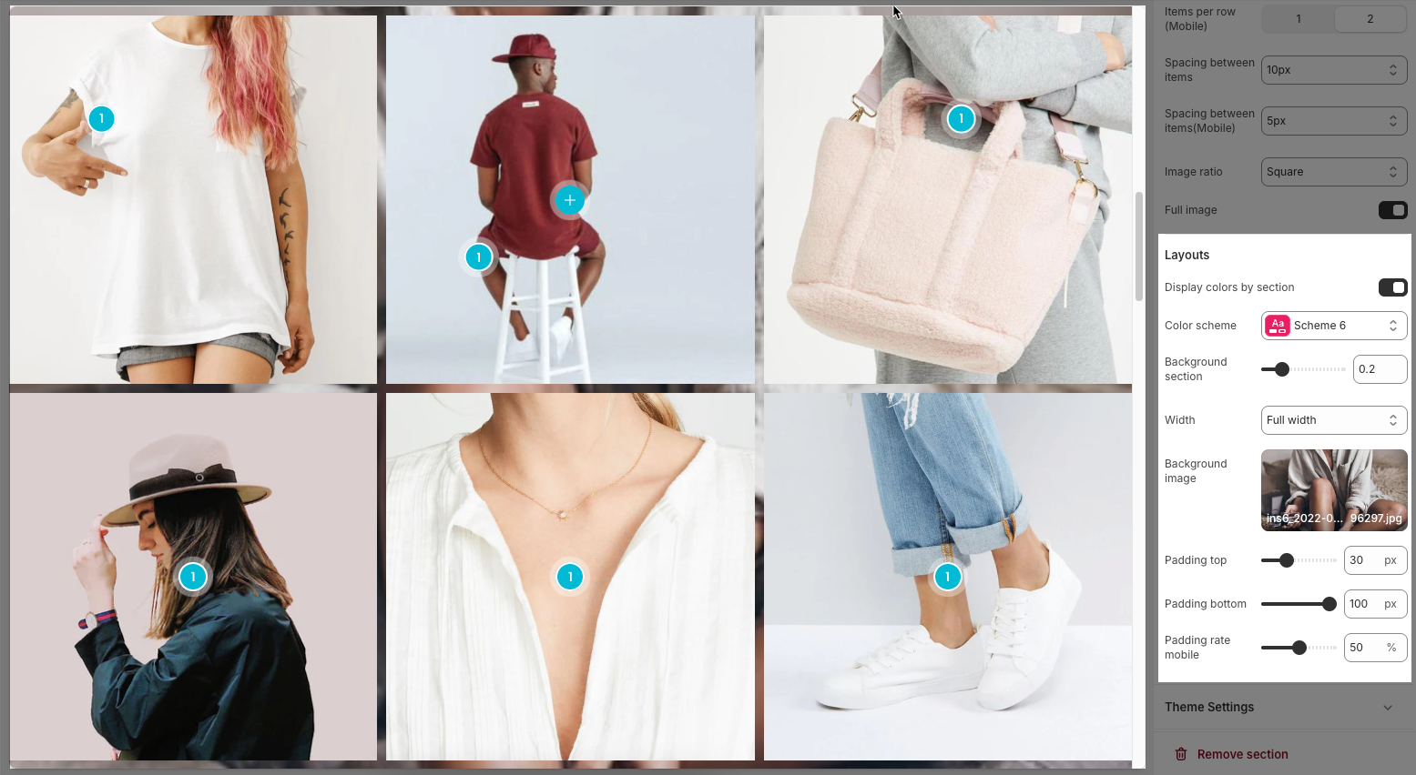
Display colors by section: Enables section-specific color styling based on the selected scheme.
Color scheme: Choose a predefined color palette for the section.
Background section overlay: Adjusts the transparency level (0–100%) of a dark or colored overlay above the background.
Width: Sets the section’s width (e.g., Container, Wrap container, Full width).
Background image: Allows you to select an image for the section background.
Padding top / bottom: Controls the vertical spacing (in px) above and below the content in the section.
Padding rate mobile: Sets the padding as a percentage for mobile layout to ensure responsiveness.
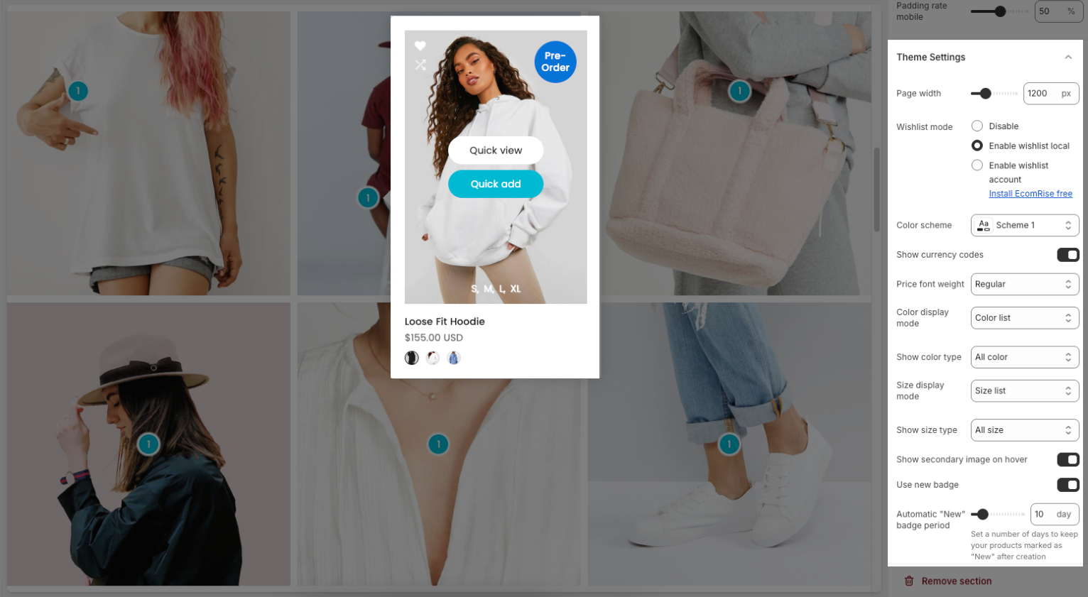
2.2.3. Theme settings
The Theme Settings panel allows you to control the global appearance and behavior of your store, including how products and product cards are displayed when added through Lookbook pins. From layout width and wishlist functionality to detailed product display options, these settings let you tailor the visual experience to match your brand and optimize how customers interact with featured items.
For detailed customization instructions, please refer to the Theme Settings – Product and Theme Settings – Product Card documentation.
2.2.4. Custom CSS
Allows users to customize by adding CSS rules, beyond the limitations of default settings. This allows for fine-tuning the design to every detail, to suit specific needs.
Add custom styles to this section only.
To add custom styles to your entire online store, go to theme settings for detailed instructions.


