


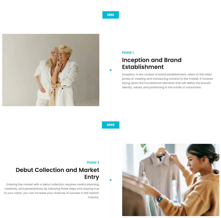
The Timeline section allows you to visually present key milestones or phases in your brand’s journey. Each timeline block includes a year marker, image, title, and descriptive text, offering a clean and engaging way to tell your story.
1. How to access the Timeline section?
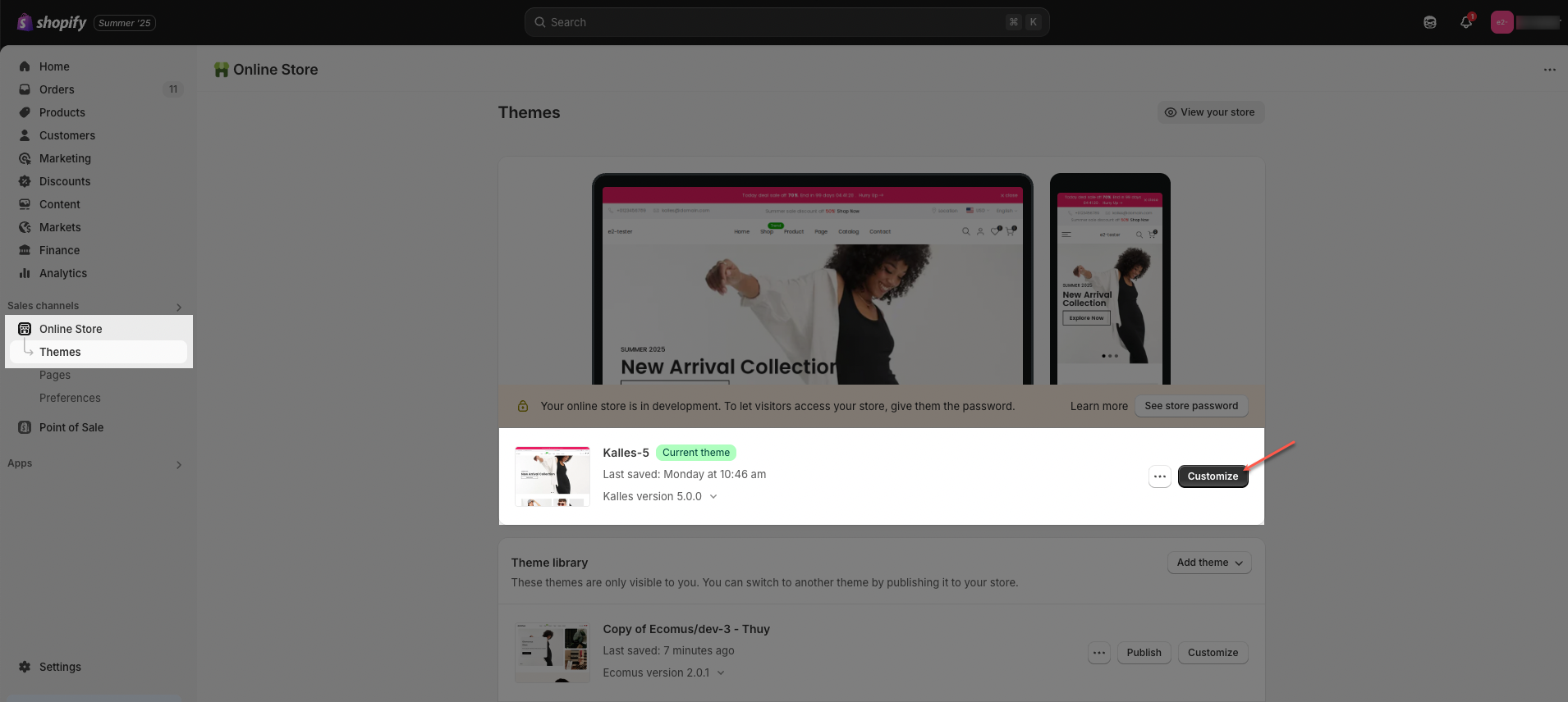
Step 01: From Shopify Admin, click on Online Store > Select Themes > In the Current theme section, click the Customize button.
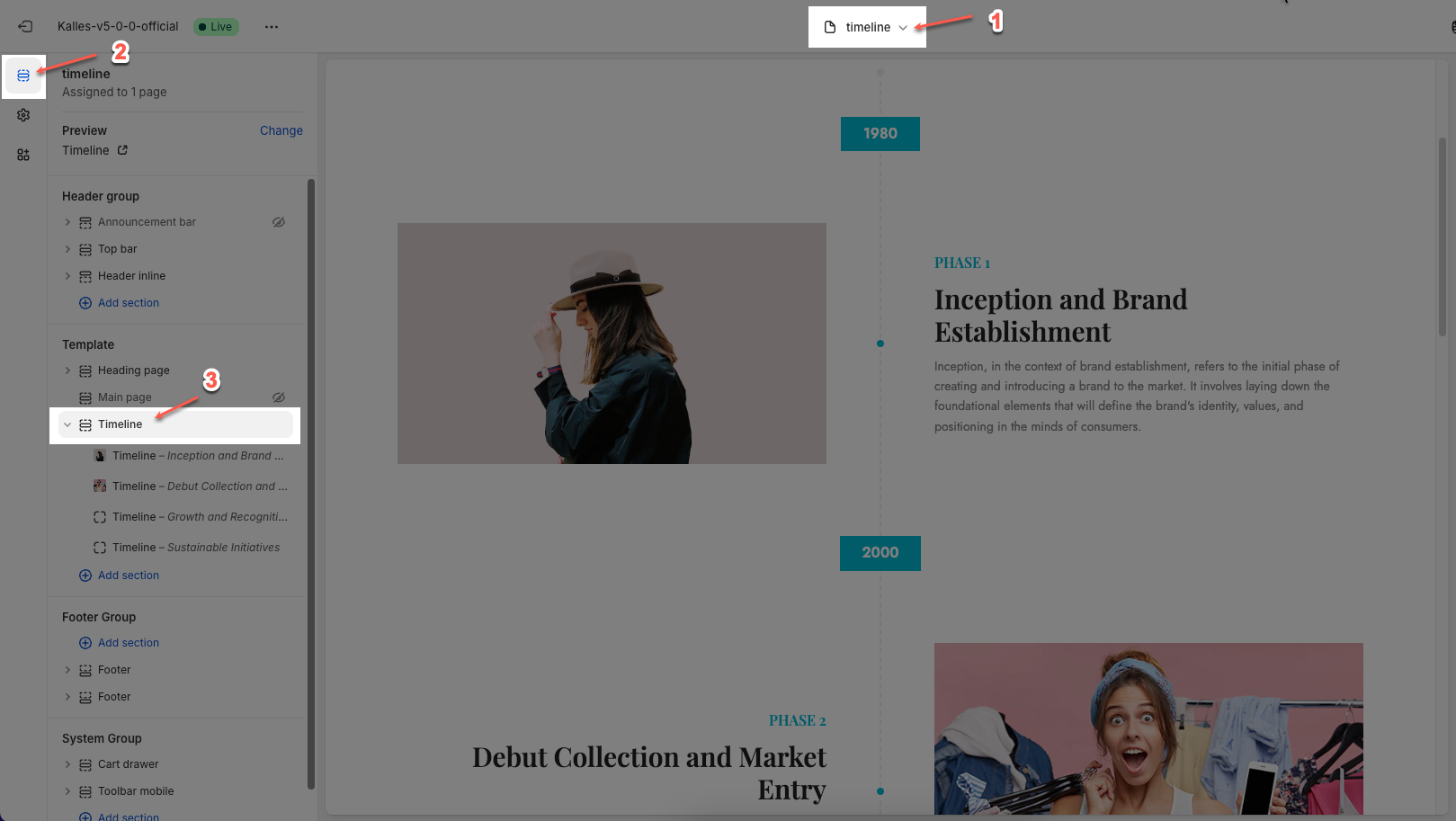
Step 02: In the theme editor (Customize), select Timeline page > click the Sections button > In the sidebar, scroll through the list and select Timeline.
The Timeline section allows you to be used across various types of pages: home page, product page, collection page,...
2. How to customize the Timeline section?
2.1. Timeline block
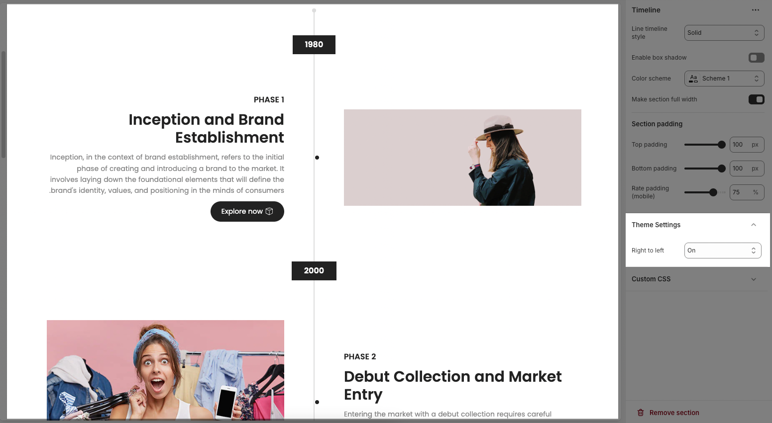
The Timeline section contains multiple timeline blocks, allowing you to present development stages, key events, or your brand story in a visual and coherent way.
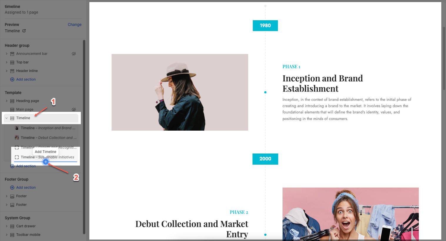
Click on Timeline section > Add block (plus icon ➕) > Timeline block
You can customize a Timeline block with the options below:
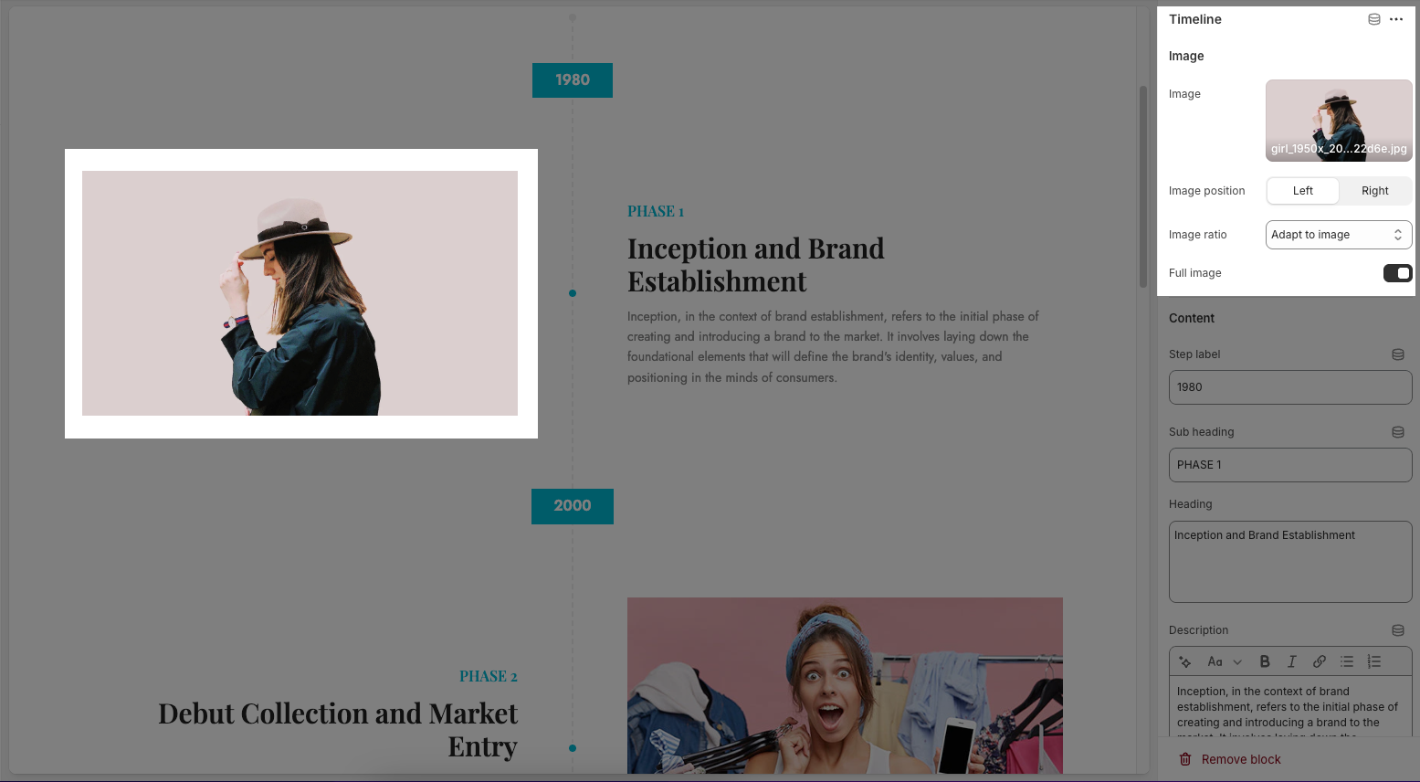
2.1.1. Image
Image: Upload or select an image to visually represent the timeline event. You can also browse free images from the library.
Image position (Left/Right): Choose whether the image appears on the left or right side of the content.
Image ratio: Adjust how the image is displayed (e.g., adapt to image size, square, landscape).
Full image toggle: Enable this to display the image in its full size instead of a cropped view.
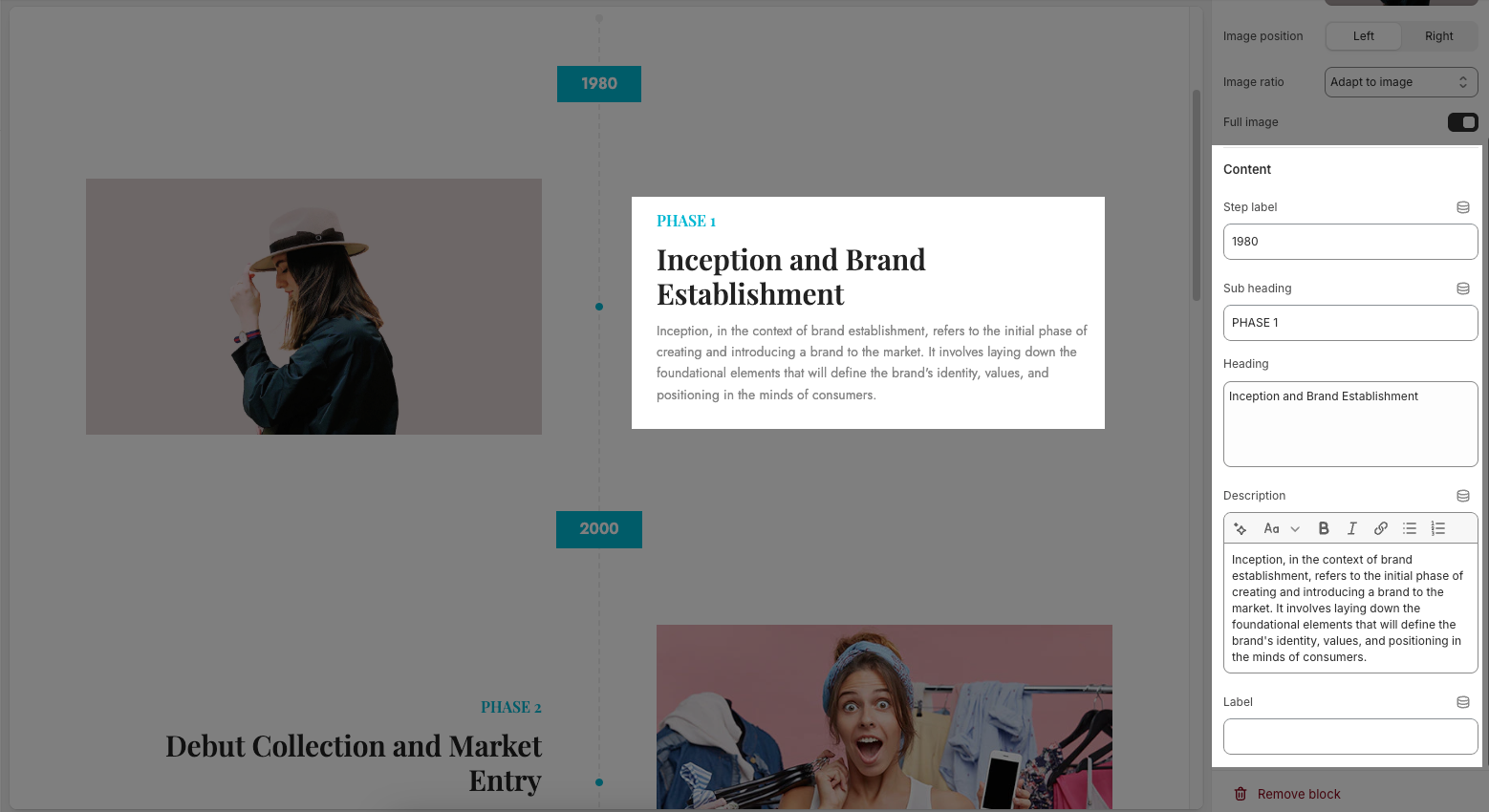
2.1.2. Content
Step label: This is typically used to mark the year or a specific milestone (e.g., "2010").
Sub heading: A short label for the timeline phase (e.g., "PHASE 3").
Heading: The main title of the block, usually a summary of the event or phase (e.g., "Growth and Recognition").
Description: A text field to describe the event in more detail. You can format the text using bold, italic, links, or lists.
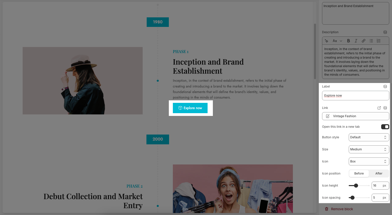
Label: This option is a custom field used to add a label for a button. When you enter a label, a button will appear along with additional customization options for the button below. If the field is left empty, the button will be hidden.
Link: Assign a link to the button. You can select a product, collection, or custom URL.
Open this link in a new tab: Toggle this on if you want the link to open in a new browser tab.
Button style: Choose the visual style of the button (e.g., Default, Outline, etc.).
Size: Set the size of the button (e.g., Small, Medium, Large).
Icon: Select an icon to appear next to the button text (e.g., Box, Arrow, etc.).
Icon position: Decide whether the icon appears before or after the label text.
Icon height: Adjust the icon's size in pixels.
Icon spacing: Set the spacing between the icon and the label text.
2.2. Timeline section
The Timeline section is fully customizable, allowing you to adjust everything from line style and color scheme to spacing and content blocks, making it a versatile way to showcase your brand’s journey or milestones.
2.2.1. General options
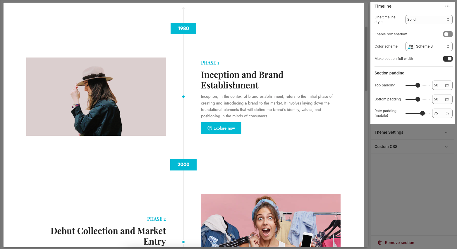
Line timeline style: Choose the visual style of the timeline line (e.g., Dashed, Solid, or Dotted) to match your site's design.
Enable box shadow: Toggle this on to add a subtle shadow around each timeline block, giving them more visual depth.
Color scheme: Select a predefined color scheme to control the text and background colors for the section.
Make section full width: Toggle this on to stretch the timeline section across the entire browser width. If turned off, the section stays within the page's content container.
2.2.2. Section padding
Top padding: Adjusts the spacing above the timeline section (in pixels).
Bottom padding: Adjusts the spacing below the timeline section (in pixels).
Rate padding (mobile): Sets the percentage-based padding for mobile devices, allowing for better responsive spacing.
2.2.3. Theme settings
Right to left: This setting controls the Right to Left (RTL) text direction in your theme, typically used for languages like Arabic, Hebrew, or Persian. Here’s what each option means:
Off: RTL layout is disabled. The site follows the standard Left to Right (LTR) direction.
On: Enables RTL layout for the entire site, shifting text and layout alignment accordingly.
On with text RTL list: Enables RTL layout only for specified text elements based on a predefined list—ideal when mixing RTL and LTR languages.
2.2.4. Custom CSS
Allows users to customize by adding CSS rules, beyond the limitations of default settings. This allows for fine-tuning the design to every detail, to suit specific needs.
Add custom styles to this section only.
To add custom styles to your entire online store, go to theme settings for detailed instructions.


