


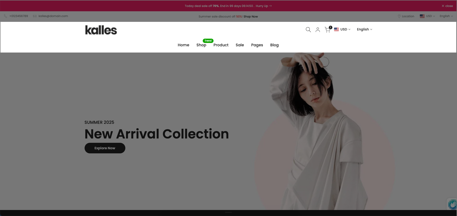
The "Section Header Bottom" refers to a dedicated area or element positioned at the very bottom of a section's header component. This area provides a flexible and configurable zone to place additional elements that complement the main header content, such as sub-navigation links, call-to-action buttons, search bars, or decorative dividers. Its strategic placement at the base of the header ensures these elements are visually connected to the header's context while maintaining a distinct position.
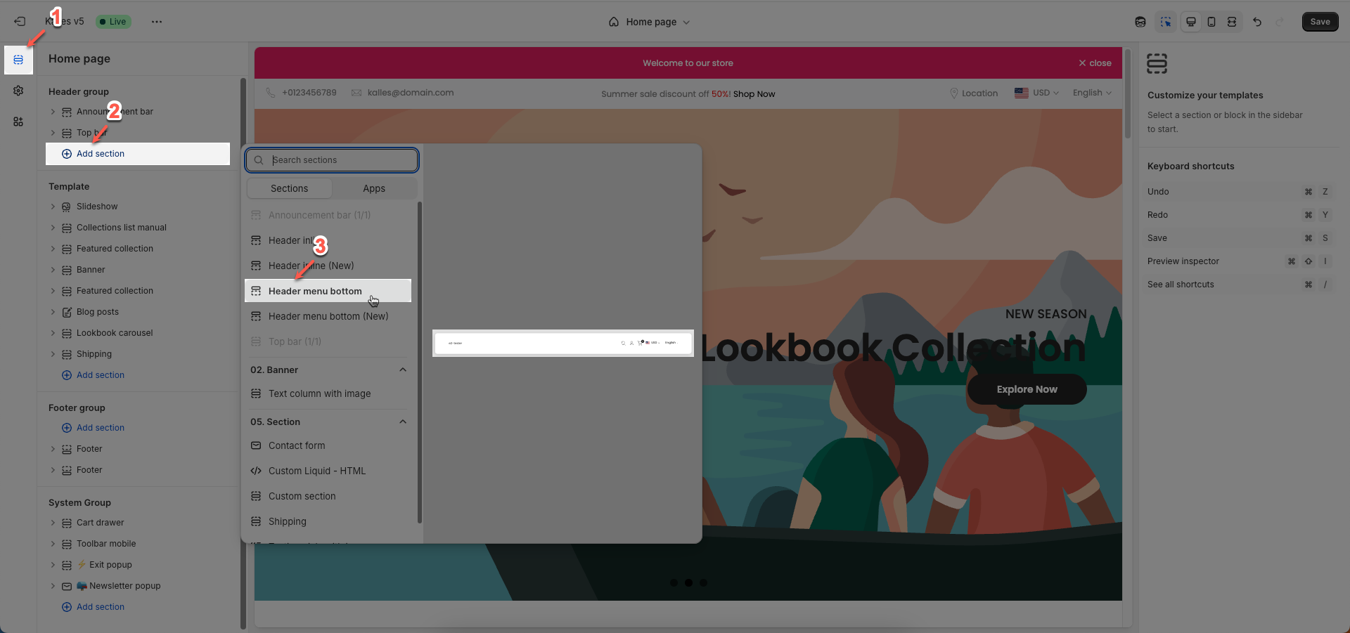
1. How to access the Header bottom section?
Step 01: From Shopify Admin, click on Online Store > Select Themes > In the Current theme section, click the Customize button.

Step 02: In the theme editor (Customize), click the Sections button > In the Sections tab, scroll through the list or use the search bar to find and select the Header bottom section.
2. How to customize the Header bottom section?
Follow this guide to easily create and manage a menu.
2.1. Config Header bottom section
We prioritize the top first section header to show. Please delete header sections that you do not use.
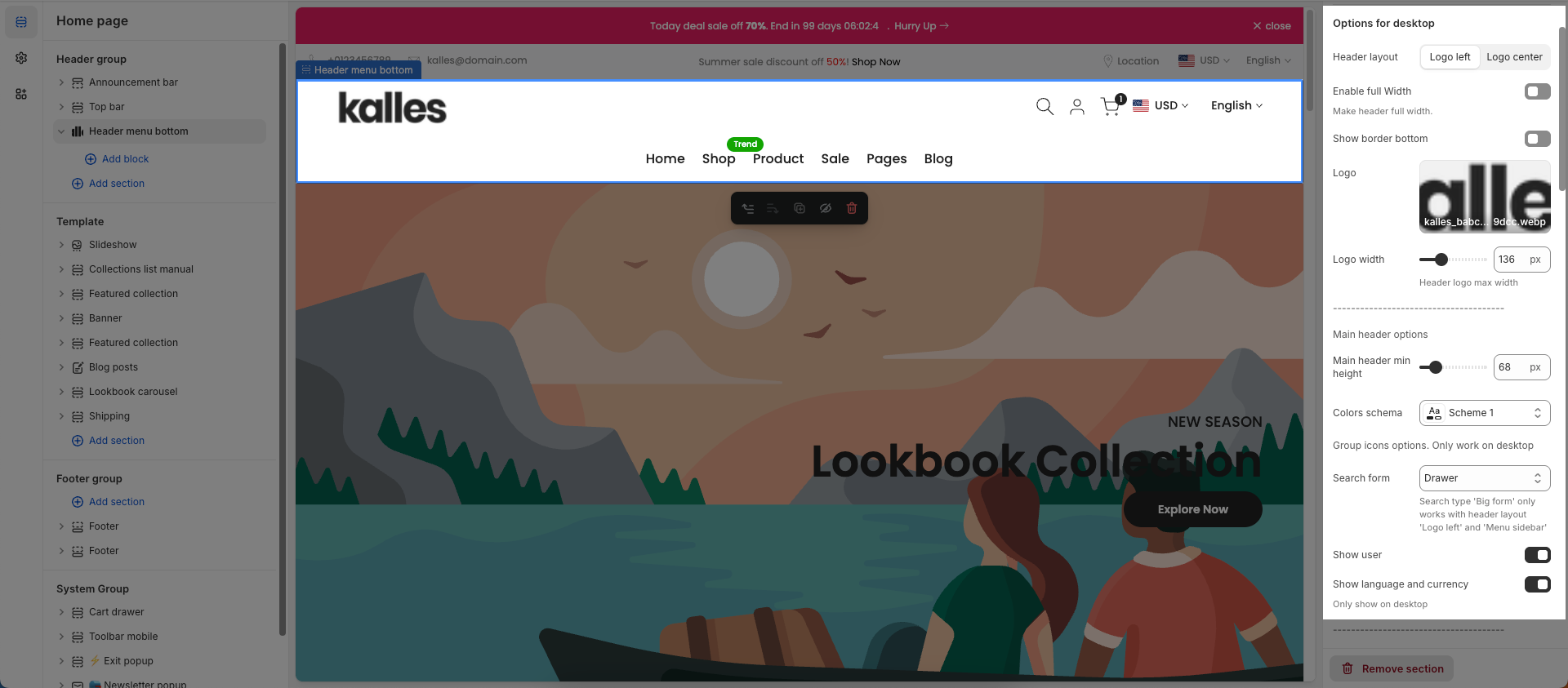
Options for desktop
Header layout: Choose the layout for your header. Common options include a center-aligned logo with a centered menu, a left-aligned logo with a right-aligned menu, or a left-aligned logo with a center-aligned menu.
Enable full Width: Check to enable full width for the header. When enabled, the header will stretch across the entire browser viewport
Show border bottom: Check to display a bottom border on this element.
Logo: Upload your logo image file. This is the primary visual identifier for your brand, typically appearing at the top of the page.
Logo width: Set the width of the logo (in pixels) for desktop viewing. This width will automatically adjust for mobile devices to ensure optimal display.
Main header options
Main header min height: Set the minimum height of the header on desktop. This affects the vertical space the header occupies on the page.
Colors schema: Select the color schema for the header. This schema will determine the header's background color and text color, ensuring color consistency across your website.
Group icons options. Only work on desktop
Search form: Select the display type for the search form (drawer, short form, big form).
Show user: Check to display the user account icon or link.
Show language and currency: Check to display the language and currency selectors.
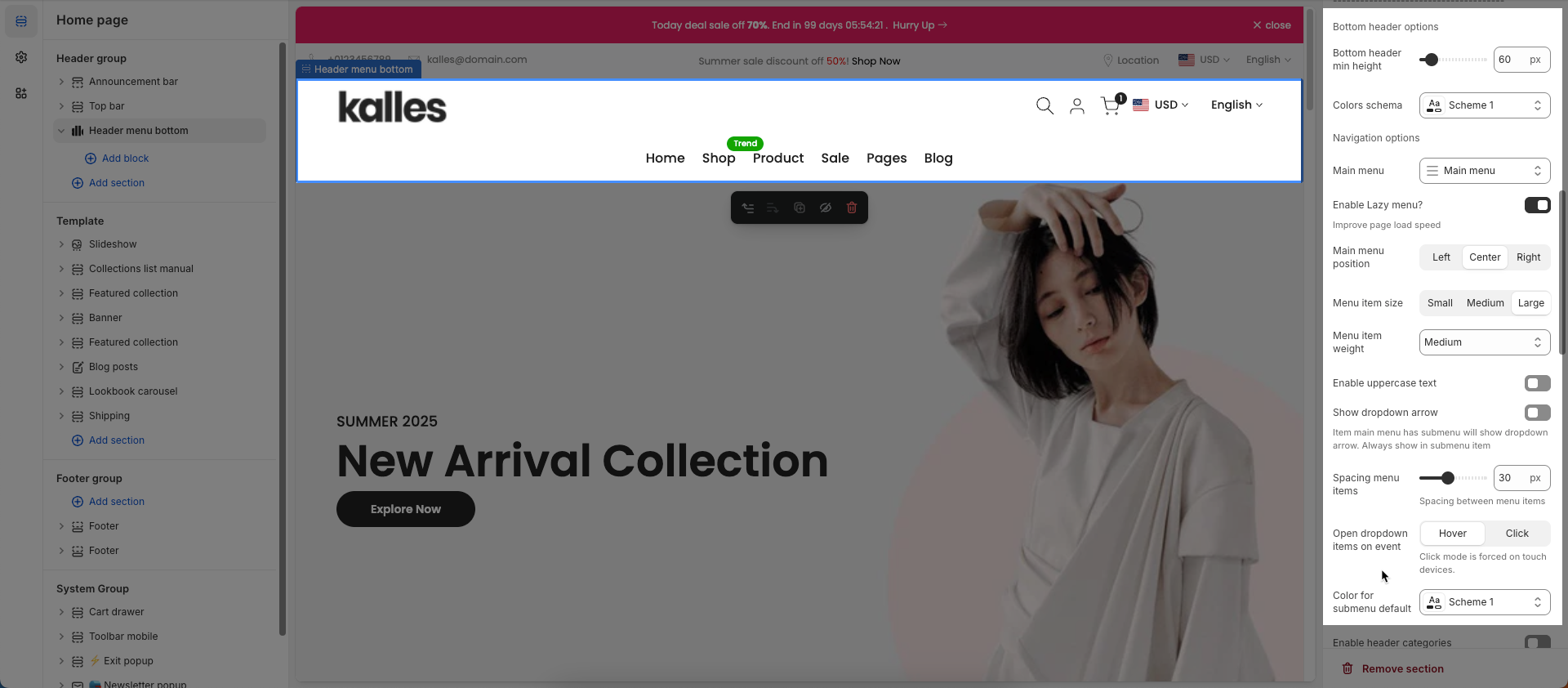
Bottom header options
Bottom header min height: Set the minimum height for the bottom part of the header.
Colors schema: Select the color scheme to be applied to this section or component. A color scheme includes predefined colors for backgrounds, text, buttons, and other UI elements, as defined within your theme.
Navigation options
Main menu: Select the main menu to be displayed.
Enable Lazy menu?: Check to enable lazy loading of sub-menu items (only load on demand).
Improve page load speed
Main menu position: Set the position (alignment) of the main menu.
Menu item size: Set the text size for menu items.
Menu item weight: Adjust the boldness or thickness of the text for menu items.
Enable uppercase text: Check to convert the text of menu items to uppercase.
Show dropdown arrow: Check to display a small arrow icon next to menu items with dropdowns.
Item main menu has submenu will show dropdown arrow. Always show in submenu item
Spacing menu items: Set the horizontal distance between main navigation menu items.
Spacing between menu items
Open dropdown items on event: Select the trigger event to open dropdown sub-menus (hover, click).
Click mode is forced on touch devices.
Color for submenu default: Set the default background color for sub-menus (dropdowns).
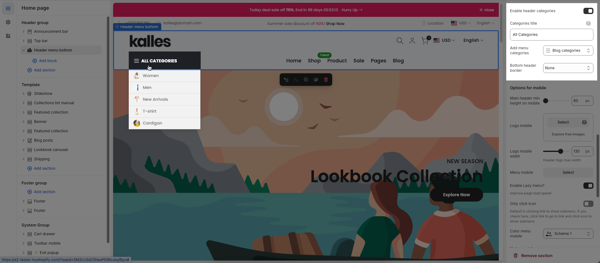
Enable header categories: Check to display a product category navigation or dropdown within the header.
Categories title: Enter the title for the product categories section in the header.
Add menu categories: Select the menu that will be used to display product categories.
Bottom header border: Check to display a border at the bottom of the header section.
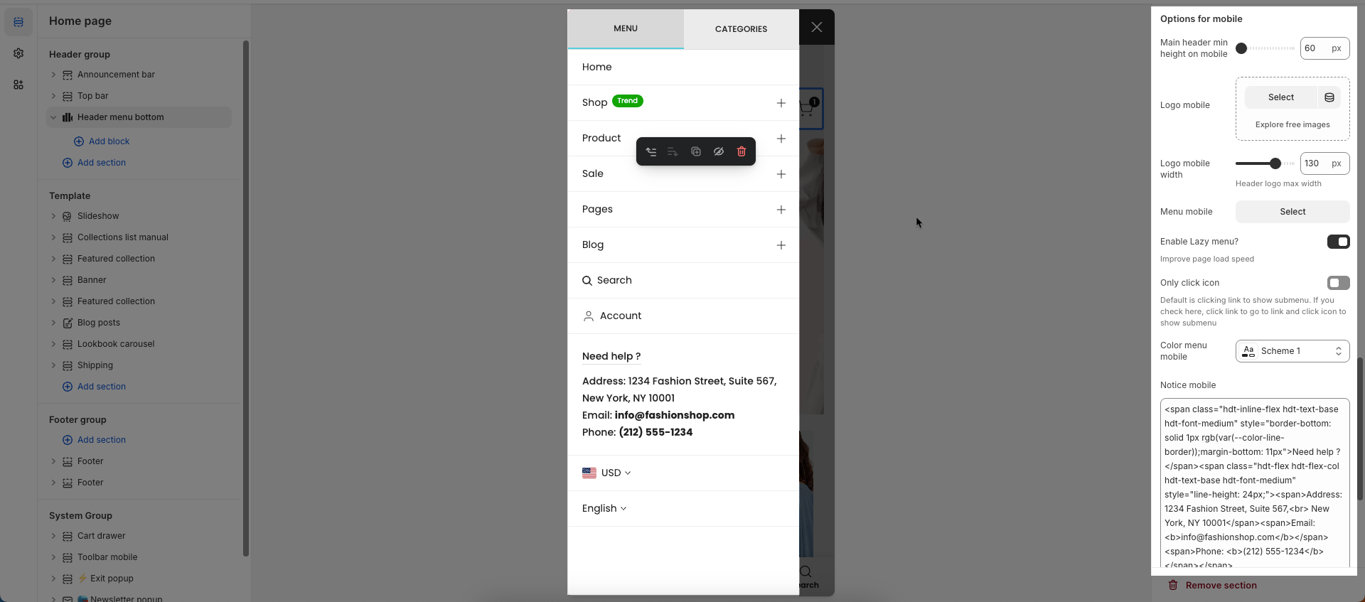
Options for mobile
Main header min height on mobile: Set the minimum height for the main header when viewed on mobile devices.
Logo mobile: Select or upload a different logo image specifically for mobile display.
Logo mobile width: Adjust the display width of the mobile-specific logo.
Header logo max width
Menu mobile: Check to enable lazy loading of sub-menu items on the mobile menu.
Enable Lazy menu?: Only allow clicking on the icon to expand/collapse sub-menus on mobile.
Improve page load speed
Only click icon: Default is clicking link to show submenu. If you check here, click link to go to link and click icon to show submenu
Color menu mobile: Set the colors for the mobile menu (background and text colors).
Notice mobile: Enter a short message or announcement to display specifically for mobile users.
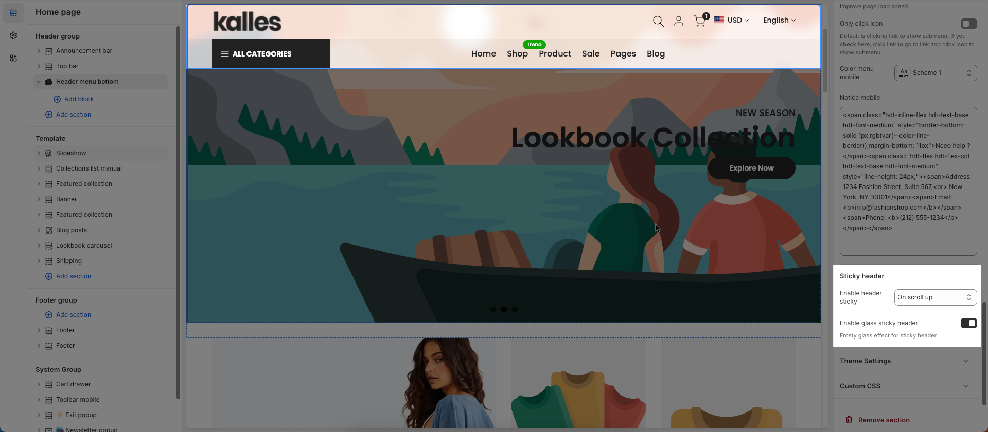
Sticky header
Enable header sticky: Select the behavior of the sticky header when scrolling.
On scroll up: The header reappears only when the user scrolls upwards.
Always: The header remains fixed at the top of the page after scrolling down a certain distance.
None: The header does not stick (it scrolls out of view).
Enable glass sticky header: Enable this option to apply a "glassmorphism" effect to your sticky header.
Frosty glass effect for sticky header.
Theme Settings
Products suggest: Suggests products that are similar in category, style, features
Enable search full width: Enable this option to display the search form full width. This creates a more prominent and immersive search experience
Only work on desktop
Enable login form sidebar: Enable this option to display the login form as a sidebar
Wishlist mode: Enables or disables the wishlist feature, providing users with a function to save favorite products.
You can Disable, Enable wishlist local, Enable wishlist account Install EcomRise free, Enable Growave wishlist
Show country flag: Check to display the country flag next to the country name in the currency/region selector.
Flag size: Set the size of the country flag.
Multiple Currencies By: Select the multi-currency management tool being used.
Shopify: Utilizes Shopify Payments' built-in multi-currency feature.
The4: Uses The4's custom solution (likely an app or integrated theme feature).
Page width: Defines the maximum width of the page content, influencing layout and display on various devices.
Remove collection URL: Eliminates the collection URL from the product page path, optimizing SEO and creating shorter URLs.
Remove the collection portion from product URLs for better SEO
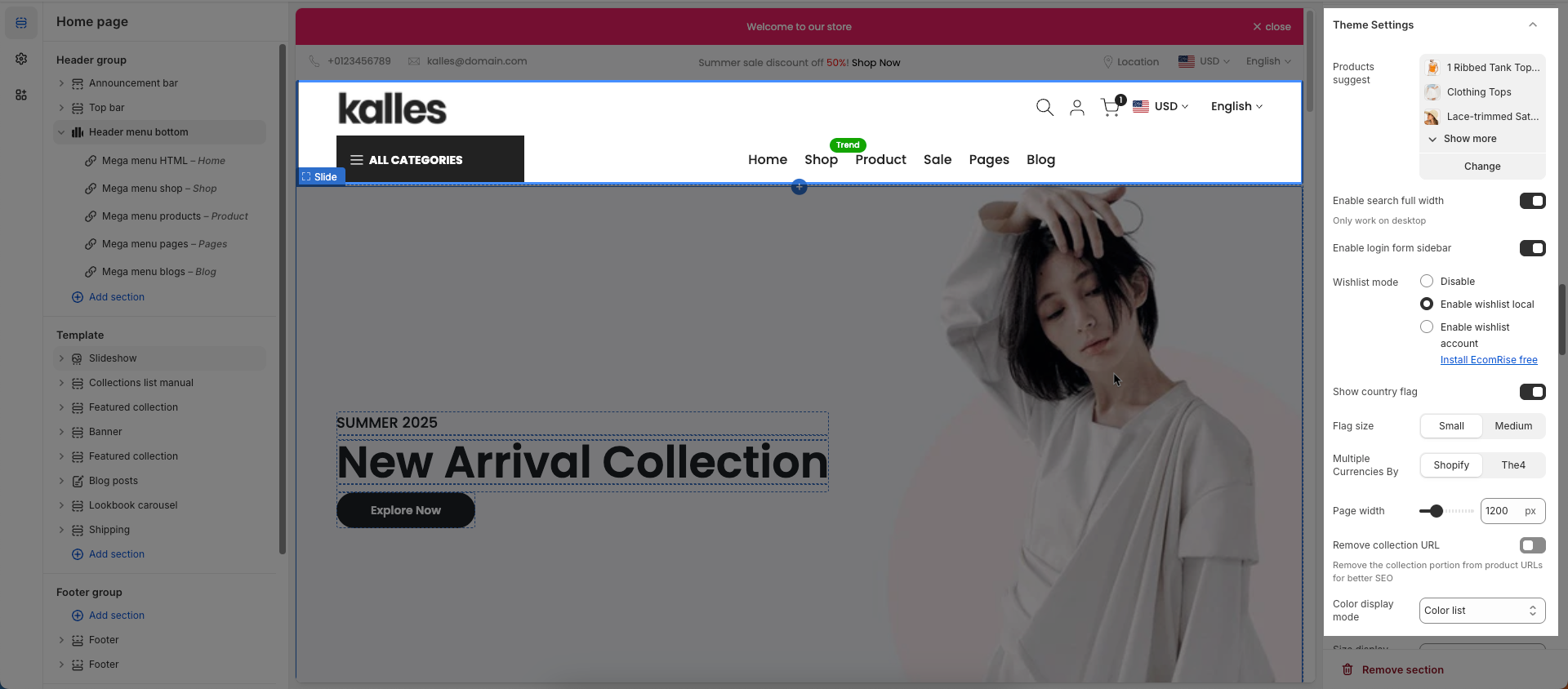
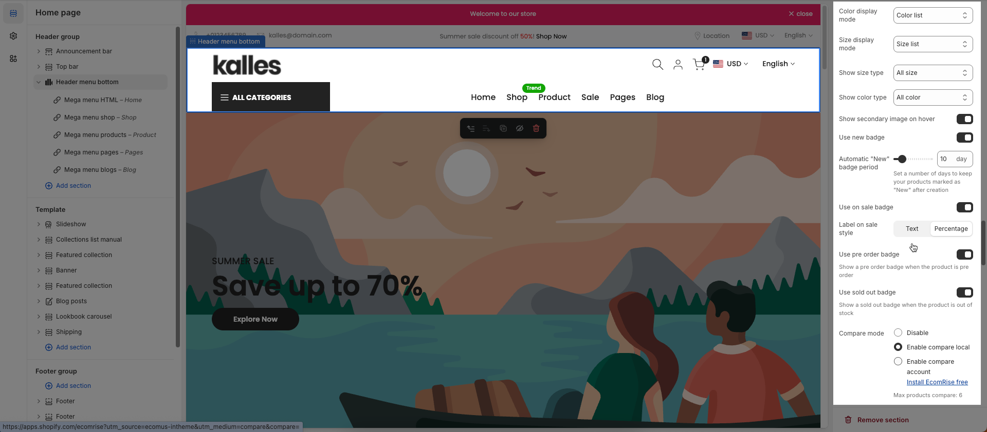
Color display mode: Selects the product color display method, such as color list or count
Size display mode: Choose how the product size options are displayed.
Show size type: Choose which product sizes to display (All sizes, Only available sizes).
Show color type: Displays All colors or Only color available. This option allows customers to see the complete color range of a product or focus solely on colors currently in stock.
Show secondary image on hover: Displays a secondary product image when hovering over it, giving customers a multi-dimensional view of the product.
Use new badge: Enables or disables the display of a "new" badge on new products, attracting customer attention.
Automatic "New" badge period: Enter the number of days a product will automatically display a "New" badge from its creation date. After this period, the badge will automatically disappear.
Use on sale badge: Enables or disables the display of an "on sale" badge on discounted products, stimulating purchases
Label on sale style (text, percentage):
Use pre-order badge: Enables or disables the display of a "pre-order" badge on upcoming products, informing customers of pre-order availability
Use sold out badge: Enables or disables the display of a "sold out" badge on out-of-stock products, notifying customers of product availability.
Compare mode: Enables or disables the product comparison mode, allowing customers to compare products side-by-side for informed purchasing decisions.
You can Disable, Enable compare local, Enable compare account
Max products compare: 6
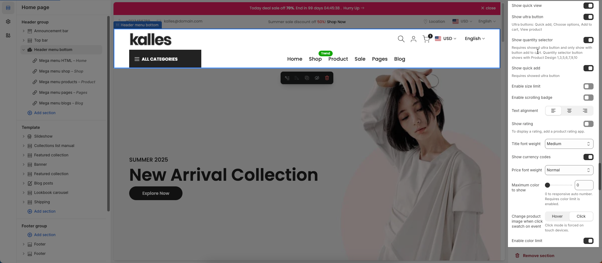
Show quick view: Enables or disables the "quick view" button, allowing customers to view product details without leaving the current page.
Show ultra button: Enables or disables the "ultra" button (custom button), allowing the addition of special action buttons to products.
Ultra buttons: Quick add, Choose options, Add to cart, View product
Show quantity selector: Requires showed ultra button and only show with button add to cart. Quantity selector button shows with Product Design 1,3,5,6,7,9,10
Show quick add: Requires showed ultra button
Enable size limit: Enables or disables the limit on the number of product sizes displayed
Enable scrolling badge: Follow this Guide
Text alignment: Adjusts the text alignment of products (left, right, center), customizing the display layout.
Show rating: Enables or disables the display of product ratings, providing customer feedback information.
To display a rating, add a product rating app.
Title font weight: Selects the font weight of the product title, creating emphasis and attracting attention.
Show currency codes: Enables or disables the display of currency codes next to product prices, providing clear currency information.
Price font weight: Select the font weight for the product price. This allows you to control the visual emphasis of pricing information, either making it stand out or blend more seamlessly with other text elements.
Maximum color to show: Limits the number of product colors displayed
0 to responsive auto number. Requires color limit is enabled.
Change product image when click swatch on event: Allows the product image to change when a user clicks on a color swatch, creating a more interactive and visual experience.
Click mode is forced on touch devices.
Enable color limit: Enables or disables the limit on the number of product colors displayed, allowing control over the color count shown on the product page.
Color image source: Choose the image source for color variants (e.g., pulling from product variant images or uploading custom images).
Color shape: Selects the display shape for product colors (e.g., square, circle), customizing the color display interface.
Price varies style: Choose a display style for variable product prices (e.g. "From [price]"), which helps customers understand the price range.
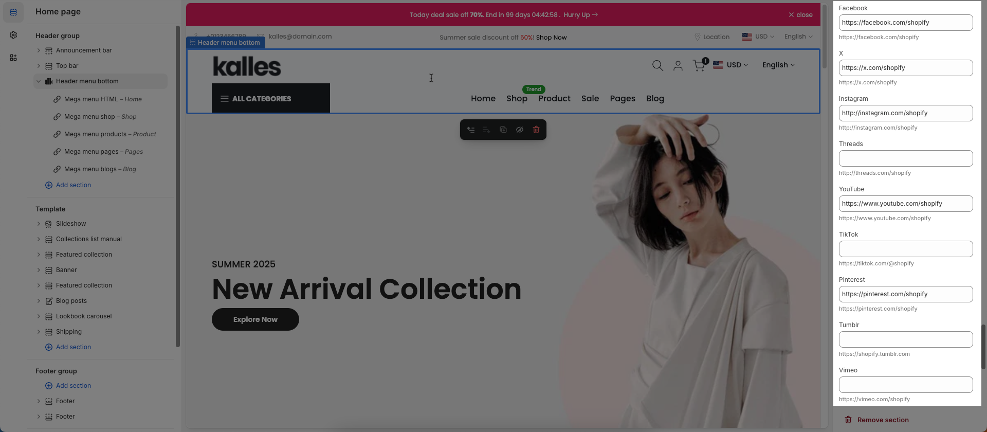
Social links: Enter the link to display the social you want
Custom CSS
Allows users to customize by adding CSS rules, beyond the limitations of default settings. This allows for fine-tuning the design to every detail, to suit specific needs.
Add custom styles to this section only.
To add custom styles to your entire online store, go to theme settings for detailed instructions.

2.2. Config Mega menu block
Header Bottom
Please follow this Guide


