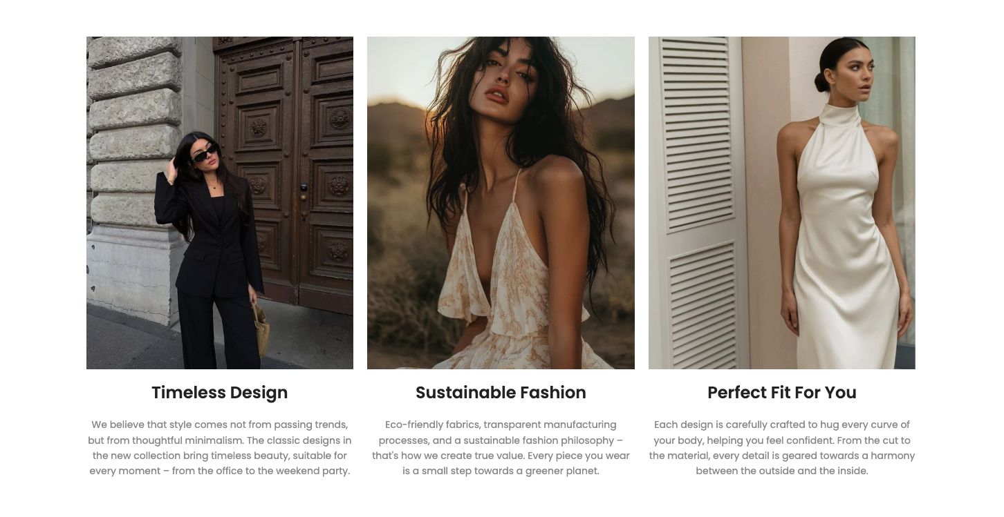
Text column with image is a flexible and powerful Section designed to present information in a column format, where each column can contain a title, descriptive text, and a separate illustration. This section is extremely useful for breaking down complex ideas into digestible chunks, introducing product features, listing benefits, or telling a story in bullet points.
1. How to access the Text column with image section?
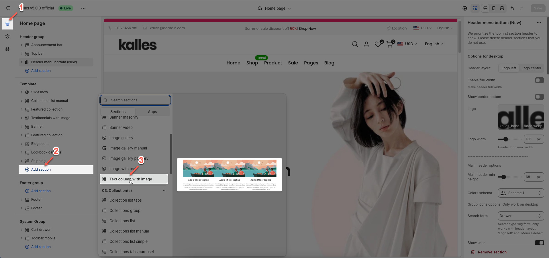
Step 01: From Shopify Admin, click on Online Store > Select Themes > In the Current theme section, click the Customize button.

Step 02: In the theme editor (Customize), click the Sections button > Click the Add section button > In the Sections tab, scroll through the list or use the search bar to find and select the Text column with image section.
2. How to customize the Text column with image section?
2.1. Text column with image section
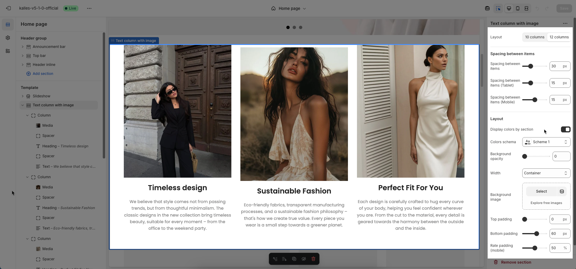
You need to add content for each column first to configure the section.
Layout: Choose the column layout for this section.
10 columns: Content will be arranged on a 10-column grid, often used for layouts with larger side margins or specific aesthetic needs.
12 columns: Content will be arranged on a 12-column grid, which is the most common and flexible layout for most web designs.
Spacing between items
Spacing between items: Set the space between items on desktop
Spacing between items (Tablet): Set the space between items on tablet
Spacing between items (Mobile): Set the space between items on mobile
Layout
Display colors by section: Turn on this option to apply different color schemes to individual sections on your page.
Colors schema: Select the color scheme to be used for this specific section. These schemes are predefined in your theme
Background opacity: Set the opacity for the background color or color overlay on the section's background image. Values range from 0 (completely transparent) to 1 (fully opaque)
Width: Select the content width for this section.
Container: The content will be constrained within a fixed-width container, usually centered with a defined maximum width (e.g., 1200px), leaving space on the sides on larger screens.
Wrap container: The content will have a maximum width similar to "Container" but might have slightly less padding or more flexible wrapping.
Full width: The content will span the entire width of the browser window, with no horizontal padding at the edges.
Background image: Upload the image to be used as the background for this section.
Top padding: Enter the value for the top padding of the element (unit: pixels). This padding creates space between the top edge of the content and the top edge of the element.
Bottom padding: Enter the value for the bottom padding of the element (unit: pixels). This padding creates space between the bottom edge of the content and the bottom edge of the element.
Rate padding (mobile): Enter the padding rate value for the element on mobile devices
Theme Settings
Page width: Defines the maximum width of the page content, influencing layout and display on various devices.
Custom CSS
Allows users to customize by adding CSS rules beyond the limitations of default settings. This allows for fine-tuning the design to every detail, to suit specific needs.
Add custom styles to this section only.
To add custom styles to your entire online store, go to theme settings for detailed instructions.

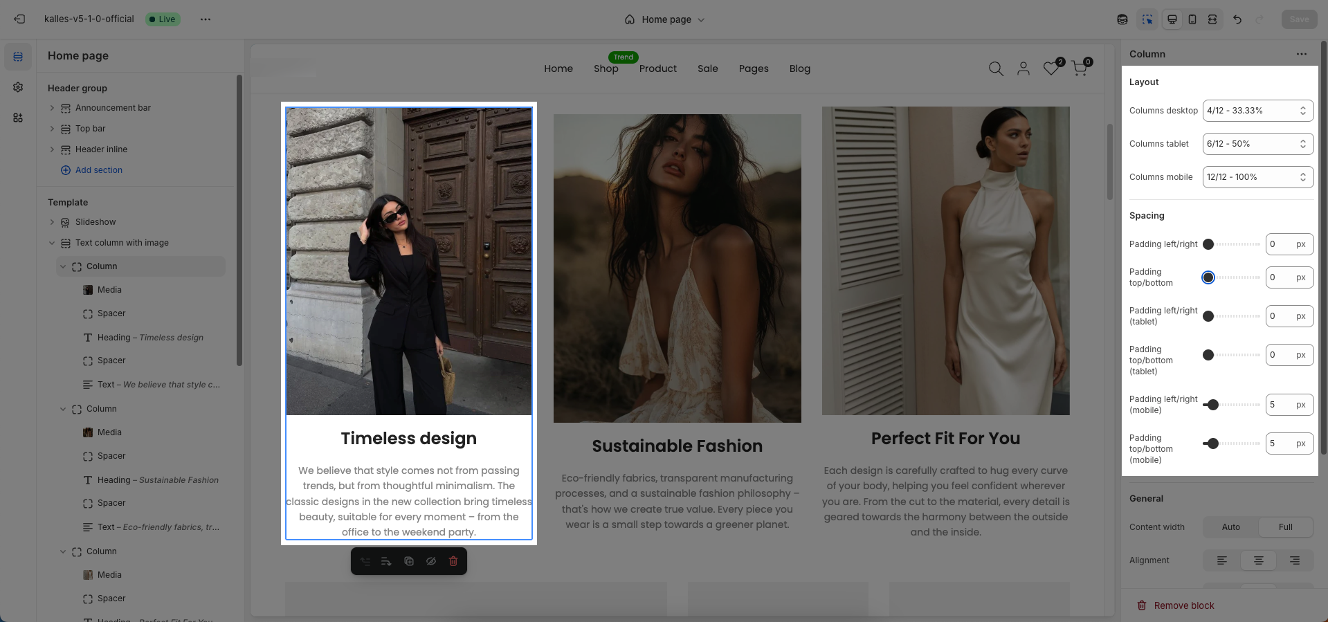
2.2. Column block
Layout
Columns desktop: This defines the column's width on desktop screens. eg: "4/12-33.33%" means the column takes up 33% of the available width.
Columns tablet: This defines the column's width on tablet screens
Columns mobile: This defines the column's width on mobile screens
Spacing
Padding left/right (desktop, tablet, mobile): Sets the space between the content and the left/right edges of the column.
Padding top/bottom (desktop, tablet, mobile): Sets the space between the content and the top/bottom edges of the column.
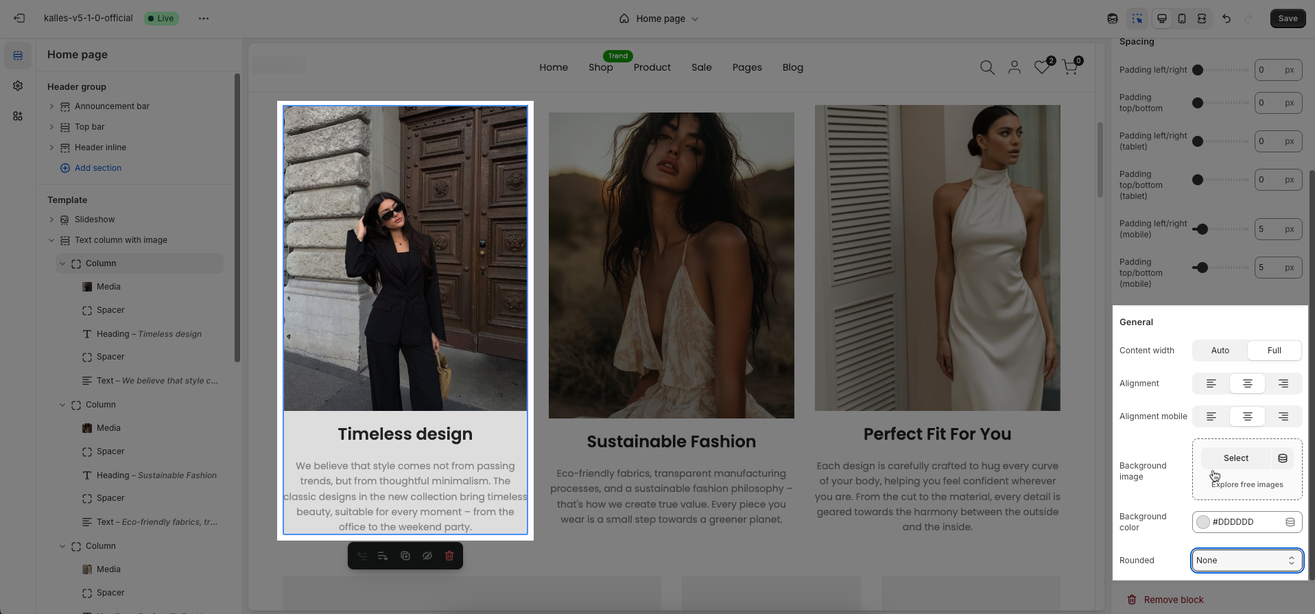
General
Content width: Auto / Full
Auto: The content takes up only the space it needs.
Full: The content stretches to fill the entire width of the column.
Alignment: Set the horizontal alignment for content or elements (left, center, right)
Alignment mobile: Set the horizontal alignment for content or elements on mobile devices (left, center, right).
Background image: Upload the image to be used as the background for this section or element.
Background color: Select the background color for this section or element.
Rounded: Set the roundness of the corners for the element. A higher value will create more rounded corners.
2.3. Other block
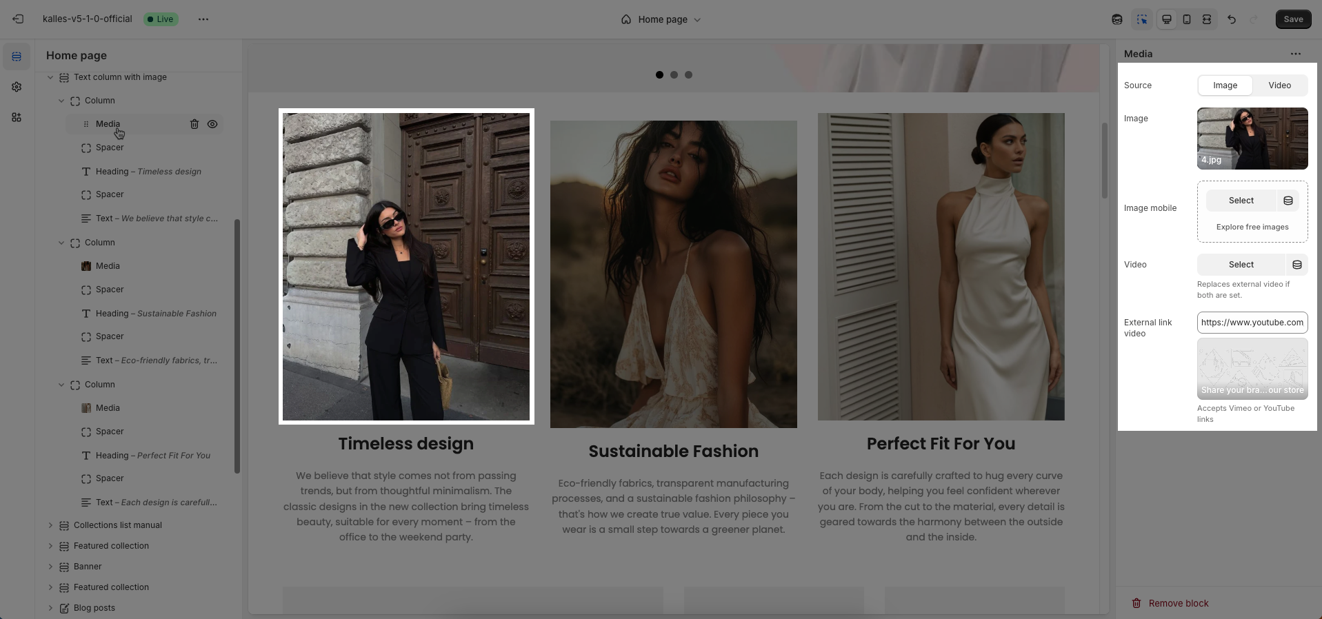
2.3.1. Media block
Use source: Select the type of media source you want to use.
Image: Display a static image.
Video: Display a video (either uploaded or from an external link).
Image: (Only applies when
Use sourceis Image) Upload or select the main image to be displayed on desktop and tablet devices.Image Mobile: Upload or select an alternative image optimized for mobile devices
Video: (Only applies when
Use sourceis Video) Upload or select an MP4 video file to be playedReplaces external video if both are set.
External link video: Enter the URL of the video from external platforms like YouTube or Vimeo. The video will be embedded and played from this source.
Accepts Vimeo or YouTube links
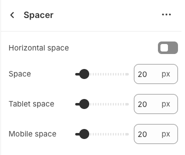
2.3.2. Spacer block
The Spacer block is used to add empty space between blocks. It helps improve the layout, create visual separation, and ensure a balanced design. This block is particularly useful for adjusting spacing in different screen sizes (desktop, tablet, and mobile) to enhance readability and aesthetics.
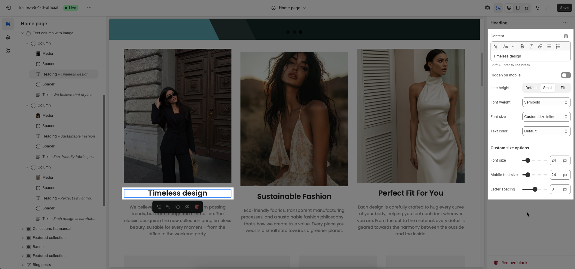
2.3.3. Heading block
Heading: Allows you to enter and format the text (bold, italic, underline, lists, links, etc.).
Shift + Enter to line break.
Hidden on mobile: Hides the heading on mobile screens.
Line height: Select the line height (spacing between lines of text).
Default: Uses the theme's standard line height value, typically optimized for readability.
Small: Reduces the space between lines, creating a more condensed block of text.
Fit: Adjusts the line height to closely fit or fill a specific space, often used for specific design cases (e.g., large headlines).
Font weight: Controls the thickness of the text (e.g., 600 is semi-bold).
Font size: Lets you select sizes for the heading.
Text color: Allows you to set the text color. Please follow this guideline to configure the Color.
Custom Size Options:
Font size: Adjusts the heading size for desktop.
Mobile font size: Adjusts the heading size for mobile.
Letter spacing: Adjusts the space between characters.
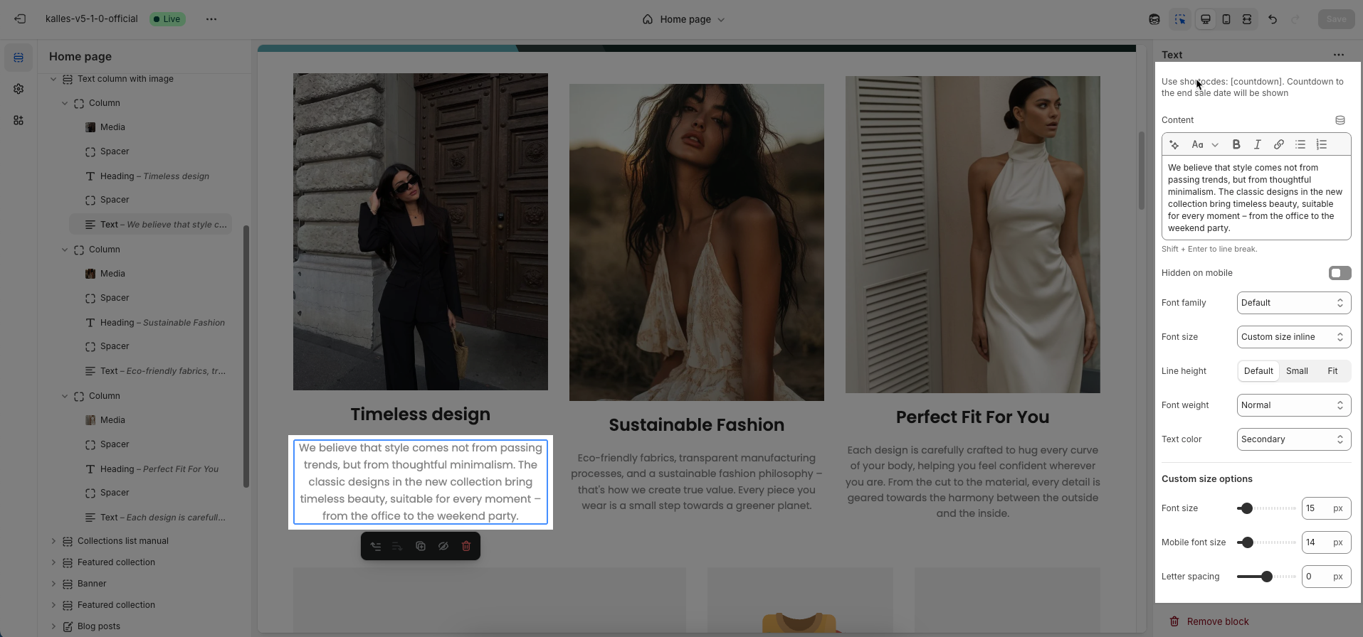
2.3.4. Text block
To add Text block to the Content, click the Add block button (plus icon ➕) under the Content.
Once the Text block is added, you can customize its settings in the left or right-hand sidebar (depending on your screen size)
Use shortocdes: [countdown]. Countdown to the end sale date will be shown
Content: Allows you to enter and format the text (bold, italic, underline, lists, links, etc.). Press Shift + Enter to line break.
Hidden on mobile: Enable this option to hide the heading on mobile screens.
Font family: Select the font family to be applied to the text.
Font Size: Let you select sizes for the text. You can choose the options included Extra small, Small, Medium, Large, Extra Large, 2 Extra Large, 4 Extra Large, and Custom size inline.
Line height: Set the line height (spacing between lines of text). A higher value will create more white space between lines, improving readability.
Font weight: Controls the thickness of the text. Common font weight values range from 100 to 900.
Text color: Allows you to set the text color.
Date countdown: Select the end date and time for the countdown. The countdown will display the time remaining until this date.
Text day countdown: Enter the text to display alongside the countdown (e.g., "Offer ends in:", "Remaining:").
Custom Size Options:
The options below are only active when you select Custom size inline in the Size option.
Font size: Adjusts the font size of the heading in pixels (px) for desktop screens.
Mobile font size: Adjusts the font size of the heading in pixels (px) for mobile devices.
Letter spacing: Adjust the horizontal space between the letters in the heading text, measured in pixels (px).