Section Scrolling Text, often referred to as a “Marquee” or “Ticker”, is a dynamic element that displays text that moves continuously horizontally or vertically. While it can be overused, when designed and used properly, it is an effective tool for drawing attention to important announcements, special offers, breaking news headlines, or branded slogans without taking up too much static space on the screen.

1. How to access the Scrolling text section?
Step 01: From Shopify Admin, click on Online Store > Select Themes > In the Current theme section, click the Customize button.

Step 02: In the theme editor (Customize), click the Sections button > Click the Add section button > In the Sections tab, scroll through the list or use the search bar to find and select the Scrolling text section.
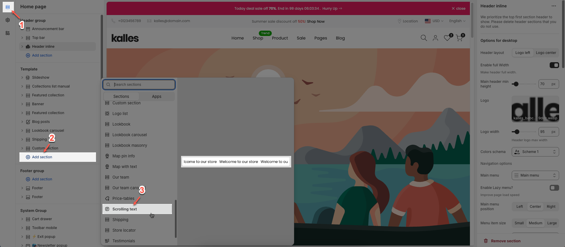
2. How to customize the Scrolling text section?
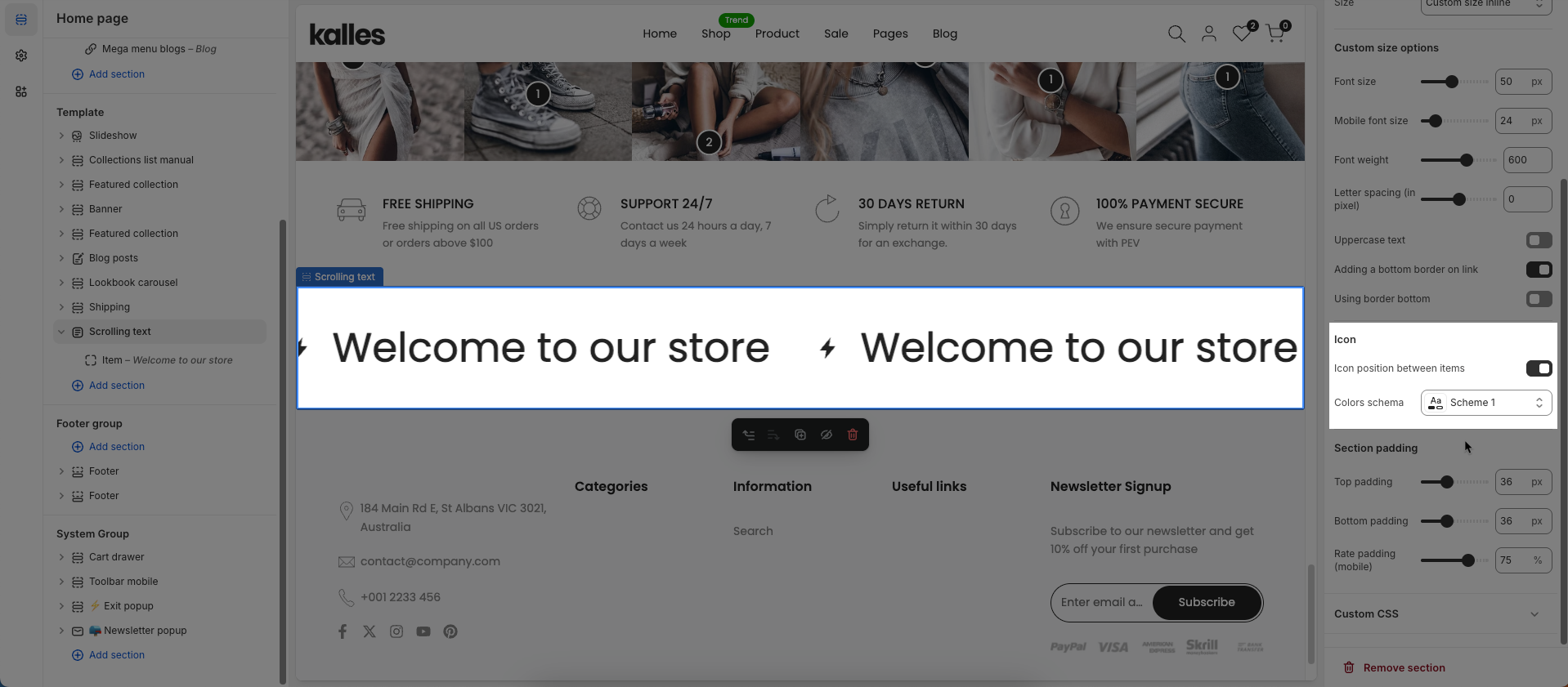
2.1. Scrolling text section
After adding the Scrolling text section, you can customize its settings using the sidebar—located on the right or left side of your screen depending on your device.
You need to add content for each item first to configure the section.
Spacing between items: Set the space between items
Speed factor: Set the speed factor for an animation or movement. A higher value typically results in a faster animation
Direction: Select the direction of movement for an animation or layout.
Pause when hover: Check to pause the animation or movement when the user hovers their mouse cursor over the element.
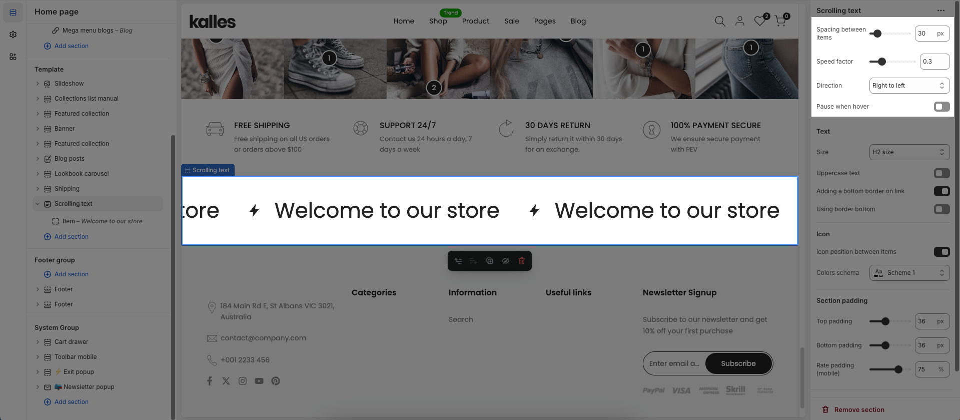
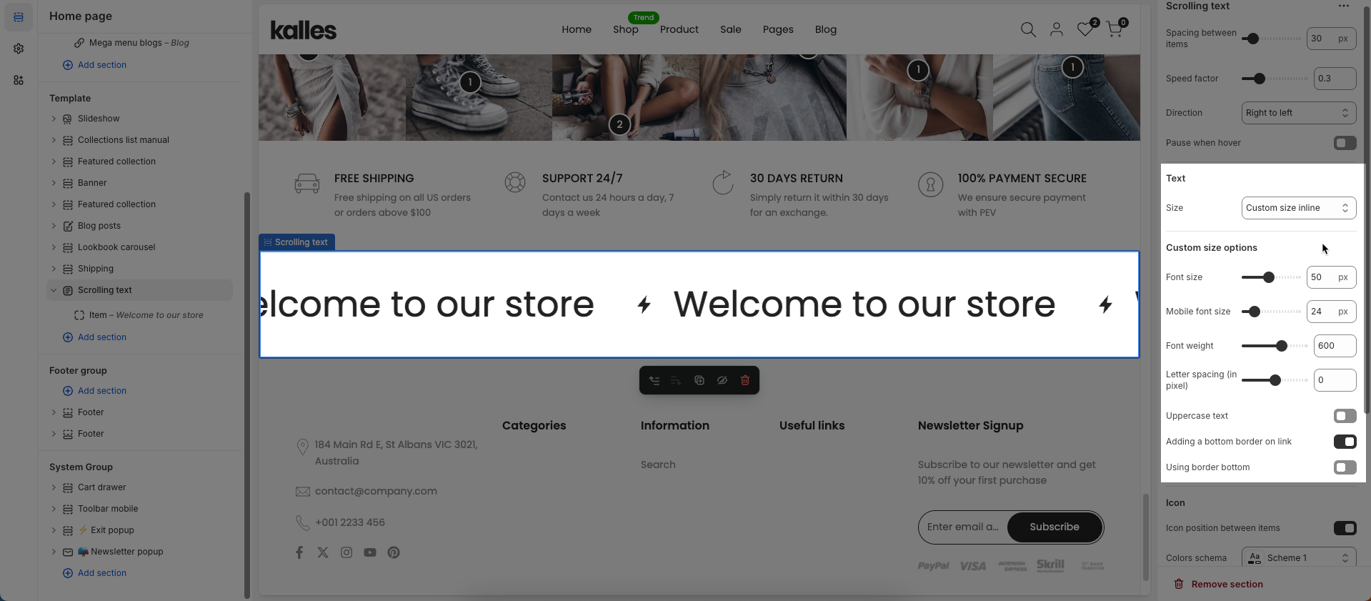
Text
Size: Set the font size for the number and its related text
Uppercase text: Check to transform all letters in the text to uppercase.
Adding a bottom border on link: Check to add a bottom border to the link.
Using border bottom: Check to use a bottom border for this element.
Custom size options
Font size: Set the font size for the text (in pixels). This value applies to desktop and tablet devices.
Mobile font size: Set the font size for the text on mobile devices (in pixels).
Letter spacing: Set the spacing between characters (letters) in the text (in pixels or
emunits). Positive values increase spacing, negative values decrease it.
Icon
Icon position between items: Set the position of the icon relative to the text or content within an item, especially when multiple items are present.
Colors schema: Select the color scheme to be applied to this section or component
Section padding
Top padding: Enter the value for the top padding of the element (unit: pixels). This padding creates space between the top edge of the content and the top edge of the element.
Bottom padding: Enter the value for the bottom padding of the element (unit: pixels). This padding creates space between the bottom edge of the content and the bottom edge of the element.
Rate padding (mobile): Enter the padding rate value for the element on mobile devices
Custom CSS
Allows users to customize by adding CSS rules beyond the limitations of default settings. This allows for fine-tuning the design to every detail, to suit specific needs.
Add custom styles to this section only.
To add custom styles to your entire online store, go to theme settings for detailed instructions.

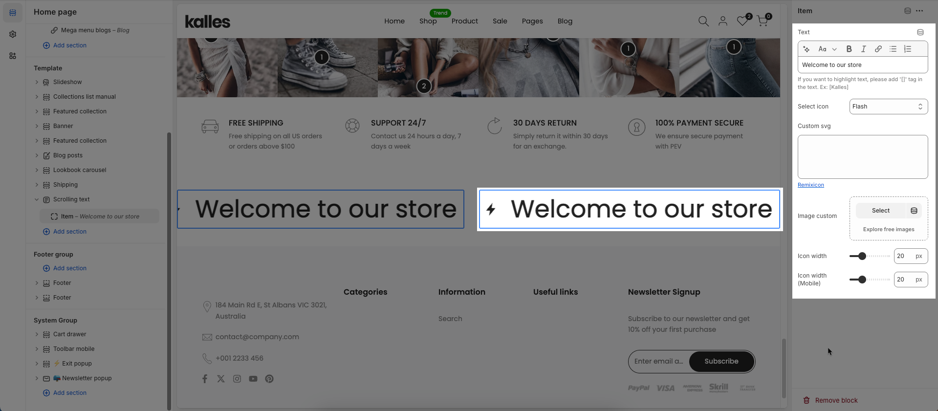
2.2. Item block
To add an Item block to the Scrolling text, click the Add item button (plus icon ➕) under the Scrolling text.
Once the Item block is added, you can customize its settings in the left or right-hand sidebar (depending on your screen size)
Text: Enter the text content to be displayed.
If you want to highlight text, please add '[]' tag in the text. Ex: [Kalles]
Select icon: Select an icon from the available library.
Custom SVG: Enter custom SVG code to be used as an icon or graphic. Remixicon
Image custom: Upload a custom image to use.
Icon width: Set the width of the icon (in pixels). This value applies to desktop and tablet devices.
Icon width (Mobile): Set the width of the icon on mobile devices (in pixels).