The Cart Drawer is a quick-access shopping cart feature that enhances user experience by allowing customers to view and manage their cart without leaving the current page. It provides a convenient summary of the cart’s contents, displays important details like subtotal, shipping info, and discounts, and supports customization options such as gift wrap, shipping estimator, and complementary product suggestions. This section of the guide will walk you through how to configure and optimize the Cart Drawer for your store.
1. How to access the Cart drawer section?
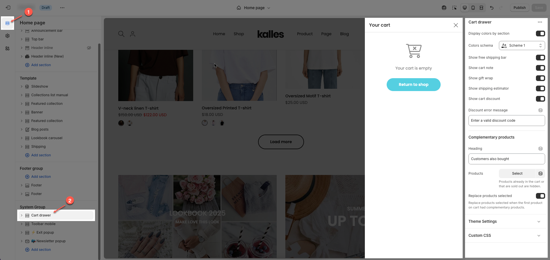
Step 01: From Shopify Admin, click on Online Store > Select Themes > In the Current theme section, click the Customize button.

Step 02: In the theme editor (Customize), click the Sections button > Click the Add section button > In the Sections tab, scroll through the list to System Group or use the search bar to find and select Cart drawer.
2. How to customize the Cart drawer section?
2.1. Cart drawer section
Cart drawer
Display colors by section: When enabled, the cart drawer uses color settings defined for each section instead of the global theme colors.
Colors schema: Lets you select a predefined color scheme (e.g., "Scheme 1") for the cart drawer’s appearance.
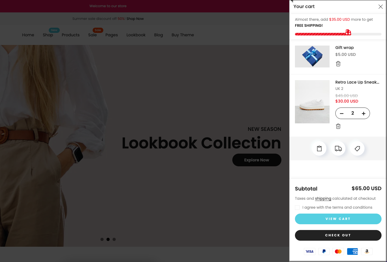
Show free shipping bar: Enables a progress bar that encourages customers to reach a free shipping threshold, increasing average order value.
Show cart note: When enabled, the 'Cart note' button appears and allows customers to leave a note or special instruction with their order."
Show gift wrap: When enabled, the 'Gift wrap' button appears and offers a gift wrapping option. Click the 'Gift wrap' button to add it to your cart.
Show shipping estimator: When enabled, the 'Shipping estimator' button appears to displays a shipping cost estimator directly in the cart drawer based on the user’s location.
Show cart discount: When enabled, the 'Cart discount' button appears and enables a field for customers to enter discount codes within the cart drawer.
Discount error message: A customizable message shown if the customer enters an invalid discount code.
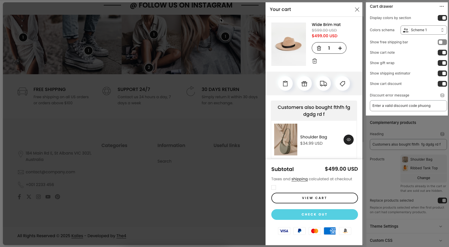
Complementary products
Heading: The title text shown above product recommendations in the cart drawer (e.g., “Customers also bought...”).
Products: Lets you manually select specific products to display as recommendations when a product is added to the cart.
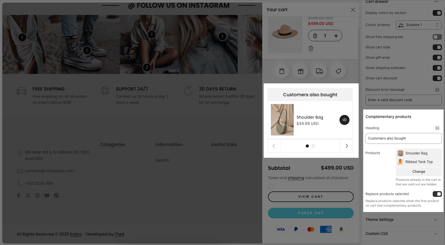
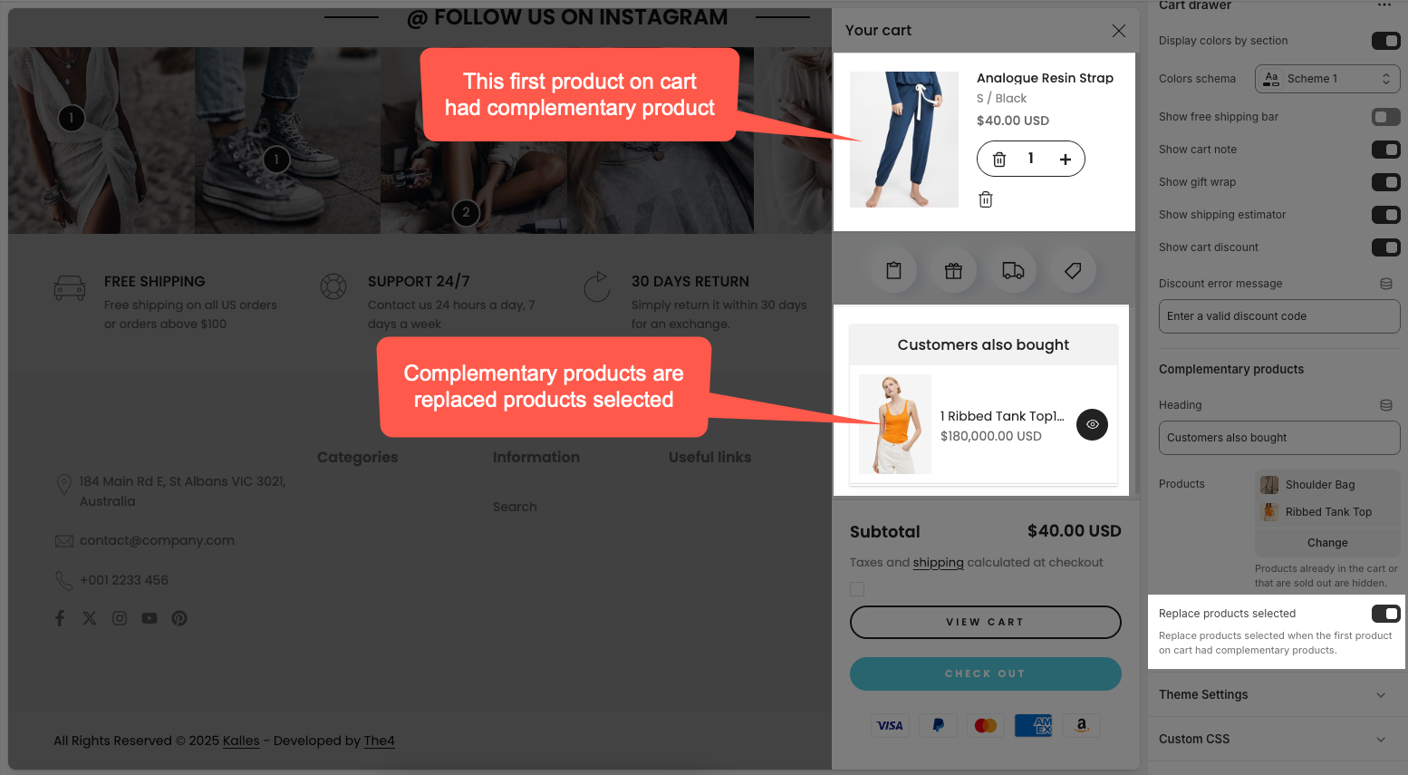
Replace products selected: When enabled, this replaces the initially selected complementary products with others if the current product already has its own defined complementary items.
Theme settings
Product: Choose product to taken free shipping minimum amount.
Choose product gift wrap: Select the specific product in your store that will be used as the gift wrap option. When customers select gift wrap, this product will be added to their cart.
Show currency codes: Check to display currency codes (e.g., USD, EUR, VND) next to monetary values.
Price font weight: This option allows you to choose the thickness of the font used for displaying product prices.
Show quick view: Check to display the "Quick View" button on product listings, allowing customers to view product details in a pop-up without leaving the current page.
Price varies style: This controls how the price is displayed when a product has multiple variants (with different prices).
Design free shipping bar: Choose a style (e.g., "#0 - Normal") for how the free shipping progress bar will be displayed to customers.
Empty button link: Set a link (e.g., "All collections") that will appear when the shopping cart is empty, directing users to browse products.
2.2. Cart drawer blocks content
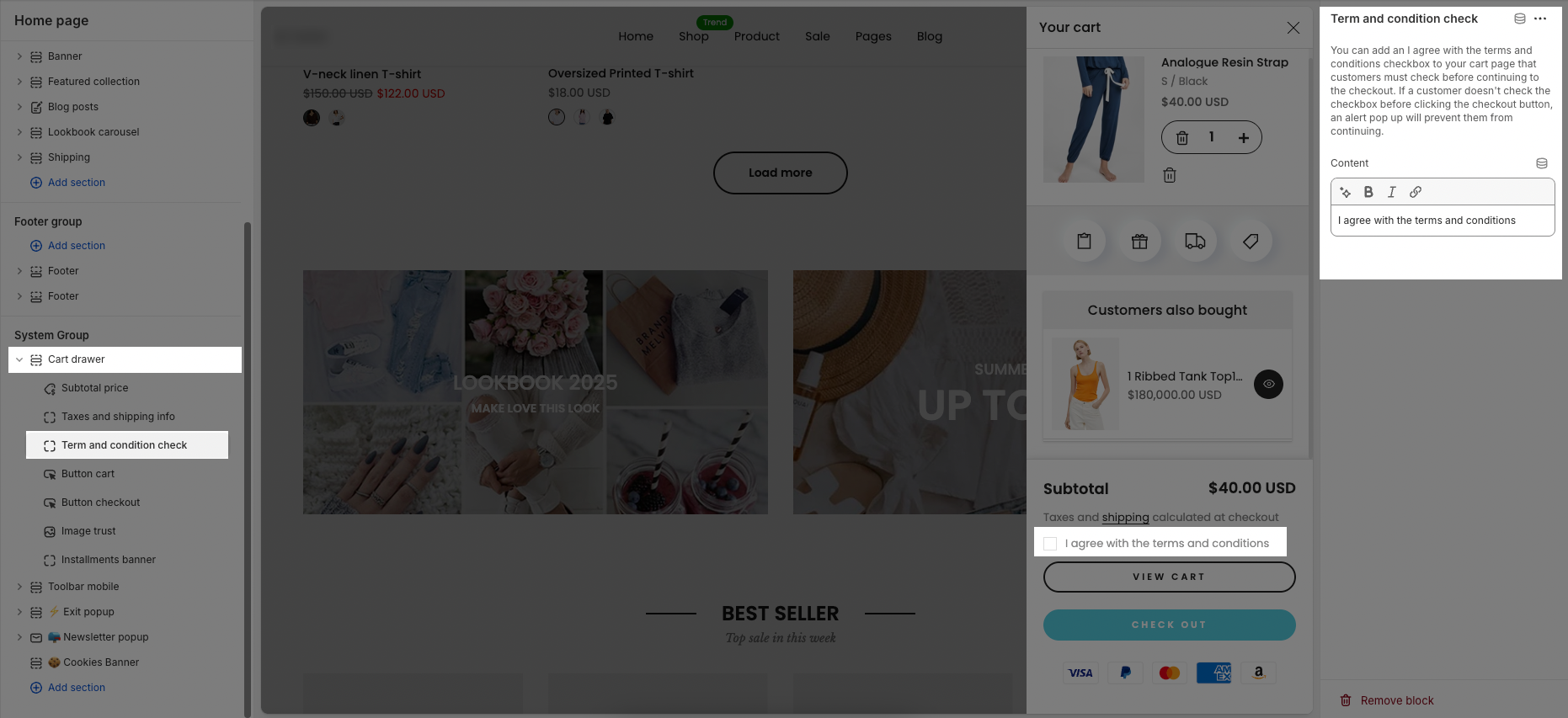
2.2.1. Term and condition check
You can add an I agree with the terms and conditions checkbox to your cart page that customers must check before continuing to the checkout. If a customer doesn't check the checkbox before clicking the checkout button, an alert pop up will prevent them from continuing.
Content: This is the text displayed beside the checkbox that customers must tick before proceeding to checkout.
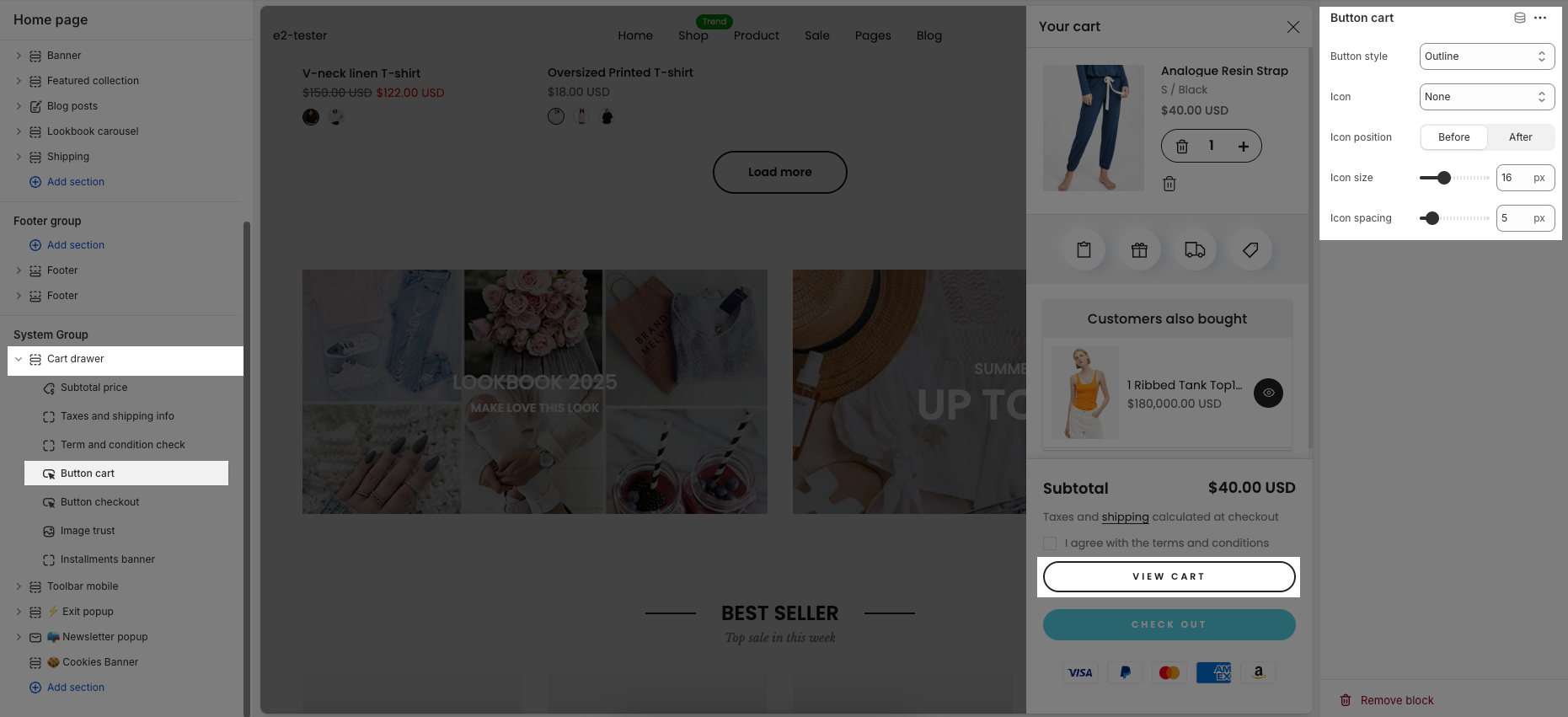
2.2.2. Button cart
Button style: Allows you to choose the visual style of the cart button, such as
Outline,Solid, or other predefined styles depending on your theme.Icon: Lets you select an icon to display inside the cart button (e.g., a shopping cart icon). Selecting "None" means no icon will be shown.
Icon position: Determines whether the icon appears before (to the left of) or after (to the right of) the button text.
Icon size: Adjusts the size of the icon in pixels. You can use the slider or enter a specific value.
Icon spacing: Sets the amount of space (in pixels) between the icon and the button text.
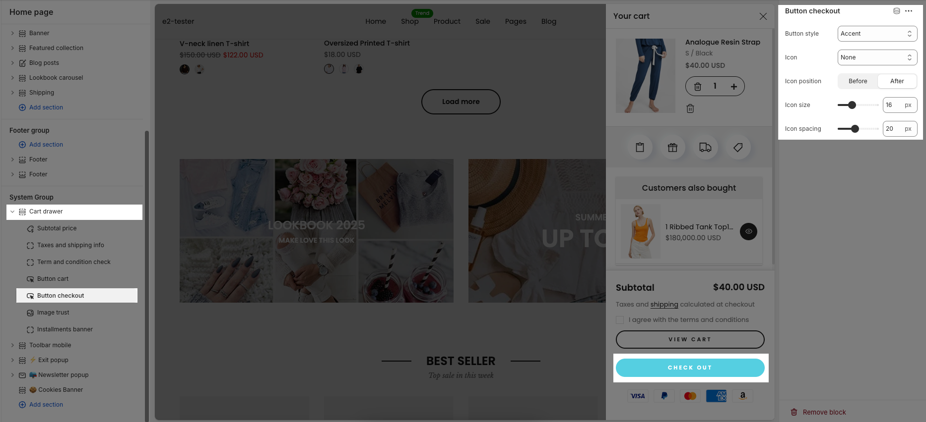
2.2.3. Button checkout
Button style: Allows you to select the design style of the checkout button (e.g.,
Accent,Primary, orOutline).Icon: Lets you choose an icon to display inside the checkout button. If set to "None", no icon will be shown.
Icon position: Determines the icon placement relative to the button text — either Before (left side) or After (right side).
Icon size: Adjusts how large the icon appears, measured in pixels. You can use the slider or type a specific value.
Icon spacing: Sets the distance (in pixels) between the icon and the text to control visual balance.
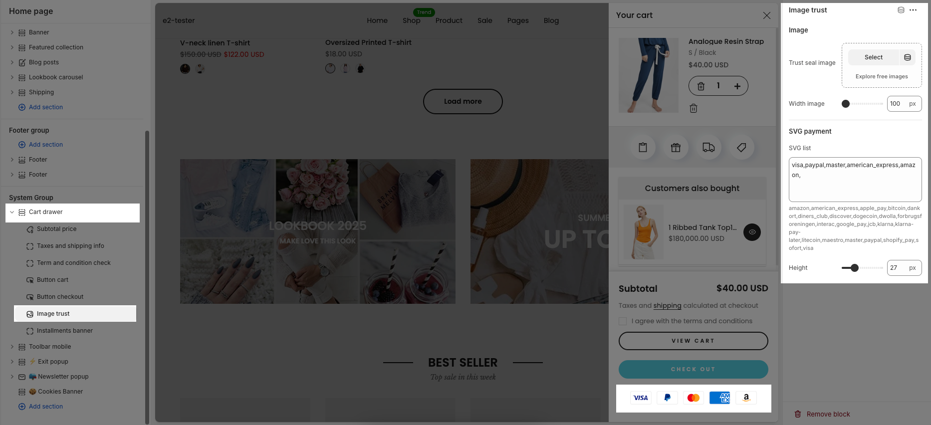
2.2.4. Image trust
Trust seal image: Allows you to upload or choose a trust seal image to display below the cart.
Width image: Controls the width of the trust seal image in pixels. You can adjust the size using the slider or enter a value manually.
SVG list: Lets you enter a list of accepted payment methods (e.g.,
visa,paypal,master,amazon, etc.) to be shown as icons under the checkout button. Each payment method should be separated by a comma.Height: Adjusts the height (in pixels) of the payment icons shown below the checkout button.