


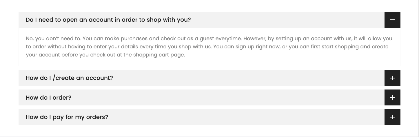
The "Accordion" section allows you to present information in an organized and space-efficient manner by grouping collapsible and expandable content blocks. It's an ideal solution for displaying Frequently Asked Questions (FAQs), additional product details, user guides, or any content you want users to easily access without overwhelming the interface. By collapsing information, this section helps improve readability and navigation on your page.
1. How to access the Accordion section?
Step 01: From Shopify Admin, click on Online Store > Select Themes > In the Current theme section, click the Customize button.

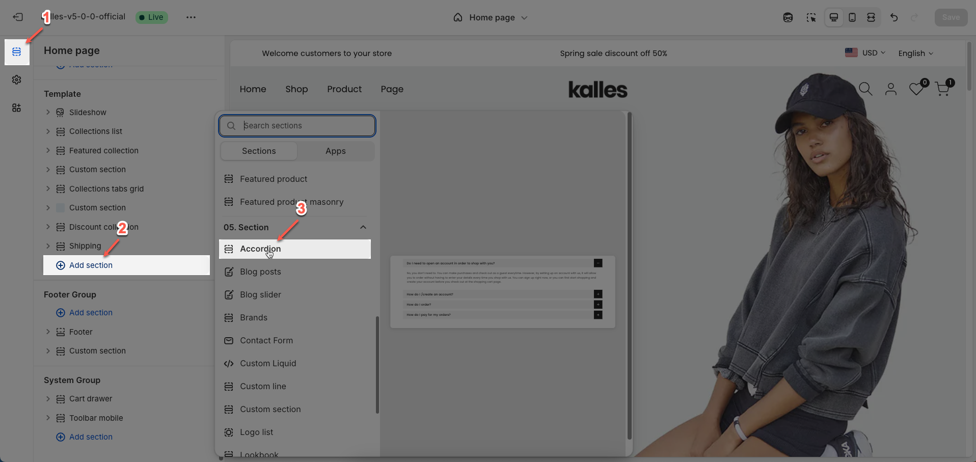
Step 02: In the theme editor (Customize), click the Sections button > Click the Add section button > In the Sections tab, scroll through the list or use the search bar to find and select the Accordion.
2. How to customize the Accordion?
2.1. Accordion item block
To add an Accordion item block to the Accordion, click the Add Accordion item button (plus icon ➕) under the Accordion.
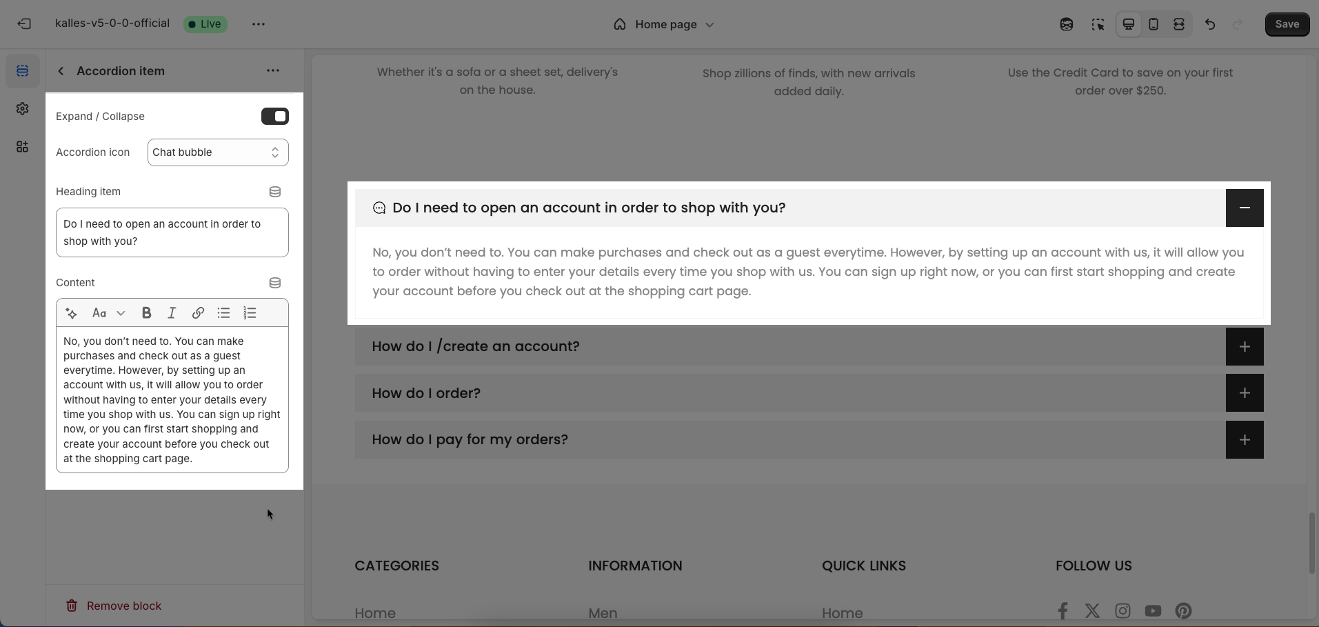
After adding the Accordion item block, you can adjust its settings using the sidebar—located on the right or left side of your screen depending on your device
Expand / Collapse: Select the default state of this Accordion item when the page loads.
Accordion icon: Select the icon that will be displayed next to the Accordion
Heading item: Enter the heading for this Accordion item. This heading will always be visible and is the clickable part that expands or collapses the content.
Content: Enter the detailed content that will be displayed when this Accordion item is expanded
2.2. Other block
2.2.1. Section heading block
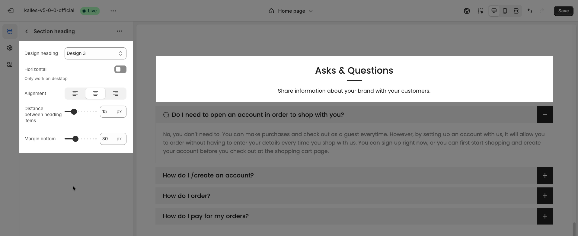
The Section Heading block allows you to add a title and description to different sections of your page, you can customize this block with options below:
Design heading: Choose a design for the header to ensure aesthetics
Horizontal: Select how horizontal lines will be displayed with the heading
Only work on desktop
Text Alignment: Align the Section heading block to the left, center, or right
Spacing between items: Adjust the space between the heading and the text (measured in pixels).
Margin bottom: Define the space between the Section Heading and the next section to maintain a balanced layout.
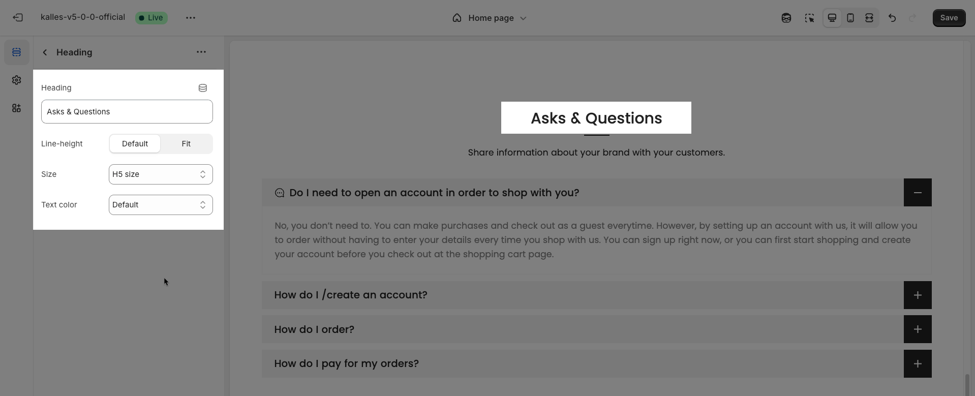
2.2.2. Heading block
To add a Heading block to the Section heading, click the Add block button (plus icon ➕) under the Section heading.
Once the Heading block is added, you can customize its settings in the left or right-hand sidebar (depending on your screen size)
Heading: Enter the heading text to display. This is the main content you want users to read.
Line-height: Select the line height for the heading.
Default: Uses the default line height of the font or theme.
Fit: Automatically adjusts the line height to optimally fit the font size and content, often resulting in tighter text.
Size: Select the font size for the heading. This directly impacts the prominence and readability of the heading.
Text color: Choose the color for the heading text. Ensure this color has good contrast with the background for readability.
2.2.3. Sub heading block
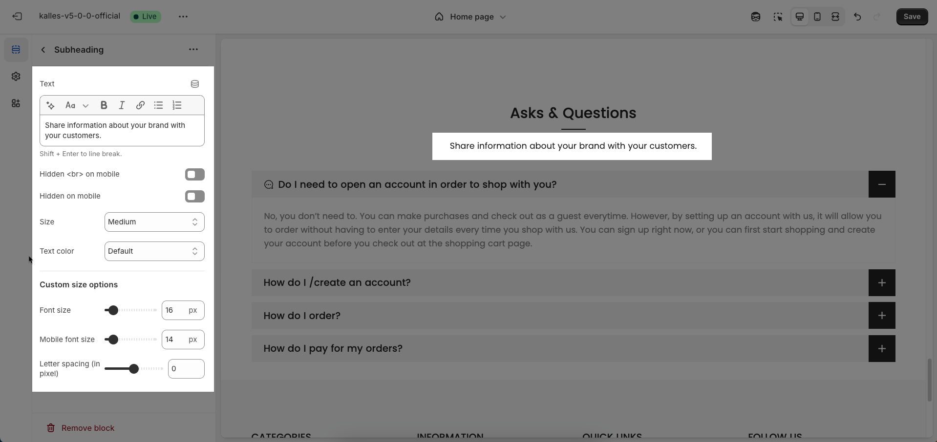
To add Sub heading block to the Section heading, click the Add block button (plus icon ➕) under the Section heading.
Once the Sub heading block is added, you can customize its settings in the left or right-hand sidebar (depending on your screen size)
Text (Shift + Enter to line break): Allows users to add textual content, providing information, descriptions, or explanations.
Hidden <br> on mobile: Remove unnecessary line breaks on mobile devices
Hidden on mobile: Choose whether to hide the heading completely on mobile devices for a streamlined display.
Choose "Custom size inline" to freely adjust the size in the Custom Size Options section.
Custom size options
Font size (Desktop/Mobile): Set different font sizes for each device type to ensure a responsive and visually appealing layout.
Letter spacing (in pixel): Adjust the space between letters to enhance readability and design precision.
2.2.4. Icon block
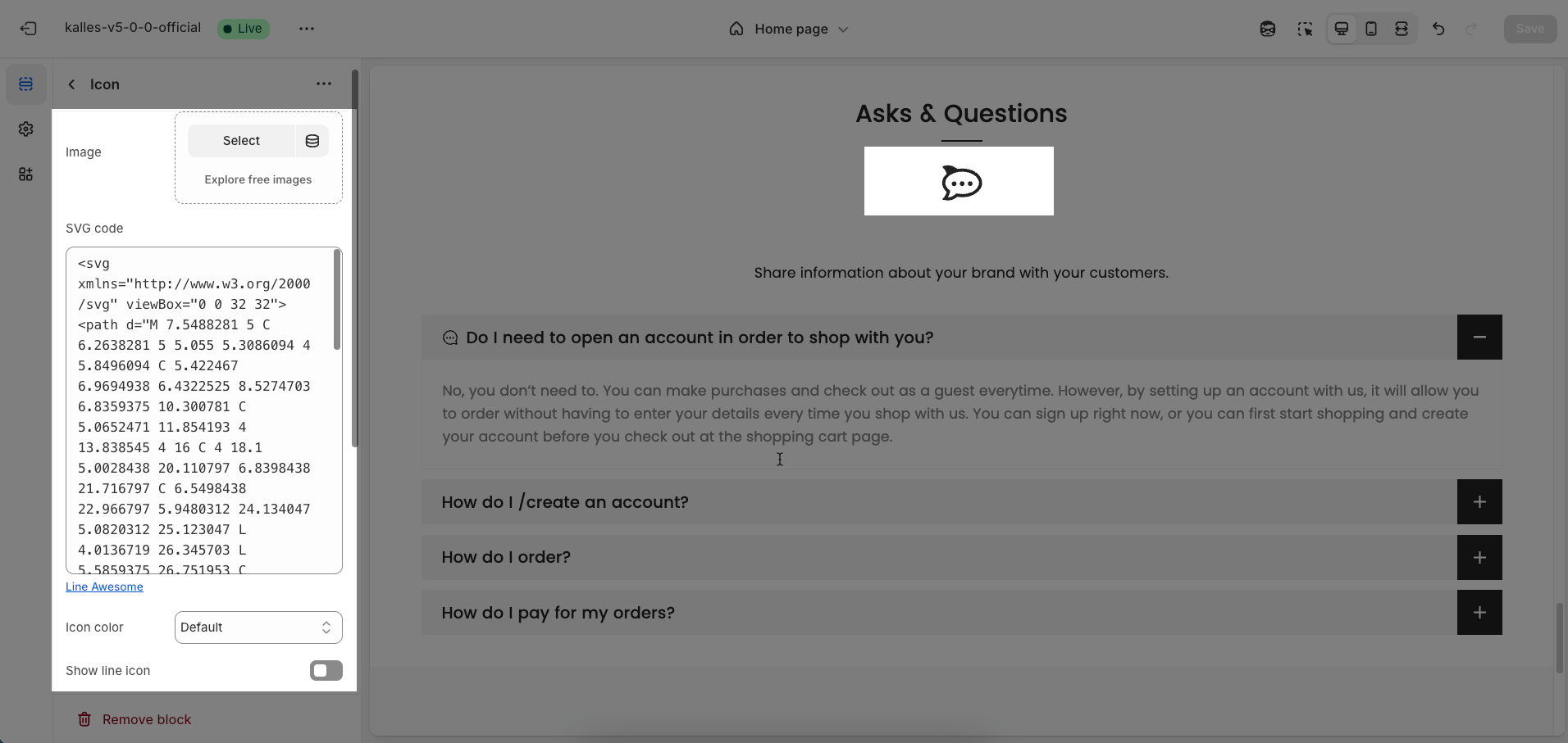
To add Icon block to the Section heading, click the Add block button (plus icon ➕) under the Section heading.
Once the Icon block is added, you can customize its settings in the left or right-hand sidebar (depending on your screen size)
Image: Upload an image file to display. This is ideal for logos, illustrations, or any other graphic you wish to use.
SVG code: Paste SVG (Scalable Vector Graphics) code directly into this field. SVG is an ideal vector graphic format for icons or simple graphics, scalable without loss of quality, and can be color-customized with CSS.
Icon color: Choose the color for the icon. This option applies to icons rendered from SVG code or those sourced from an icon library.
Show line icon: Enable this option to display a line icon (outline icon) instead of a filled icon, if your theme supports both styles.
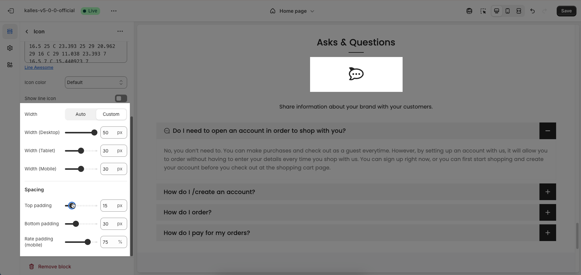
Width: Select the width setting mode.
Auto: The width will automatically adjust based on the content and available space of its parent element. This is the default and often the most flexible setting.
Custom: Allows you to specify a custom width. When this option is selected, detailed width input fields for each device will appear.
Width (Desktop): (Only visible when
Widthis set toCustom) Enter the width of the element on desktop screensWidth (Tablet): Enter the width of the element on tablet screens
Width (Mobile): Enter the width of the element on mobile devices
Spacing
Top padding: Enter the value for the top padding of the element (unit: pixels). This padding creates space between the top edge of the content and the top edge of the element.
Bottom padding: Enter the value for the bottom padding of the element (unit: pixels). This padding creates space between the bottom edge of the content and the bottom edge of the element.
Rate padding (mobile): Enter the padding rate value for the element on mobile devices
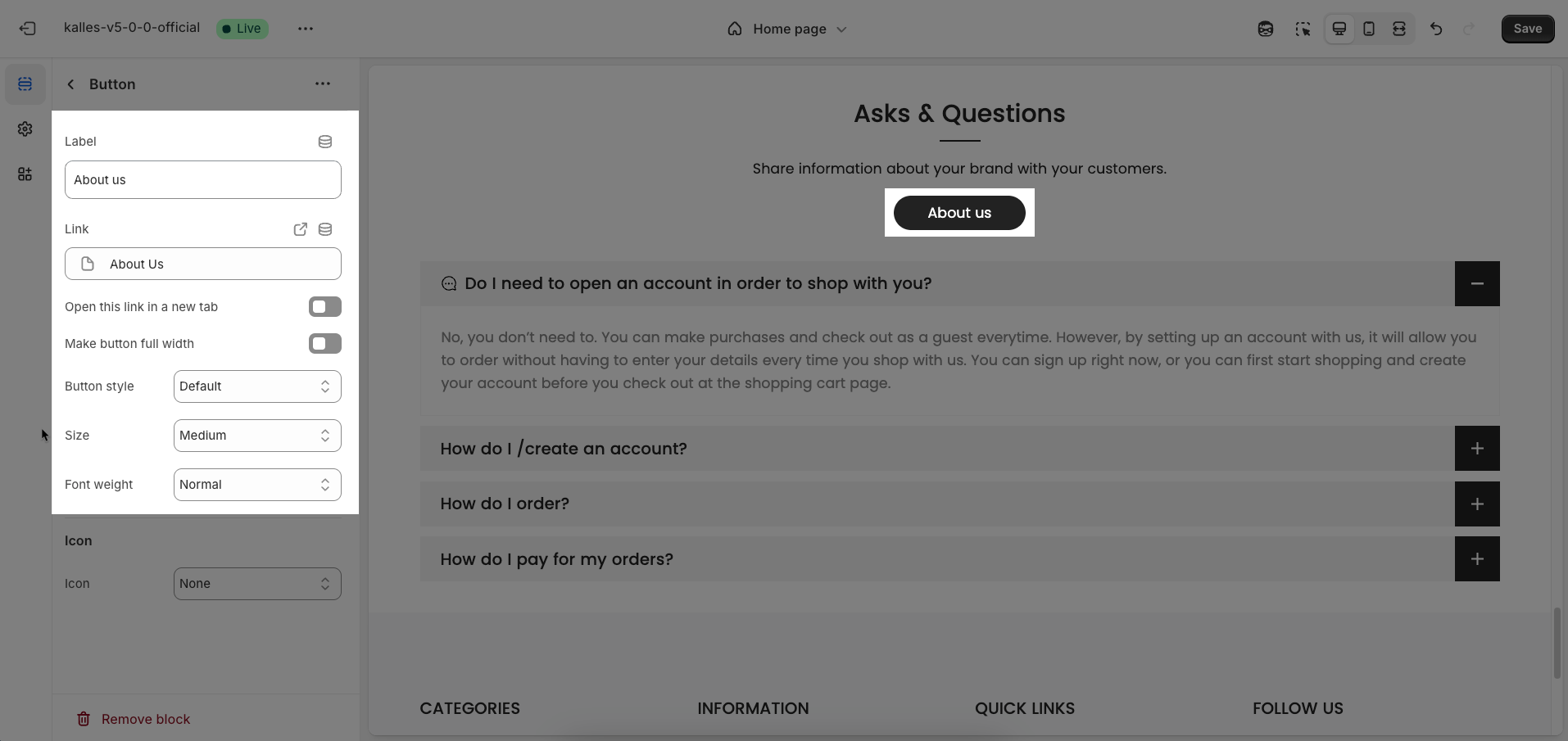
2.2.5. Button block
To add Button block to the Section heading, click the Add block button (plus icon ➕) under the Section heading.
Once the Button block is added, you can customize its settings in the left or right-hand sidebar (depending on your screen size)
Label: Enter the text that will be displayed on the button. This is the main content users will read to understand the button's function
Link: Enter the URL that the button will link to when clicked. This can be an internal page within your store, a collection, a specific product, or an external link.
Open this link in a new tab: Enable this option to open the link in a new browser tab or window when the button is clicked.
Make button full width: Enable this option to make the button expand to the full available width of its containing element. This can make the button more prominent, especially on mobile devices.
Button style: Select the visual style of the button (Defaul, Outline, Link,...)
Size: Select the size of the button (e.g.,
Small,Medium,Large,...). This affects the button's height and internal padding.Font weight: Select the weight or boldness of the font on the button (e.g.,
Normal,Bold). This impacts the prominence of the button text.
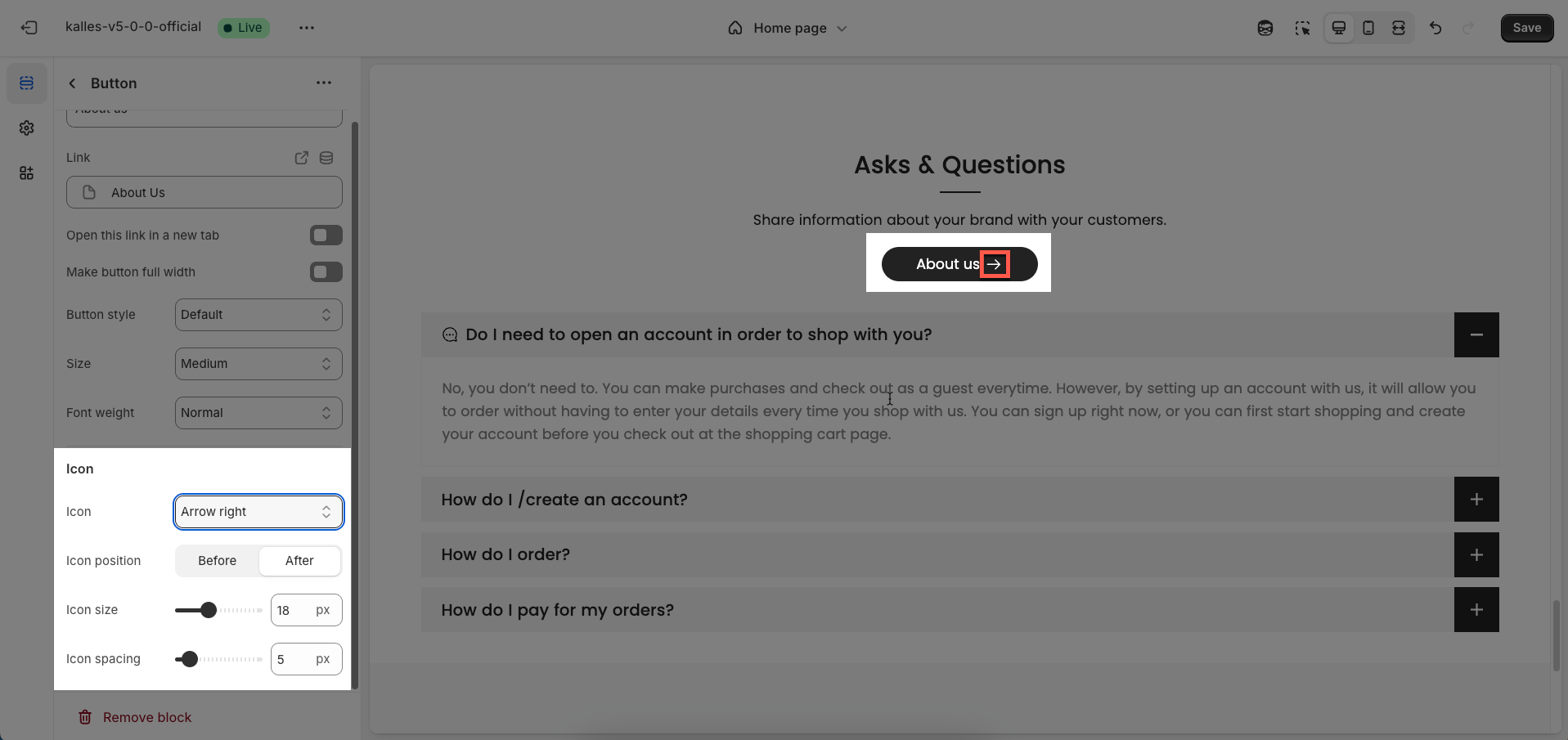
Icon
Icon: An icon is a small graphic element used for illustration or emphasis.
Icon position: Select the position of the icon relative to the text or element it accompanies
Icon size: Select the size of the icon
Icon spacing: Enter the spacing between the icon and its adjacent text or element (unit: pixels).
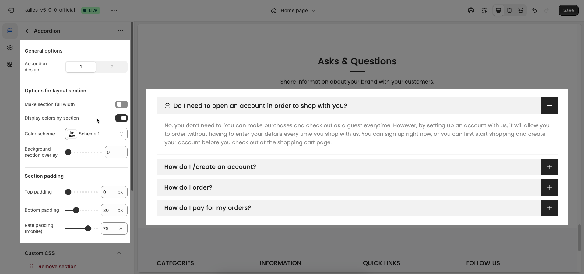
2.3. Accordion section
After adding the Accordion section, you can customize its settings in the left or right sidebar (depending on your screen size)
General options
Accordion design: Select the visual design style for the Accordion items within this section
Options for layout section
Make section full width: Enable this option to make the section span the full width of the browser, ignoring the theme's usual content width constraints.
Display colors by section: Enable this option to allow each section to manage its own color scheme independently
Color scheme: Select the color scheme that will be applied to this section. A color scheme typically includes settings for background color, primary text color, secondary text color, and other accent colors
Background section overlay: Select a color overlay that will be applied on top of the section's background
Section padding
Top padding: Enter the value for the top padding of the element (unit: pixels). This padding creates space between the top edge of the content and the top edge of the element.
Bottom padding: Enter the value for the bottom padding of the element (unit: pixels). This padding creates space between the bottom edge of the content and the bottom edge of the element.
Rate padding (mobile): Enter the padding rate value for the element on mobile devices
Custom CSS
Allows users to customize by adding CSS rules, beyond the limitations of default settings. This allows for fine-tuning the design to every detail, to suit specific needs.
Add custom styles to this section only.
To add custom styles to your entire online store, go to theme settings for detailed instructions.


