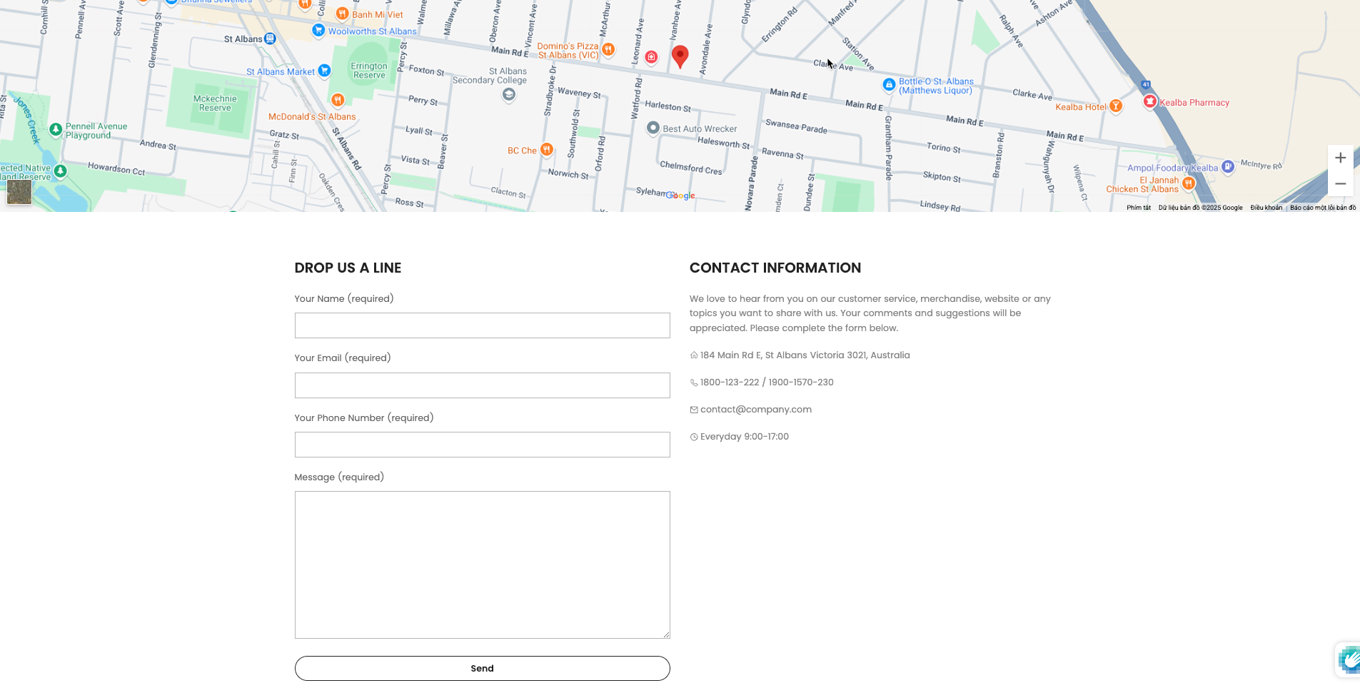
Contact Form allows customers to leave contact information to support marketing campaigns. Besides, customers also have information about the online store to contact. It is quite important in a website.
1. How to access the Contact Form section?
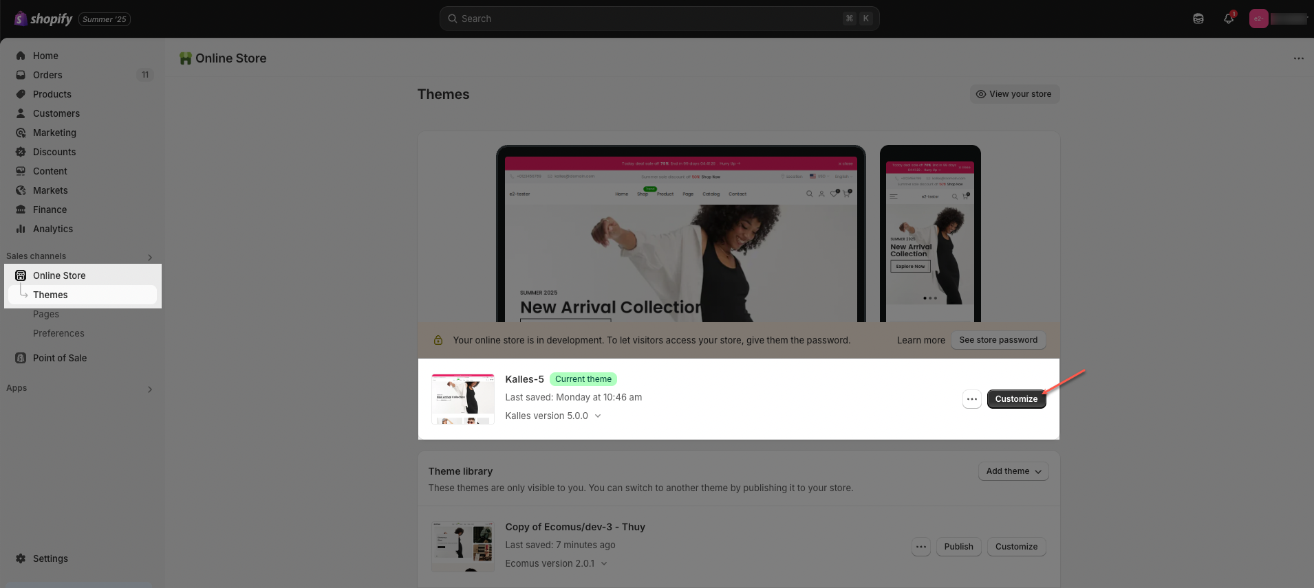
Step 01: From Shopify Admin, click on Online Store > Select Themes > In the Current theme section, click the Customize button.
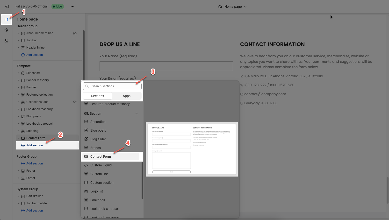
Step 02: In the theme editor (Customize), click the Sections button > Click the Add section button > In the Sections tab, scroll through the list or use the search bar to find and select Contact Form.
2. How to customize the Contact Form section?
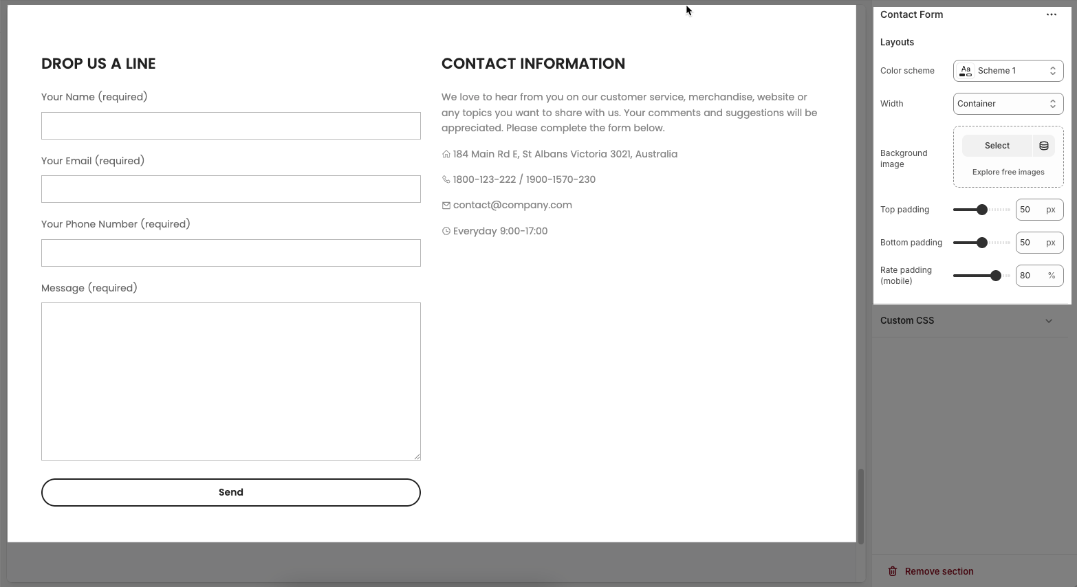
2.1. Contact Form
The Contact form allows you to collect information and messages from your visitors, customers, or users. Below are the customization options available:
Color scheme - Select a specific layout preset or theme for the contact form.
Width - Controls the horizontal size of the contact form.
Background image - An option to add or change an image in the background of the contact form.
Top padding - Adjusts the space between the top edge of the contact form and its content.
Bottom padding - Adjusts the space between the bottom edge of the contact form and its content.
Rate padding (mobile) - Adjusts padding specifically for mobile devices, possibly as a percentage.
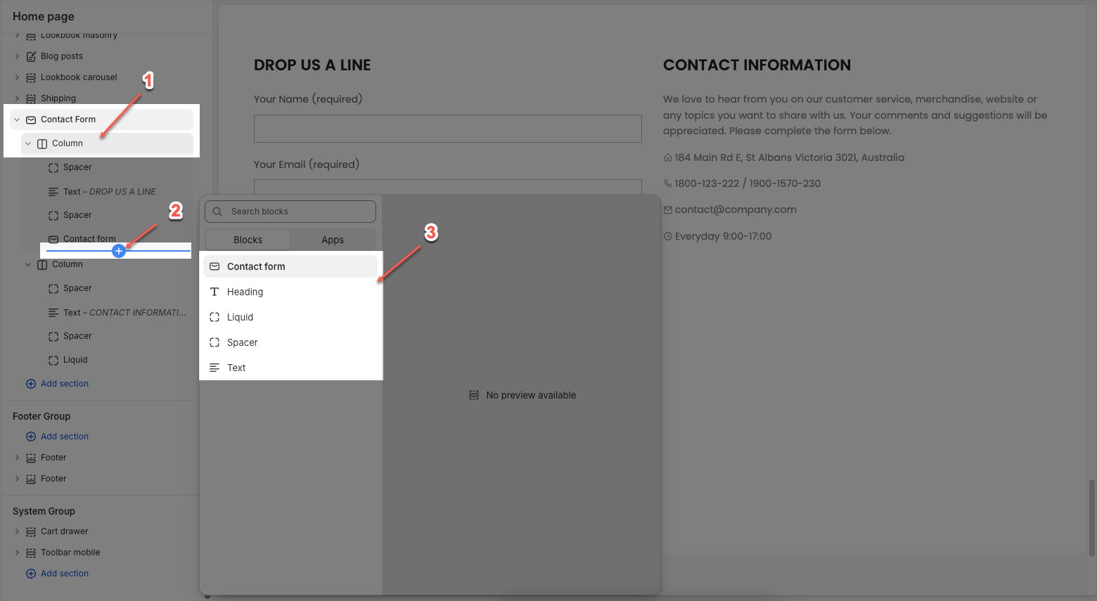
2.2. Blocks in the Contact Form
In the Contact Form section, you can add various blocks, such as Heading, Text, Contact form, Liquid, and Spacer to enhance the layout and design.
Click on Contact Form section > Add block (plus icon ➕) > Select Column block.
Under Column block > Add block (plus icon ➕) > Select block you can add
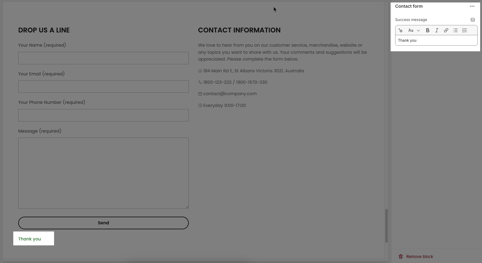
2.2.1. Contact form block
Success message: This option allows you to customize the message that appears to a user after they have successfully submitted the contact form.
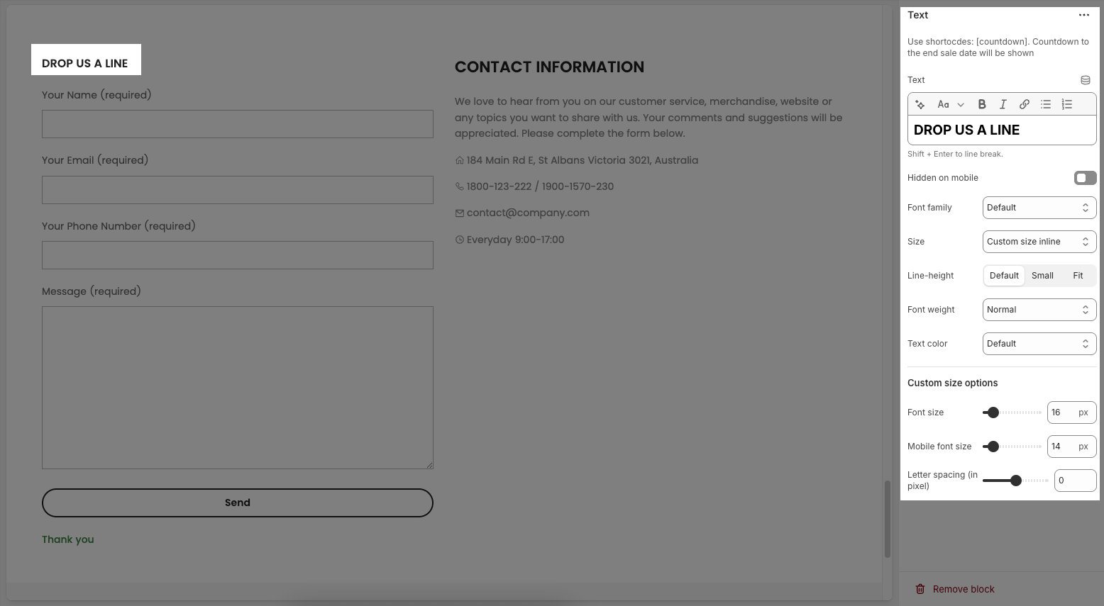
2.2.2. Text
Text : This is where you input the main text content
Shift + Enter to line break.
Use shortocdes: [countdown]. Countdown to the end sale date will be shown
Hidden on mobile: A toggle switch. If enabled, the text content will not be displayed on mobile devices.
Font family: A dropdown menu to select the typeface for the text. "Default" is currently selected.
Size: Controls font size, options include such as Small, Medium, Large, ... and "Custom size inline" for specific settings.
Line-height: Adjusts the vertical spacing between lines of text. Options include "Default", "Small", and "Fit".
Font weight: A dropdown menu to choose the thickness or boldness of the font.
Text color: A dropdown menu to set the color of the text. "Default" is currently selected.
Date countdown: An input field or date picker where you can set the exact date and time for the countdown to end (e.g., "2025-09-30 15:00:00").
Text day countdown: An input field where you define the text to display for the "days" unit of the countdown.
Effect slider: This likely refers to the transition effect for the content, with options like "Fade" or "Slider" currently selected.
Autoplay speed in seconds: A slider and input field to set the duration (in seconds) before the next slide or item in the "slider" effect appears.
Set is '0' to disable autoplay
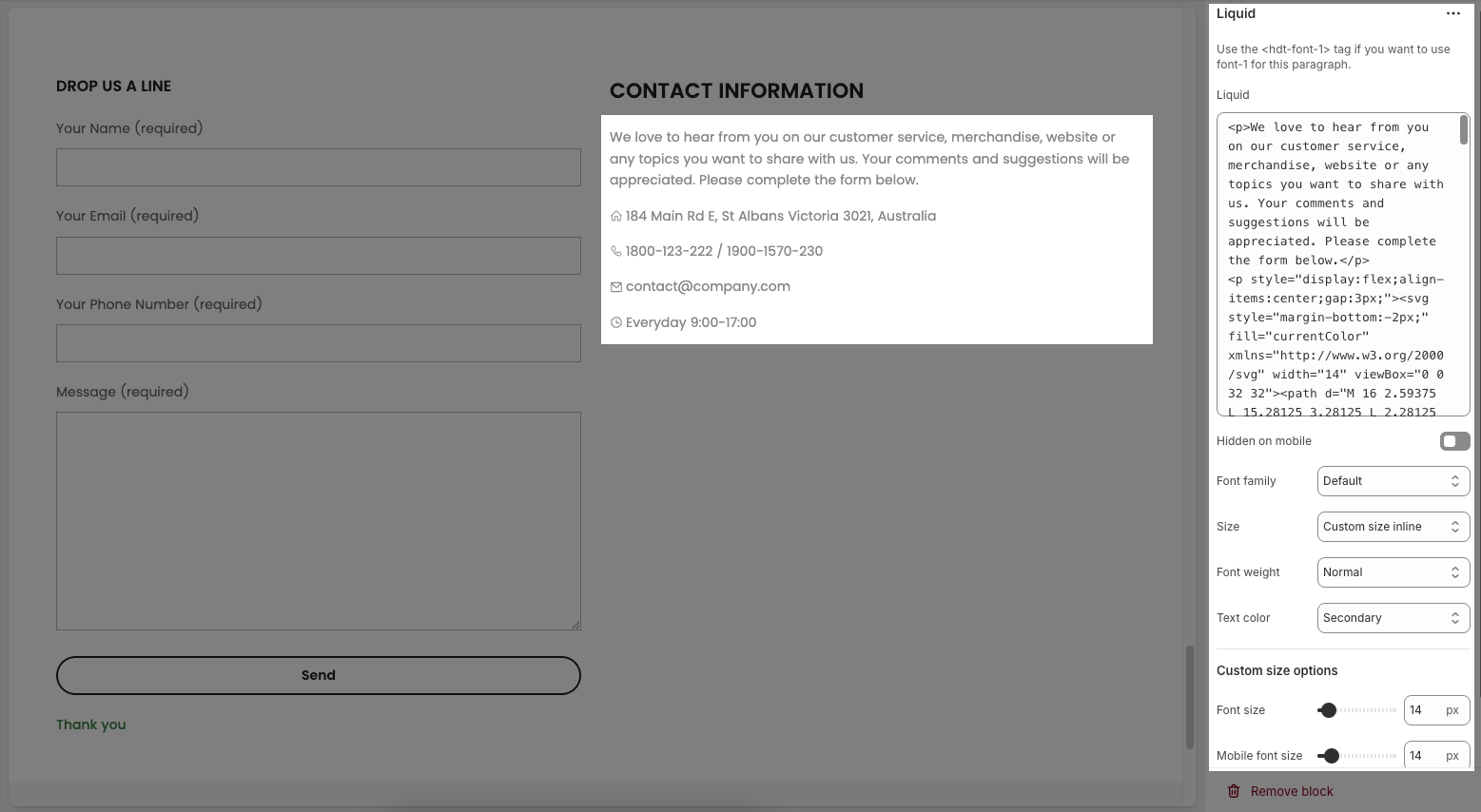
2.2.3. Liquid
Use the <hdt-font-1> tag if you want to use font-1 for this paragraph.
Liquid: Field for dynamic content using Liquid templating.
Hidden on mobile: This is a toggle switch. When enabled, the content configured in this section will not be displayed on mobile devices.
Font family: A dropdown menu to select the typeface for the text. "Default" is currently selected.
Size: Controls font size, options include such as Small, Medium, Large, ... and "Custom size inline" for specific settings.
Font weight: Adjusts font thickness (e.g., "Medium, Bold,...").
Text color: Sets the text color (e.g., "Default" uses theme's color).
Font size (Custom options): Sets font size in pixels for desktop.
Mobile font size (Custom options): Sets font size in pixels for mobile.
Letter spacing (in pixel) (Custom options): Adjusts space between letters in pixels.
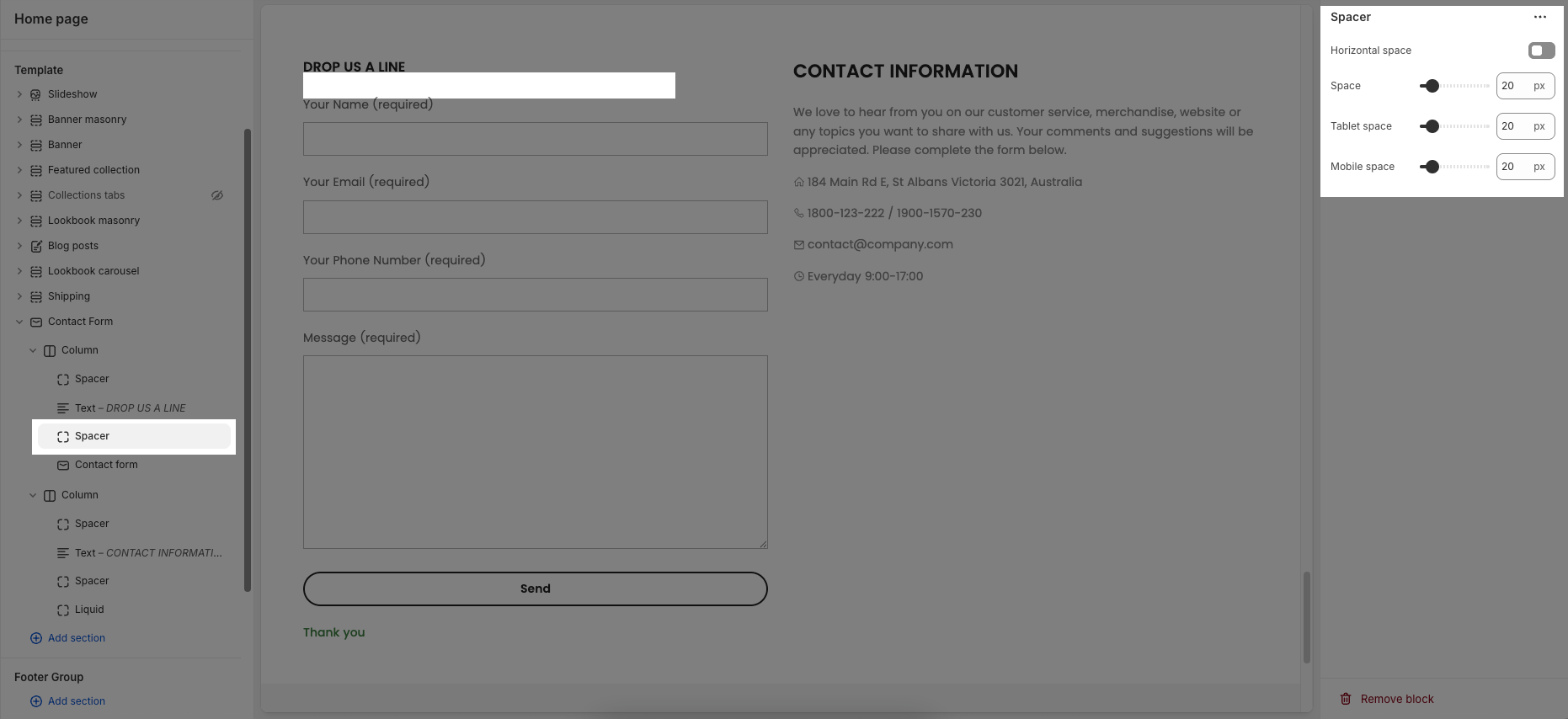
2.2.4. Spacer
Horizontal space: If enabled, the spacer will also add horizontal spacing instead of only vertical spacing.
Space: Adjusts the amount of space (in pixels) on desktop screens.
Tablet space: Defines the amount of space for tablet devices, ensuring responsive spacing.
Mobile space: Sets the spacing specifically for mobile screens.