


The Announcement Bar is a thin notification strip, usually located at the top of a website (above the main header), designed to display important, topical, or promotional messages to users. These messages can be about promotions, free shipping offers, service announcements, or urgent news.
1. How to access the Announcement bar section?
Step 01: From Shopify Admin, click on Online Store > Select Themes > In the Current theme section, click the Customize button.

Step 02: In the theme editor (Customize), click the Sections button > find the Announcement bar
2. How to customize the Announcement bar section?
2.1. Announcement bar block
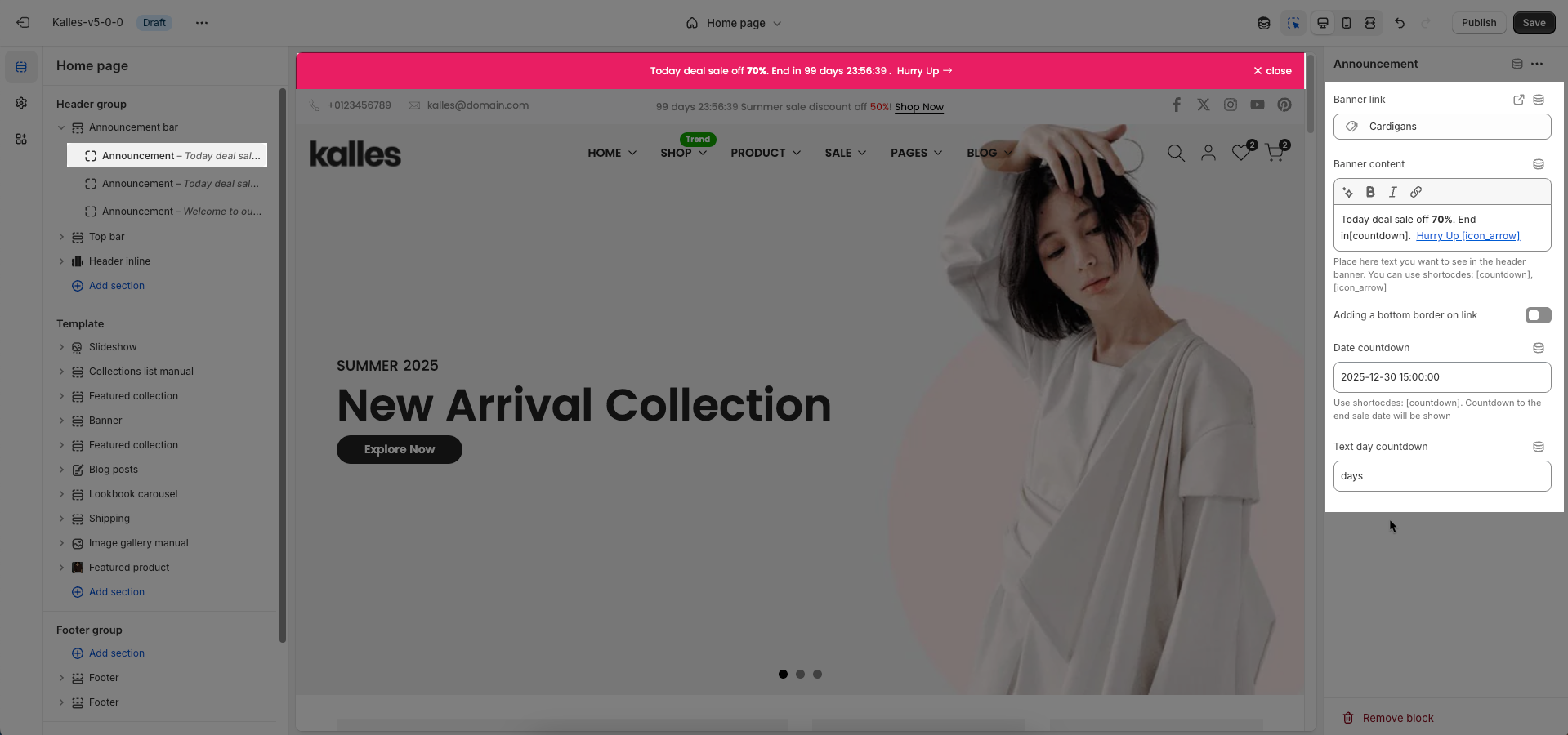
To add Announcement block to the Top bar, click the Add block button (plus icon ➕) under the Announcement bar
Banner link: Enter the URL the banner will link to when clicked.
Banner content: Enter the main content to be displayed on the banner. This can include text, custom HTML, or other rich elements.
Place here text you want to see in the header banner. You can use shortocdes: [countdown], [icon_arrow]
Adding a bottom border on link: Check to add a bottom border to links within the banner. This helps to visually emphasize the links.
Date countdown: Select the end date and time for the countdown. The countdown will display the time remaining until this date.
Text day countdown: Enter the text to display alongside the countdown
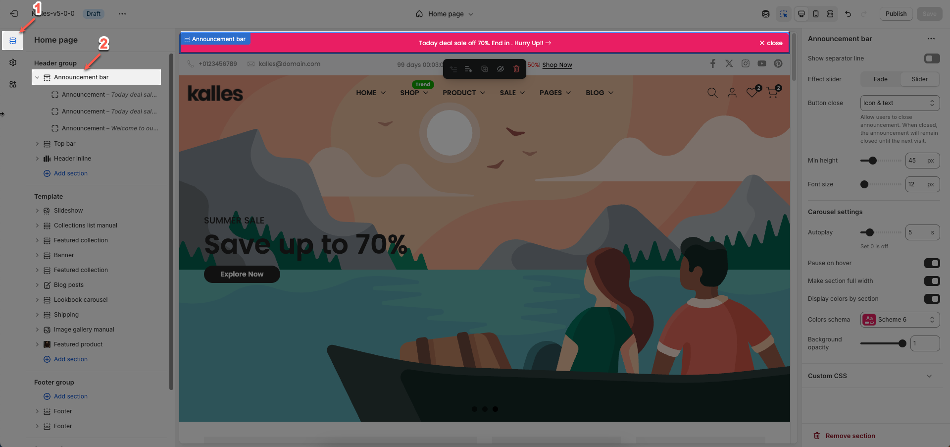
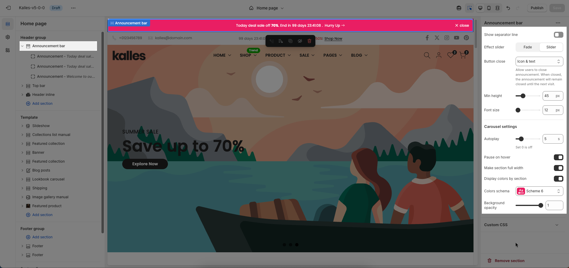
2.2. Announcement bar section
Show separator line: Check to display a separator line above or below this section. This helps to visually divide content and improve overall layout.
Effect slider: Choose the transition effect between slides in the slideshow or carousel.
Fade: Slides will fade in and out, creating a gentle transition.
Slide: Slides will move horizontally or vertically, providing a more direct motion effect.
Button close: Check to display a close button for this element (e.g., for a popup or announcement bar). This allows users to dismiss it.
Min height: Set the minimum height for this section. This helps ensure the section always occupies a certain vertical space, even if its content is minimal.
Font size: Set the font size for the text within this section.
Carousel settings
Autoplay: Enable this option to allow the slideshow when the page loads.
Pause on hover: Check to pause autoplay when the user hovers over the slideshow
Make section full width: Check to stretch this section to full width of the screen. If unchecked, the content will be constrained to the page's maximum content width.
Display colors by section: Check to apply a specific color schema for this section. When selected, you can assign an independent color scheme to this section, overriding global theme color settings.
Colors schema: Select the color schema to be applied to this section. A color schema defines color variables such as background color, text color, button colors, and more, ensuring consistency and easy management.
Background opacity: Set the opacity of this section's background. 0 is completely transparent, 1 is fully opaque.
Custom CSS
Allows users to customize by adding CSS rules, beyond the limitations of default settings. This allows for fine-tuning the design to every detail, to suit specific needs.
Add custom styles to this section only.
To add custom styles to your entire online store, go to theme settings for detailed instructions.


