


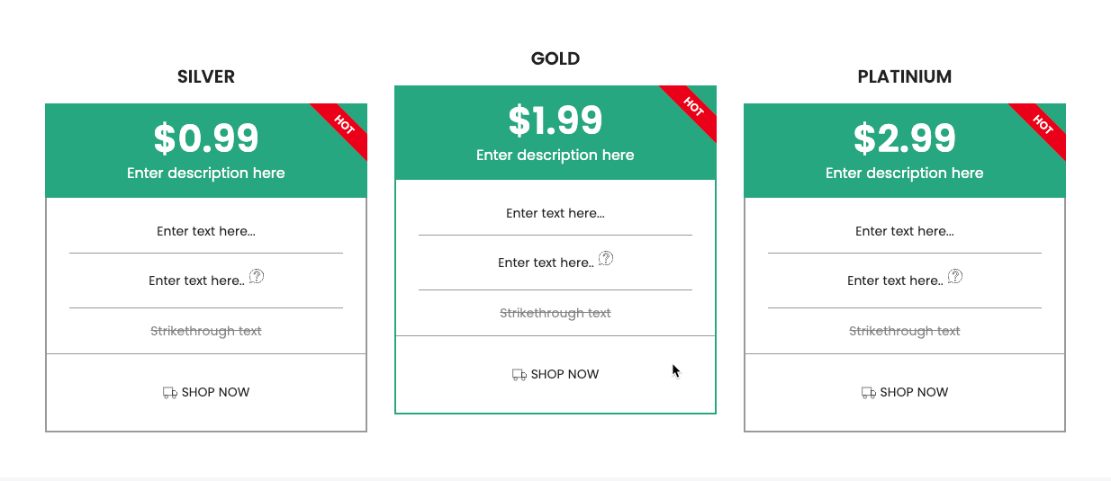
The Price tables is built with a clear structure, allowing for easy customization of both layout and functionality. It supports displaying multiple service or product packages with various attributes. Optimized for both desktop and mobile devices to ensure the best user experience.
1. How to access the Price tables section?
Step 01: From Shopify Admin, click on Online Store > Select Themes > In the Current theme section, click the Customize button.

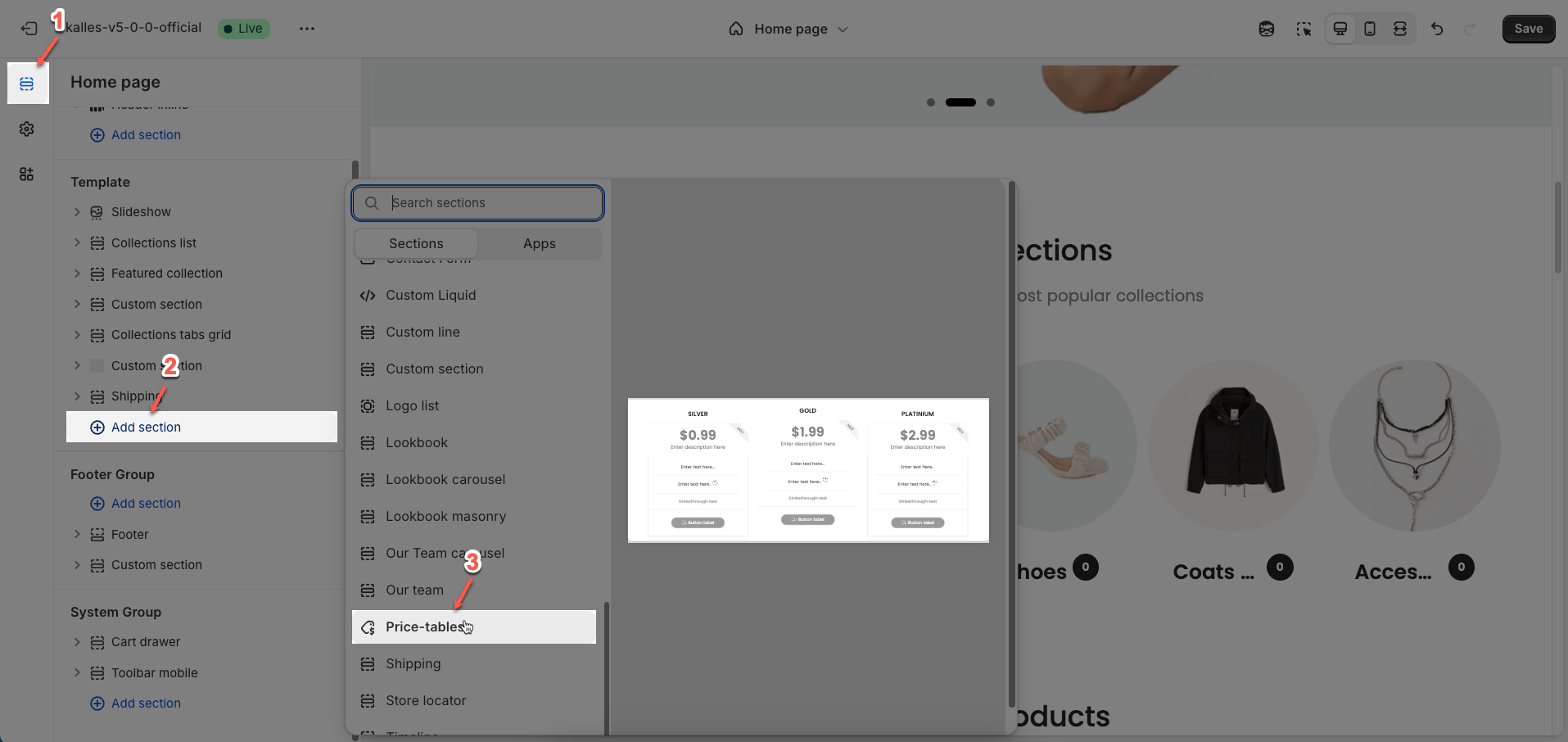
Step 02: In the theme editor (Customize), click the Sections button > Click the Add section button > In the Sections tab, scroll through the list or use the search bar to find and select the Price tables section.
2. How to customize the Price tables section?
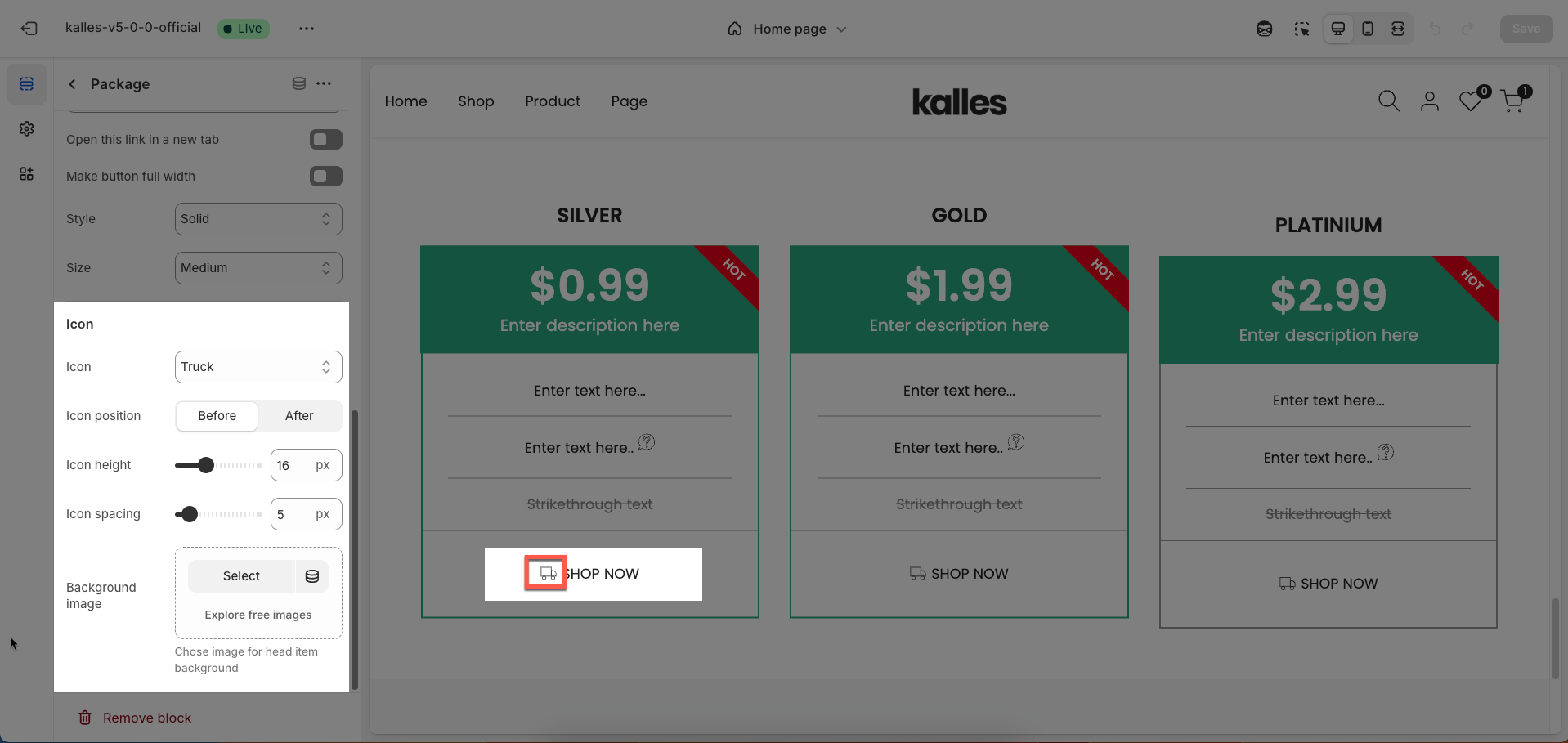
2.1. Package block
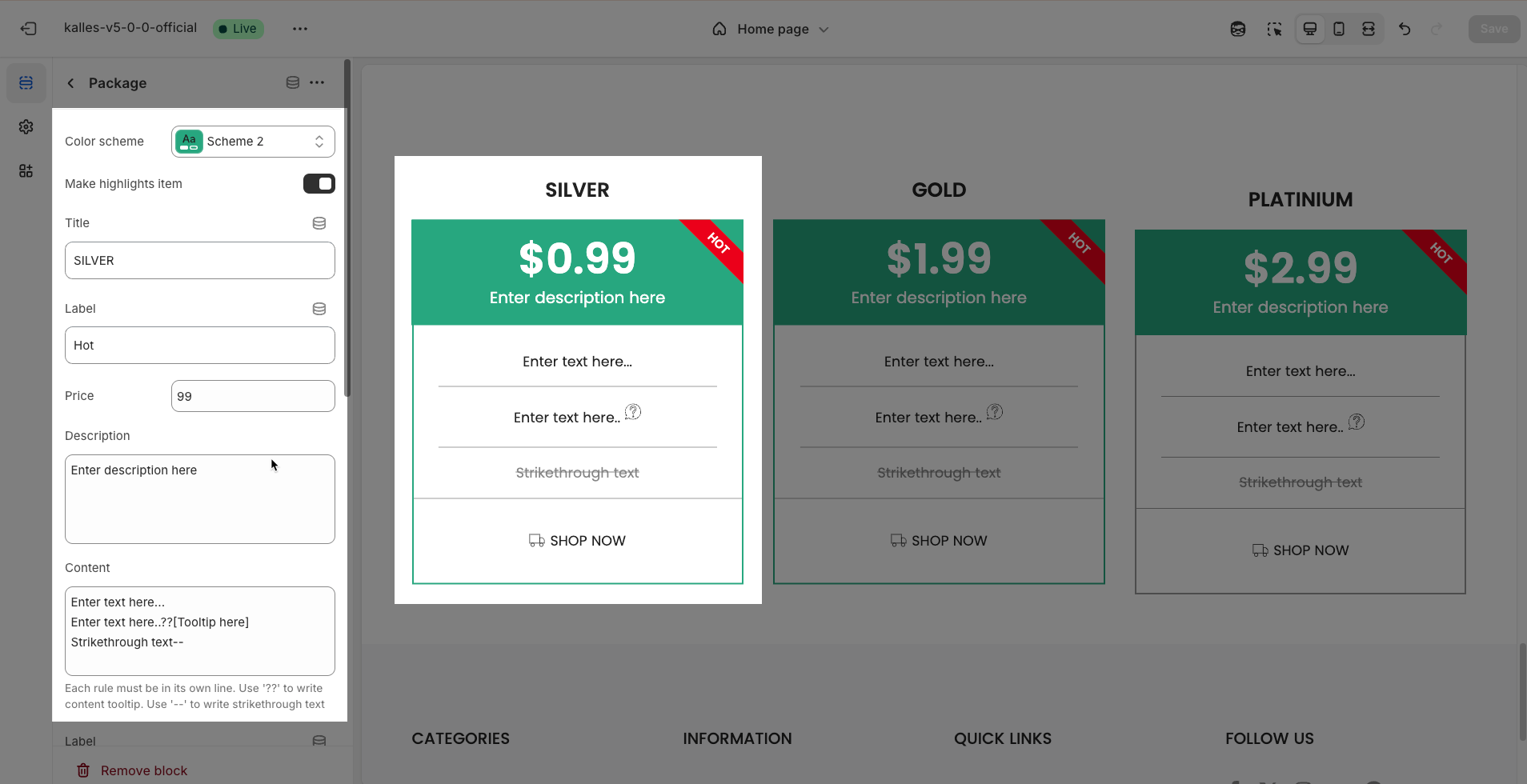
To add a Package block to the Price tables, click the Package button (plus icon ➕) under the Price tables.
After adding the Package block, you can adjust its settings using the sidebar—located on the right or left side of your screen depending on your device
Color scheme: Select the color scheme that will be applied to this item. A color scheme typically includes settings for background color, primary text color, secondary text color, and other accent colors, helping maintain design consistency and brand identity.
Make highlights item: Enable this option to highlight this item compared to others within the same section.
Title: Enter the title for this item
Label: Enter the label for this item. Labels are typically short and descriptive.
Price: Enter the price for this item (if applicable).
Description: Enter a brief description for this item
Content: Enter the detailed content for this item.
Each rule must be in its own line. Use '??' to write content tooltip. Use '--' to write strikethrough text
Label button: Enter the text that will be displayed on the button.
Link: Enter the URL that the button will link to when clicked.
Open this link in a new tab: Enable this option to open the link in a new browser tab or window when the button is clicked.
Make button full width: Enable this option to make the button expand to the full available width of its containing element.
Style: Select the visual style of the button (Solid, Outline, Link, 3D)
Size: Select the size of the button (e.g.,
Small,Medium,Large).
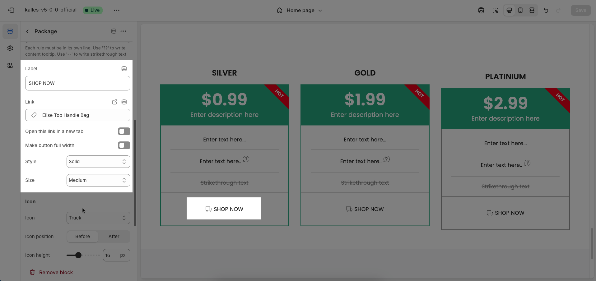
Icon
Icon: Selected from an icon font library.
Icon position: Select the position of the icon relative to the main content of the item
Icon height: Enter the height of the icon (unit: pixels). This height helps control the displayed size of the icon.
Icon spacing: Enter the spacing between the icon and the main content of the item
Background image: Upload the image to be used as a background for the element or section. A background image can be a decorative element or provide visual context for the content.
Chose image for head item background
2.2. Price tables section
After adding the Price tables section, you can customize its settings using the sidebar—located on the right or left side of your screen depending on your device.
Package design: Select the visual design style for the content packages or items. This defines the overall look and presentation of information within each item.
Content align: Select how content will be horizontally aligned within each package or item (e.g.,
Left,Center,Right).Items per row (Desktop): Enter the number of items to display per row on desktop screens (large screens).
Items per row (Tablet): Enter the number of items to display per row on tablet screens. This allows you to optimize the layout for intermediate devices.
Items per row (Mobile): Enter the number of items to display per row on mobile devices. Optimizing for small screens is crucial for a good user experience.
Color scheme: Select the color scheme that will be applied to this section
Make section full width: Enable this option to make the section span the full width of the browser, ignoring the theme's usual content width constraints.
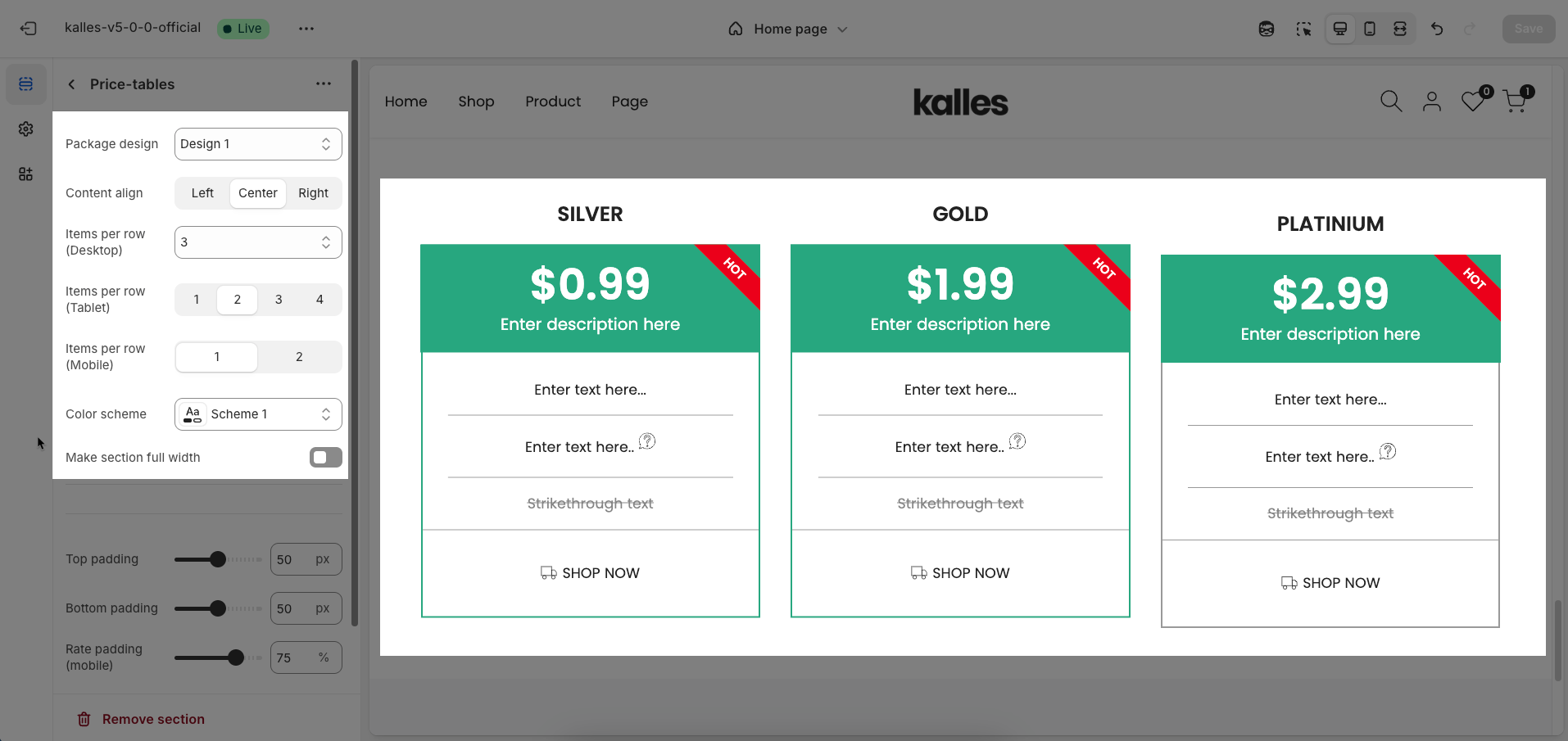
Section padding
Top padding: Enter the value for the top padding of the element (unit: pixels). This padding creates space between the top edge of the content and the top edge of the element.
Bottom padding: Enter the value for the bottom padding of the element (unit: pixels). This padding creates space between the bottom edge of the content and the bottom edge of the element.
Rate padding (mobile): Enter the padding rate value for the element on mobile devices
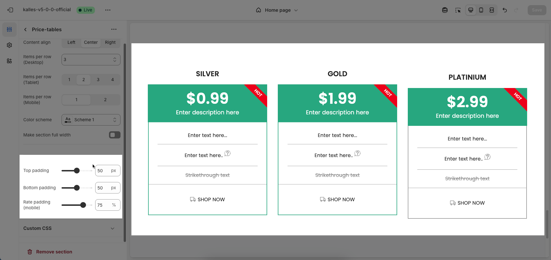
Custom CSS
Allows users to customize by adding CSS rules, beyond the limitations of default settings. This allows for fine-tuning the design to every detail, to suit specific needs.
Add custom styles to this section only.
To add custom styles to your entire online store, go to theme settings for detailed instructions.


