The Collection page section allows you to customize the layout and appearance of product listings within a specific collection. You can adjust product design, image ratio, grid layout, spacing, and pagination to create a shopping experience that fits your brand.
1. How to access the Collection page section?
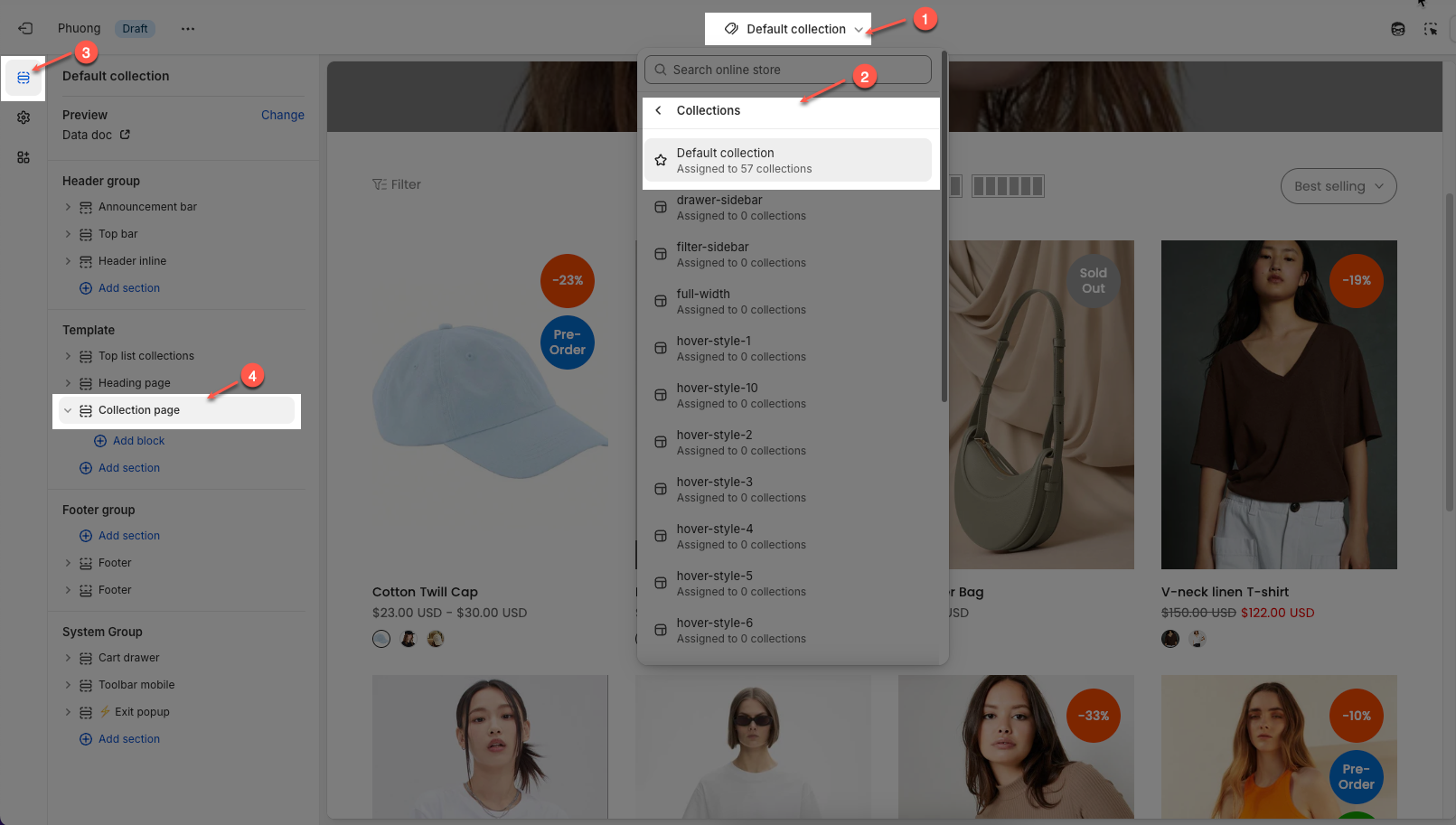
Step 01: From Shopify Admin, click on Online Store > Select Themes > In the Current theme section, click the Customize button.

Step 02: In the theme editor (Customize), click to open the dropdown pages in the topbar > select Collection > click Collection product > In the Sections tab, scroll and find Collection page section in Template
2. How to customize the Collection page section?
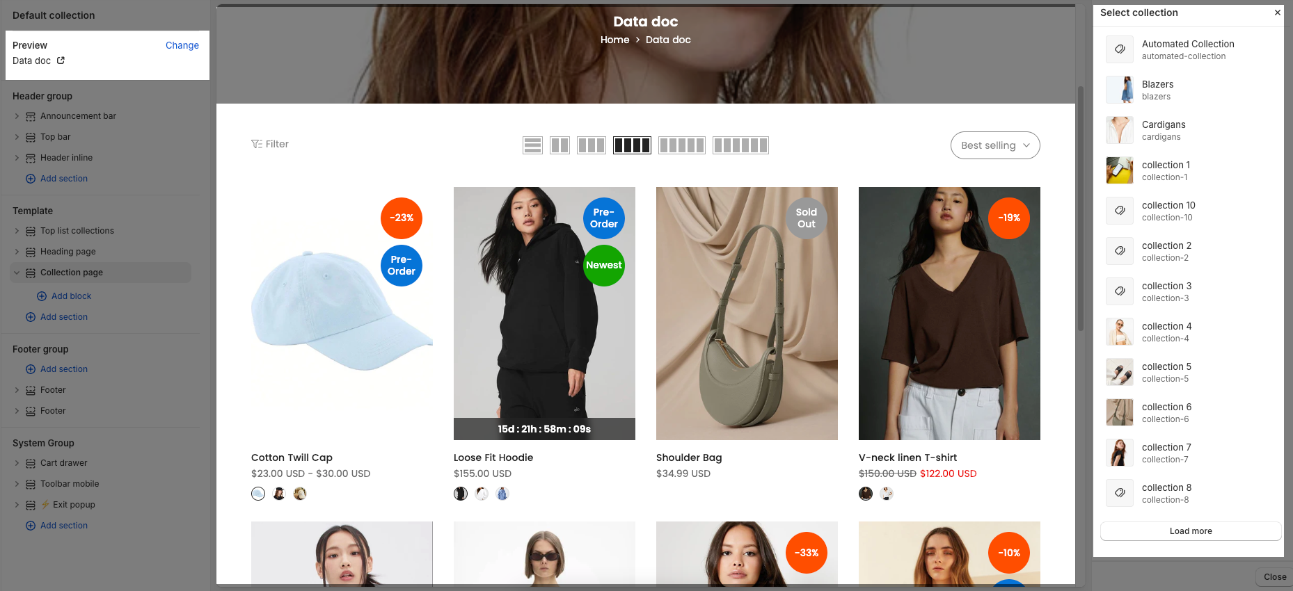
To configure a specific collection, go to the Preview section at the top left and click Change. From there, select the collection you want to edit. The available settings for that collection will then be displayed under the Collection page section, where you can customize its layout and content.
2.1. Collection page section
Below are the available options for customizing the Collection page section, allowing you to control the layout, product display, and overall appearance of your collection pages.
2.1.1. Collection page
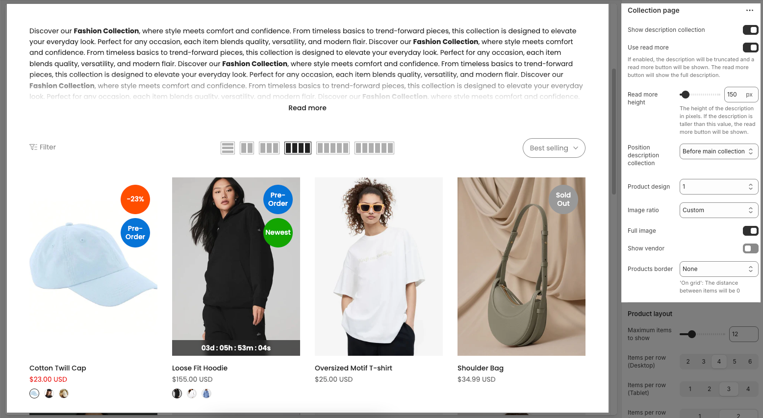
Show description collection: Toggle this on to display the collection's description on the page.
Use read more (New version)
Turn on/off the “Read more” button. If enabled, the description will be truncated to a certain height, and a “Read more” button will appear to show the full text.Read more height (px) (New version)
Enter the maximum height (in pixels) for the description to be shown initially. If the content exceeds this height, the “Read more” button will be displayed to expand the description.Position description collection: Choose where to show the collection description:
Before main collection: The description will appear above the product grid.
After main collection: The description will appear below the product grid.
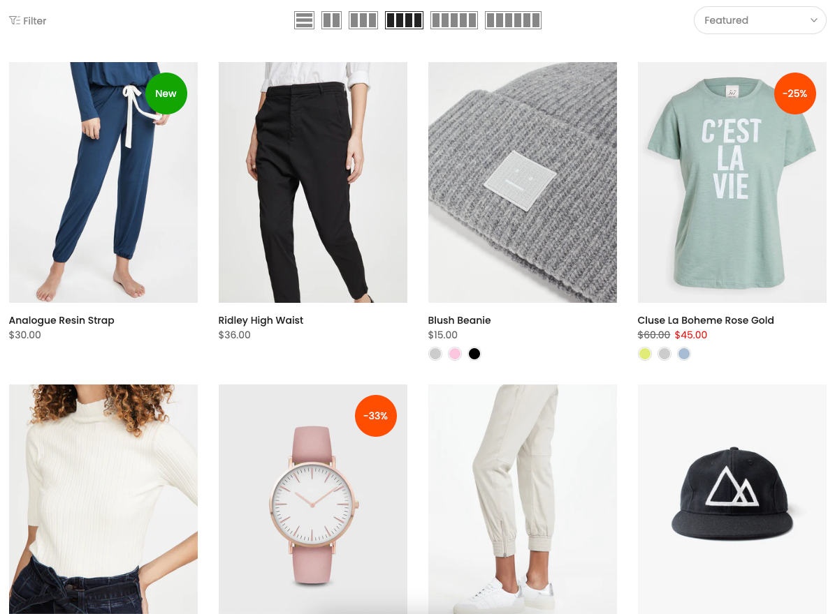
Product design: Select a layout style for how products are displayed within the collection
Image ratio: Controls the aspect ratio of product images. You can use a fixed ratio (like square, portrait, etc.) or select Custom for a more tailored display.
Go to Theme settings > Product card tab > Product image custom ratio to select a custom image ratio.
Full image: When enabled, it shows the entire product image without cropping. Turn it off to crop images to fit the grid uniformly.
Show vendor: Toggle this on to display the product vendor (brand or supplier) beneath each product.
Products border: Choose a border style for product cards:
None: No border is applied between product items.
In image: A border is applied only around the product image area, not the full product card.
On items: A border surrounds the entire product card, including the image, title, price, and other content.
On grid: Borders are added around the grid structure itself. The distance between items will be 0
2.1.2. Product layout
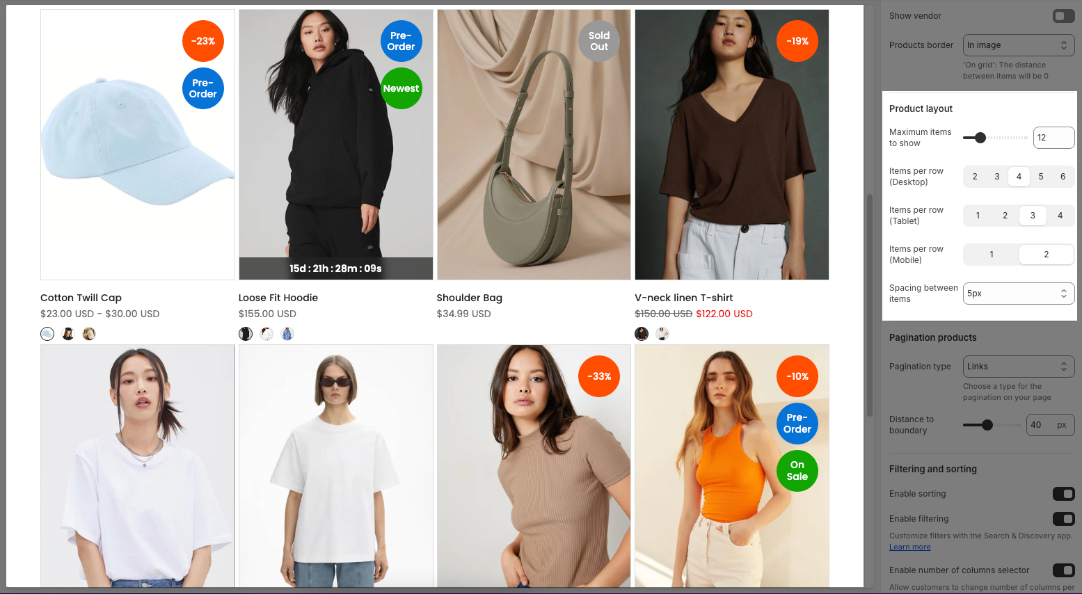
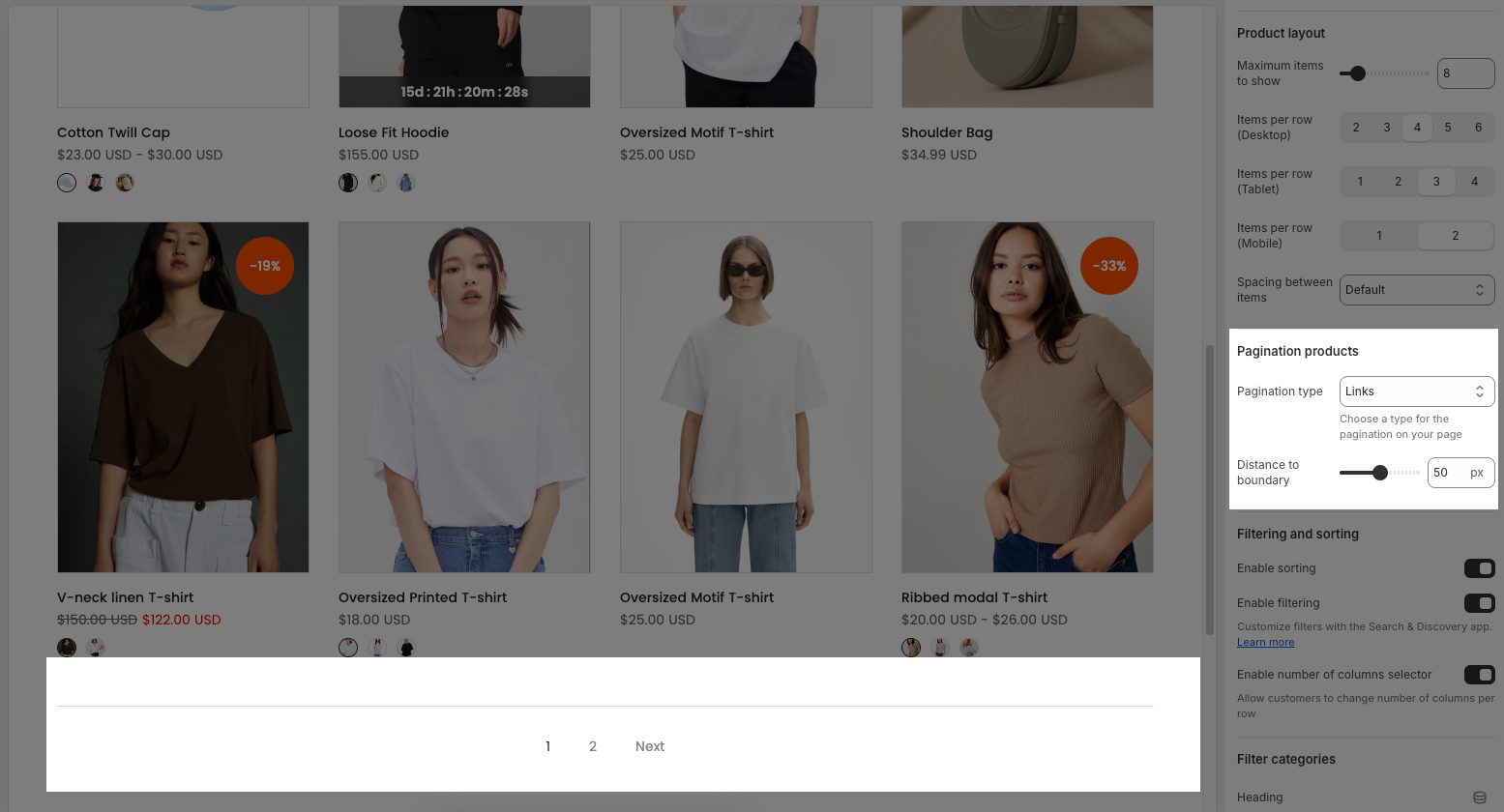
Maximum items to show: Set the maximum number of products to display on the collection page.
Items per row (Desktop): Choose how many product items to display per row on desktop screens (2 to 6 items).
Items per row (Tablet): Choose how many items appear per row on tablet devices (1 to 4 items).
Items per row (Mobile): Choose how many items appear per row on mobile devices (1 or 2 items).
Spacing between items: Adjust the space (in pixels) between product items.
Default: Uses the theme’s default spacing.
0: No spacing between items.
5px / 10px / 15px / 20px: Set a custom spacing between items in pixels.
2.1.3. Pagination products
Pagination type: Choose how products are loaded when users reach the end of the current product list:
Links: Displays numbered pagination links (e.g., 1, 2, 3...) at the bottom of the collection page. Clicking on a number loads a new page.
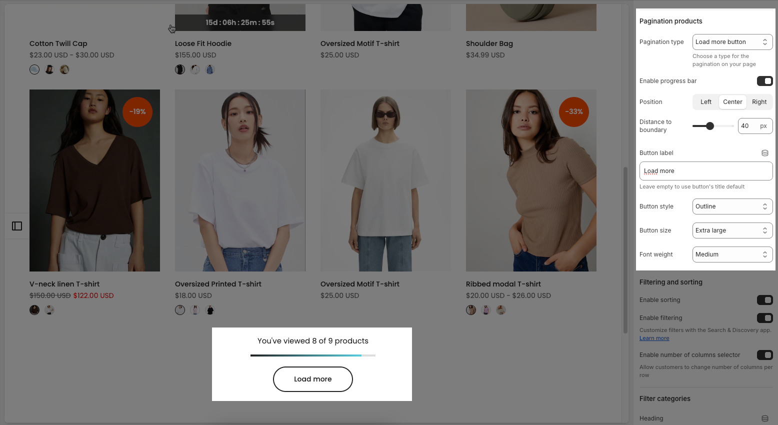
Load more button: Shows a "Load more products" button that loads additional products without refreshing the page.
Infinite scrolling: Automatically loads more products as the user scrolls down the page, creating a seamless browsing experience.
Distance to boundary: Sets the distance (in pixels) between the end of the product list and the point where the pagination.
If you select "Load more button" as the pagination type, you can customize its appearance and behavior using the options below.
Enable progress bar: Toggles a progress bar that visually indicates how many products have been viewed or loaded.
Position: Sets the alignment of the "Load more" button — options are Left, Center, or Right.
Distance to boundary: Adjusts the vertical spacing (in pixels) between the "Load more" button and the page boundary.
Button label: Lets you customize the text shown on the button (e.g., "Load more"). Leaving it blank will use the default label.
Button style: Selects the visual style of the button, such as "Outline" or "Solid".
Button size: Sets the size of the button.
Font weight: Determines how thick or bold the button text appears (e.g., Light, Medium, Bold).
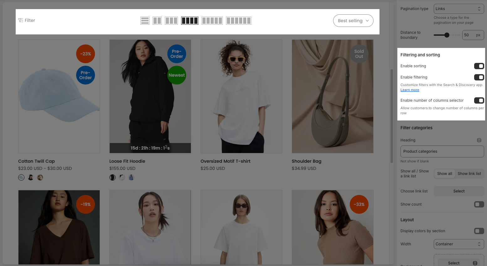
2.1.4. Filtering and sorting
Enable sorting: Allows customers to sort products using a dropdown menu (e.g., Best selling, Price: Low to High, Newest, etc.).
Enable filtering: Enables product filters such as size, color, price, etc. Filters are managed through the Search & Discovery app.
Note: To have this feature, you must install Shopify Search & Discovery
Step 1: Add filter
From dashboard Search & Discovery app > click Filters tab > Click Add filter button to add filter conditions for products in the collection.
Step 2: Customize filter and Save
Follow below video:
Enable number of columns selector: Adds a visual selector (icon buttons) that lets customers choose how many product columns per row they want to view (e.g., 2, 3, 4, or more items per row).
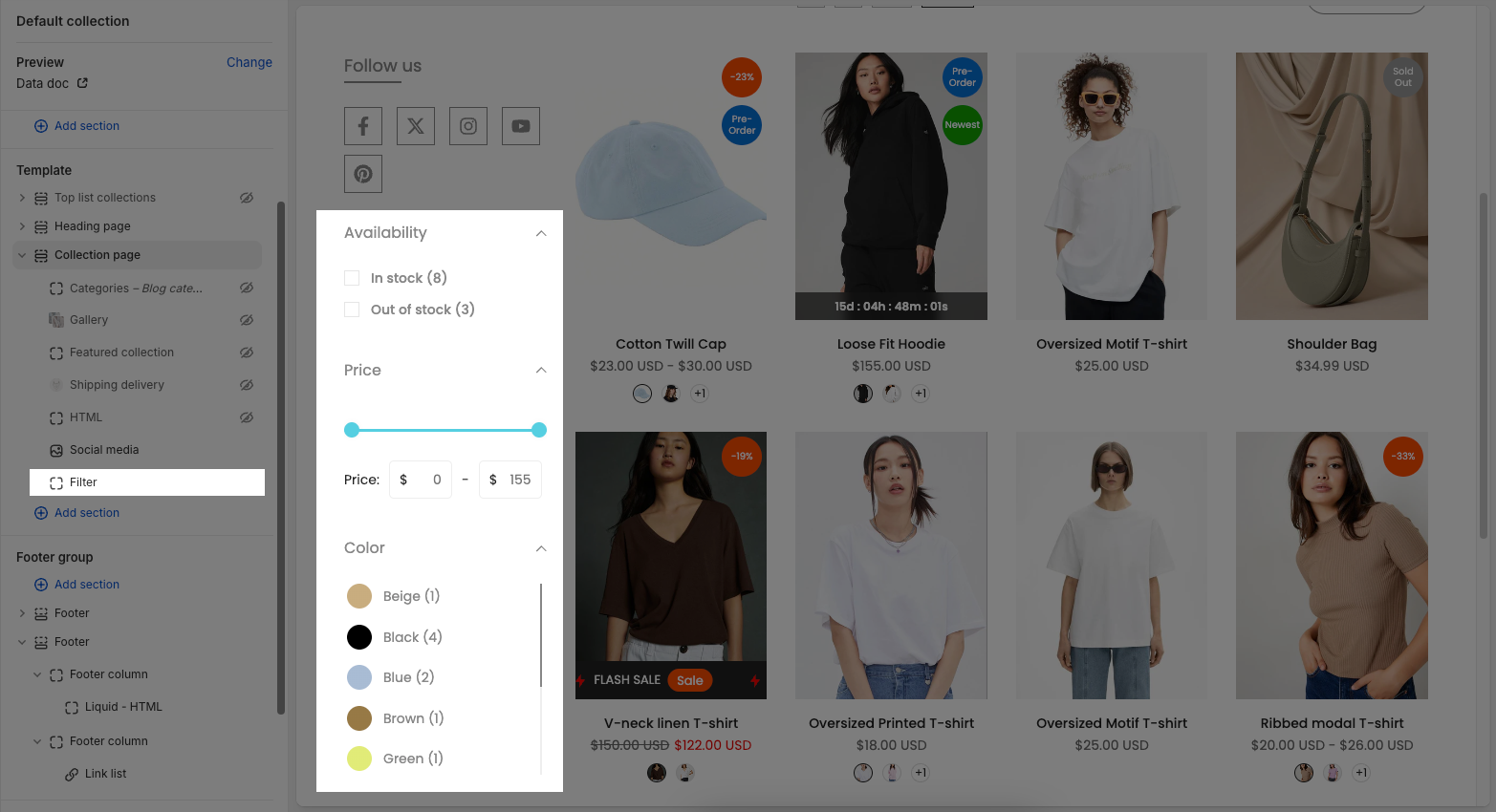
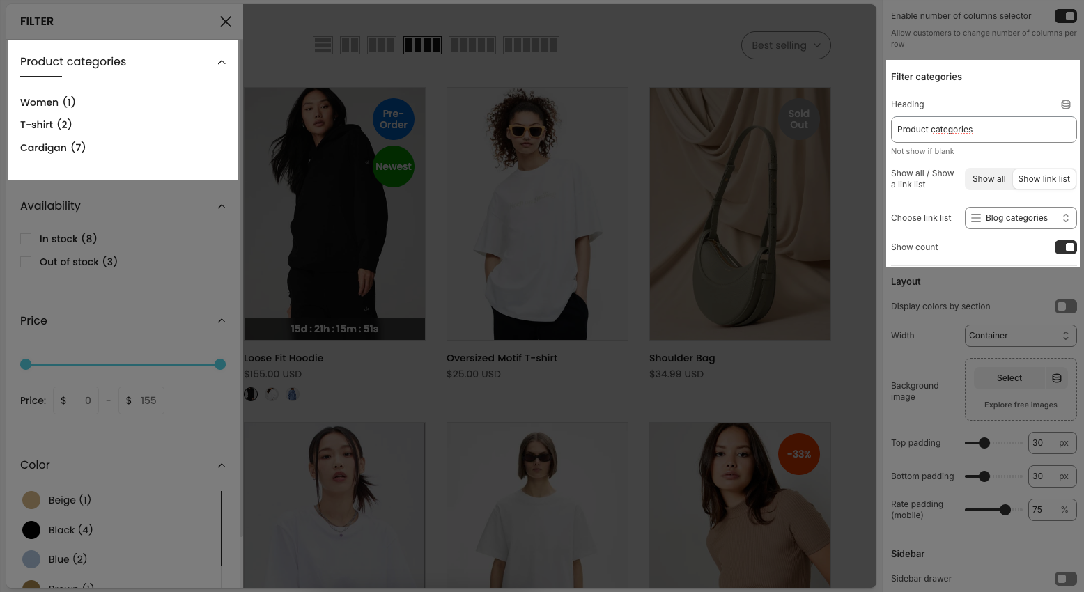
2.1.5. Filter categories
Heading: Enter the title for the filter categories (e.g., “Product categories”). If left blank, the heading will not be shown.
Show all / Show a link list: These buttons determine how the filter links are displayed:
Show all: Displays all items in the selected link list.
Show link list: Displays a dropdown or menu using the selected link list.
Choose link list: Select a predefined link list (created in Menu settings of Shopify) to use as filter items.
Show count: Toggle this on to display the number of products in each filter category (e.g., “T-shirt (2)”, “Cardigan (7)”).
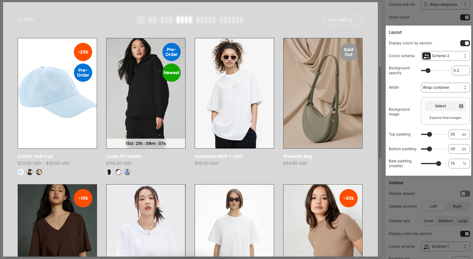
2.1.6. Layout
Display colors by section: Toggle this option on to apply different colors for layout section.
Colors schema: Choose a color scheme (e.g., Scheme 1, Scheme 2) to change the overall tone of the section.
Background opacity: Adjust the transparency level of the background image.
Width: Set the content width of the section
Container: Fixed-width layout with content centered. Leaves white space on both sides.
Wrap container: Similar to Container but adds padding on the sides.
Full width: Content stretches across the full screen.
Background image
Select: Choose an image from your device or library.
Explore free images: Browse free stock images from external sources.
Top padding / Bottom padding: Adjust the vertical spacing between the content and the top/bottom edges of the section (px).
Rate padding (mobile): Define how padding is scaled on mobile devices compared to desktop.
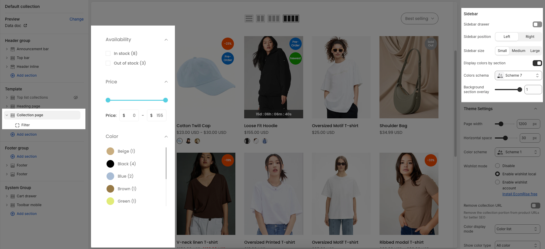
2.1.7. Sidebar
Sidebar drawer: Enables or disables a drawer-style sidebar that slides in and out.
Sidebar position: Lets you choose whether the sidebar appears on the Left or Right side of the page.
Sidebar size: Adjusts the width of the sidebar. You can choose between Small, Medium, or Large depending on how much space you want it to take.
Display colors by section: When enabled, different sections of the sidebar can use different color schemes. When disabled, one consistent color scheme is used.
Colors schema: Allows you to select a predefined color scheme (e.g., Scheme 7) for the sidebar’s appearance.
Background section overlay: Adjusts the transparency level of the overlay behind the sidebar background. A higher value means the overlay is more solid.
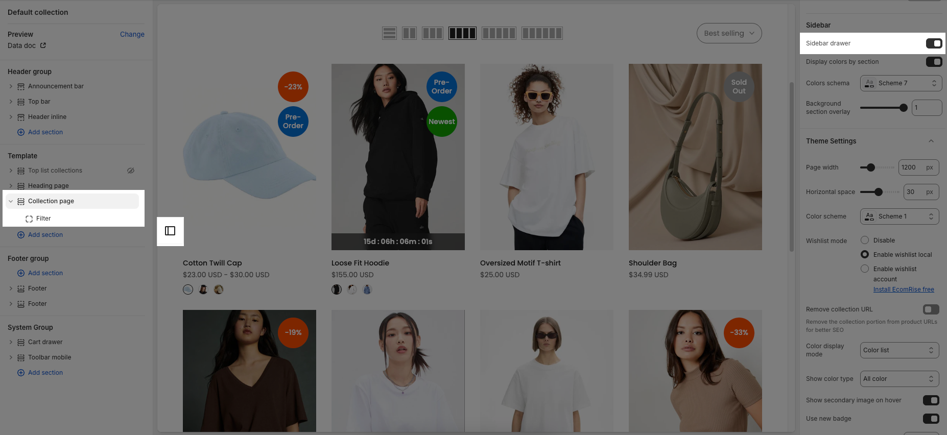
2.1.8. Theme setting
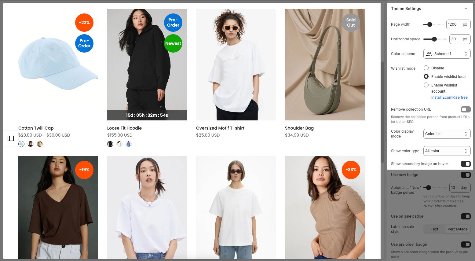
Page width: Sets the maximum width of the page layout in pixels.
Horizontal space: Controls the horizontal spacing (padding/margin) between elements on the page.
Color scheme: Allows you to choose a predefined color palette for your store’s theme
Wishlist mode:
Disable – Turns off the wishlist feature.
Enable wishlist local – Allows customers to save wishlists locally on their browser.
Enable wishlist account – Requires customers to log in to save wishlists to their account (needs EcomRise app).
Remove collection URL: When enabled, it removes the “collection” portion from product URLs to improve SEO.
Color display mode:
Color list – Displays product color options as a list or swatches.
Count: Show only the number of colors (e.g., “+3 colors available”).
Hide: Don’t show any color information.
Show color type:
All color: Displays all product colors, including out-of-stock ones.
Only color available: Shows only colors that are in stock, hiding out-of-stock colors.
Show secondary image on hover: When enabled, a second product image will appear when the user hovers over the product image.
Use new badge: When enabled, products added recently will be marked with a "New" badge.
Automatic "New" badge period: Defines how many days after a product is created it should show the "New" badge.
Use on sale badge: When enabled, products with discounted prices will show a “Sale” badge.
Label on sale style:
Text – Shows a "Sale" label.
Percentage – Displays the discount as a percentage (e.g., "-20%").
Use pre order badge: When enabled, shows a “Pre-order” badge on products available for pre-order.
Use sold out badge: When enabled, shows a “Sold out” badge on products out of stock
Compare mode:
• Disable – Turns off the product comparison feature.
• Enable compare local – Allows customers to compare products locally without an account.
• Enable compare account – Enables account-based product comparison (requires the EcomRise app).
• Note: You can compare up to 6 products.Show quick view: When enabled, show quick view button for products.
Show ultra button: Toggles the display of "Ultra buttons" like Quick add, Choose options, and Add to cart.
Show quantity selector: Determines if a quantity selector is visible, requiring the "ultra button" and only showing with "Add to cart" for specific product designs.
Show quick add: Controls the display of a quick add feature, which requires the "ultra button" to be shown.
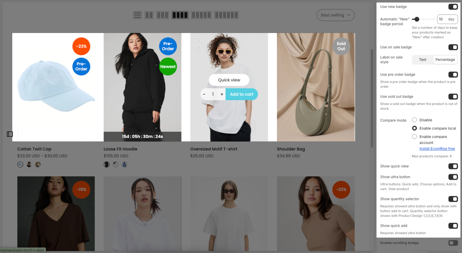
Enable scrolling badge: Allows for the activation of a scrolling badge.
Text alignment: Configures the horizontal alignment of text (options shown are left, center, and right).
Show rating: Controls whether product ratings are displayed, noting that a product rating app is required.
Title font weight: Adjusts the boldness of the product title font (current setting is Medium).
Show currency codes: Toggles the display of currency codes alongside prices.
Price varies style: Sets the format for displaying variable product prices (current setting is "$39.00 – $59.00").
Price font weight: Adjusts the boldness of the product price font (current setting is Normal).
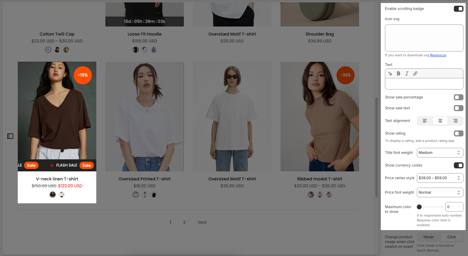
Maximum color to show: Sets the maximum number of colors to display. A value of 0 allows for a responsive automatic number, and this option requires the "color limit" to be enabled.
Change product image when click swatch on event: Determines whether the product image changes when a color swatch is clicked or hovered over. "Click" mode is automatically enforced on touch devices.
Enable color limit: Toggles the functionality of limiting the number of colors shown.
Color image source: Specifies where the color images are pulled from (currently set to "Variant images").
Color shape: Defines the visual shape of the color swatches (options are "Square" and "Circle").
Size display mode: Determines how product sizes are presented (current setting is "Size list").
Show size type: Controls the visibility of the size type (current setting is "All size").
Use custom badge: Enables the use of a custom badge when a product is custom.
Enable size limit: Allows for the activation of a size limit.
2.2. Other blocks
Below are the customizable blocks available within your Collection page. These blocks offer various options to enhance the layout and functionality of your product collections.
To add block to the Collection page, click the Add block button (plus icon ➕) under the Collection page > Select block.
Once the block is added, you can customize its settings in the left or right-hand sidebar (depending on your screen size)
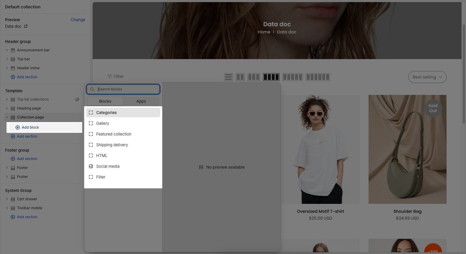
Here's an introduction to the configurable blocks you can add to your Collection page:
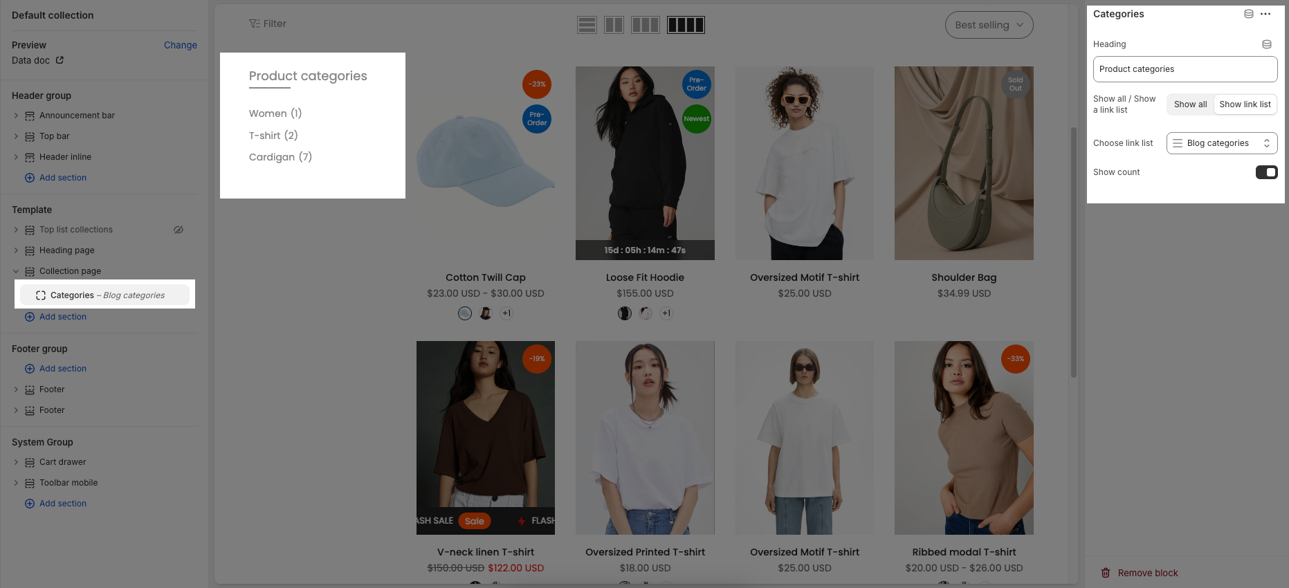
2.2.1. Categories block
Heading: Enter the title for the filter categories (e.g., “Product categories”). If left blank, the heading will not be shown.
Show all / Show a link list: These buttons determine how the filter links are displayed:
Show all: Displays all items in the selected link list.
Show link list: Displays a dropdown or menu using the selected link list.
Choose link list: Select a predefined link list (created in Menu settings of Shopify) to use as filter items.
Show count: Toggle this on to display the number of products in each filter category (e.g., “T-shirt (2)”, “Cardigan (7)”).
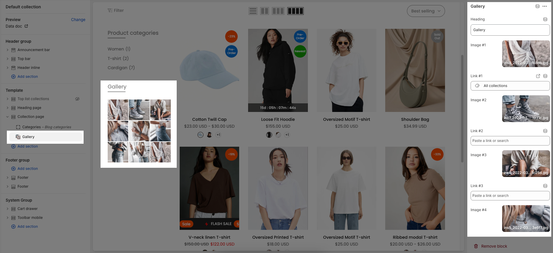
2.2.2. Gallery block
Heading: This field allows you to set the title or heading for your gallery (currently "Gallery").
Image: This option allows you to select and upload the image for your gallery. You can either "Select" an image or "Explore free images."
Link: This field enables you to add a hyperlink to the image. You can "Paste a link or search" for an existing page.
You can add up to 9 images and corresponding links, ranging from Image #1 to Image #9 and Link #1 to Link #9, respectively.
Open link in: Choose between option below
Current tab (_self): This option opens the linked content in the same browser tab, replacing the current page.
New tab (_blank): This option opens the linked content in a new browser tab or window, keeping the current page open.
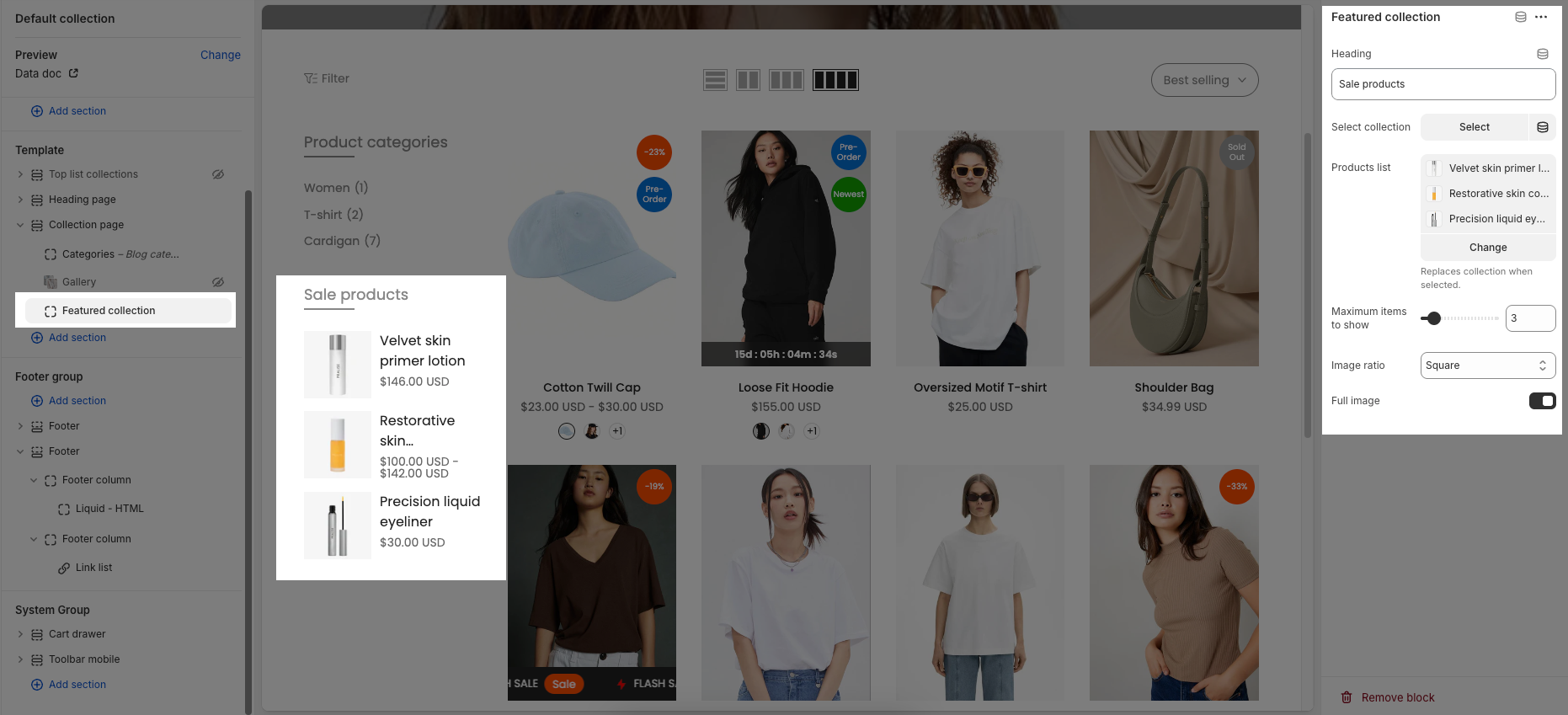
2.2.3. Featured collection block
Heading: This field allows you to set the title or heading for your featured collection (currently "Sale products").
Select collection: This option allows you to choose a specific product collection to display.
Products list: This option enables you to manually select individual products to feature, which will replace the selected collection if chosen.
Maximum items to show: This slider and input field control the maximum number of products that will be displayed in the featured collection (currently set to 3).
Image ratio: This setting determines the aspect ratio of the product images within the collection (currently "Adapt to image").
Full image: This toggle likely controls whether the product images are displayed in their full size.
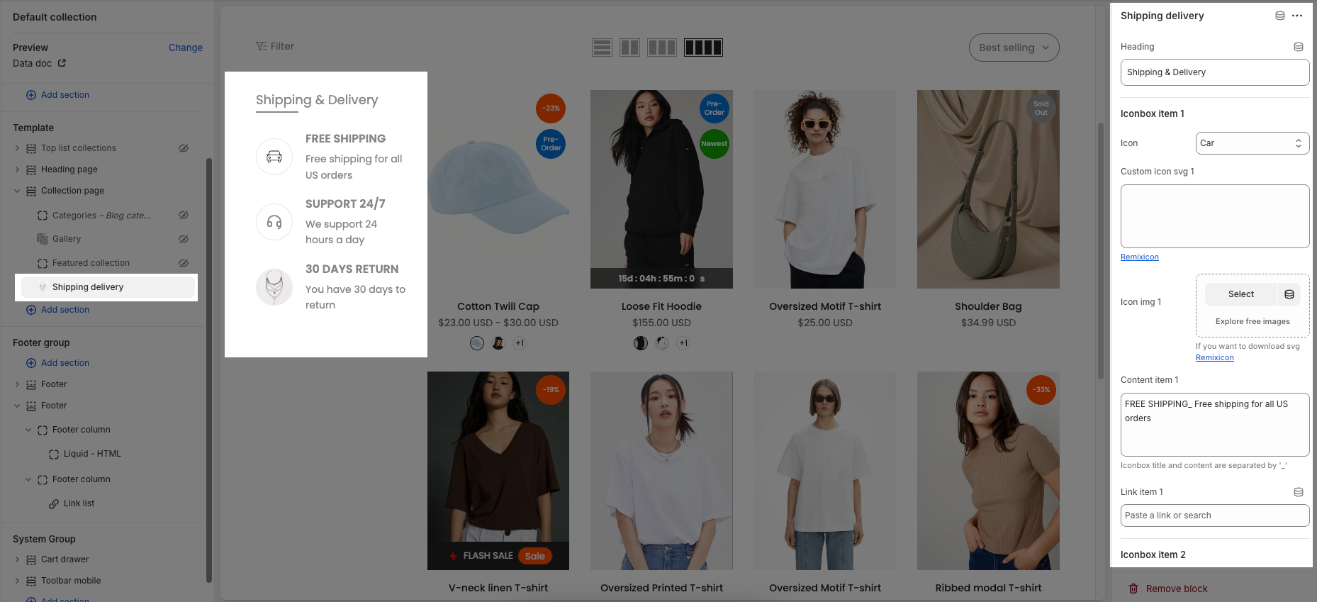
2.2.4. Shippng delivery block
Heading: This field allows you to set the title or heading for the shipping and delivery section (currently "Shipping & Delivery").
Iconbox item 1
Icon: This dropdown allows you to select a predefined icon for the first iconbox item
Custom icon svg 1: This field allows you to paste custom SVG code for the icon, offering more design flexibility. A link to Remixicon is provided for downloading SVG icons.
Icon img 1: This section allows you to select and upload an image to be used as the icon for the first item. You can "Select" an image or "Explore free images."
Content item 1: This text area is for the main content or description of the first iconbox item (currently "FREE SHIPPING_ Free shipping for all US orders"). It notes that the title and content are separated by
_.Link item 1: This field enables you to add a hyperlink associated with the first iconbox item. You can "Paste a link or search" for an existing page.
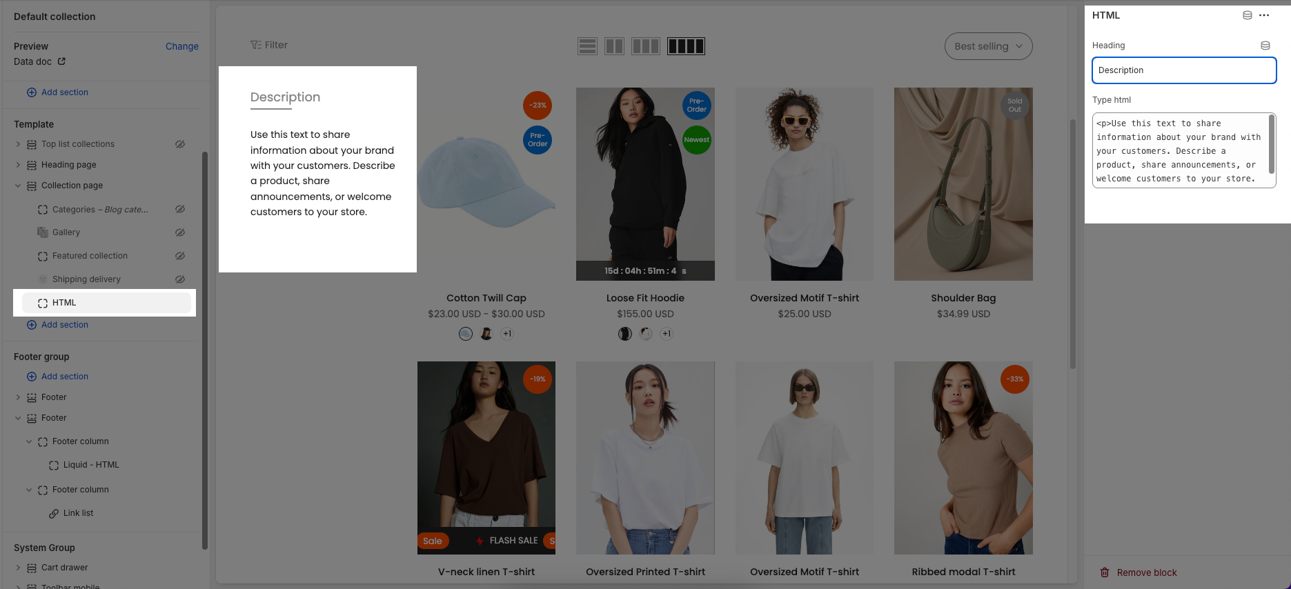
2.2.5. HTML block
Heading: This field allows you to set a title or heading for this HTML block
Type html: This is a text area where you can input custom HTML code to display content.
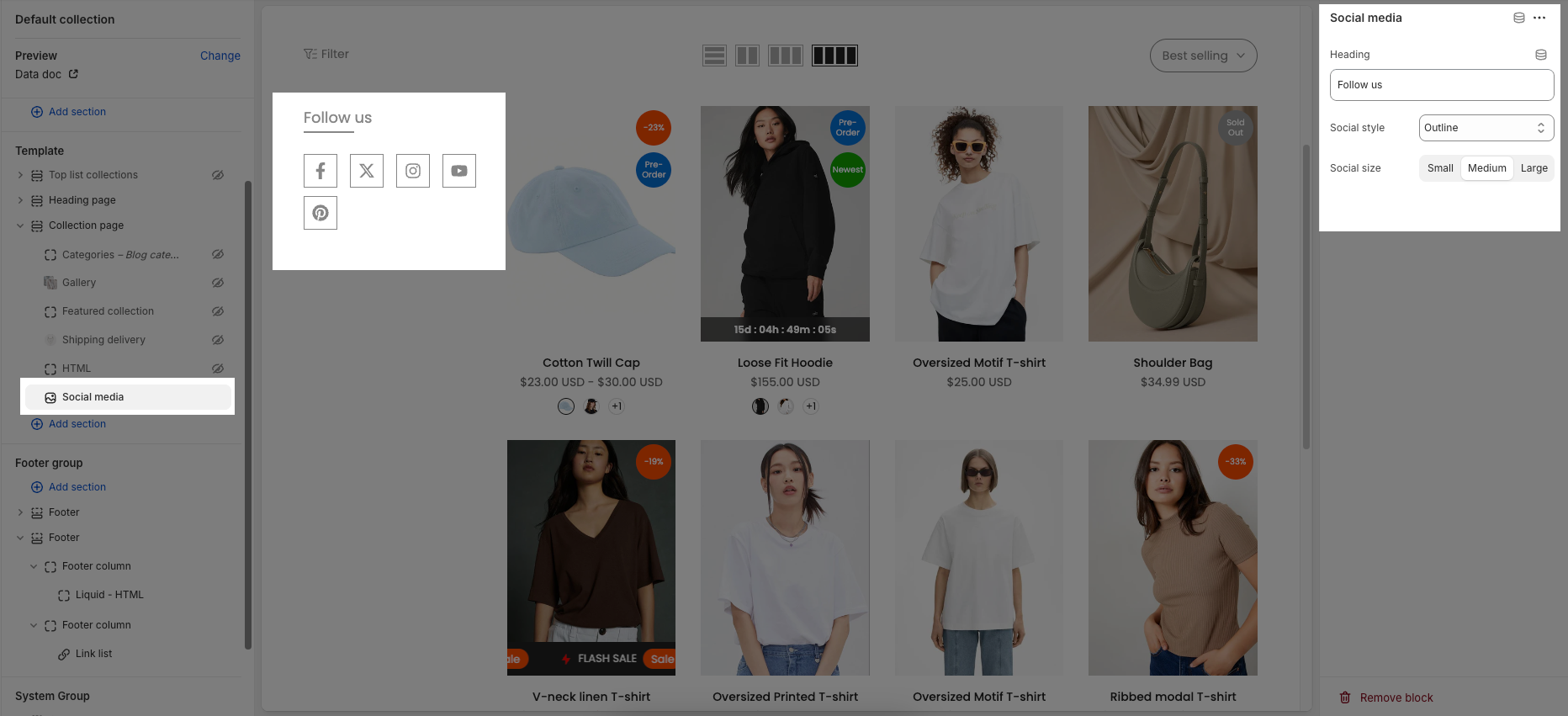
2.2.6. Social medias block
Heading: This field allows you to set the title or heading for your social media block (currently "Follow us").
Social style: This dropdown lets you choose the visual style of your social media icons. Options typically include:
Default: The standard appearance of the icons.
Outline: Icons displayed with only their outlines.
Simple: A minimalist or unadorned style for the icons.
Social size: This option allows you to select the size of the social media icons, with choices like "Small," "Medium," and "Large."
2.2.7. Filter block
To display the filtering options, you can add a "Filter" block. This block's settings can be customized in the "Sidebar" section, as previously detailed in the Collection page instructions.