


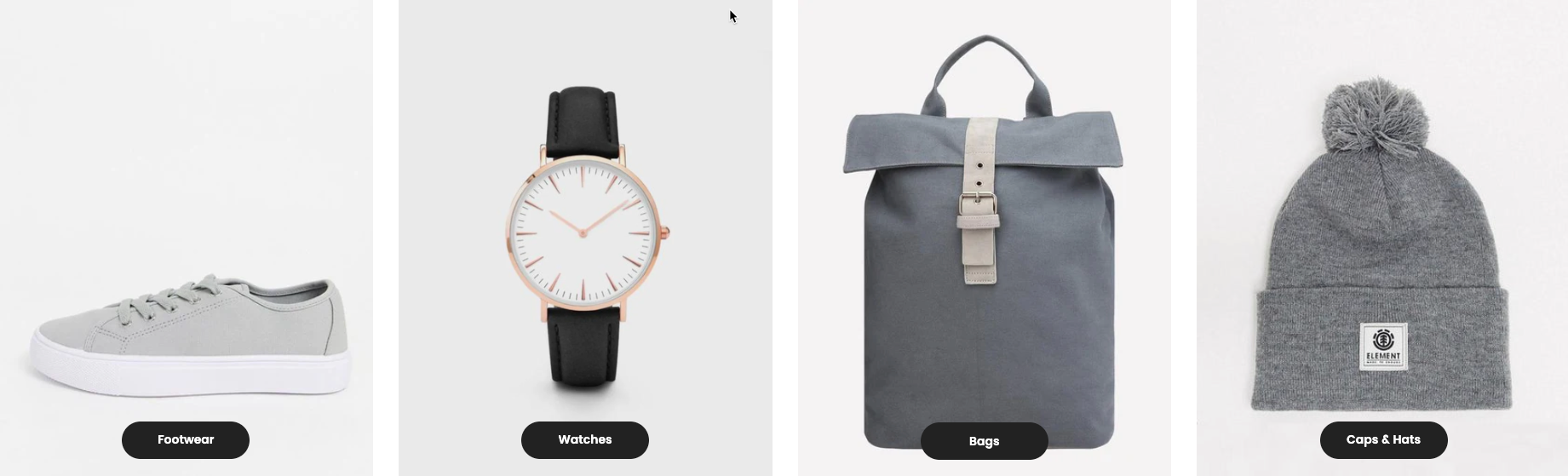
The Collection List section allows you to showcase multiple collections in a visually appealing grid or slider layout. This section helps users navigate your store easily by highlighting featured collections, seasonal categories, or best-selling products.
1. How to access the Collection list section?
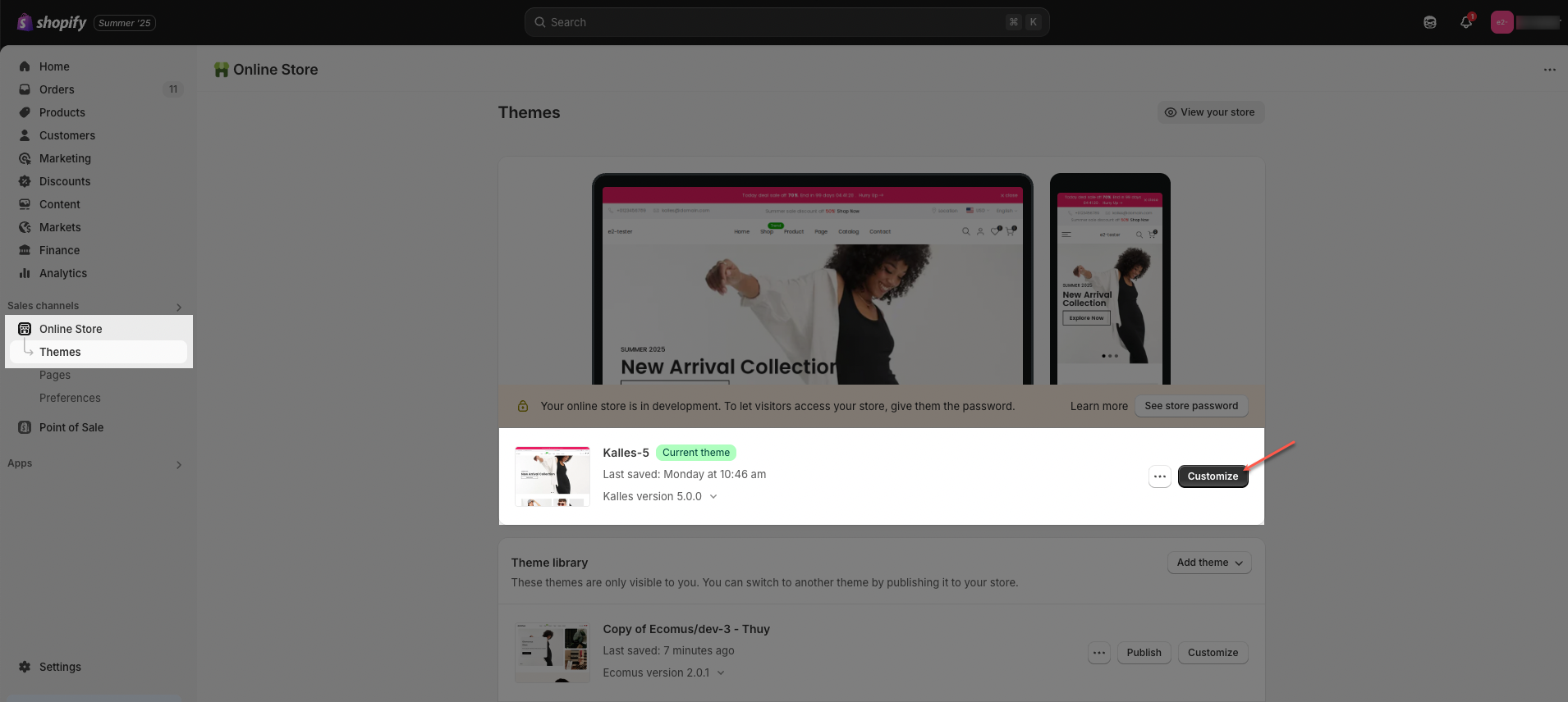
Step 01: From Shopify Admin, click on Online Store > Select Themes > In the Current theme section, click the Customize button.
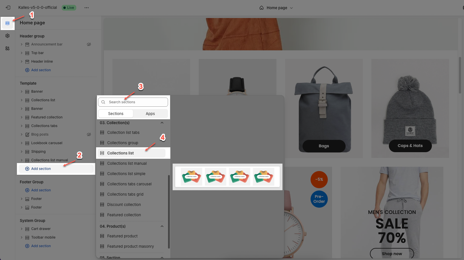
Step 02: In the theme editor (Customize), click the Sections button > Click the Add section button > In the Sections tab, scroll through the list or use the search bar to find and select Collection list.
2. How to customize the Collection list section?
2.1. Collection item
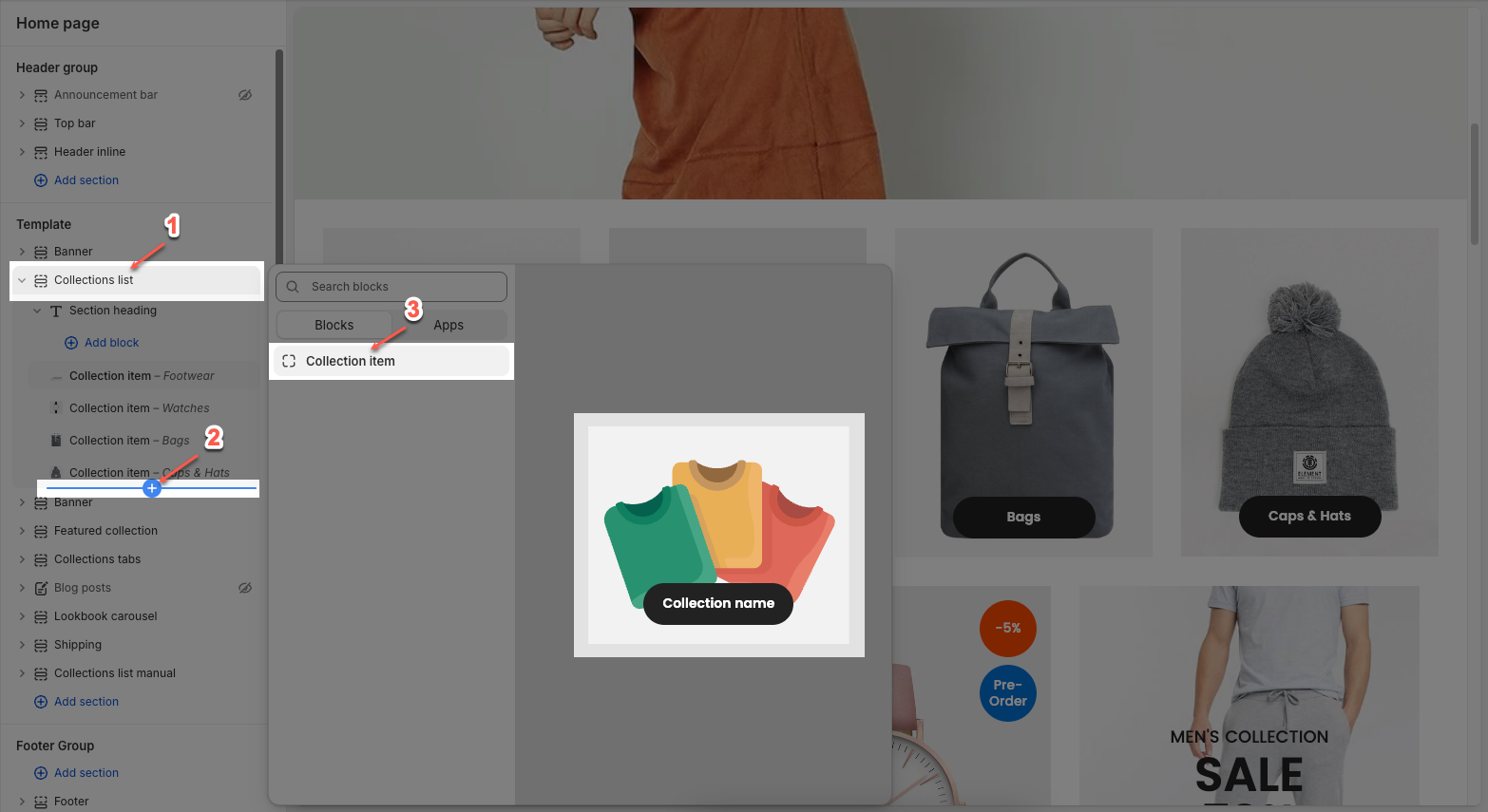
Click on Collection list section > Add block (plus icon ➕) > Collection item block
On each block, you can configure:
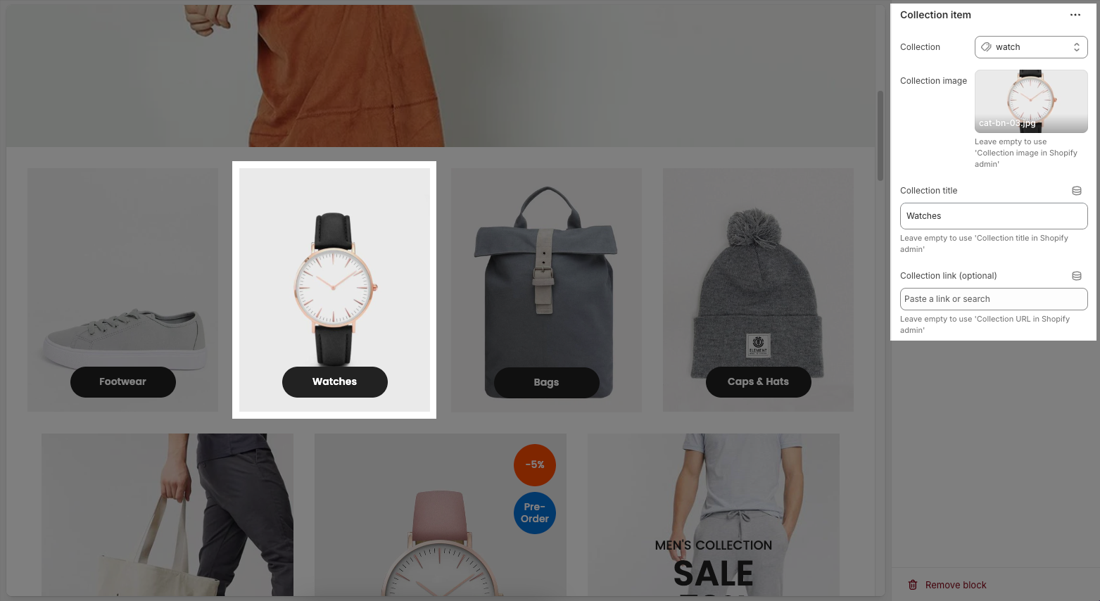
Collection: Choose an existing collection from your Shopify store.
Collection image:
Select: Upload or choose an image to represent this collection item manually.
Explore free images: Browse and use free images from Shopify's image library.
Leave empty to use 'Collection image in Shopify admin'
Collection title: Enter a custom title for the collection item.
Leave empty to use 'Collection title in Shopify admin'
Collection link (optional): Paste a custom link or search for a page to link this item to.
Leave empty to use 'Collection URL in Shopify admin'
2.2. Collection list
You can configure some general options for the section below:
2.2.1. General options
Select collection list: Choose a collection list to display
Leave empty to use blocks collection
Collection design: Choose a layout style for displaying your collections (different designs may affect image shape, spacing, and content placement).
Content font size: Set the size of the text inside the collection blocks (e.g., Small, Medium, Large).
Content font weight: Select how bold the text appears (e.g., Regular, Semibold, Bold).
Content position: Choose where the collection title and product count appear:
Center: Displays content in the center of the image.
Center bottom: Displays content at the bottom center of the image.
Depending on the design to display the appropriate location
Content spacing: Adjust the distance (in pixels) between the content (text) and the edge of the image.
Depending on the 'content position'. Not work when 'content position' is center. Only work on desktop, on mobile it automatically adjusts to be responsive
Show count items: Toggle ON to display the number of products in each collection.
Count label: Customize the label text shown under the collection title
Only work when enable 'Show count items'
Image rounded: Toggle ON to apply rounded corners to the collection images.
Enable border: Toggle ON to add a border around each collection image.
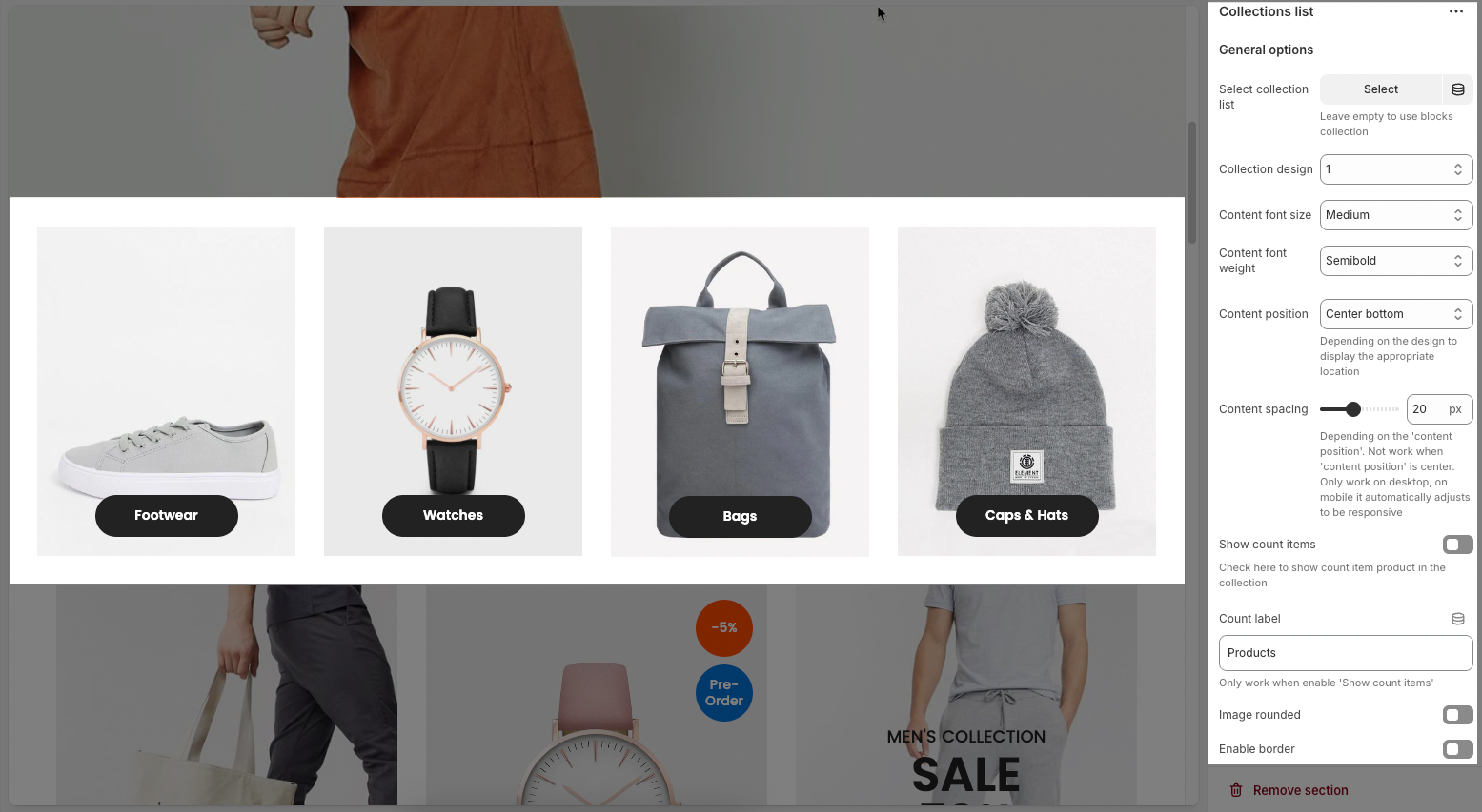
Image padding: Set the amount of space (in pixels) between the image content and the border.
Only work when 'Enable border'
Image ratio: Controls the aspect ratio of images. Options include:
Adapt to image – Keeps the original aspect ratio of each image; no cropping or resizing.
Square – Forces all images into a 1:1 aspect ratio (equal width and height).
Portrait – Displays images in a vertical rectangle format (taller than wide).
ASOS – Uses a custom aspect ratio often seen on e-commerce sites like ASOS (typically taller than Square but shorter than Portrait).
Landscape – Displays images in a horizontal rectangle format (wider than tall).
Full image: Toggle on to fit the full image inside its container without cropping; off means the image may be cropped to fill space.
Image hover effect: Applies a visual animation to the image when a user hovers over it with their cursor—for example, selecting “Zoom in” will slightly enlarge the image on hover.
Hovering effect will resize your images
Item effect when hover: Adds an animation or style to the entire collection item when hovered—for example, “Border run” animates a border around the item, giving users a more interactive and engaging experience.
Items per row (Desktop): Sets how many items to show in one row on desktop view (e.g., 2 to 6 items).
Items per row (Tablet): Sets how many items to show in one row on tablet view (e.g., 1 to 4 items).
Items per row (Mobile): Sets how many items to show in one row on mobile view (e.g., 1 or 2).
On a screen that is too small, the item will automatically be full
Spacing between items: Controls the horizontal and vertical spacing between the collection items.
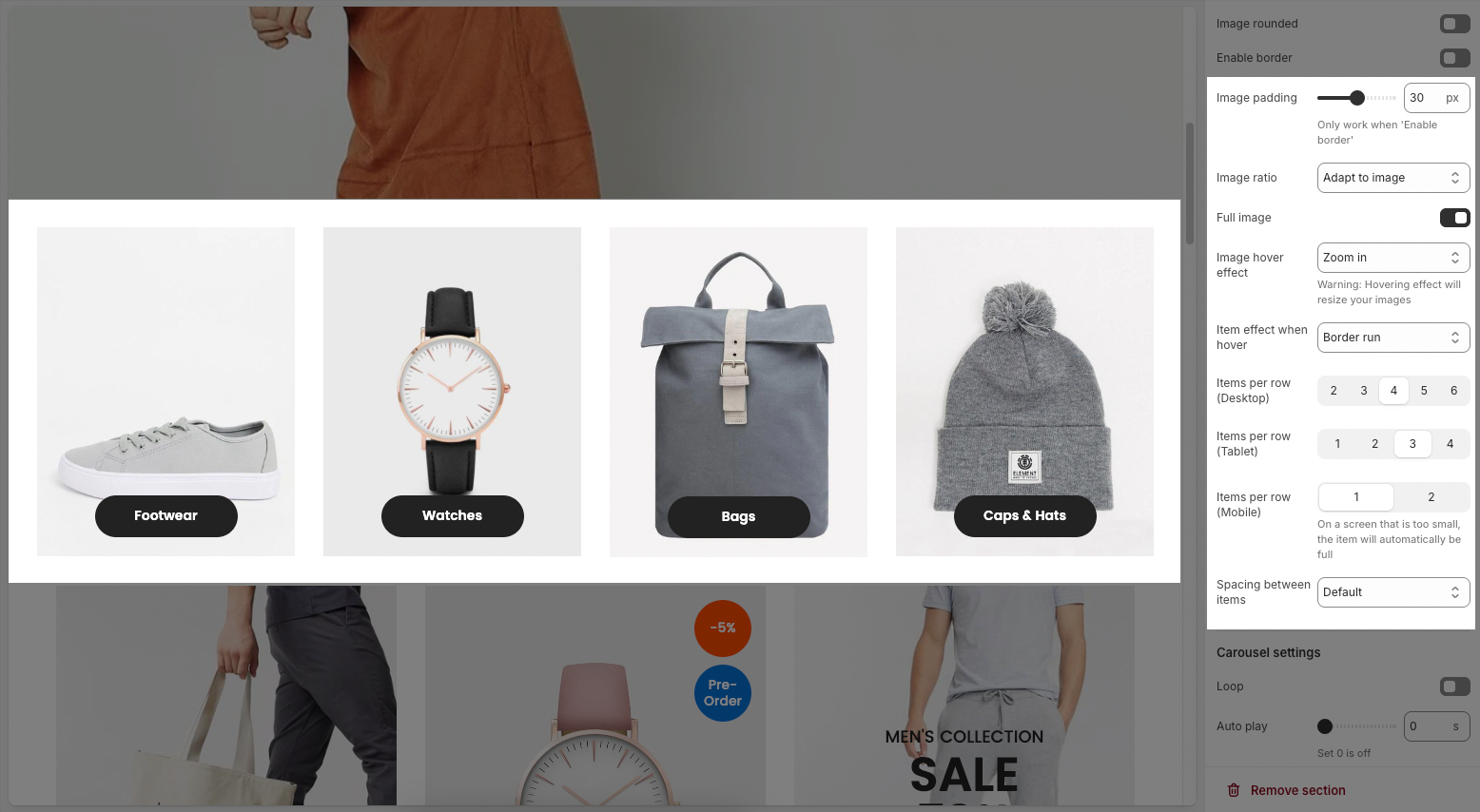
2.2.2. Carousel settings
Loop: Enables continuous looping of the carousel; after the last slide, it returns to the first automatically.
Auto play: Sets the time (in seconds) for automatic slide switching. Setting to 0 disables autoplay.
Pause on hover: When enabled, the autoplay pauses while the user hovers over the carousel.
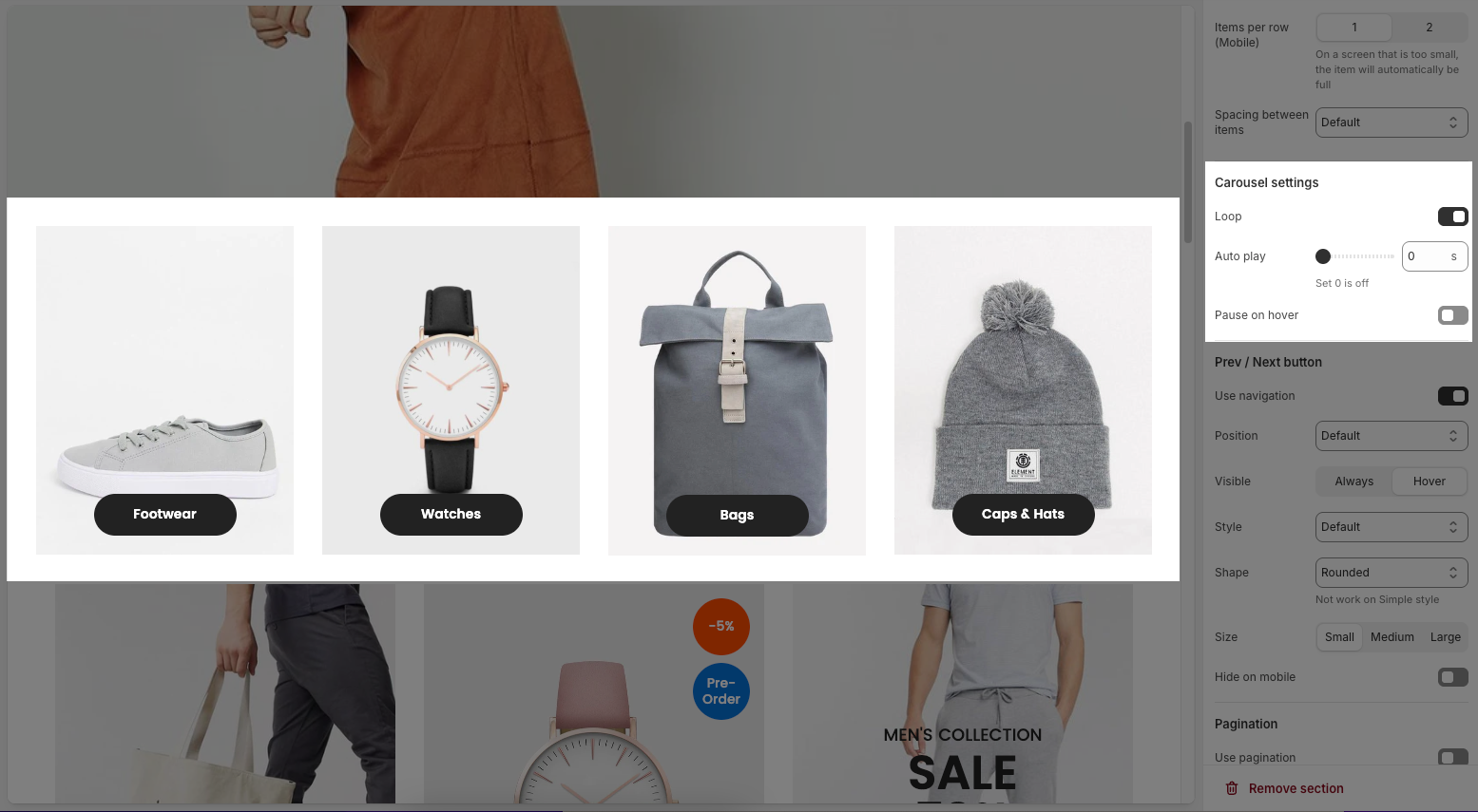
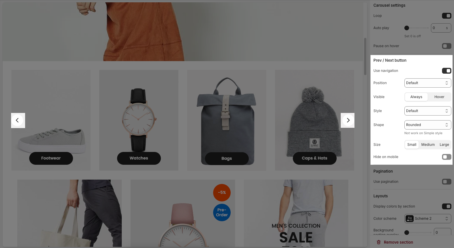
2.2.3. Pre / Next buttons
Use navigation: Enables the left/right navigation arrows for manual slide control.
Position: Sets the placement of the navigation buttons (e.g., Default, On border, Outside, etc.).
Visible: Choose whether the navigation buttons are always visible or only appear on hover.
Style: Select the design style of the navigation buttons (e.g., Default, Outline, Simple.).
Shape: Defines the button shape (e.g., Rounded, Rotate); note: doesn't apply to the “Simple” style.
Size: Sets the size of the navigation buttons (Small, Medium, or Large).
Hide on mobile: Hides navigation buttons on mobile devices when enabled.
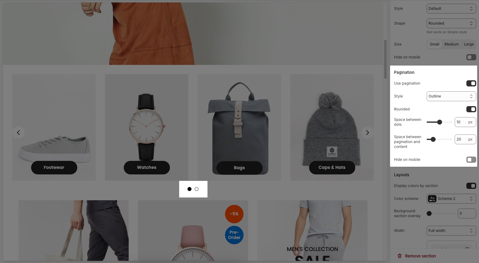
2.2.4. Paginations
Use pagination: Turns on pagination (usually dots below the carousel to indicate slide position).
Style: Sets the appearance of the dots (e.g., Default, Outline, Elessi, Full width).
Rounded: Makes the pagination dots circular when enabled.
Space between dots: Adjusts the distance (in px) between pagination dots.
Space between pagination and content: Controls the vertical gap (in px) between pagination and the content above.
Hide on mobile: Hides the pagination dots on mobile devices when enabled.
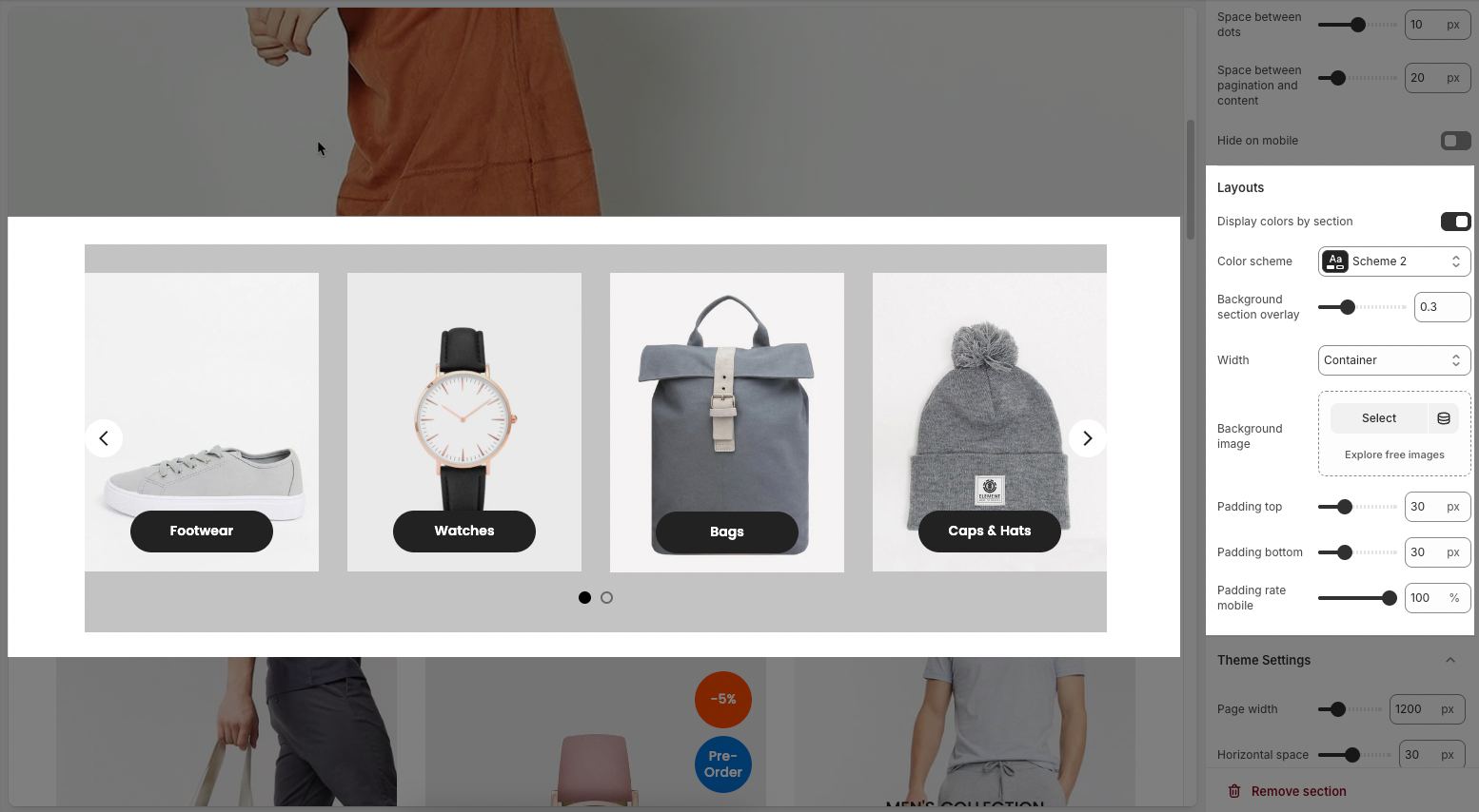
2.2.5. Layouts
Display colors by section: Enables section-specific color styling based on the selected scheme.
Color scheme: Choose a predefined color palette for the section.
Background section overlay: Adjusts the transparency level (0–100%) of a dark or colored overlay above the background.
Width: Sets the section’s width (e.g., Container, Wrap container, Full width).
Background image: Allows you to select an image for the section background.
Padding top / bottom: Controls the vertical spacing (in px) above and below the content in the section.
Padding rate mobile: Sets the padding as a percentage for mobile layout to ensure responsiveness.
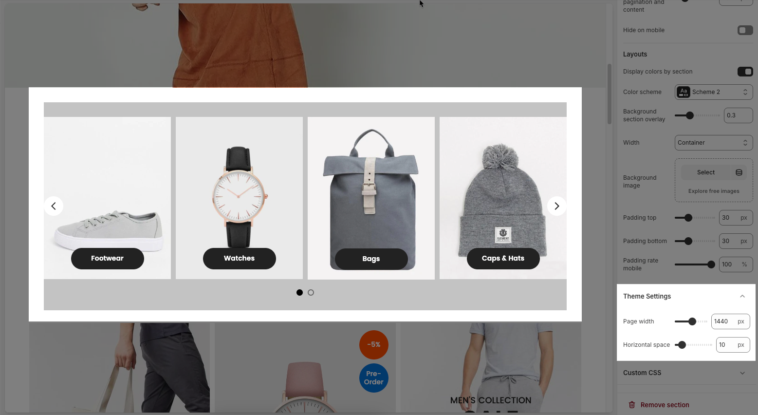
2.2.6. Theme Settings
Page width: defines the maximum width of the main content area on the website.
Horizontal space: Sets the spacing (gap) between individual collection items horizontally in a row.
2.2.7. Custom CSS
Allows users to customize by adding CSS rules, beyond the limitations of default settings. This allows for fine-tuning the design to every detail, to suit specific needs.
Add custom styles to this section only.
To add custom styles to your entire online store, go to theme settings for detailed instructions.


