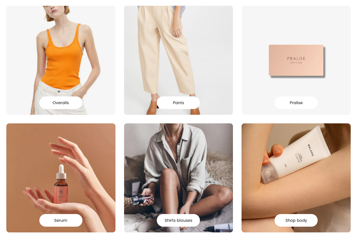
The Main list collections section is a core component for showcasing product collections on your Shopify store. It gives store managers (merchant) the flexibility to display featured collections, customize their order, and presentation.
1. How to access the Main list collections section?
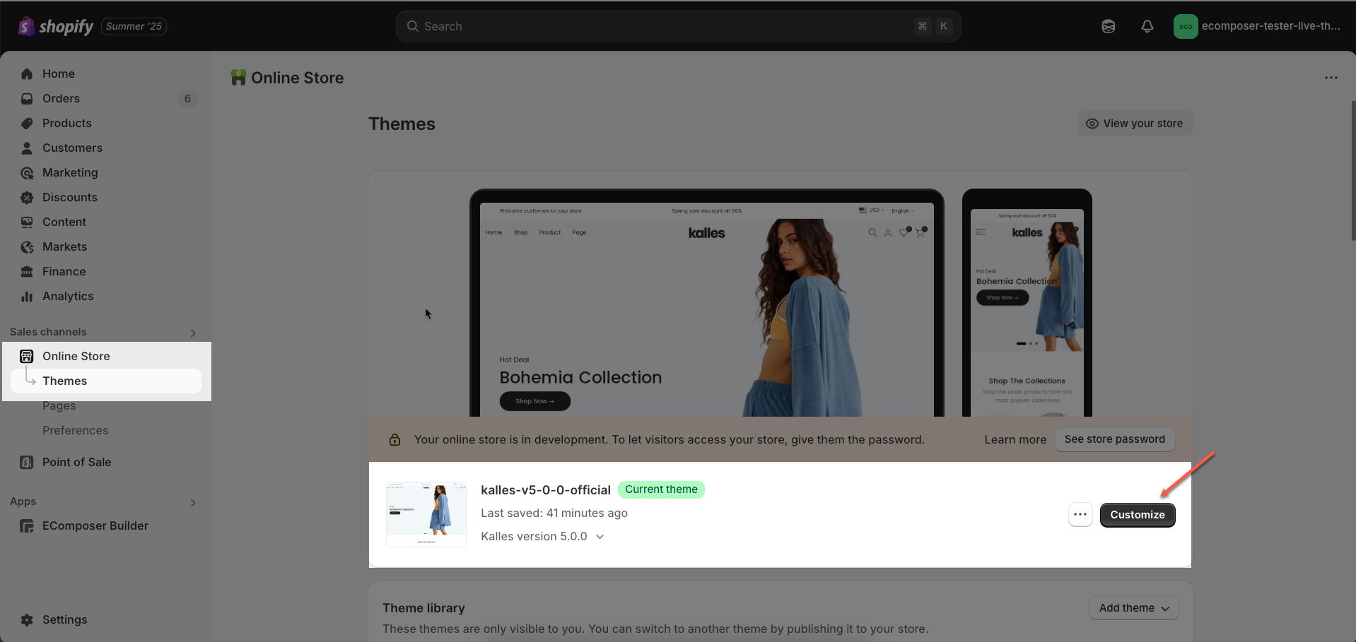
Step 01: From Shopify Admin, click on Online Store > Select Themes > In the Current theme section, click the Customize button.
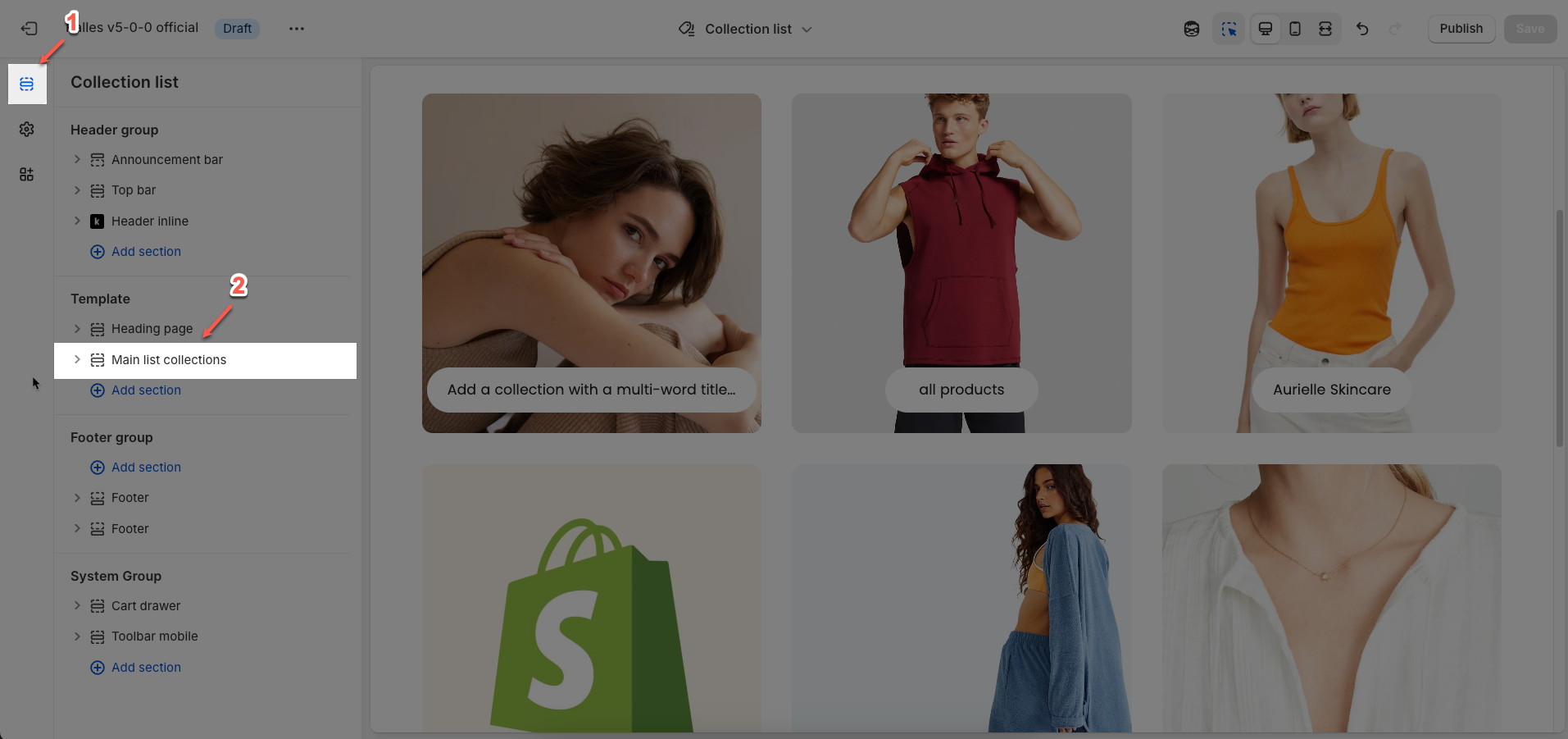
Step 02: In the theme editor (Customize), click to open the dropdown pages in the topbar > select Collection list > In the Sections tab, scroll and find Main list collections in Template
2. How to customize the Main list collections section?
2.1. Main list collections section
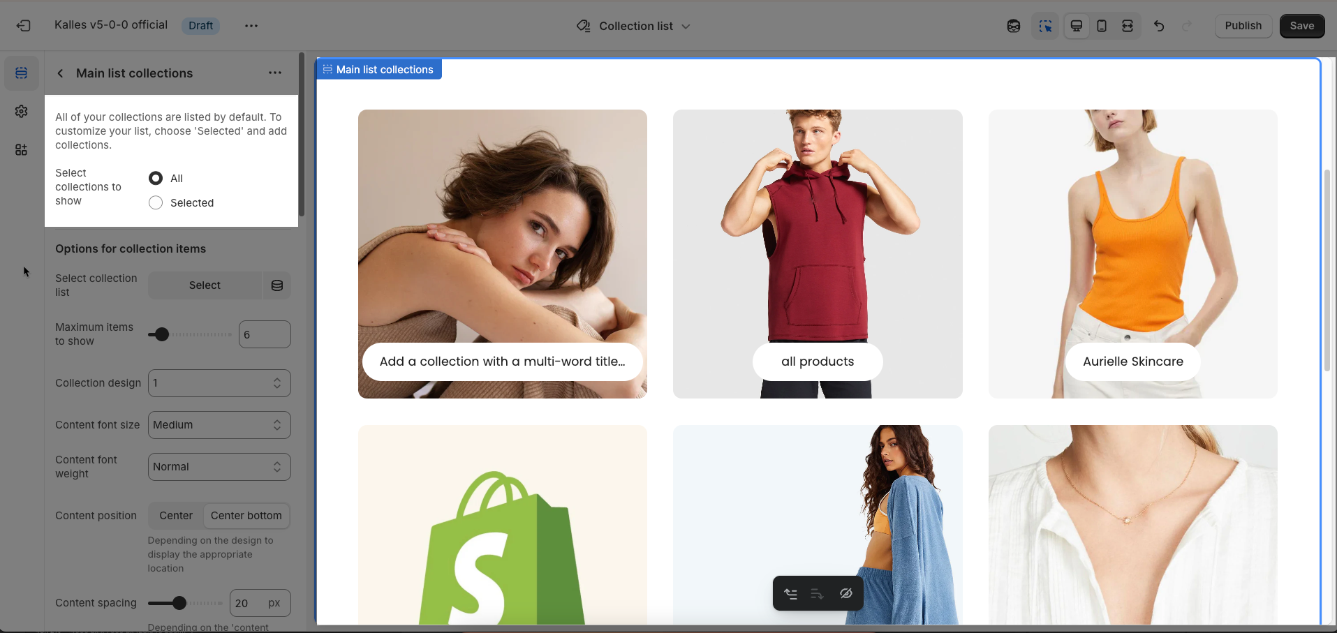
All of your collections are listed by default. To customize your list, choose 'Selected' and add collections.
Select collections to show: Choose how you want to display your collections.
All: Displays all existing collections in your store.
Selected: Displays only the collections you manually select from a list.
Options for collection items
Select collection list: (Only displayed when "Select collections to show" is "Selected"). Select the specific collections you want to display
Maximum items to show: Set the maximum number of collections that will be displayed in this section. If you choose "All" collections, this option will limit the quantity shown.
Collection design: Choose the design style for each collection card. This affects the layout, borders, shadows, and other visual elements of each individual collection item.
Content font size: Adjust the font size of the text displayed within each collection card
Content font weight: Adjust the font weight of the text displayed within each collection card
Content position: Select the position of the text content (title, item count, etc.) within the collection card.
Center: Content will be centered both horizontally and vertically over the image or inside the card.
Center bottom: Content will be centered horizontally and aligned to the bottom vertically.
Depending on the design to display the appropriate location
Content spacing: Adjust the padding within each collection card, between the text content and the card's edges. This helps control the space around the text.
Depending on the 'content position'. Not work when 'content position' is center. Only work on desktop, on mobile it automatically adjusts to be responsive
Show count items: Check this option to display the number of products within each collection.
Check here to show count item product in the collection
Count label: (Only displayed when "Show count items" is checked) Enter the text that will appear before or after the product count.
Only work when enable 'Show count items'
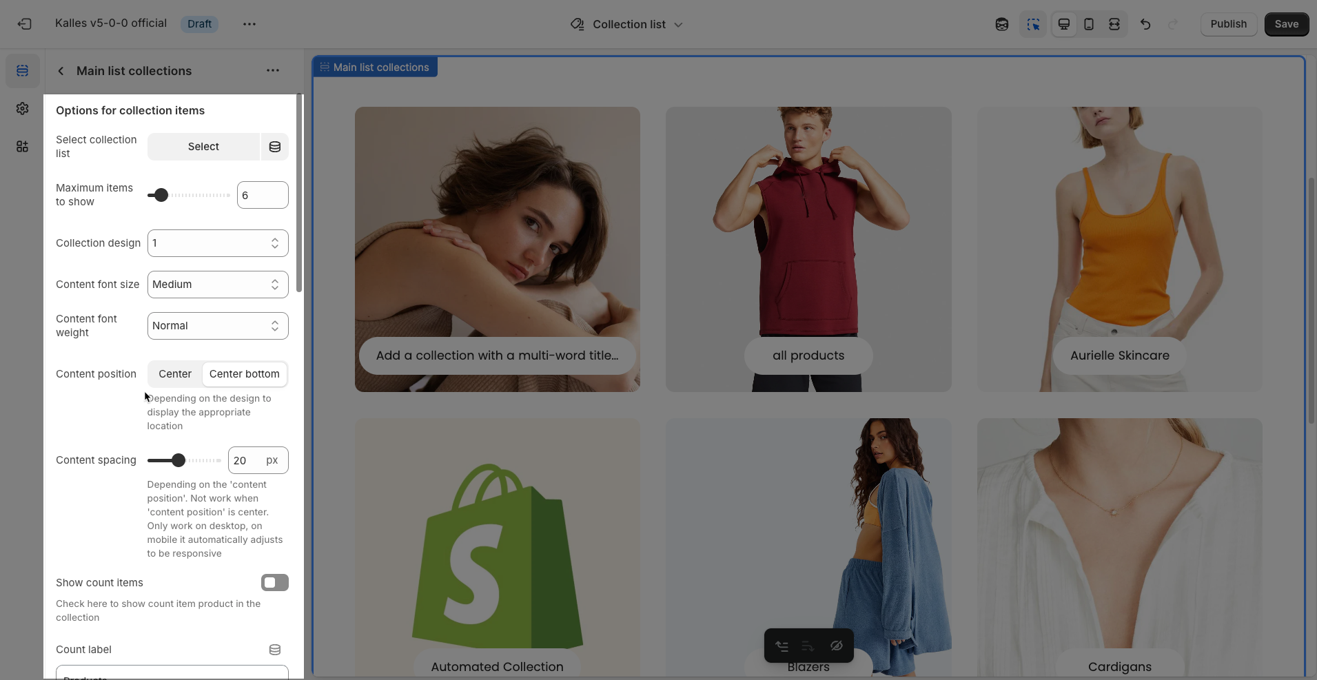
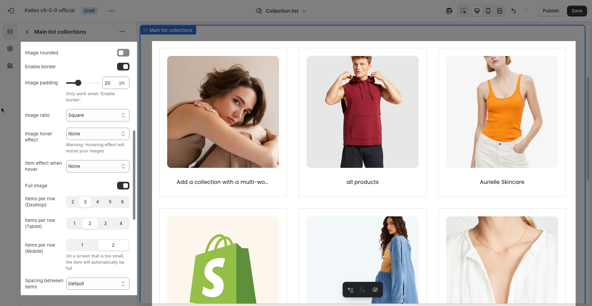
Image rounded: Check this option to make the corners of the collection images rounded (instead of sharp corners).
Enable border: Turn on this option to add a border around each item or image.
Image padding: Adjust the padding inside each image frame, creating space between the image and its border.
Only work when 'Enable border'
Image ratio: Select the aspect ratio for your images. This ensures all images are uniformly sized, leading to a cleaner and more professional layout.
Image hover effect: Choose the visual effect that will appear when a user hovers their mouse over the image.
Warning: Hovering effect will resize your images
Item effect when hover: Select the effect applied to the entire item (not just the image) when a user hovers their mouse over it.
Full image: Enable this option for the image to fill its entire available space, cropping if necessary to maintain the selected aspect ratio
Items per row (Desktop): Set the number of items to display per row on desktop devices.
Items per row (Tablet): Set the number of items to display per row on tablet devices.
Items per row (Mobile): Set the number of items to display per row on mobile devices.
On a screen that is too small, the item will automatically be full
Spacing between items: Adjust the gap between individual items in the grid.
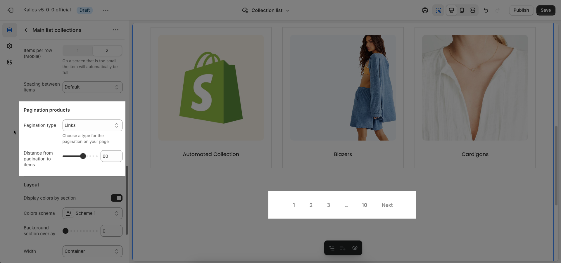
Pagination products
Pagination type: Choose the type of pagination that will be used to navigate through content pages.
Link: Displays numerical page links (e.g.,
1, 2, 3, ... Next, Last). This is the most common type, providing a clear overview of the total pages and the user's current position.Load more: Displays a "Load more" button at the end of the list. When clicked, more items are loaded and appended to the current page without a full page reload. This type creates a smoother Browse experience, similar to infinite scroll.
Infinite scroll: Automatically loads more items as the user scrolls to the bottom of the page. This type offers the most seamless Browse experience, removing the need for clicks.
Distance from pagination to items: Adjust the distance (padding) between the pagination element (the "Load more" button, numerical page links, or the infinite scroll trigger point) and the last content items on the page
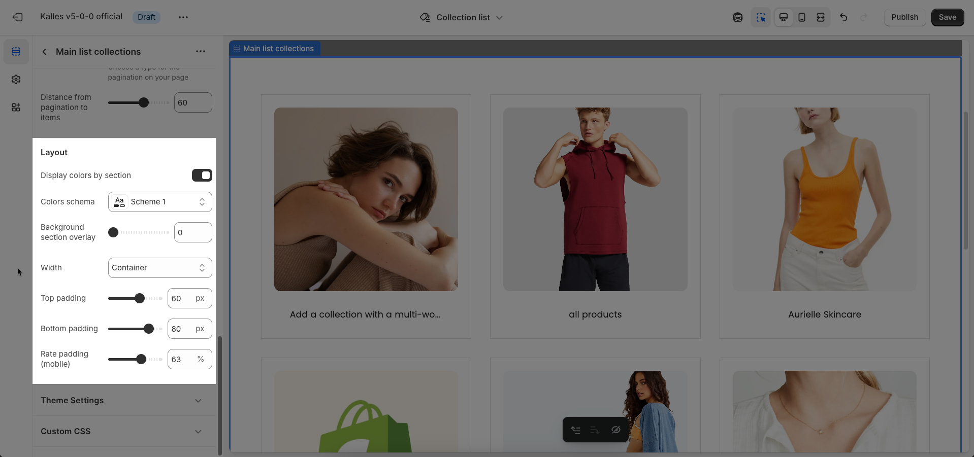
Layout
Display colors by section: Enable this option to allow each section to manage its own color scheme independently
Color scheme: Select the color scheme that will be applied to this section. A color scheme typically includes settings for background color, primary text color, secondary text color, and other accent colors
Background section overlay: Select a color overlay that will be applied on top of the section's background
Colors schema: Select the color scheme to be applied to this section. This allows you to quickly switch between predefined sets of colors
Background section overlay: Select the overlay color to be applied on top of the section's background. This is useful for improving text readability over images or for creating unique visual effects
Width: Select the width of the content within the section.
Container: The content will be confined within a fixed-width (or max-width) container defined by your global theme settings.
Wrap container: The content will be enclosed in a slightly wider container than the default, but still with limits.
Full width: The content will span the entire width of the browser viewport, ignoring any container constraints.
Top padding: Enter the value for the top padding of the element (unit: pixels). This padding creates space between the top edge of the content and the top edge of the element.
Bottom padding: Enter the value for the bottom padding of the element (unit: pixels). This padding creates space between the bottom edge of the content and the bottom edge of the element.
Rate padding (mobile): Adjust the padding around the rating display element when viewed on mobile devices
Theme Settings
Page width: Defines the maximum width of the page content, influencing layout and display on various devices.
Horizontal space: Adjust the padding on the left and right sides of the page content
Custom CSS
Allows users to customize by adding CSS rules, beyond the limitations of default settings. This allows for fine-tuning the design to every detail, to suit specific needs.
Add custom styles to this section only.
To add custom styles to your entire online store, go to theme settings for detailed instructions.

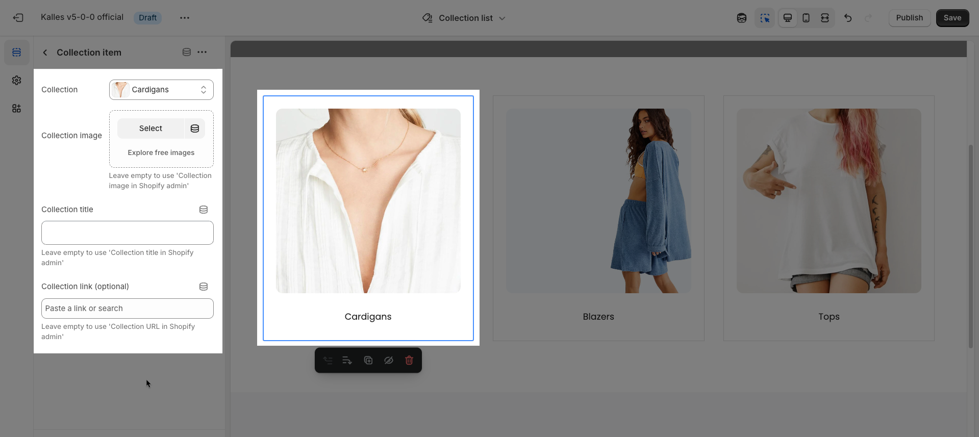
2.2. Collection item block
To add a Collection item block to the Main list collections section, click the Add block button (plus icon ➕) under the Main list collections section.
After adding the Collection item block, you can adjust its settings using the sidebar—located on the right or left side of your screen depending on your device
Only displayed when "Select collections to show" is "Selected"
Collection: Select the Shopify collection you want to feature. When chosen, fields like "Collection image" and "Collection title" might be automatically populated with information from this collection.
Collection image: Select or upload the representative image for this collection.
Leave empty to use 'Collection image in Shopify admin'
Collection title: Enter the title that will be displayed for the collection. Like the image, if a "Collection" is selected, its title will be the default, but you can customize it here.
Collection link (optional): Enter a URL or select a page, product, or collection you want to link to. If a "Collection" has been selected, the default link will be to that collection's URL. You can leave this blank if no link is desired, or change it to link to a different page.