


The Layout section in the Theme Settings allows you to control the overall structure and spacing of your store’s design. It includes settings for page width, grid spacing, and element corner rounding—giving you flexibility to create a clean, well-balanced layout.
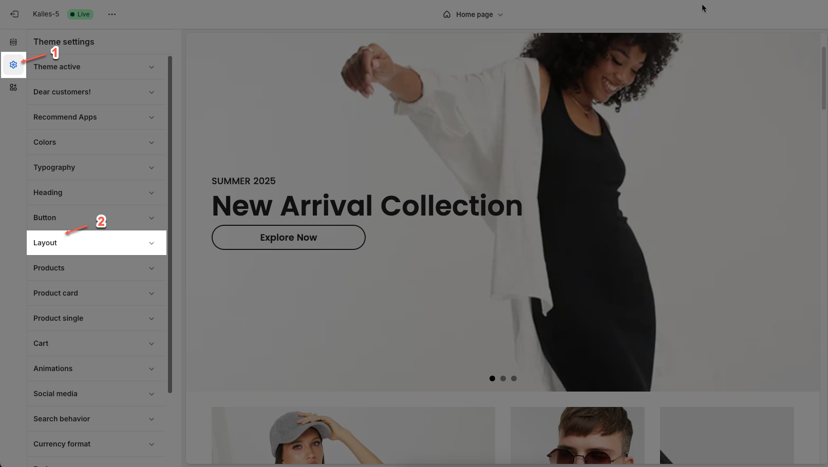
1. How to access the Layout in the Theme settings?
In the theme editor (Customize), click the Theme settings button > In the Theme settings tab, scroll through the list and select Layout.
2. How to customize the Layout in the Theme settings?
After access the Layout, you can customize its settings in the left sidebar.
2.1. Layout
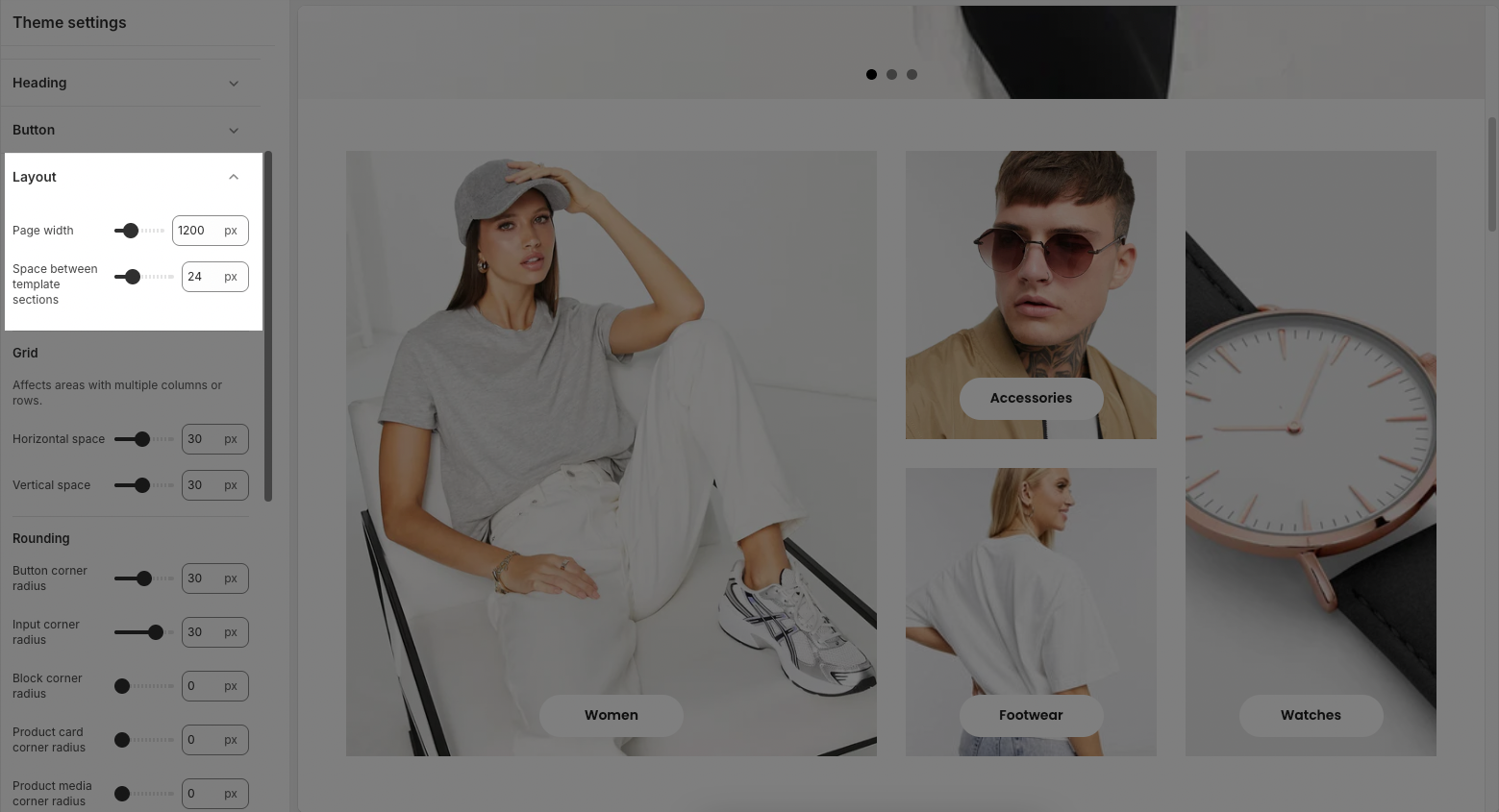
Page width: Sets the maximum width of the website’s content area (in pixels). This controls how wide the layout stretches across the screen. (except for sections that contain the option enable Fullwidth)
Space between template sections: Adds vertical spacing between different sections on the page (in pixels).
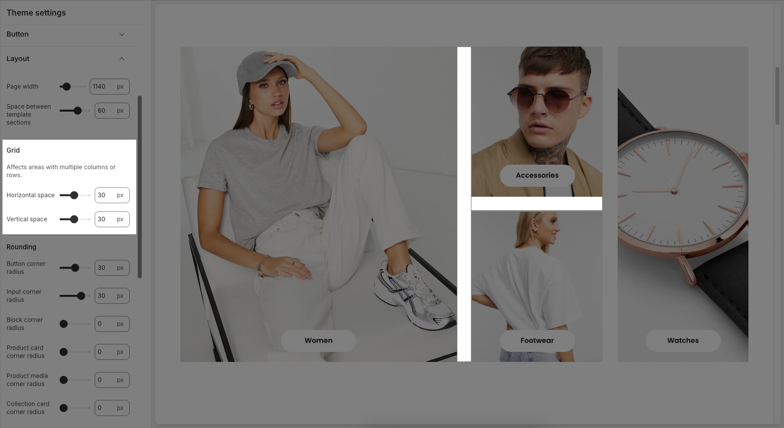
2.2. Grid
Affects areas with multiple columns or rows.
Horzontal space: Controls the horizontal spacing between columns in grid-based layouts.
Vertical space: Adjusts the vertical spacing between rows or stacked grid elements.
2.3. Rounding
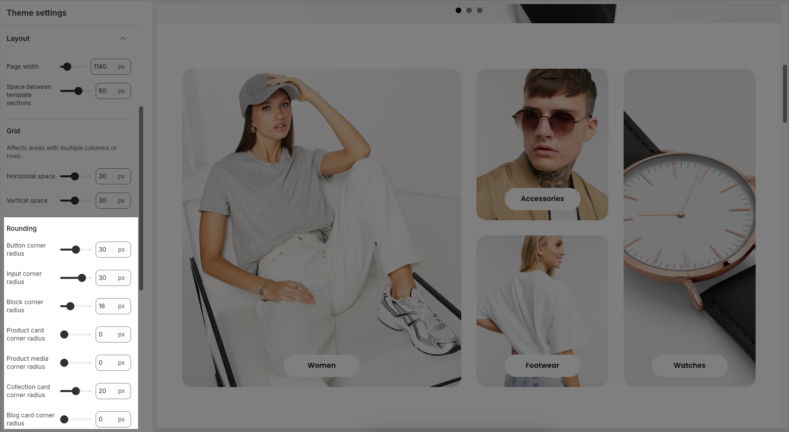
Button corner radius: Rounds the corners of all buttons. Higher values make buttons more pill-shaped.
Input corner radius: Rounds the corners of form input fields like text boxes and dropdowns.
Block corner radius: Applies rounding to content blocks or containers.
Product card corner radius: Sets the rounding for the outer edges of product cards.
Product media corner radius: Adjusts the rounding specifically for product images or media inside product cards.
Collection card corner radius: Controls the corner radius for collection preview cards.
Blog card corner radius: Sets the rounding for blog preview or featured post cards.


