


The Slideshow section allows you to create the Slider with images, Customers can swipe to see the next images or they watch it autoplay. You also can add texts, call-out buttons for them.
It is usually located on Homepage. However, Shopify 2.0 allows you to add the Slideshow section to any pages that you wanna use.
1. How to access the Slideshow section?
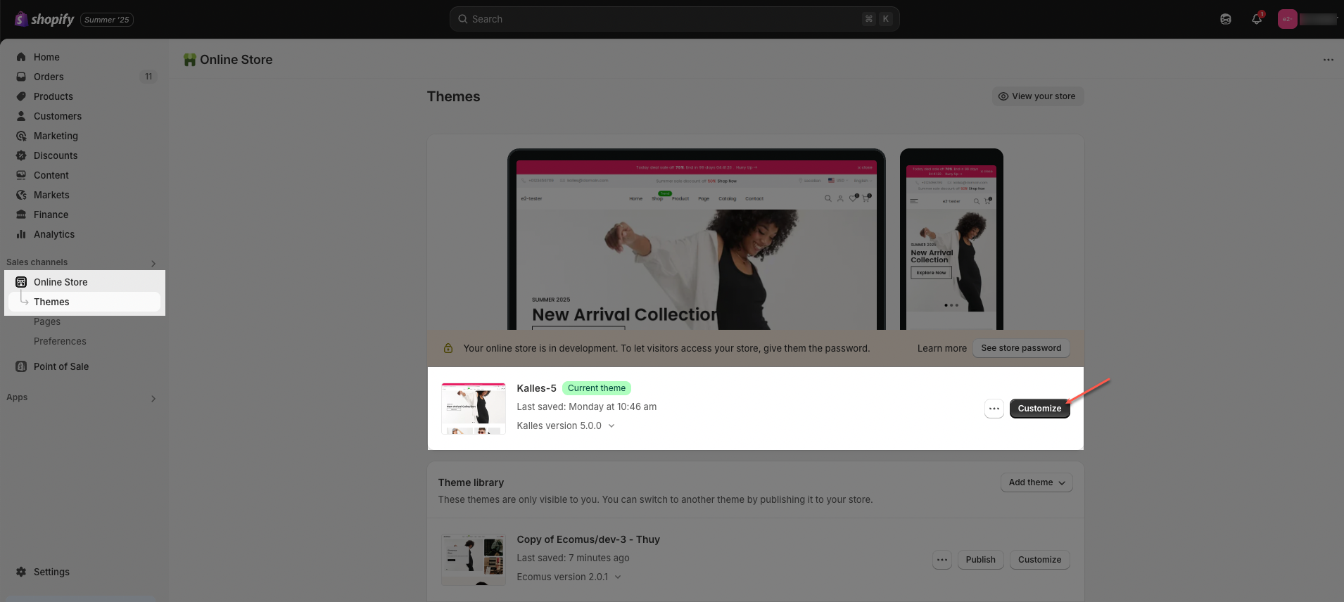
Step 01: From Shopify Admin, click on Online Store > Select Themes > In the Current theme section, click the Customize button.
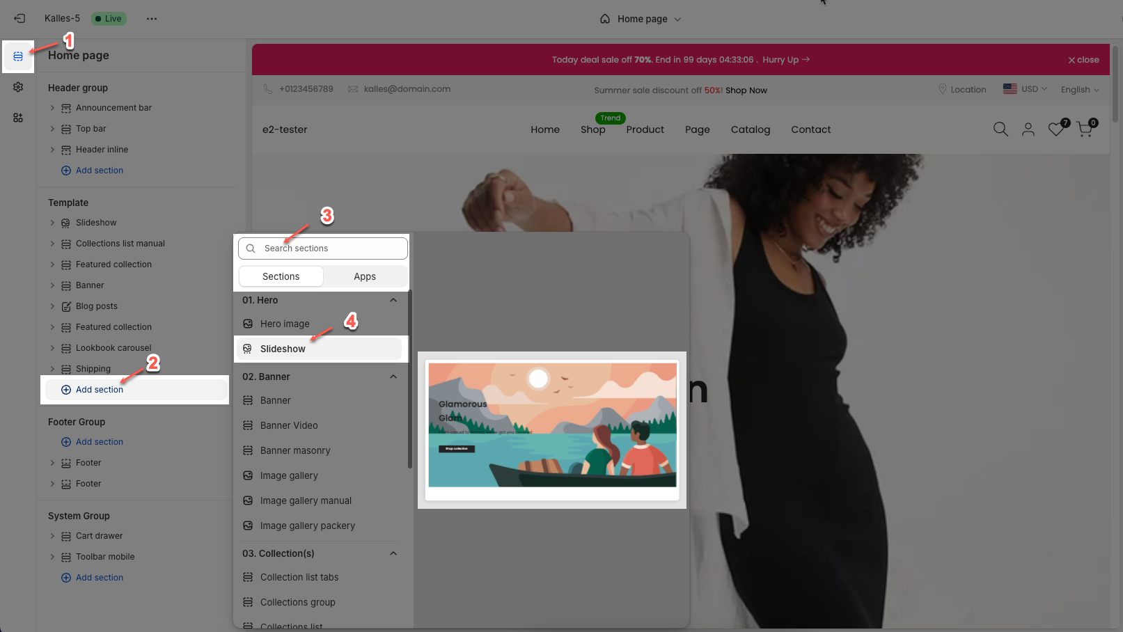
Step 02: In the theme editor (Customize), click the Sections button > Click the Add section button > In the Sections tab, scroll through the list or use the search bar to find and select Slideshow.
2. How to customize the Slideshow section?
2.1. Slide block
Click on Slideshow section > Add block > Slide block
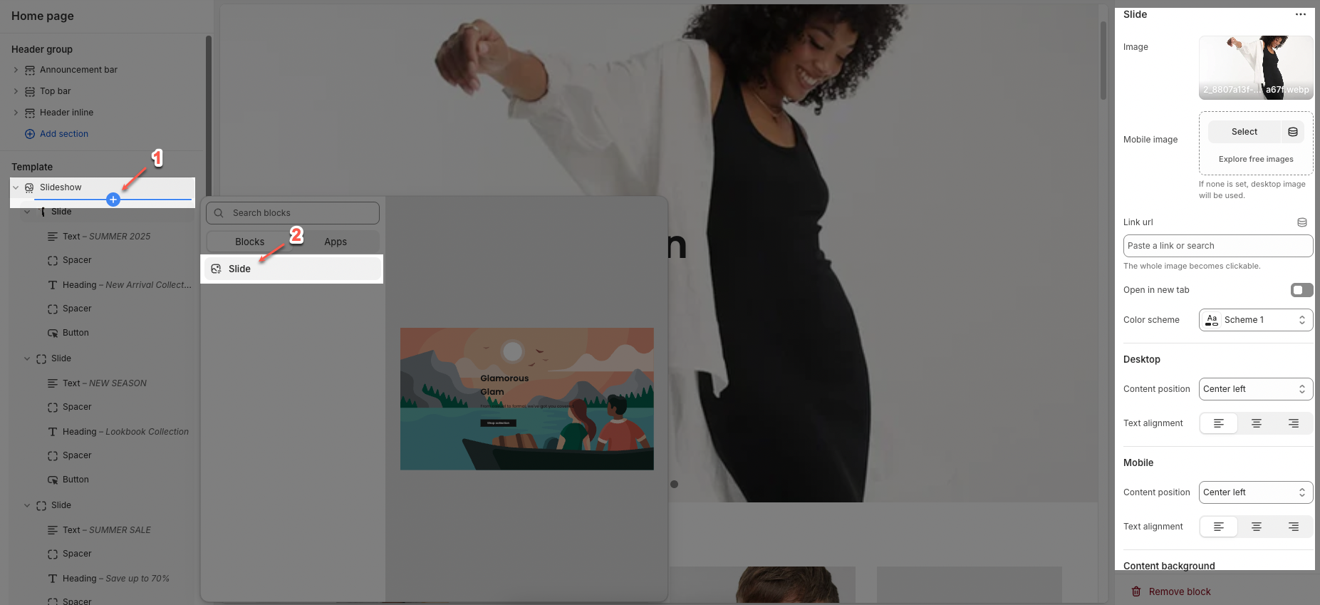
On each block, you can configure:
2.1.1. Slide
Image: This option allows add main image for the slide
Select: Choose or upload the main image for the slide.
Explore free images: Browse a library of free images to use.
Mobile image: Choose or upload a separate image optimized for mobile devices.
Note: If no mobile image is set, the desktop image will be used.
Link URL: Add a link here to make the entire image clickable.
Note: The whole image becomes clickable.
Open in new tab: Toggle this on to open the link in a new browser tab; off means it opens in the same tab.
Color scheme: Choose a color and text scheme for the slide
2.1.2. Desktop
Content position: Select where the content appears on desktop view. Options include: Top left, Top, Top right, Center, Center left, Center right, Bottom right, Bottom left, Bottom
Text alignment: Choose how the text is aligned on desktop—left, center, or right.
2.1.3. Mobile
Content position: Set the position of content for mobile view independently from desktop.
Text alignment: Choose how the text is aligned on mobile devices—left, center, or right.
2.1.4. Content background
Background content: Toggle to show or hide a background behind text for better readability over the image.
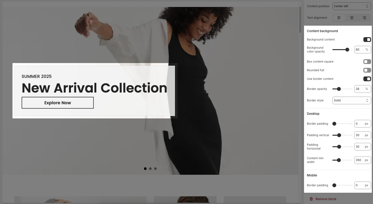
Background color opacity: Adjust the transparency of the background color (0% = fully transparent, 100% = fully opaque).
Box content square: Toggle to force the background box into a perfect square shape.
Rounded full: Toggle to apply fully rounded corners to the content background box.
Use border content: Toggle to show or hide a border around the content box.
Border opacity: Adjust the transparency of the border around the content box.
Border style: Choose the style of the border (e.g. solid, dashed, dotted).
Desktop
Border padding: Set the space between the border and content (in pixels).
Padding vertical: Adjust the vertical padding (top and bottom spacing) inside the content box.
Padding horizontal: Adjust the horizontal padding (left and right spacing) inside the content box.
Content min width: Set the minimum width of the content area in pixels.
Mobile
Border padding: Set the border padding specifically for mobile view (in pixels).
2.2. Slideshow section
You can configure some general options for the section below:
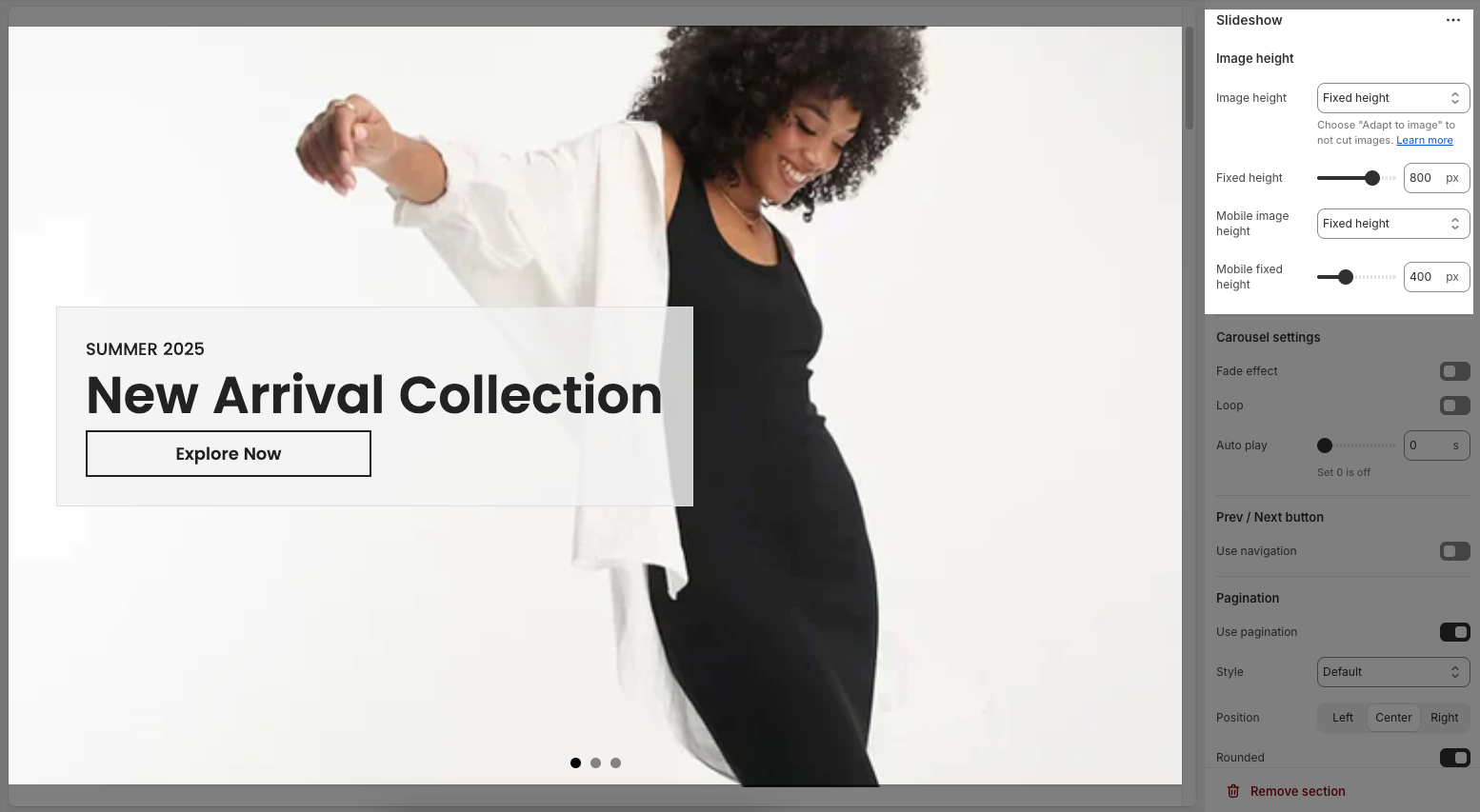
2.2.1. Image height
Image height: Choose how the slideshow image height is set—either Fixed height or Adapt to image (auto adjusts to image's natural height).
Fixed height: Set a specific height in pixels for desktop slides.
Mobile image height: Same as above, but applied to mobile view.
Mobile fixed height: Set a specific height in pixels for mobile slides.
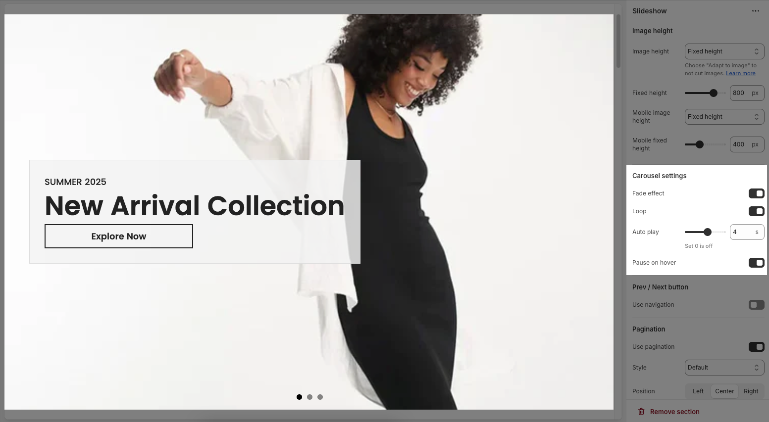
2.2.2. Carousel settings
Fade effect: Toggle to use a smooth fade transition between slides instead of a sliding motion.
Loop: Toggle to make the slideshow cycle continuously (it restarts automatically after the last slide).
Auto play: Set how many seconds each slide is shown before moving to the next automatically (set 0 to disable).
Pause on hover: Toggle to pause autoplay when the user hovers the mouse over the slideshow.
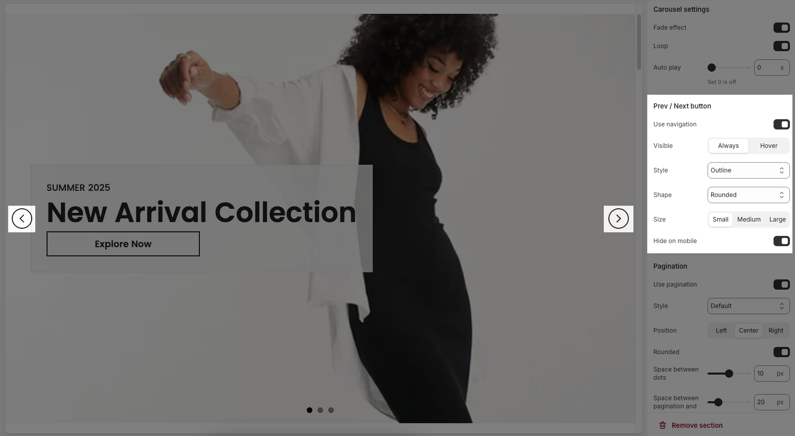
2.2.3. Prev/Next button
Use navigation: Toggle to show/hide previous/next arrows on the slideshow.
Visible: Choose whether arrows are Always shown or only on Hover.
Style: Set the button appearance — e.g., Outline, Solid, etc.
Shape: Define arrow shape — Rounded, Square, etc.
Size: Choose button size — Small, Medium, or Large.
Hide on mobile: Toggle to hide arrows on mobile devices.
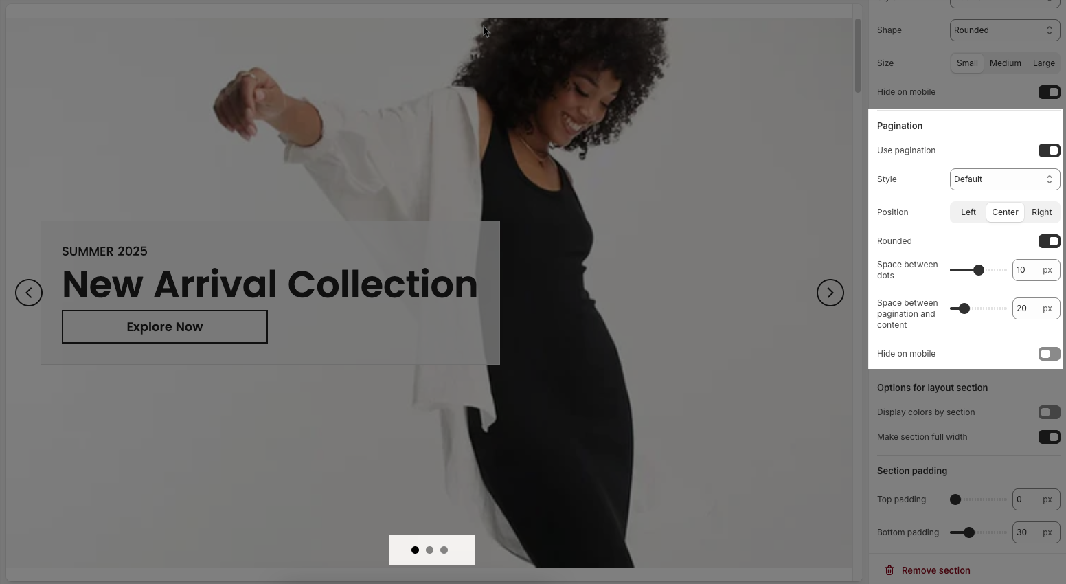
2.2.4. Pagination
Use pagination: Toggle this on or off to show or hide the pagination dots.
Style: Select the visual style of the dots (e.g., Default, which may include solid, outline, etc., depending on the platform).
Position: Choose the position of the dots – Left, Center, or Right.
Rounded: Toggle this to make the dots rounded. If off, the dots may appear square or rectangular.
Space between dots: Adjust the spacing between each pagination dot (in pixels).
Space between pagination and content: Adjust the vertical spacing between the pagination dots and the slideshow content above (in pixels).
Hide on mobile: Enable this option to hide pagination on mobile devices.
2.2.5. Options for layout sections
Display colors by section: When enabled, each section can have its own distinct color settings.
Color scheme: Allows you to choose a predefined set of colors (e.g., Scheme 5) for text and background elements.
Background section overlay: Adjusts the opacity of the overlay color on top of the background (e.g., 0.4 = 40% opacity).
Make section full width: When enabled, the section stretches across the entire width of the screen, removing default margins or padding on the sides.
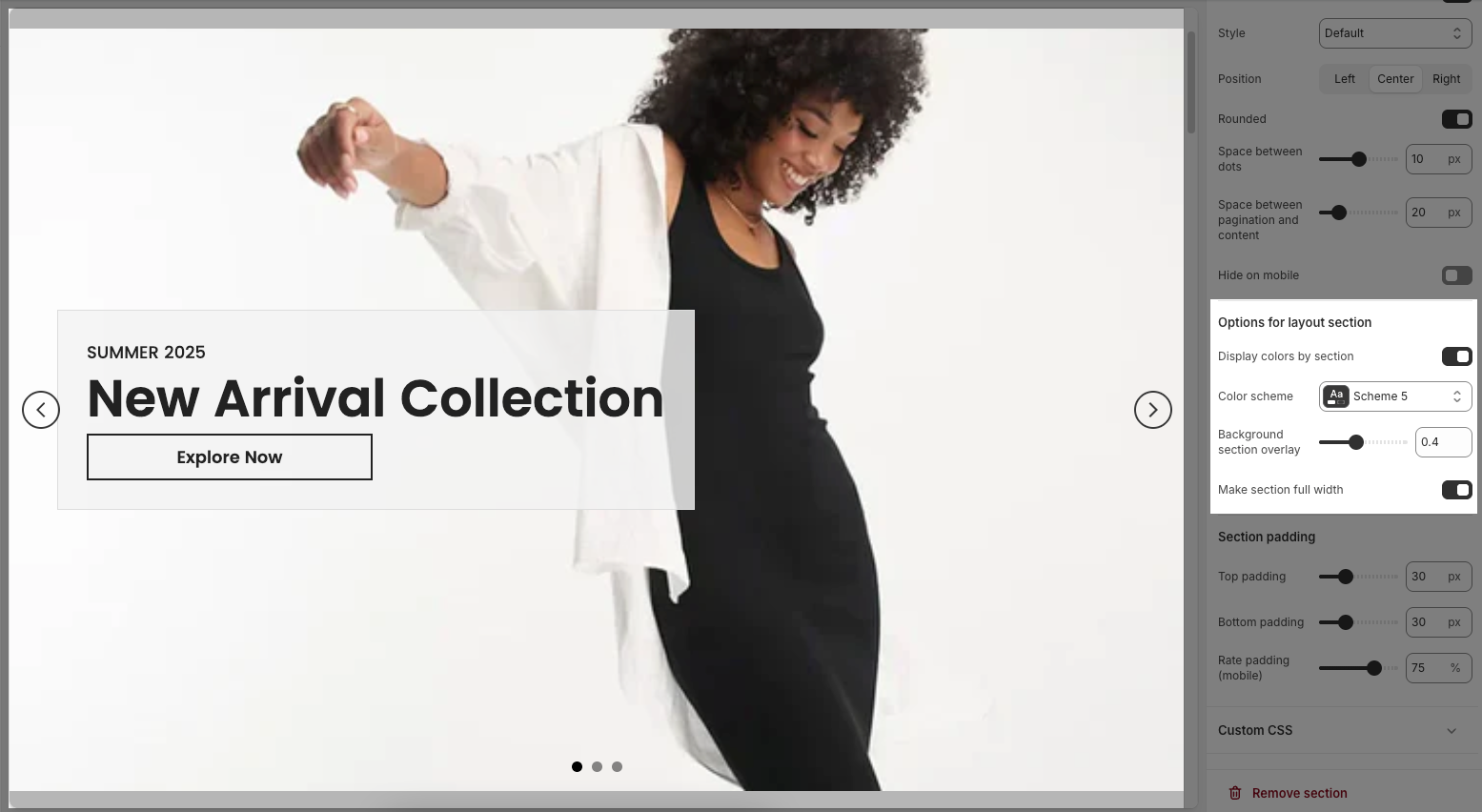
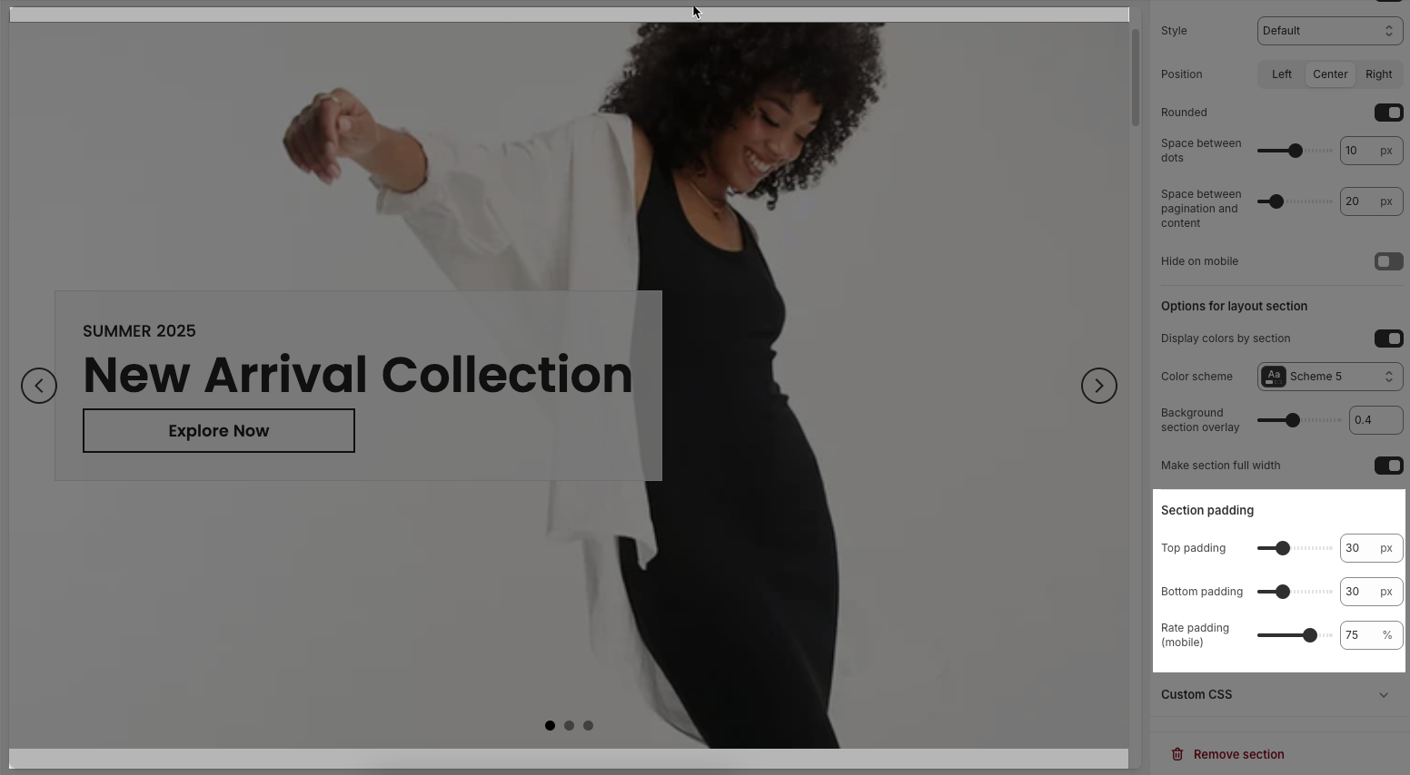
2.2.6. Section padding
Top padding: Sets the vertical spacing (in pixels) above the section.
Bottom padding: Sets the vertical spacing (in pixels) below the section.
Rate padding (mobile): Defines the vertical padding as a percentage for mobile devices, allowing responsive spacing.
2.2.7. Custom CSS
Allows users to customize by adding CSS rules, beyond the limitations of default settings. This allows for fine-tuning the design to every detail, to suit specific needs.
Add custom styles to this section only.
To add custom styles to your entire online store, go to theme settings for detailed instructions.


