


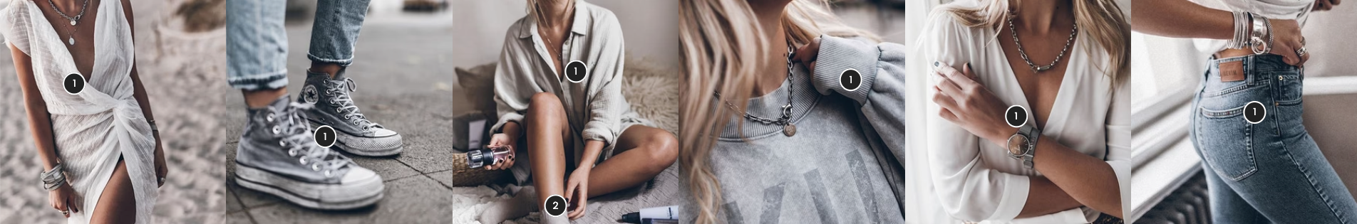
The Lookbook Carousel section presents a visually rich slider that highlights curated lifestyle or product images, often used to inspire shoppers with style ideas. It also supports product pins, allowing specific products to be tagged directly within images—making it easier for customers to shop the look interactively.
1. How to access the Lookbook carousel section?
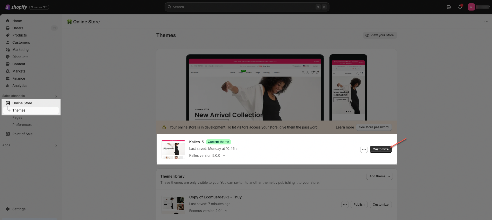
Step 01: From Shopify Admin, click on Online Store > Select Themes > In the Current theme section, click the Customize button.
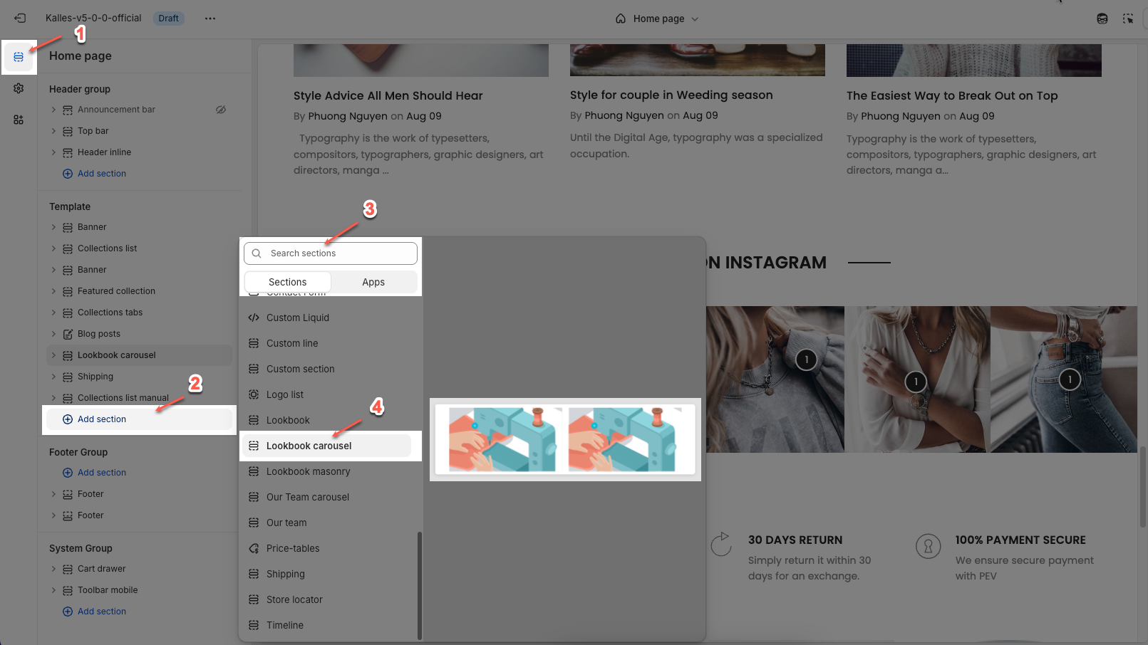
Step 02: In the theme editor (Customize), click the Sections button > Click the Add section button > In the Sections tab, scroll through the list or use the search bar to find and select Lookbook carousel.
2. How to customize the Lookbook carousel section?
2.1. Lookbook item
A Lookbook Item is a component within the Lookbook Carousel that allows you to add hotspots on an image to display product details or direct users to a product page.
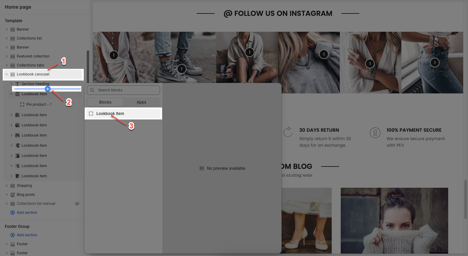
Click on Lookbook carousel section > Add block (plus icon ➕) > Lookbook item block
You can customize a lookbook item with options bellow:
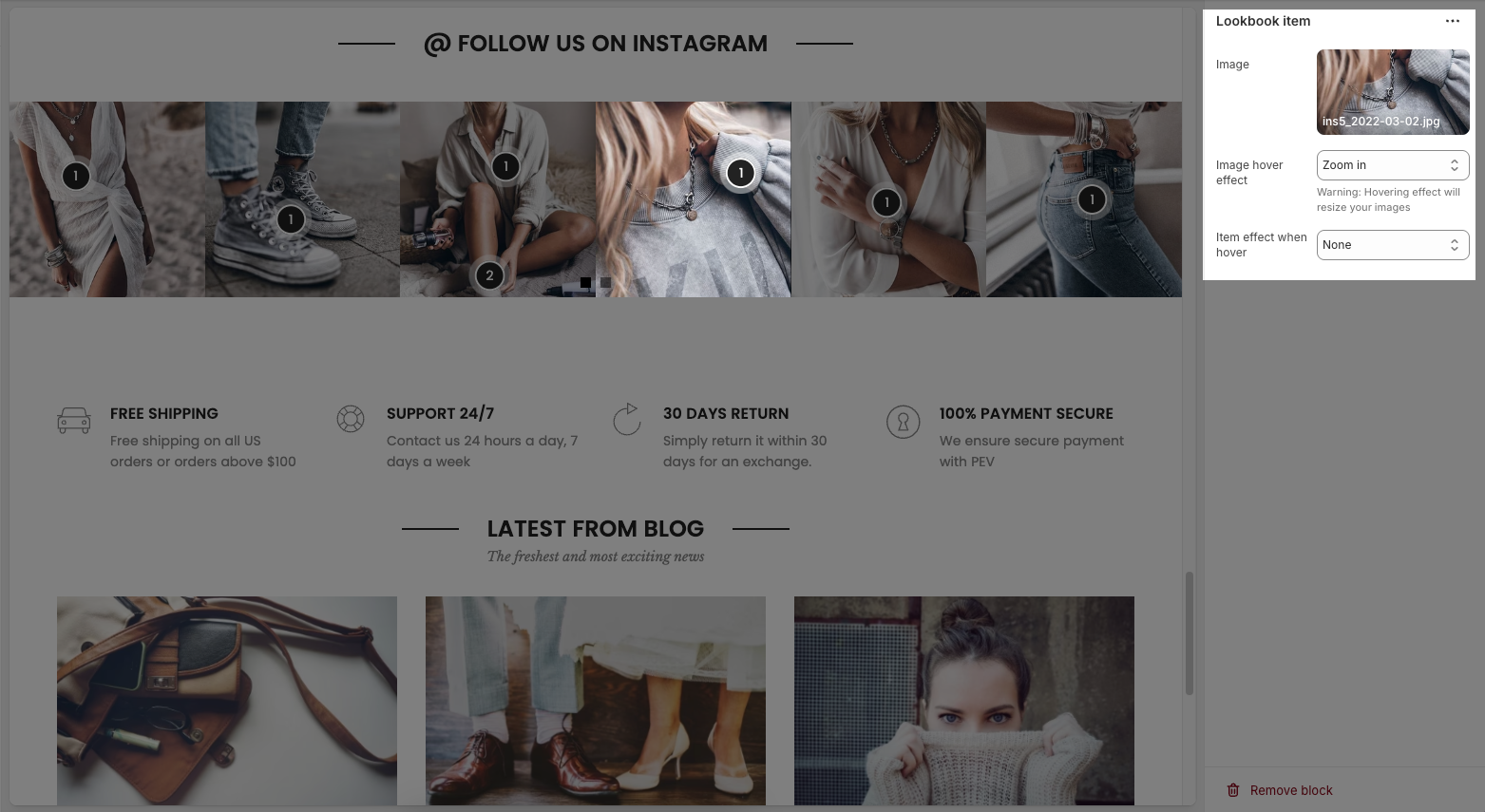
Image: Select the main image for the Lookbook Item.
Image Hover Effect: Allows you to apply effects when hovering over the image. Options may include zooming in, fading, or changing the image color.
Item Effect When Hover: Allows you to apply effects when hovering over the item, such as a running border effect or other visual effects.
There are 2 Pin blocks can add to the Lookbook item: Pin product and Pin text.
2.1.1. Pin product
The Pin Product feature allows you to add interactive hotspots to images, showcasing specific products with a pop-up display. Below are the customization options available for configuring a Pin product.
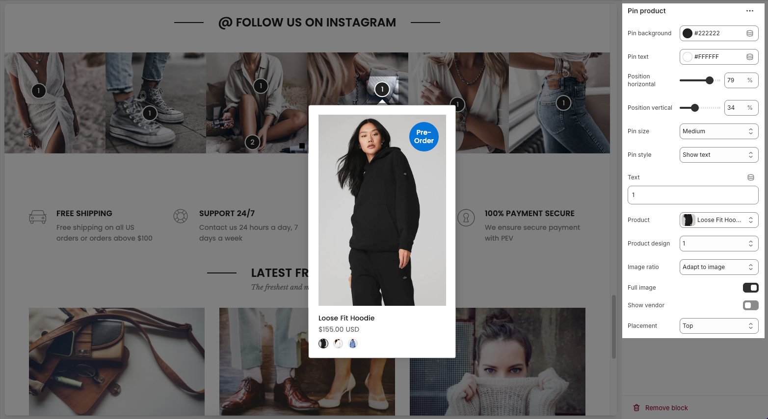
Pin background: Sets the background color of the pin
Pin text: Sets the color of the text on the pin
Position horizontal/vertical – Adjust the horizontal/vertical position of the pin on the image.
Pin size – Choose the size of the pin (small, medium, large).
Pin style – Select how the pin is displayed (icon only or with text).
Text – Enter the text displayed on the pin.
Product – Assign a product linked to the pin.
Product design – Choose how the product appears in the pop-up.
Image ratio – Select the image aspect ratio (square, landscape, portrait).
Full image – Enable/disable full product image display.
Show vendor – Enable/disable displaying the brand or vendor.
Placement – Choose where the pop-up appears (top, bottom, left, right of the pin).
2.1.2. Pin text
Below are the customization options available for configuring a Pin text:
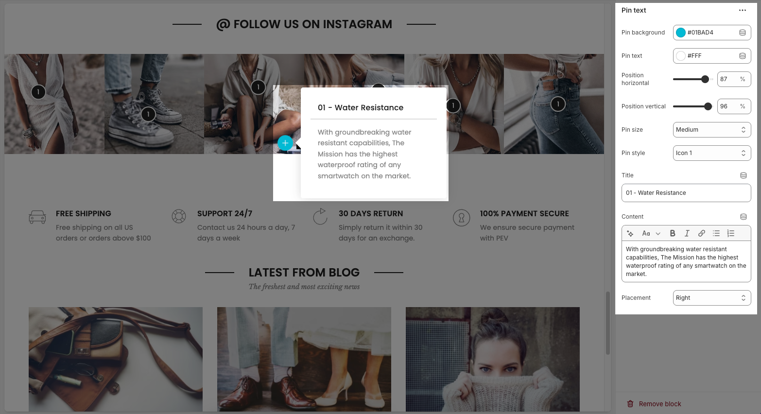
Pin background: Sets the background color of the pin
Pin text: Sets the color of the text on the pin
Position horizontal/vertical – Adjust the pin’s exact location on the image.
Pin size – Select the size of the pin (small, medium, large).
Pin style – Choose the icon style for the pin.
Title – Enter a heading for the text box.
Content – Provide a detailed description or information related to the pin.
Placement – Set the position of the text box relative to the pin (top, bottom, left, right).
2.2. Lookbook carousel
The Lookbook Carousel allows you to showcase multiple images in a slider format, perfect for highlighting products or key visuals. Below are the customization options available:
2.2.1. Options layout
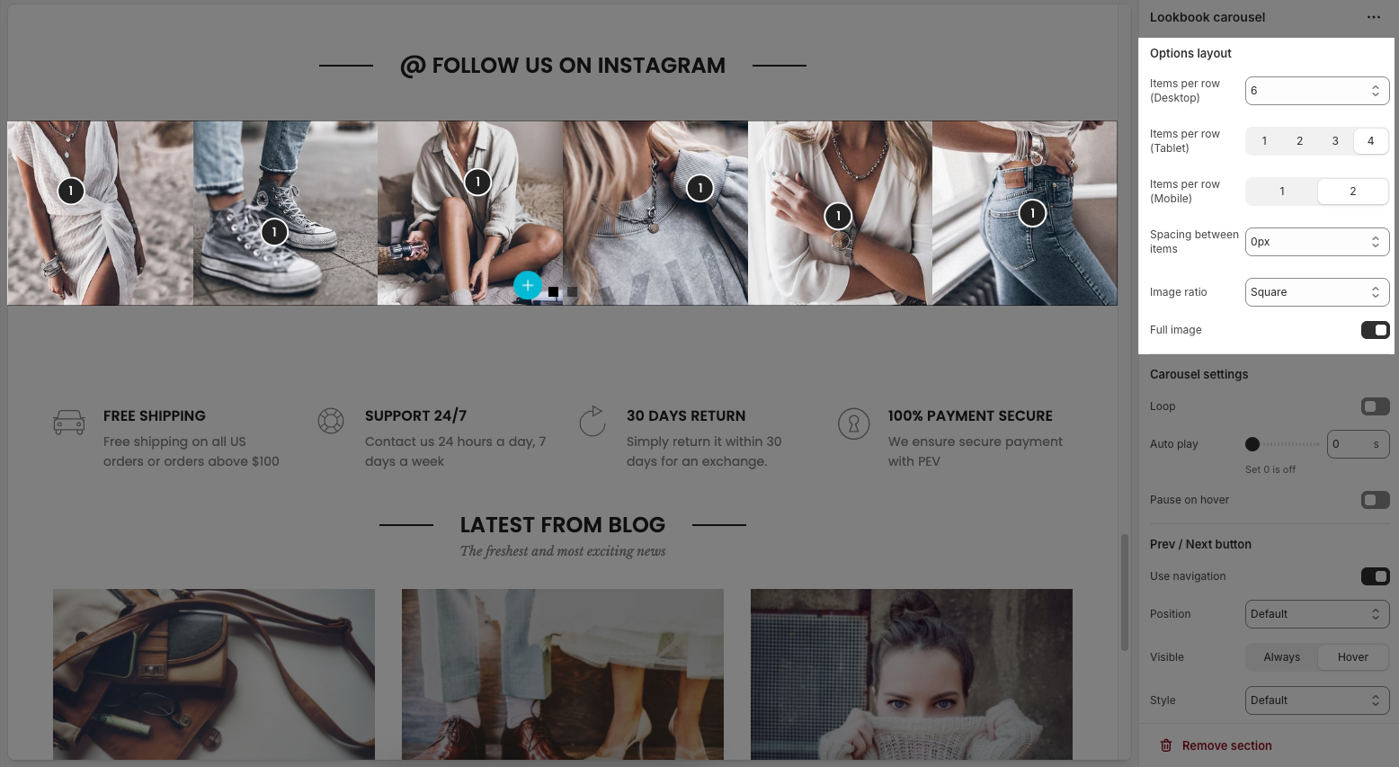
Items per row (Desktop): Sets how many items to show in one row on desktop view (e.g., 2 to 6 items).
Items per row (Tablet): Sets how many items to show in one row on tablet view (e.g., 1 to 4 items).
Items per row (Mobile): Sets how many items to show in one row on mobile view (e.g., 1 or 2).
Spacing between items: Controls the horizontal and vertical spacing between the collection items.
Image ratio: Controls the aspect ratio of images. Options include:
Adapt to image – Keeps the original aspect ratio of each image; no cropping or resizing.
Square – Forces all images into a 1:1 aspect ratio (equal width and height).
Portrait – Displays images in a vertical rectangle format (taller than wide).
ASOS – Uses a custom aspect ratio often seen on e-commerce sites like ASOS (typically taller than Square but shorter than Portrait).
Landscape – Displays images in a horizontal rectangle format (wider than tall).
Full image: Toggle on to fit the full image inside its container without cropping; off means the image may be cropped to fill space.
2.2.2. Carousel settings
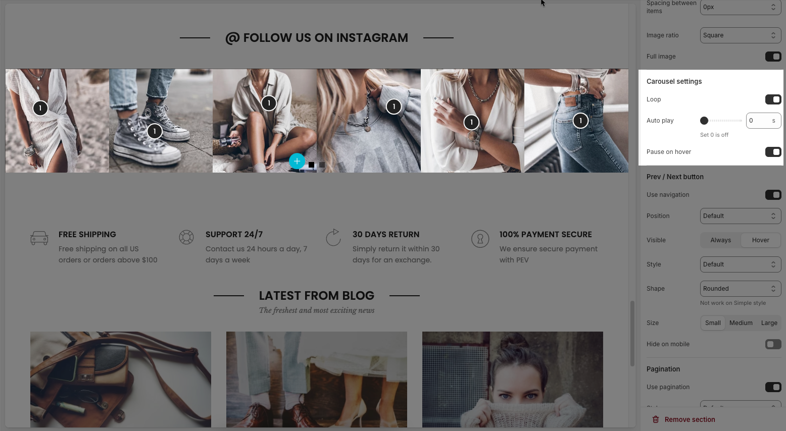
Loop: Enables continuous looping of the carousel; after the last slide, it returns to the first automatically.
Auto play: Sets the time (in seconds) for automatic slide switching. Setting to 0 disables autoplay.
Pause on hover: When enabled, the autoplay pauses while the user hovers over the carousel.
2.2.3. Pre / Next buttons
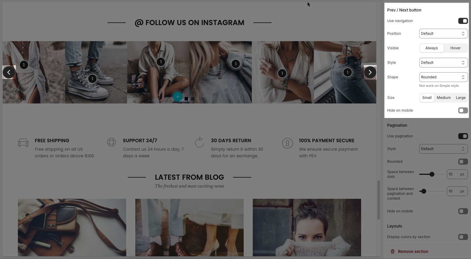
Use navigation: Enables the left/right navigation arrows for manual slide control.
Position: Sets the placement of the navigation buttons (e.g., Default, On border, Outside, etc.).
Visible: Choose whether the navigation buttons are always visible or only appear on hover.
Style: Select the design style of the navigation buttons (e.g., Default, Outline, Simple.).
Shape: Defines the button shape (e.g., Rounded, Rotate); note: doesn't apply to the “Simple” style.
Size: Sets the size of the navigation buttons (Small, Medium, or Large).
Hide on mobile: Hides navigation buttons on mobile devices when enabled.
2.2.4. Pagination
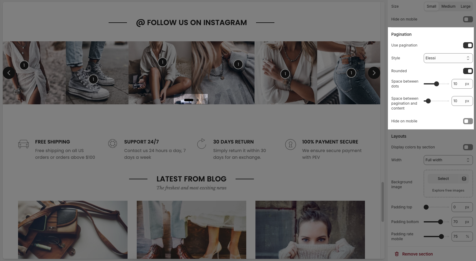
Use pagination: Turns on pagination (usually dots below the carousel to indicate slide position).
Style: Sets the appearance of the dots (e.g., Default, Outline, Elessi, Full width).
Rounded: Makes the pagination dots circular when enabled.
Space between dots: Adjusts the distance (in px) between pagination dots.
Space between pagination and content: Controls the vertical gap (in px) between pagination and the content above.
Hide on mobile: Hides the pagination dots on mobile devices when enabled.
2.2.5. Layouts
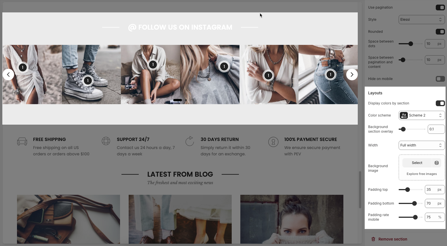
Display colors by section: Enables section-specific color styling based on the selected scheme.
Color scheme: Choose a predefined color palette for the section.
Background section overlay: Adjusts the transparency level (0–100%) of a dark or colored overlay above the background.
Width: Sets the section’s width (e.g., Container, Wrap container, Full width).
Background image: Allows you to select an image for the section background.
Padding top / bottom: Controls the vertical spacing (in px) above and below the content in the section.
Padding rate mobile: Sets the padding as a percentage for mobile layout to ensure responsiveness.


