


The Our Team Carousel section is a customizable feature on your homepage that showcases team members in a sliding carousel layout. It includes options to display names, roles, and profile images, and supports responsive design for desktop, tablet, and mobile views. This section helps personalize your brand by introducing the people behind it.
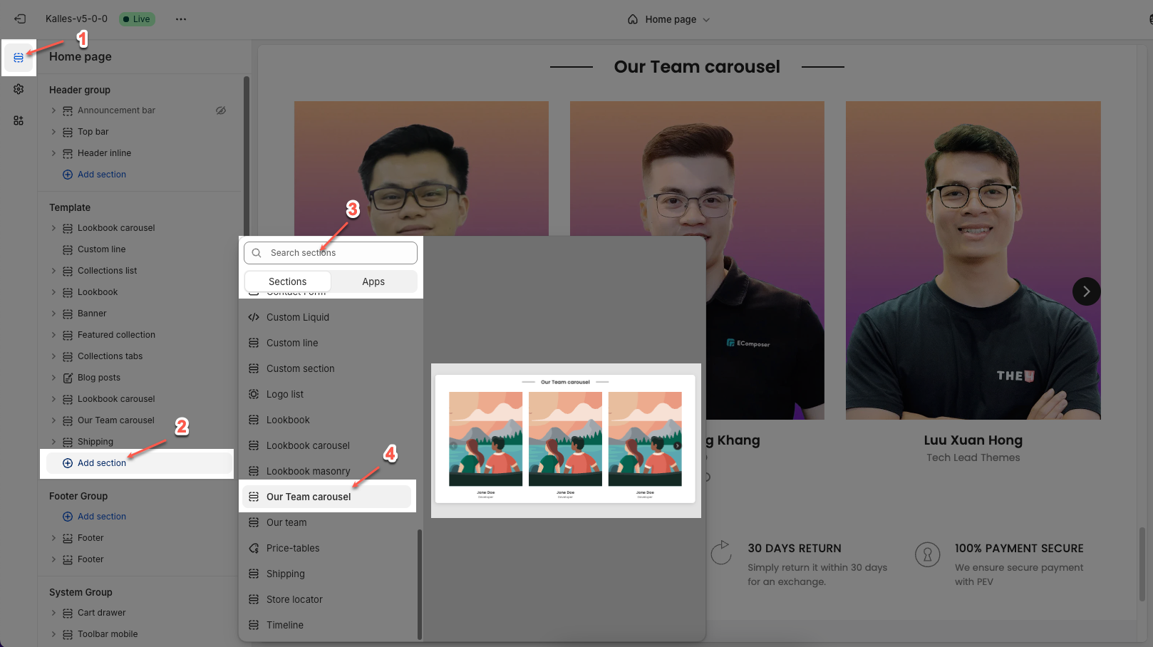
1. How to access the Our team carousel section?
Step 01: From Shopify Admin, click on Online Store > Select Themes > In the Current theme section, click the Customize button.

Step 02: In the theme editor (Customize), click the Sections button > Click the Add section button > In the Sections tab, scroll through the list or use the search bar to find and select the Our team carousel section.
2. How to customize the Our team carousel section?
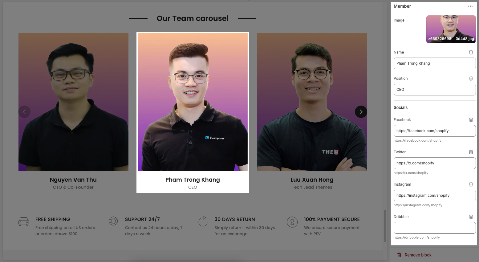
2.1. Member block
To add a Member block to the Our team, click the Add block button (plus icon ➕) under the Grid Layout.
After adding the Member block, you can adjust its settings using the sidebar—located on the right or left side of your screen depending on your device
Image: Upload the portrait image of the team member.
Name: Enter the full name of the team member.
Position: Enter the position or role of the team member within the company.
Social links: Provide links to the team member's social media profiles (e.g., LinkedIn, Twitter, Instagram). This is a great way for customers to connect on a deeper level
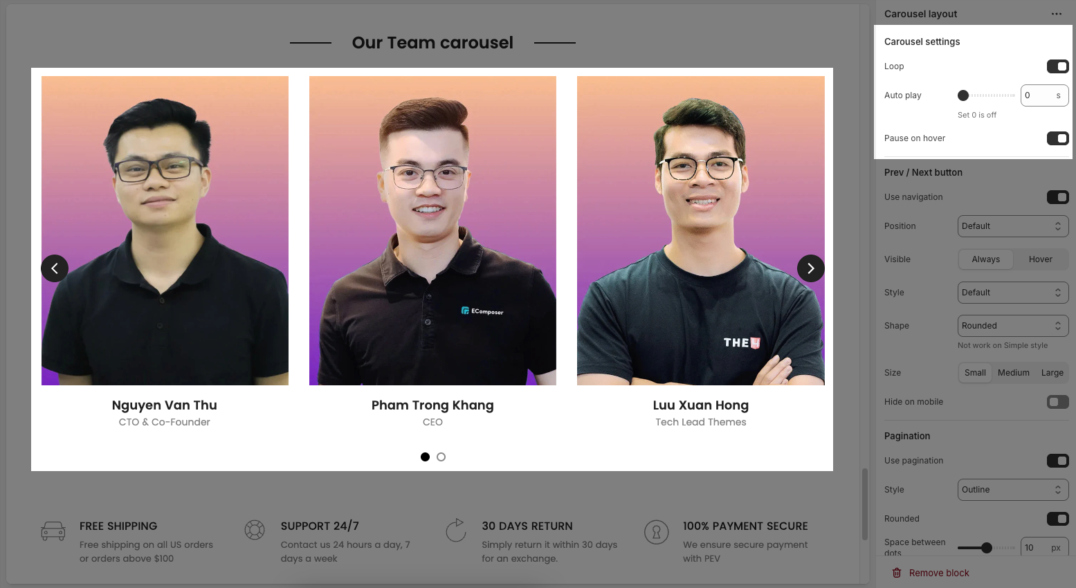
2.2. Carousel layout block
You can customize carousel layout block with the options below:
2.2.1. Carousel settings
Loop: Enable this option to make the section automatically loop its content after all items have been displayed. This creates a seamless and continuous experience for the user.
Auto play: Enable this option to make the section automatically play (advance slides) as soon as the page loads.
Pause on hover: Enable this option to pause the auto-play of the section when the mouse cursor hovers over its area
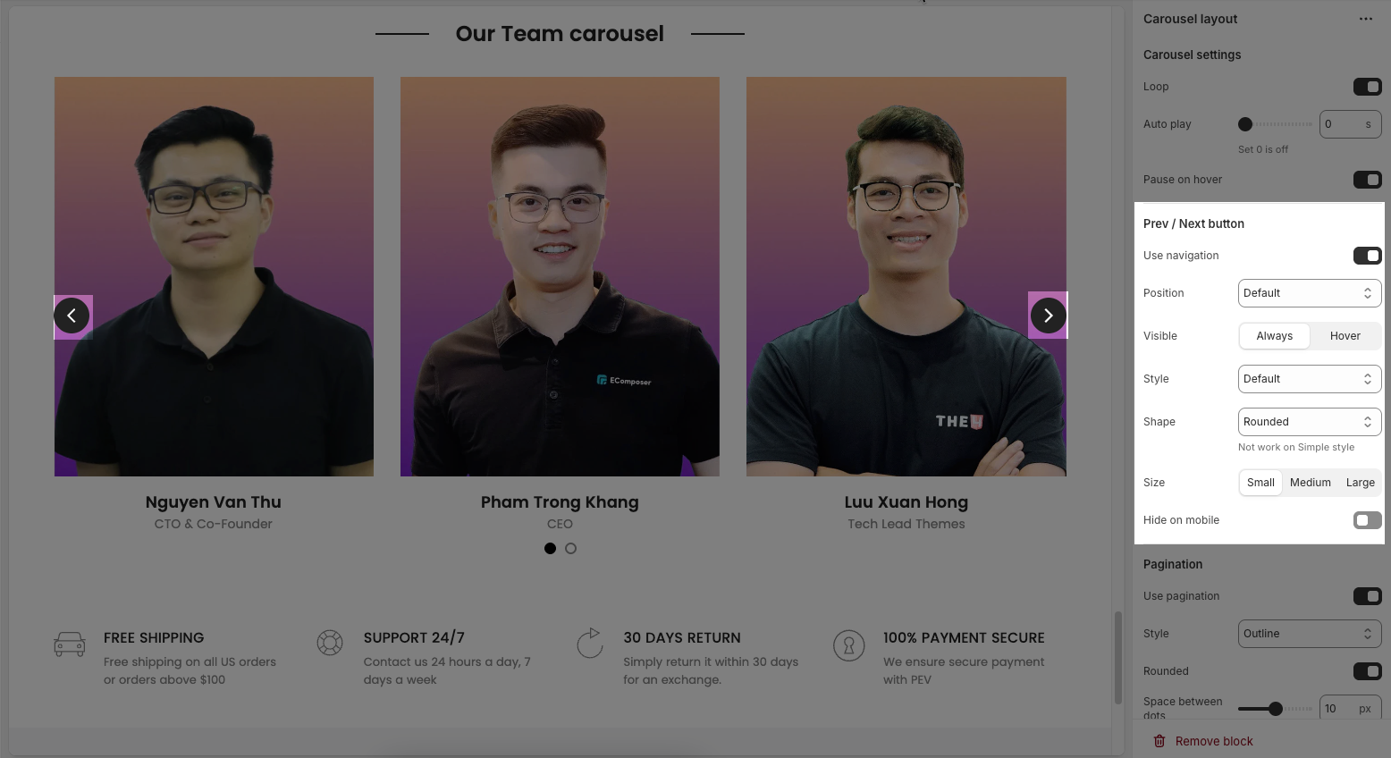
2.2.2. Prev/ Next button
Use navigation: Enables the left/right navigation arrows for manual slide control.
Position: Sets the placement of the navigation buttons (e.g., Default, On border, Outside, etc.).
Visible: Choose whether the navigation buttons are always visible or only appear on hover.
Style: Select the design style of the navigation buttons (e.g., Default, Outline, Simple.).
Shape: Defines the button shape (e.g., Rounded, Rotate); note: doesn't apply to the “Simple” style.
Size: Sets the size of the navigation buttons (Small, Medium, or Large).
Hide on mobile: Hides navigation buttons on mobile devices when enabled.
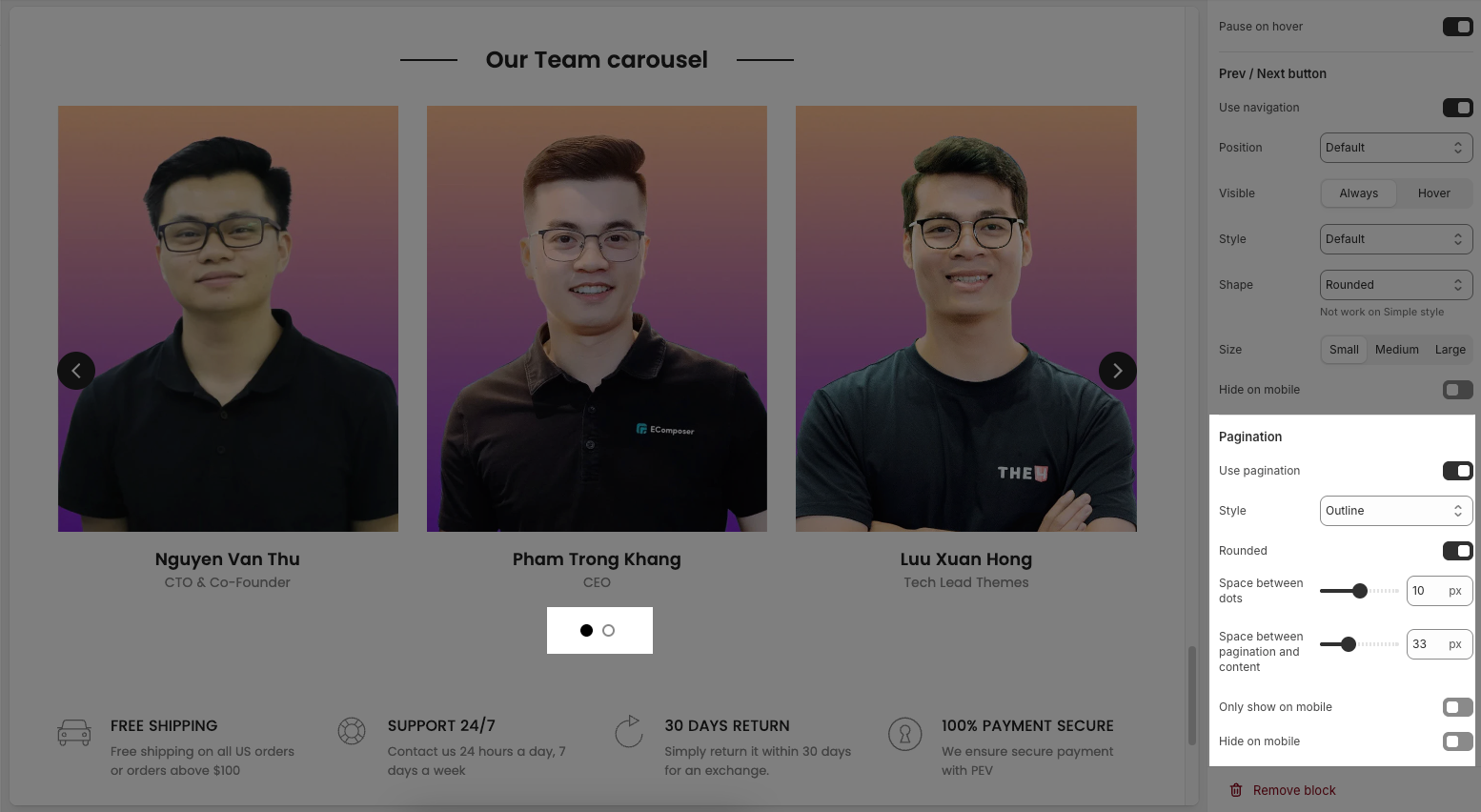
2.2.3. Pagination
Use pagination: Turns on pagination (usually dots below the carousel to indicate slide position).
Style: Sets the appearance of the dots (e.g., Default, Outline, Elessi, Full width).
Rounded: Makes the pagination dots circular when enabled.
Space between dots: Adjusts the distance (in px) between pagination dots.
Space between pagination and content: Controls the vertical gap (in px) between pagination and the content above.
Only show on mobile: Enable this if you want pagination to appear only on mobile devices.
Hide on mobile: Hides the pagination dots on mobile devices when enabled.
2.3. Other block
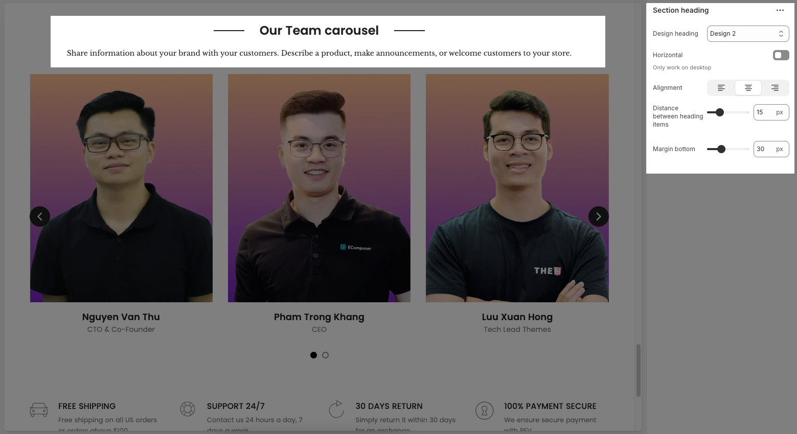
2.3.1. Section heading block
The Section Heading block allows you to add a title and description to different sections of your page, you can customize this block with options below:
Design heading: Choose a design for the header to ensure aesthetics
Horizontal: Select how horizontal lines will be displayed with the heading
Only work on desktop
Text Alignment: Align the Section heading block to the left, center, or right
Spacing between items: Adjust the space between the heading and the text (measured in pixels).
Margin bottom: Define the space between the Section Heading and the next section to maintain a balanced layout.
2.3.2. Heading block
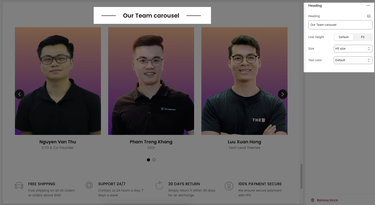
To add a Heading block to the Section heading, click the Add block button (plus icon ➕) under the Section heading.
Once the Heading block is added, you can customize its settings in the left or right-hand sidebar (depending on your screen size)
Heading: Allows you to enter and format the text (bold, italic, underline, lists, links, etc.). Shift + Enter to line break.
Line height: Adjusts the spacing between lines of text. Options include: "Default", "Small", "Fit".
Size: Lets you select sizes for the heading.
Text color: Allows you to set the text color.
2.3.3. Sub heading
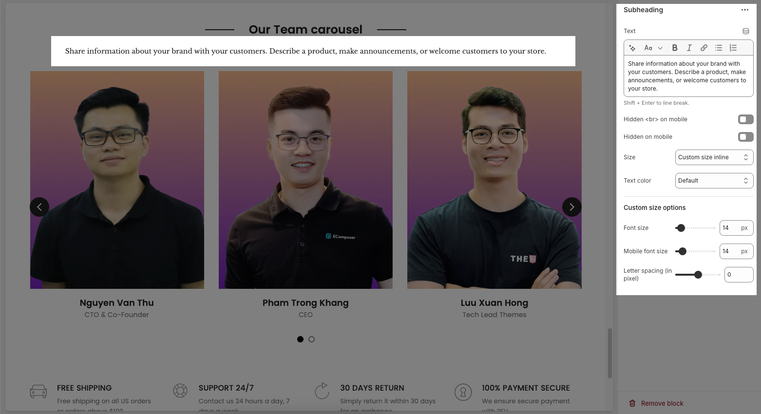
Text: This is where you input the main text content
Shift + Enter to line break.
Use shortocdes: [countdown]. Countdown to the end sale date will be shown
Hidden <br> on mobile: Disables line breaks on mobile devices.
Hidden on mobile: A toggle switch. If enabled, the text content will not be displayed on mobile devices.
Size: Controls font size, options include such as Small, Medium, Large, ... and "Custom size inline" for specific settings.
Choose "Custom size inline" to freely adjust the size in the Custom Size Options section.
Text color: A dropdown menu to set the color of the text. "Default" is currently selected.
Custom size options
Font size (Desktop/Mobile): Set different font sizes for each device type to ensure a responsive and visually appealing layout.
Letter spacing (in pixel): Adjust the space between letters to enhance readability and design precision.
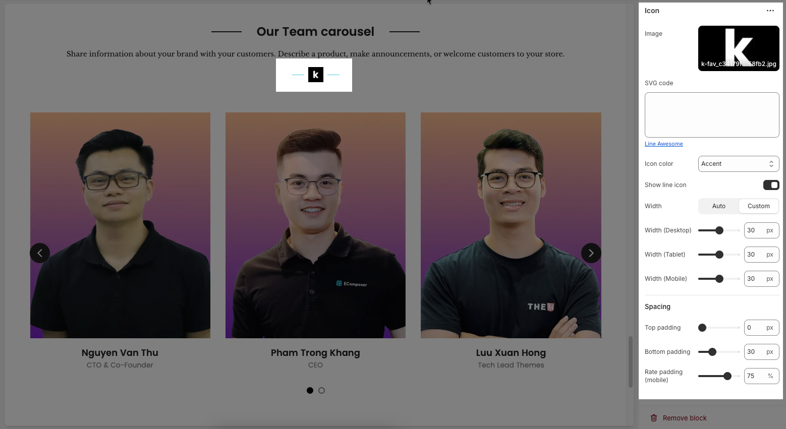
2.3.4. Icon
Once the Icon block is added, you can customize its settings in the left or right-hand sidebar (depending on your screen size)
Image: Upload an image file to display. This is ideal for logos, illustrations, or any other graphic you wish to use.
SVG code: Paste SVG (Scalable Vector Graphics) code directly into this field. SVG is an ideal vector graphic format for icons or simple graphics, scalable without loss of quality, and can be color-customized with CSS.
Icon color: Choose the color for the icon. This option applies to icons rendered from SVG code or those sourced from an icon library.
Show line icon: Enable this option to display a line icon (outline icon) instead of a filled icon, if your theme supports both styles.
Width: Select the width setting mode.
Auto: The width will automatically adjust based on the content and available space of its parent element. This is the default and often the most flexible setting.
Custom: Allows you to specify a custom width. When this option is selected, detailed width input fields for each device will appear.
Width (Desktop): (Only visible when
Widthis set toCustom) Enter the width of the element on desktop screensWidth (Tablet): Enter the width of the element on tablet screens
Width (Mobile): Enter the width of the element on mobile devices
Spacing
Top padding: Enter the value for the top padding of the element (unit: pixels). This padding creates space between the top edge of the content and the top edge of the element.
Bottom padding: Enter the value for the bottom padding of the element (unit: pixels). This padding creates space between the bottom edge of the content and the bottom edge of the element.
Rate padding (mobile): Enter the padding rate value for the element on mobile devices
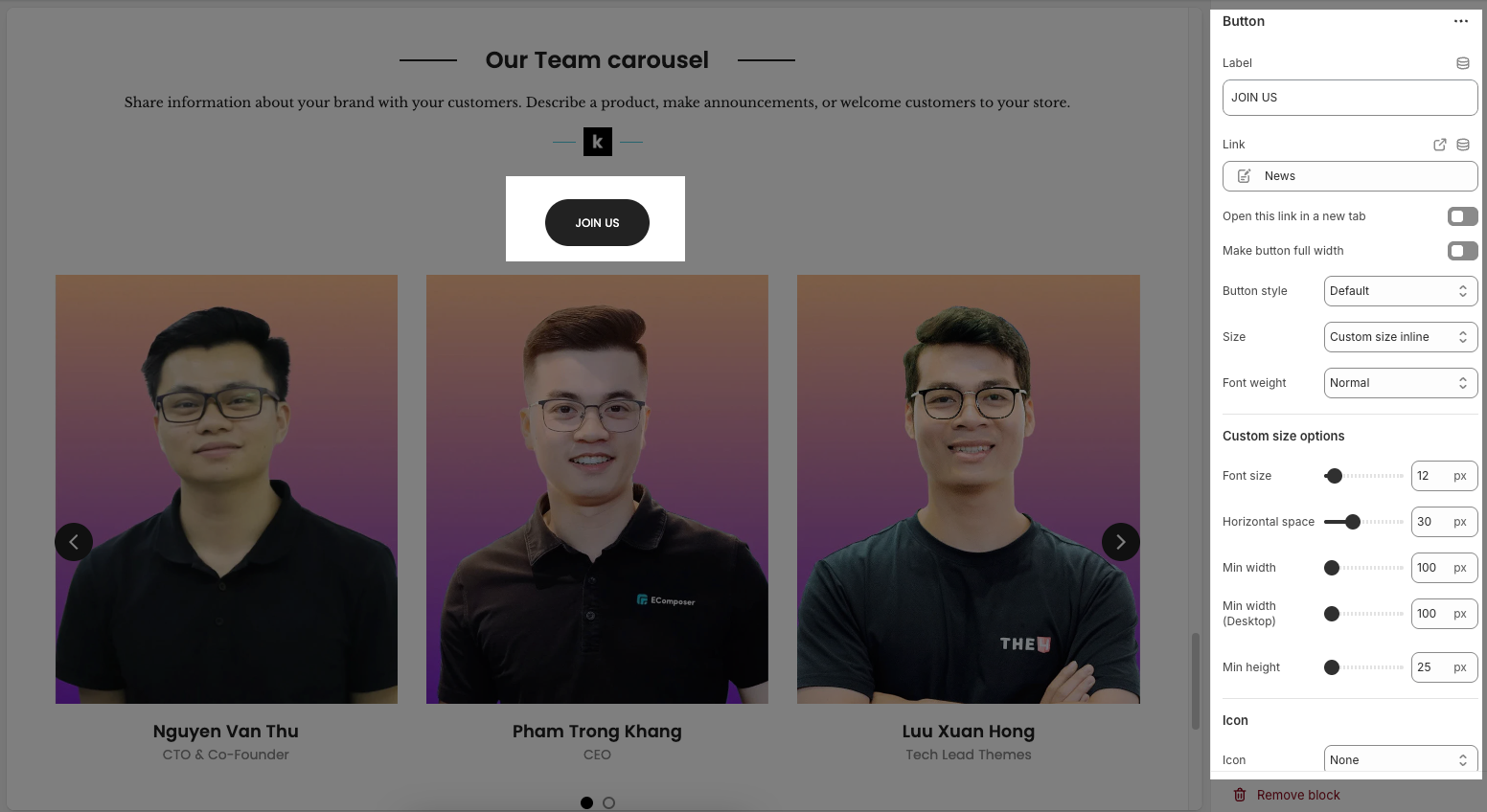
2.3.5. Button
Once the Button block is added, you can customize its settings in the left or right-hand sidebar (depending on your screen size)
Label: Enter the text that will be displayed on the button. This is the main content users will read to understand the button's function
Link: Enter the URL that the button will link to when clicked. This can be an internal page within your store, a collection, a specific product, or an external link.
Open this link in a new tab: Enable this option to open the link in a new browser tab or window when the button is clicked.
Make button full width: Enable this option to make the button expand to the full available width of its containing element. This can make the button more prominent, especially on mobile devices.
Button style: Select the visual style of the button (Defaul, Outline, Link,...)
Size: Select the size of the button (e.g.,
Small,Medium,Large,...). This affects the button's height and internal padding.Font weight: Select the weight or boldness of the font on the button (e.g.,
Normal,Bold). This impacts the prominence of the button text.
Icon
Icon: An icon is a small graphic element used for illustration or emphasis.
Icon position: Select the position of the icon relative to the text or element it accompanies
Icon size: Select the size of the icon
Icon spacing: Enter the spacing between the icon and its adjacent text or element (unit: pixels).
2.4. Our Team Carousel section
Here’s how you can customize the Our team carousel section to best fit your content and layout. Below are the available options for customization:
2.4.1. Our Team Carousel
Image ratio: Controls the aspect ratio of images. Options include:
Adapt to image – Keeps the original aspect ratio of each image; no cropping or resizing.
Square – Forces all images into a 1:1 aspect ratio (equal width and height).
Portrait – Displays images in a vertical rectangle format (taller than wide).
ASOS – Uses a custom aspect ratio often seen on e-commerce sites like ASOS (typically taller than Square but shorter than Portrait).
Landscape – Displays images in a horizontal rectangle format (wider than tall).
Items per row (Desktop): Sets how many items to show in one row on desktop view (e.g., 2 to 6 items).
Items per row (Tablet): Sets how many items to show in one row on tablet view (e.g., 1 to 4 items).
Items per row (Mobile): Sets how many items to show in one row on mobile view (e.g., 1 or 2).
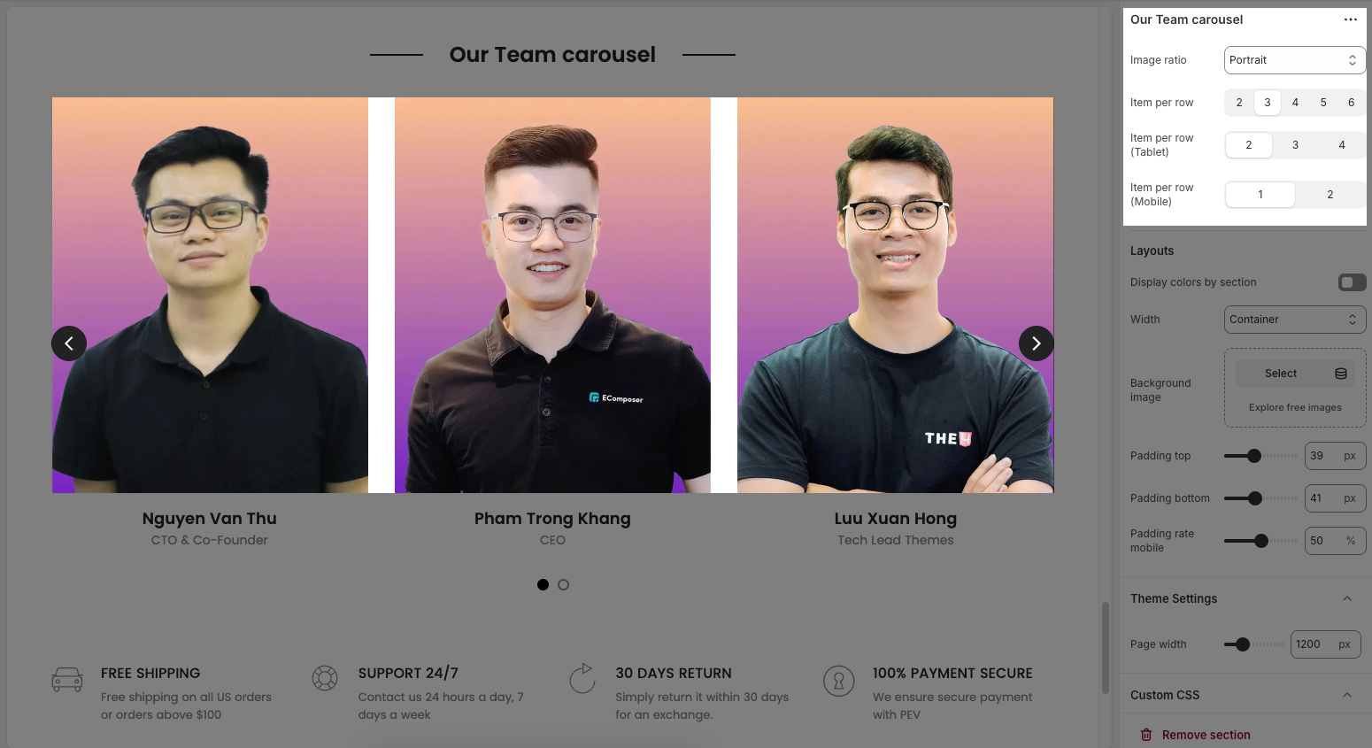
2.4.2. Layouts
Display colors by section: Enables section-specific color styling based on the selected scheme.
Color scheme: Choose a predefined color palette for the section.
Background section overlay: Adjusts the transparency level (0–100%) of a dark or colored overlay above the background.
Width: Sets the section’s width (e.g., Container, Wrap container, Full width).
Background image: Allows you to select an image for the section background.
Padding top / bottom: Controls the vertical spacing (in px) above and below the content in the section.
Padding rate mobile: Sets the padding as a percentage for mobile layout to ensure responsiveness.
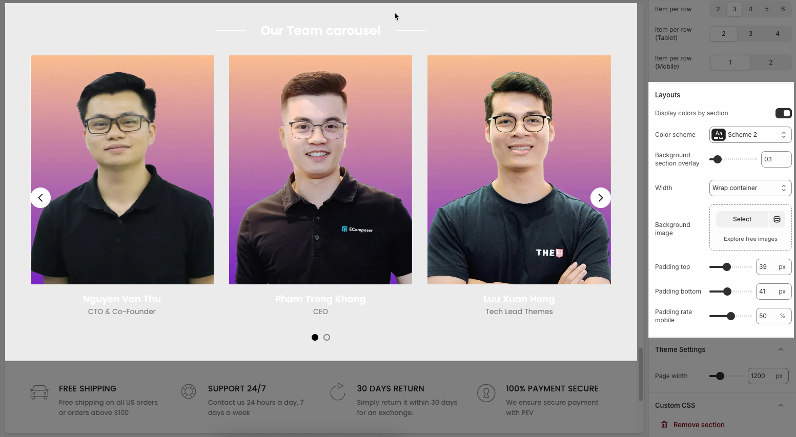
2.4.3. Theme settings
Page width: Enter the maximum width for the main content of your page (unit: pixels). The content will be centered and will not exceed this width, which helps improve readability and layout control.
2.4.4. Custom CSS
Allows users to customize by adding CSS rules, beyond the limitations of default settings. This allows for fine-tuning the design to every detail, to suit specific needs.
Add custom styles to this section only.
To add custom styles to your entire online store, go to theme settings for detailed instructions.


