What are color schemes?
Color schemes allow you to create a preset choice of colors that you can apply throughout your site. This is convenient because you define them in one location and then if you ever want to change a color, you can change it in that one place and it will update across every section and element you've applied it to.
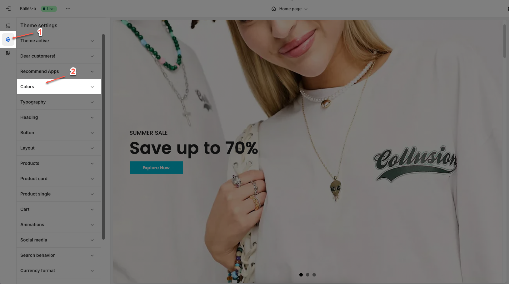
1. How to access the Colors in the Theme settings?
In the theme editor (Customize), click the Theme settings button > In the Theme settings tab, scroll through the list and select Colors.
2. How to customize the Colors in the Theme settings?
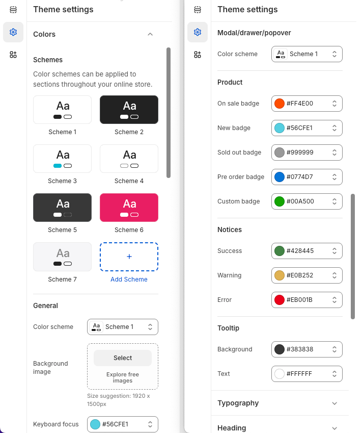
2.1. Schemes
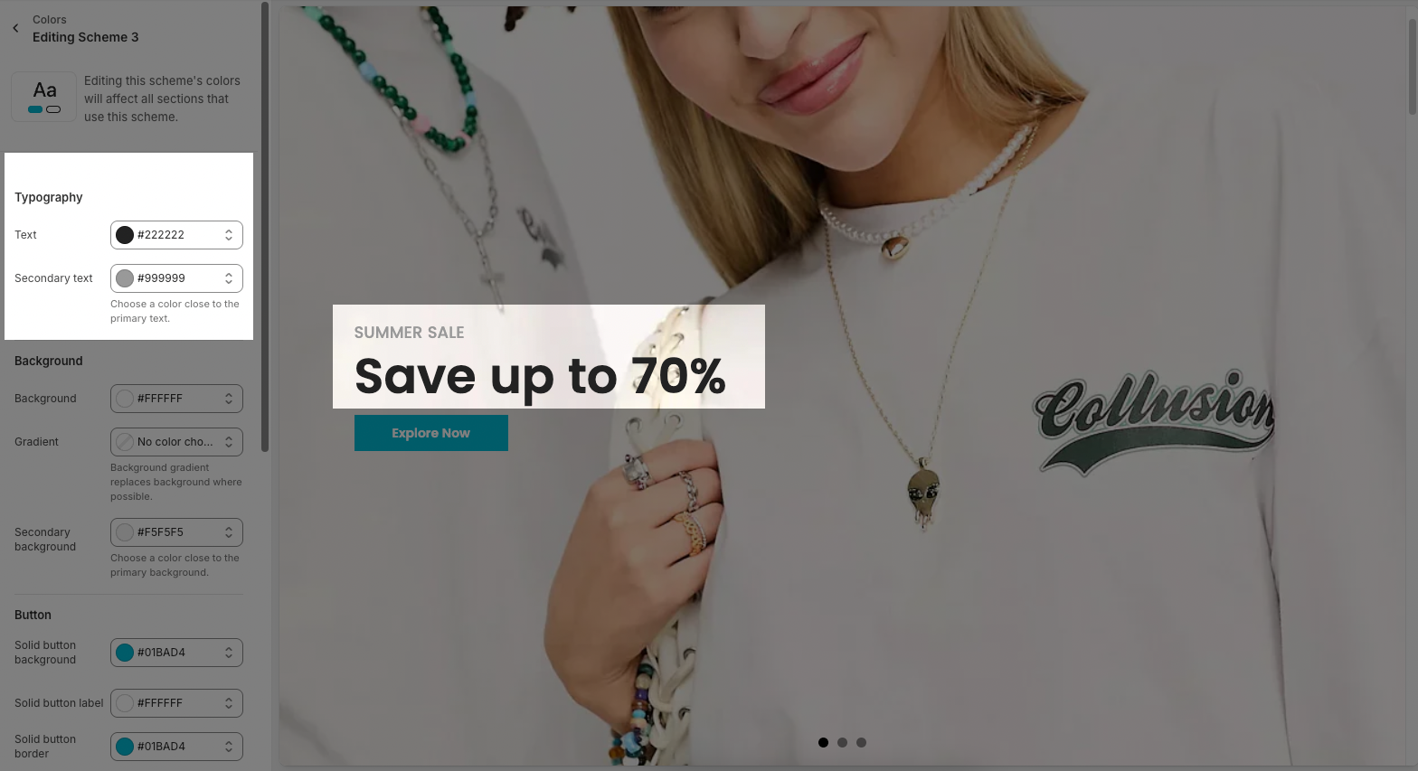
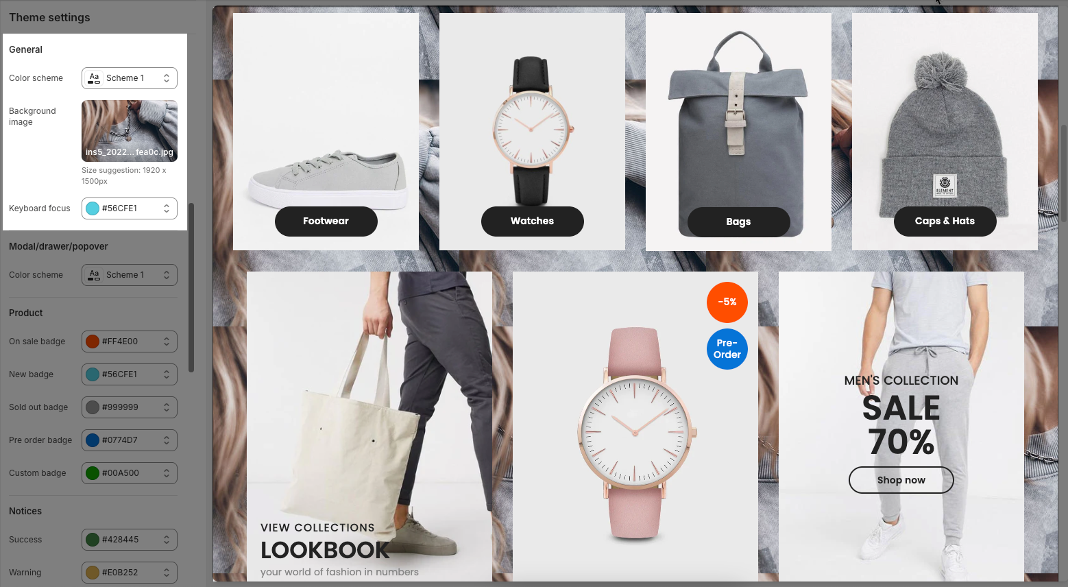
Color schemes can be applied to sections throughout your online store. For example in 'Slideshow' section below:
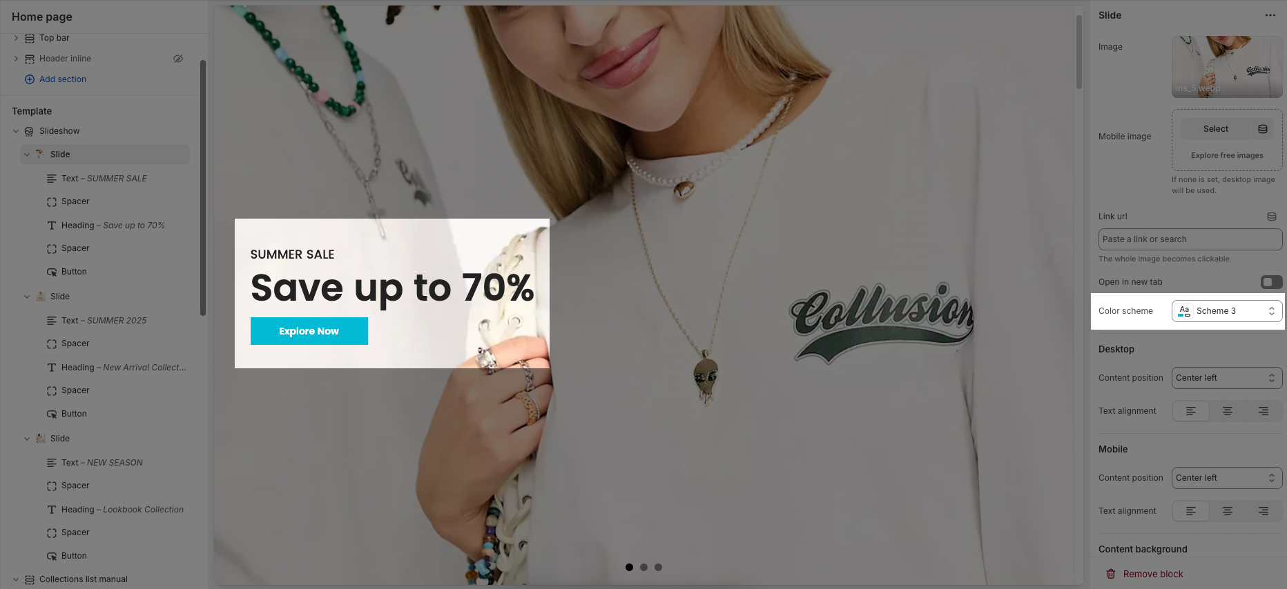
By default, there are 7 color schemes in the theme. You can click on each color scheme to edit your own colors.
2.1.1. Typography
Text: the heading text of section
Secondary text: the subheading text of section
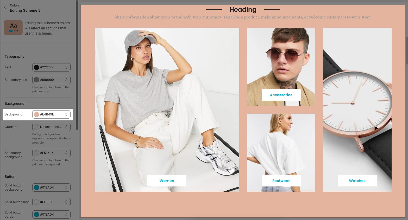
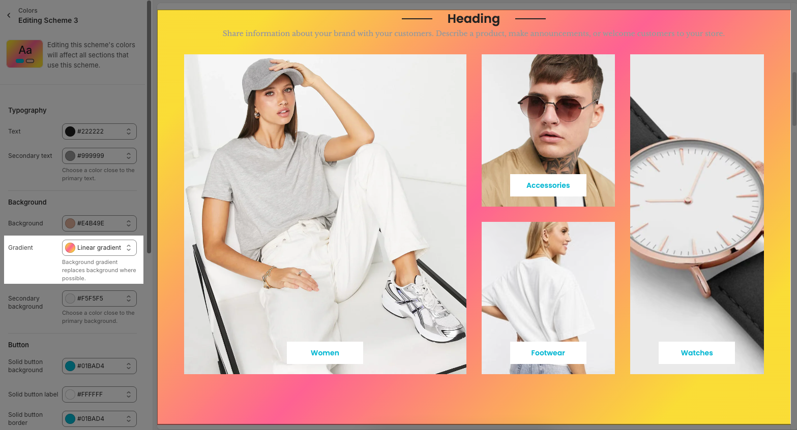
2.1.2. Background
Use for sections that have a background. Not for sections with background images: slideshow, video, etc...
Background and gradients: the main background of section.
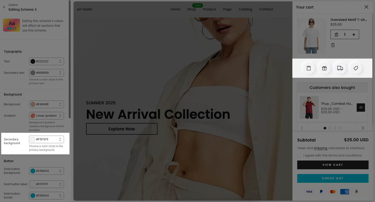
Secondary background: some sections have a second background for the child element. Example: Order note, Shipping blocks in Cart Drawer, Testimonials
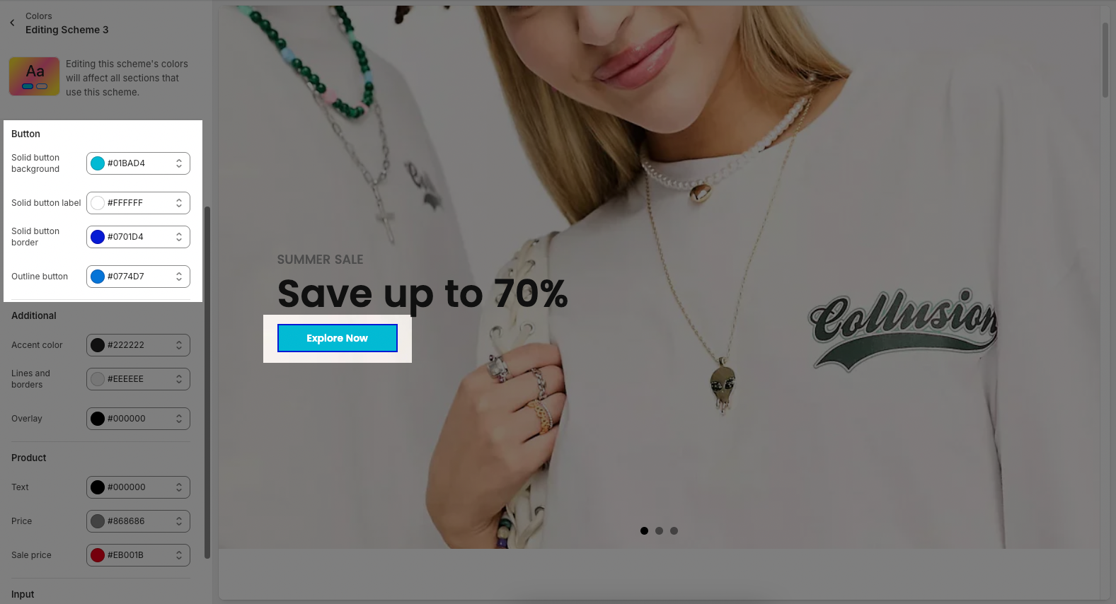
2.1.3. Button
All buttons over the theme, in sections, in product grid. Button colors depend on the design of button
Solid button background: The background color of solid (filled) buttons.
Solid button label: The text color used on solid buttons.
Solid button border: The border color applied to solid buttons.
Outline button: The color of the outline (border and text) for buttons that are not filled.
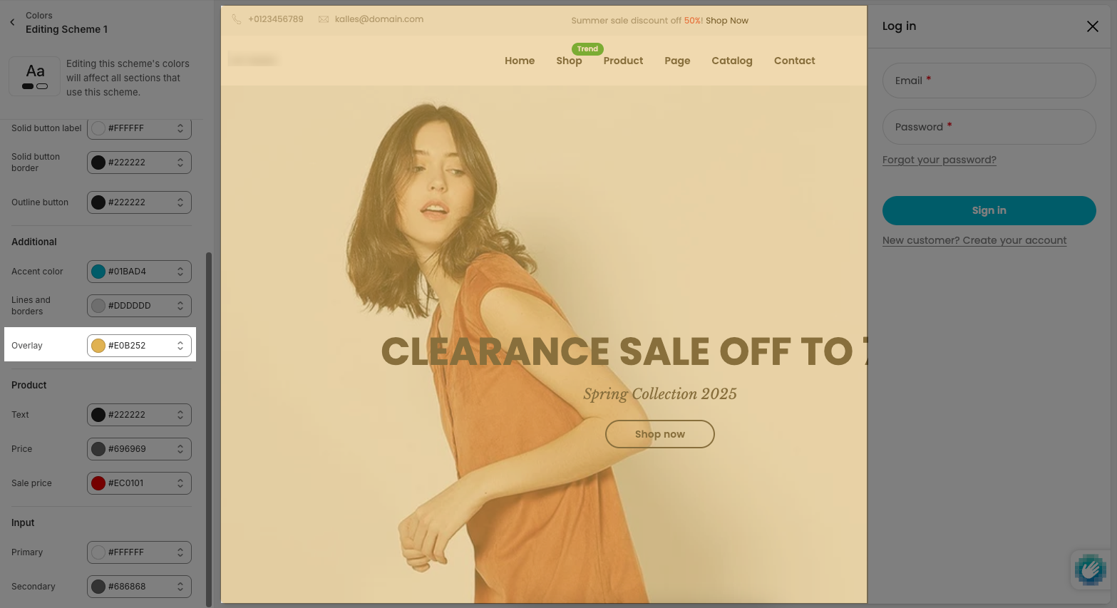
2.1.4. Additional
Accent color: A secondary or highlight color used to draw attention to certain elements.
Lines and borders: The color for dividing lines or element borders across the interface.
Overlay: The color overlay used for dimming backgrounds, such as in modals or pop-ups.
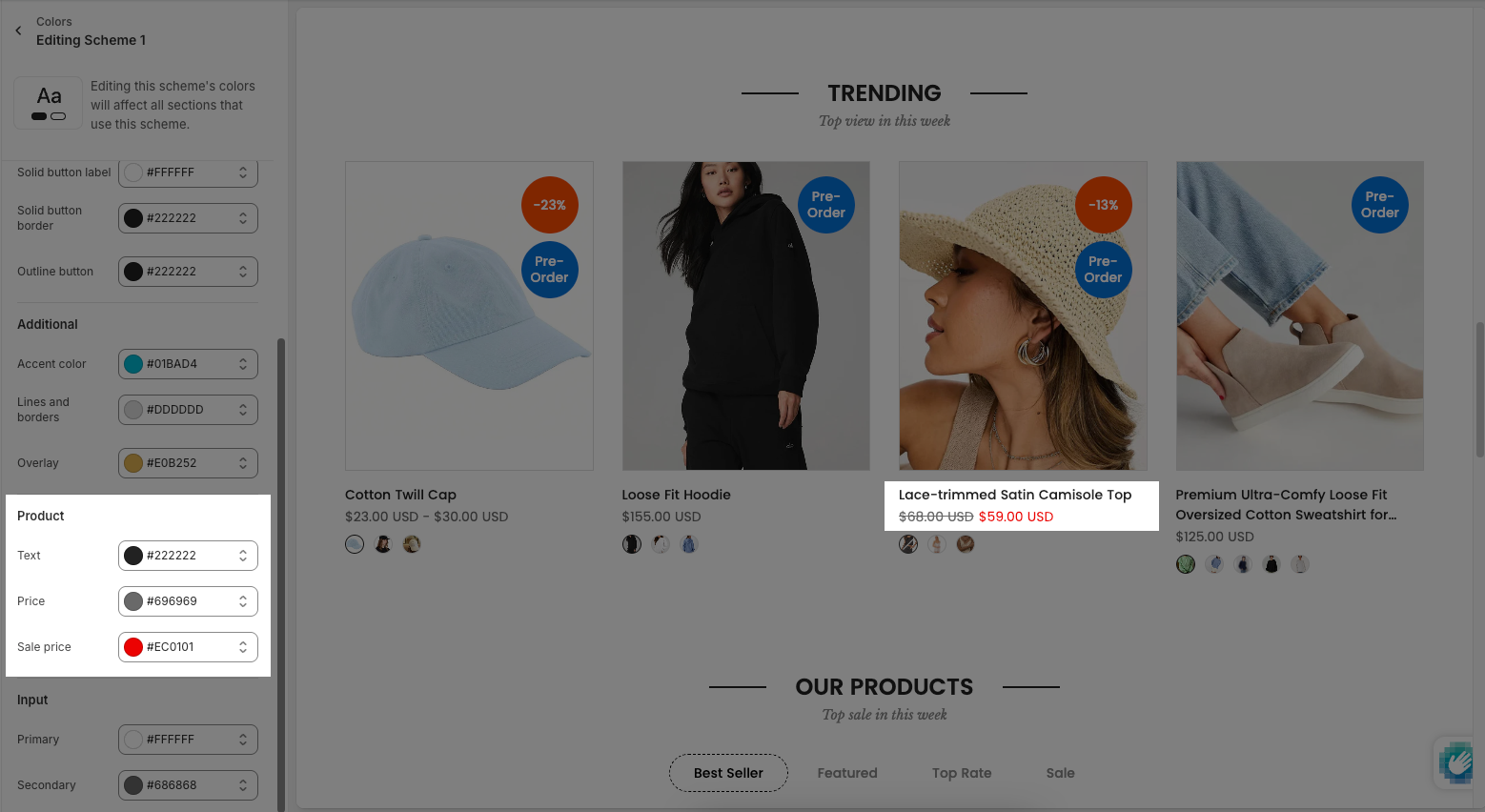
2.1.5. Product
Text: The primary color used for standard body text.
Price: The color used to display original or regular product prices.
Sale price: The color used to highlight discounted or promotional prices.
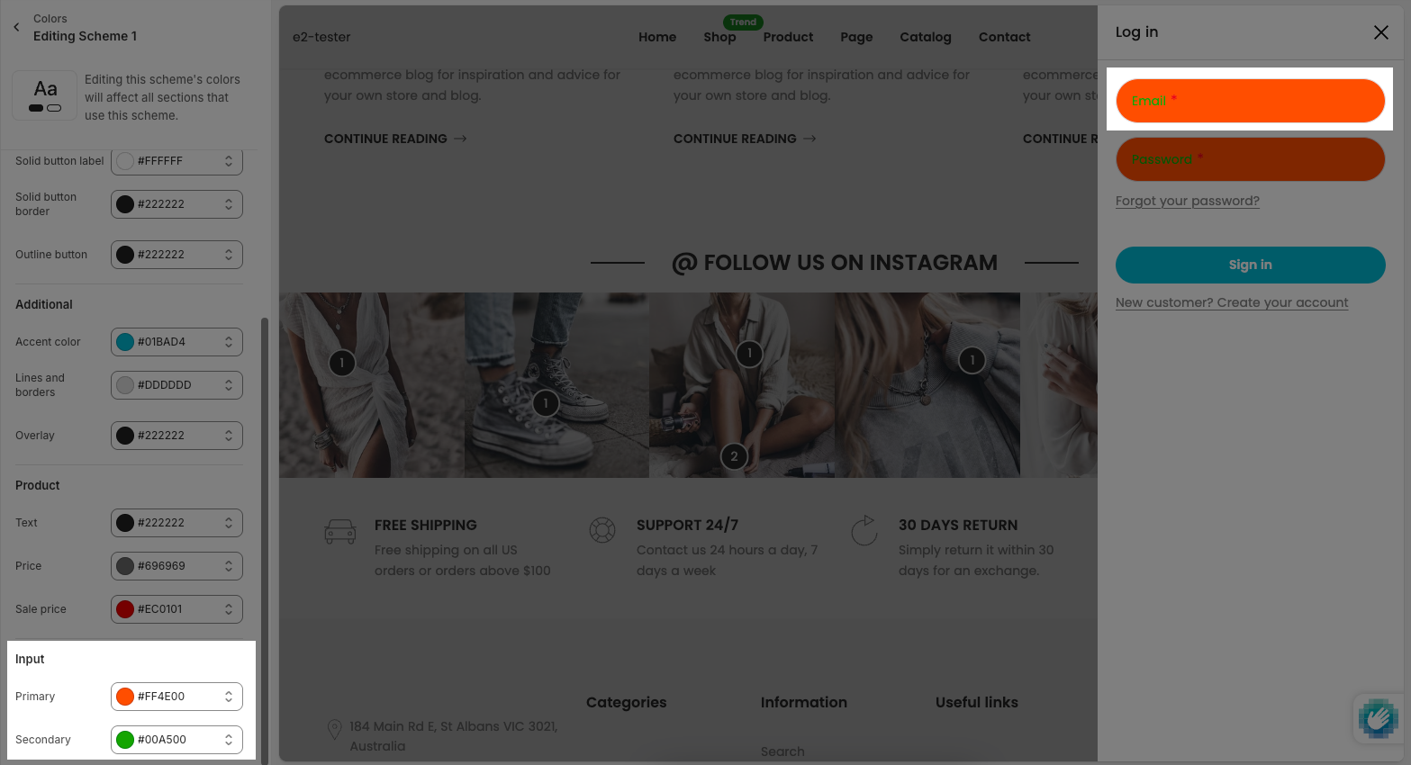
2.1.6. Input
Primary: background input color
Secondary: text input color
2.2. General
Color scheme: The overall theme or preset of colors applied to the interface.
Background image: An image used as the background for the website or section (suggested size: 1920 x 1500px).
Keyboard focus: The color shown on elements when they are selected via keyboard navigation (e.g., tab focus).
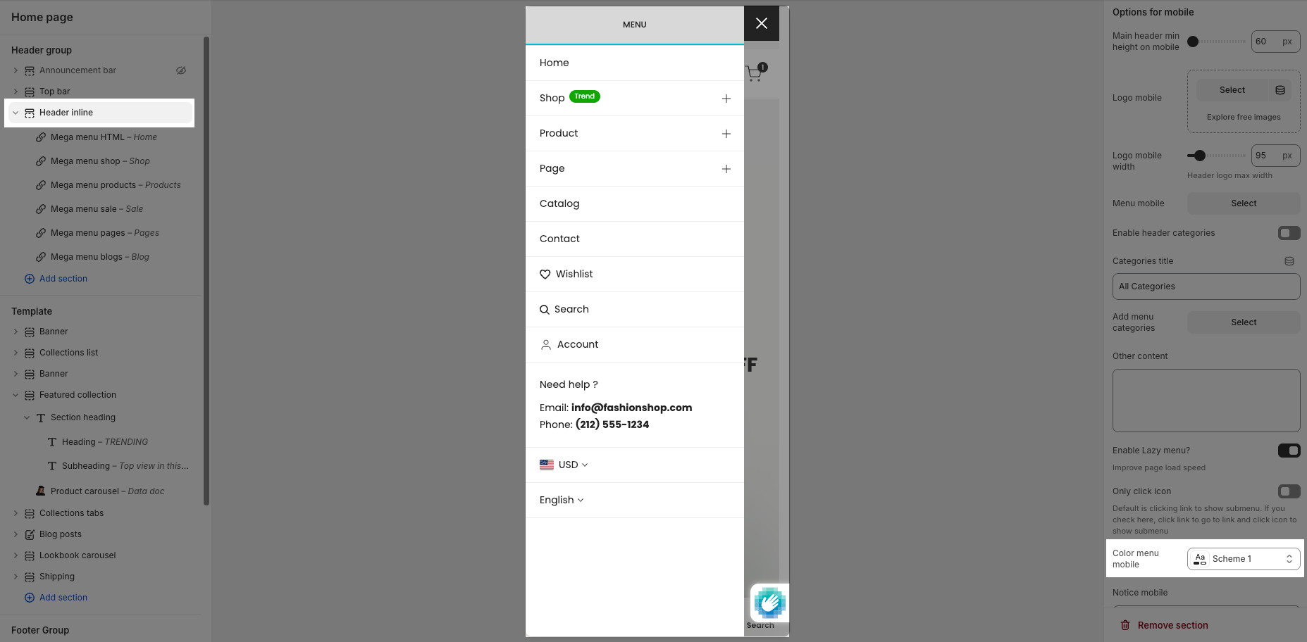
2.3. Modal/drawer/popover
Choose a color scheme for modal/drawer such as: Search drawer, Login pop-up.
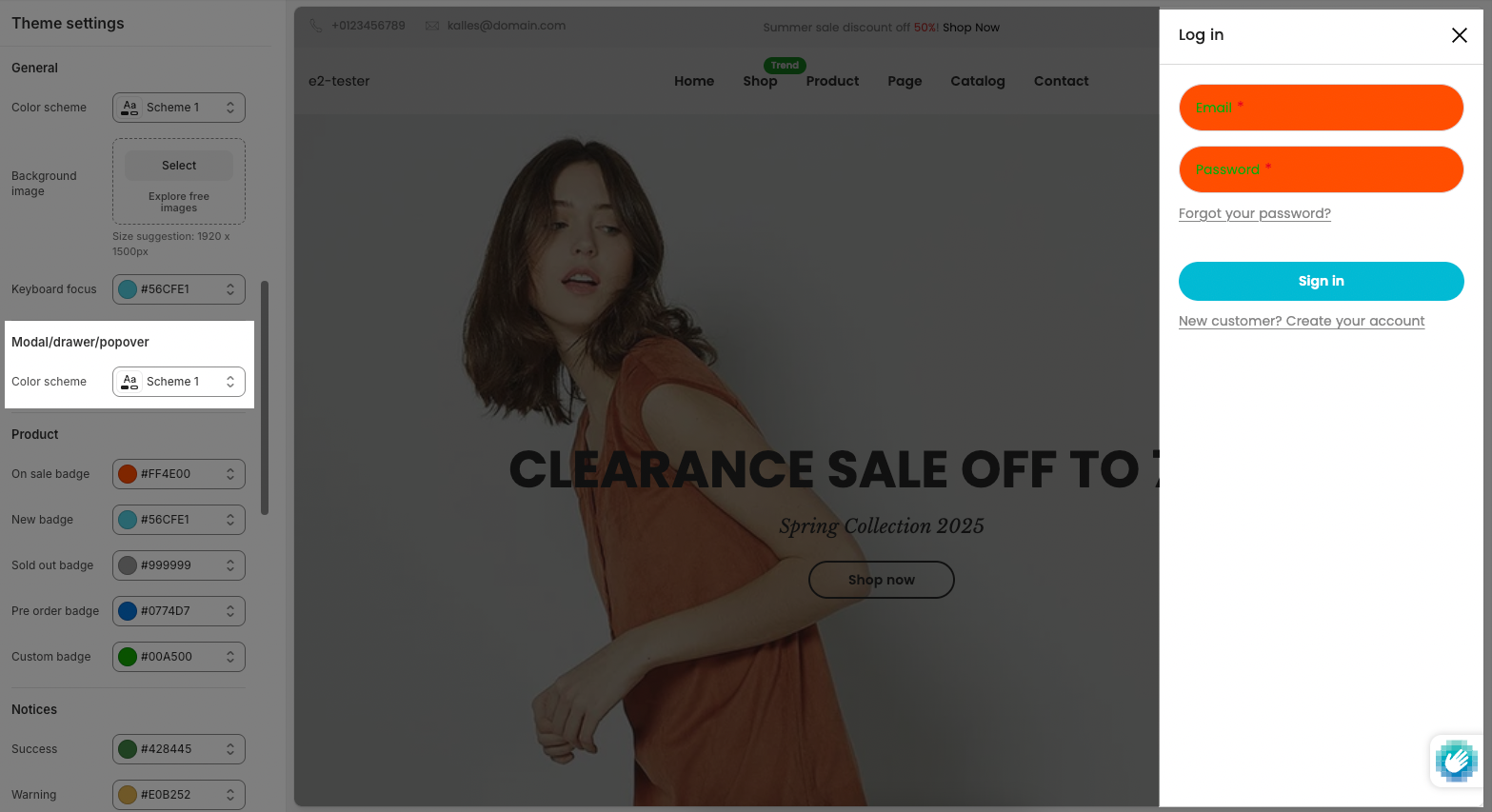
Not for sections that have the own option: Cart Drawer, Mobile menu
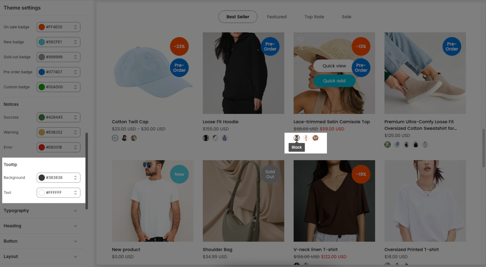
2.4. Product
You set up the background for product badges.
On sale badge: The color used for the badge that indicates a product is on sale.
New badge: The color used for the badge that marks a newly added product.
Sold out badge: The color of the badge for products that are out of stock.
Pre order badge: The color for the badge showing that a product is available for pre-order.
Custom badge: A color for a custom label or tag you define (e.g., “Best Seller”, “Limited Edition”).
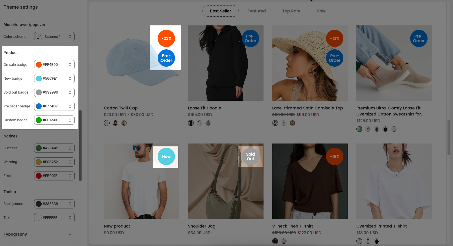
To configure the custom badge, please follow this guide.
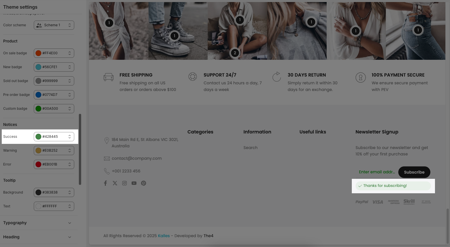
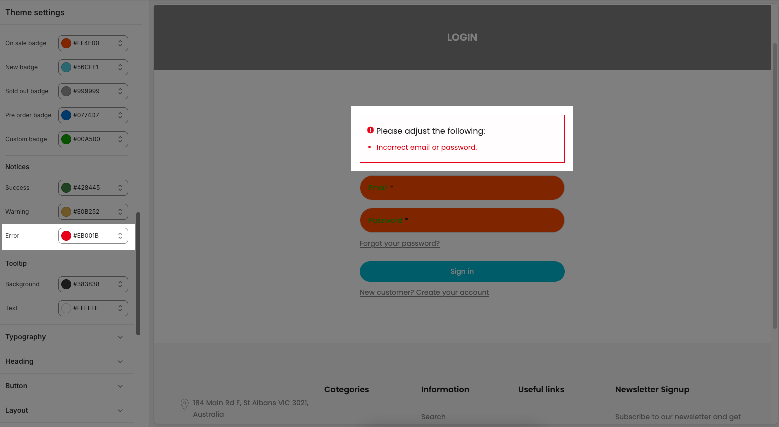
2.5. Notices
Config colors for success, warning, and error messages in the theme.
Success: The color used for success messages or notifications, typically indicating a positive outcome.
Warning: The color used for warning messages to alert users of potential issues or cautionary information.
Error: The color for error messages, indicating something went wrong or needs attention.
2.5. Tooltip
Background: The background color of tooltip elements that appear when hovering over or focusing on UI components.
Text: The text color inside the tooltip.