The Button section in the Theme Settings allows you to customize the appearance and dimensions of buttons across your store. You can easily adjust border thickness, spacing, width, height, and font size to match your design preferences and brand style.
1. How to access the Button in the Theme settings?
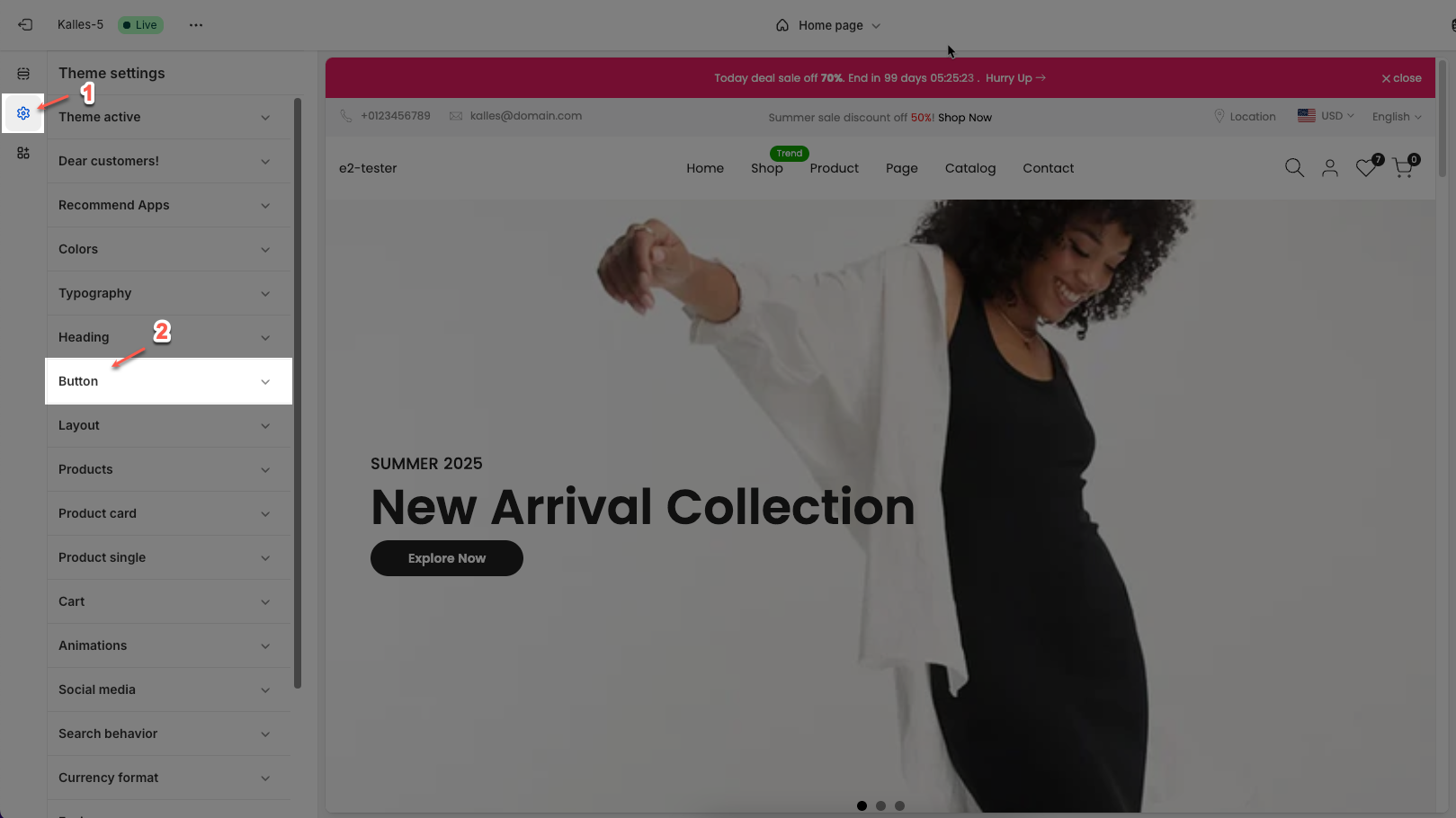
In the theme editor (Customize), click the Theme settings button > In the Theme settings tab, scroll through the list and select Button.
2. How to customize the Button in the Theme settings?
After access the Button, you can customize its settings in the left sidebar.
2.1. Thickness border
Thickness border: Setting thickness border for button, not use for button style link
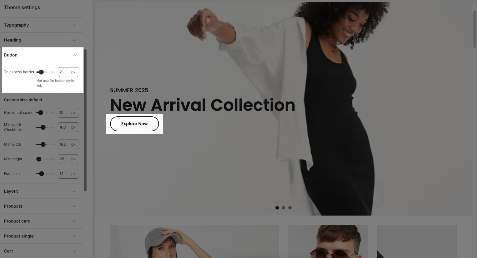
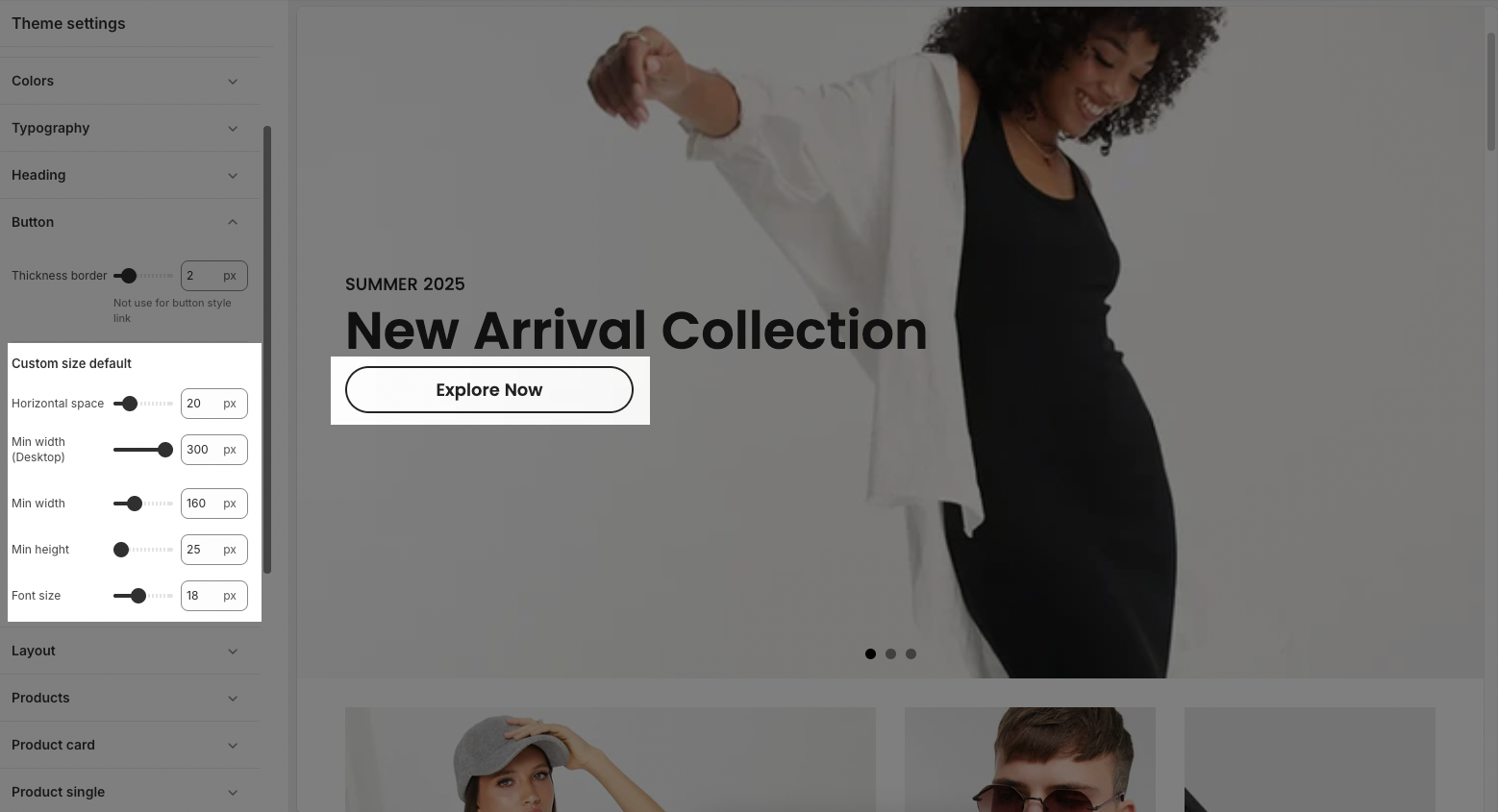
2.2. Custom size default
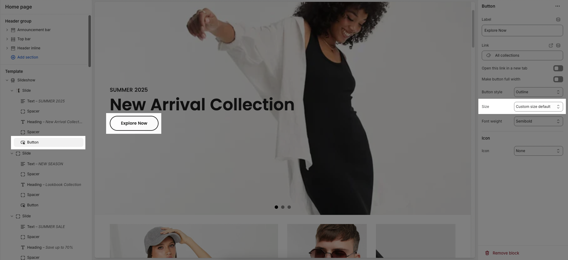
Before config, you have chose size for button block is "Custom size default":
In this Button setting, you can custommize horizontal space, min width, min height, font size for button default:
Horizontal space: Controls the horizontal padding inside the button (left and right space in pixels).
Min width (Desktop): Defines the minimum width of buttons when viewed on desktop devices.
Min width: Sets the overall minimum width for buttons on all devices.
Min height: Determines the minimum height of buttons to ensure they are easily clickable and consistent in size.
Font size: Adjusts the size of the text inside the button (in pixels).