The Shoppable Video section allows you to showcase your products through engaging videos that capture your customers' attention. Use this section to highlight product features, share brand stories, or promote new arrivals — all while making it easy for viewers to shop directly from the video.
1. How to access the Shoppable Video section?
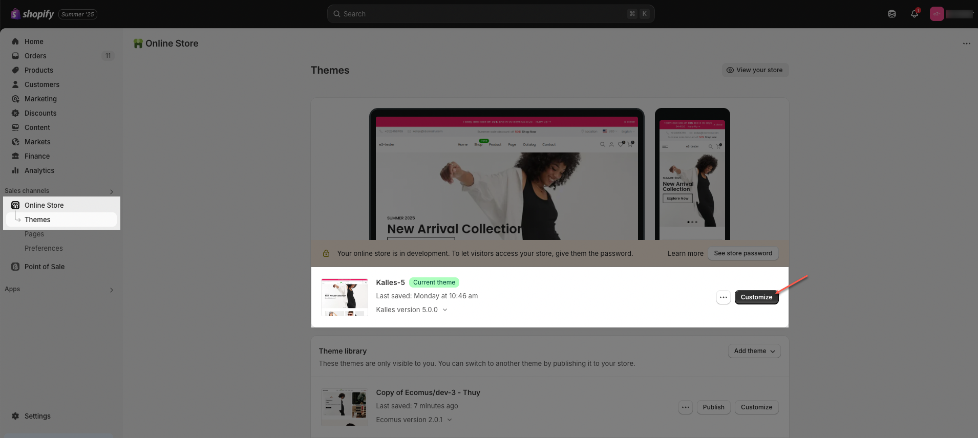
Step 01: From Shopify Admin, click on Online Store > Select Themes > In the Current theme section, click the Customize button.
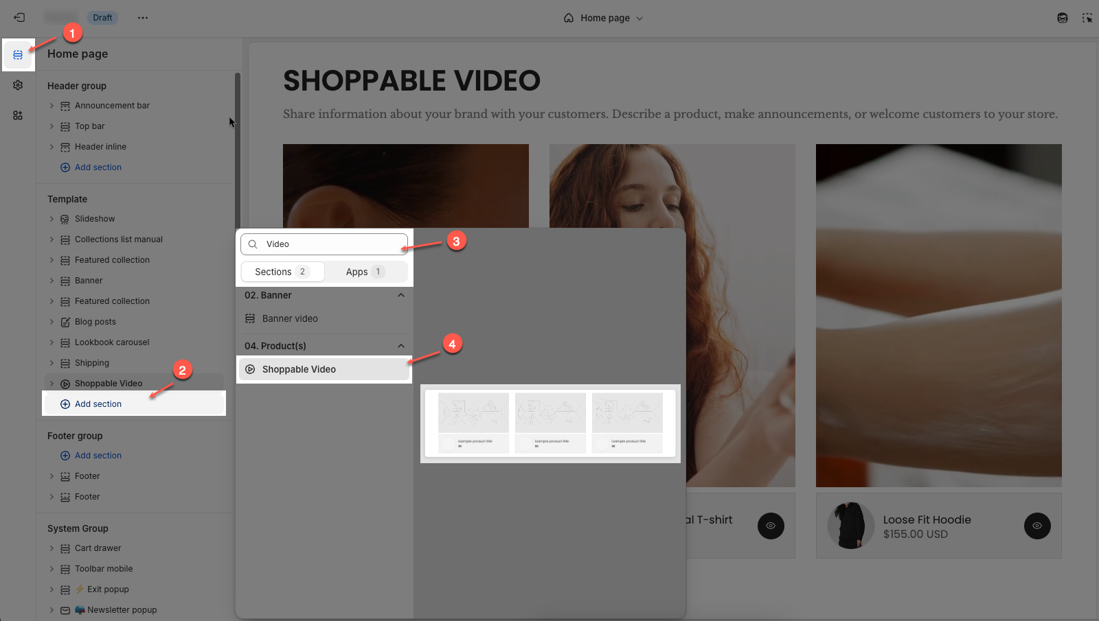
Step 02: In the theme editor (Customize), click the Sections button > Click the Add section button > In the Sections tab, scroll through the list or use the search bar to find and select Shoppable Video.
2. How to customize the Shoppable Video section?
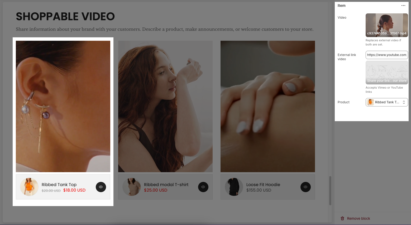
2.1. Item block
In the Shoppable Video section, you can add Item blocks to upload videos and link specific products to each video.
Click on Shoppable video section > Add block (plus icon ➕) > Select the Item blocks you can add.
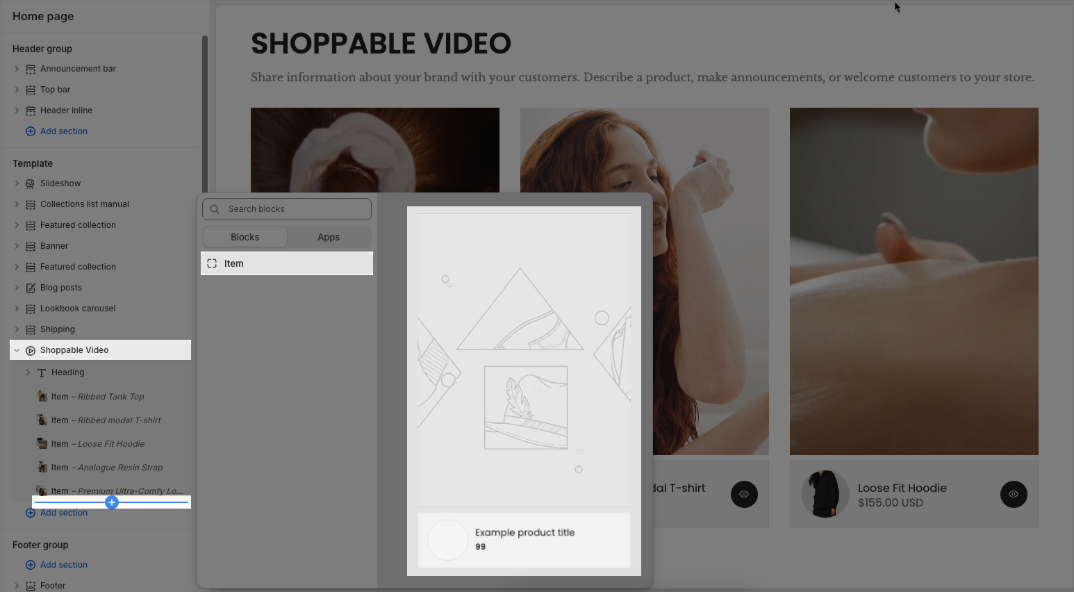
Video: Upload a video file directly from your device. This will override the external video link if both are set.
External link video: Paste a Vimeo or YouTube link to use an external video. This option will be ignored if a video file is uploaded above.
Product: Select a product from your store to associate it with the video. This product will appear below the video as a shoppable item.
2.2. Shoppable video section
You can customize how your Shoppable Video section appears and behaves on your store by adjusting the options below:
Shoppable video
Enable section full width: Toggles the video section to stretch the full width of the screen.
Colors schema: Lets you choose a predefined color scheme (like “Scheme 1”) to style this section.
Video height: Allows you to choose video height on desktop
Adapt to video: The section automatically adjusts its height to fit the original aspect ratio of the video.
Fixed height: Sets the video section to a specific pixel height that you define.
Full screen height: Expands the video section to fill the full height of the browser window.
Fixed height: When “Fixed height” is selected, this slider or input lets you set the video height.
Mobile video height: Lets you choose how video height should behave on mobile. Options include: Adapt to video, Fixed height or Full screen height.
Mobile fixed height: Sets a specific pixel height for videos on mobile if “Fixed height” is selected.
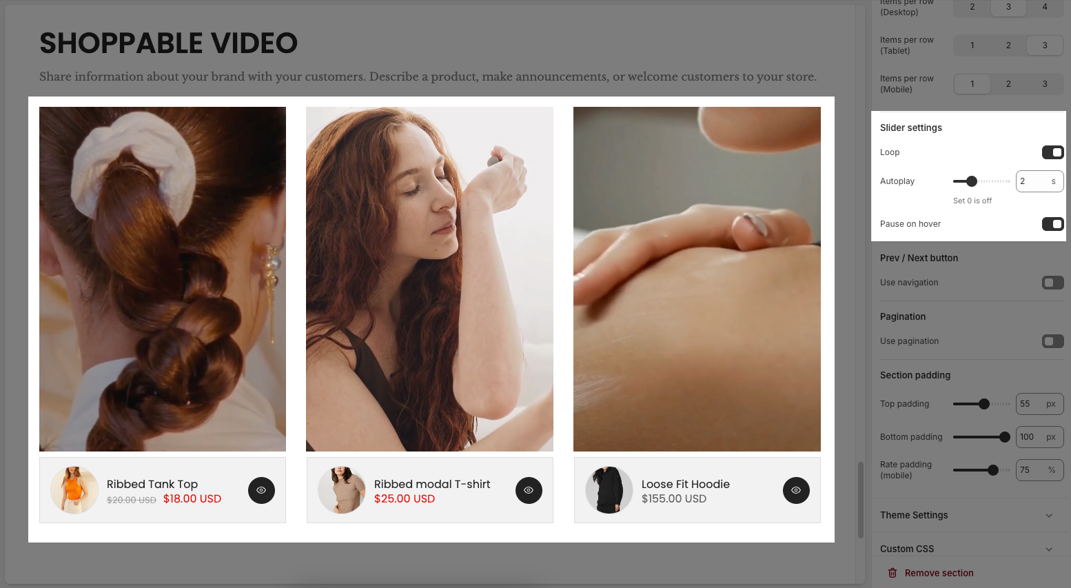
Items per row (Desktop): Sets how many video items should be shown per row on desktop (2, 3, or 4).
Items per row (Tablet): Sets how many video items should be shown per row on tablets (1, 2, or 3).
Items per row (Mobile): Sets how many video items should be shown per row on mobile devices (1, 2, or 3).
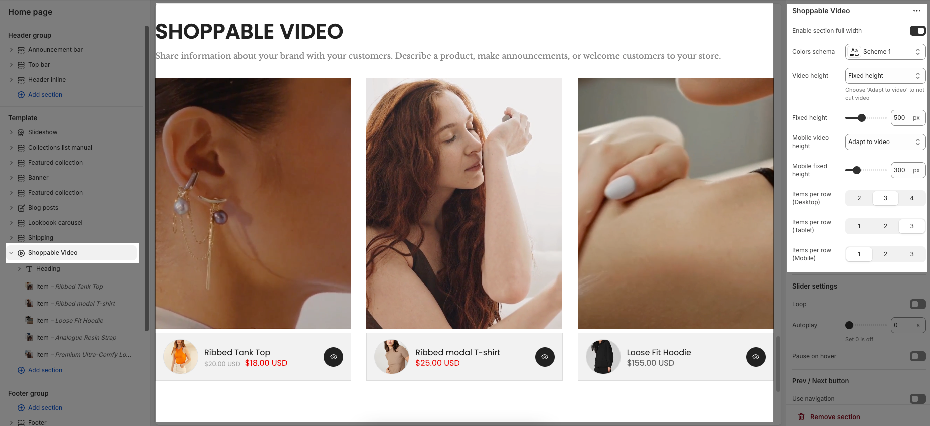
Slider settings
Loop: When enabled, the video slider will continuously cycle through videos without stopping after the last one.
Autoplay: Automatically starts switching between videos every few seconds. Setting this to 0 will disable autoplay.
Pause on hover: When enabled, the autoplay will pause if the user hovers their mouse over the video, allowing them to watch or interact without interruption.
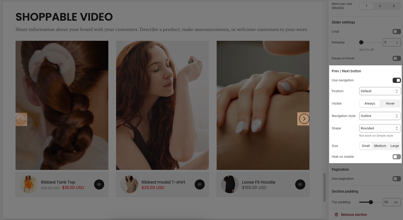
Prev / Next button
Use navigation: Enables or disables the previous/next navigation buttons on the video slider.
Position: Sets the position of the navigation buttons: Default; On border or Outside
Visible: Controls when the navigation buttons are shown (likely other options appear here when enabled, such as "always" or "on hover").
Navigation style: Defines the visual style of the buttons, such as Outline, Simple, or Default.
Shape: Sets the shape of the buttons. Example:
Rounded: Buttons have curved edges.
(Note: This doesn’t apply if using a “Simple” style theme.)
Size: Choose the size of the buttons – Small, Medium, or Large.
Hide on mobile: When enabled, the navigation buttons will not appear on mobile devices.
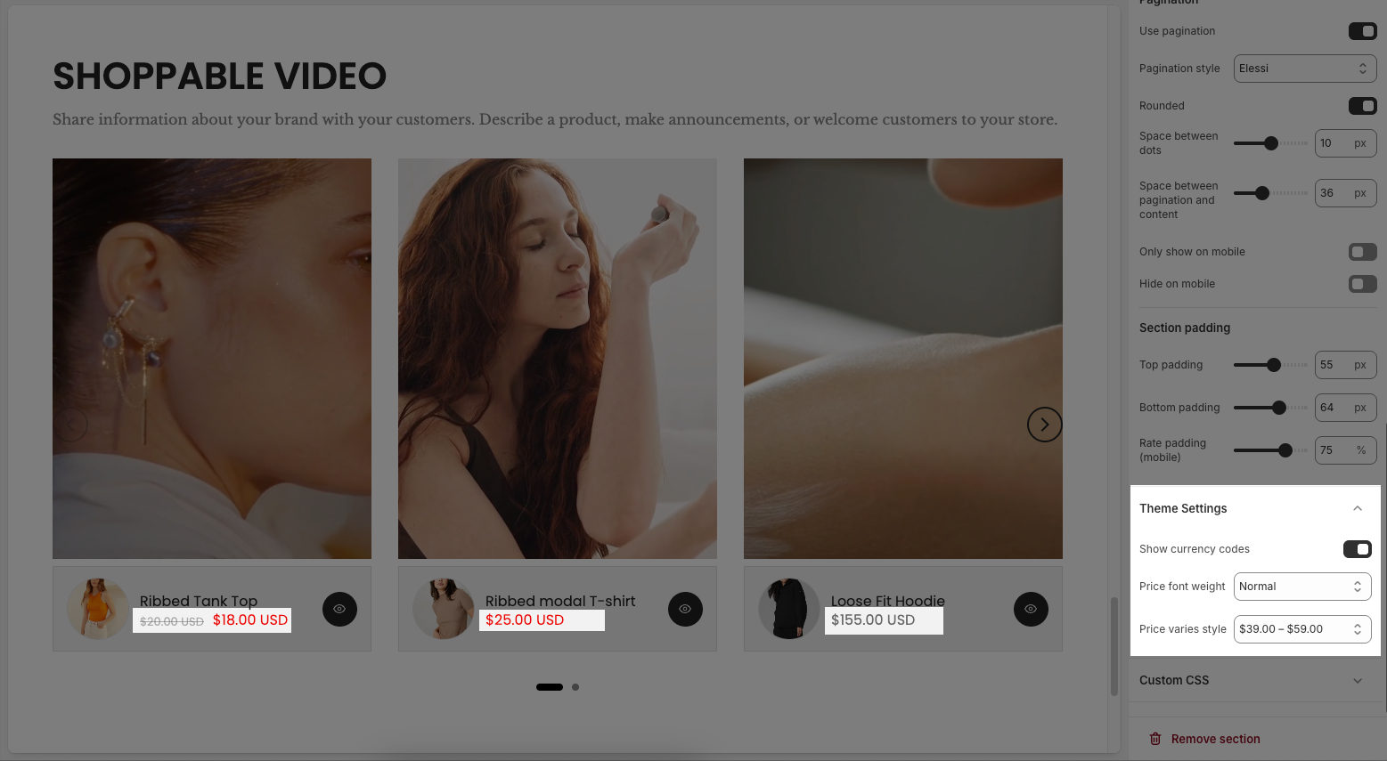
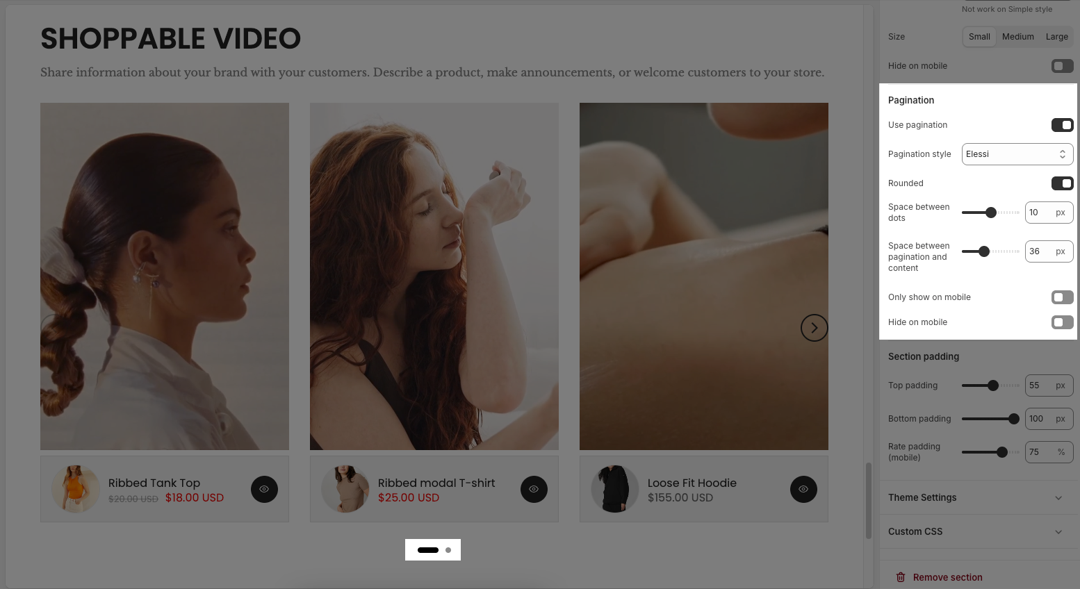
Pagination
Use pagination: Turns the pagination dots on or off.
Pagination style: Selects the design style of the dots (e.g., “Elessi” – a theme-specific style).
Rounded: When enabled, makes the pagination dots rounded instead of square.
Space between dots: Adjusts the spacing (in pixels) between each pagination dot.
Space between pagination and content: Sets the vertical space (in pixels) between the dots and the content above (videos).
Only show on mobile: If enabled, pagination will only appear on mobile devices.
Hide on mobile: If enabled, pagination will not appear on mobile devices.
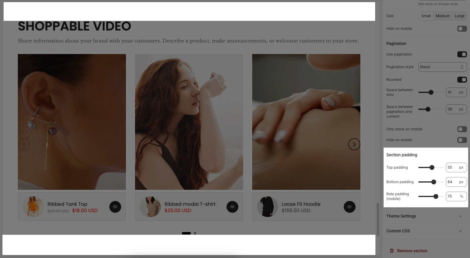
Section padding
Top padding: Sets the vertical spacing (in pixels) above the section.
Bottom padding: Sets the vertical spacing (in pixels) below the section.
Rate padding (mobile): Defines the vertical padding as a percentage for mobile devices, allowing responsive spacing.
Theme Settings
Show currency codes: When enabled, the currency code (e.g., USD, EUR) is displayed next to the product price.
Price font weight: Allows you to change the thickness of the price text.
Price varies style: Controls how price ranges are shown for products with variable pricing (e.g., different sizes or variants).