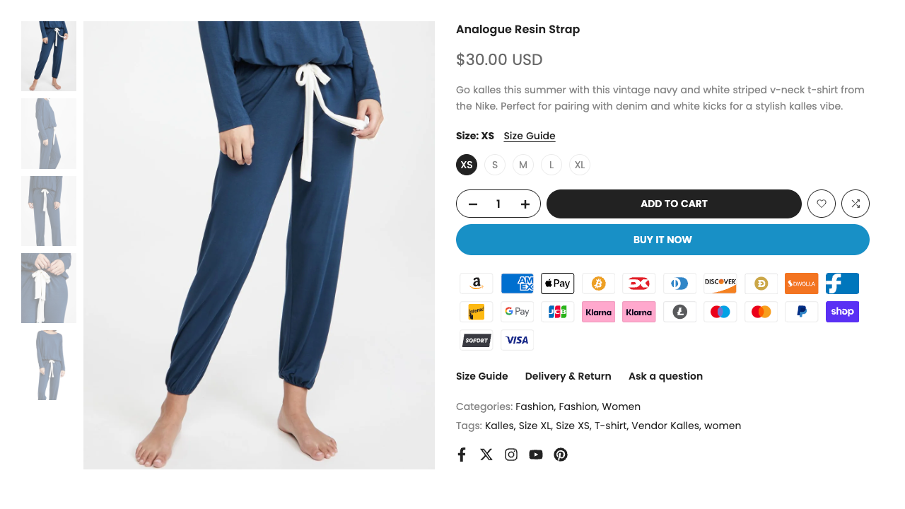
The Main Product section is the core layout for displaying product details on your product page. It includes all essential elements such as media, title, price, description, variant picker, add-to-cart buttons, and more. This section allows you to fully customize the structure and content of how your main product is presented to customers.
1. How to access the Main Product section?
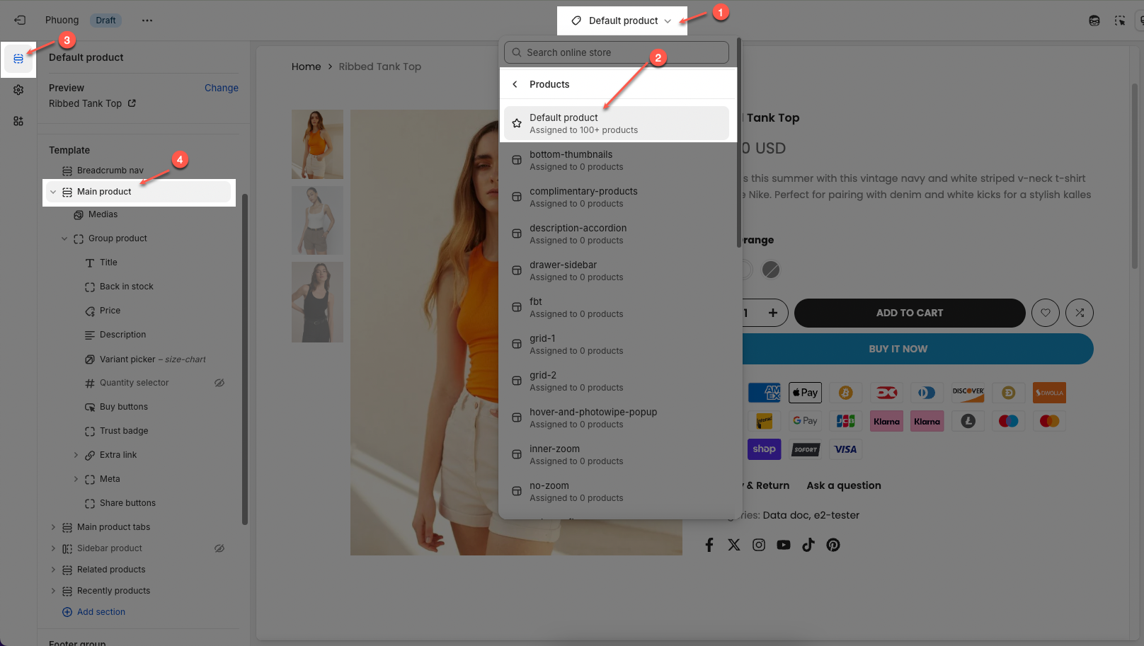
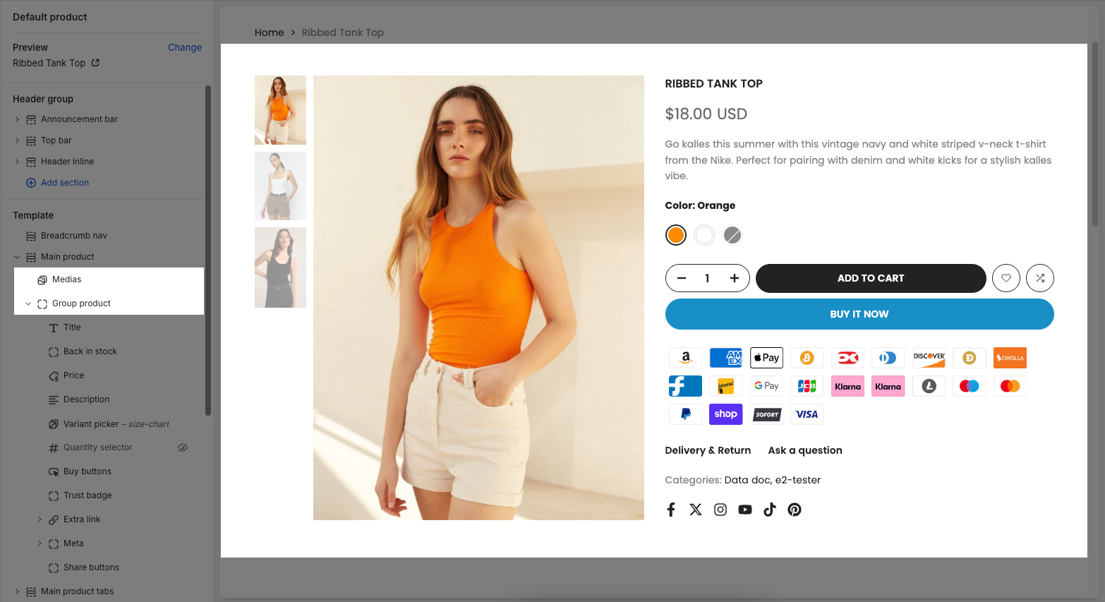
Step 01: From Shopify Admin, click on Online Store > Select Themes > In the Current theme section, click the Customize button.

Step 02: In the theme editor (Customize), click to open the dropdown pages in the topbar > select Product > click Default product > In the Sections tab, scroll and find Main product in Template
2. How to customize the Main Product section?
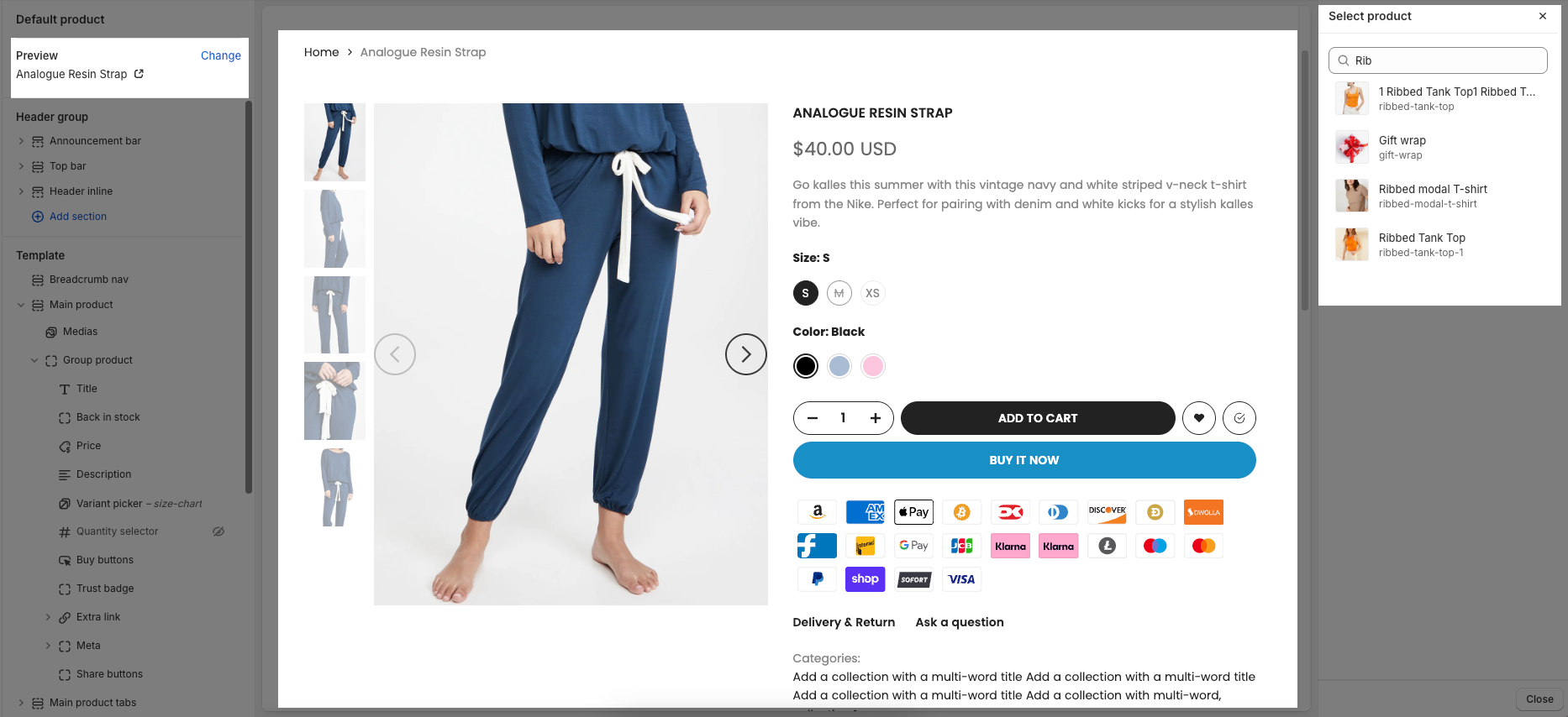
To configure a specific product, go to the Preview section at the top left and click Change. From there, select the product you want to edit. The available settings for that product will then be displayed under the Main product section, where you can customize its layout and content.
Within the Main product section, there are two primary blocks:
Media block – used to configure and display product images or videos.
Group product block – used to manage and customize all product content such as title, price, description, variant options, and buy buttons.
2.1. Medias block
After open the Medias block, you can adjust its settings using the sidebar—located on the right or left side of your screen depending on your device
Visible if certain conditions are met
Media
Learn more about media types.
Desktop media layout: Select the main media display layout for product images/videos on desktop and tablet devices.
Thumbnail carousel: Large main image with smaller thumbnails below in a carousel format.
1 column: Displays all media in a single vertical column.
2 columns: Displays media in two columns (often a larger main image in one column and smaller thumbnails in the other, or two equal columns).
Stacked: Stacks all media vertically, with the main image at the top.
Without thumbnails: Displays only the main image/video without accompanying thumbnails.
Thumbnail left/right size: (Only applies to 2 columns layouts or when thumbnails are left/right) Adjust the relative size of the thumbnail column when placed to the left or right of the main media.
Mobile media layout: Select the media display layout for product images/videos on mobile devices (smartphones).
Fraction: Displays page indicators (e.g., "1/5") instead of thumbnails.
Thumbnail: Displays small thumbnails below or next to the main image.
Show first media: Enable this option to always display the product's first media item by default, regardless of which variant is selected.
Show first media until customers hand-pick a variant.
Use select variants by change image on slide: Enable this option to automatically select the product variant when the user swipes or navigates through the product's media images
Normally, variants are selected from a swatch. You might want your customers to be able to select a product variant by change a variant image. Only working when slider active.
Video are muted automatically to allow autoplay: Enable this option to automatically mute videos when they start playing. Muting is required to enable autoplay functionality on most modern browsers.
Enable video looping: Enable this option to automatically loop videos when they finish playing.
Enable thumbnail effect: Enable this option to apply an effect (e.g., zoom, hover effect) to thumbnails when a user interacts with them.
Image ratio: Select the aspect ratio (Adapt to image, Square, Portrait, Landscape,...) for the image. Setting an aspect ratio helps ensure consistency in layout
Full image: Enable this option to make the image span the full available width of its containing element.
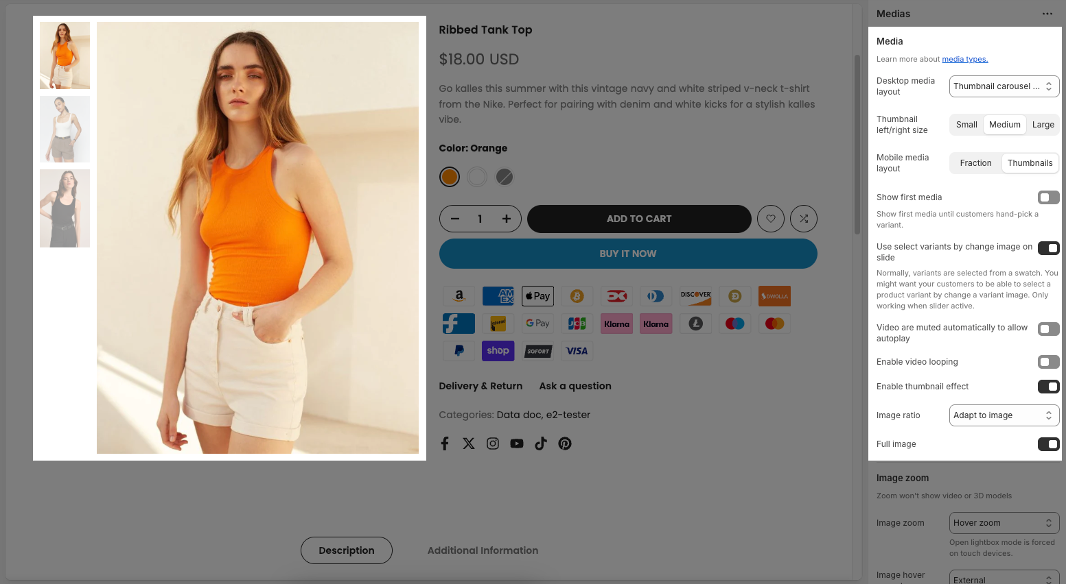
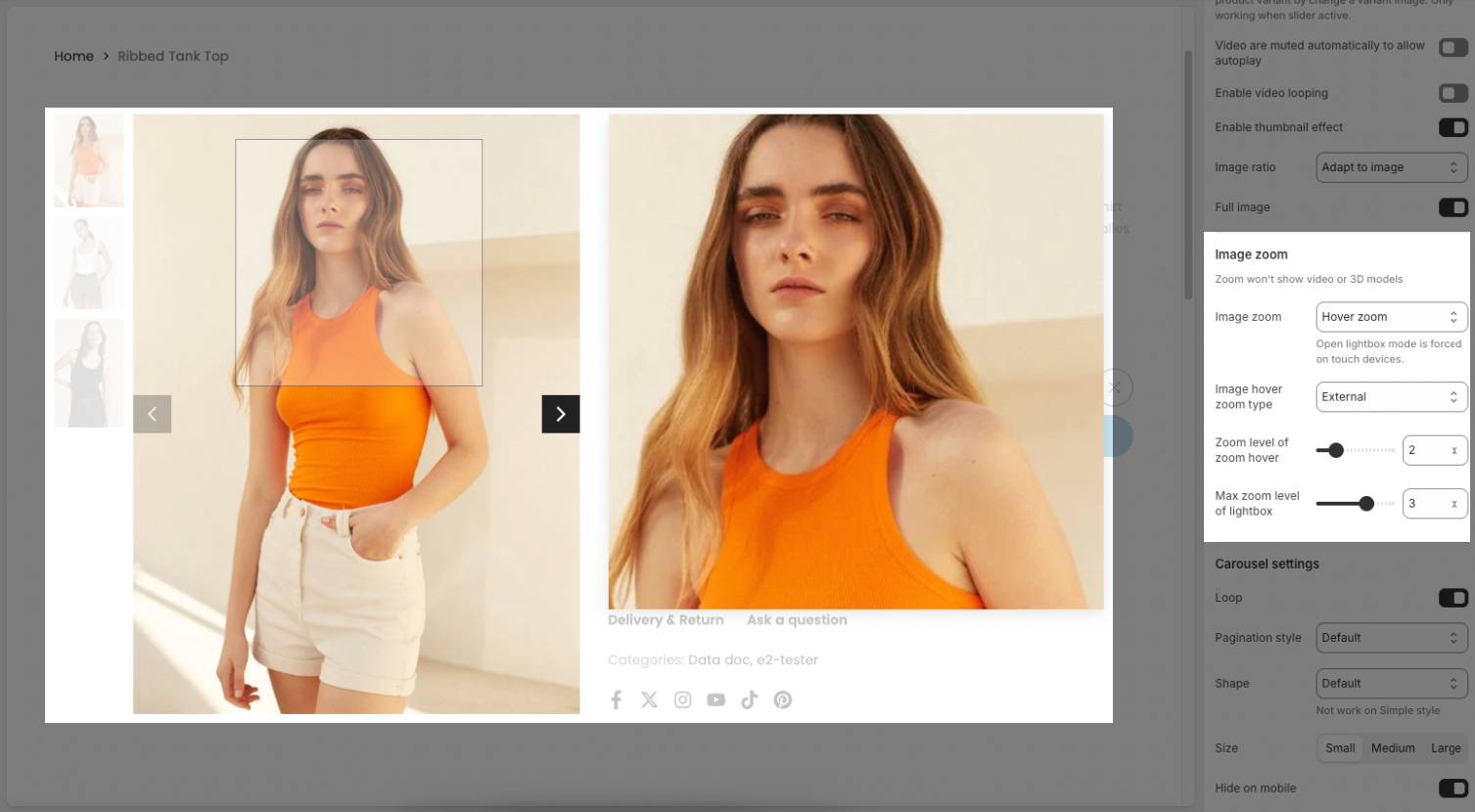
Image zoom
Zoom won't show video or 3D models
Image zoom: Select the zoom and lightbox behavior when a user interacts with product images.
Hover zoom: Zooms the image when the user hovers over it.
Click open lightbox: Opens the image in a lightbox (a pop-up window) when the user clicks on it.
No zoom: No zoom effect is applied.
Hover zoom and click open lightbox: Applies both hover zoom and opens a lightbox on click.
Open lightbox mode is forced on touch devices.
Image hover zoom type: (Only applies when Hover zoom is selected) Select the type of zoom effect on hover.
Inner: Zooms the image within its container, potentially overflowing the container.
External: Displays a zoomed version of the image next to the original.
Magnifier: Displays a smaller, magnified region that follows the mouse cursor.
Zoom level of zoom hover: (Only applies when Hover zoom is selected) Adjust the zoom level on hover. The higher the value, the more the image is zoomed.
Max zoom level of lightbox: (Only applies when Click open lightbox is selected) Adjust the maximum zoom level when the image is displayed in the lightbox.
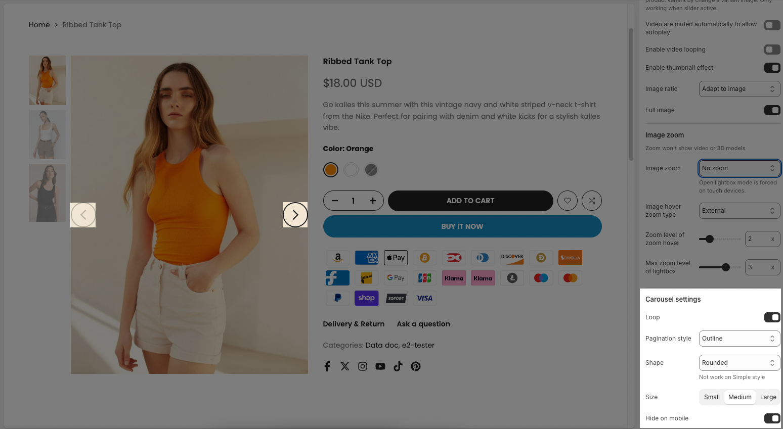
Carousel settings
Loop: This option allows you to enable or disable the looping behavior of the carousel.
Style: Select the design style for the navigation buttons. This controls the visual appearance of the buttons, such as their background color, border, and arrow styling.
Default: A solid background button with a contrasting arrow color.
Outline: A button with a border and a transparent or arrow-colored background.
Simple: Only the arrow is visible, without a distinct background or border.
Shape: Select the shape of the navigation buttons.
Default: The default shape (typically square or rectangular).
Rounded: The buttons have rounded corners or a circular shape (depending on size).
Rotate: The button might have a rotational or transformative effect on interaction
Size: Select the size of the navigation buttons. This affects the overall size of the button and the arrow icon.
Hide on mobile: Enable this option to hide the navigation controls on mobile screens. On mobile, swiping is often preferred over navigation buttons.
2.2. Group product block
After open the Group Product block, you can adjust its settings using the sidebar—located on the right or left side of your screen depending on your device
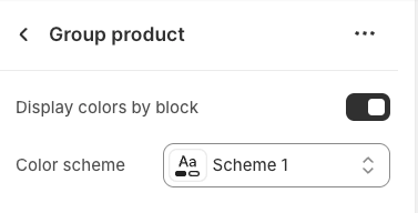
Display colors by block: Enable this option to allow each individual block within this section to choose its own color scheme.
Color scheme: Select the color scheme that will be applied to this section. A color scheme typically includes settings for background color, primary text color, secondary text color, and other accent colors
The Group product block contains multiple sub-blocks that represent different pieces of product information. You can easily add, rearrange, remove, and customize these blocks with flexibility to match your desired layout. In the following Group product block guide, we’ll walk you through how to configure each block in detail.
2.3. Main product section
The Main product section settings allow you to customize how your main product section appears and behaves on the product page. Below are the available options and how each one affects the layout and user experience.
Frequently Bought Together
Products: Choose additional products to display as "Frequently Bought Together" with the main product.
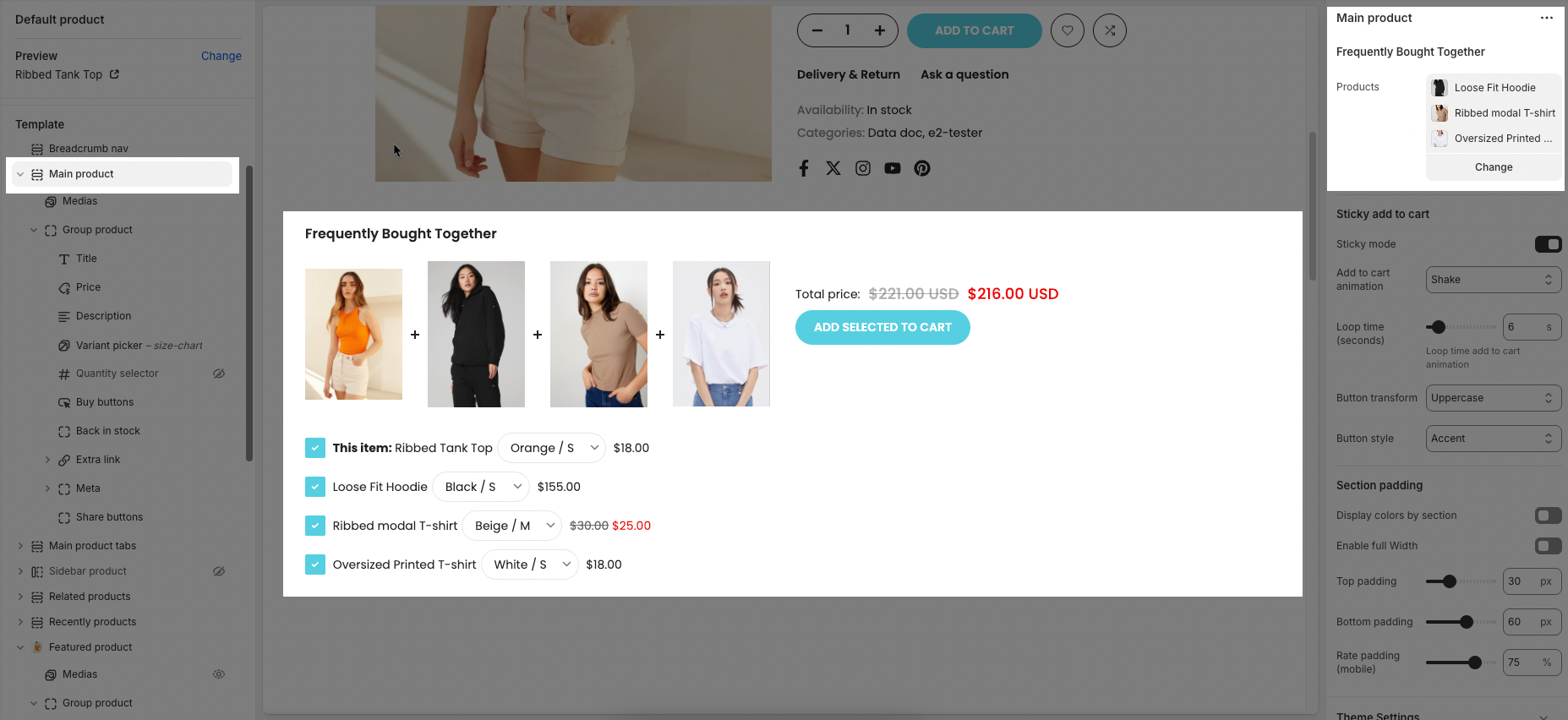
To create Frequently bought together, follow this link
Sticky add to cart
Sticky mode: Enable a sticky add-to-cart bar that remains visible when scrolling past the buy buttons on the product page.
Add to cart animation: Choose an animation (e.g. Shake) to apply to the add-to-cart button for drawing user attention.
Loop time (seconds): Set how often (in seconds) the animation repeats on the add-to-cart button.
Button transform: Choose text transformation for the Add to cart button. (Options include: Uppercase, Capitalize, Lowercase)
Button style: This option allows you to change the visual appearance of the Add to Cart button.
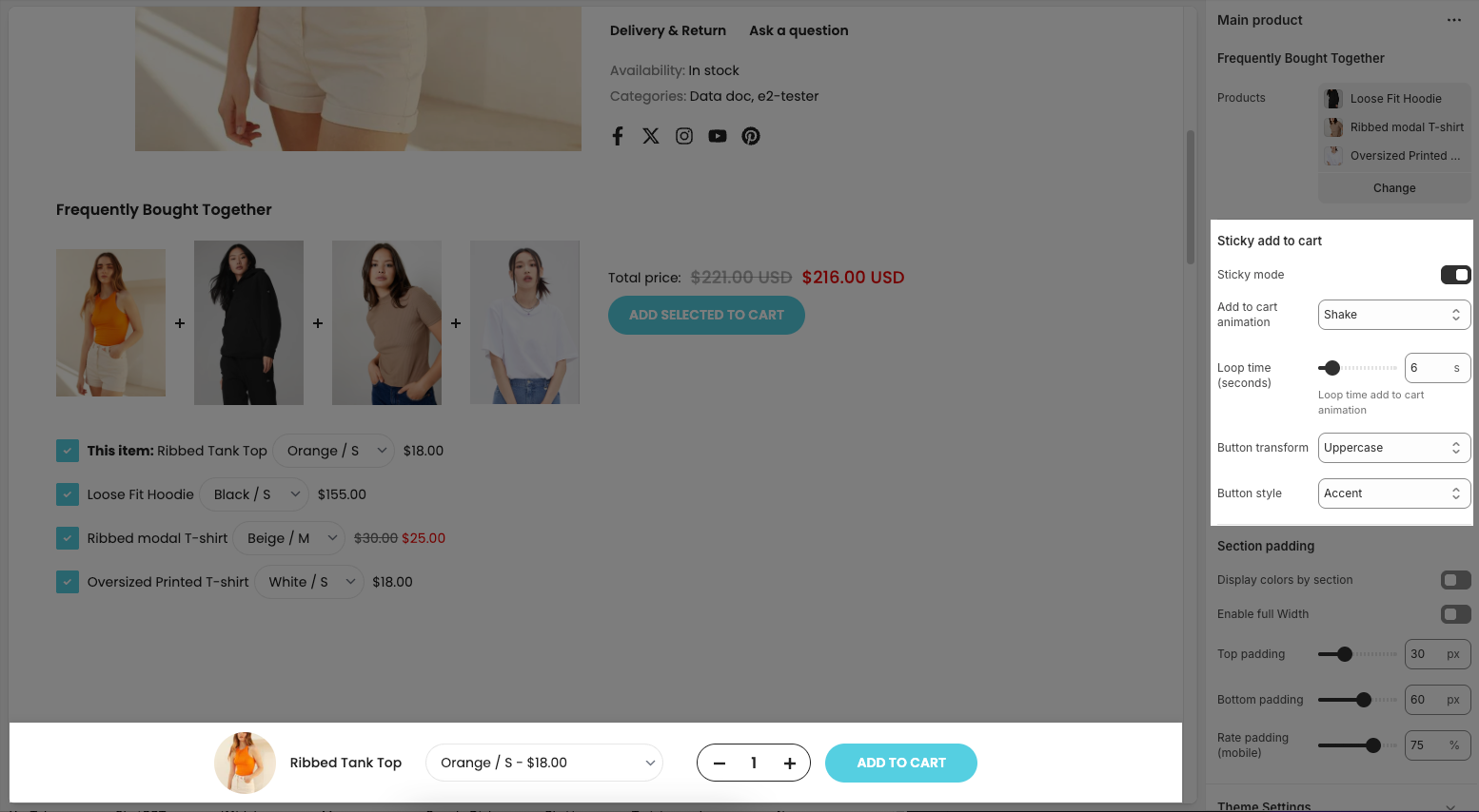
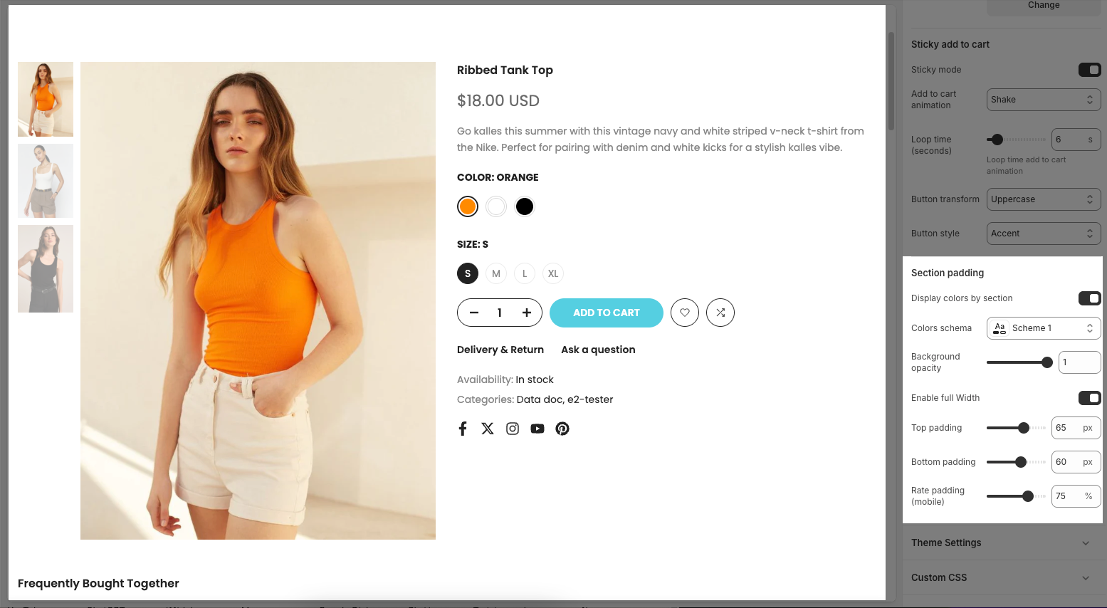
Section padding
Display colors by section: Enable this option to apply a color scheme specifically to this section, helping to visually separate it from others.
Colors schema: Choose a predefined color scheme (e.g., Scheme 1) from your theme to style this section.
Background opacity: Adjust the transparency of the background.
1means fully opaque, and0means fully transparent.Enable full Width: When enabled, this section will stretch across the full width of the screen instead of staying within the default layout container.
Top padding: Set the vertical spacing at the top of the section in pixels.
Bottom padding: Set the vertical spacing at the bottom of the section in pixels.
Rate padding (mobile): Adjust the padding for mobile devices as a percentage to ensure responsive spacing.
2.4. Theme settings
Pick mode: Choose the default product variant selection method.
No pick: No product variant is selected by default. The customer must manually select a variant before purchasing.
Pick first variant: Automatically selects the first variant in the product’s variant list, regardless of availability (even if it's sold out).
Pick first available variant: Automatically selects the first variant that is in stock. This is the most user-friendly option to ensure a purchasable variant is preselected.
Use new badge: Enable this to show a “New” badge on newly added products.
Automatic "New" badge period: Set how many days a product will be labeled as “New” after its creation.
Use on sale badge: Enable this to show a badge when a product is on sale.
Label on sale style: Choose how the sale badge appears — either as plain text (e.g. "Sale") or as a discount percentage (e.g. "20% off").
Use pre order badge: Display a “Pre-order” badge when the product is available for pre-order.
Use sold out badge: Show a “Sold Out” badge when the product is out of stock.
Show currency codes: Display the currency code (e.g., USD, EUR) next to the product price.
Enable history state: Activate deep-linking for product variants. It allows sharing URLs that automatically select a specific product variant. (Only works when a variant is selected.)
Hide sold out variants: Hide variant options that are sold out. (This option does not apply if the product itself is sold out.)
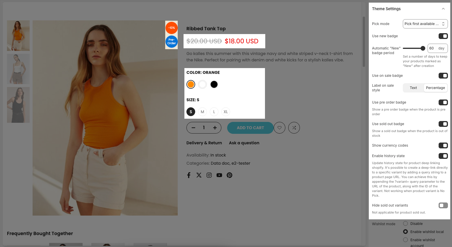
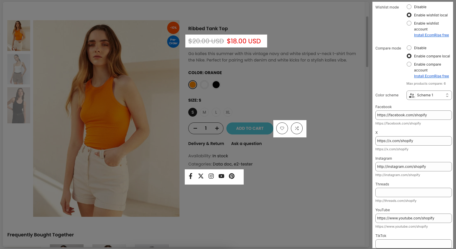
Wishlist mode:
• Disable – Turns off the wishlist feature entirely.
• Enable wishlist local – Allows customers to save their wishlist locally using browser storage.
• Enable wishlist account – Enables account-based wishlist saving (requires the EcomRise app).Compare mode:
• Disable – Turns off the product comparison feature.
• Enable compare local – Allows customers to compare products locally without an account.
• Enable compare account – Enables account-based product comparison (requires the EcomRise app).
• Note: You can compare up to 6 products.Color scheme: Select a predefined color theme (e.g., Scheme 1) for styling this section.
Social links (Facebook, X, Instagram, Threads, YouTube):
Add URLs to your social media pages. These links will be used to display corresponding social media icons on your storefront. Leaving a field blank will hide that platform’s icon.Multiple Currencies By": This option lets you choose the method for handling multiple currencies on your store.