


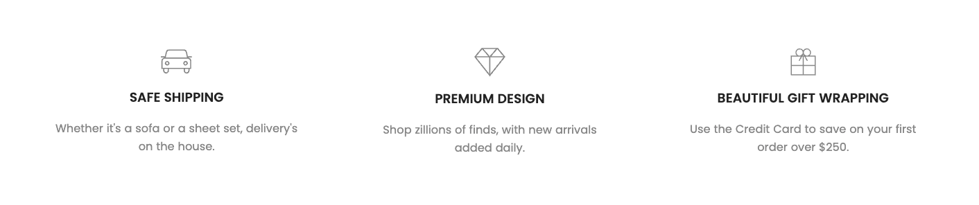
The "Shipping" section is designed to display important information related to your store's shipping policy. It's an ideal place to clarify delivery terms, estimated shipping times, costs, and other special options. By providing transparent information directly on product or landing pages, you can build customer trust and minimize shipping-related inquiries.
1. How to access the Shipping section?
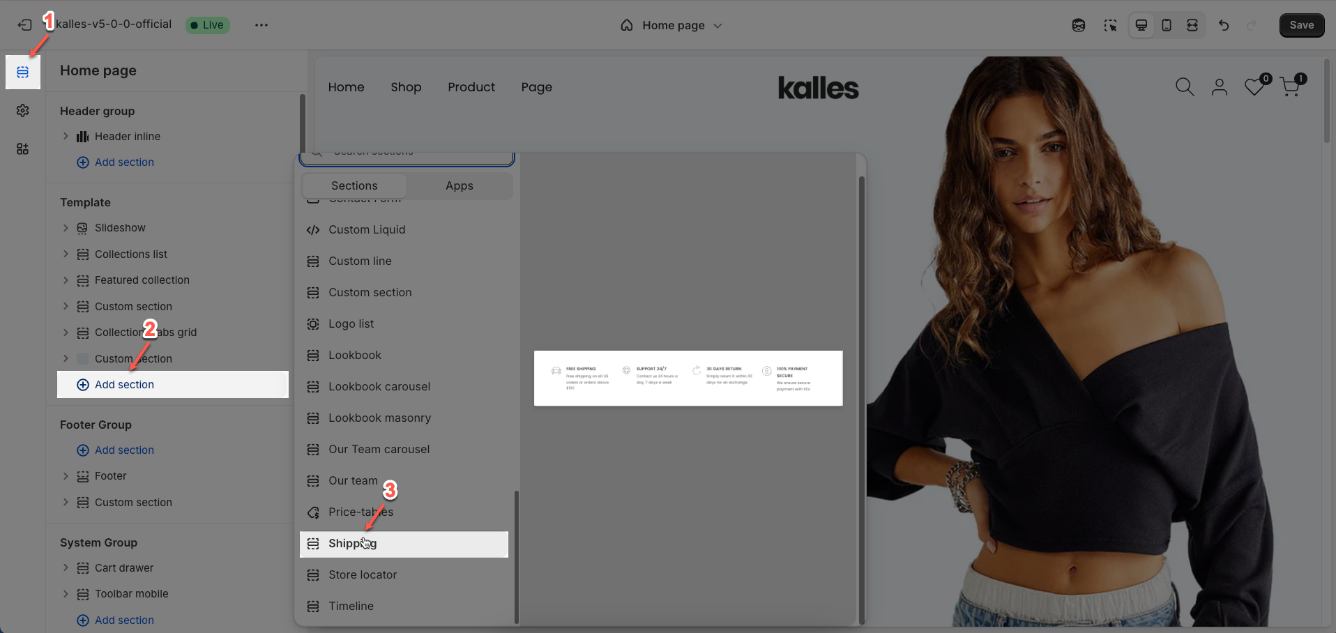
Step 01: From Shopify Admin, click on Online Store > Select Themes > In the Current theme section, click the Customize button.

Step 02: In the theme editor (Customize), click the Sections button > Click the Add section button > In the Sections tab, scroll through the list or use the search bar to find and select the Shipping section.
2. How to customize the Shipping section?
2.1. Shipping item
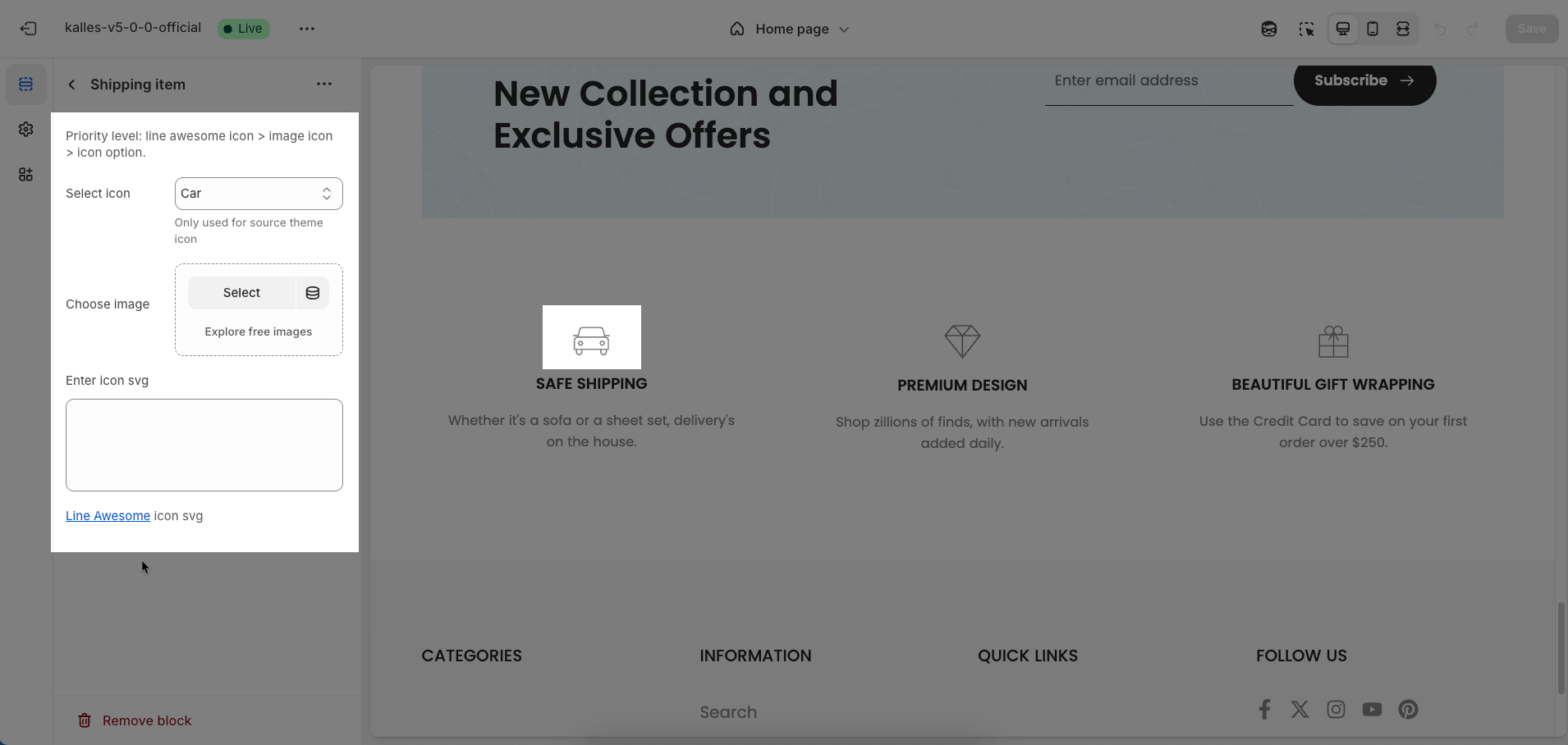
To add a Shipping item block to the Shipping section, click the Add block button (plus icon ➕) under the Shipping section.
After adding the Shipping item block, you can adjust its settings using the sidebar—located on the right or left side of your screen depending on your device
Priority level: line awesome icon > image icon > icon option.
Select icon: Select an icon from the theme's integrated icon library. This is a quick and convenient way to add common icons without needing to upload separate files.
Only used for source theme icon
Choose image: Upload an image file (e.g., PNG, JPG, GIF) to display. This option is suitable when you want to use a specific image, rather than a monochromatic icon.
Enter icon SVG: Paste SVG (Scalable Vector Graphics) code directly into this field. SVG is a vector graphic format that scales without losing quality and can be easily customized in terms of color using CSS
Line Awesome icon svg
2.2. Heading block
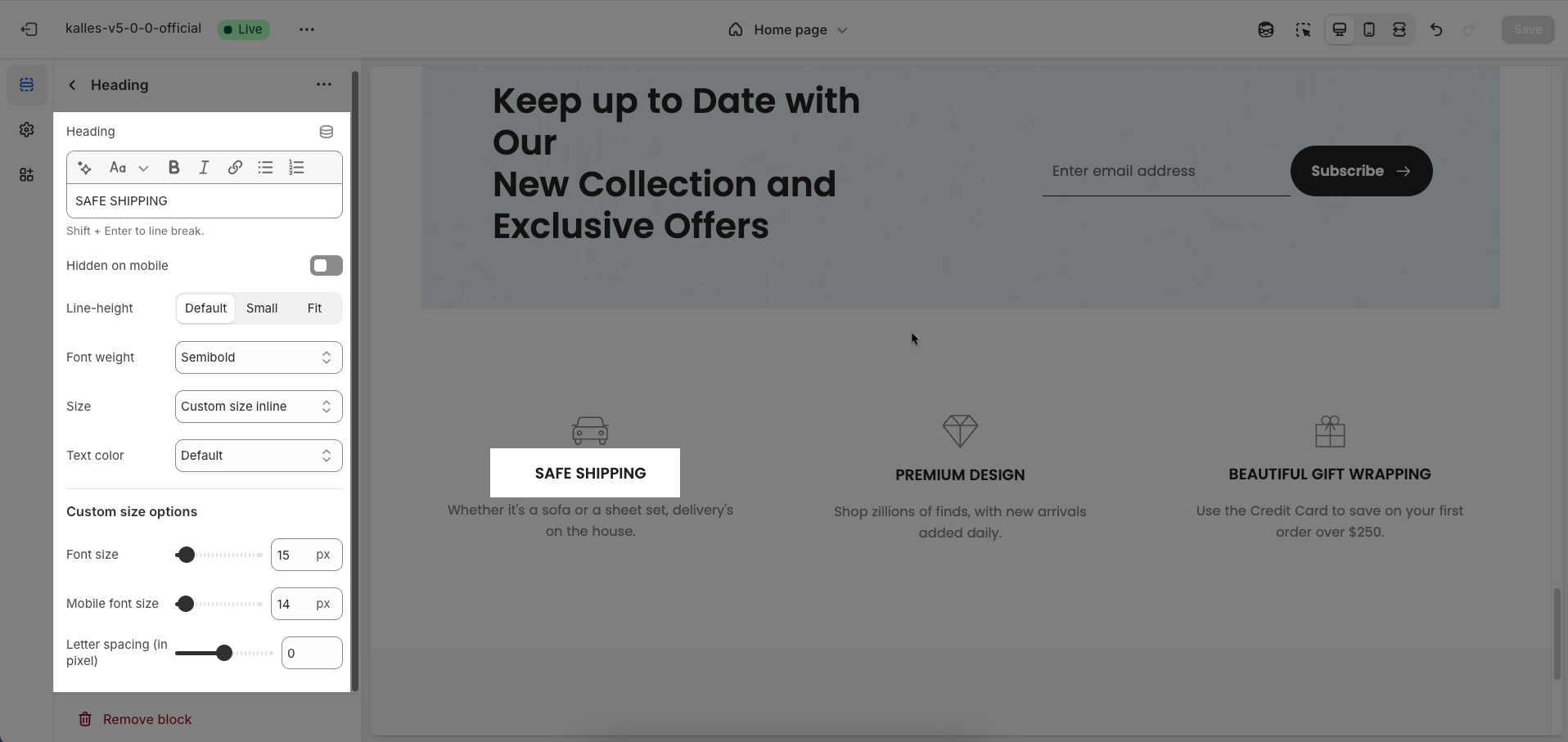
To add a Heading block to the Shipping item, click the Add block button (plus icon ➕) under the Shipping item.
Once the Heading block is added, you can customize its settings in the left or right-hand sidebar (depending on your screen size)
Heading: Enter the heading text to display. This is the main content you want users to read.
Shift + Enter to line break.
Hidden on mobile: Enable this option to completely hide this element or content block when the website is viewed on mobile devices.
Line-height: Select the line height for the heading.
Default: Uses the default line height of the font or theme.
Fit: Automatically adjusts the line height to optimally fit the font size and content, often resulting in tighter text.
Size: Select the font size for the heading. This directly impacts the prominence and readability of the heading.
Text color: Choose the color for the heading text. Ensure this color has good contrast with the background for readability.
Custom size options
Font size: Enter the default font size for this element (unit: pixels or
rem). This size will apply on larger screens (desktop) and serve as a base for other devices.Mobile font size: Enter the specific font size for this element when displayed on mobile devices (unit: pixels or
rem)Letter spacing (in pixel): Enter the spacing between characters in the element's text (unit: pixels). A positive value increases spacing, while a negative value brings characters closer.
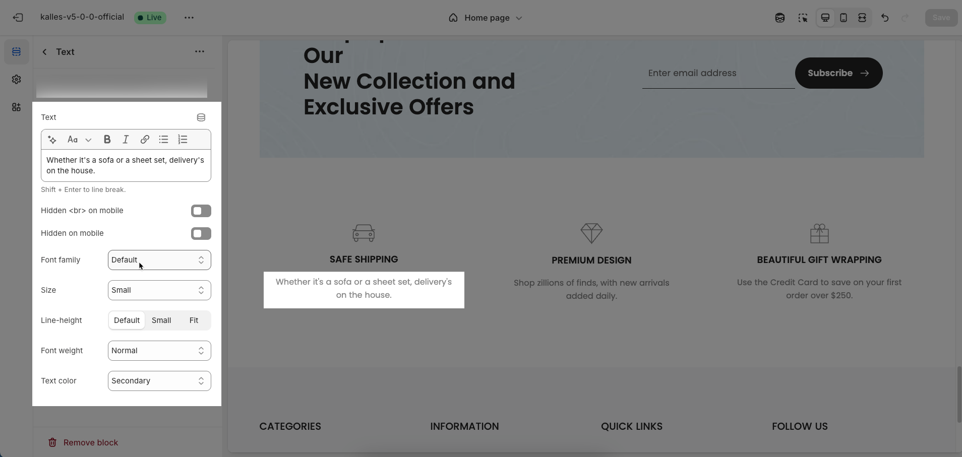
2.3. Text block
To add a Text block to the Shipping item, click the Add block button (plus icon ➕) under the Shipping item.
Once the Text block is added, you can customize its settings in the left or right-hand sidebar (depending on your screen size)
Text: Enter the text content to be displayed.
Hidden <br> on mobile: Enable this option to hide
<br>(line break) tags when displayed on mobile devices. This helps text flow continuously on smaller screens without abrupt line breaks, improving readability.Hidden on mobile: Enable this option to completely hide this element or content block when the website is viewed on mobile devices.
Font family: Select the font family to be used for the text. The font family impacts the aesthetic and readability of the text.
Size: The font size for the text
Line-height: Select the line height for the heading.
Default: Uses the default line height of the font or theme.
Fit: Automatically adjusts the line height to optimally fit the font size and content, often resulting in tighter text.
Font weight: Select the weight or boldness of the font for the text within this element (e.g.,
Normal,Bold,Light). This value impacts the prominence and readability of the text.Text color: Choose the color for the heading text. Ensure this color has good contrast with the background for readability.
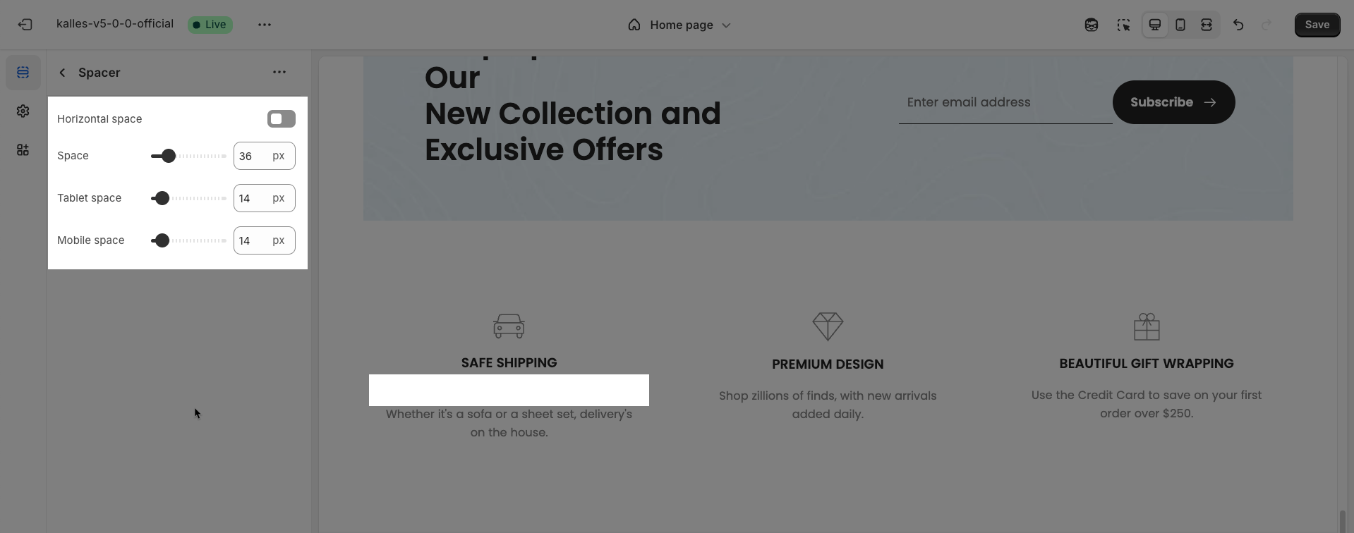
2.4. Spacer block
To add a Spacer block to the Shipping item, click the Add block button (plus icon ➕) under the Shipping item.
Once the Spacer block is added, you can customize its settings in the left or right-hand sidebar (depending on your screen size)
Horizontal space: Enable to adjust the horizontal space between elements, creating a balanced and easy-to-read layout
Space: Setting space between elements creates clear separation.
Tablet space: Optimizes the spacing between elements on tablet screens, ensuring content is displayed balanced and easy to interact with on medium-sized screen devices.
Mobile space: Adjusts the spacing between elements on mobile phone screens, optimizing the user experience on small screens
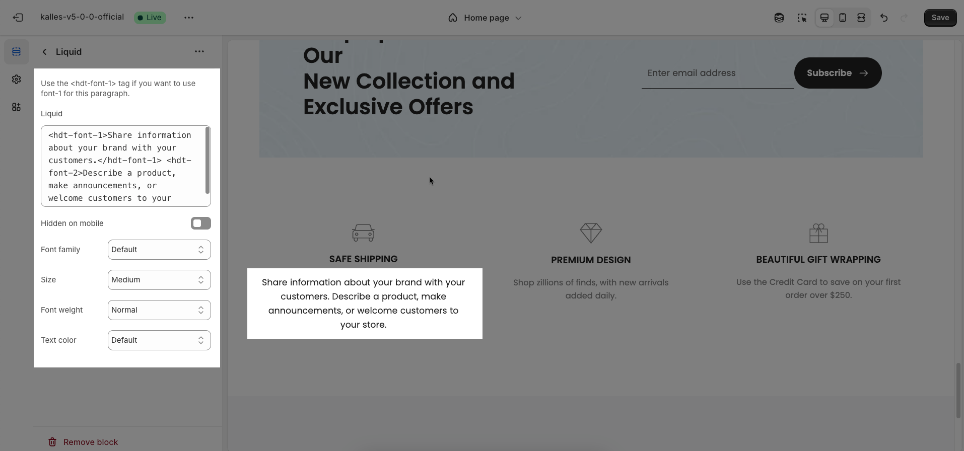
2.5. Liquid block
To add a Liquid block to the Shipping item, click the Add block button (plus icon ➕) under the Shipping item.
Once the Liquid block is added, you can customize its settings in the left or right-hand sidebar (depending on your screen size)
Use the <hdt-font-1> tag if you want to use font-1 for this paragraph.
Liquid: Enter custom Liquid code to be rendered directly at this position. This option is incredibly powerful, allowing you to embed dynamic data from Shopify
Hidden on mobile: Enable this option to completely hide this element or content block when the website is viewed on mobile devices
Font family: Select the font family to be used for the text. The font family impacts the aesthetic and readability of the text.
Size: The font size for the text
Font weight: Select the weight or boldness of the font for the text within this element (e.g.,
Normal,Bold,Light). This value impacts the prominence and readability of the text.Text color: Choose the color for the heading text. Ensure this color has good contrast with the background for readability.
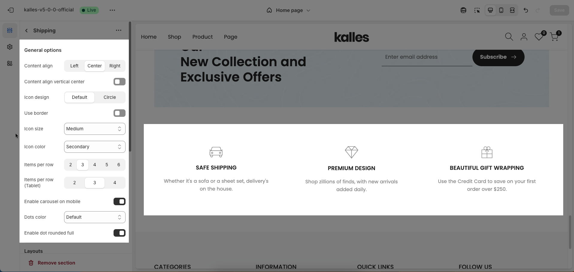
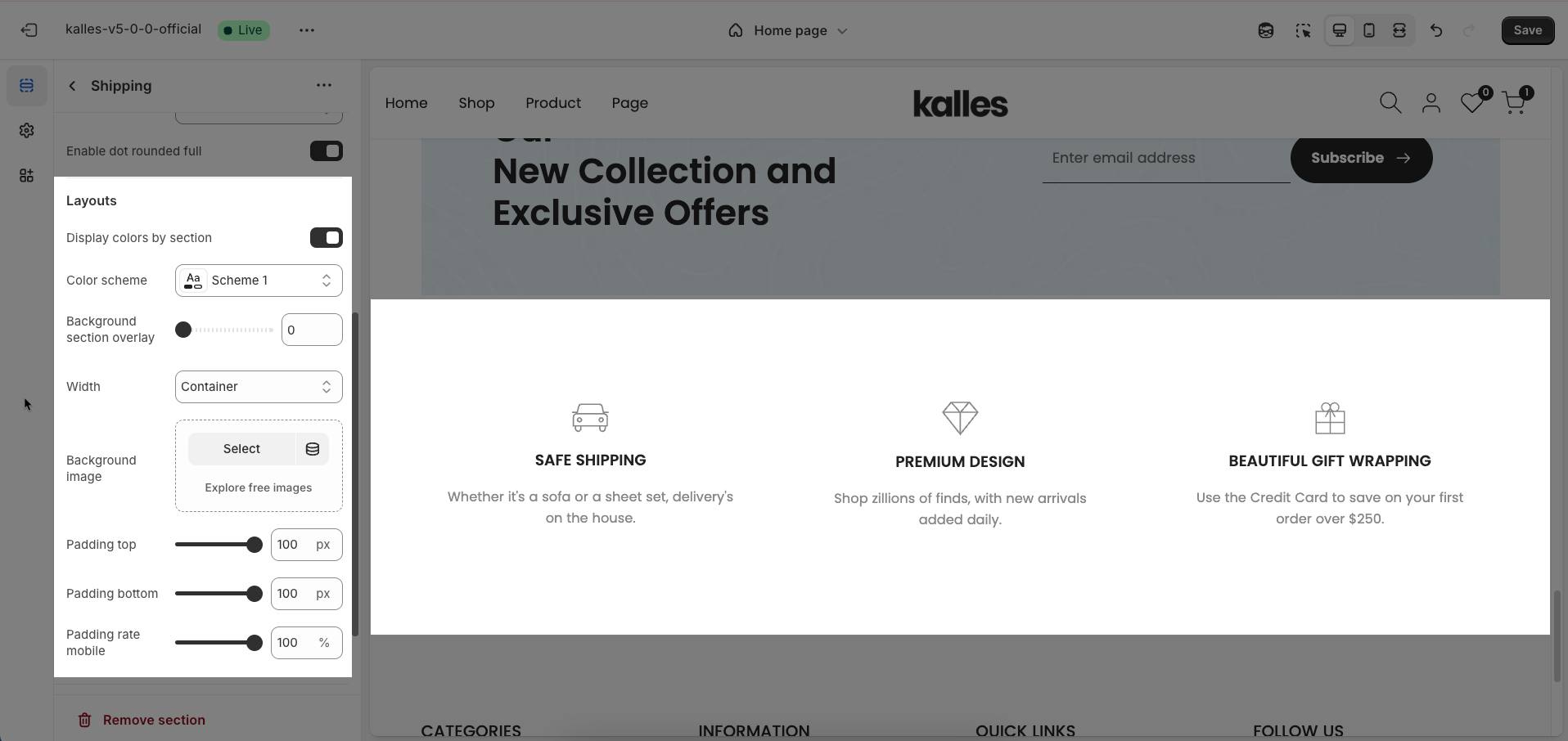
2.6. Shipping section
After adding the Shipping section, you can customize its settings in the left or right sidebar (depending on your screen size)
General options
Content align: Select how content will be horizontally aligned within an element (e.g.,
Left,Center,Right).Content align vertical center: Enable this option to vertically center the content within its containing element.
Icon design: Select the visual design style for the icon. Options may include Default & Circle
Use border: Enable this option to add a border around the icon or its containing box
Icon size: Select the size of the icon
Icon color: Choose the color for the icon. This option applies to vector-based icons (SVG) or font icons.
Items per row: Enter the number of items to display per row on desktop screens (large screens).
Items per row (Tablet): Enter the number of items to display per row on tablet screens. This allows you to optimize the layout for intermediate devices.
Enable carousel on mobile: Enable this option to transform the item list into a carousel (slider) when viewed on mobile devices. If disabled, items will display in single or multiple columns depending on your mobile layout.
Dots color: Select the color for the carousel's pagination dots.
Enable dot rounded full: Enable this option to make the pagination dots fully rounded (circular). If disabled, they might have a default shape (e.g., small squares).
Layouts
Display colors by section: Enable this option to allow each section to manage its own color scheme independently
Color scheme: Select the color scheme that will be applied to this section. A color scheme typically includes settings for background color, primary text color, secondary text color, and other accent colors
Background section overlay: Select a color overlay that will be applied on top of the section's background
Width (Container, Wrap container, Full width): Select the width of the content within the section.
Container: The content will be confined within a fixed-width (or max-width) container defined by your global theme settings.
Wrap container: The content will be enclosed in a slightly wider container than the default, but still with limits.
Full width: The content will span the entire width of the browser viewport, ignoring any container constraints.
Background image: Upload an image to be used as the background for this entire section. This helps create a prominent and engaging visual element.
Top padding: Enter the value for the top padding of the element (unit: pixels). This padding creates space between the top edge of the content and the top edge of the element.
Bottom padding: Enter the value for the bottom padding of the element (unit: pixels). This padding creates space between the bottom edge of the content and the bottom edge of the element.
Rate padding (mobile): Enter the padding rate value for the element on mobile devices
Theme Settings
Page width: Enter the maximum width for the main content of your page (unit: pixels). The content will be centered and will not exceed this width, which helps improve readability and layout control.
Custom CSS
Allows users to customize by adding CSS rules, beyond the limitations of default settings. This allows for fine-tuning the design to every detail, to suit specific needs.
Add custom styles to this section only.
To add custom styles to your entire online store, go to theme settings for detailed instructions.


