


The Collection List Simple section is a clean and modern layout designed to showcase product collections in a straightforward, visually appealing format. Its minimalist design ensures content remains the focus while maintaining a polished look.
1. How to access the Collection list simple section?
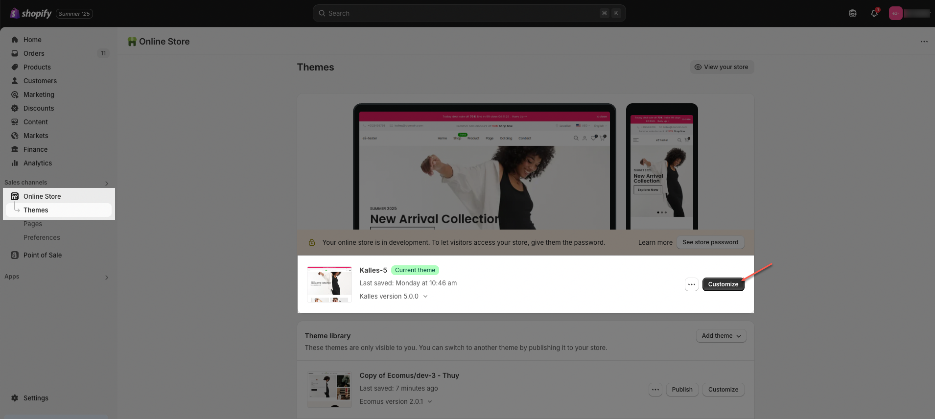
Step 01: From Shopify Admin, click on Online Store > Select Themes > In the Current theme section, click the Customize button.
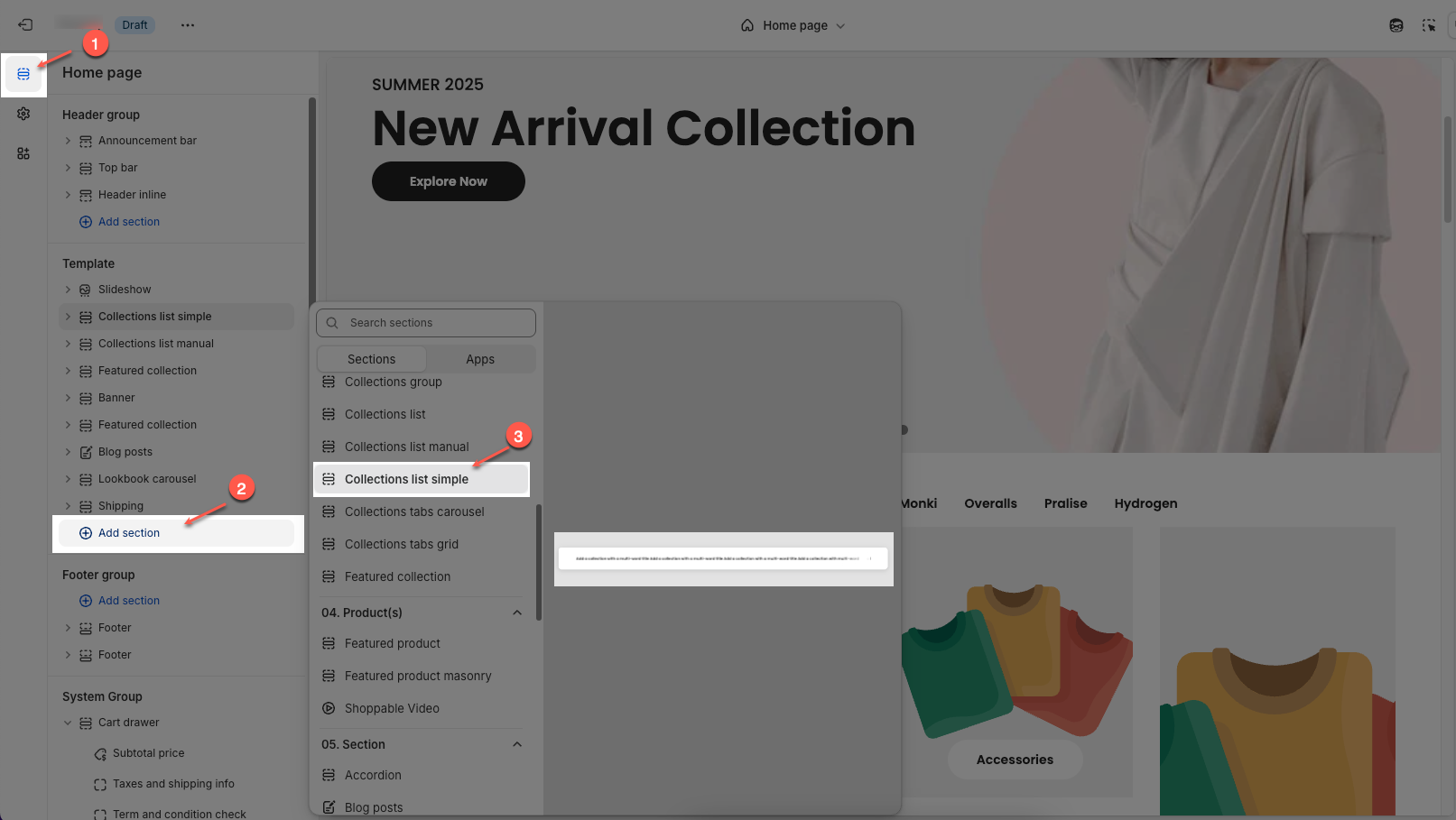
Step 02: In the theme editor (Customize), click the Sections button > Click the Add section button > In the Sections tab, scroll through the list or use the search bar to find and select Collection list simple.
2. How to customize the Collection list simple section?
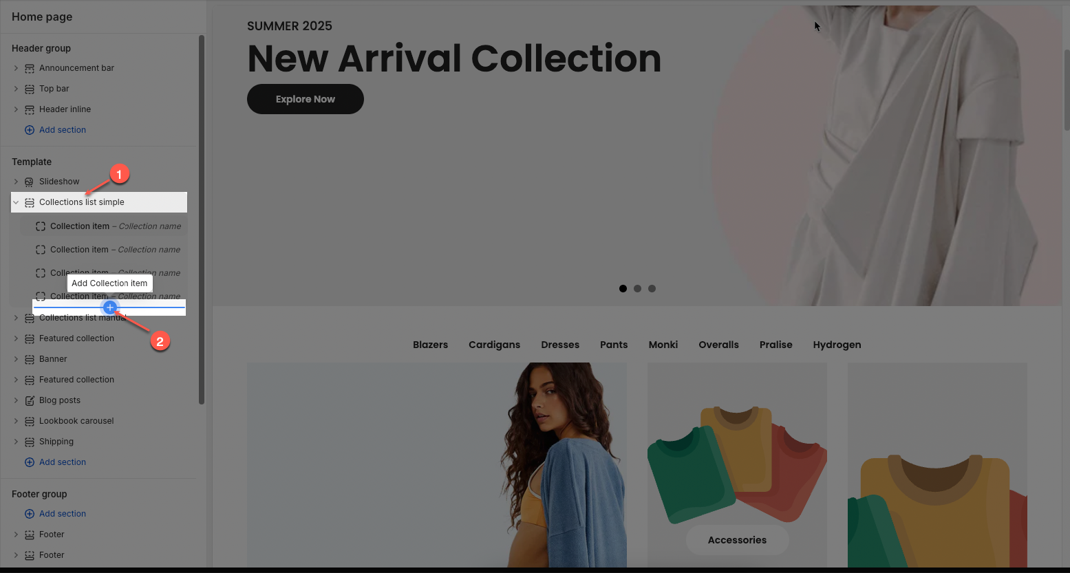
2.1. Collection item
Click on Collection list simple section > Add block (plus icon ➕) > Collection item block
On each block, you can configure:
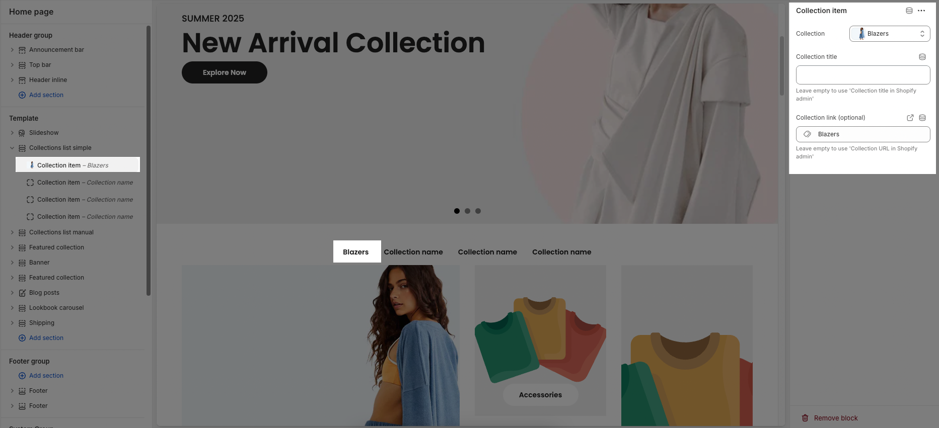
Collection: Choose an existing collection from your Shopify store.
Collection title: Enter a custom title for the collection item.
Leave empty to use 'Collection title in Shopify admin'
Collection link (optional): Paste a custom link or search for a page to link this item to.
Leave empty to use 'Collection URL in Shopify admin'
2.2. Collection list simple
You can configure some general options for the section below:
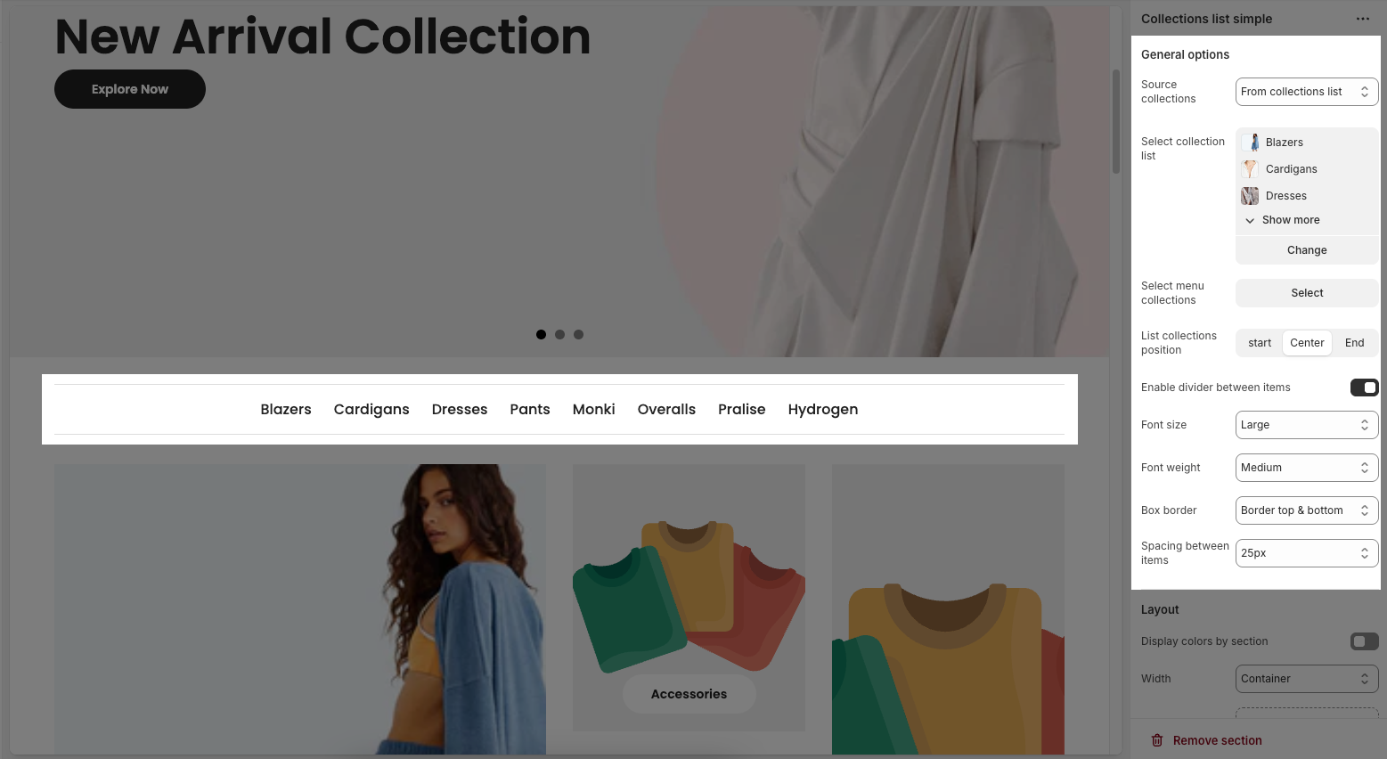
2.2.1. General options
Source collections: Choose the source of the collections to display — options include "From collections list", "From menu collections", or "From blocks".
From collections list
Select collection list: Select specific collections (e.g., Blazers, Cardigans, Dresses) to show from the chosen source.
From menu collections
Select menu collections: Select menu collections to show from the chosen source.
From blocks
Use Collection item blocks
List collections position: Set the alignment of the collection list — choose between "start" (left), "Center", or "End" (right).
Enable divider between items: Toggle this switch to show or hide dividing lines between collection items.
Font size: Choose the size of the text (e.g., Medium) used for collection names.
Font weight: Choose the thickness of the font (e.g., Semibold) used for collection names.
Box border: Choose a border style (e.g., None) for the boxes containing collection items.
Spacing between items: Adjust the spacing between each collection item — options include Default and other spacing levels.
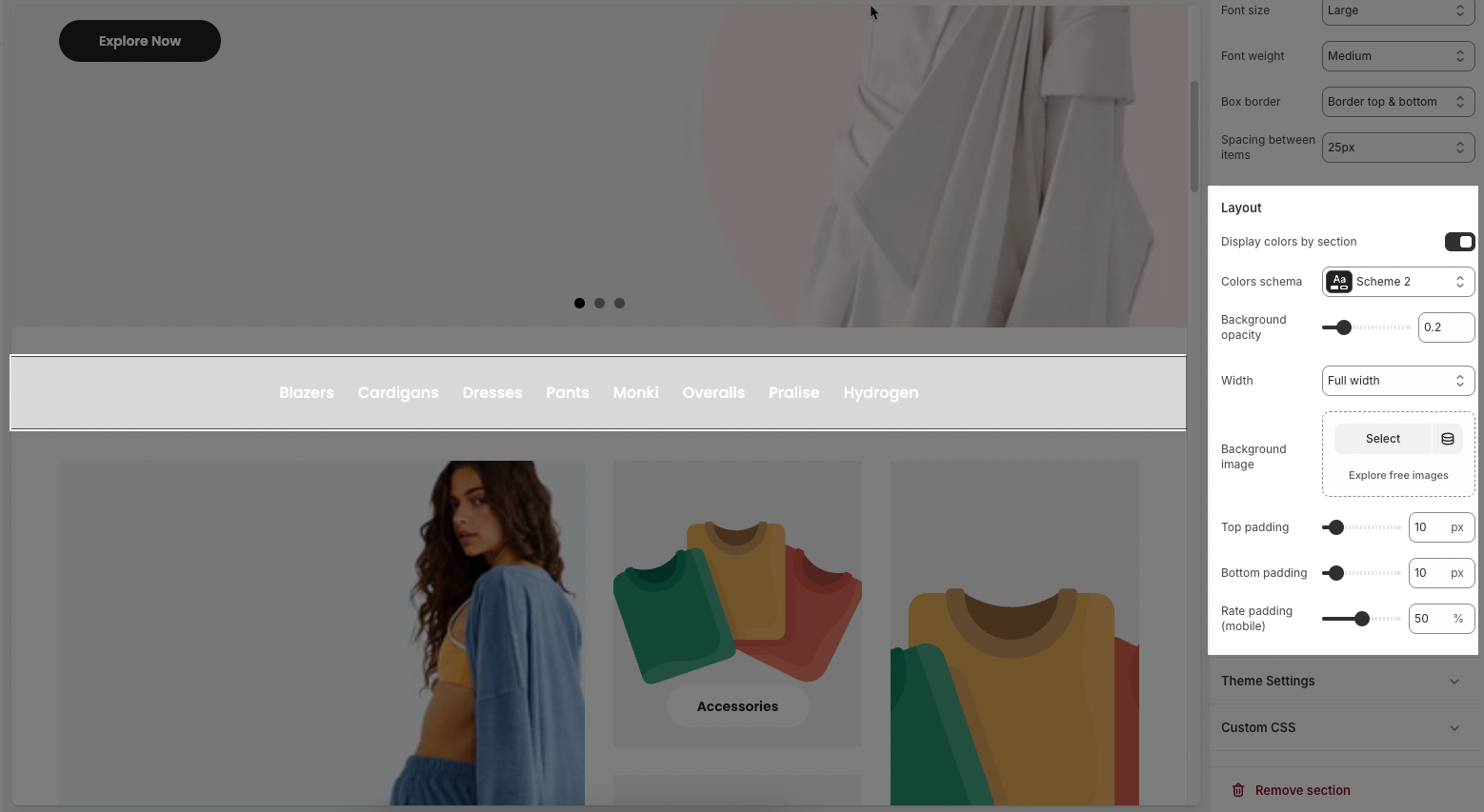
2.2.2. Layout
Display colors by section: Toggle to enable or disable different color schemes for different sections of your layout.
Colors schema: Dropdown menu to select a predefined color scheme (e.g., "Scheme 2") for the layout.
Background opacity: Slider to adjust the transparency level of the background (value ranges from 0 to 1).
Width: Dropdown to set the layout width (e.g., “Full width” makes the section stretch across the entire screen).
Background image: Button to upload or select a background image, with an option to explore free image resources.
Top padding: Slider/input to set the space (in pixels) above the content.
Bottom padding: Slider/input to set the space (in pixels) below the content.
Rate padding (mobile): Slider to set padding as a percentage for mobile view to ensure responsive spacing.
2.2.3. Theme settings
Page width: Slider and input box to set the total width of the page content in pixels (e.g., 1200px). This controls how wide the content area appears on the screen.
2.2.4. Custom CSS
Allows users to customize by adding CSS rules, beyond the limitations of default settings. This allows for fine-tuning the design to every detail, to suit specific needs.
Add custom styles to this section only.
To add custom styles to your entire online store, go to theme settings for detailed instructions.


