The header menu is a crucial element for website navigation, providing users with quick access to key sections. This guide will walk you through the configuration options available for your header menu, enabling you to customize its appearance and functionality to best suit your site's needs.

1. How to access the Header inline section?
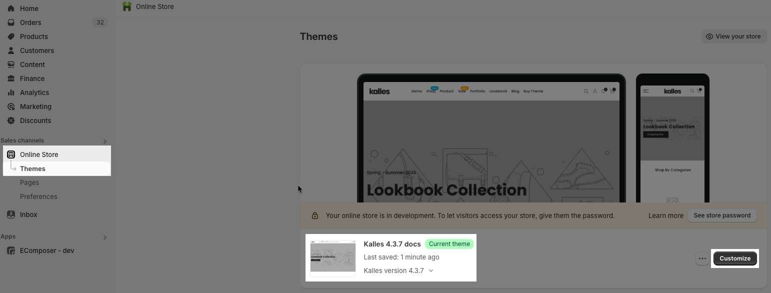
Step 01: From Shopify Admin, click on Online Store > Select Theme > In the Current theme section, click the Customize button.
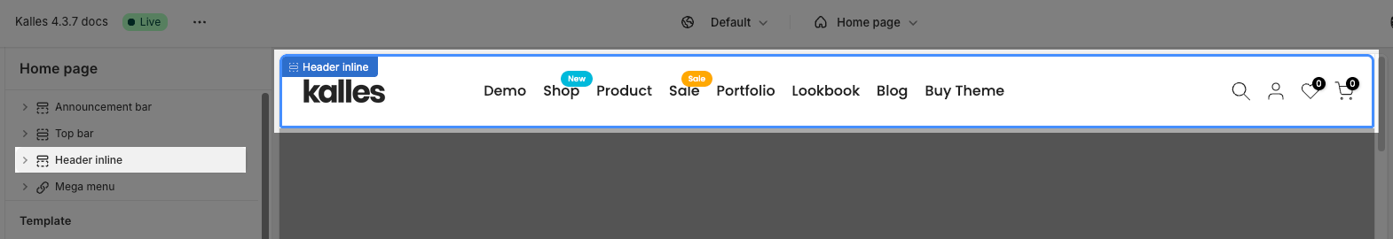
Step 02: In the theme editor (Customize), in the Header Group section > click the Header inline section
2. How to customize the Header inline?
This guideline helps you create the header menu with Base Item, Dropdown Item and Mega menu Item.
Go to Header inline > Add block > choose a block that you want.
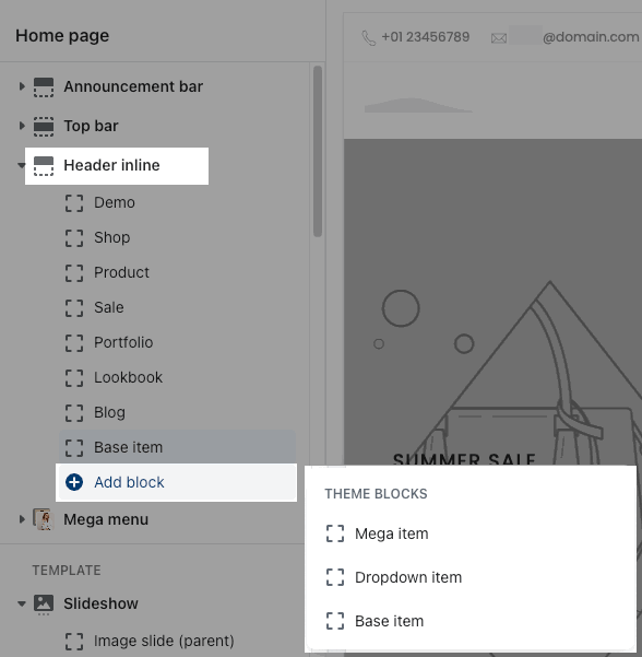
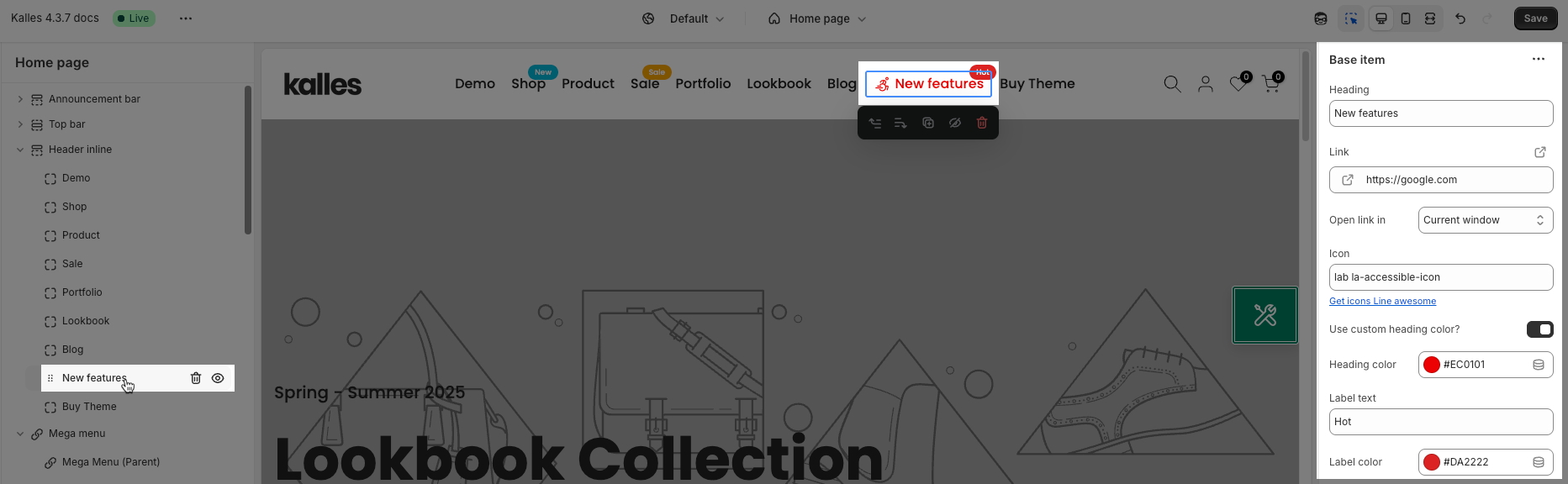
2.1. Base Item block
This is a simple menu item, you can choose the URL to redirect to when customers click on the item.
Heading: The label that you want to display on the menu.
Link: Add a menu link. You can choose an external URL or select from existing pages.
Open link in: You have 2 options to choose, open in "Current window" or open in "New window".
Icon: Show icon beside the menu. Click on the "Get icons Line awesome" link under the Icon option to find the icon you want.
Use custom heading color: You can set a specific color for this menu.
Heading color: This option only works when the "Use custom heading color" above is turned on.
Label text: Add a badge to highlight this menu.
Label color: Configure color for the menu badge.
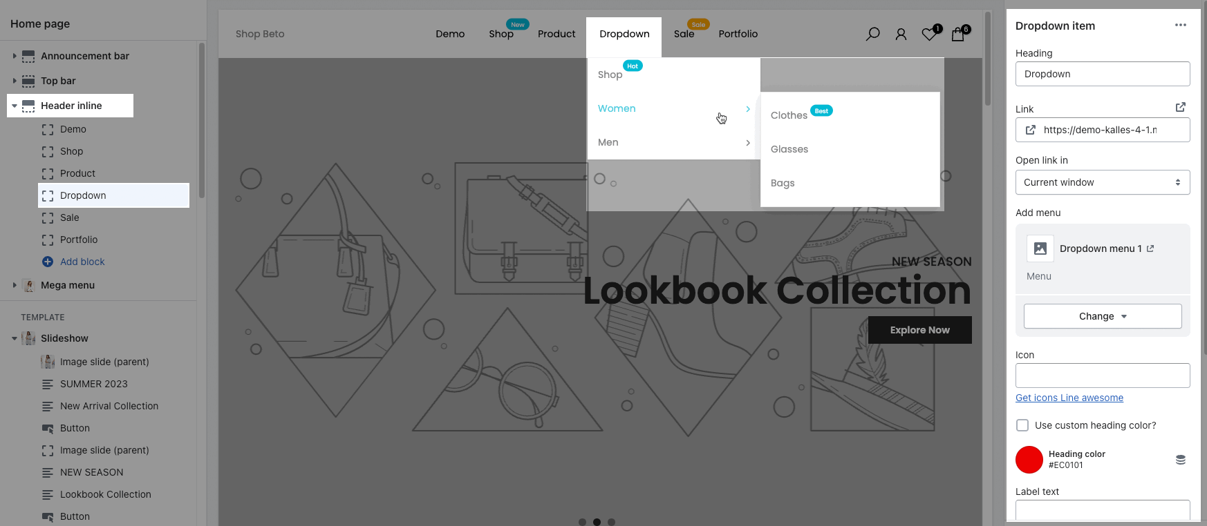
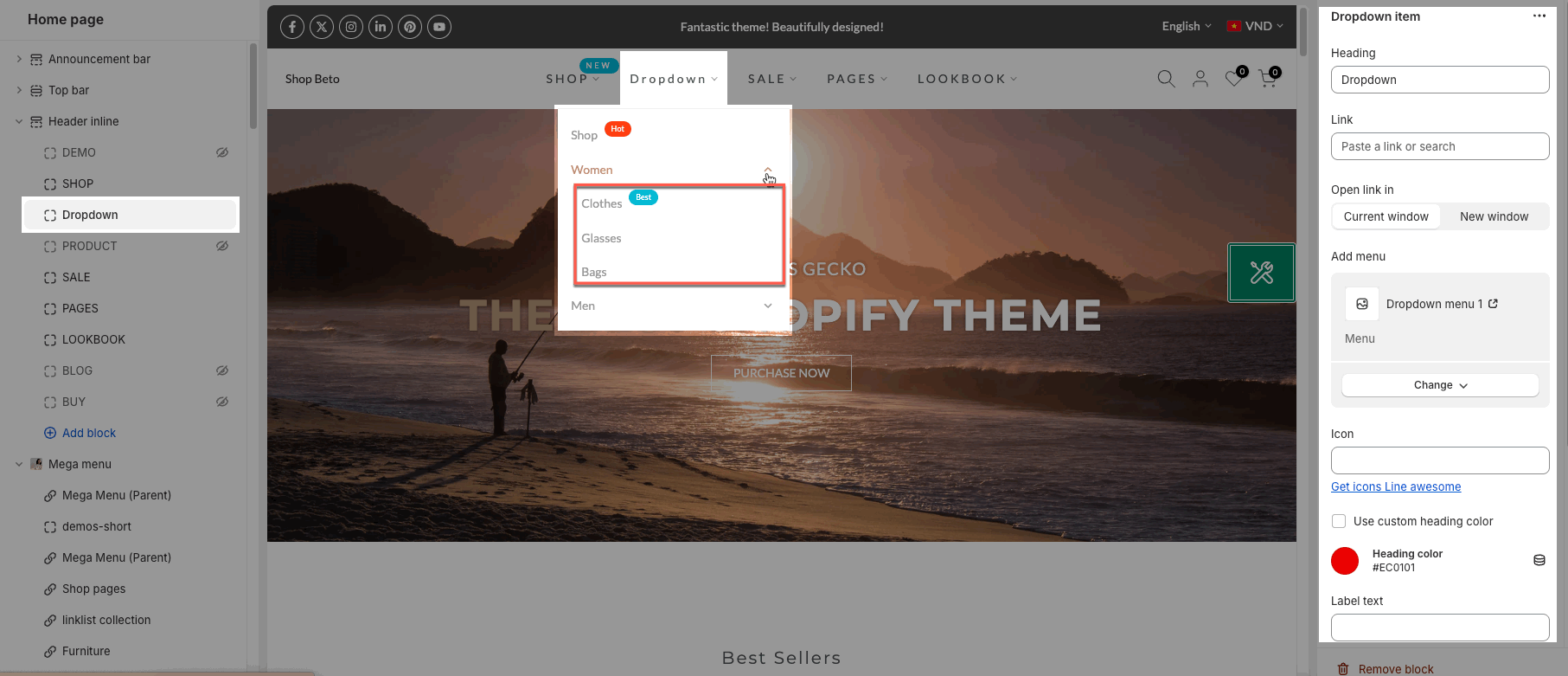
2.2. Dropdown Item block
Heading: The label that you want to display on the menu.
Link: Add a menu link. You can choose an external URL or select from existing pages.
Open link in: You have 2 options to choose, open in "Current window" or open in "New window"
Add menu: it allows you to select only one menu to show as a dropdown.
You need go to Shopify admin -> Content -> Menus to create a new menu or configre an available menu:
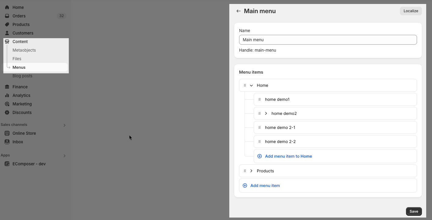
Note: Shopify allows you to create a Navigation up to 3 levels, so the maximum level for dropdown is 3.
Icon: Show icon beside the menu. Click on the "Get icons Line awesome" link under the Icon option to find the icon you want.
Use custom heading color: You can set a specific color for this menu.
Heading color: This option only works when the "Use custom heading color" above is turned on.
Label text: Add a badge to highlight this menu.
Label color: Configure color for the menu badge.
Submenu
Enable Lazy menu: designed to enhance page load speed by initially loading only the visible portion of the menu. The remaining menu items are loaded on demand as the user interacts with the menu, improving initial page rendering time.
Position submenu: The Submenu can show on Start or Center, or End.
Position child submenu: Set the position for the child submenu on the Left or Right.
Font size menu items: Configure font size for submenu items.
Space between menu items: Set space between submenu items.
This is a dropdown layout in Kalles, Ocolus theme (sub-menu on the right side)
This is a dropdown layout for Gecko, Unsen theme (sub-menu under the parent item)
2.3. Mega item block
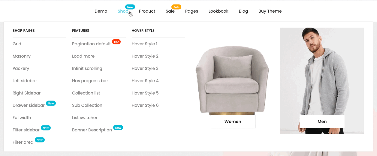
Mega menu is a type of expandable menu in which multiple choices are displayed in a drop-down layout. It is a great design choice to accommodate a large number of options or to display lower-level pages that appear in the menu Header.
2.3.1. Example
This is an example of a mega menu:
To create a mega menu with 5 columns above, you follow these steps:
Step 1: Hide/Remove the exit items to build your own menu => Video guide 1
Step 2: Create 'Mega menu' for Shop
Connect the same ID for Mega menu (Parent) and add some child blocks such as Linklist (Child) or Collection(Child), etc.. => Video guide 2
Step 3: Adjust the Width (Col) and order of the items => Video guide 3
2.3.2. Connect Header Inline and Mega Menu
To create Mega menu, you need to connect the Mega Item of Header Inline and Mega Menu(Parent) of the Mega Menu by choosing the same ID.
There is a total of 16 IDs here, from #1 to #16. It means you can create up to 16 mega menus.
For example, Header Inline: Mega Item - SHOP - the ID to connect is #2;
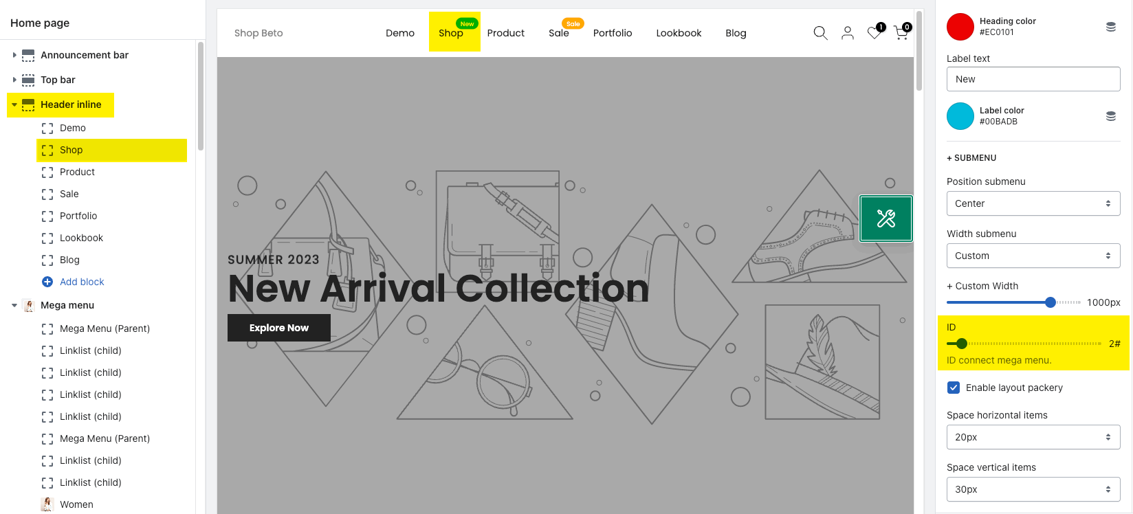
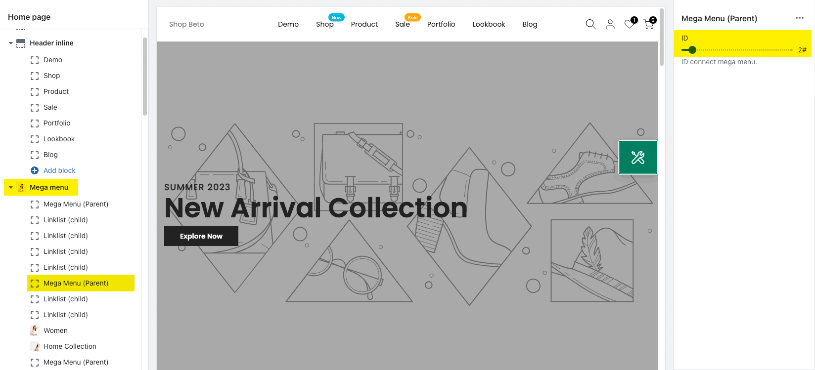
The Mega Menu: Mega Menu (parent) to connect with this header needs to set ID #2.
2.3.3. How to add content for Mega menu?
To add content to Mega menu, please put the child blocks below Mega Menu (Parent).

Mega menu has many child blocks, click Mega menu > Add block:
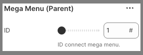
2.3.3.1. Mega Menu (Parent) block
ID: This ID is used to connect the mega menu. You need to fill in the ID that you set on the Mega item block here.
2.3.3.2. Linklist (child) block
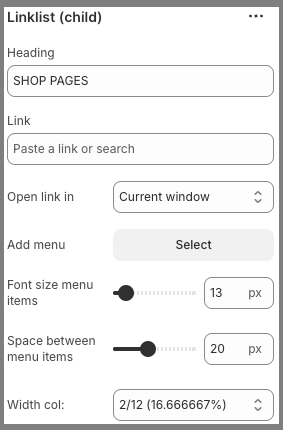
Heading: The label that you want to display on the menu.
Link: Add a menu link. You can choose an external URL or select from existing pages.
Open link in: You have 2 options to choose, open in "Current window" or open in "New window"
Add menu: it allows you to select only one menu to show as a dropdown.
You need to go to Shopify admin -> Content -> Menus to create a new menu or configre an available menu:
Font size menu items: Configure font size for menu items.
Space between menu items: Set space between menu items.
Width col: Set menu column width.
2.3.3.3. Linklist 2 (child)
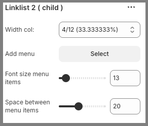
Width col: Set menu column width.
Add menu: It allows you to select only one menu to show as a dropdown.
You need to go to Shopify admin -> Content -> Menus to create a new menu or configre an available menu.
Font size menu items: Configure font size for menu items.
Space between menu items: Set space between menu items.
2.3.3.4. Product (child)
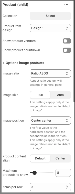
Collection: Choose one collection you want to show here.
Product item design: We have some pre-designed layouts for the product that you can choose.
Show product vendors: You can show product vendors or not.
Show product countdown: If turned on, Countdown timers will appear on products where they have been set.
Options image products:
Image ratio: Configure the Product image ratio. Aspect ratio custom will settings in general panel.
Image size: You can set Product image size Full or Auto. This settings apply only if the image ratio is not set to 'Adapt to image'.
Image position: Configure the Product image position. The first value is the horizontal position and the second value is the vertical. This settings apply only if the image ratio is not set to 'Adapt to image'
Product content align: Product content can display Default or Center.
Maximum products to show: Number of products to show on this section.
Items per row: Number of product to show per row.
Space horizontal items: controls the amount of empty space or padding applied between items arranged horizontally.
Space vertical items: controls the amount of empty space or padding applied between items arranged vertically.
Box options:
Layout design: You can choose layout Grid or Carousel here.
Options for carousel layout:
Use the prev next button: Allow you turn on/off prev next button.
Visible: Set previous and next buttons always to show, or only show when hover.
Button style: We have 3 styles for you choose: Default, Outline, Simple.
Button shape: Choose button shape as you want. Not working with button style 'Simple'.
Button color: Configure color for Prev/Next button.
Button size: Configure size for Prev/Next button.
Hidden buttons on mobile: You can show/hide Prev/Next button on mobile.
Width col: Set the column width.
2.3.3.5. Collection (child)
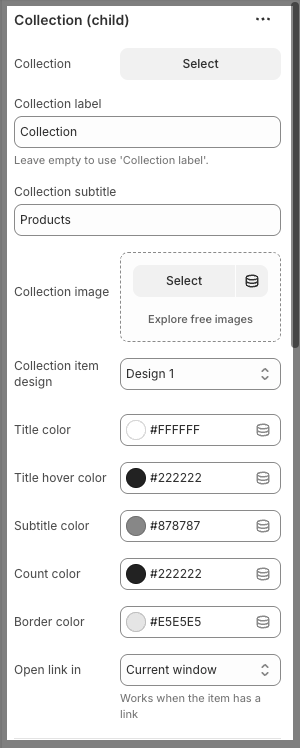
Collection: Choose one collection you want to show here.
Collection label: Add a label for the selected collection. Leave empty to use 'Collection label'.
Collection subtitle: Add a subtitle for your collection if you want.
Collection image: Choose one image for your collection.
Collection item design: We have a list of pre-designed collection items for you choose.
Title color: Configure color for Collection title.
Title hover color: Configure hover color for Collection title.
Subtitle color: Configure color for Subtitle of collection.
Count color: Configure color for count number.
Border color: Configure color for border.
Open link in: You can open the link in current window or in new window. Works when the item has a link.
Options image collection
Space bottom: Space between the image and info of collection.
Space bottom (Mobile): Space between the image and info of collection on mobile.
Enable border: Allow turn on/off border for collection image.
Image padding: Set padding for collection image. Only working when collection has border.
Image rounded: Set the corner rounded for the collection image.
Image hover effect: Add hover effect for collection image. Waring: Hovering effect will resize your images
Collection hover effect: Add hover effect for collection.
Image ratio: Configure ratio for collection image. Aspect ratio custom will settings in general panel.
Image size: You can set collection image size Full or Auto. This settings apply only if the image ratio is not set to 'Adapt to image'.
Image position: Configure the collection image position. The first value is the horizontal position and the second value is the vertical. This settings apply only if the image ratio is not set to 'Adapt to image'.
Link (optional): Add a collection link. You can choose an external URL or select from existing pages. Leave empty to use 'collection url'.
Width col: Set width for Collection column.
2.3.3.6. Banner (child)
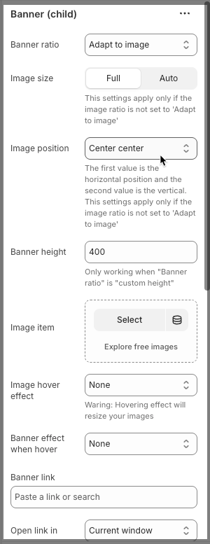
Banner ratio: Configure the ratio for banner.
Image size: You can set banner image size Full or Auto. This settings apply only if the image ratio is not set to 'Adapt to image'.
Image position: Configure the banner image position. The first value is the horizontal position and the second value is the vertical. This settings apply only if the image ratio is not set to 'Adapt to image'
Banner height: Set height for banner. Only working when "Banner ratio" is "custom height".
Image item: Select an image for banner item.
Image hover effect: Add hover effect for banner image. Waring: Hovering effect will resize your images.
Banner effect when hover: Add hover effect for banner image when hover over.
Banner link: Add a banner link. You can choose an external URL or select from existing pages.
Open link in: You have 2 options to choose, open in "Current window" or open in "New window".
Content options:
Content HTML: Add HTML content here.
Content align: Set align for content: Left/Center/Right
Content position options
Content vertical position: Set the content position to follow the vertical side. <= 50 is top position, > 50 is bottom position.
Content horizontal position: Set the content position to follow the horizontal side. <= 50 is left position, > 50 is right position.
Text: Configure content text color.
Overlay: Configure overlay color.
Overlay opacity: Set the opacity overlay for content.
Width col: Set width for content column.
2.3.3.7. Blogs (child)
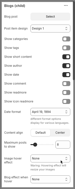
Blog post: select one blog to show here.
Post item design: We have some pre-designed post items for you to choose.
Show categories: Allow you to turn on/off the categories.
Show tags: Allow you to turn on/off the tags.
Show short content: Allow you to turn on/off the short content.
Show author: Allow you to turn on/off the author.
Show date: Allow you to turn on/off the date.
Show comment: Allow you to turn on/off the comment.
Show readmore: Allow you to turn on/off the readmore.
Show icon readmore: Allow you to turn on/off the readmore icon.
Date format: Choose one date format suite for you here, different format options display for various languages.
Content align: Set align for content: Default/Center.
Maximum posts to show: Number of posts to show on this section.
Image hover effect: Add hover effect for blog image. Waring: Hovering effect will resize your images
Blog effect when hover: Add hover effect for blog image when hover.
Image ratio: Configure the blog image ratio. Aspect ratio custom will settings in general panel.
Image size: You can set blog image size Full or Auto. These settings apply only if the image ratio is not set to 'Adapt to image'.
Image position: Configure the blog image position. The first value is the horizontal position, and the second value is the vertical. These settings apply only if the image ratio is not set to 'Adapt to image'
Items per row: Number of posts to show per row.
Space horizontal items: controls the amount of empty space or padding applied between items arranged horizontally.
Space vertical items: controls the amount of empty space or padding applied between items arranged vertically.
Box options
Layout design: You can choose layout Grid or Carousel here.
Options for carousel layout
Use the prev next button: Allow you turn on/off the prev next button.
Visible: Set prev and next buttons always to show, or only show when hovering.
Button style: We have 3 styles for you choose: Default, Outline, Simple.
Button shape: Choose button shape as you want. Not working with button style 'Simple'.
Button color: Configure color for Prev/Next button.
Button size: Configure size for Prev/Next button.
Hidden buttons on mobile: You can show/hide Prev/Next button on mobile.
Width col: Set the column width.
2.3.3.8. HTML (child)
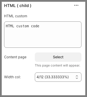
HTML custom: You can add some custom HTML code here.
Content page: The page content will appear.
Width col: Set width for HTML column.
You can check this video below to know more about these child blocks:
You can drag blocks to arrange them:
2.3.4. How to configure the Mega item block
Heading: The label that you want to display on the menu.
Link: Add a menu link. You can choose an external URL or select from existing pages.
Open link in: You have 2 options to choose, open in "Current window" or open in "New window".
Icon: Show icon beside the menu. Click on the "Get icons Line awesome" link under the Icon option to find the icon you want.
Use custom heading color: You can set a specific color for this menu.
Heading color: This option only works when the "Use custom heading color" above is turned on.
Label text: Add a badge to highlight this menu.
Label color: Configure color for the menu badge.
Submenu
Position submenu: The Submenu can show on Start or Center, or End.
Width submenu: You have 3 options for width: Custom, Full width, Content full width.
Custom width: Set width for submenu, this option only works when the "Width submenu" option above is turned on.
ID: This ID is used to connect the mega menu.
Enable layout packery: Unlike a strict grid, Packery allows items of varying sizes to fit together organically, filling in spaces to create a visually compact and interesting arrangement.
Space horizontal items: controls the amount of empty space or padding applied between items arranged horizontally.
Space vertical items: controls the amount of empty space or padding applied between items arranged vertically.
2.4 Header section settings
Click on HEADER section, there are many options for you to config the header.
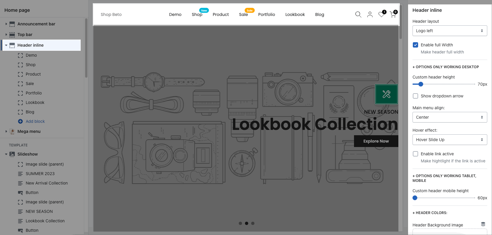
Header layout: choose different position of logo, search form, and menu. You can check video below to know more:
Config Header height on desktop, tablet and mobile.
Main menu align, Hover effect for the menu
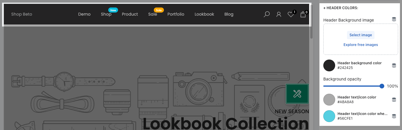
2.4.1. HEADER COLORS
Config background color, text color, etc...
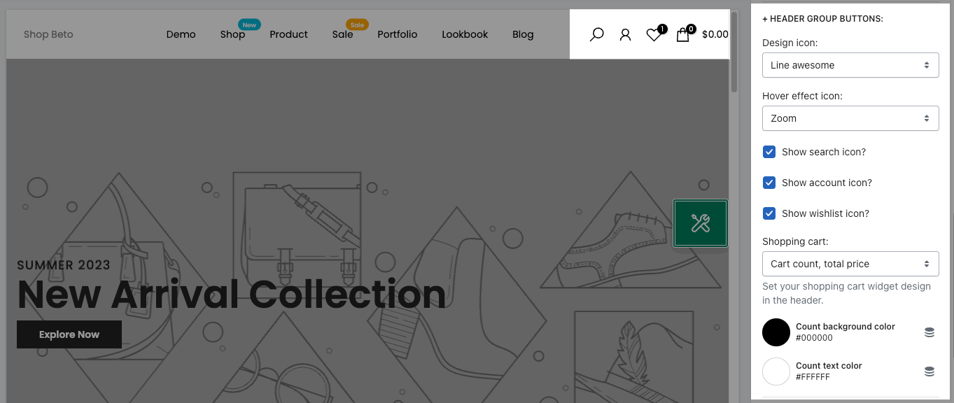
2.4.2. HEADER GROUP BUTTONS
Choose design icon, enable/disable search, account, wishlist icons, cart style.
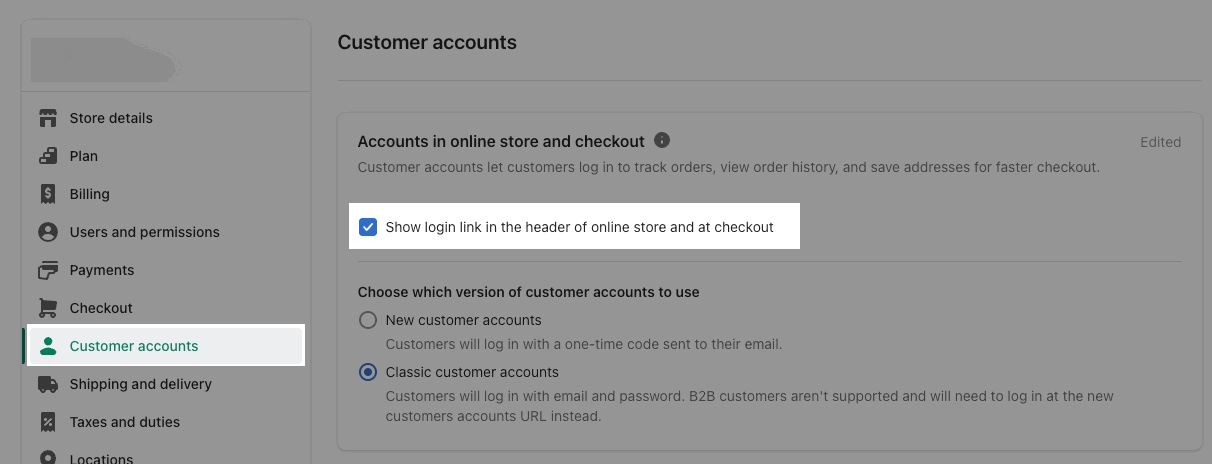
If you tick "Show account icon" but the icon still not show, please go to Shopify Settings > Customer accounts > enable “Show login link in the header of online store and at checkout”:
2.4.3. STICKY HEADER
Sticky header always shows when you scroll up/down the page. Please check this video to know more about Sticky header.
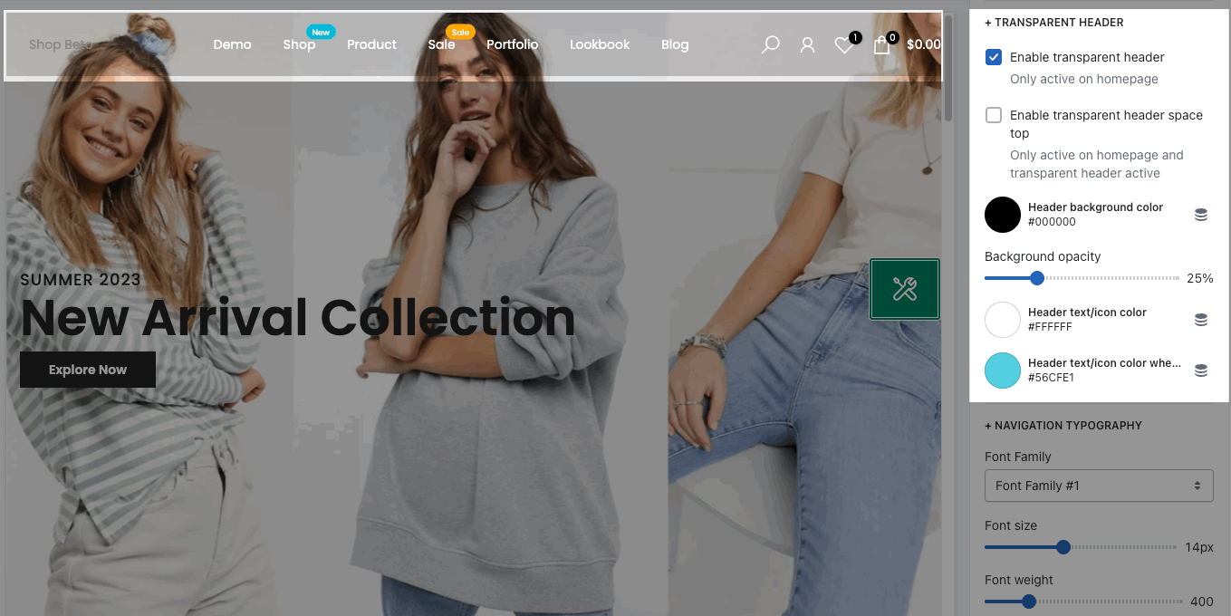
2.4.4. TRANSPARENT HEADER
The background of the header becomes transparent with the background of the section behind it.