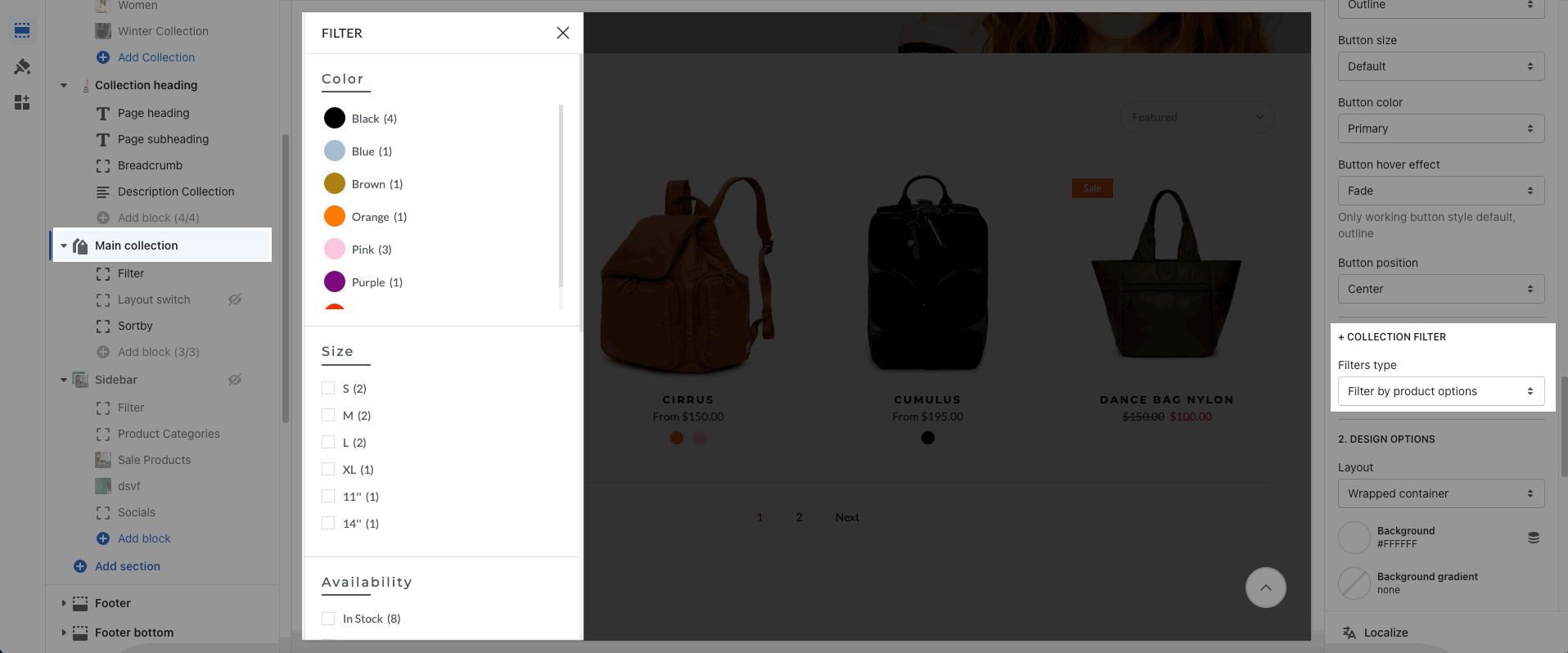
The main collection is the collection you choose to display on the collections page. There are many features to help you customize it, follow this article.
1. Main Collection Content
In Main Collection, there are 3 blocks: Filter, Layout switch and Sort by. You can change the position or hide these blocks.
Layout switch does not work with Layout Masonry.
The Filter has 2 styles: Hidden Sidebar and Filters Area. To config the Filter block, you need to go Main Collection > COLLECTION FILTER.
2. Main Collection settings
2.1. GENERAL OPTIONS
Show description collection: This option allows you can show the description of the collection.
Position description collection: You can select the description shown before or after the main collection.
Product item design: choose a design for product item.
Show product vendors: When you enable this option, you can show the vendors. To add product vendors, please go to Shopify Admin > Products > Product Vendor.
Show product countdown: This option allows you to show the countdown for the product. You need to configure the Countdown Metafield and then add the date and time in each product.
You can refer to this video for these options:
2.2. OPTIONS IMAGE PRODUCTS
Image ratio, Image size, Image position: change the display of product image.
Product content align: You can change the alignment of the product content.
Maximum products to show: This feature helps you limit the number of products to show on 1 page.
Enable list switch /Set list view as default: Two options will help you enable the list switch and set list as the default for the collection page.
Items per row: You can set the limitation of the products per row. It has a few options to set on many devices. This option only works when you hide the Layout Switch block.
Space horizontal/vertical items: You can change the vertical and horizontal spacing between products.
Layout design: There are two types of Grid and Masonry for layout.
Please check this video to know more:
2.3. PAGINATION OPTIONS
Pagination: This option allows you to change the design of pagination. There are 3 types: Default, "Load more" button, and Infinite Scrolling.
With Infinite Scrolling, you can scroll until all of the Collection's products show up.
Enable progress bar?: Only active when you use 'Load more' or 'Infinite scrolling'.
Enable button icon: You can enable this option to show the icon of Load more and Infinite Scrolling button.
Button style, Button size, Button color, Hover button effect, Button position: config the appearance for Pagination Button.
To customize the Custom Color, please click on Button config section.
You can refer to the video below to know more about these options:
2.4. COLLECTION FILTER
You can choose the Filters types, please follow these link for Filter By Tags and Filter By Product option.

2.5. DESIGN OPTIONS
Layout: There are 3 types of layout Container, Wrapped Container, and Full-width.
Background/Background gradient/Background image options allow you to design the background.
Margin/Padding: You can change the margin/padding for Main Collection. Besides, you can configure it specially for tablet and mobile devices.
2.6. THEME SETTINGS
There are many settings for Product Items and applied for Collection Page in the Theme settings. Please check this document.


