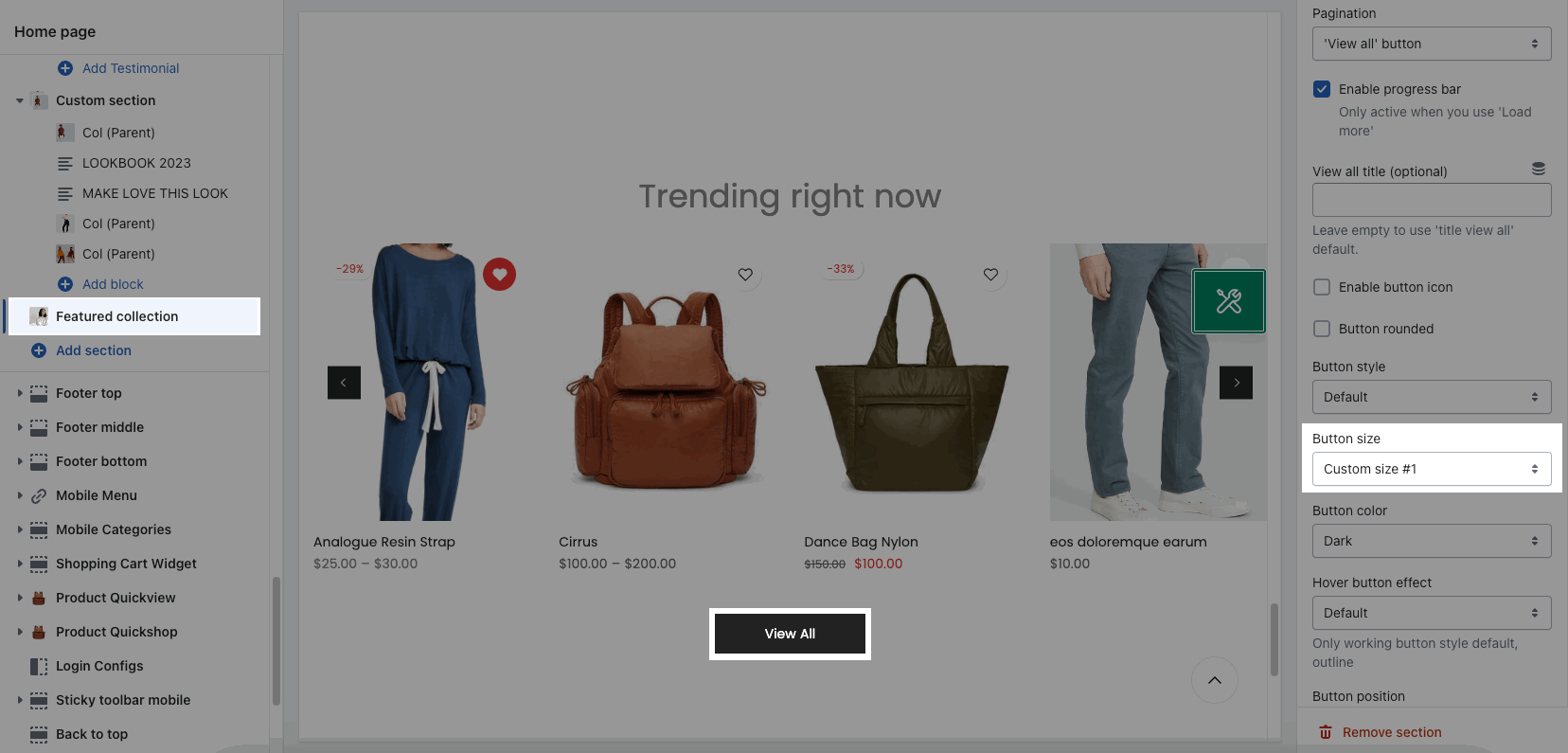
The setting will apply to all the sections that have the Button style, Button color or Button size options in the settings.
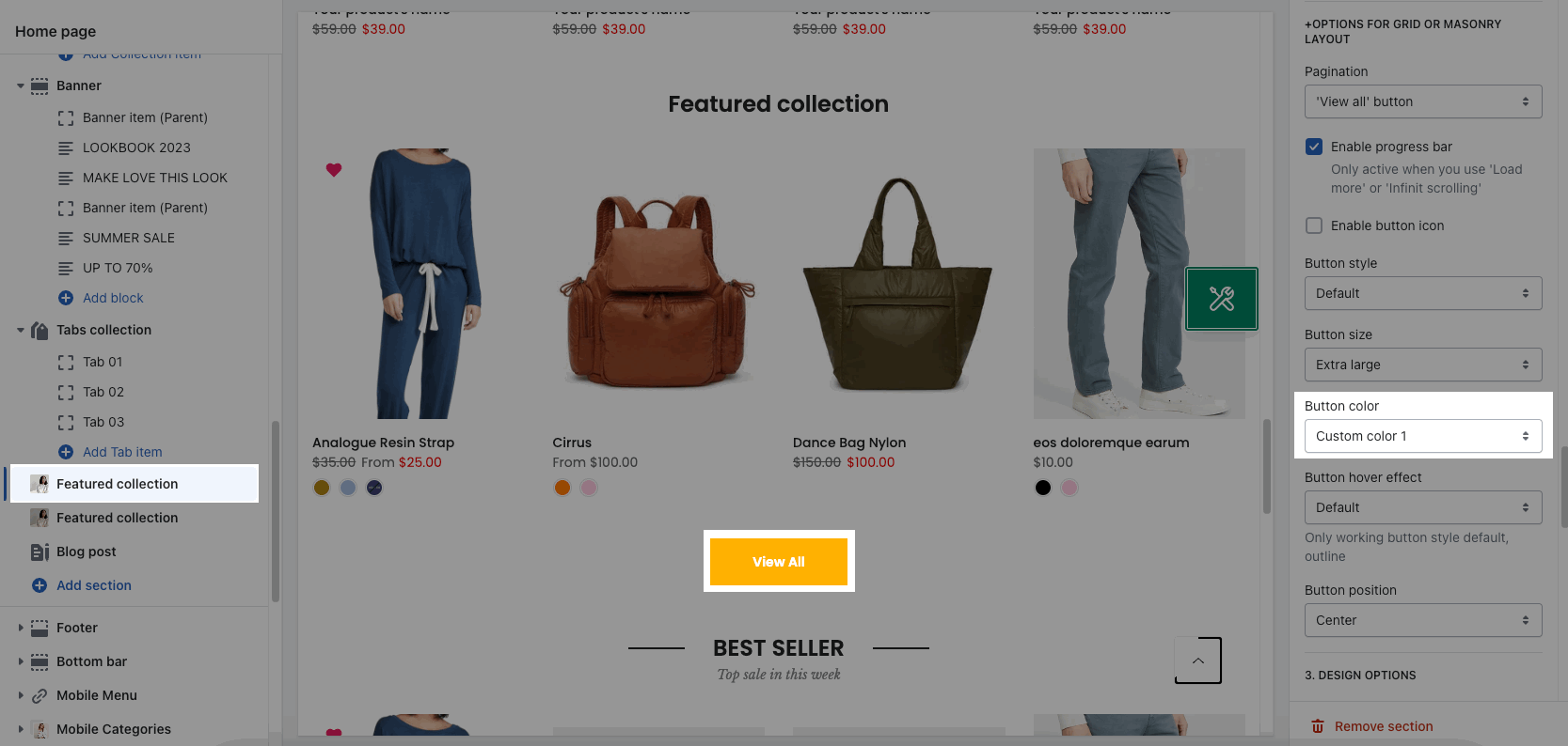
Example: Featured Collection section.
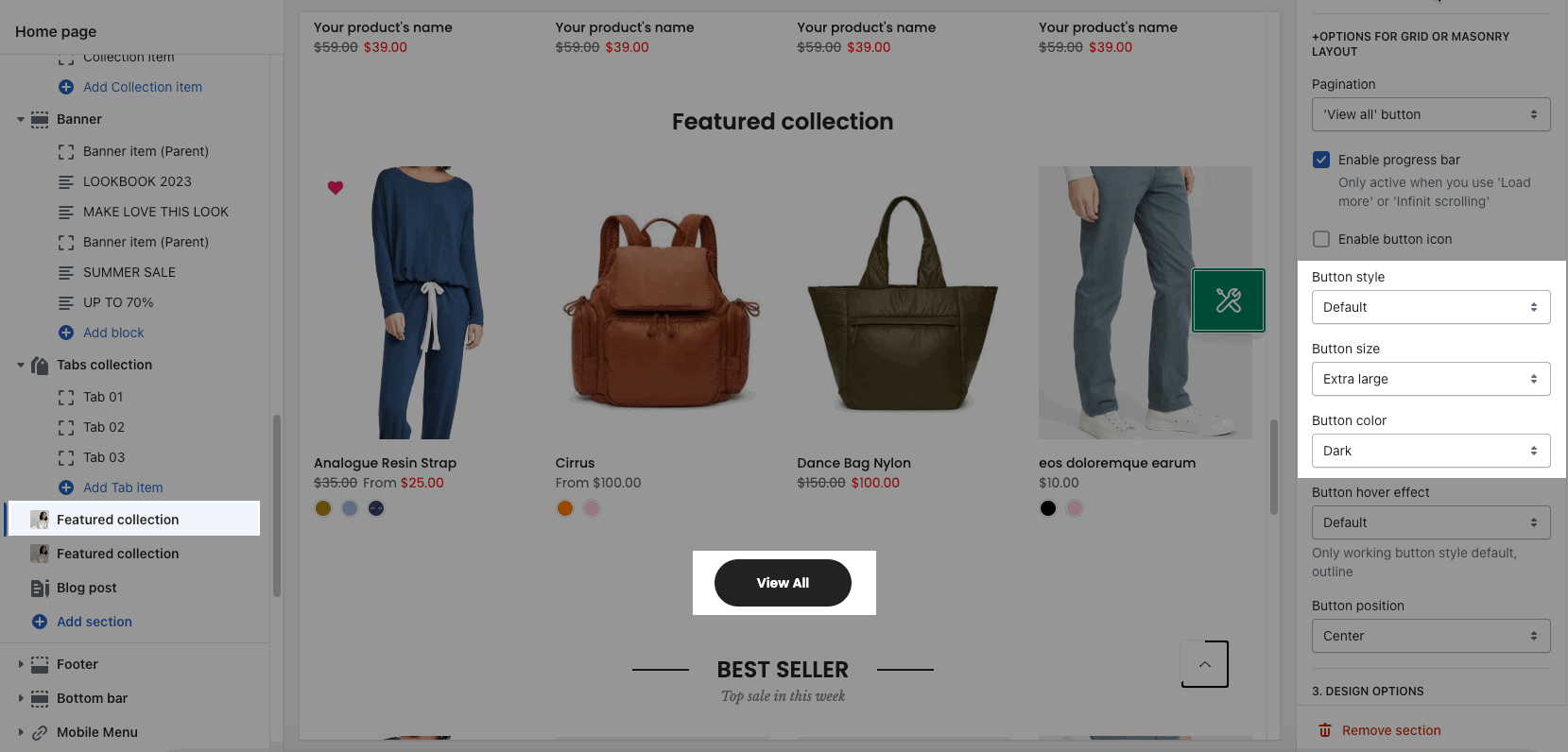
You can go to Admin tools -> Go to configs page -> Sections Sidebar -> Button Configs and configure it.
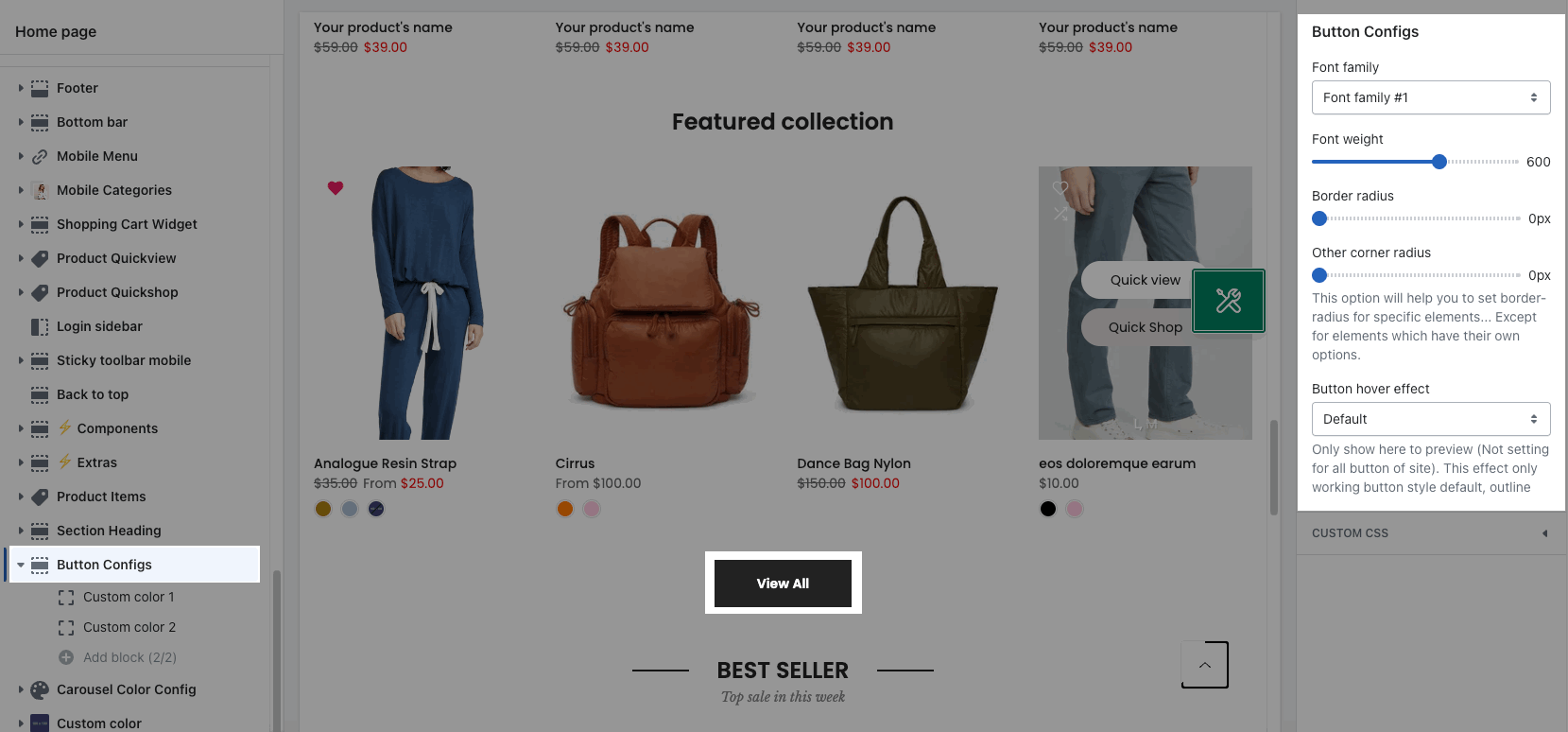
1. Button Config
You can adjust Font family, Font weight, Border radius, Other corner radius.
Hover button effect: Set the effect for the button on hover. It's only shown here to preview, not set for all site buttons. This effect only works with the button style default, outline.
2. Custom Color
The Button config section only supports 2 custom color blocks. From here, you can customize the button color as you want.
Step 1: Go to Button configs > click Custom color 1 to config the color.
There are some options for Primary color, Secondary color, Primary color hover and Secondary color hover.
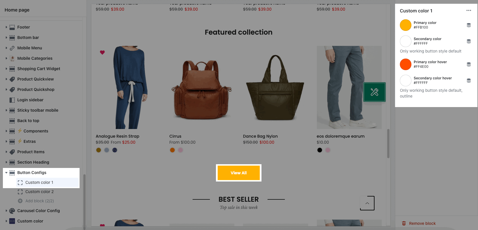
Step 2: From the section you are using > choose 'Button color: Custom color 1'. Example:
3. Button size
Button size block is available on Unsen and Gecko theme. Not for Kalles.
We provide Three button size blocks as:
Button size #1
Button size #2
Button size #3
With each block you can adjust many options like: Font family, Border width, Font size, Font weight, Letter spacing, Min height, Padding left/right.
Step 1: Go to Button configs > click Button size #1 to config the color.
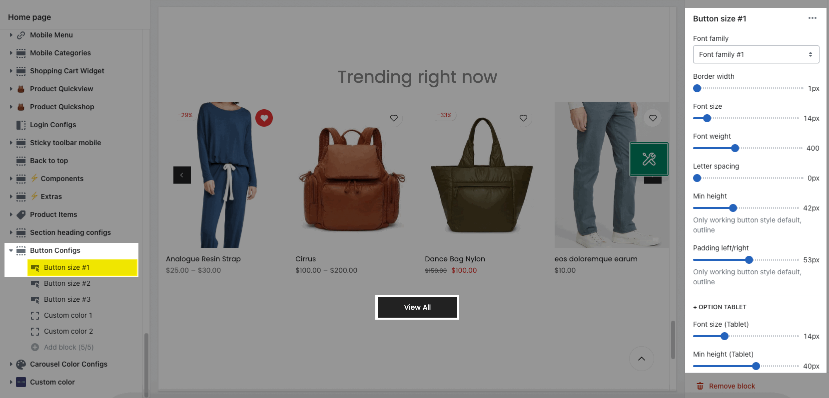
Step 2: From the section you are using > choose 'Button color: Custom size #1'. Example:
