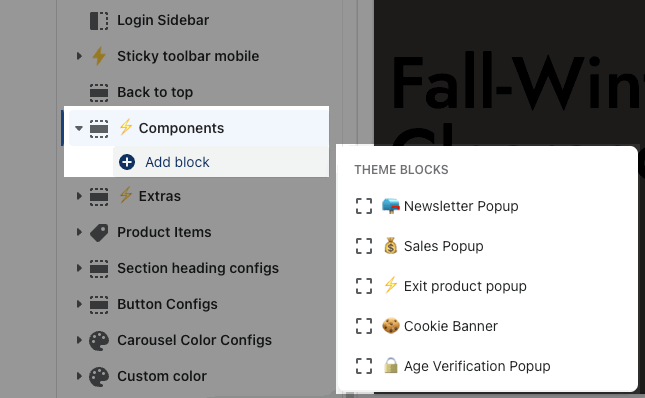
This section allows you to add many Popup types on the theme: Newsletter Popup, Exit Product Popup, Sales Popup, Age Verification Popup, and Cookie banner. All of them added more features to increase flexibility. Let's stick to this article to figure them out.
Go to Sections > Components > Add block > add the block you want to show on the store.
1. Newsletter Popup
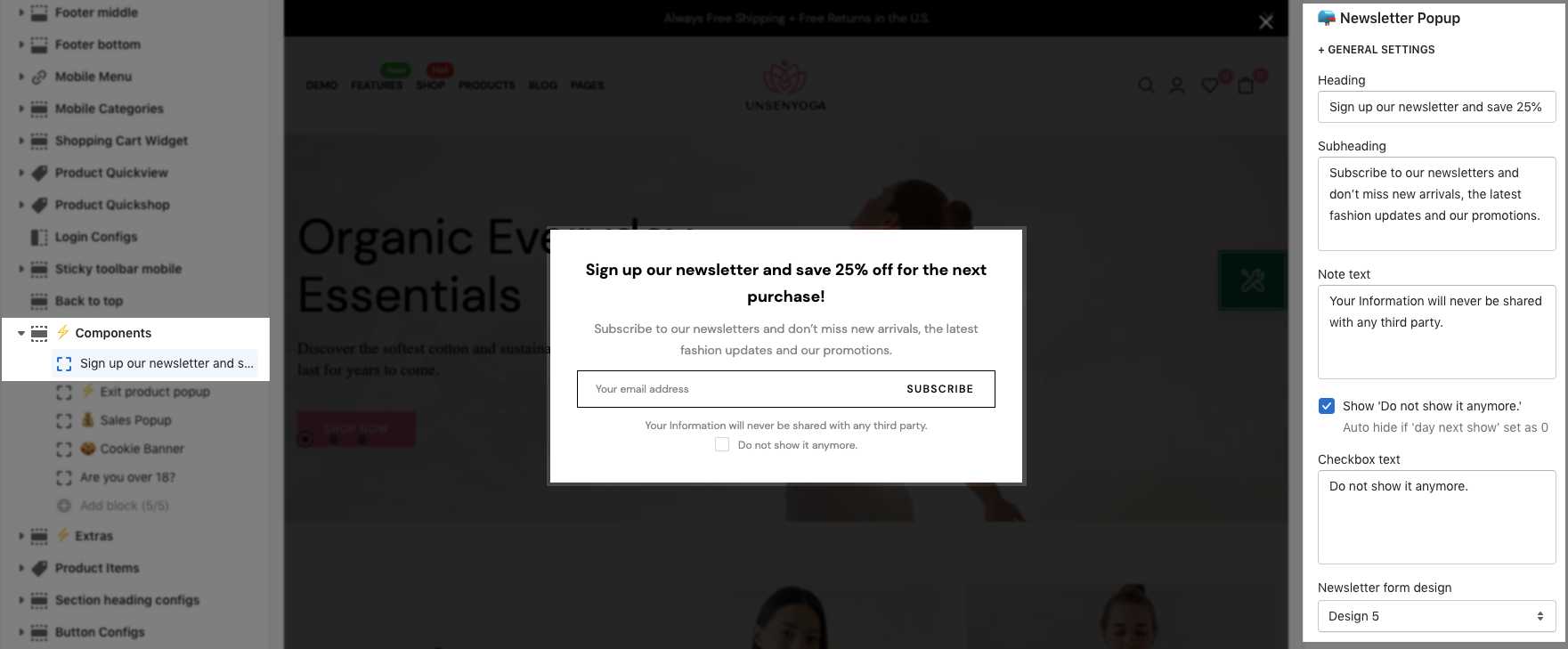
1.1. GENERAL SETTINGS
Text: You are allowed to enter Heading, Subheading, Note text, Checkbox text for the Newsletter popup.
Design: you can choose many designs for Newsletter form. Besides, you can choose the Size and Source newsletter button.
Color: There are many options for the color of Input, Button and Background.
Image and Layout design: You can upload an image and choose the position between image and text.
Show for mobile devices: Click on it to show the Newsletter popup on mobile devices.
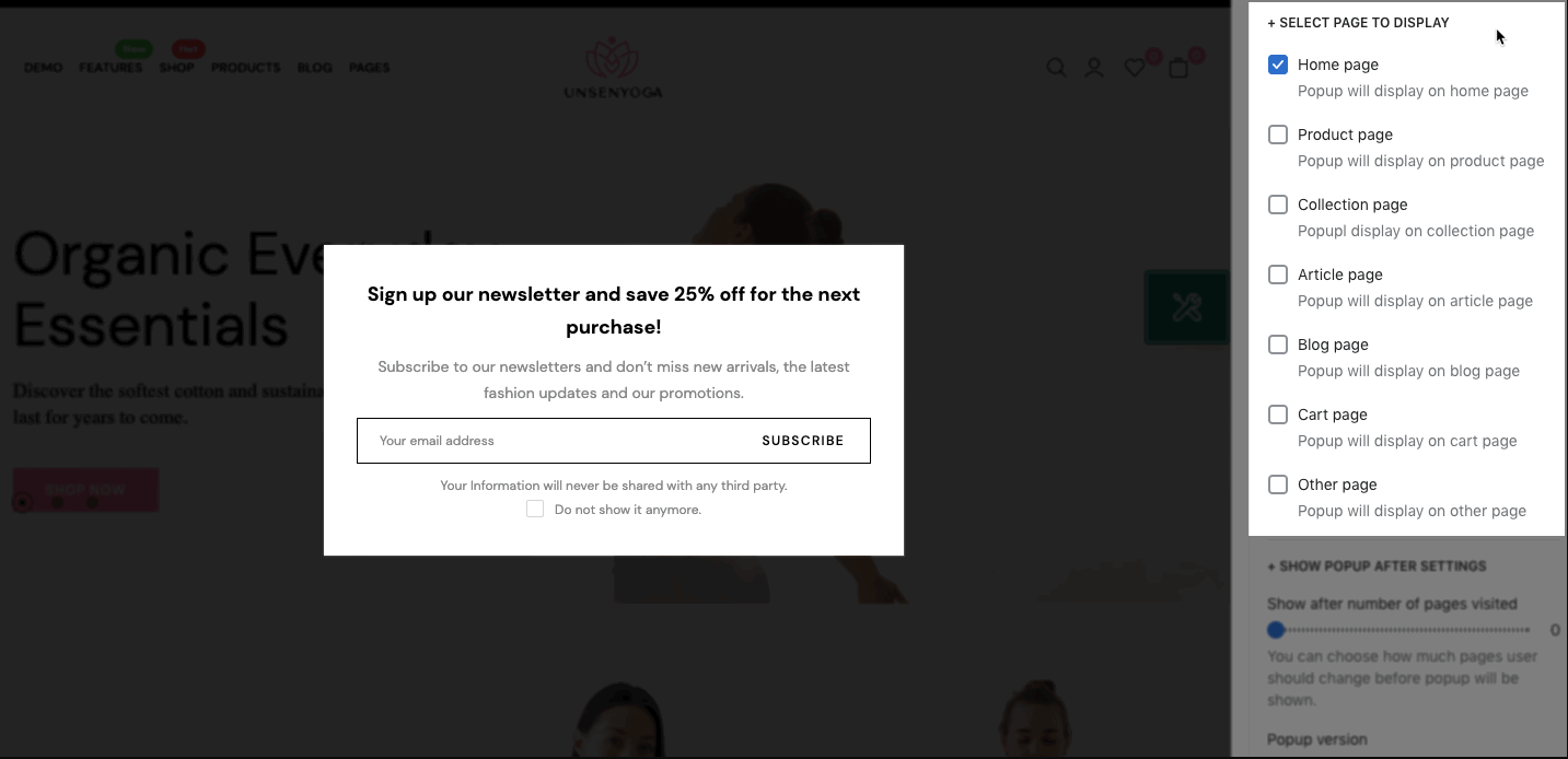
1.2. SELECT A PAGE TO DISPLAY
You can choose pages to activate the Newsletter popup. These are the pages for you to choose: Home page, Product page, Collection page, Article page, Blog page, Cart page, Other pages.
1.3. SHOW POPUP AFTER SETTINGS
Show after number of pages visited: You can choose how many pages the user should change before the popup will be shown.
Popup version: If you change your promo popup you can increase its version to show the popup to all visitors again.
Day next show (n): If user closes the popup, the next popup will show after 'n' days
Show popup after: You can choose between Sometimes and User scroll. If you choose Sometimes, you can set time on Popup delay. If you choose User scroll, you can set scrolled pixel on Show after user scroll down the page.
2. Exit Product Popup
This popup is only visible on Desktop devices when the user hover over the top of the browser intending to close the site.
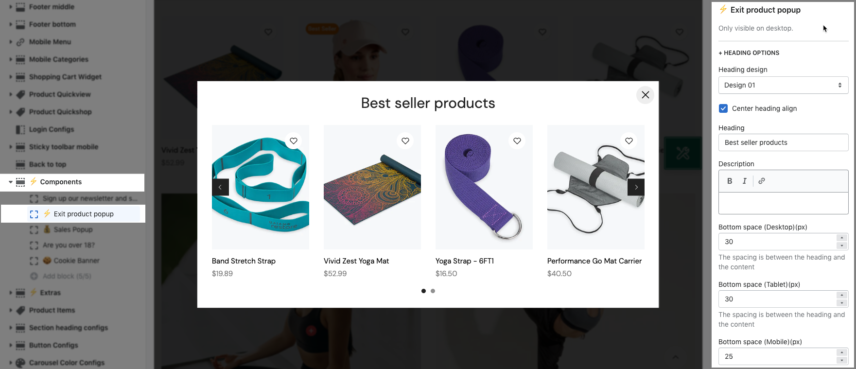
2.1. HEADING OPTIONS
Header design: There are a total of 5 styles for the header. Moreover, you can also choose Heading align.
Text: You are allowed to enter Heading, Subheading and Bottom Space between Heading and Content.
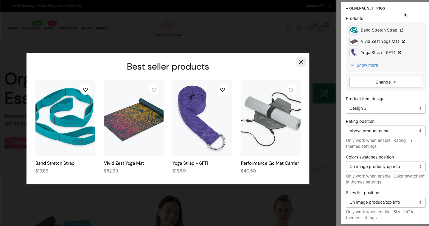
2.2. GENERAL SETTINGS
Products: You can choose a maximum of 12 profucts for this popup.
Product item design: you can choose the design for the product item.
Rating, Colors swatches, Sizes list: you can choose a position for this information or hide them.
Show product vendors, Show product countdown
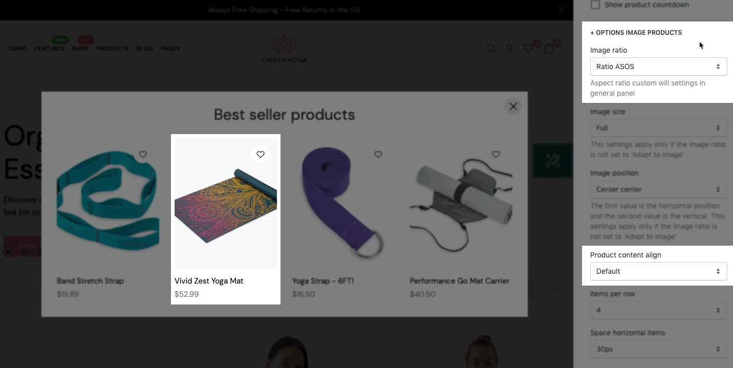
2.3. OPTIONS IMAGE PRODUCTS
You are allowed to change Image ratio, Image size, Image position, Product content align, Item per row, Space horizontal items, Day next show (n)
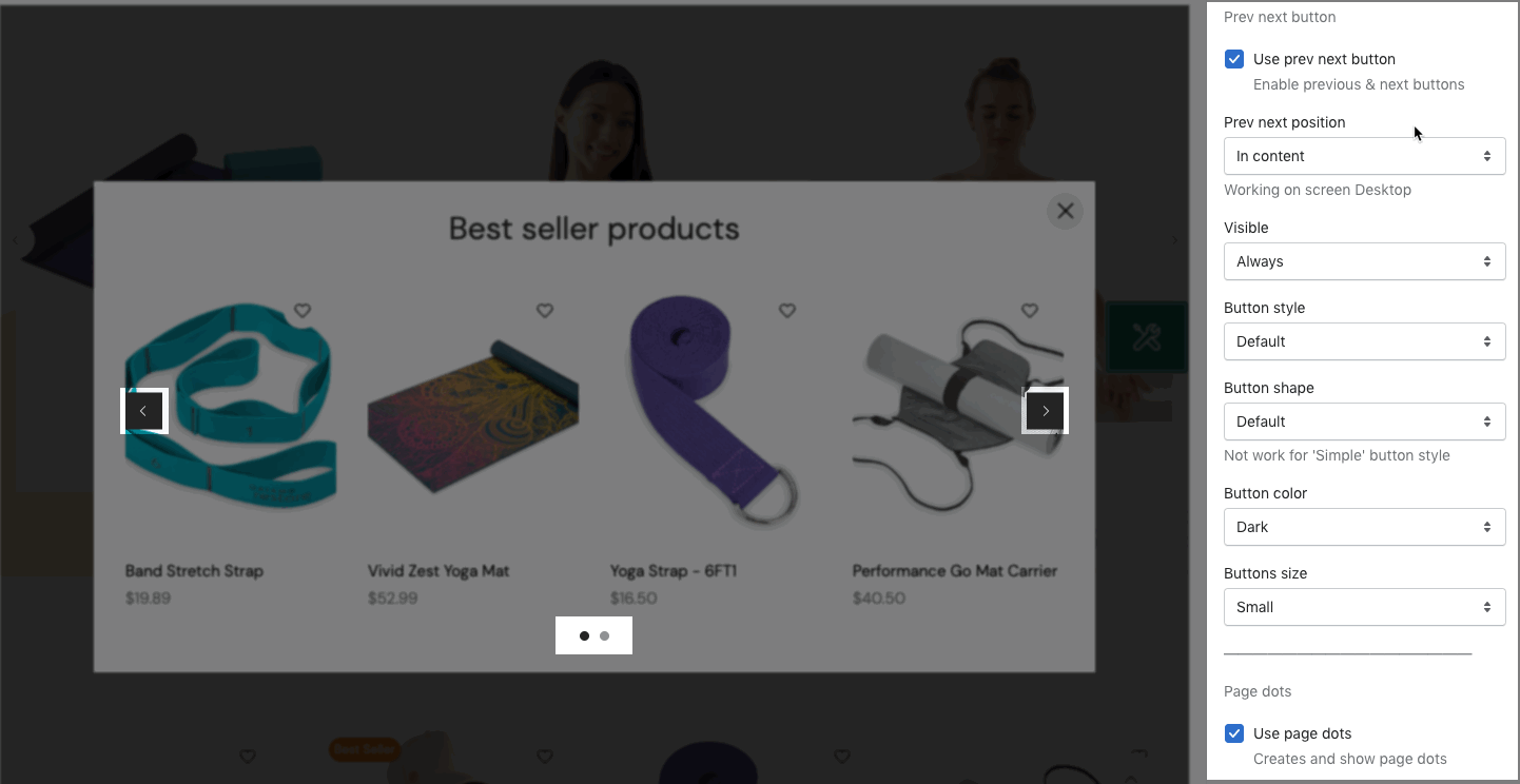
2.4. OPTIONS FOR CAROUSEL LAYOUT
You can config Loop, Autoplay speed, Pause autoplay on hover for carousel products.
Prev/ Next button: You can adjust the Visibility, Button Style, Shape, Color, Size.
Page dot: You can change Styles, Color, Round dots and Space among dots.
2.5. SELECT PAGE TO DISPLAY
You can choose pages to activate the Exit popup. These are the pages for you to choose: Home page, Product page, Collection page, Article page, Blog page, Cart page, Other pages.
3. Sales Popup
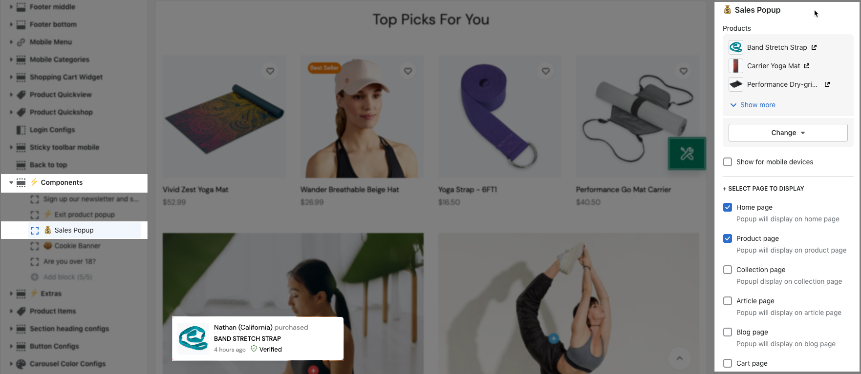
Products: You can choose each product for the popup. Moreover, you can enable Show for mobile devices to show a sale popup on Mobile devices.
3.1. SELECT PAGE TO DISPLAY
You can choose pages to activate the Newsletter popup. These are the pages for you to choose: Home page, Product page, Collection page, Article page, Blog page, Cart page, Other page.
3.2. GENERAL SETTINGS
Sale popup type: You are able to choose between Random and Sensequential.
Start time, Stay time, Start/ Staytime unit
Enable and change the text for close button, Enable Quickview button, and Progress bar.
List user purchased: This option allows you to enter fake purchases.
Enable time ago in suggest: You can enter the list time. That was separated with '|'.
3.3. LAYOUT SETTINGS
You can change Animation style, Text 'purchased' and Text 'verified'
4. Age Verification Popup
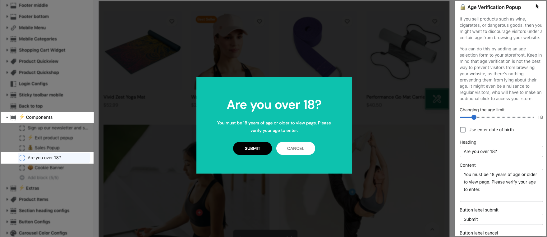
Changing the age limit: You can change the age from 1 to 100. This option only works when you enable "Use enter date of birth".
Use enter date of birth: Create the fields for user to submit their birthday.
Text: You are allowed to enter Heading, Content, Button label submit, Button label cancel, Text forbidden 1, Text forbidden 2.
Day next show (n): If users verify, the next show will be after 'n' days.
TEXTS OPTIONS:
You can change the text for Year, Each month, and Day.
DESIGN OPTIONS:
Background image: You can upload an image from your device here.
Moreover, there are some color options here for you to change.
5. Cookie banner
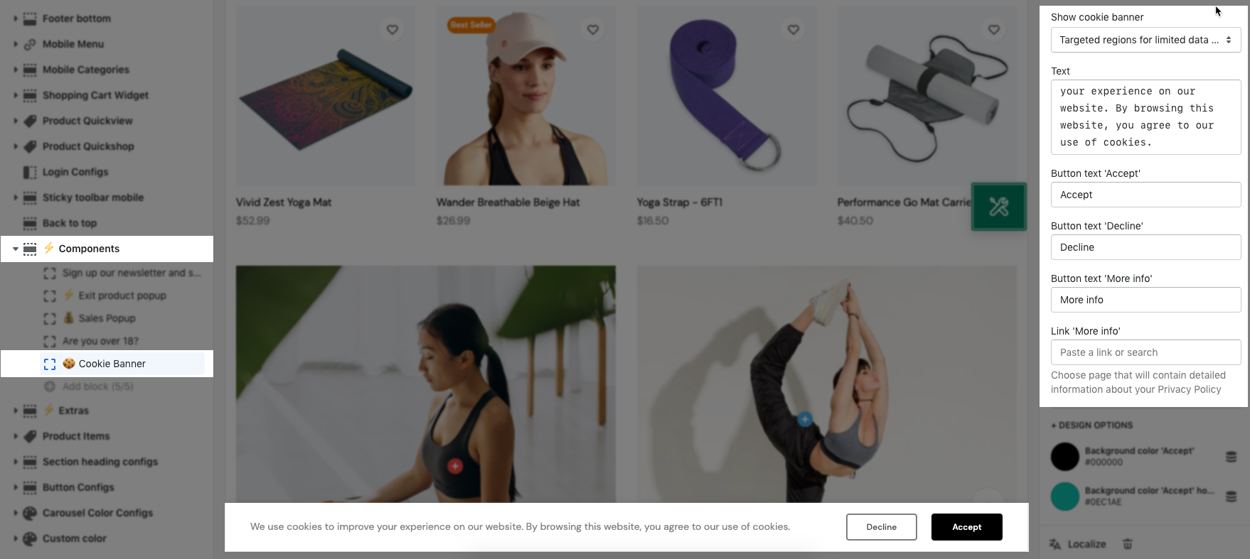
Show cookie banner: you can choose Show cookie banner for All regions or only Targeted regions for limited data collection.
Text: You are allowed to enter the whole text, Button text "Decline", Button text "Accept", Button text "More info".

DESIGN OPTIONS
You're allowed to change the color for the button "Accept" and button "Accept" hover.


