This block will allow you to configure Product Swatch, Add to Cart button, Checkout button, Grouped Product and Advance Product Type feature. This is the most important block in the Product Main.
Product form is added to Product Main by default. You can drag it to any position that you wanna show it.
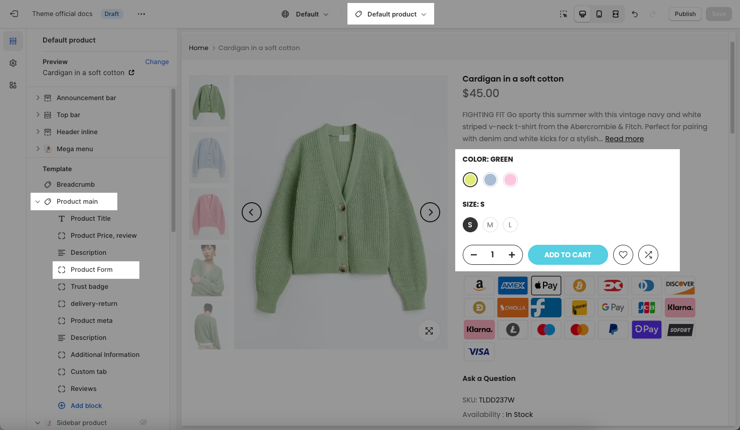
From Product page > Product Main > Click Product Form, the settings sidebar will open and you guys can configure some options below:
1. Product Swatch
Selector type: You can choose a variant selector type here. There are many types of Product Variants.
Color selector type: choose a style for Color variant. To config color swatches and use multi-languages, please check this guide.
Enable adapt to first swatch image variant: If you tick on this checkbox, the ratio of the Color Variant image will adapt to the ratio of the first product variant image that you configured in the Shopify backend.
Color selector size: You can choose the size for the color swatch color/ image here. This option only works with Color selector: color swatches, variant image types.
You can refer to this video to know more about swatch options:
Show quantity selector, Enable quantity full width, Enable wishlist/ compare
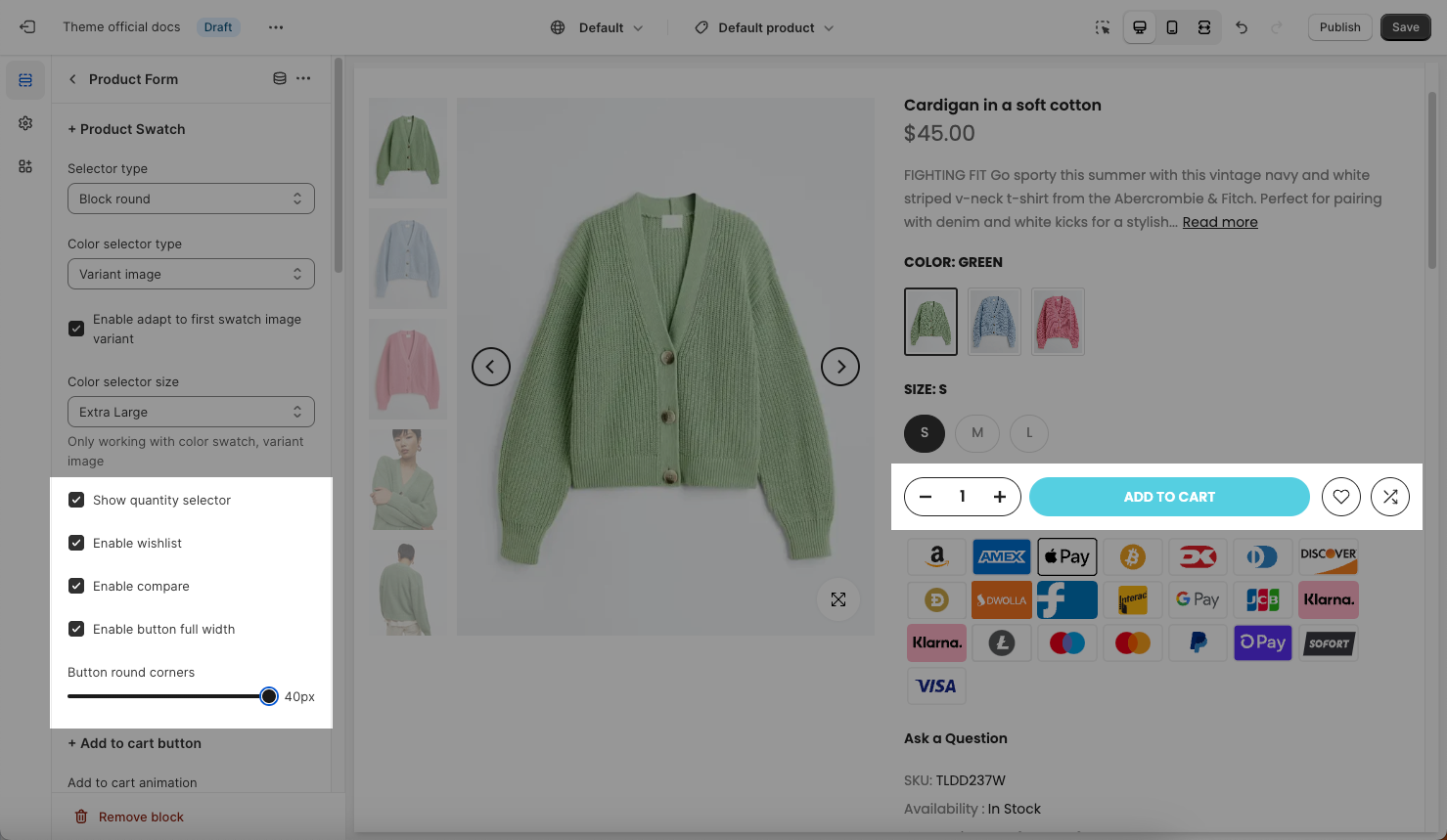
Button round corners: You can configure the border-radius for the quantity selector, Add to Cart button, Wishlist/ Compare button
2. Add To Cart Button
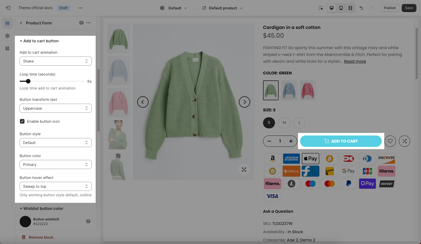
Add to Cart animation: You can choose an animation for the Add to Cart button here.
Loop time (seconds): This option allows you to configure the time that you wanna replay the animation for Add to Cart button.
Button Transform Text: Choose text transformation for the text on Add to Cart button here. We have 4 options: None, Uppercase, Capitalize and Lowercase.
Enable button icon: Tick on this checkbox to Enable the Add to Cart button icon.
Button Style, Button Color, Button Hover Effect: you can configure style, color, hover effect for the button.
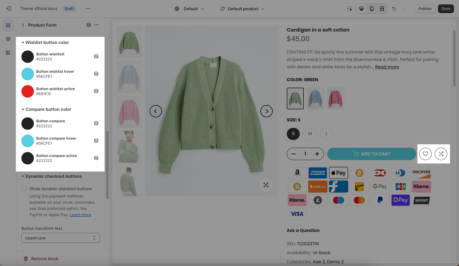
3. Wishlist, compare button color
There are some options for the static button, button when hovering, active button.
4. Dynamic Checkout Buttons
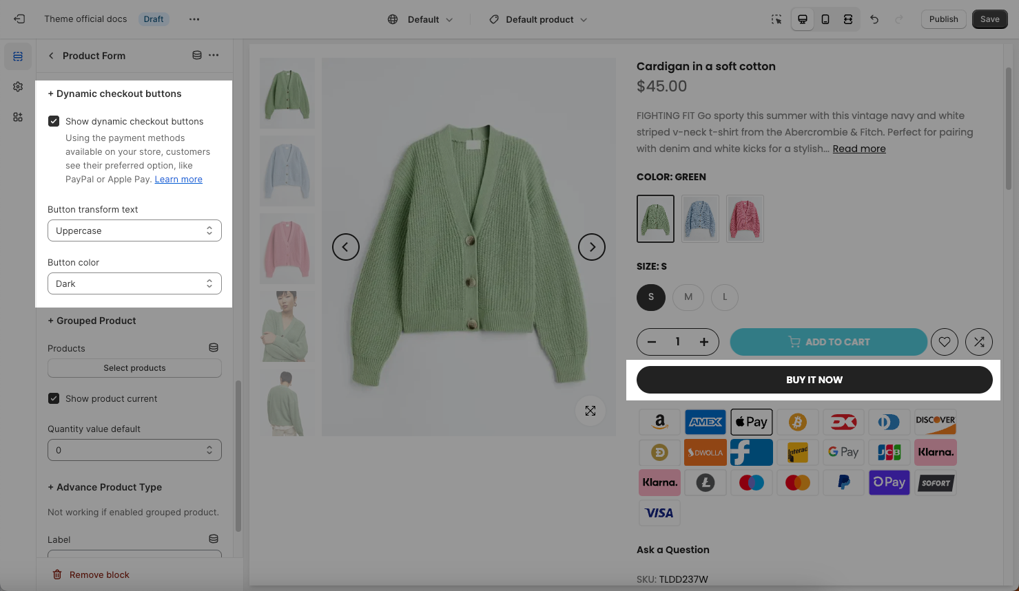
Show dynamic checkout buttons checkbox: Tick on this checkbox to enable the Buy it now button on the product page.
Button Transform Text: Choose text transformation for the text on the Buy It Now button here. We have 4 transformations: None, Uppercase, Capitalize and Lowercase.
Button Color: Configure the color for the Buy It Now button.
The Dynamic Checkout button will alter payment methods based on the customer's purchasing habits. For example, if a customer frequently uses Apple Pay, the frequently used payment method (Apple pay) will appear below the Dynamic Checkout button when customers access the store and view the product.
The checkout method that's displayed on the button depends on a few factors:
your payment settings
the customer's browser
the customer's device
the customer's personal payment history
Only the payment methods that you've enabled in your payment settings appear as options to your customers. If you don't have a third-party accelerated checkout method enabled, then only the unbranded button is displayed.
Our Theme Developers does not intervene to change the configuration, settings, or any functionality of the Dynamic Checkout button. This is a standard Shopify button, our Dev just calls and displays this button on the Product page.
You can read this article to learn more about the Dynamic Checkout button of Shopify.
5. Grouped Product
You can read this article to configure Grouped products.
6. Advance Products Type
You can read this article to configure the Advance Products Type.


