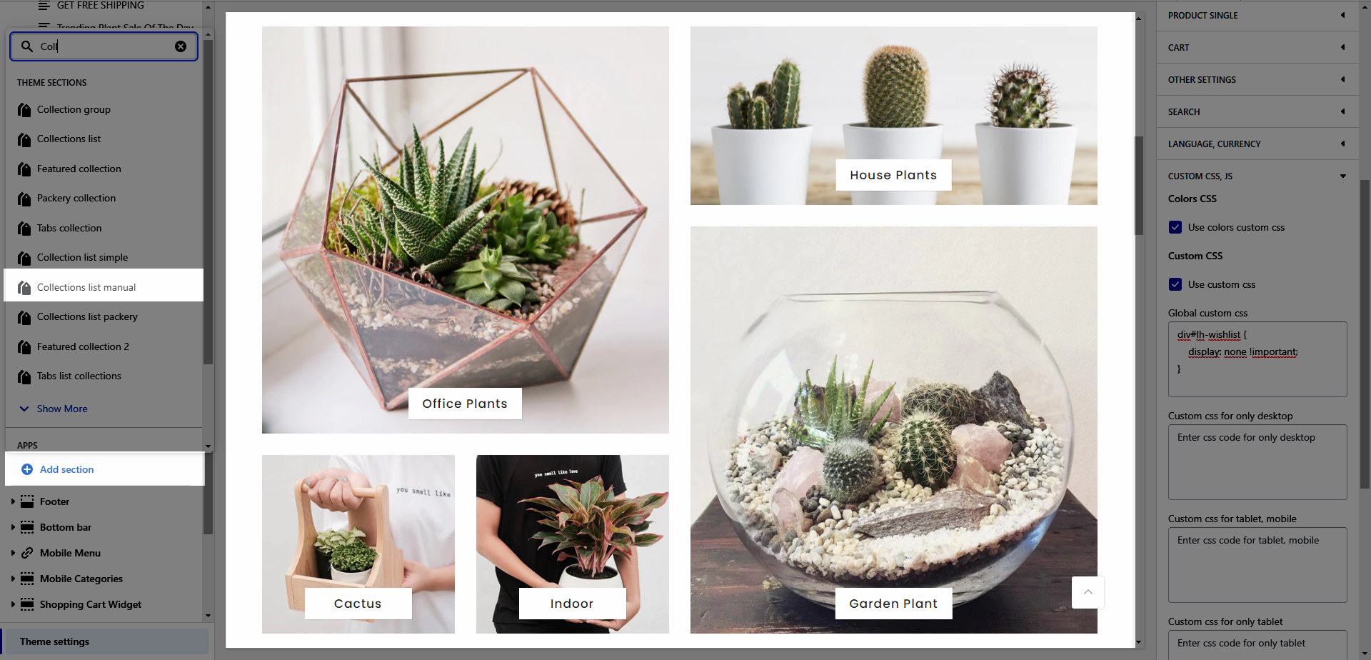
This section allows you to display collections list with many designs and layouts with awesome effects that will increase user experience (UX) for your store.
From Theme Section Sidebar -> Add section Collection list manual

1. Collection List Manual settings
HEADING OPTIONS
Heading design: There are a total of 14 heading designs.
Heading align: Align the title to the left, center.
Heading: Enter the content of the heading.
Enter an icon name on the heading: Go to LineAwesome to get the icon that you want to show on the design 6.
Subheading: Enter the content of the subheading.
Space bottom (px): This allows you to change the space between the heading and content.
Please follow this video below for details:
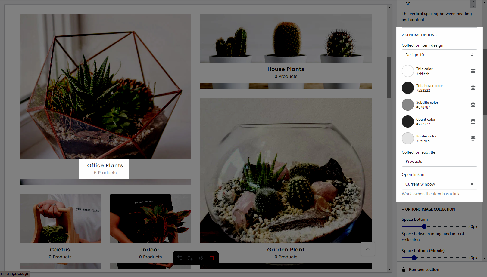
GENERAL OPTIONS
Collection item design: There are a total of 13 heading designs.
It helps you configure the title of a collection item with options for Title color, Title hover color, Subtitle color, Count color, and Border color.
Collection subtitle: Enter the content of the sub-title.
Open link in This option allows you to set the link to open in the current window or a new window when a customer clicks on the button.

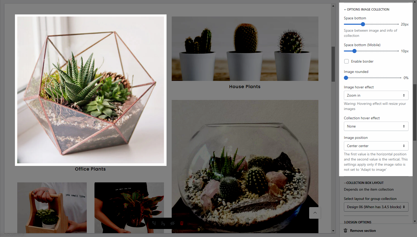
OPTIONS IMAGE COLLECTION
It helps you configure the image collections with options for Space bottom(both on desktop & mobile), Image padding, Image rounded, Image hover effect, Collection hover effect and Image position.

COLLECTION BOX LAYOUT
Select layout for group collection: There are a total of 7 designs.
Note: The height and width of the section will depend on the design you choose here. You can not change them yourself.
2. Collection List Manual item
Collection: Select a collection that you want to show on the collection item. You can set it blank (It's not required.)
Collection image: It allows you to upload an image for the collection item.
Collection label: Enter the content of the label.
Link (optional): Input the link for the collection item. If you input the link here, it'll overwrite the link that you add in the Collection option from the Collection List Manual item.


