


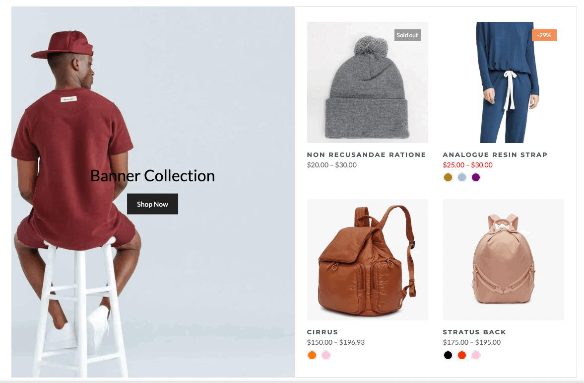
Here is an amazing section that will help you design the Banners with the collection creatively and professionally.
From Theme section sidebar -> Add section -> Banner collection section
1. Banner collection content
1.1. Banner item (Parent)
In this block, you can adjust your Banner with many options below:
Use custom height for many devices: Desktop, Tablet, Mobile
Add image item: You can add an image to show as a banner
Choose an effect when hover image and banner
Content align: You can align content to Left, Center or Right.
Content vertical/horizontal position: Choose the position for the content inside.
Content padding: You can set the padding for Block content on desktop or mobile devices.
Background content, Border content: You can set color, opacity, style, padding for background and border content
1.2. Other blocks (Child)
Text: you can add a text to the banner image and you can adjust text with many options like Font family, Font size, color, etc.
Button: This block allows you to create a button for the banner, you can customize this button with many options like add a link, style, effect, color, etc.
HTML: you can add a HTML code to the banner.
Image (Child): With this block, you can add a Image(child) inside the Image(parent) and you can adjust the Image(child) more creatively.
Countdown timer: This block help you add the countdown timer and set it very easily just by adding the date countdown into.
Newsletter: you can add a subscribe form here.
Space HTML: This block allows you to create a separator line for this section.
You can refer to this video to know more about these blocks:
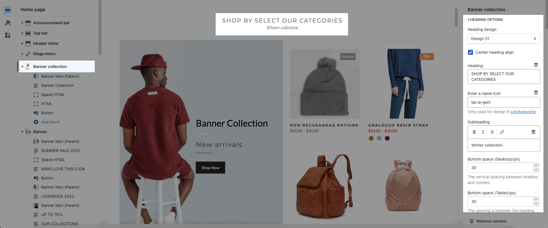
2. How to configure the Banner collection Section?
2.1. HEADING OPTIONS
You can enter the Heading and Subheading, choose the design for the heading, also can choose text align: center.
2.2. GENERAL OPTIONS
Collection position: Choose the position for the collection list. Only works on a desktop.
You can choose to show: Collection, Product item design, product vendors, countdown, border
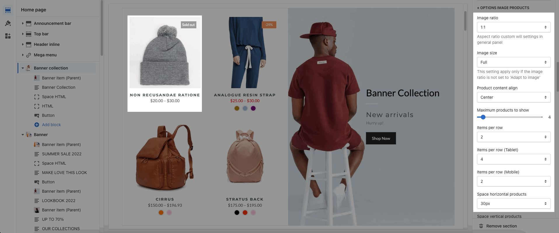
2.3. OPTIONS IMAGE PRODUCTS
These options let you configure the image and product item with: Image ratio, Image size, Product content align, choose the maximum item to show, number of item per row and Space horizontal/ vertical items. Moreover, you can have different options for many devices: Desktop, Tablet, Mobile.
2.4. BOX OPTIONS
You can choose the layout for the product list: Grid or Carousel. With Carousel layout, you can config for the Prev next button and Page dots
About Design options, please follow this guideline to config Layout, Background, and Margin/Padding for the section.


