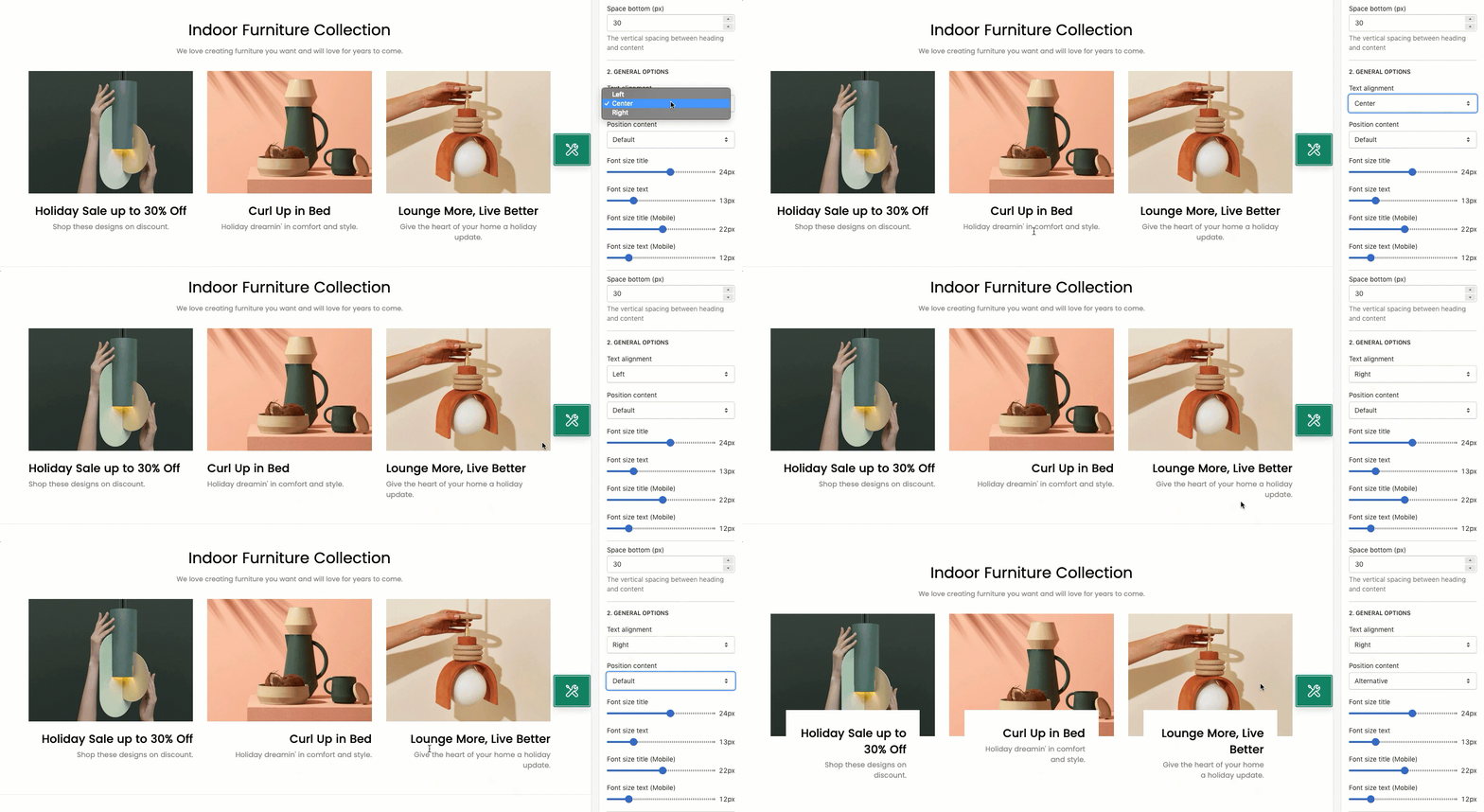
This section allows you to show the images and texts in different columns. You also can handle the width of those text/ image columns following what you want to build the layout that you wanna use.

It is usually located on Homepage. However, Shopify 2.0 allows you to add the Text columns with image 2 section to any pages that you wanna use.
Steps
1.
In the theme editor (Customize), click Add section
2.
Search Text columns with image 2
3.
Click Save
1. Text columns with image 2 column
In the section, you can click the "Add Column" button to add the content to the section:

- Enable image checkbox: You can tick on this checkbox to enable the Image option in this section.
- Image option: You can Upload the image for each column here.

- Heading option: You can add a Heading text for the Text columns with image 2 section here.
- Text option: You can add some texts for the Text columns with image 2 section here.

- Block width (Desktop, Tablet & Mobile): You can configure the width for the Text columns here. Our theme has the option that allows you to configure the block width on all devices: Desktop, Tablet & Mobile.

2. How to configure the Text columns with image 2 section?
- Heading design: You can choose a design for the Text columns with image 2 heading here. We have total of 5 heading designs for you to choose.
- Heading align center checkbox: Tick on this checkbox to enable the Heading of section on the center. If you uncheck this checkbox, the Heading will align left by default.

- Heading: You can enter the content that you wanna show on the Text columns with image 2 heading here.
- Description: You can enter the sub-heading content for the section here.

- Text alignment: You can choose to align text Left, Center or Right here.
- Position content: We have 2 positions for you to choose: Default position or Alternative.

- Font size title/ text (Desktop and Mobile): You can configure the font-size for the Title and text of this section here.

- Layout: You can choose the layout for the section here. We have 3 layouts for you to choose: Container, Wrapped Container and Fullwidth.

- Margin/ Padding: You can configure the margin/ padding for the section here. You also can configure margin/ padding for other devices: Tablet and Mobile devices.


