


This section allows you to create a Lookbook slider. One of the best sections that make customers impressive right first time access to your store.
From Theme Section Sidebar -> Add section Lookbook Slider
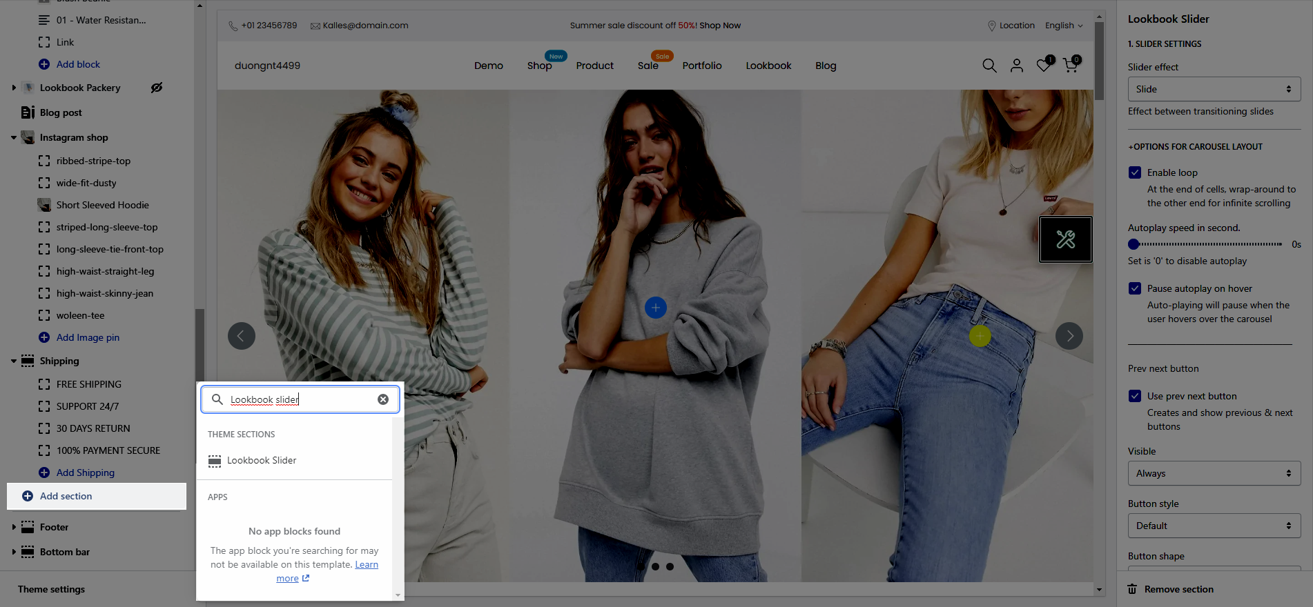
1.Lookbook Slider settings
1.1. SLIDER SETTINGS
Slider effect: Effect between transitioning slides, you can choose between Slide and Fade.
1.2.OPTIONS FOR CAROUSEL LAYOUT
Enable loop: At the end of cells, wrap-around to the other end for infinite scrolling.
Autoplay speed in second: You can set the automatically time move on to the next slider. Set is ‘0’ to disable auto play.
Pause autoplay on hover: Auto-playing will pause when the user hovers over the slideshow.
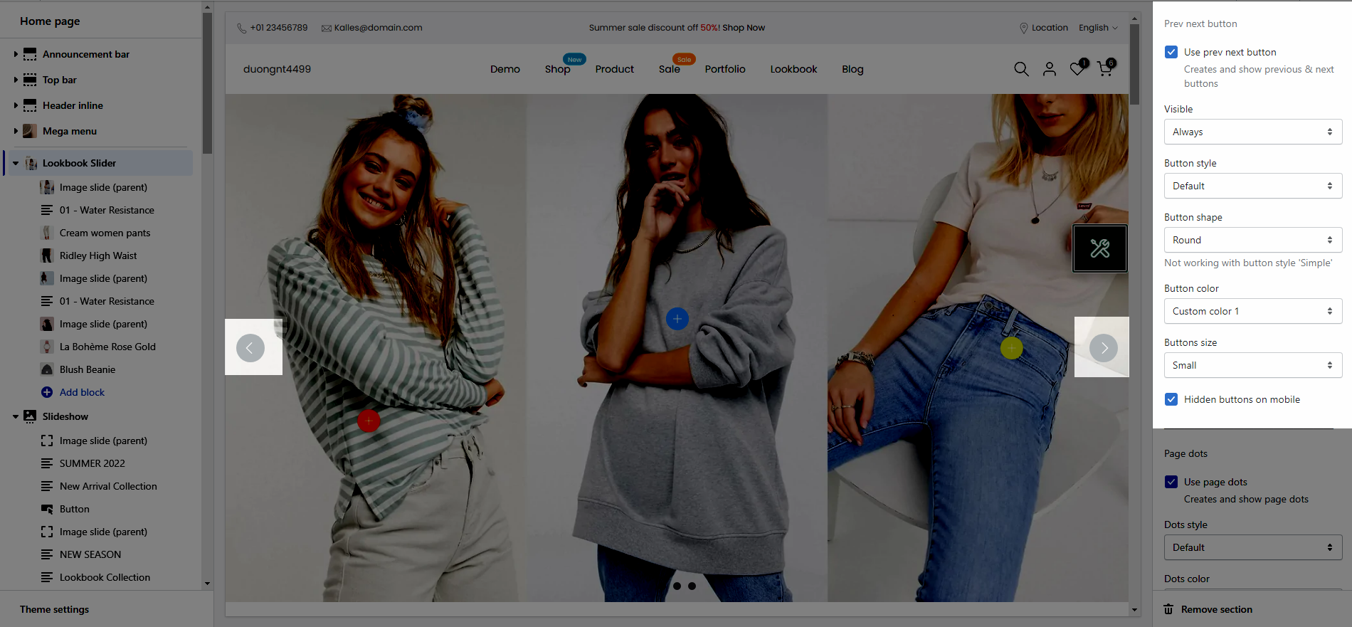
1.3.Prev next button
Use prev next button: This option allows you to enable/disable prev/next buttons for Slideshow.
Visible: You can choose between Always/ Only hover.
Button style: You can choose between Default, Outline, Simple.
Button shape(Not working with button style 'Simple'): You can choose between Default, Round, Rotate.
Button color: You can choose color for this button.
Buttons size: You can choose between Small, Medium, Large.
Hidden buttons on mobile: This option allows you disable this button on mobile devices.
1.4. Page dots
Use page dots: This option allows you to enable/disable page dot.
Dots style: You can choose between Default, Outline, Elessi.
Dots color: You can choose color for Dots.
Enable dots round: You can change dots from square to round.
Dots between horizontal: You can change the space between dots.
Hidden dots on mobile: This option allows you disable dots on mobile devices.
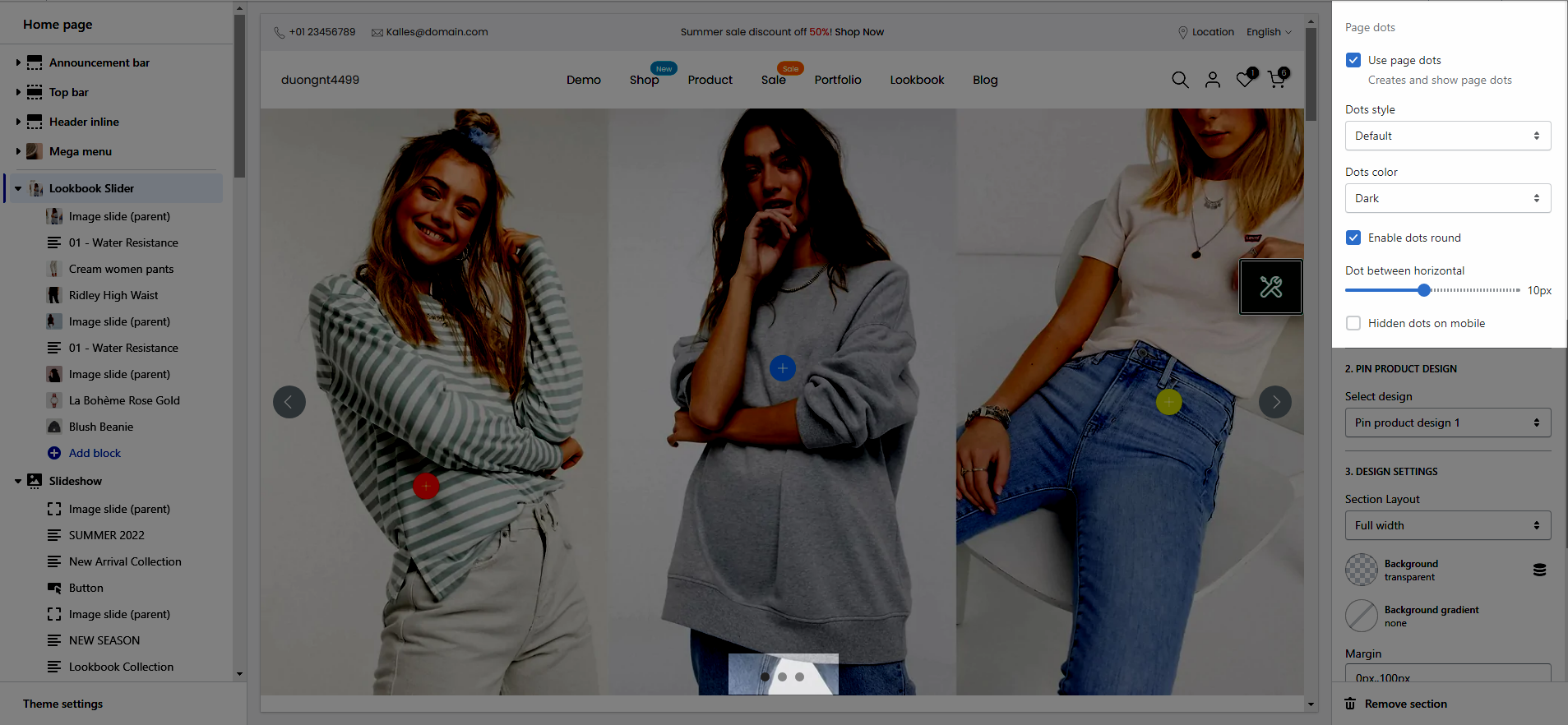
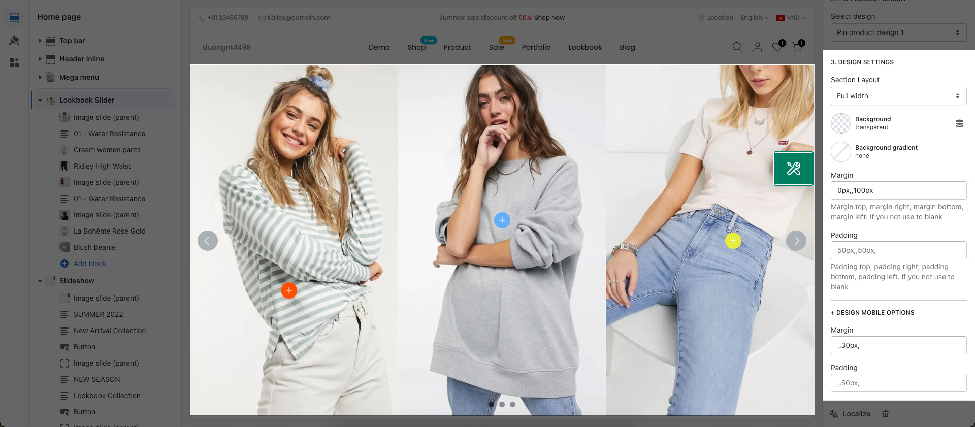
1.5. PIN PRODUCT DESIGN
This option allows you to choose any designs that you want to display for Product on Lookbook section.
We have created 4 designs for you to select, lets check it out:
1.6. DESIGN SETTINGS
Layout: You can choose between Container, Full width and Wrapped container.
Background: You can change the background color for this section.
Background gradient: You can change the background gradient color for this section.
Margin, Padding: You are allowed to change both of them for this section.
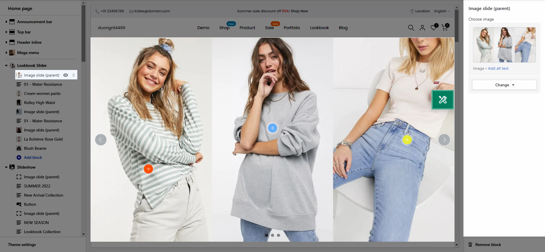
2. Image silde (parent)
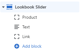
This is parent block which mean if you want to display a pin inside an image then you need to put it below this block as Sub content.
3. Pin settings
On this section, we provide 3 types of Pin as Product, Text and Link.
3.1. Pin Settings
Pin position: You can adjust position for pin by Top and Left parameter.
Title type: There are three types of icon design for you to select.
Short text: You can change the text content to display when your Title type is "Short text".
Pin size: You can set the pin size with many selections as Small, Medium, Large and Extra large.
Backgound color: This option allows you to set the background color for pin.
Icon/Text color: This option allows you so set the color for icon and text inside pin.


