The Featured collection section displays a single-row carousel of products from a selected collection.
1. Featured Collection
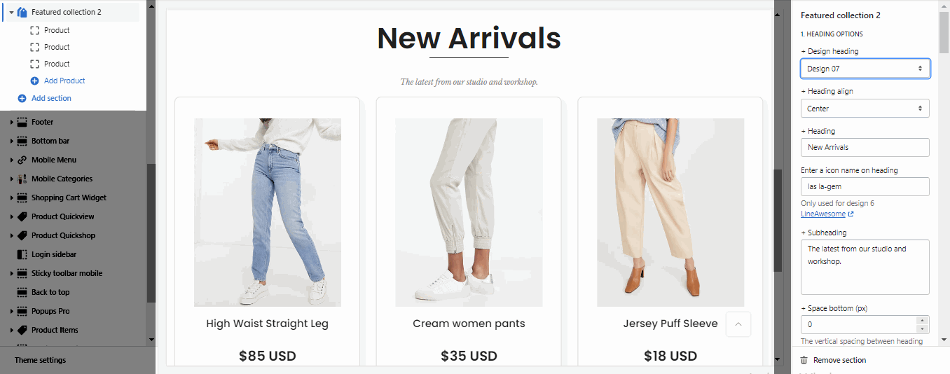
1.1. HEADING OPTIONS
Heading design: There are totally 14 heading designs.
Heading align: Align the title to the left, center.
Heading: Enter the content of the heading.
Enter a icon name on heading: Go to LineAwesome to get the icon that you want to show on design 6.
Subheading: Enter the content of the subheading.
Space bottom (px): This allows you to change the space between the heading and content.
1.2. GENERAL OPTIONS
OPTIONS IMAGE PRODUCTS
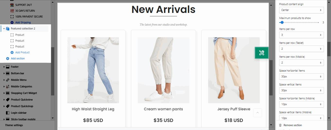
It helps you configure the image collections with options for Image ratio, Image size and Image position, Product content align, Maximum products to show, Items per row (both on Desktop, Tablet and Mobile devices), Space horizontal items, Space vertical items.
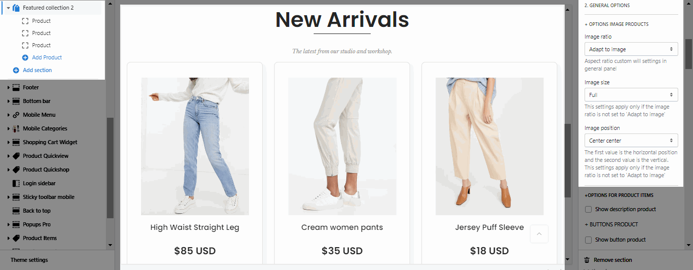
OPTIONS FOR PRODUCT ITEMS
Show description product: If you want to the product show description please enable this option.
Button Styles
Show button product: Enable this option when you want to show button below the information of the product.
Enable button icon: This option allows you add the icon next to the button label.
Button style, Button size, Button color, Button hover effect: These options will help to to design the button.
OPTIONS FOR CAROUSEL LAYOUT
Enable loop: At the end of cells, wrap-around to the other end for infinite scrolling.
Autoplay speed in second: You can set the automatically time move on to the next slider. Set is ‘0’ to disable auto play.
Pause autoplay on hover: Auto-playing will pause when the user hovers over the slideshow.
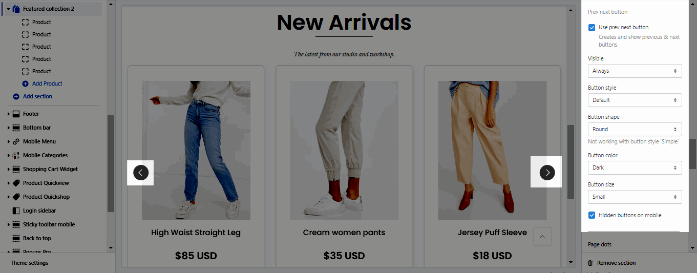
PREV NEXT BUTTON
Use prev next button: This option allows you to enable/disable prev/next buttons for section.
Visible: You can choose between Always/ Only hover.
Button style: You can choose between Default, Outline, Simple.
Button shape(Not working with button style 'Simple'): You can choose between Default, Round, Rotate.
Button color: You can choose color for this button.
Buttons size: You can choose between Small, Medium, Large.
Hidden buttons on mobile: This option allows you disable this button on mobile devices.
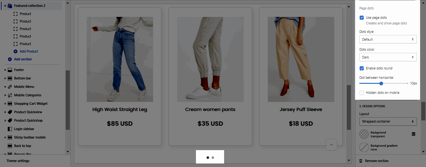
PAGE DOTS
Use page dots: This option allows you to enable/disable page dot.
Dots style: You can choose between Default, Outline and Simple.
Dots color: You can choose color for Dots.
Enable dots round: You can change dots from square to round.
Dots between horizontal: You can change the space between dots.
Hidden dots on mobile: This option allows you disable dots on mobile devices.
DESIGN OPTIONS
Layout: You can choose between Container, Wrapped Container and Full width. Besides, you can also upload a background image, choose a background color, or a background gradient for the layout.
Margin, Padding: You are allowed to change both of them for both on Mobile & Desktop devices.
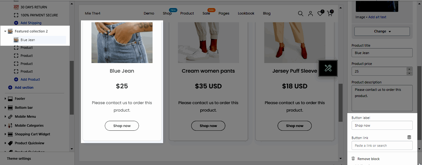
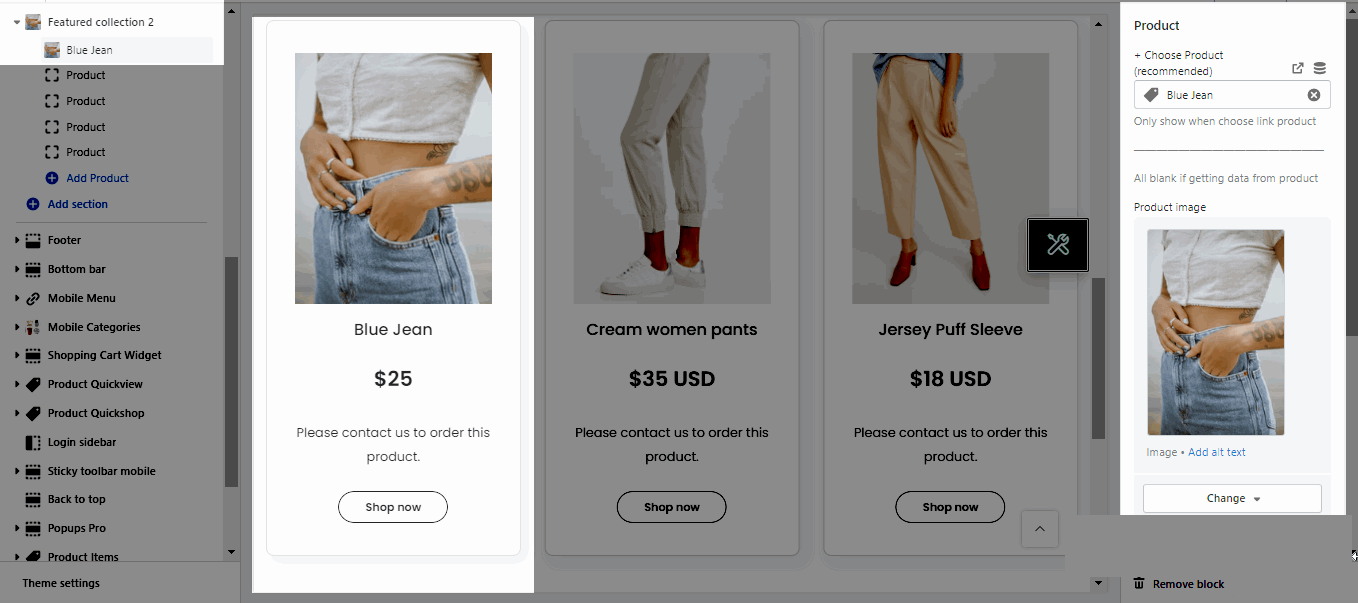
2. Product
Choose Product (recommended): Please add the link collection, product, etc that you want to show.
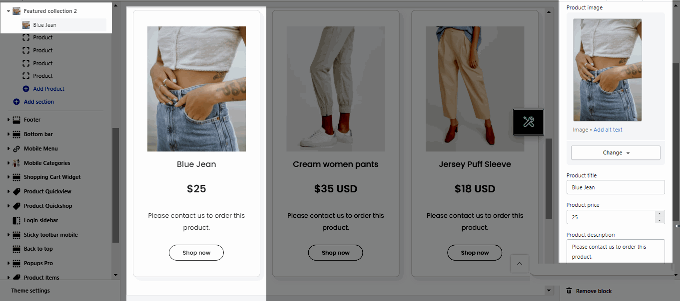
Product image, Product title, Product price, Product description: These features allow you can fill the information of the product manually.
Note: To show Product Description and Button, please enable these options here OPTIONS FOR PRODUCT ITEMS.
Button label: You can change the title of button that you want.
Button link: This option allows you can add the link for your button.