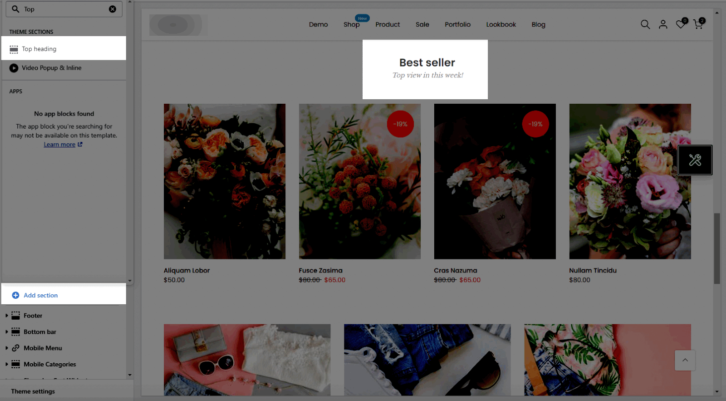
If you don't want to use the heading design in each section, you can hide it and use this section instead. From the Theme sections > Add section > Top Heading
1. Top heading content
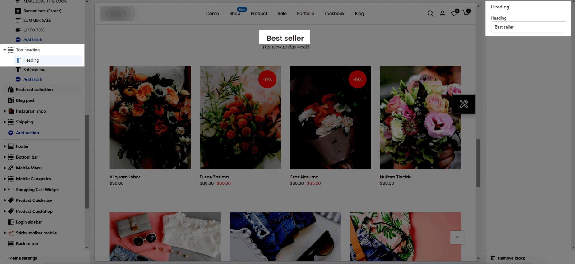
1.1. Heading
Heading: Enter the content of the heading.
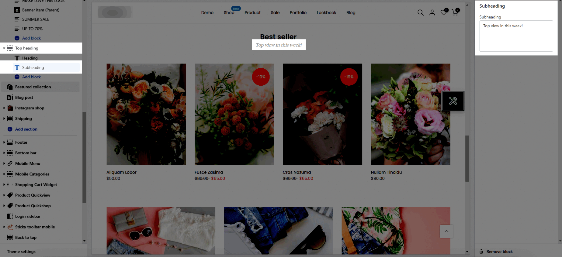
1.2. Subheading
Subheading: Enter the content of the subheading.
1.3. Icon
Source icon: This option allows you to choose to use the icon from Themes icon, Use image, Line awesome.
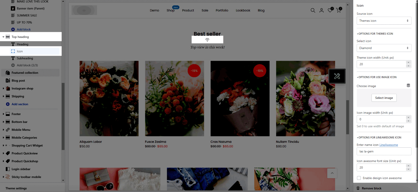
OPTIONS FOR THEMES ICON
Select icon: There are many icons. You can select one of them.
Theme icon width (Unit: px): Enter the icon's width value.
OPTIONS FOR USE IMAGE ICON
Choose image: This option allows you to upload an Image.
Icon image width (Unit: px): Enter the image's width value.
OPTIONS FOR LINEAWESOME ICON
Enter name icon: You can go to LineAwesome > Search an icon > Click on the icon to copy its code > Paste it into this box the same as the image above.
Icon awesome font size (Unit: px): Enter the icon's width value.
Enable design icon awesome: Turn on this option to show the design of the icon awesome.
MARGIN BOTTOM
Helps you to change the Space bottom both on Mobile and Desktop.
Please follow this video below for details:
2. How to configure Top heading section?
Heading design: There are totally 14 heading designs.
Heading align: Align the title to the left, center, or right.
Layout: You can choose between Container, Wrapped Container and Full width.
You can also choose Background color, Background gradient color for the layout.
Background image: It allows you to upload an image for the layout.
Margin, Padding: You are allowed to change both of them for mobile devices.
Please follow this video below for details:


