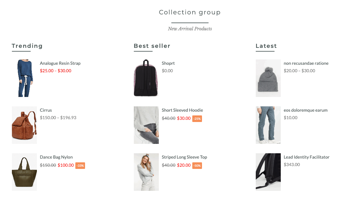
This section helps you to show the categories as columns. To add the collection group section, please go to Theme sections > Add section > Collection Group.

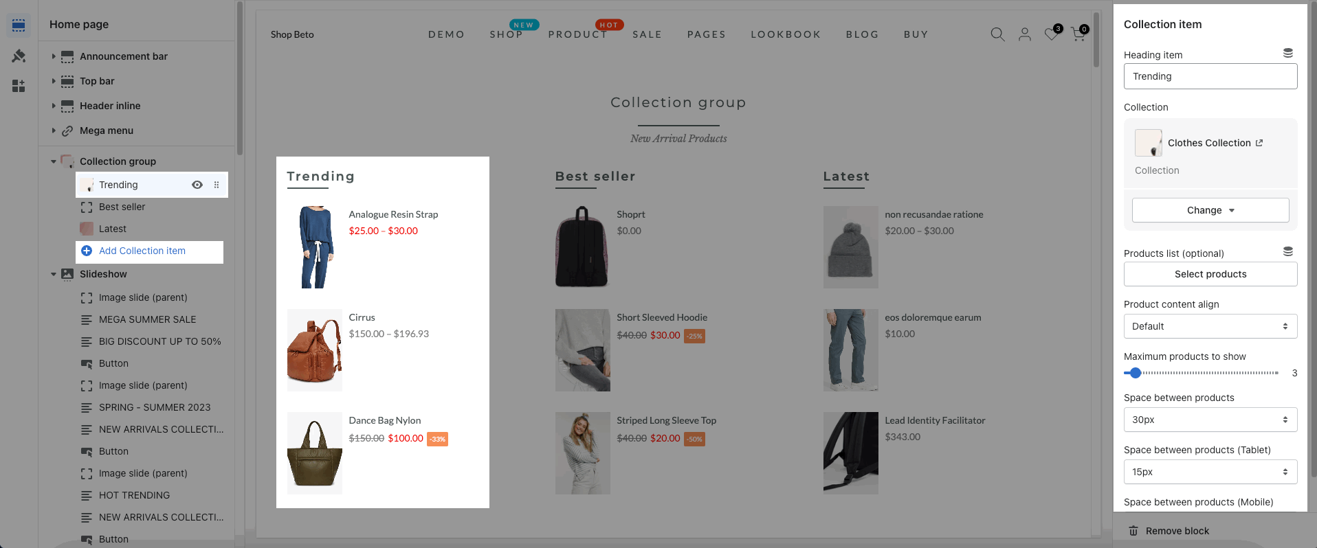
1. Collection Item
You can click on Add Collection Item to add more collection columns for this section.

Heading item: Enter the content of the heading item.
Collection: Select a collection that you want to show on the collection item
Product list: You can choose the specialty products to show here. If you use Product list, the Collection option will not be applied.
It helps you configure the collection item with options for Product content align, Maximum products to show, Space between products (desktop, tablet & mobile).
2. How to configure the Collections list section?
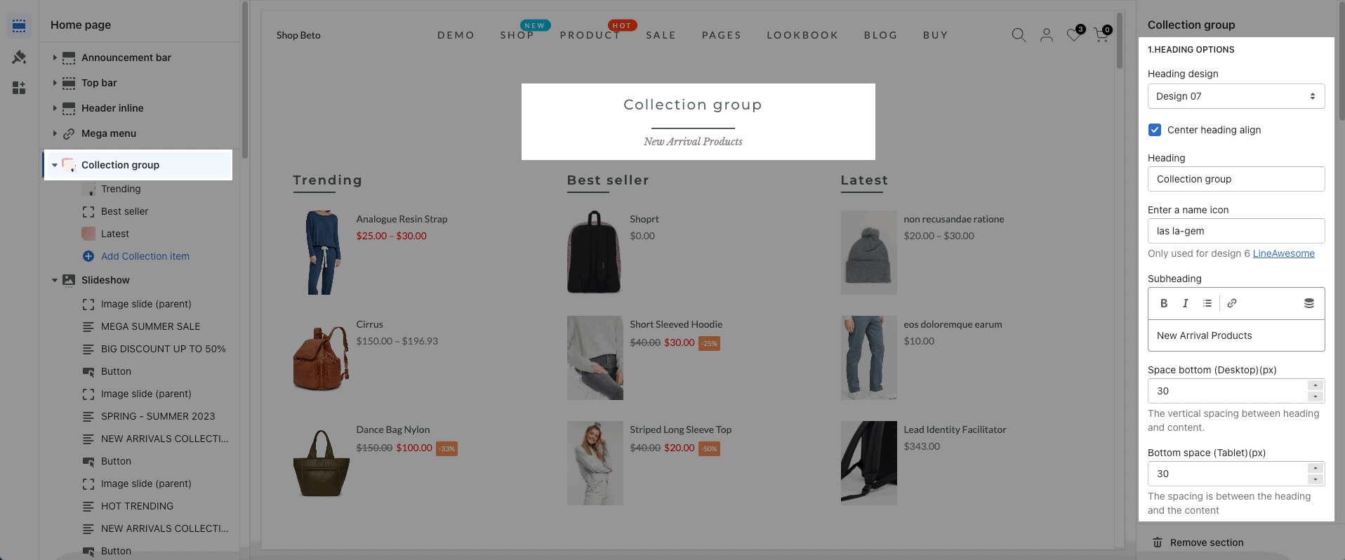
2.1. HEADING OPTIONS
Heading design: There are totally of 15 heading designs.
Center heading align: check this option to align the title center
Heading: Enter the content of the heading.
Enter a icon name on heading: Go to LineAwesome to get the icon that you want to show on design 6.
Subheading: Enter the content of the subheading.
Space bottom (px): This allows you to change the space between the heading and content.

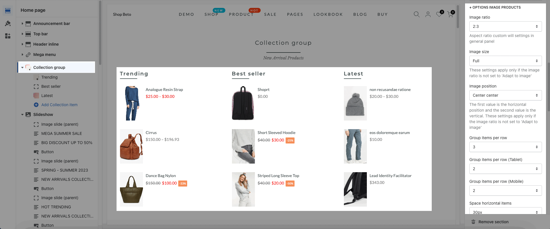
2.2. OPTIONS IMAGE PRODUCTS
Image ratio, Image size, Image position: It helps you configure the image products
Group items per row, Space horizontal items, Space vertical items(both on desktop, tablet and mobile): you can choose how many items per row and configure the spacing for them.

2.3. DESIGN OPTIONS
Layout: You can choose between Container, Wrapped Container, and Full width. Besides, you can also upload a background image, and choose a background color, or a background gradient for the layout.
Margin, Padding: You are allowed to change both of them for both Mobile and desktop devices.
Please follow this guideline to config Layout, Background, Margin/Padding for the section.


