


This section allows you to create a gallery of Images.
From Theme section sidebar -> Add section -> Image gallery section
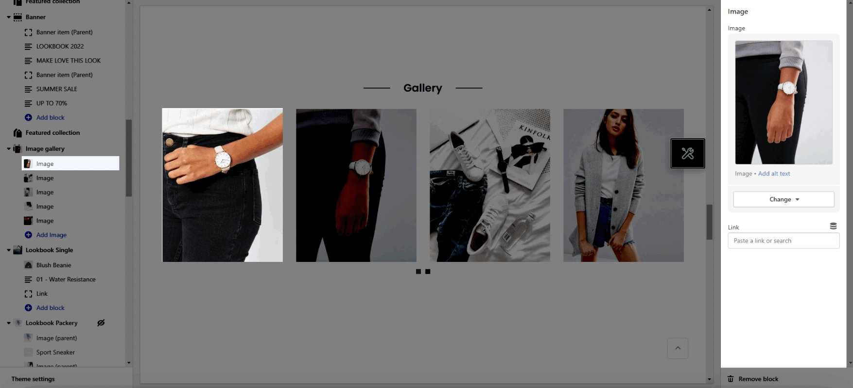
1. Image block
With this block, you can add an Image and Link.
2. How to configure the Image gallery section?
2.1. HEADING OPTIONS
Design heading: There are a variety of designs for you, please try each all.
Heading align: You can set positions Left, Center or Right for heading.
Heading: You can add the heading title for this Lookbook section.
Enter a icon name on heading: You can choose the icon that you want to add in this and paste the name in here (Only used for design 6).
Subheading: You can add the sub title for this Lookbook section.
Space bottom (px): You can set the vertical spacing between heading and content.
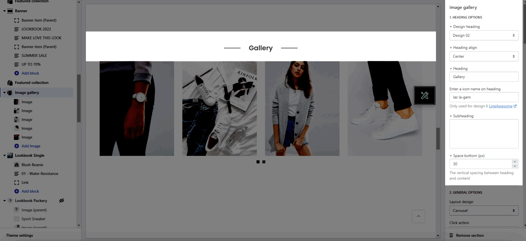
2.2.GENERAL OPTIONS
Layout: You can choose between Grid, Carousel and Packery.
Click action: Select style when you click to image.
Enable Navigation Thumbnail: Works when use Photoswise Popup.
Open link in: This option allows you to open the link on the New window or Current window.
Item image rounded: You can adjust roundness for the image.
Image hover effect: Hovering effect will resize your images.
Item effect when hover: You can set effect for image when hovering.
2.3. OPTIONS IMAGE
Image ratio: Aspect ratio custom will settings in general panel.
Image size: This settings apply only if the image ratio is not set to 'Adapt to image'.
Image position: The first value is the horizontal position and the second value is the vertical. This settings apply only if the image ratio is not set to 'Adapt to image'.
Items per row: You can set item display per row on many devices.
Space between items: You can adjust space between items.
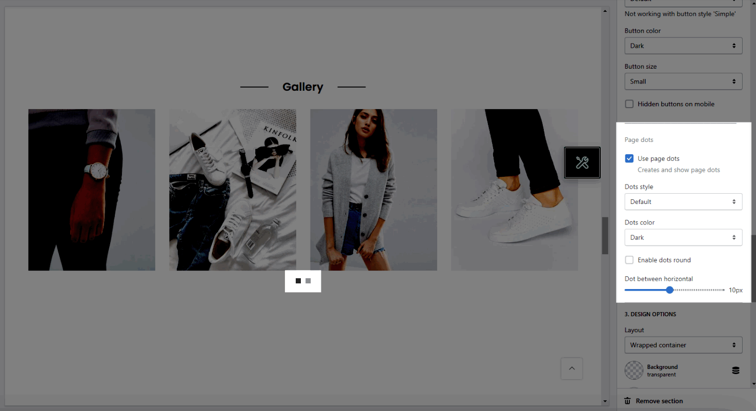
2.4. OPTIONS FOR CAROUSEL LAYOUT
Enable loop: At the end of cells, wrap-around to the other end for infinite scrolling.
Autoplay speed in second: Set is ‘0’ to disable autoplay.
Pause autoplay on hover: Auto-playing will pause when the user hovers over the carousel.
You also can config the style for Prev, next button and Page dots
2.5. DESIGN OPTIONS
Layout: You can choose between Container, Full width and Wrapped container.
Background: You can change the background color for this section.
Background gradient: You can change the background gradient color for this section.
Margin, Padding: You are allowed to change both of them for this section.


